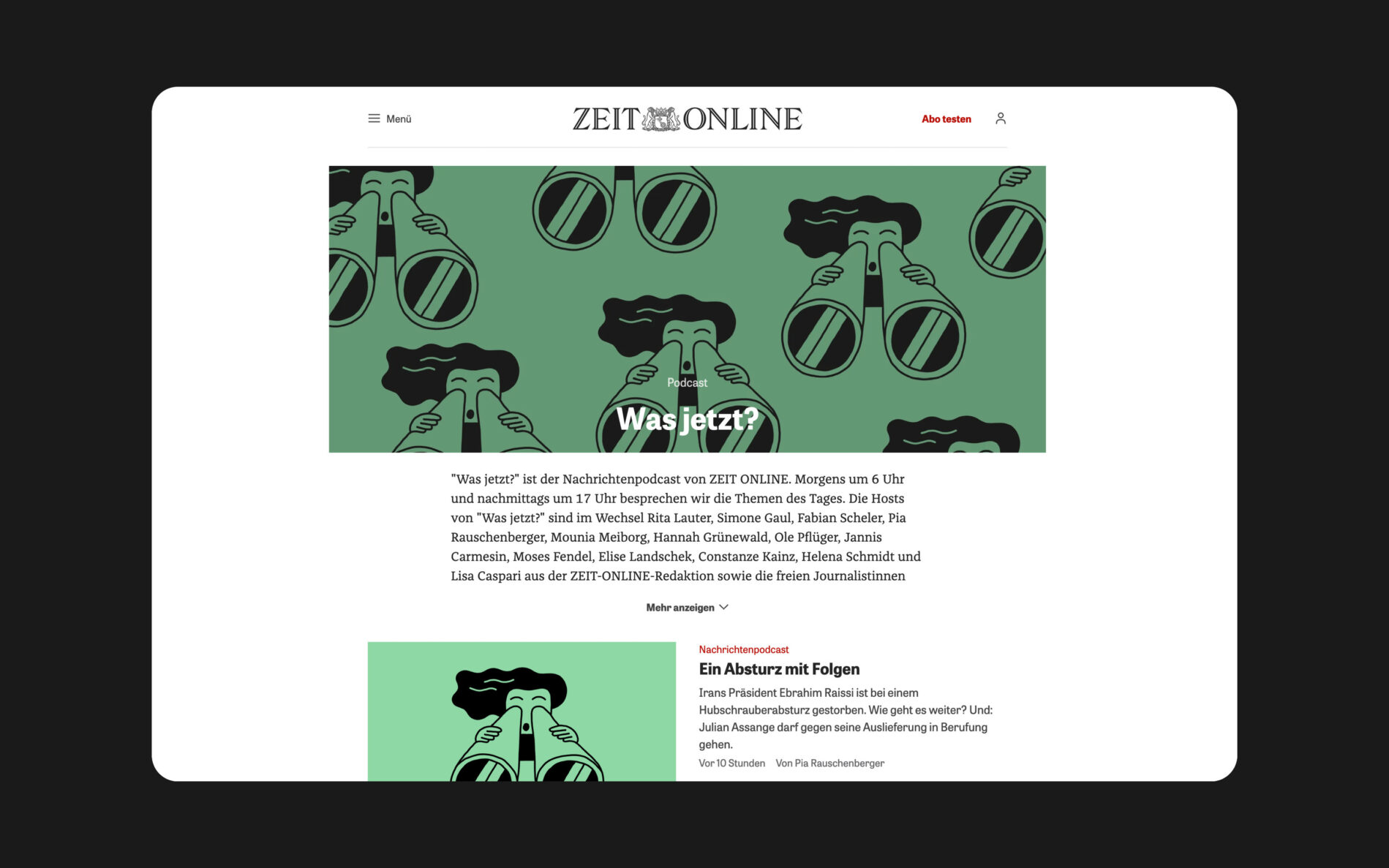
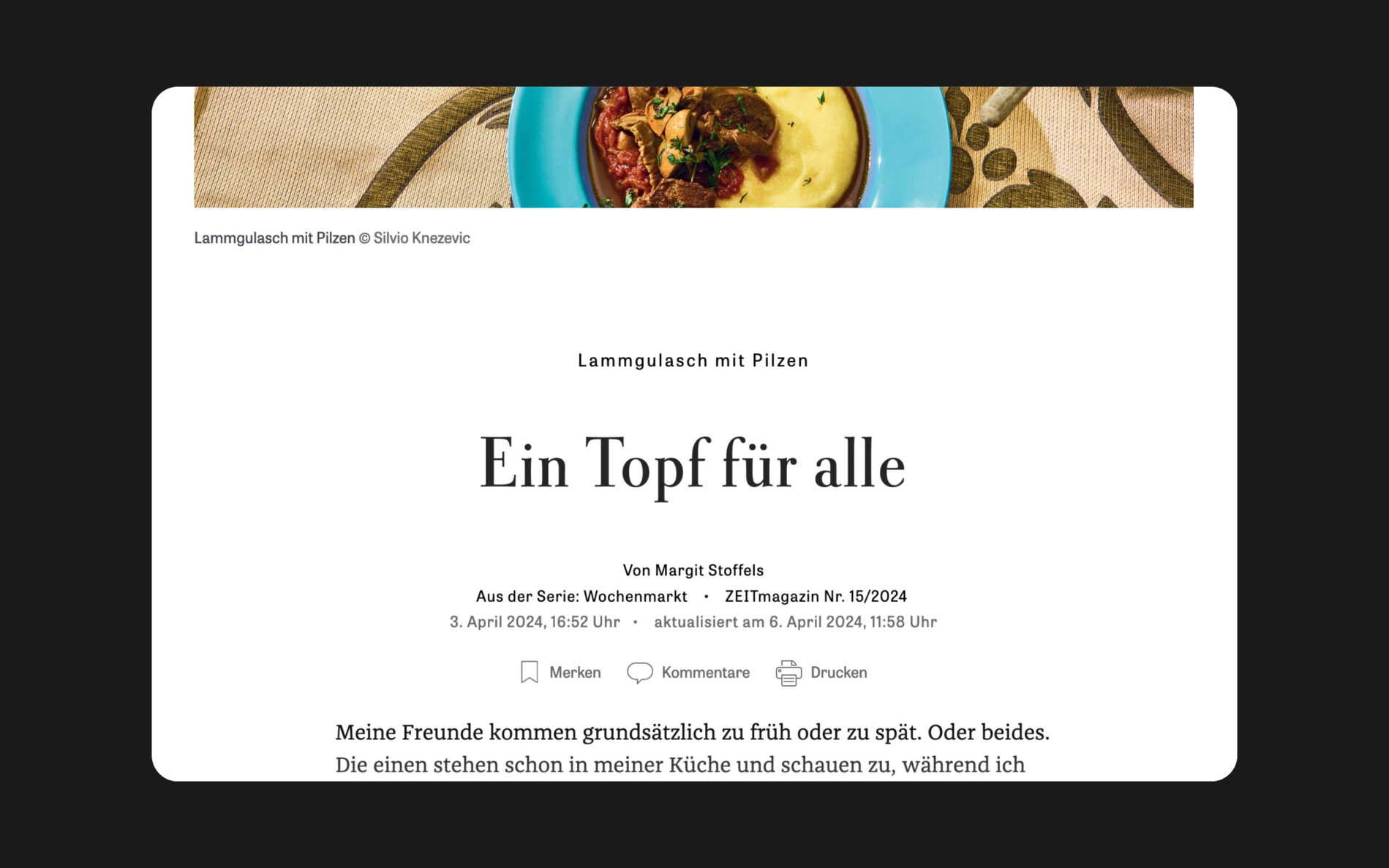
ZEIT Online
Franziska is a versatile typeface that looks great in print and on screen. As a well-rounded serif with excellent legibility, it is an essential part of the newspaper industry. Used in the digital version of Die Zeit, Germany’s most widely read weekly newspaper, Franziska has been proving its worth for over 10 years.
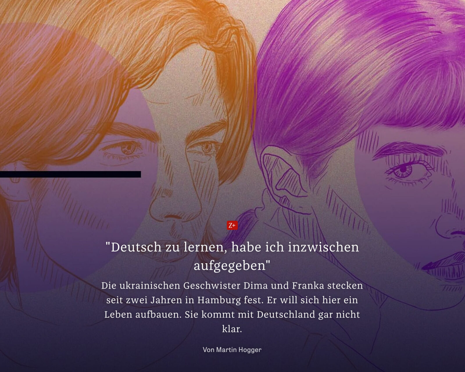
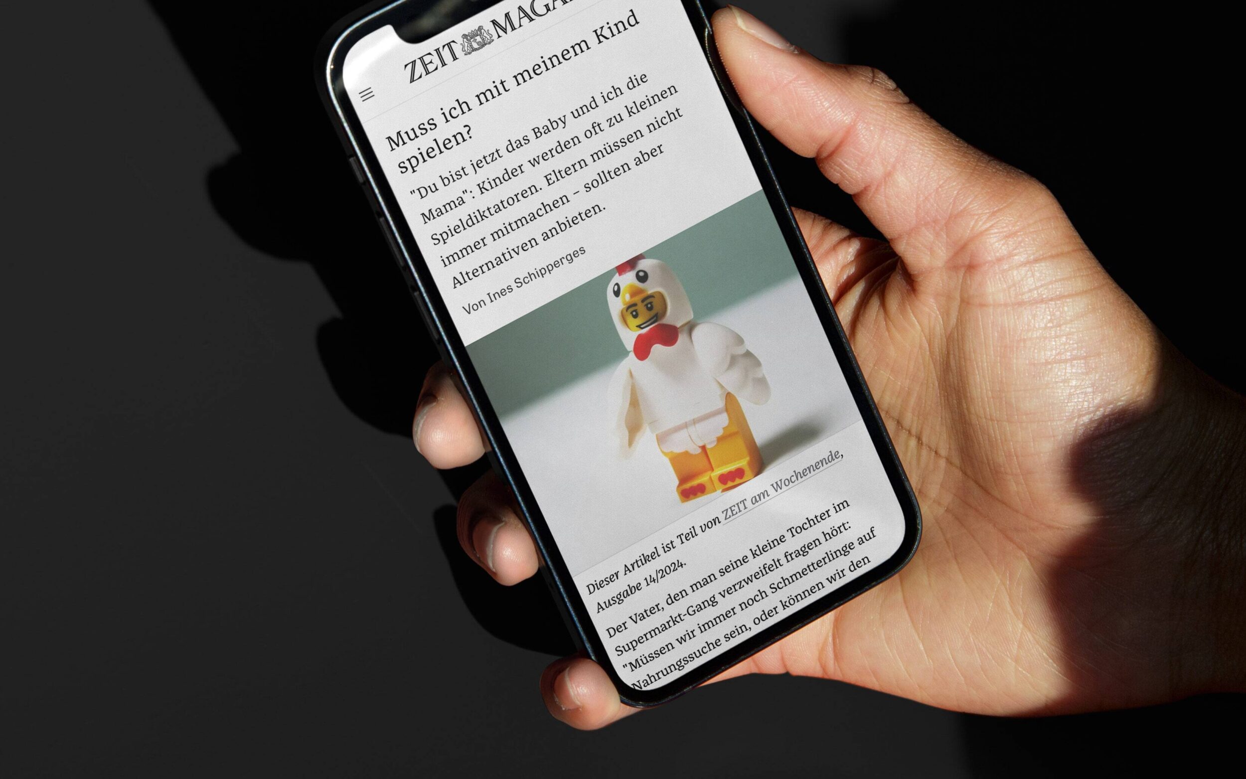
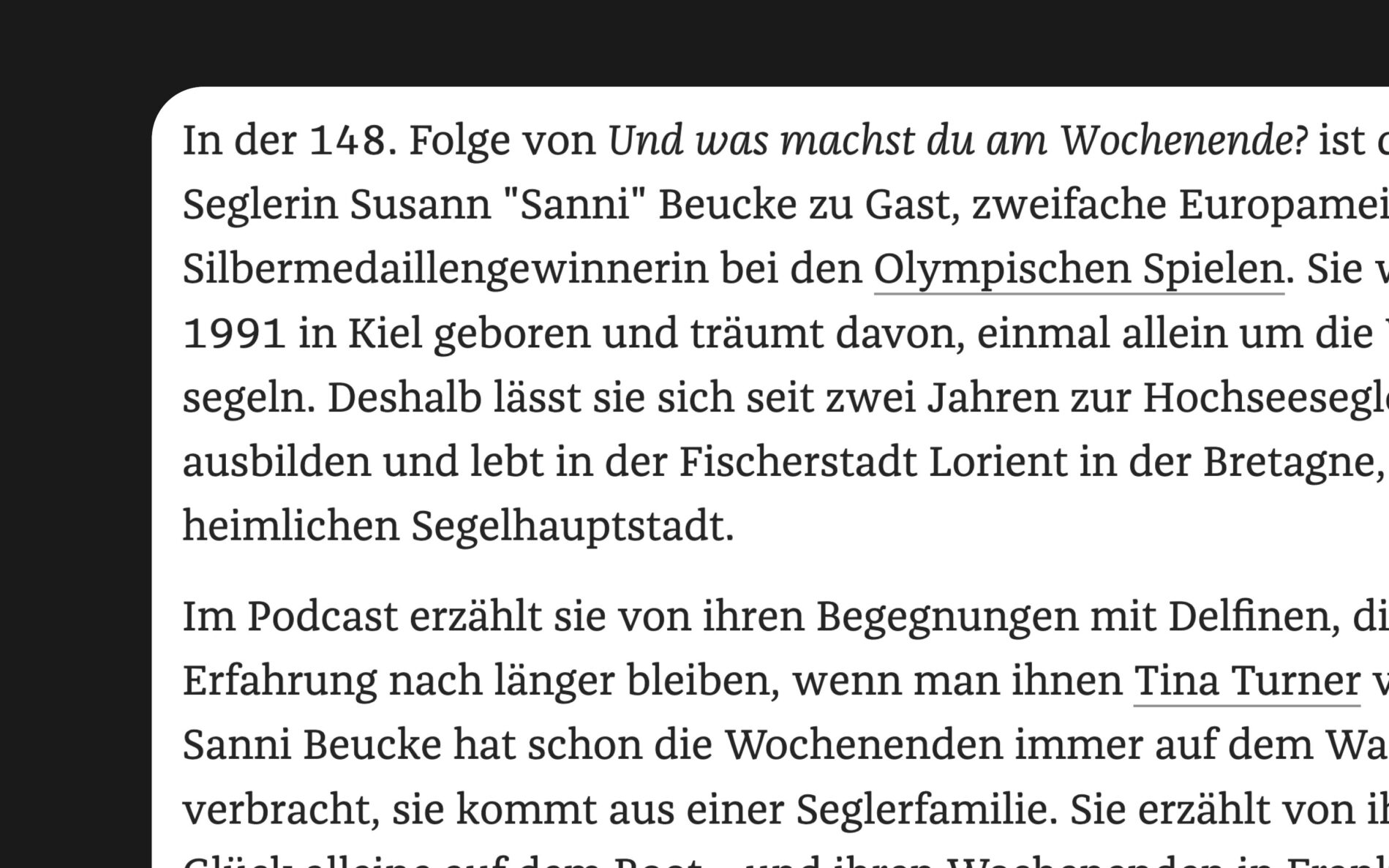
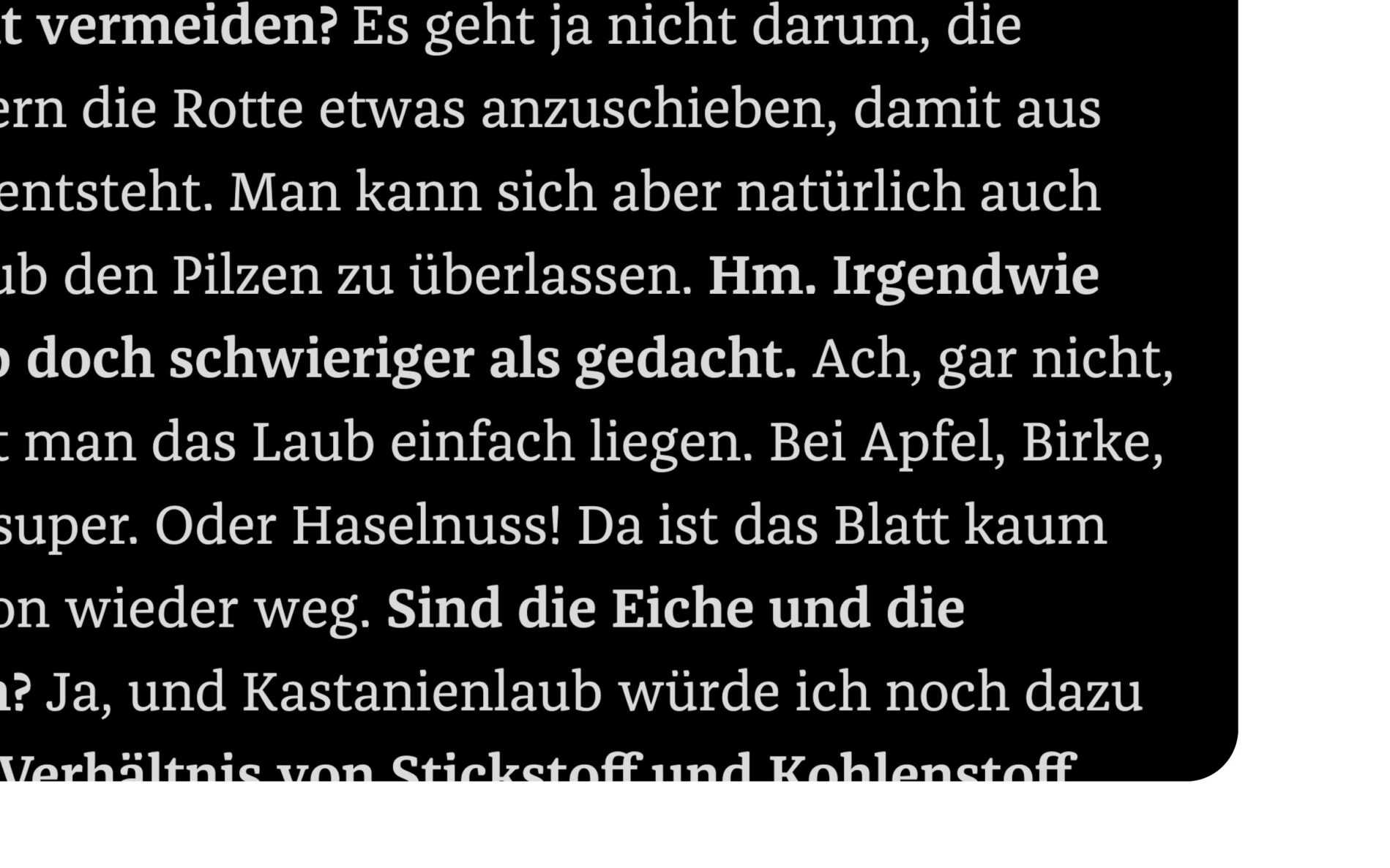
With a range of weights from Hair to Black, including Italics, Small Caps and many extras, Franziska feels right at home in newspapers. Whether Regular or Italic, Franziska impresses with its clear legibility, whatever the medium. A fan from the very beginning, Erik Spekermann not only brought Franziska to FontFont, but also used it directly in a project his design studio Edenspiekermann was working on. Here Franziska appears as a modest team player.
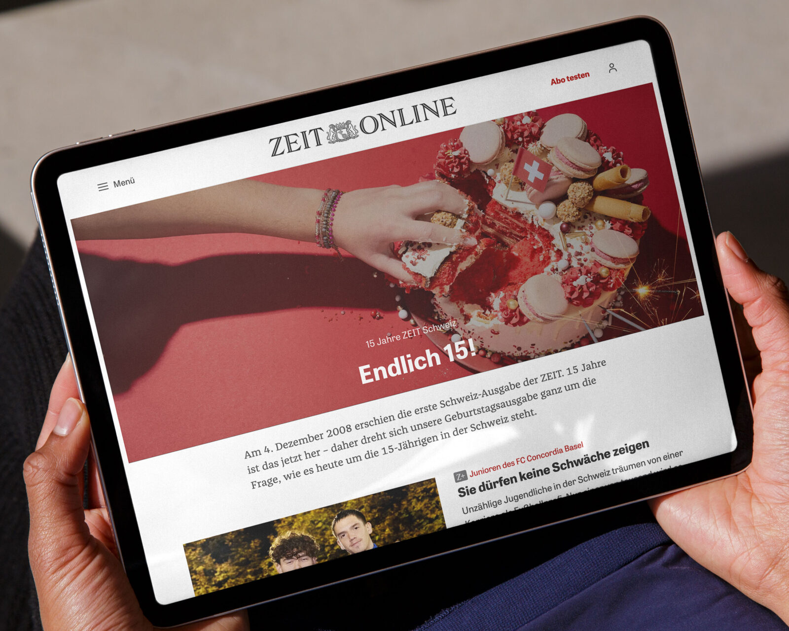
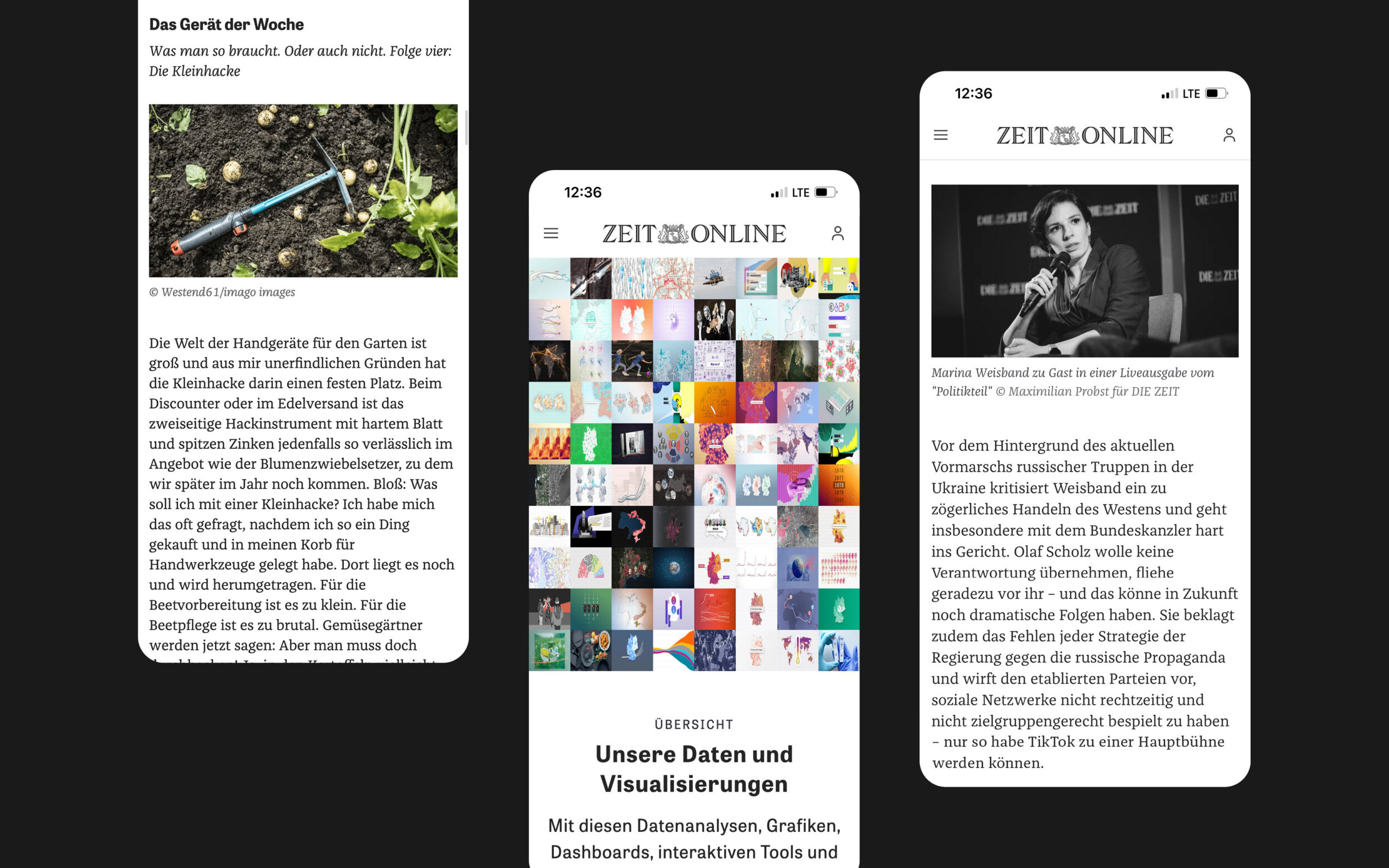
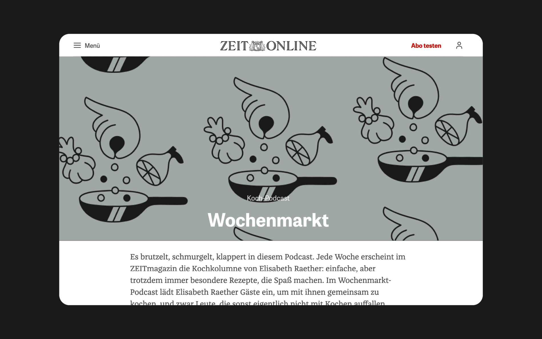
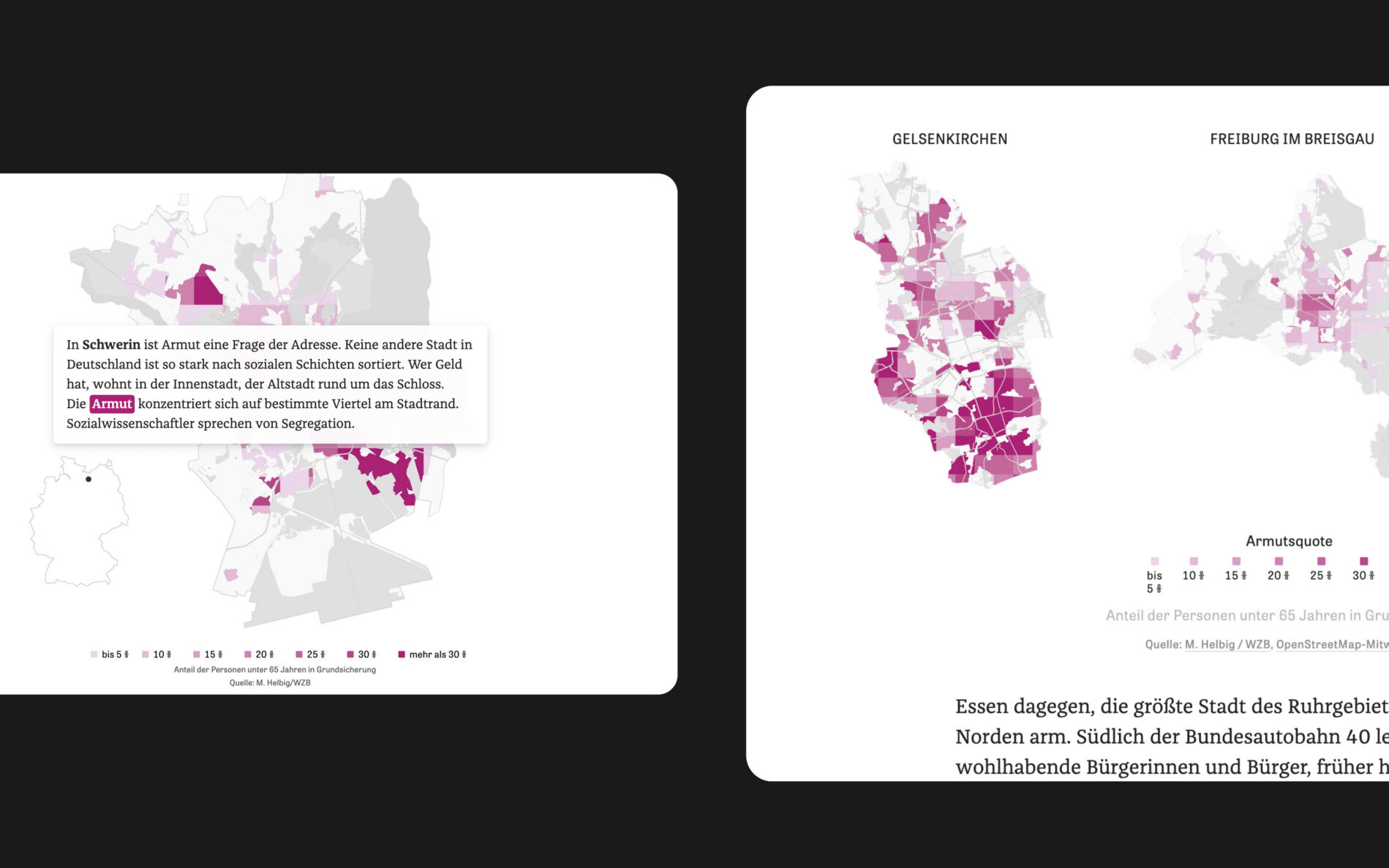
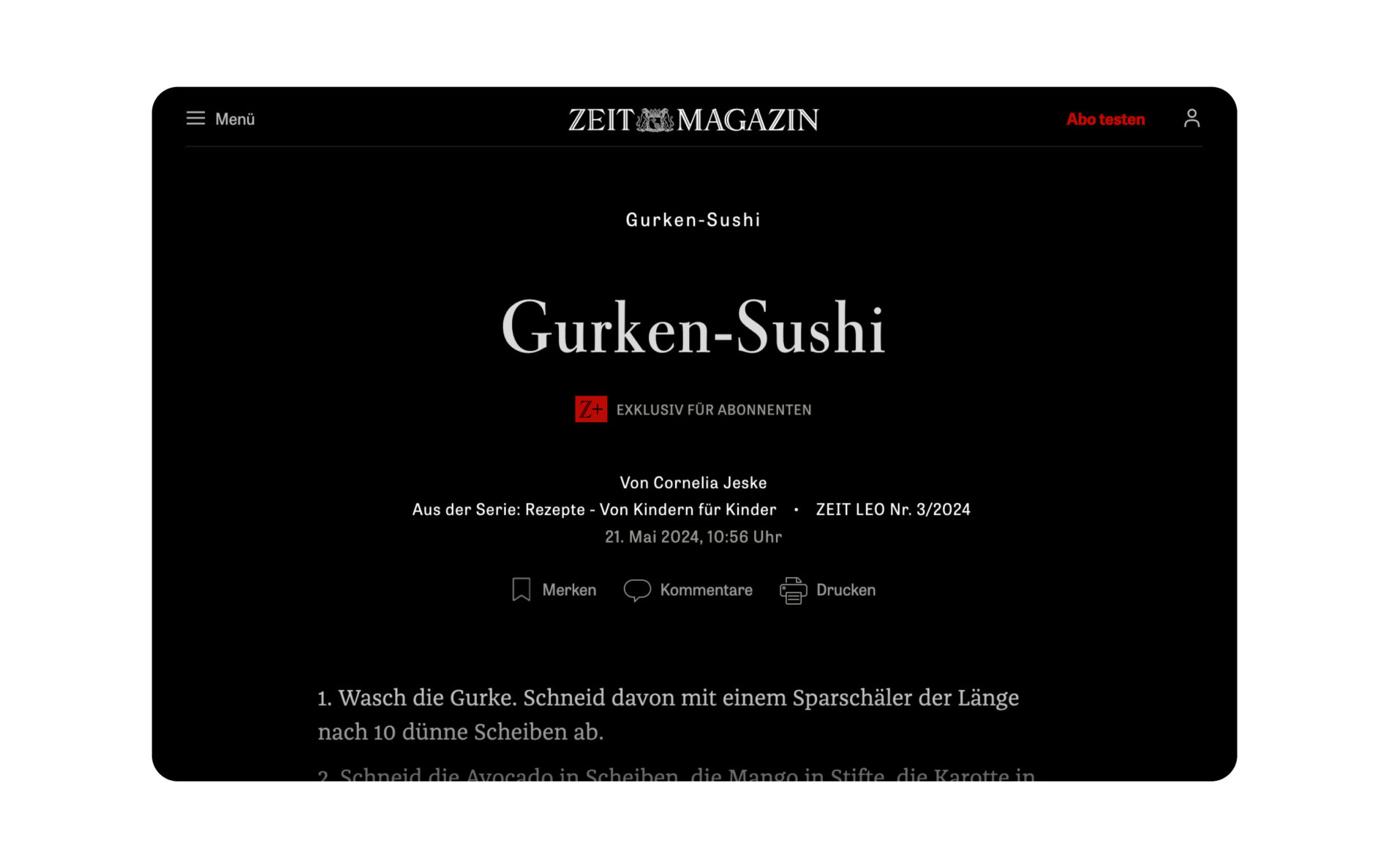
You won’t find Franziska on the homepage or landing pages. As a text typeface, it tends to stay in the background. But for a digital newspaper that focuses on long reports, in-depth interviews, and other text-heavy content, it does the most important job. It conveys information in a clear, concise manner and creates a pleasant reading experience. Franziska’s use in ZEIT Online proves that a well-designed, contemporary typeface can easily create appealing typography, regardless of the medium.
