Ten Features of Top-Notch Text Fonts
Most features for improving the legibility of typefaces are not scientifically proven yet. Most of them are a question of readability – the typographical treatment of text – and not a matter of the typeface design. However, we would like to introduce you to some features you should look for, when choosing typefaces for text.
(1) Sturdy Shape and Low Contrast
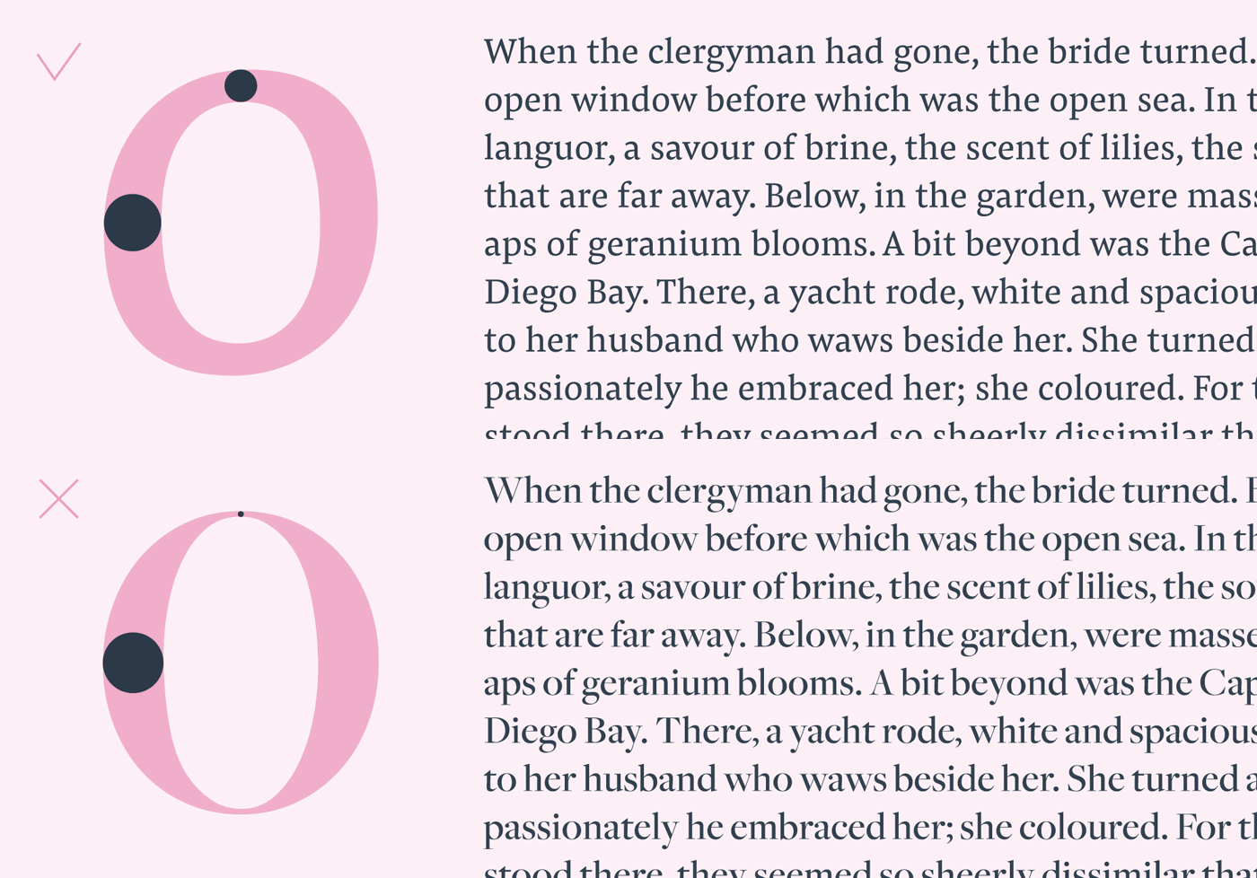
When it comes to small text, a fragile typeface with thin elements will break apart. That is why it is better to use a textface with sturdy shapes. Look for a font with low contrast in its strokes in order to keep thin elements stable. At the same time pick something with visible contrast to meet the readers common habit for known textfaces.
(2) Large X-Height
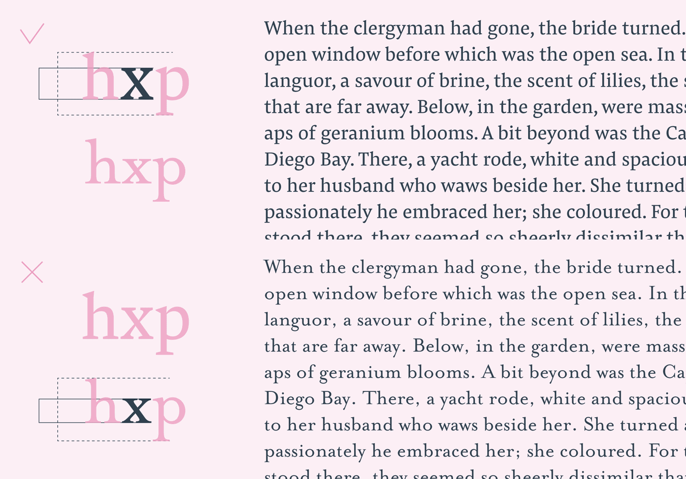
The x-height is one of the most relevant factor for increasing comfort while reading. The x-height is the distance from the type‘s baseline to the height of most lowercase glyphs. As most of the text contains lowercase letters, it makes sense to pick a font with a higher/increased x-height, so the lowercase letters are clearly visible, especially in small point sizes or captions.
(3) Open Apertures
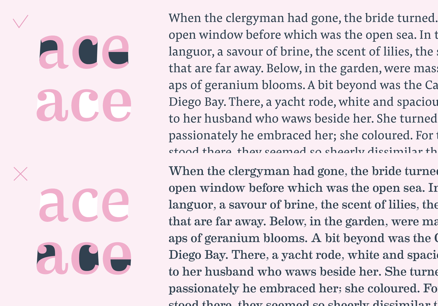
Speaking of increasing the visibility of letters in small point sizes: Open apertures are a good feature for keeping the letter space inside the glyphs visible. So having open counterforms prevents the text from becoming hard to read if the reader's eye is not able to recognise certain letters.
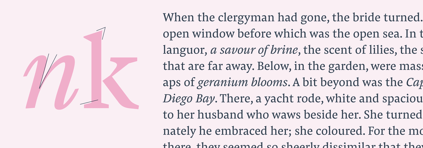
(4) Clear Shapes
Small text will blur details, that sometimes are necessary for the clear distinction of shapes. Furthermore, connecting strokes will blur to dark spots. Exaggerated details and potentially, but not necessarily, implemented ink traps can improve a typeface for text sizes. Likewise it can add some personality for large headlines.
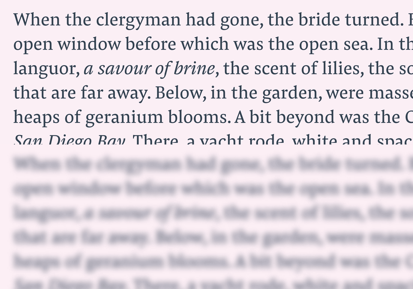
(5) Even Colour
A text is not defined by single letters. An even grey value is very important and develops with a whole block of text. Ink traps and modulated stroke thickness can help to give each letter the right gray value to not stand out or fade too much.
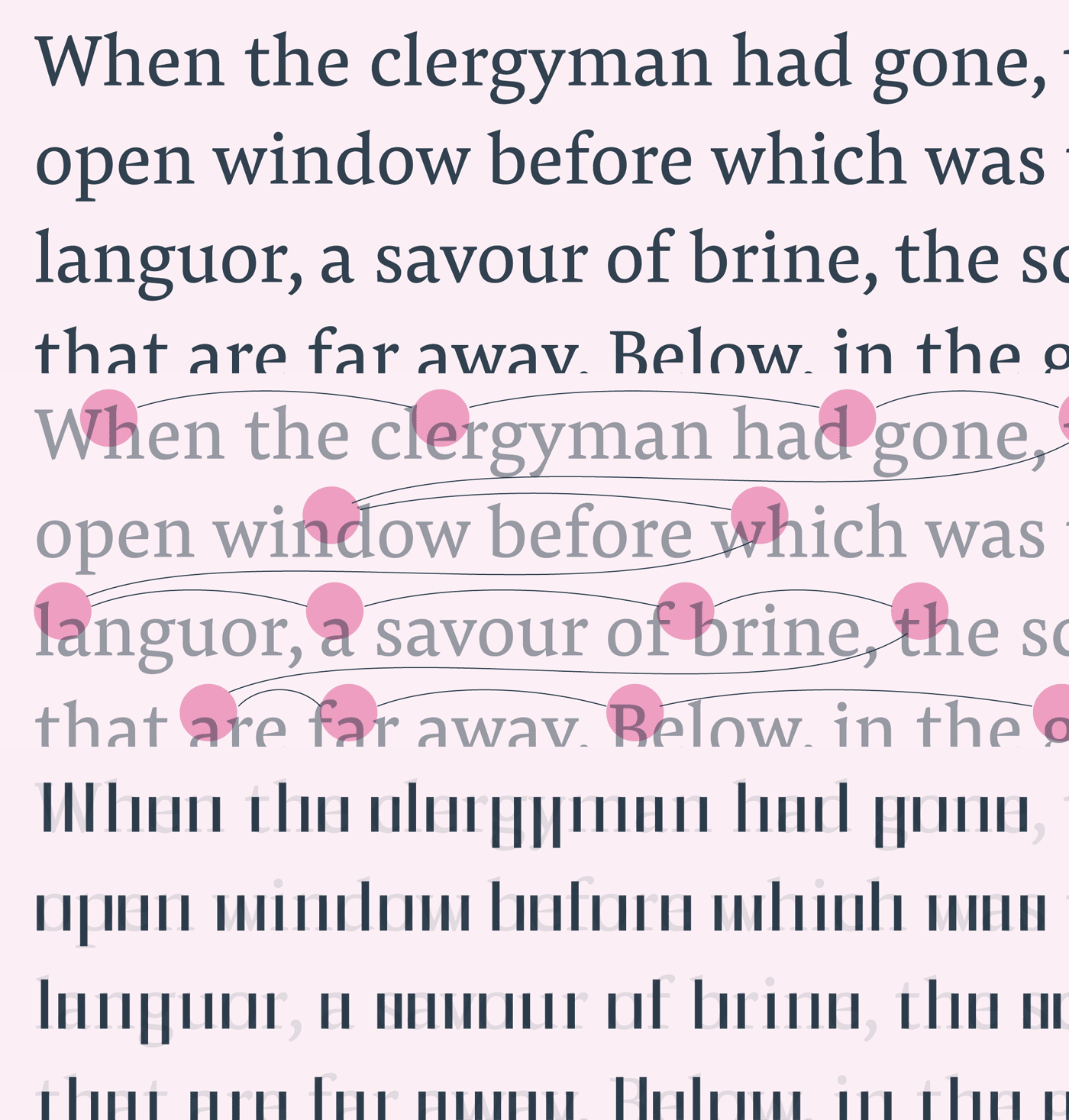
(6) Optical Harmonisation and Rhythm
Reading means to let the eye jump from letter to letter, from word to word. This flow will get disturbed when a shape can’t be recognised or some letters are too wide in comparison to others. To keep a smooth reading experience, it is necessary to have a recurring rhythm of letter stems and white space.
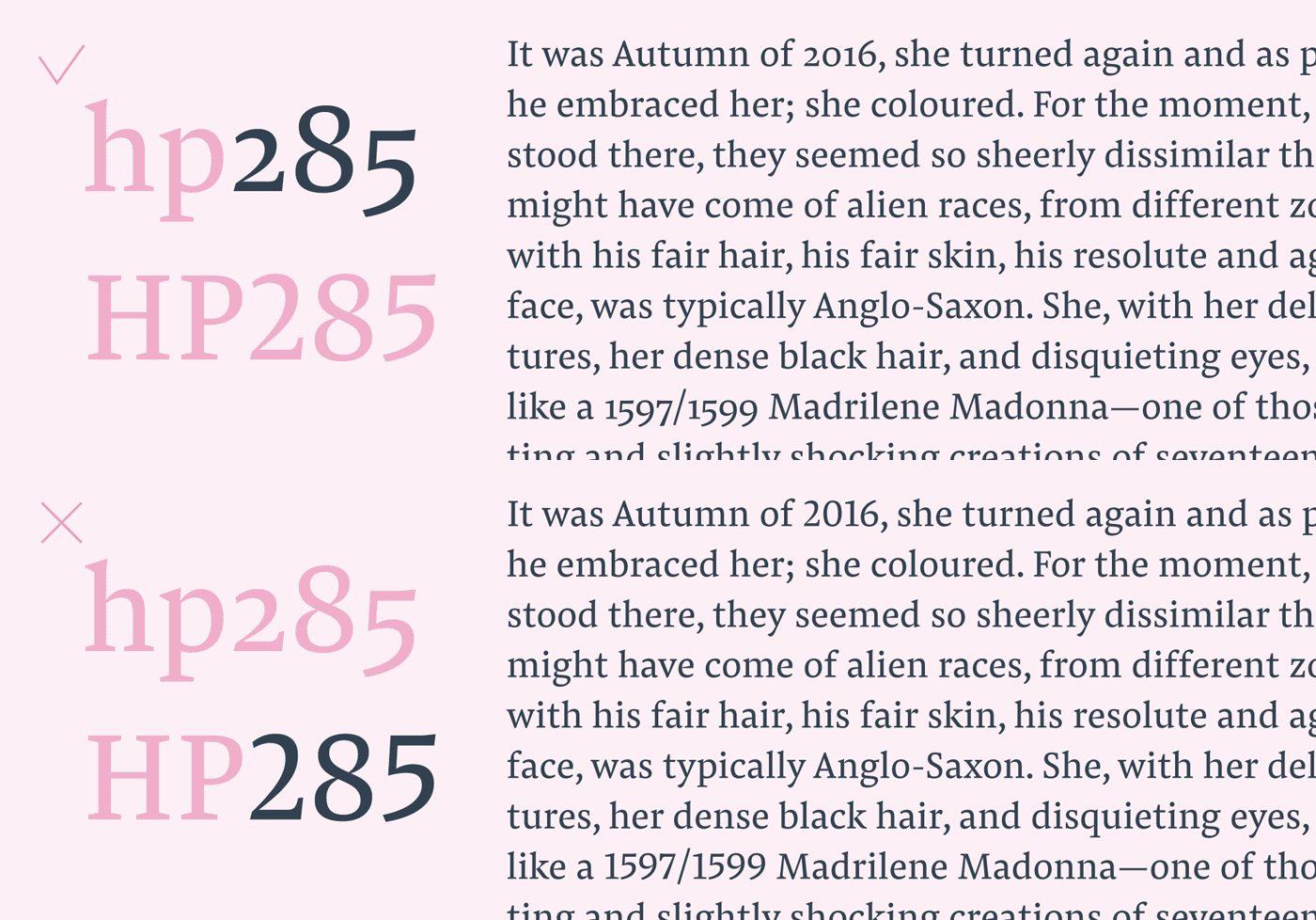
(7) OpenType Feature for Oldstyle Figures
Keeping up with rhythm: Most text is characterised by dancing descenders and ascenders. Applying oldstyle figures via the OpenType palette will help to keep up with that dancing rhythm. Lining figures often appear too blocky within text.
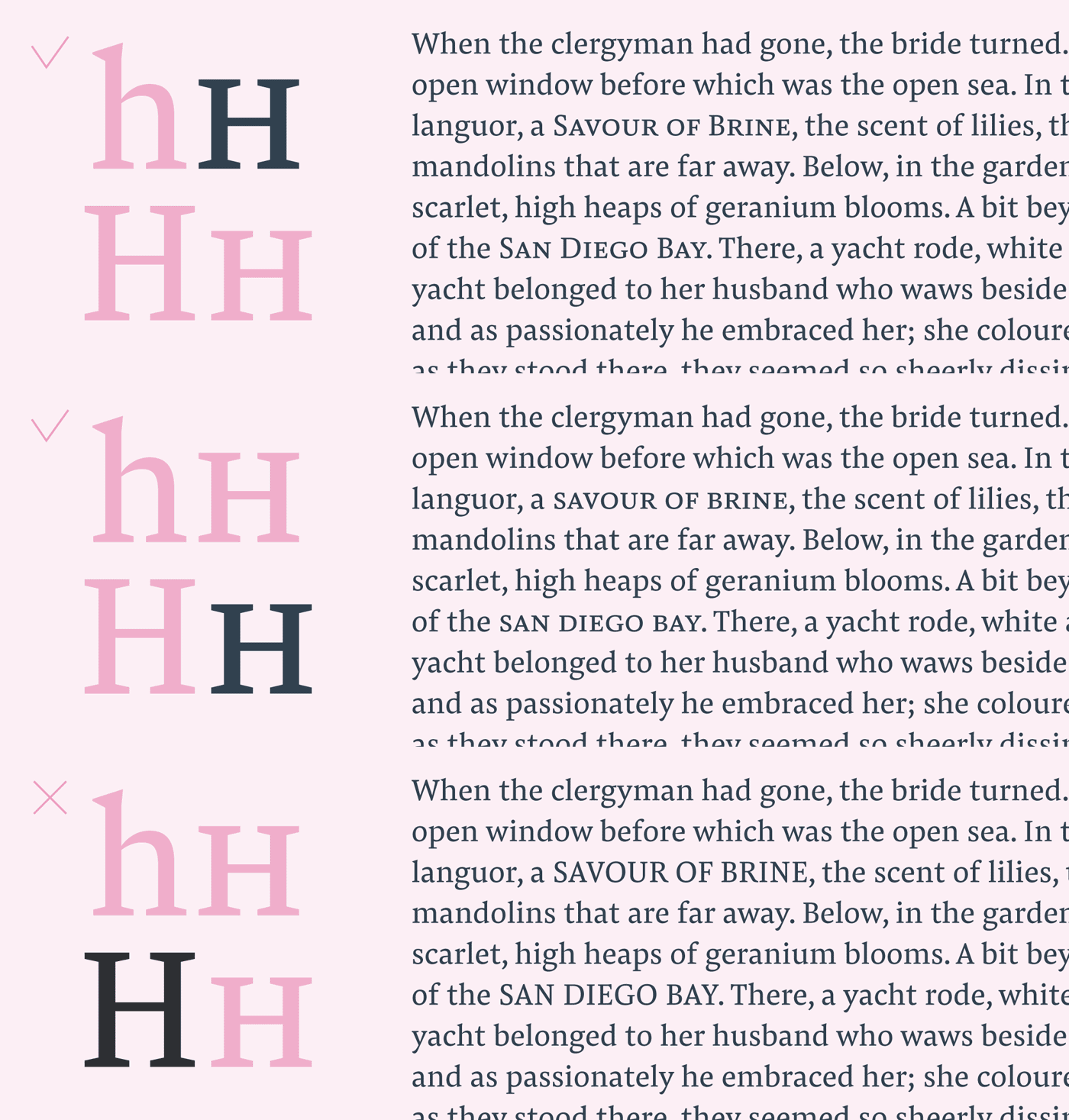
(8) OpenType Feature for Small Caps
Integrating all caps setting will always interfere with a chunk of text, as it sticks out as a block. Better activate “Small Caps” or “Small Caps From Capitals” to turn text to nicely scaled and modulated smaller versions of the uppercase letters.
If you are into Adobe’s GREP: to turn all words with more than one uppercase letter into smooth small caps by searching for “[A-Z]{2,}” and applying the format “OpenType All Small Caps”.
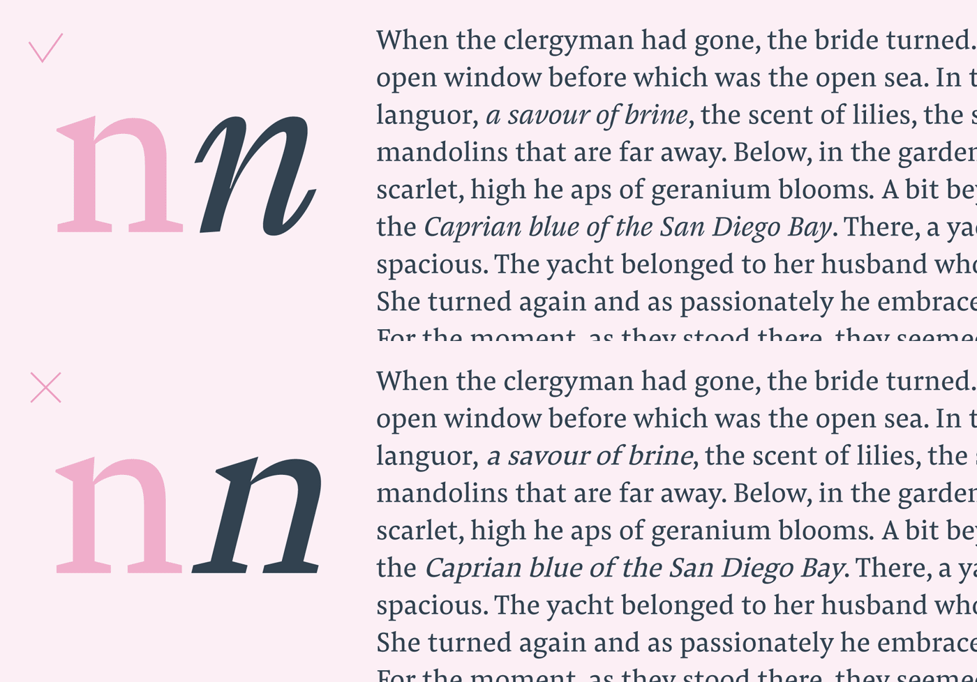
(9) Distinctive Italic
For emphasising short segments of text without making it stand out too much, using italics is a great idea. Make sure that the shapes of the italic, or at least the angle, is distinctive enough to show a clear differentiation of the text element you want to emphasise.
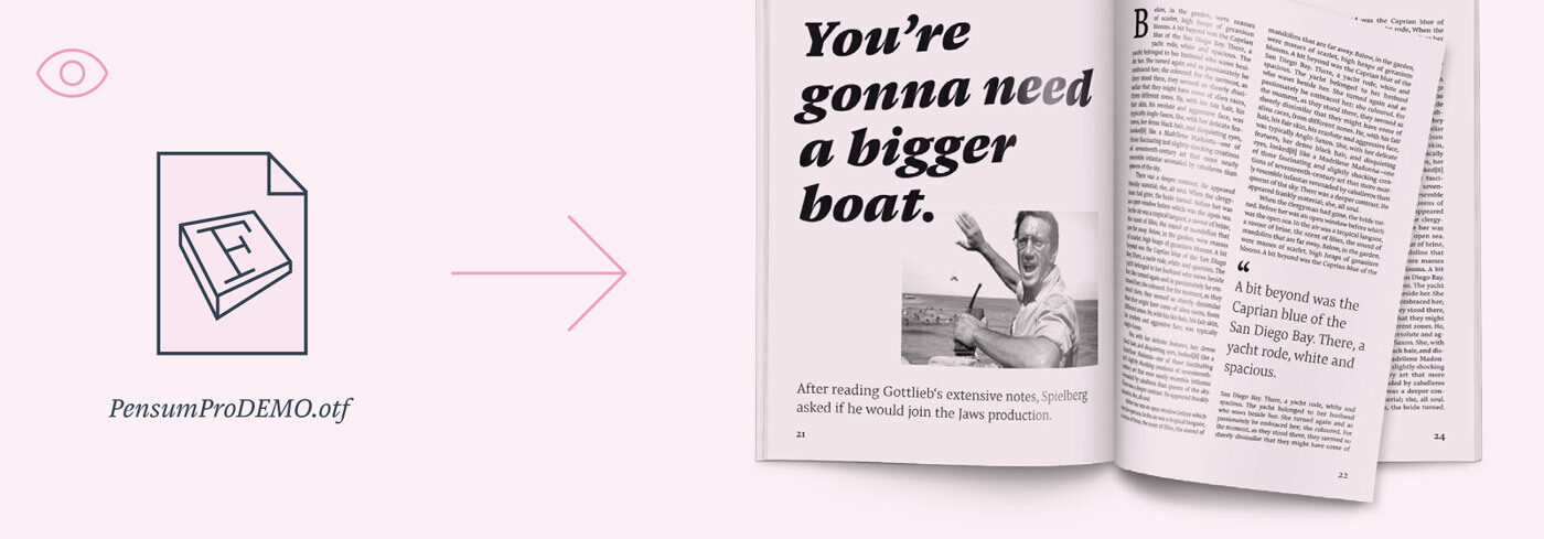
(10) Test in Context
Whatever people tell you about features for improved legibility, ultimately trust your eyes and see how typefaces perform in layout. We would be happy to receive a request for a Pensum Pro Demo font.