Type and Accessibility
From June 2025, the Accessibility Reinforcement Act, which implements the European Accessibility Act, will come into force. What does this mean for type?
From June 2025, there will be a legal obligation to ensure the accessibility of products with digital operation, regulated by the Accessibility Reinforcement Act (BFSG). However, the BFSG does not automatically apply to everyone (self-check). It mainly applies to services such as telephone or messenger services and products such as e-books, notebooks, computers, tablets, etc. So far, so good! But what does this mean for typefaces and type design?
Table of Contents:
1. What is the Accessibility Reinforcement Act about?
2. What part of the law is relevant to type?
3. How can type support accessibility?
4. How can typography support accessibility?
5. Which typefaces are accessible?
6. Conclusion: What does this mean for type and type users in the future?
7. References
1 What Is the Accessibility Reinforcement Act?
The new Accessibility Reinforcement Act aims to implement and provide information on accessibility requirements for products and services. When researching the new law, you will also come across other regulations (BITV, WCAG, BGG), which can be confusing at first. This is because the BFSG adapts the previous requirements, which were already set out in the Barrierefreie-Informationstechnik-Verordnung (BITV), the Web Content Accessibility Guidelines (WCAG) and the Disability Equality Act (BGG), to the new Europe-wide directive.
The harmonised European standard, DIN EN 301 549, which is the most important collection of relevant accessibility requirements for information and communication technology, is fundamental.
With the new BFSG, the requirements of this standard are now also mandatory for the private sector.
2 What Legal Issues Are Relevant to Typefaces?
Fonts are digital products. Shouldn't they automatically be covered by the law? It's not quite that simple. Although EN 301 549 touches briefly on issues such as legibility and design in WCAG 2.1, which should be followed, there are no legal requirements for the exact choice of typefaces, or even for type design.
It is therefore not mandatory to choose a specific font. It should be noted that there are no general legal requirements for type design, and that the standards are often concerned primarily with the readability rather than the legibility of fonts.
Nevertheless, there are of course recommendations for the design of accessible typefaces, such as DIN 1450 or the guidelines of the German Association for the Blind and Visually Impaired (DBSV).
3 How Can Type Support Accessibility?
First things first: requirements such as legibility and accessibility are nothing new in type design and its history. The individual shapes, the spacing between letters, and the grey level of the text - type designers ensure that the individual characters are adequately recognisable and form a harmonious whole.
But type has always been caught between the poles of expression and function. Fortunately! Fonts that are not primarily legible do not usually aim to be. Quiet, legible fonts for body text are just as justified as expressive fonts for headlines.This variety of fonts allows content to be conveyed visually as well as textually.

For people with visual impairments, reading, spelling or learning difficulties, migraines or other conditions that affect their ability to absorb information, there are criteria that make it easier to recognise content. Before we look at the relevant design criteria, let’s look at the important difference between legibility and readability.
Legibility and Readability
Written text should be easy for readers to decipher. The individual letter forms and the typographic use of the typeface are essential to this.
Legibility is about the perception, recognition and differentiation of individual letters and words. Readability, on the other hand, is about the comprehensibility and clarity of text, which is primarily influenced by typography, but also by language, personal and situational factors.
In short, the legibility of type refers to the design of the letters and their interaction, while readability describes the handling of type in different contexts and under different conditions.
Letter Recognition
Recognisability is the formal understanding of the individual letters and how they can be distinguished from each other. Letter recognition also has to be learned. This means that common and familiar forms are often better for readers than formally complex forms.
Distinction of Letters
Letters should be clearly distinguishable in shape so that they can be quickly recognised by readers. The use of almost identical forms for different characters should be avoided. For this reason, humanistically designed sans serifs are more appropriate than geometrically designed ones.
Openness
Openness is the amount of visible space within a character. The larger and more open this space is, the easier it is to recognise the character, especially in combination with factors such as poor print quality, blurred vision or inappropriate lighting conditions.
Proportions
A high x-height, not too short ascenders and descenders, and a stable letter width support the reading flow and help to differentiate between letters. Stroke ContrastIf the contrast between the stem and the hairline of a letter is too high, fine lines may break off or not be perceived properly, depending on the application. Fonts with a lower contrast are therefore more suitable for ensuring legibility.
Stroke Contrast
If the contrast between the stem and the hairline of a letter is too high, fine lines may break off or not be perceived properly, depending on the application. Fonts with a lower contrast are therefore more suitable for ensuring legibility.
Font Width
The width of a font is determined by the distance between the two stems of the letter n. From Compressed, Condensed, Normal to Extended, fonts can have very different widths. Narrow fonts make reading more difficult because of the small white spaces between letters. On the other hand, when fonts are very wide, the eye cannot take in many letters in one eye movement when reading. For these reasons, normal-width fonts are recommended.
4 How Can Typography Support Accessibility?
As already explained, not only the font itself, but also its typographic application and other individual circumstances have a major influence on reading. In the following section, we will discuss only the typographic factors and briefly explain their importance.
Font size
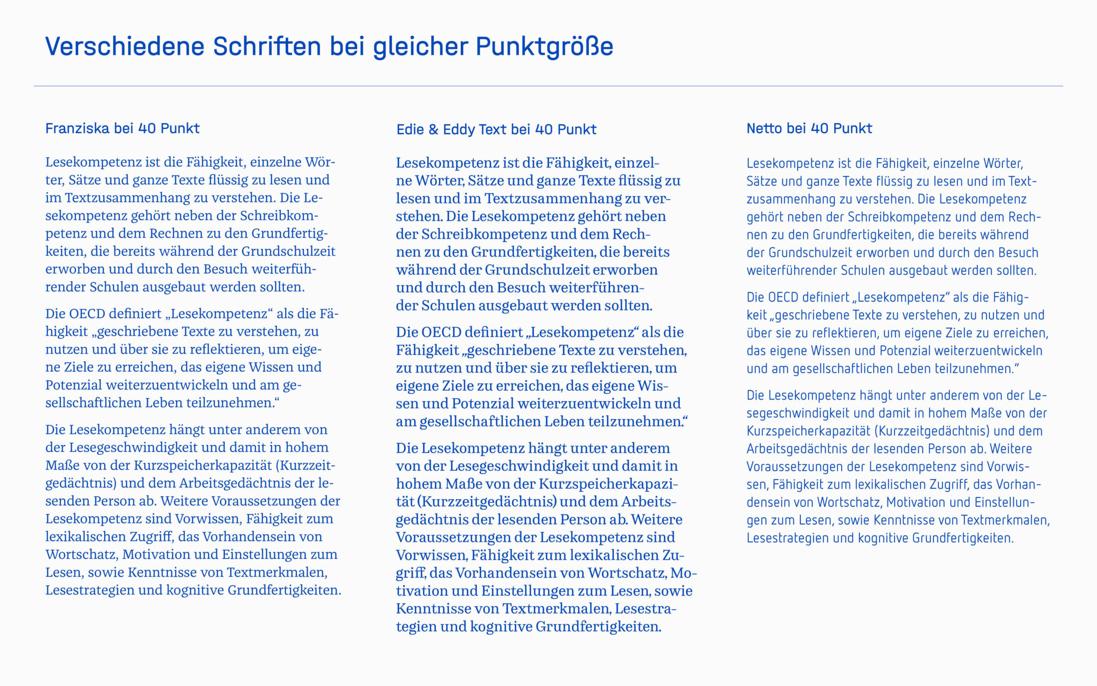
The same font size (= point size) does not mean that all fonts of a certain size are really the same size. Fonts vary greatly in this respect, so it is more helpful to use the height of the lowercase letters (x-height) as a measure of legibility.
Influenced by the medium, distance from the medium, personal limitations, type of text, design intent, etc., it is difficult to make general statements about the perfect font size. Decisions must be made on a case-by-case basis, depending on the environment.

Leading and Line Length
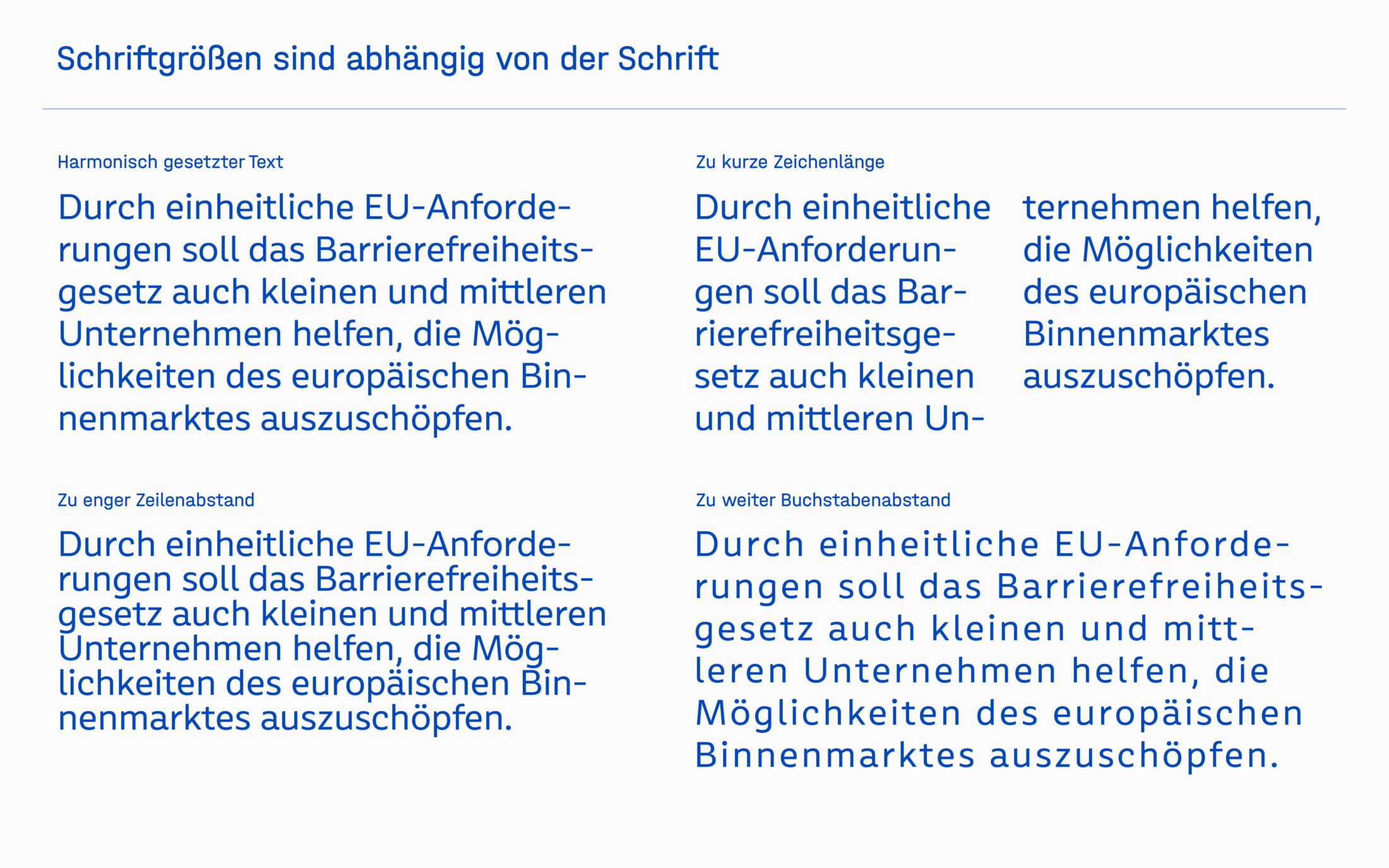
Ascenders and descenders should not touch. A line spacing of about 120% of the type size is often appropriate. Leading that is too generous can be perceived as distracting, as can line spacing that is too narrow. The choice of leading should always be made in conjunction with the chosen typeface.
Lines that are too short often lead to word-wrapping and increased line breaks, which disrupt the flow of reading. Lines that are too long make it difficult to find the beginning of the line. For this reason, long lines generally require a larger leading than short lines. The length of the line should be decided on an individual basis, depending on the type of text.

Typography on Screens
Although we are now surrounded by high-resolution screens, the characteristics of the screen have a significant impact on reading comfort. For example, the resolution and size of the screen, the brightness, but also the distance of the reader and the individual environment play an important role. To improve legibility, font size, line length and spacing should be adapted to the screen size. The use of special screen fonts can also help to improve on-screen readability.
Text Arrangement
It is good for readability if text is aligned horizontally and in the direction of reading. Left-aligned text is preferable, as justified text can cause irregularities in the grey value of the text, for example due to excessive word spacing.
Structure and Space
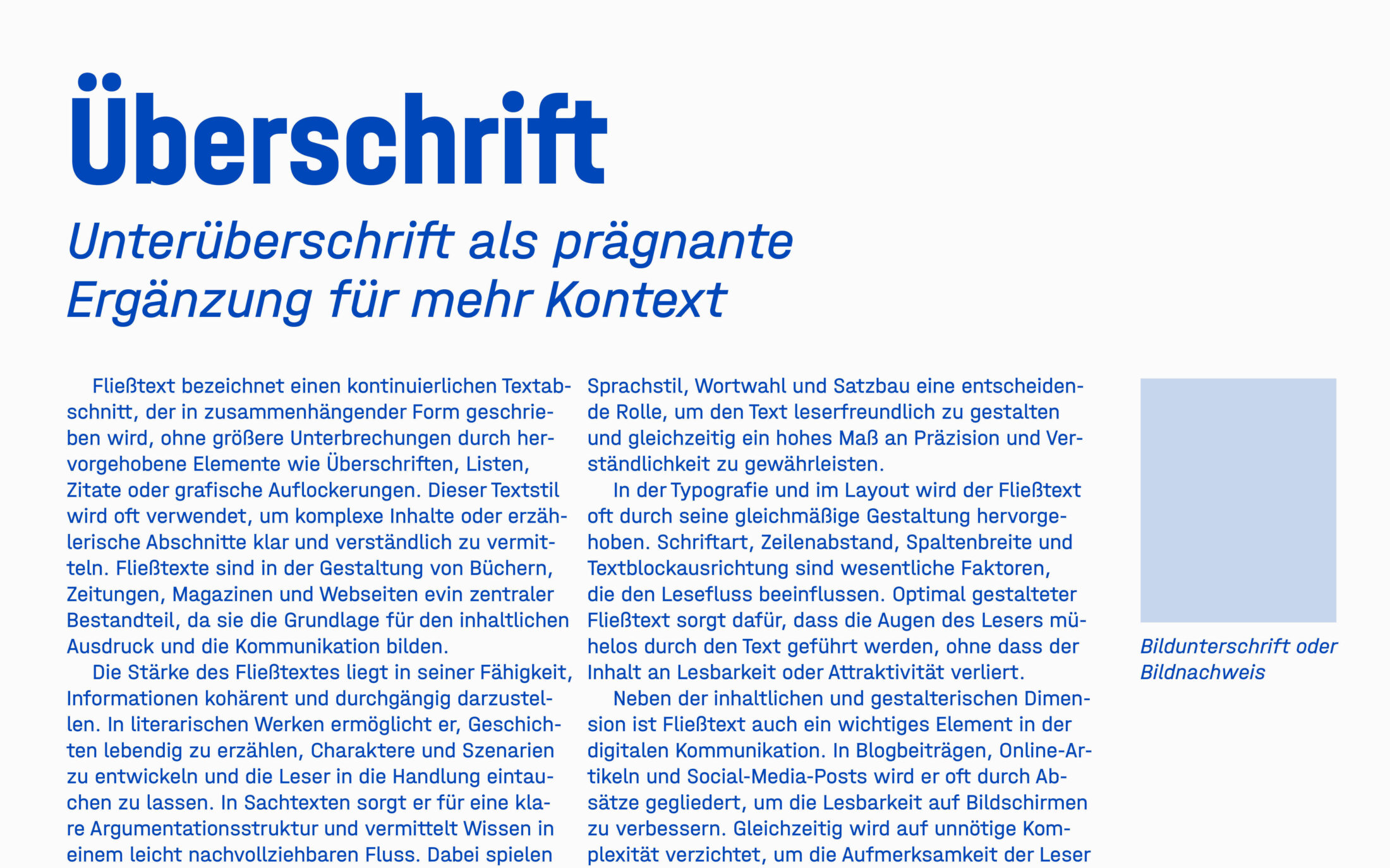
A clear typographic hierarchy and clear spacing between text and margins, images and other parts of the text make it easier to guide the reader. Typography should help the reader to navigate through the text and information. To this end, it is helpful to treat and arrange sections of text (headings, body text, quotations, captions, etc.) in different typographical ways to guide the reader through the information in a structured way.

Highlights
Emphasis in text using different weights (bold, light, etc.), styles (upright, italic, display), or capital and small caps should be chosen carefully and have a clear and understandable purpose. Too many different types of emphasis make it difficult to read and can be distracting. Font styles that are too thin result in too little grey, while styles that are too bold make reading more difficult due to less white space. Capital letters or small caps are generally difficult to read.
But the purpose and nature of the text justifies the means: bold headlines, short quotations in italics or posters in display fonts are fine.
5 Which Fonts Are Accessible?
Legibility is a recurring theme in custom work or our retail fonts. Based on the above recommendations from the German government, you will find a comprehensive compilation of accessible fonts from the TypeMates library on our website under the accessible filter. Here are two primary examples from our library:
Rumiko Clear
Rumiko Clear is a friendly sans that offers maximum legibility in digital environments. Its high x-height, humanistic proportions, low stroke contrast, and clear letterforms make it easy to read.
Meret
Meret is a robust and precise serif text face. It has a stable character width, open forms, clearly distinguishable characters and a balanced grey value, making it ideal for comfortable, uninterrupted reading.
6. Conclusion: What Does This Mean for Type and Type Users in the Future?
Although the Accessibility Strengthening Act (BFSG) may sound like a lot at first glance, there are no fixed standards for what typefaces should look like in their forms. The legibility criteria that we explain in section 3 are merely reasonable recommendations for improving legibility. Many fonts meet all or most of these criteria anyway. This means that there is still a lot of flexibility in choosing a font for a text, and it is by no means the case that all fonts have to look the same to be considered accessible.
So, font users can take a deep breath and use the simple guidelines as a guide when choosing a font. Of course, fonts that are already legible can be made more accessible if necessary. An example of this is the modification of Rumiko Clear, which was already designed with legibility in mind, to SBK Rumiko.
This can be seen in the context of type design and accessibility: Even in the world of black and white fonts, there are many shades of grey in fonts and plenty of scope for design in the area of accessibility.
7. Quellen
https://styleguide.bundesregierung.de/sg-de/hilfsmittel/barrierefreiheit/leserlichkeit-von-schrift#idSideNav-2048110
https://www.leserlich.info/kapitel/zeichen/schriftart.php
https://www.barrierefreiheit.online/beitraege/barrierefreie-schriftarten#a377
https://bfsg-gesetz.de/
https://gehirngerecht.digital/die-en-301-549-das-relevante-gesetz/
https://www.w3.org/TR/WCAG21/#text-spacing
https://www.barrierefreiheit-dienstekonsolidierung.bund.de/Webs/PB/DE/gesetze-und-richtlinien/en301549/en301549-node.html
Antonia M. Cornelius. (2017). Buchstaben im Kopf. Hermann Schmidt Verlag.