The Empathetic Sans and the Distinctive Workhorse
Rumiko brings warmth, clarity and legibility to brands and digital environments. The release of Natalie Rauch, it’s divided into two subfamilies: one with a brand-defining sense of flow, the other fine-tuned for interfaces.
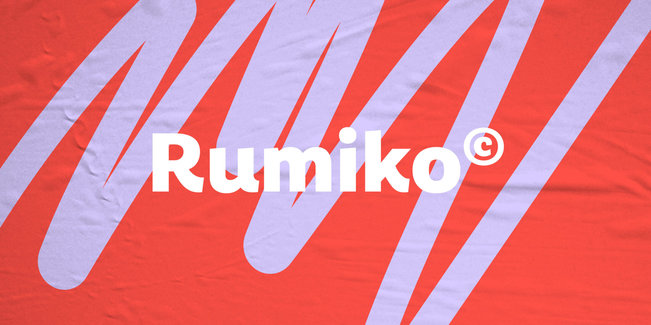
Two Sans with Charm
Named after Japanese Kanji characters that mean “flow” and “kindness”, Rumiko proves that readability and personality can work hand in hand.
Rumiko brings humanity to identity projects. With clean strokes, an open structure and a subtle geometric flavour balanced by a hint of calligraphy, it has an undistracted voice. Expressive large and comfortable small, in their construction and relaxed sense of movement Rumiko’s letters reflect written connections.
It’s also adaptable. Instead of being a single typeface, Rumiko is actually a team of two. United by a warm, hands-on, can-do attitude, they each have a slightly different emphasis.
Friendliness and Flow
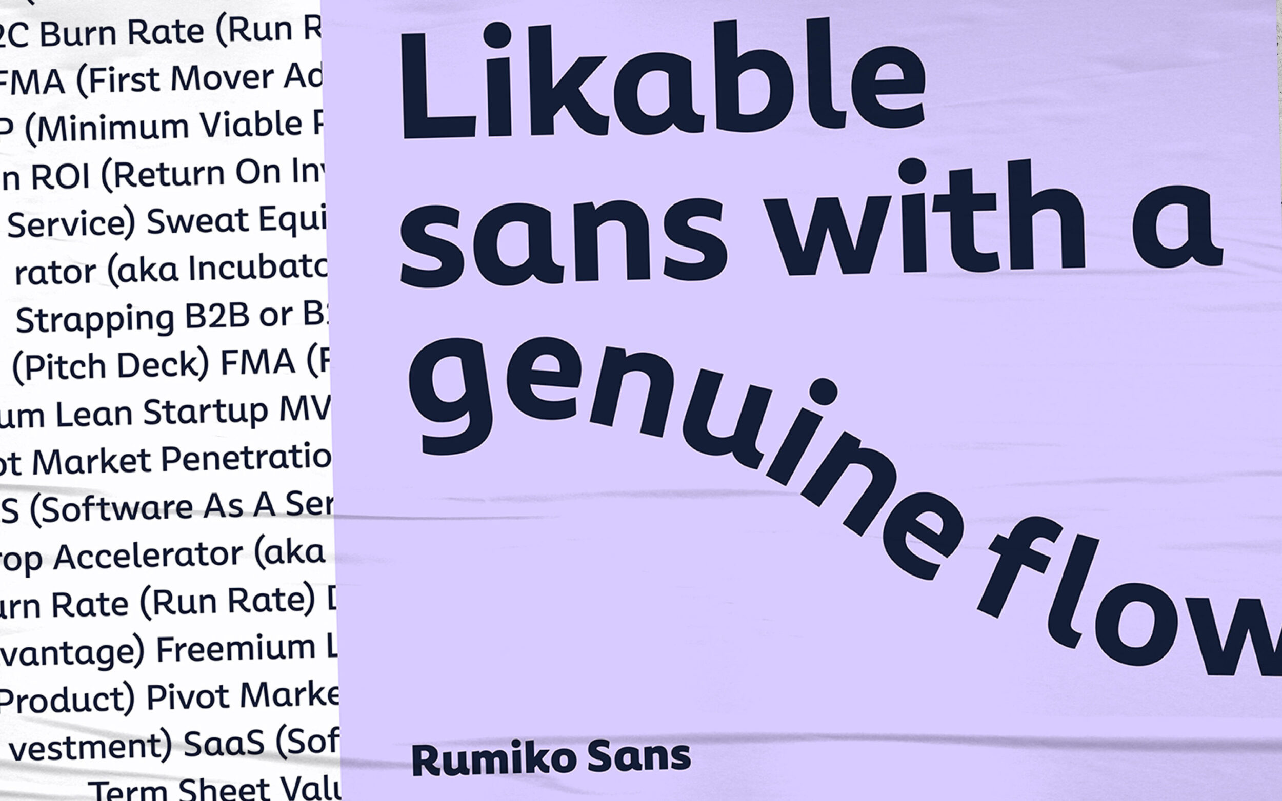
Rumiko Sans’s treatment of letters puts an emphasis on friendliness and flow. a and y have simple, relaxed forms and in K, R and u fluid outstrokes lead the eye. A dynamic allrounder, Rumiko’s six weights open up a spectrum of possibilities for human-centred brands that want a human touch.

Warmth in Digital Environments
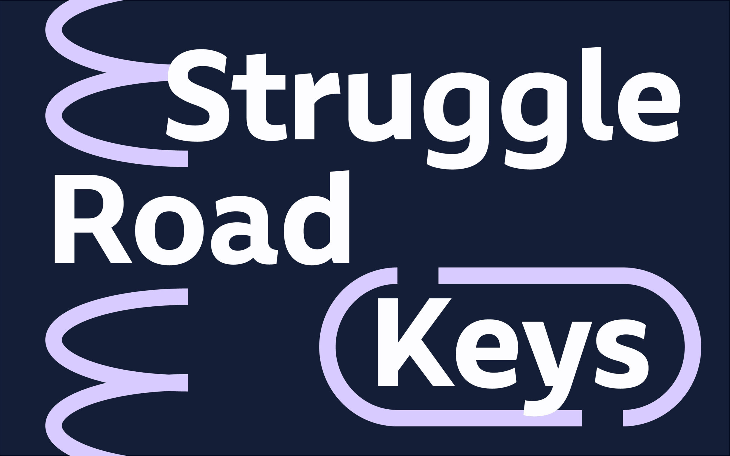
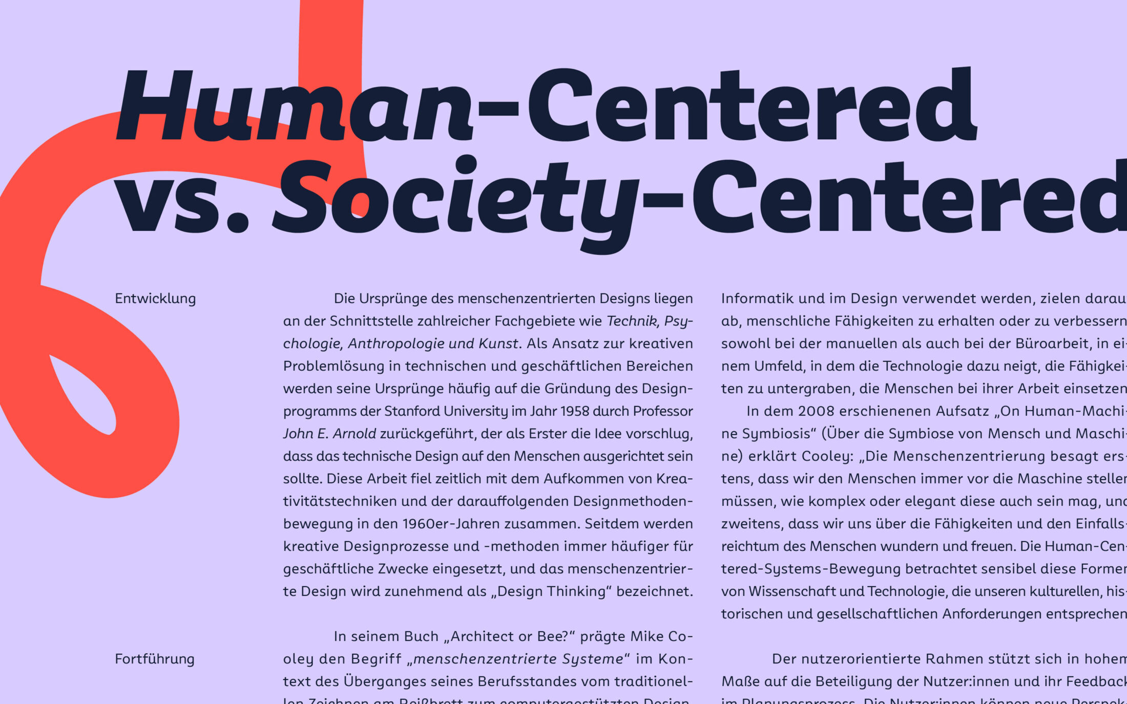
Rumiko Clear is slightly more serious, carefully fine-tuned so that it can get hands-on in toned-down typography and user interfaces. Where Rumiko Sans’ emphasises a sense of handwritten flow, in Clear letters like R, Y, a and u take on slightly more robust forms. Rumiko Clear gives soul to the virtual, empathy to the abstract and clarity to the complex.


One Italic to Fit Both
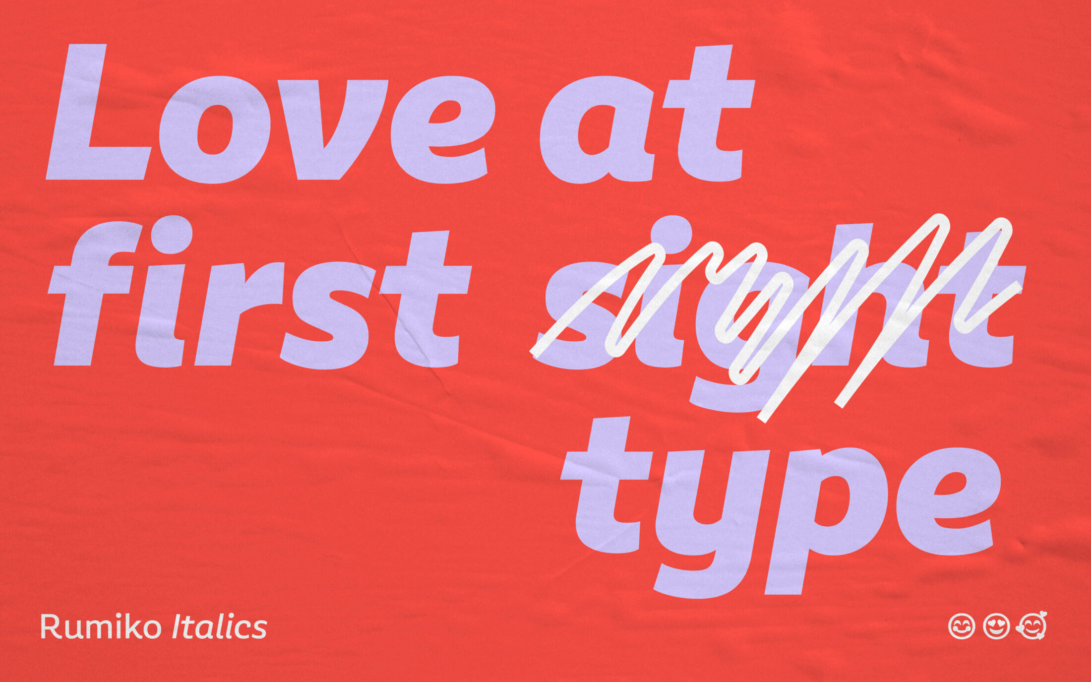
The Italic has a close relationship to the Upright, but its softer structure emphasises the typeface’s playful side, its warmth and fluidity. Through their shared Italics, both versions of Rumiko can be united in one warm and pleasant entity.

All in All, a Hands-On Tool
Rumiko is two kindred typefaces. The friendly Sans and the practical Clear provide warmth and legibility at all times and let the user precisely control tonality. Clear functionality or brand-defining kindness — you can take your pick, or use them together. Either way, Rumiko provides you with an authentic design that invites readers to linger.
A Serif in the Beginning and in Future
Rumiko will come full circle! The initial starting point for the type family was a slab serif that contained all the strong features and personality now visible in the sans. At some point the sans overtook the slab and some of its new ideas are currently being brought into the serif counterpart. Stay tuned for Rumiko’s sturdy partner in crime: Rumiko Slab.
