Pensum Shot the Serif, but Didn’t Shoot Legibility
Just chopping off the serifs? If only it could have been that easy to make Pensum Sans! Type designers simply like making their work complex and subtle. It truly isn’t easy to transfer a serif character and its legibility to a sans. Nils had to resolve questions like, how to keep important details, how to transfer the spikiness and how serious or playful can the sans be?
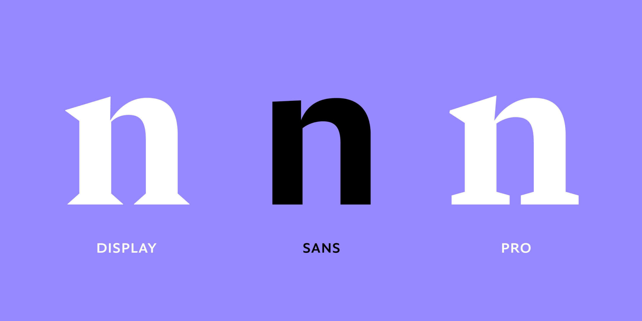
Starting with an important detail Nils wanted to keep in the Pensum Sans, the notch between the stem and arch of lowercase letter n, he was wondering how prominent the cut be. Nils decided to make it more subtle compared to the serif, so you won’t see it in reading sizes, but it’s still strong enough of a feature in display settings.
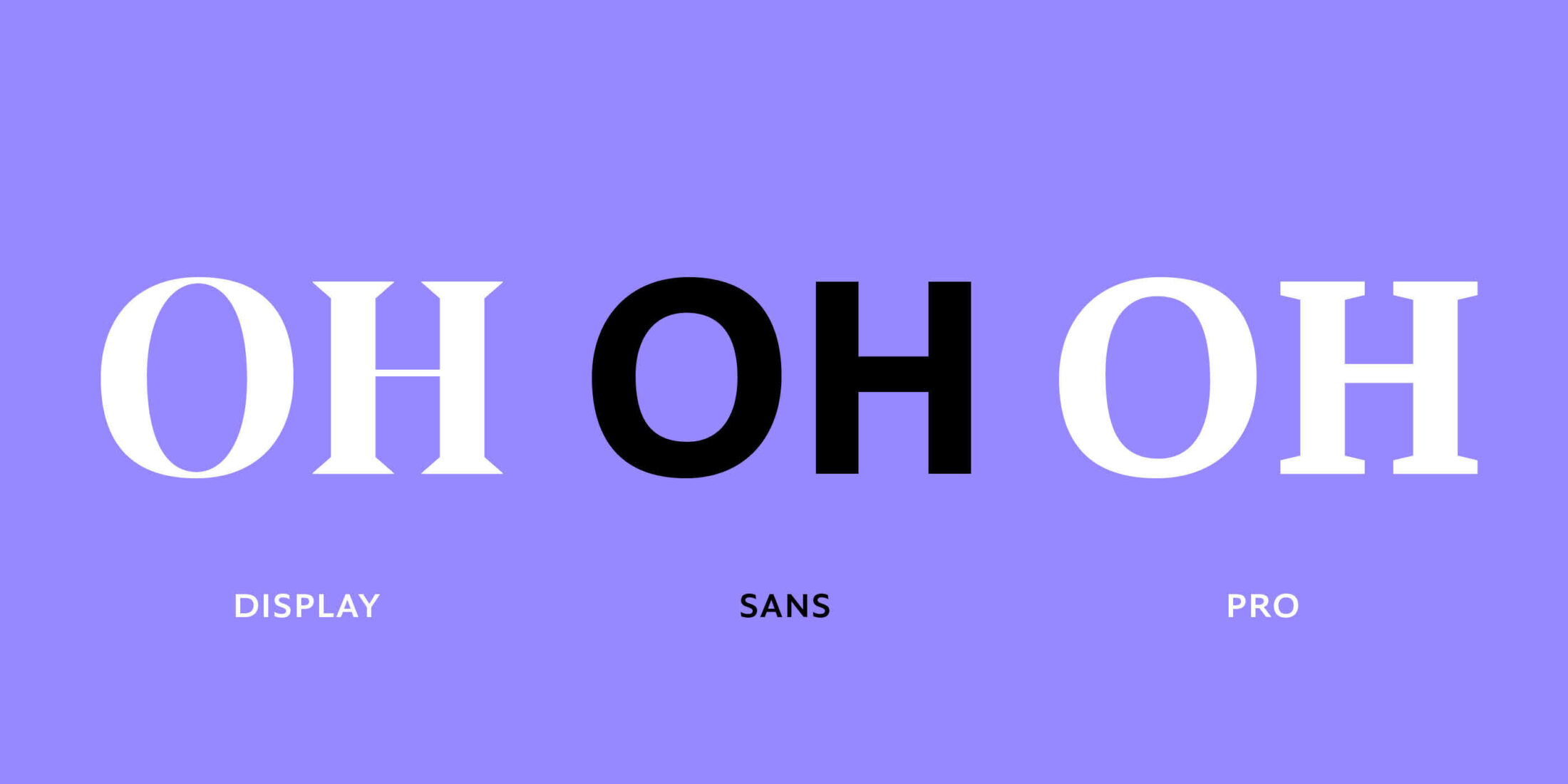
The sans needed to be less conspicuous and quite even for text, which resulted in slightly wider round letters to be designed a bit narrower.
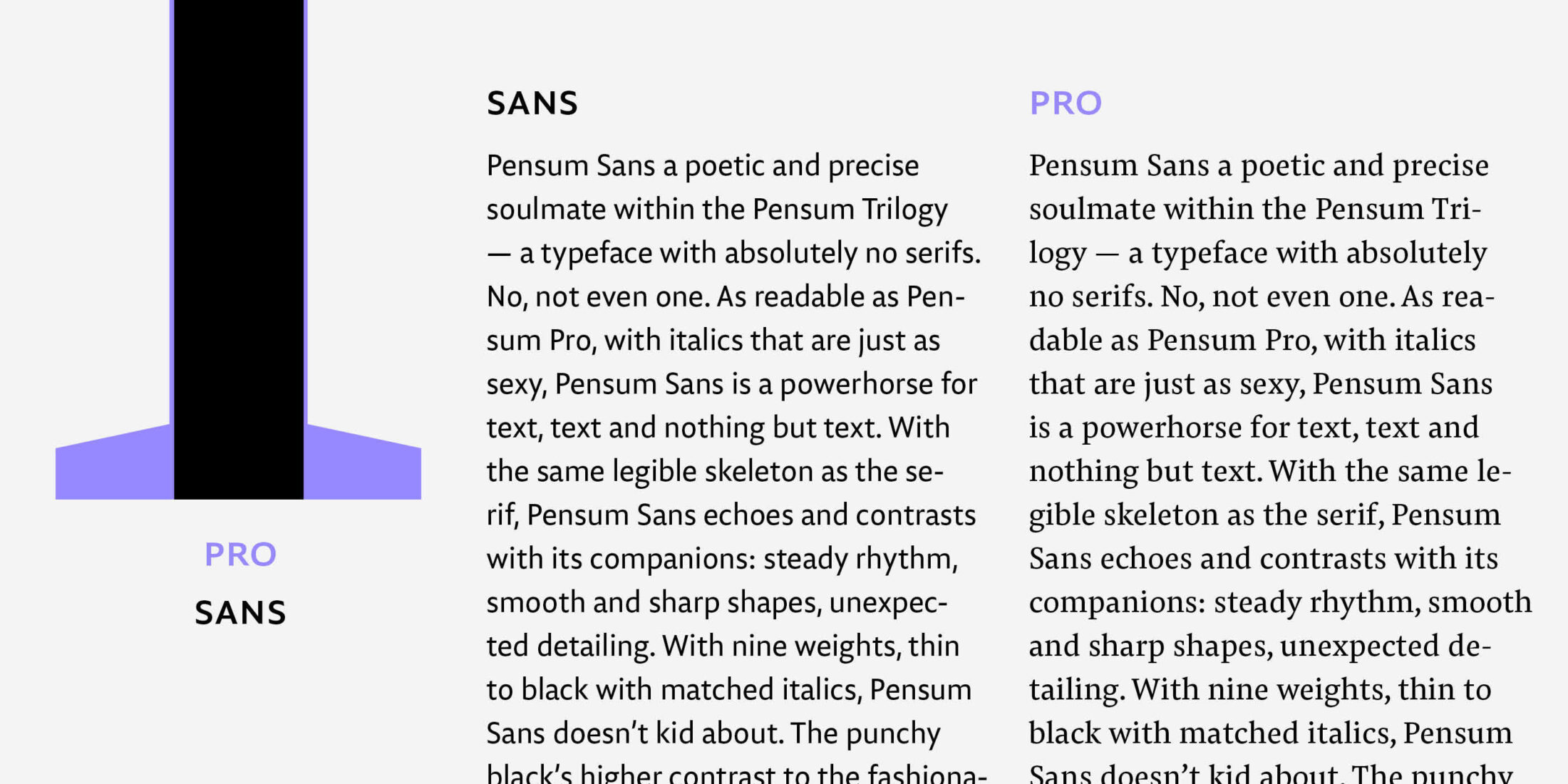
While the serif and the display share the same stem width, Nils decided that the sans should have the same texture as the serif. This entails a lighter stem, because a lower contrast leads to a darker text appearance.
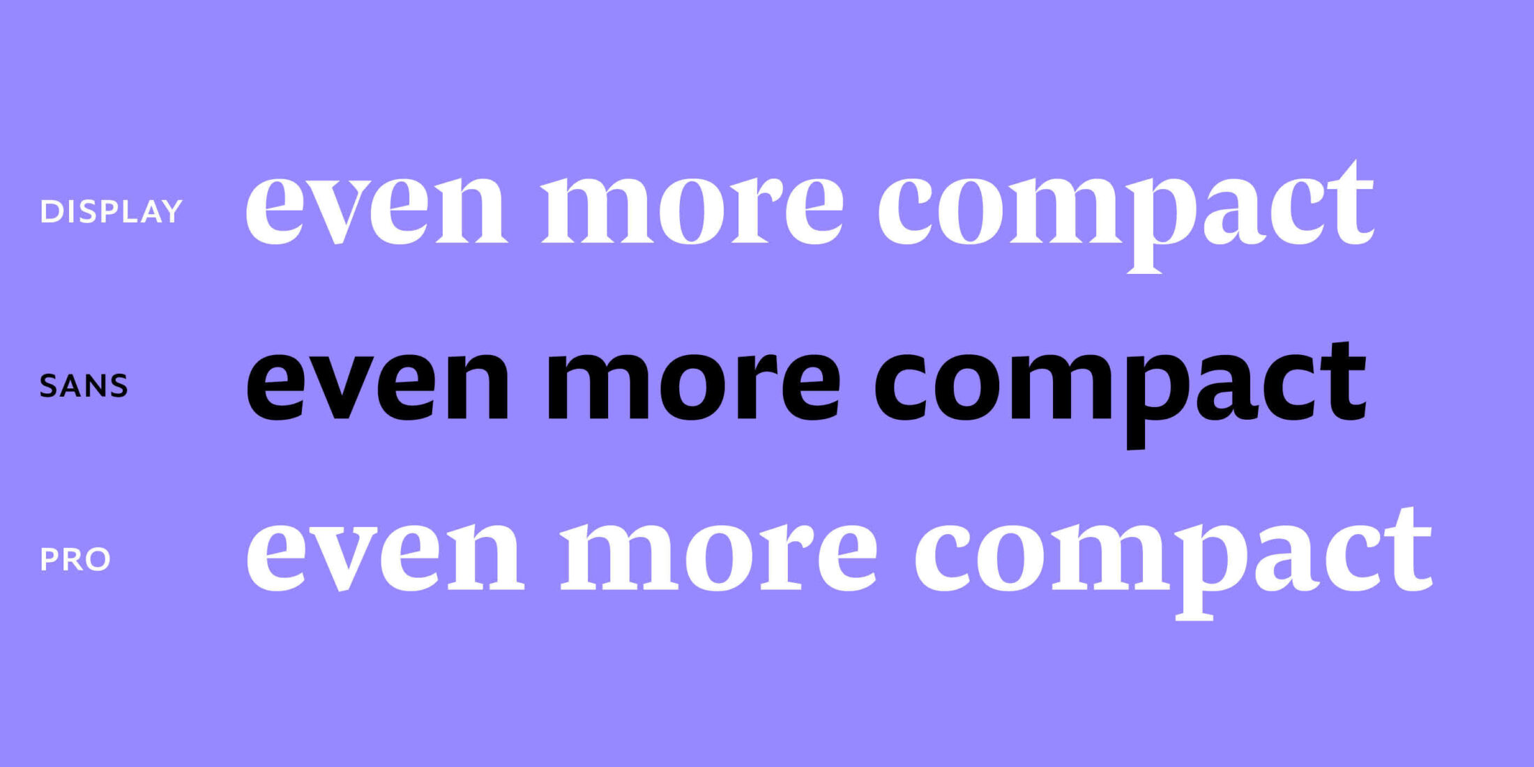
Et voilà, the sans is even more efficient than Pensum Pro and Display.
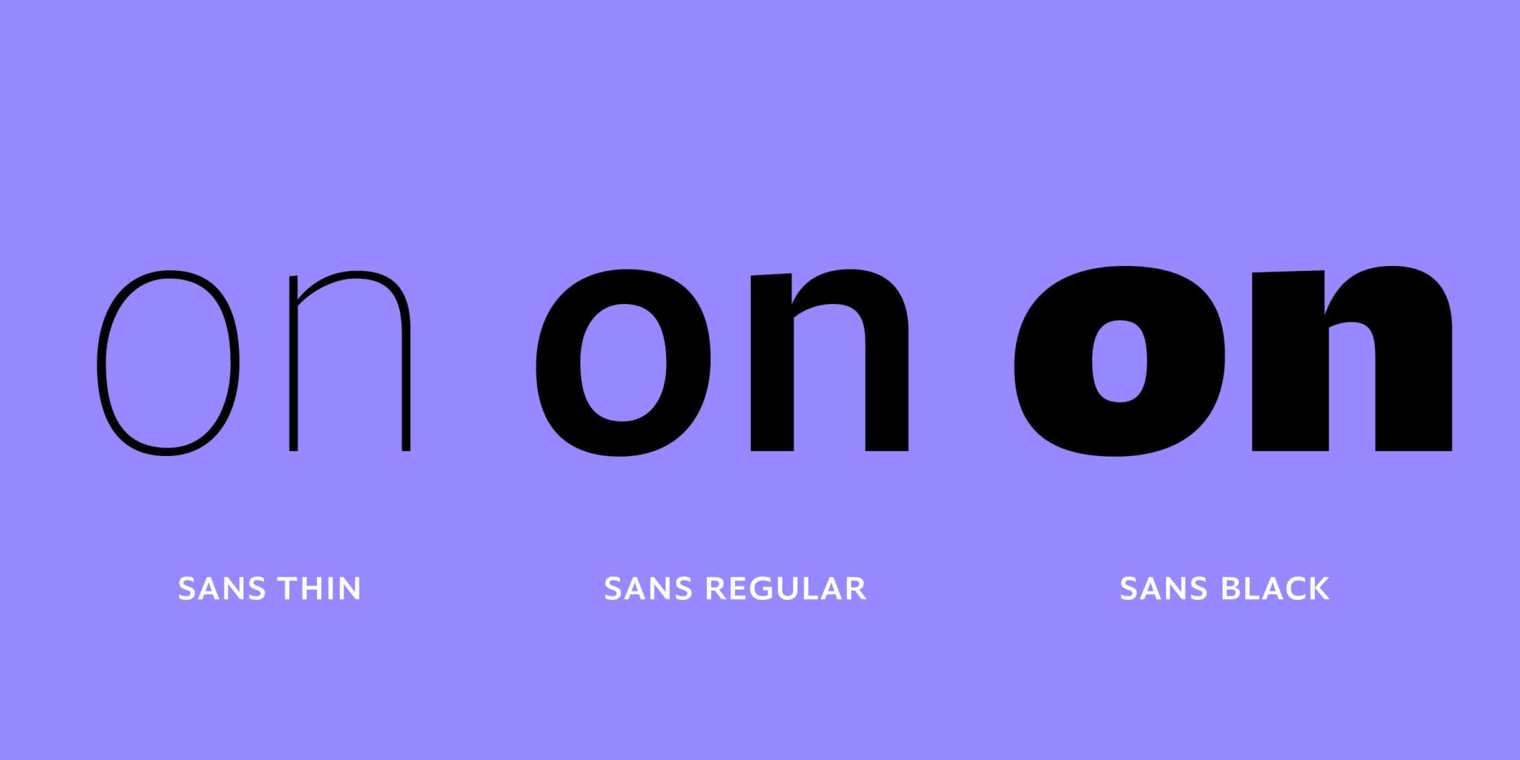
To ensure the nine weights feel like they’re part of the same humanistic sans family, the contrast increases by weight with the highest contrast being found in the black weight.
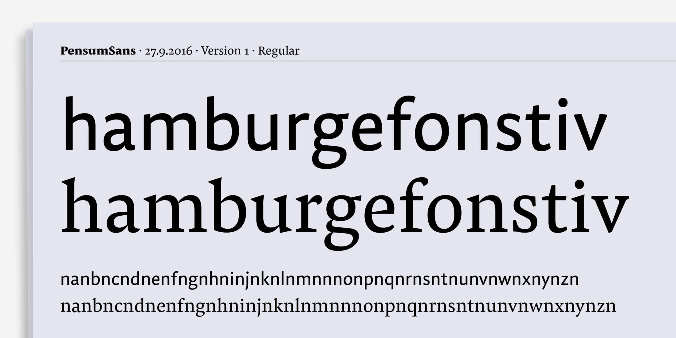
The first digital sketch of Pensum Sans was made with a humanistic style in mind, but as you can see, this would have been too soft to be a sibling for the spiky serif Pensum Pro. You can also see how retaining Pensum Pro’s stem width would have lead to a darker texture.
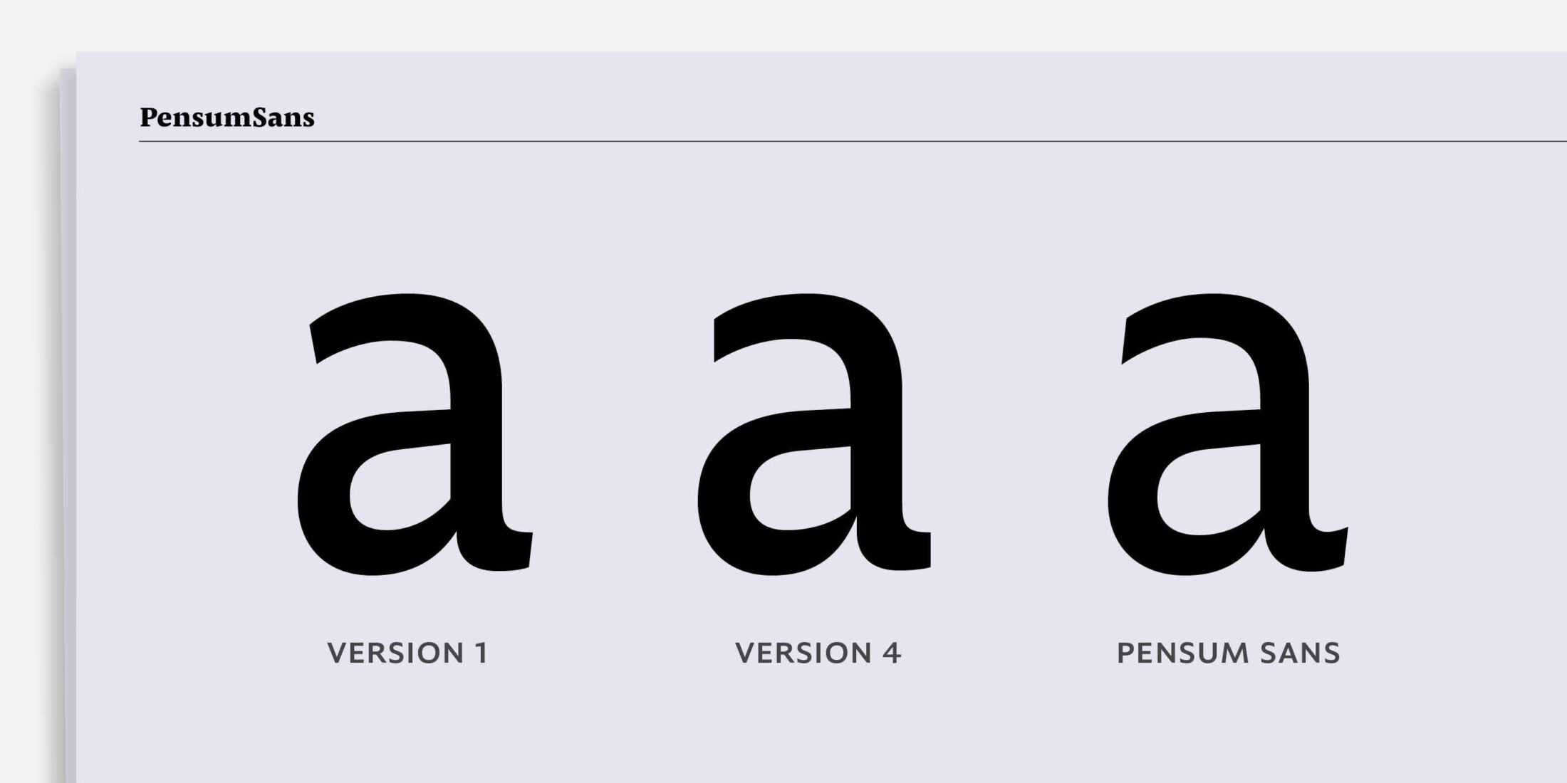
These three versions of the a show how Nils refined those early soft shapes into the sharp forms of Pensum Sans.
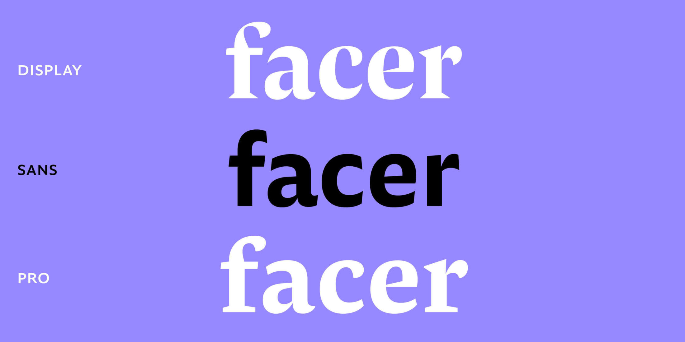
But that sharpness was very necessary. Removing Pensum Pro’s spiky-serifs brought a lot of smoothness to the sans. To balance that out, he decided to skip the brushy endings of f, a and r, and making them more spiky.
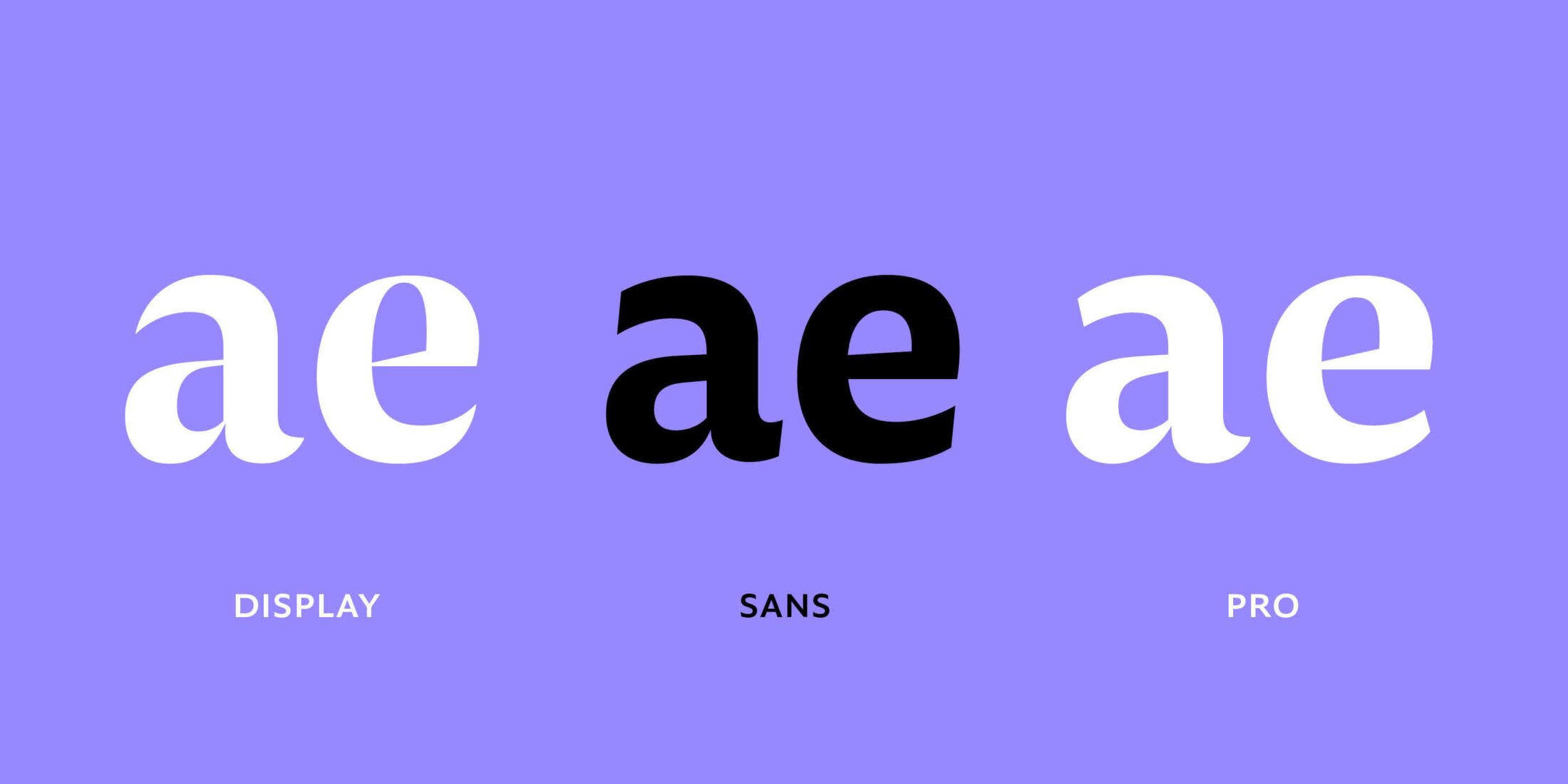
Small details like the swashy ending of the a and the slightly slanted middle bar of the e needed to stay though. As you can see, the new sharp and spiky ends of the a and e connect Pensum Sans to Pensum Display.

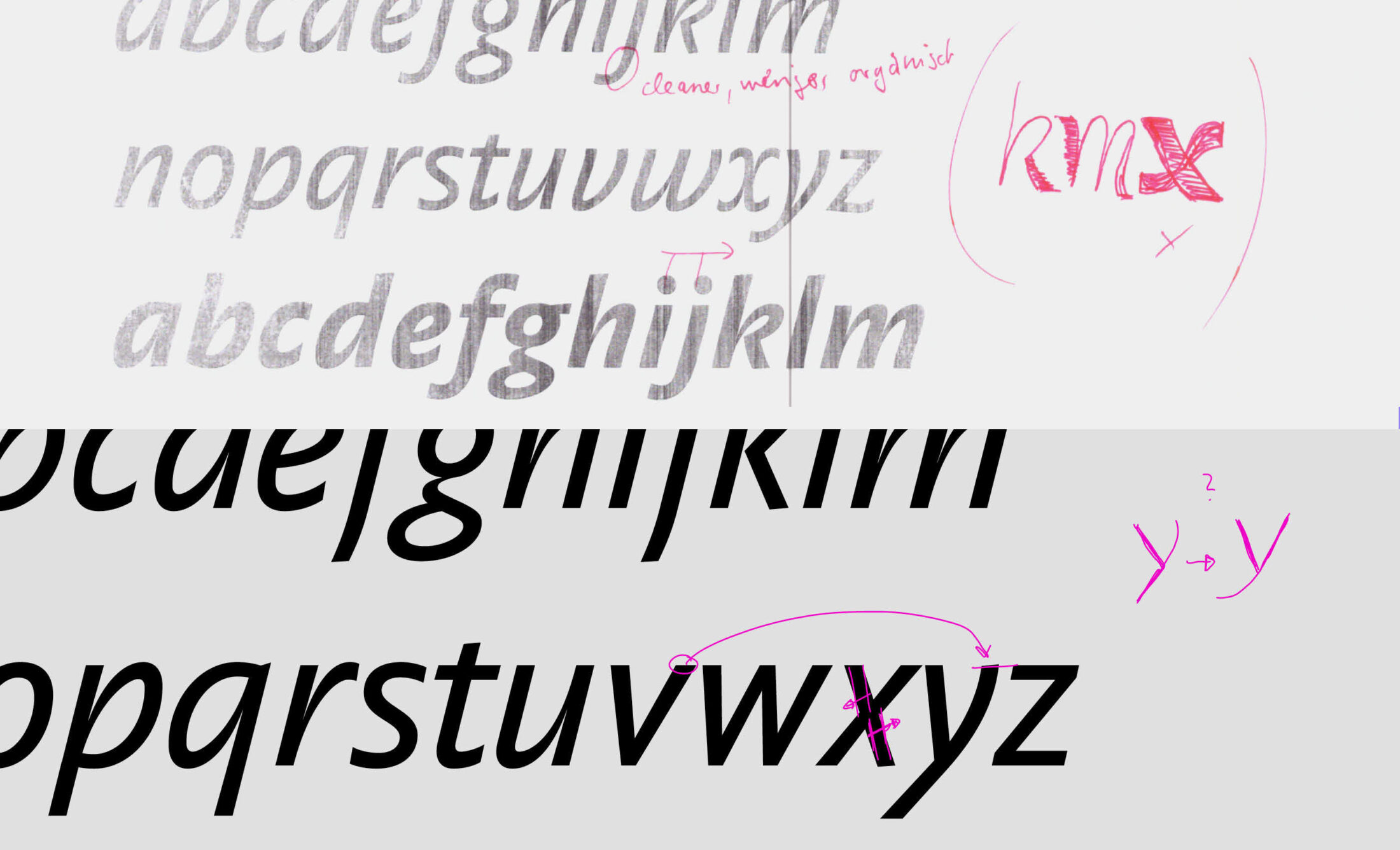
The Italic is always the biggest challenge for Nils. The first sketches were too close to Pensum Pro, too many swinging curves. As the design developed, those curves got straighter and straighter.
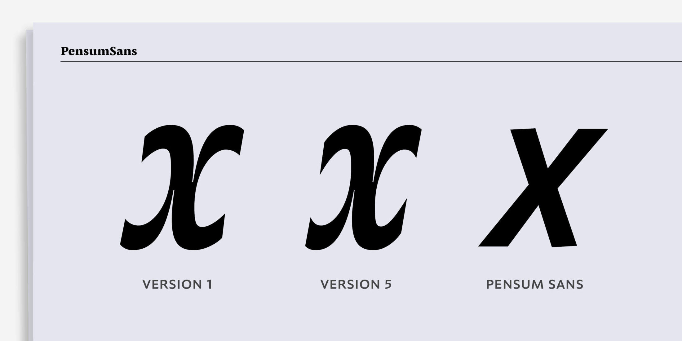
This lovely extravagant version of the small x needed to be discarded.
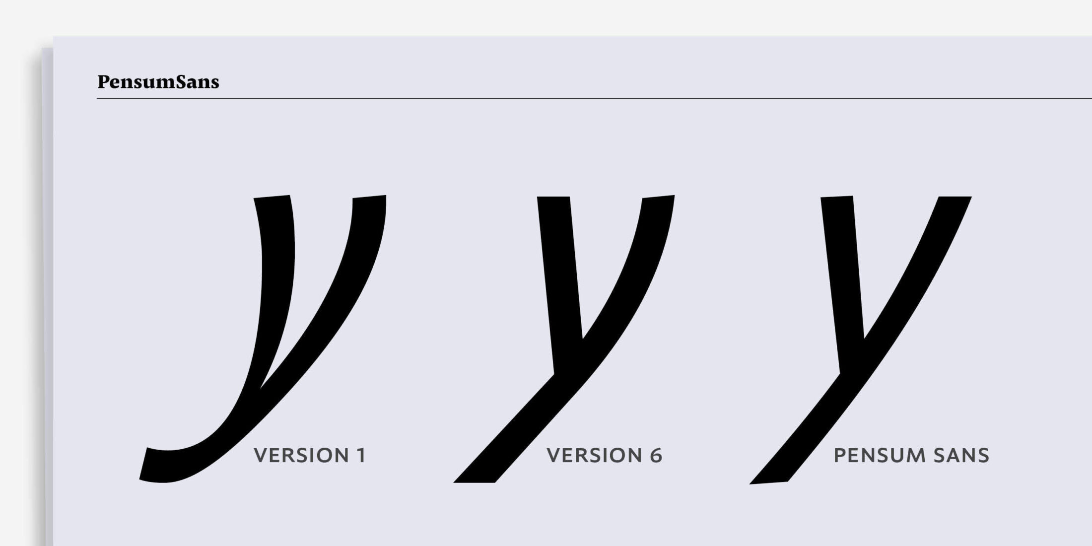
The same was true with the small y. It got straighter and straighter and that beautiful deep cut had to be dropped.
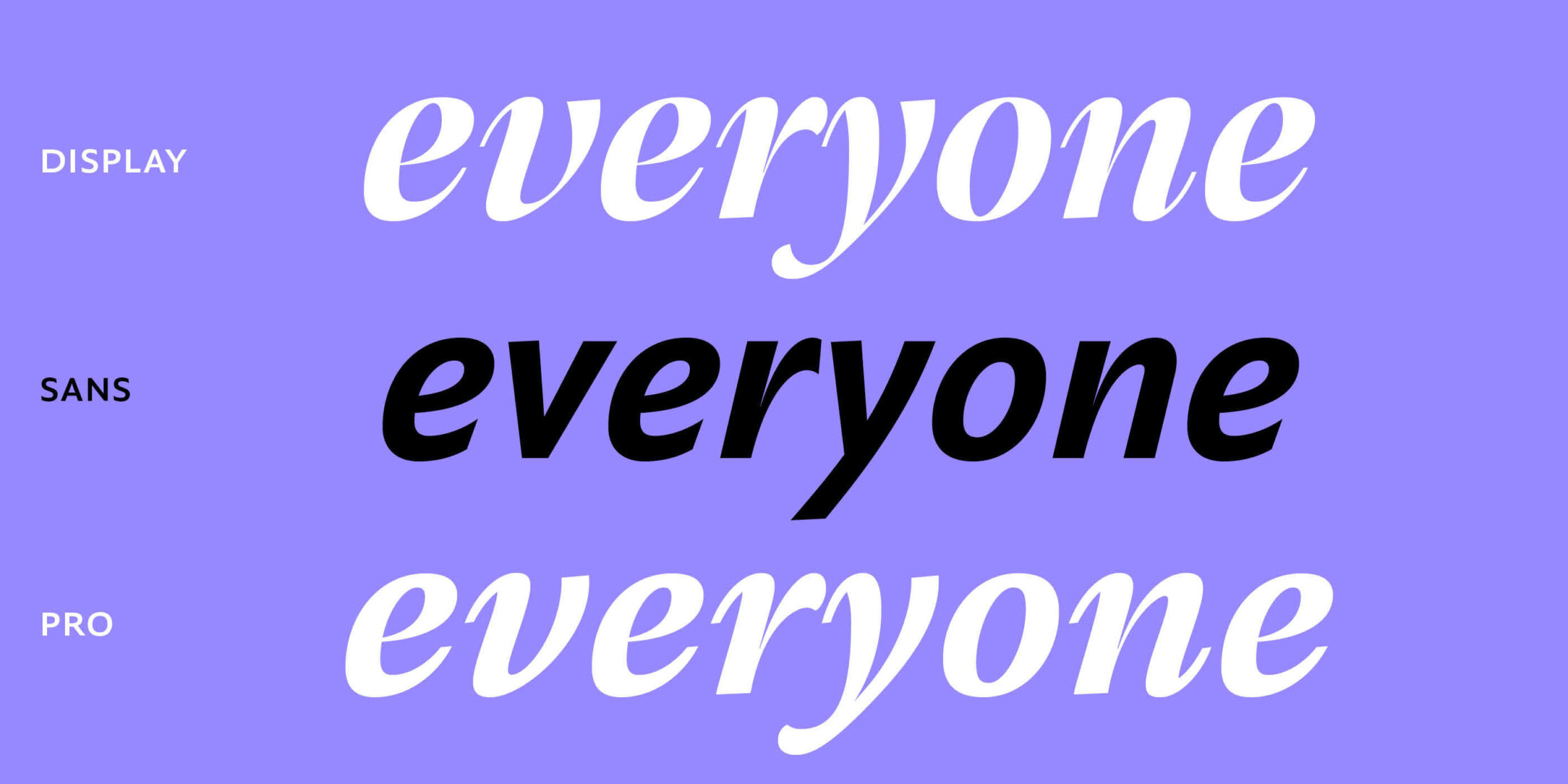
In the end, straightening the curvy shapes in k, v, w, x and z meant that the italic was a little more serious whilst still maintaining a lively and fluent character.
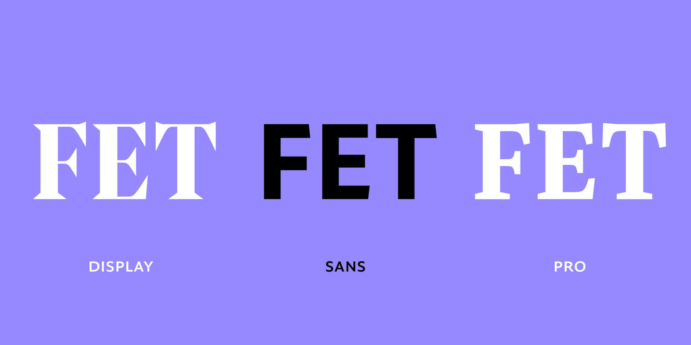
As the sans got a bit too serious, Nils added some nice little details to some shapes. There are slightly skewed endings of the uppercase letters, representing a different way to manifest Pensum’s sharp and spiky appeal.
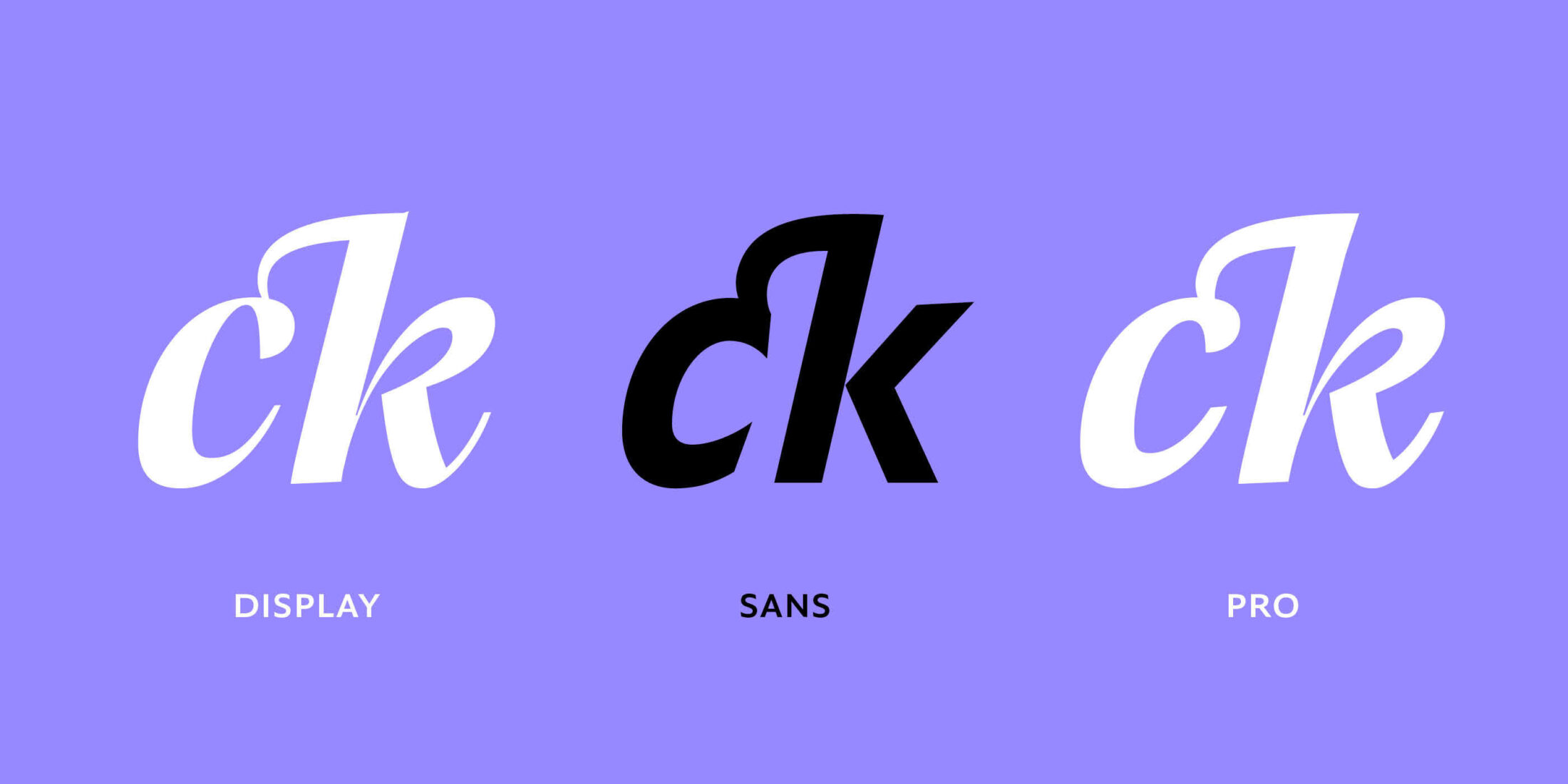
Normally a Sans doesn’t need any convoluted ligatures, but Nils is a romantic and he couldn’t resist adding them for book lovers.
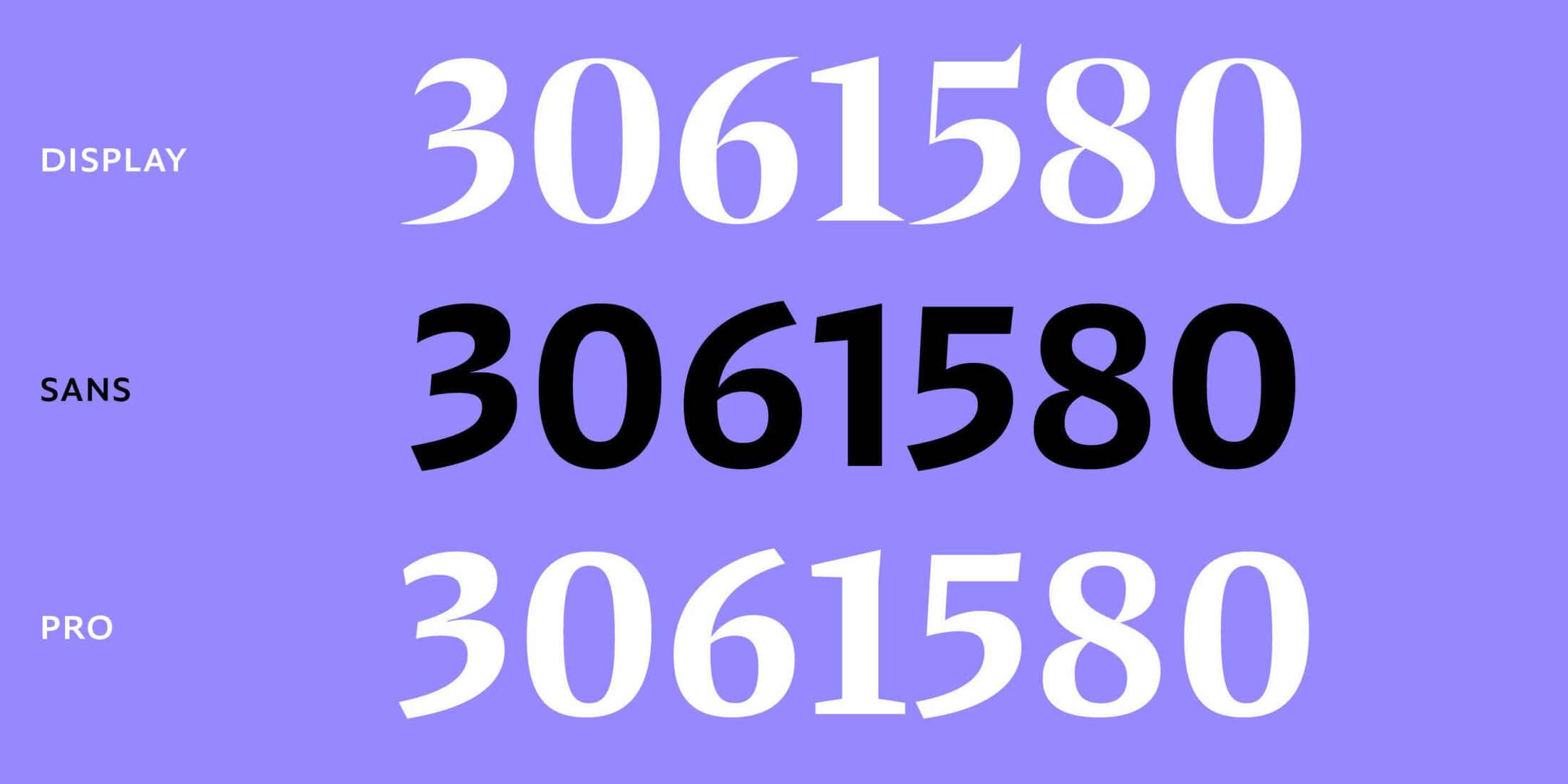
The constant debate of which letters needed to be more serious and what shapes needed to be more playful continued. One thing was obvious though: the figures needed to be clear, serious and straight. The proportions of 3 and 5 were rebalanced and the eccentric swing of 3, 5, 6 and 9 became a little more restrained.
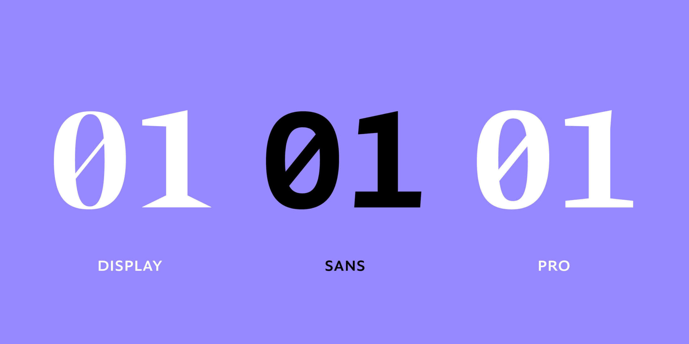
Amongst the figure set you will find a serif. Whoa-ho-ho, yes, we promised that this was a font with no serifs, but, seriously, the tabular figures work better with that one serif.