New Fonts for PAGE
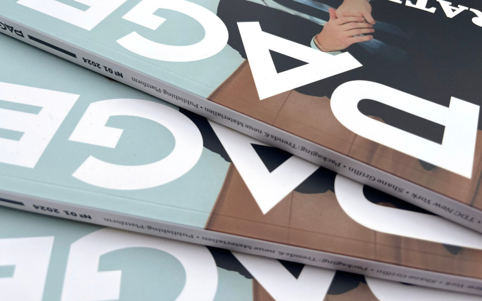
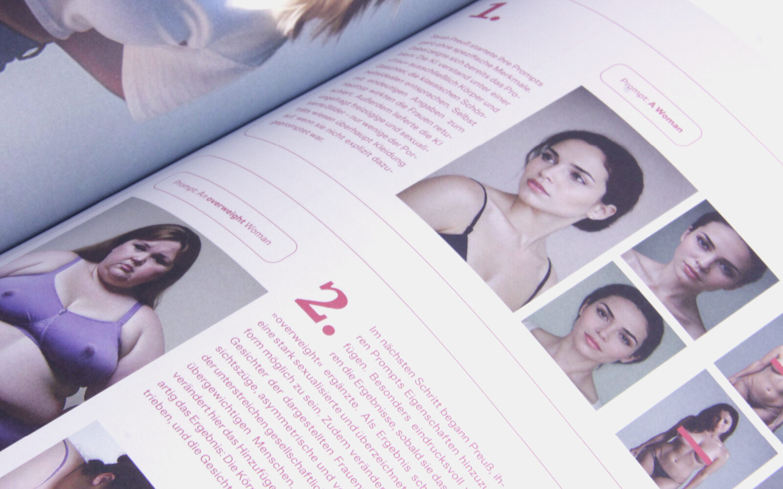
The fresh and completely revamped design magazine PAGE benefits from the versatile Edie & Eddy collection and its lovely italics. At work in both print and screen environments, E&E demonstrates its editorial design qualities in an icon of German design magazines.
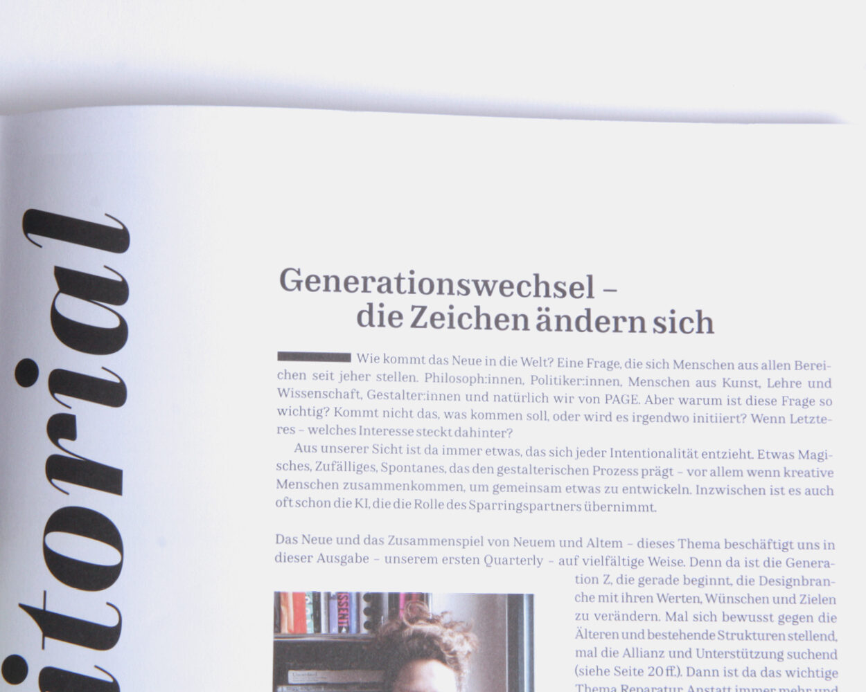
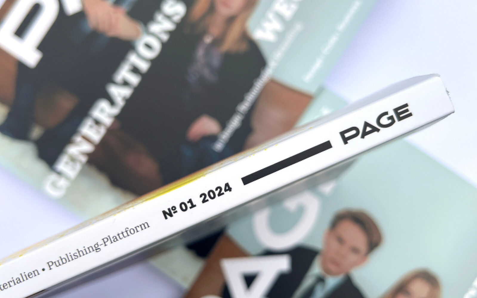
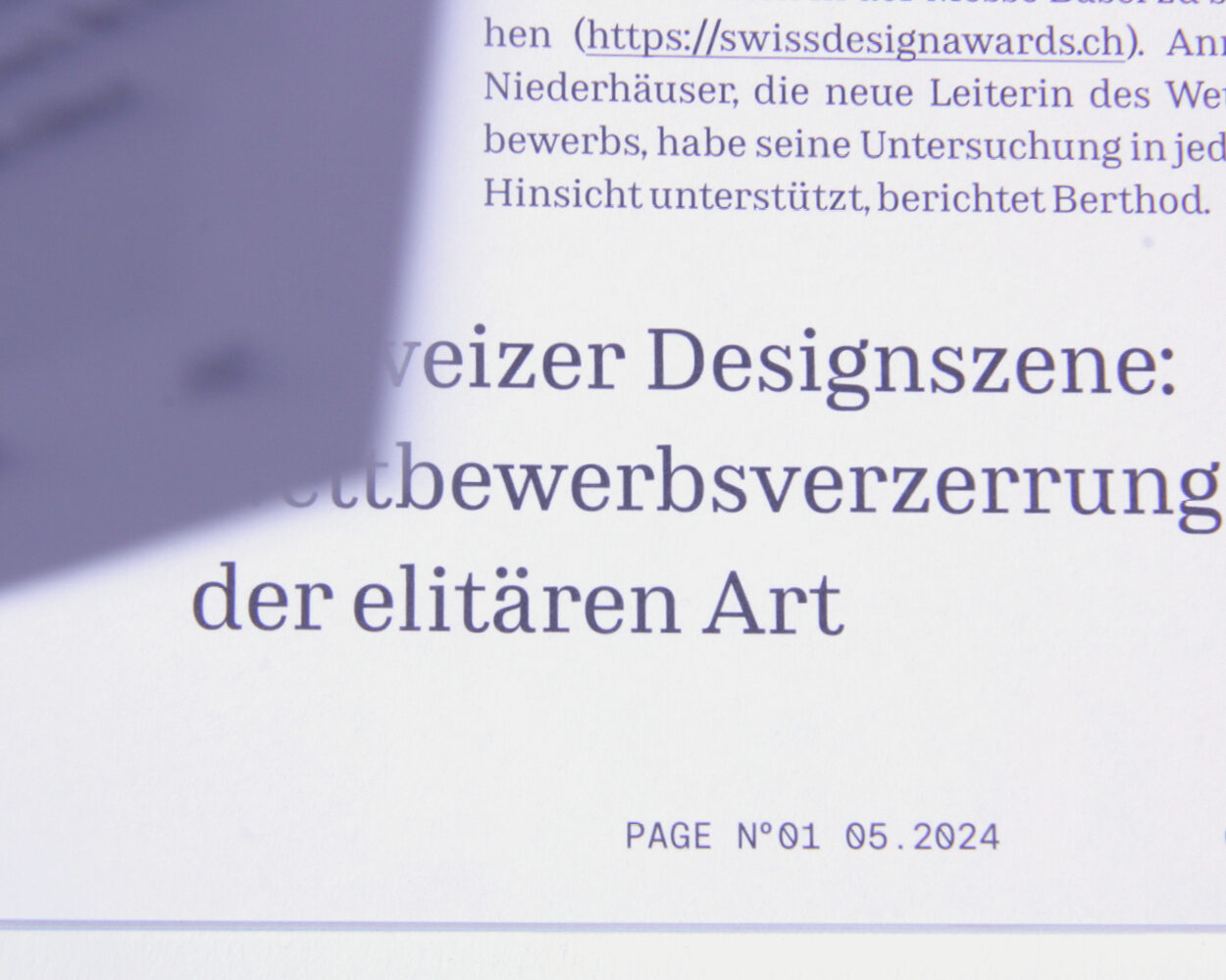
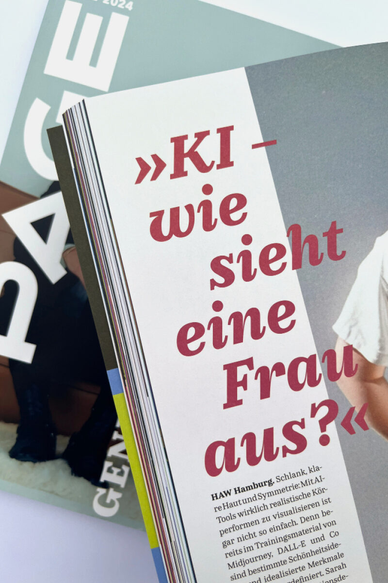
Lisa Fischbach’s expressive Edie & Eddy collection with its elegant italics and Moritz Kleinsorge’s versatile Allrounder Grotesk and Mono are the hallmarks of PAGE Magazine's new look. From the grid to the use of imagery and typography, everything in the magazine has been rethought to give the layout more lightness, space and freedom.
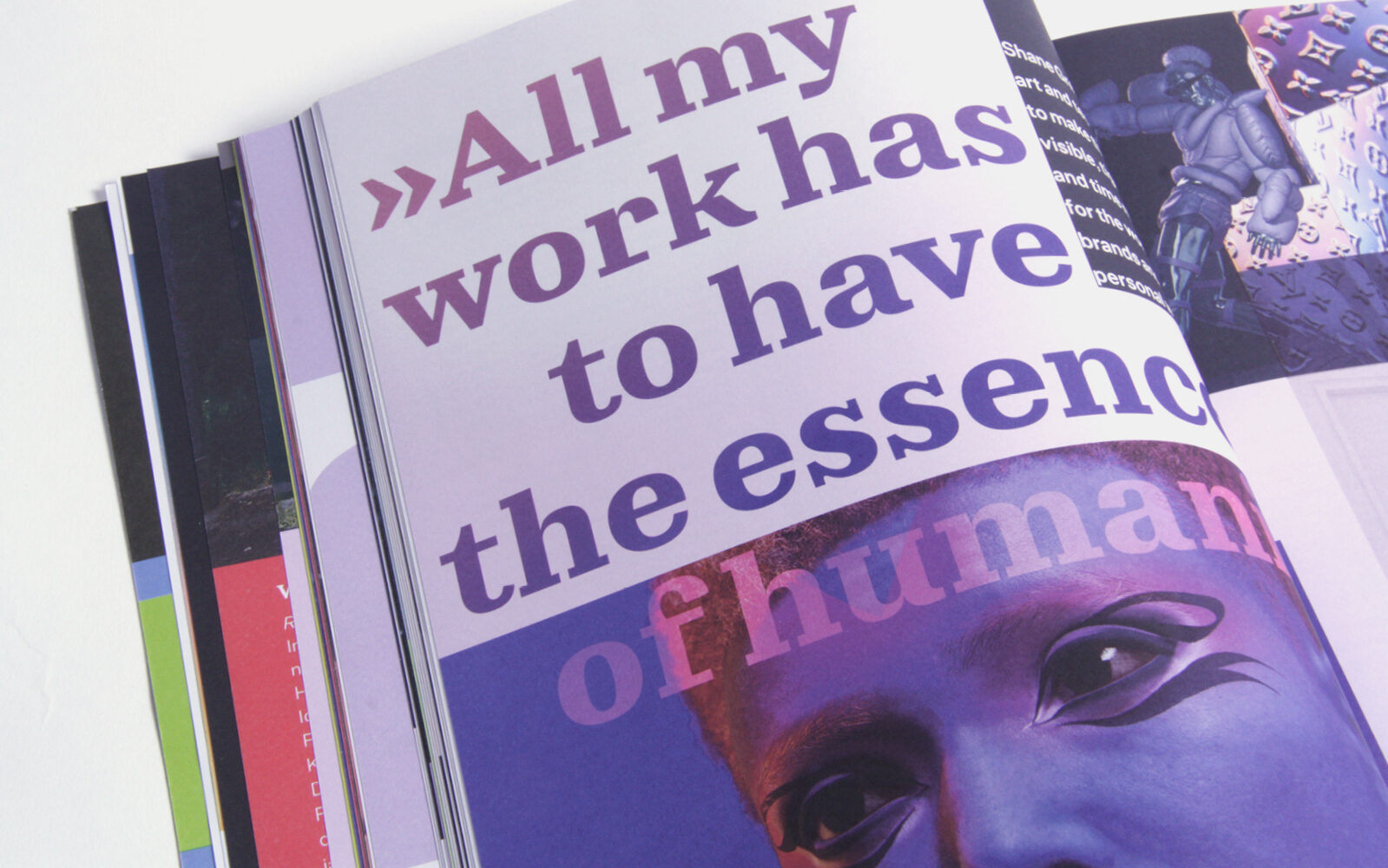
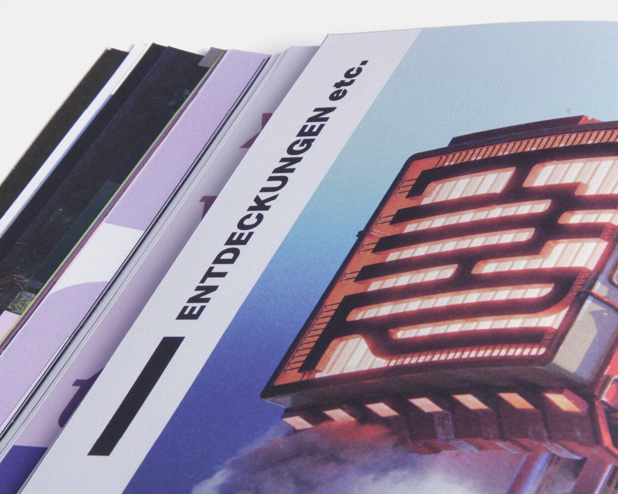
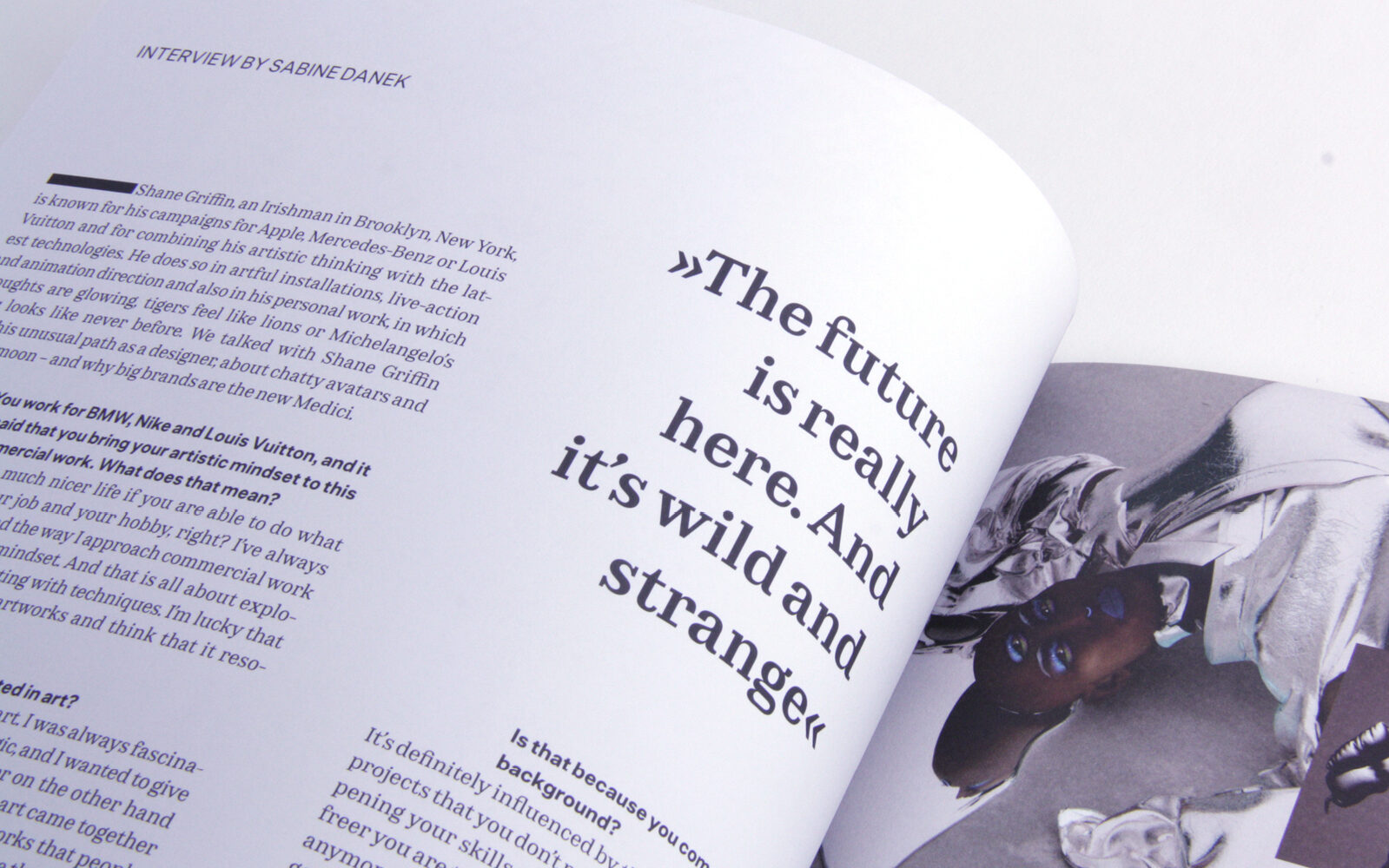
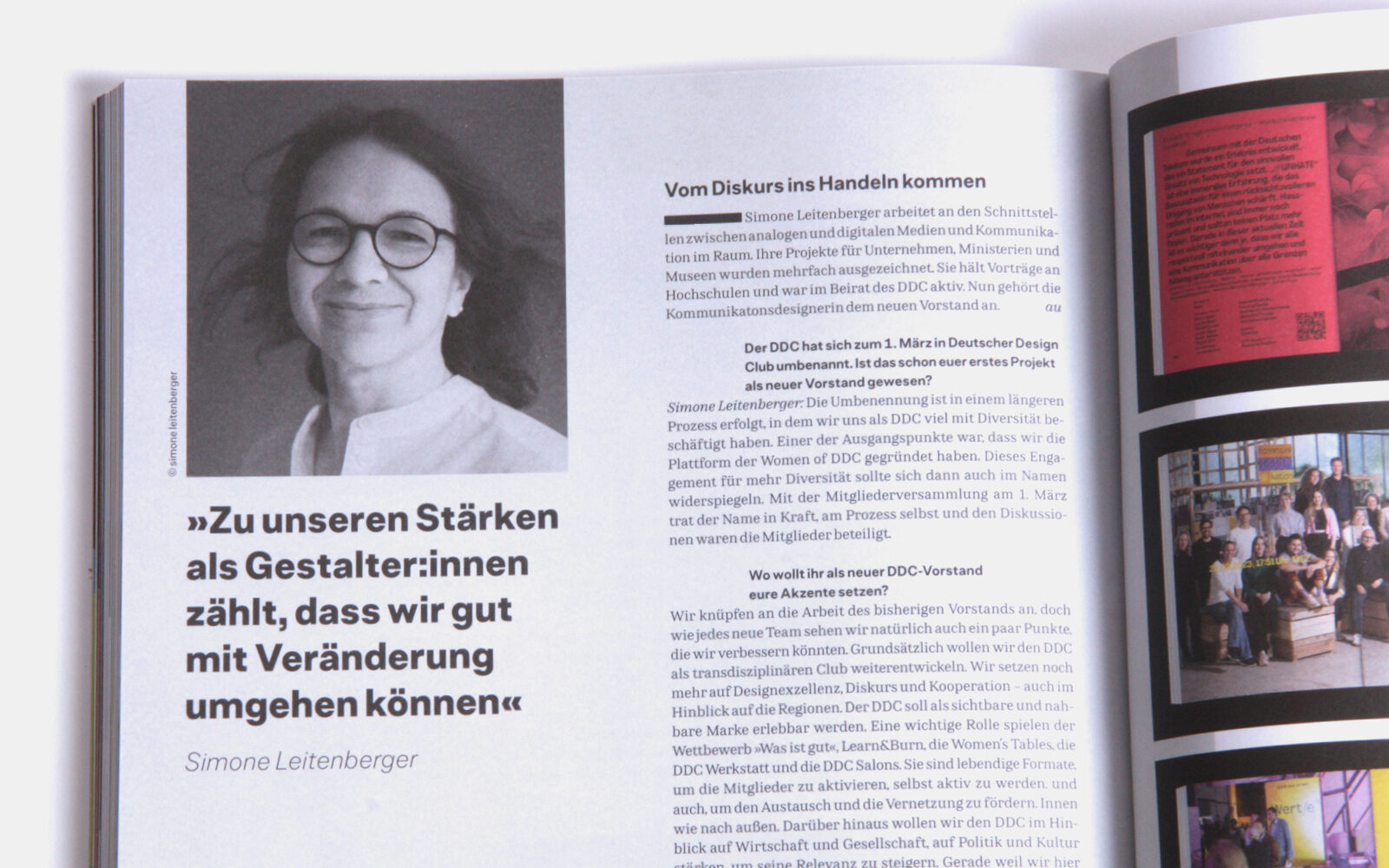
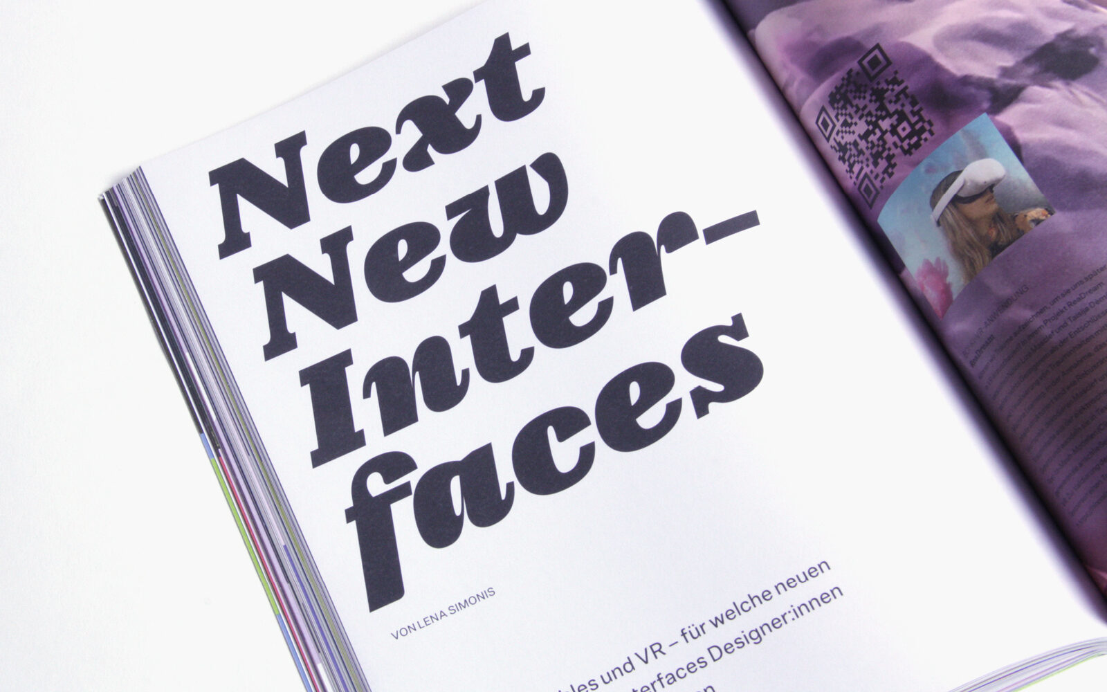
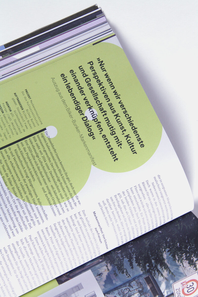
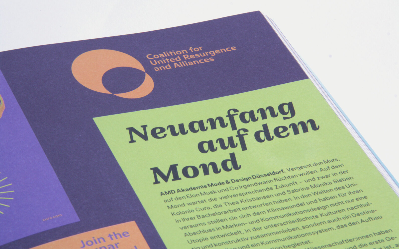
The new design is used in print and on the website. It uses Edie and Eddy for headlines and highlighting, particularly the expressive italics in large quotations. Allrounder Grotesk provides the perfect grey value for body text. From time to time they swap places, Edie and Eddy becoming the main text face and Allrounder Grotesk showing its qualities in larger sizes for headlines and subheads. Together they make an exciting mix for a fresh look.
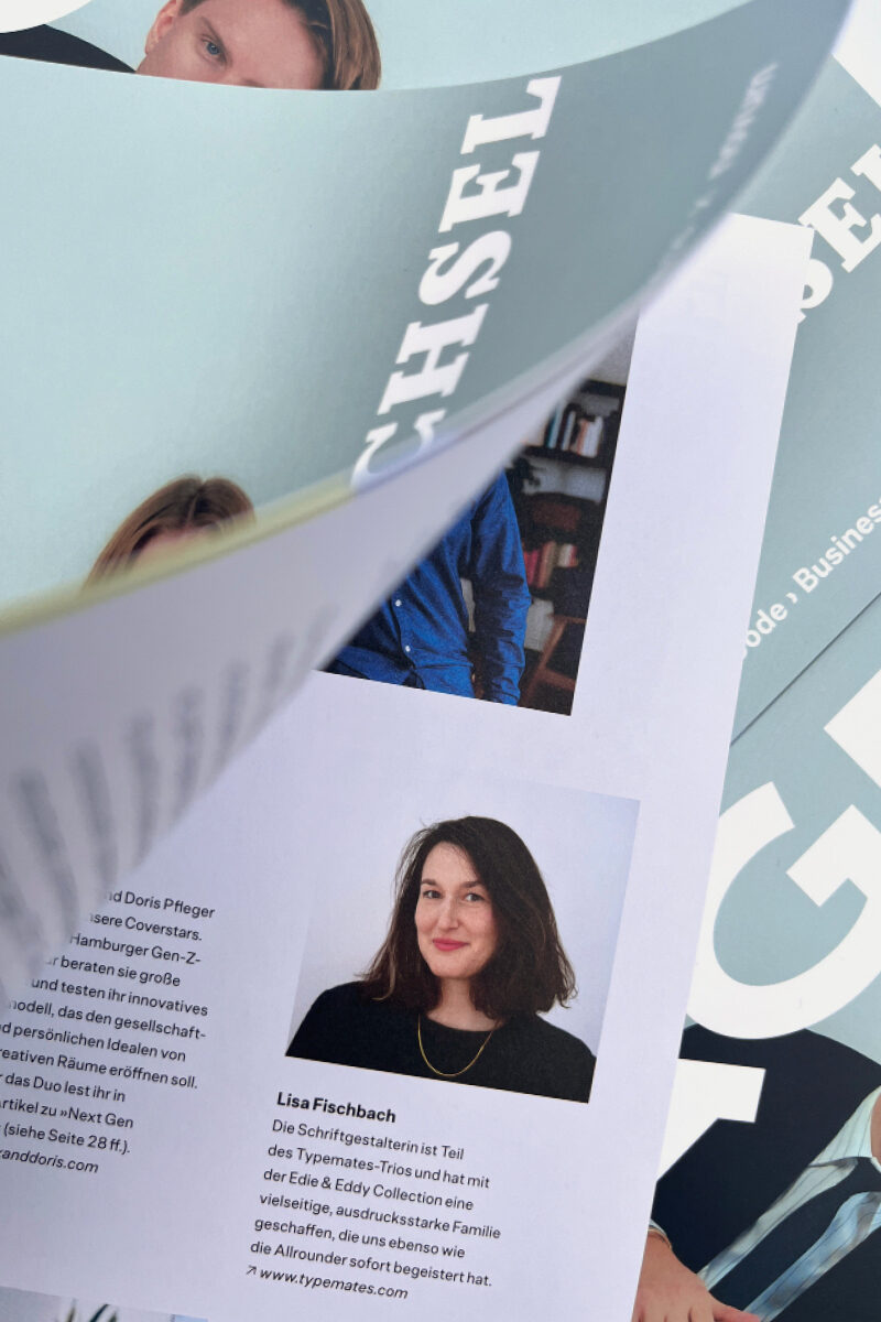
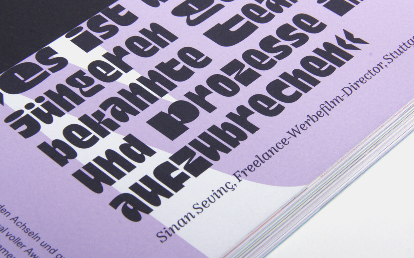
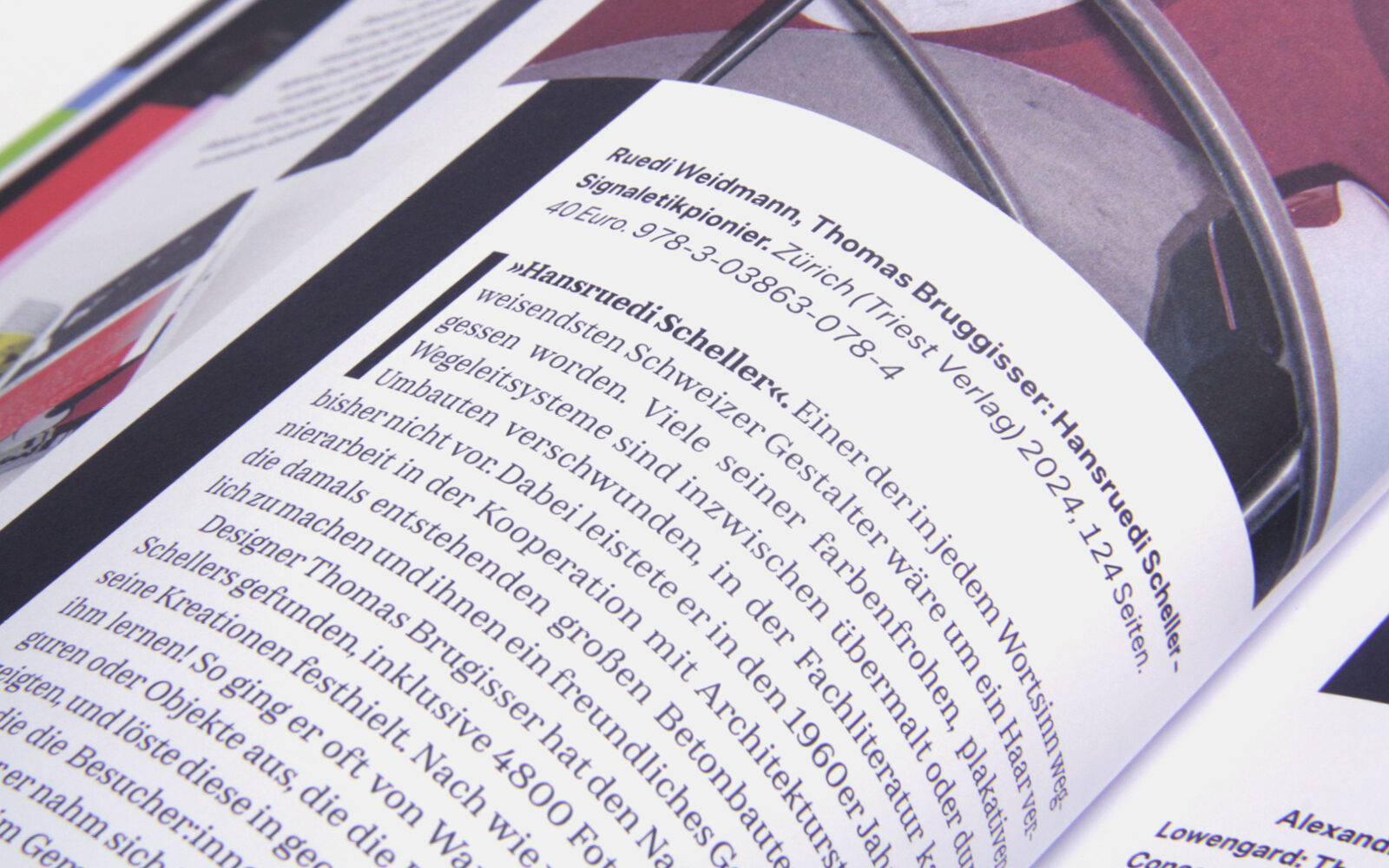
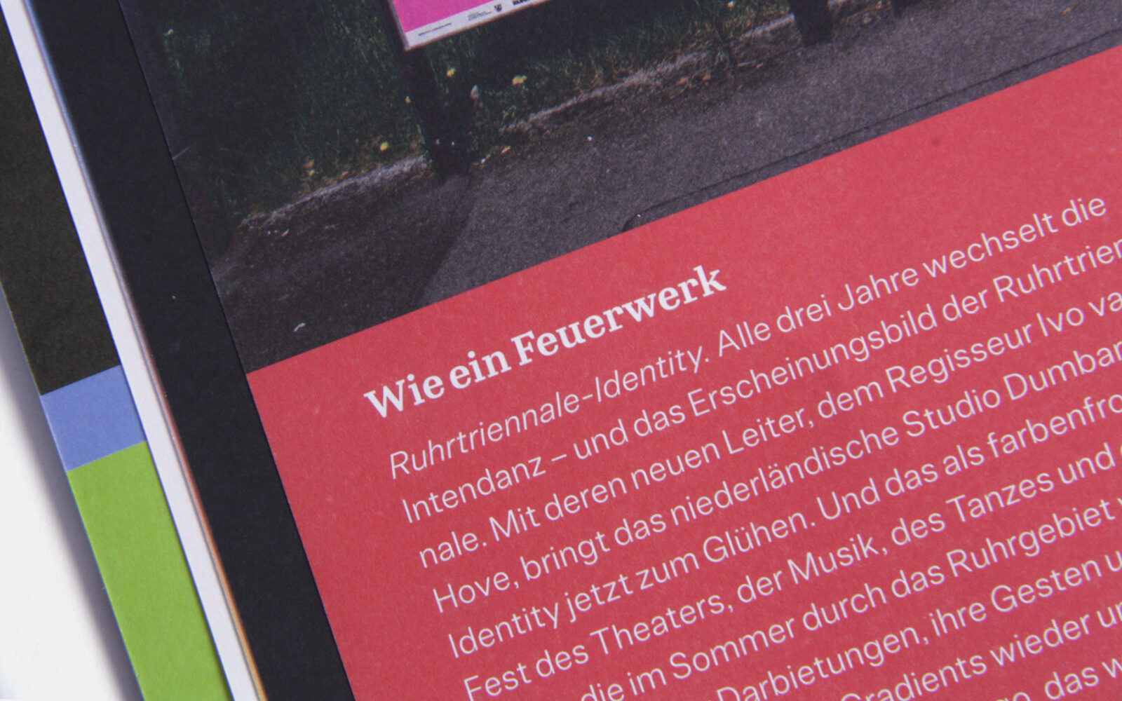
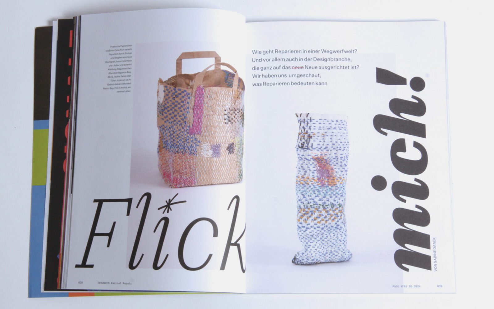
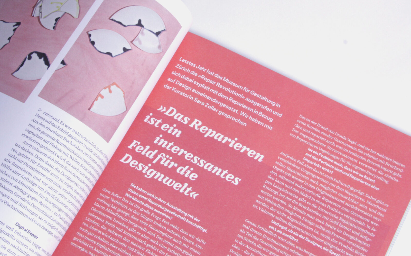
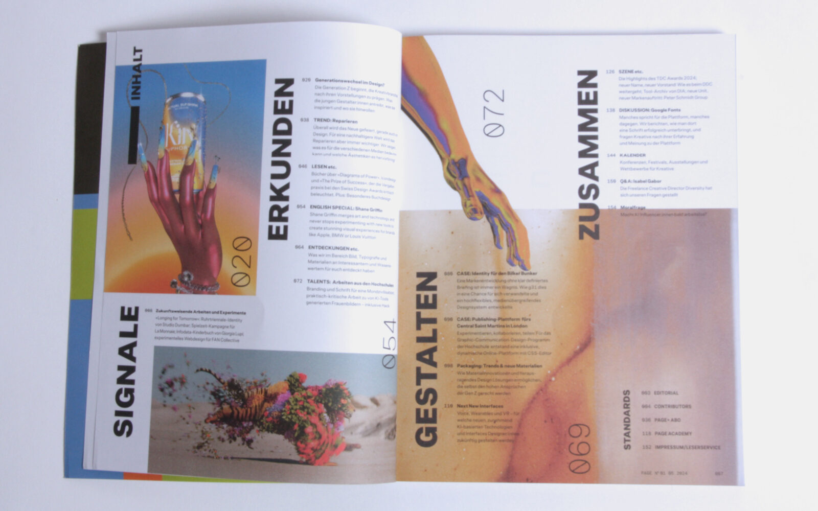
Combined with the Mono for the margins and some paragraphs, the magazine uses the full range of the two families. From Sans to Mono of Allrounder Grotesk to Slab, Text and Modern of the Edie and Eddy collection, including the italics of all versions. The Edie & Eddy fonts are perfectly used – they stand out where they fit and can simultaneously support the individual layout of articles in future issues of the magazine.
