WsC Fonts and Mental Entanglement
Worksheet Crafter (WsC) helps users design teaching and learning materials. However, highly complex planning and engineering was required to make things simple for the user. This article is about connected fonts, their contour variants and how they can be realised with game-changing OpenType Code.
The Making of VA Plus, Simplified Written Script, Or “Vereinfachte Ausgangsschrift Plus”
As “VA Plus” was our first project with the WsC software, and our first school font, the first step was to analyse the requirements and limitations of text shaping in the software, and the didactic needs for a simplified cursive font.
Our second step was to start the design detached from everything that was still to come from a technical point of view. We wanted to develop the best possible design without restrictions, and to adjust the representation of the designs to the technical demands of the software in different operating systems later.
For the head designer of the project, Lisa, and the teachers, Claudia and her team, this initial design discovery phase was exciting. As we broke up and questioned the familiar image of cursive type – they consciously reclaimed the most important features and their pedagogical function.
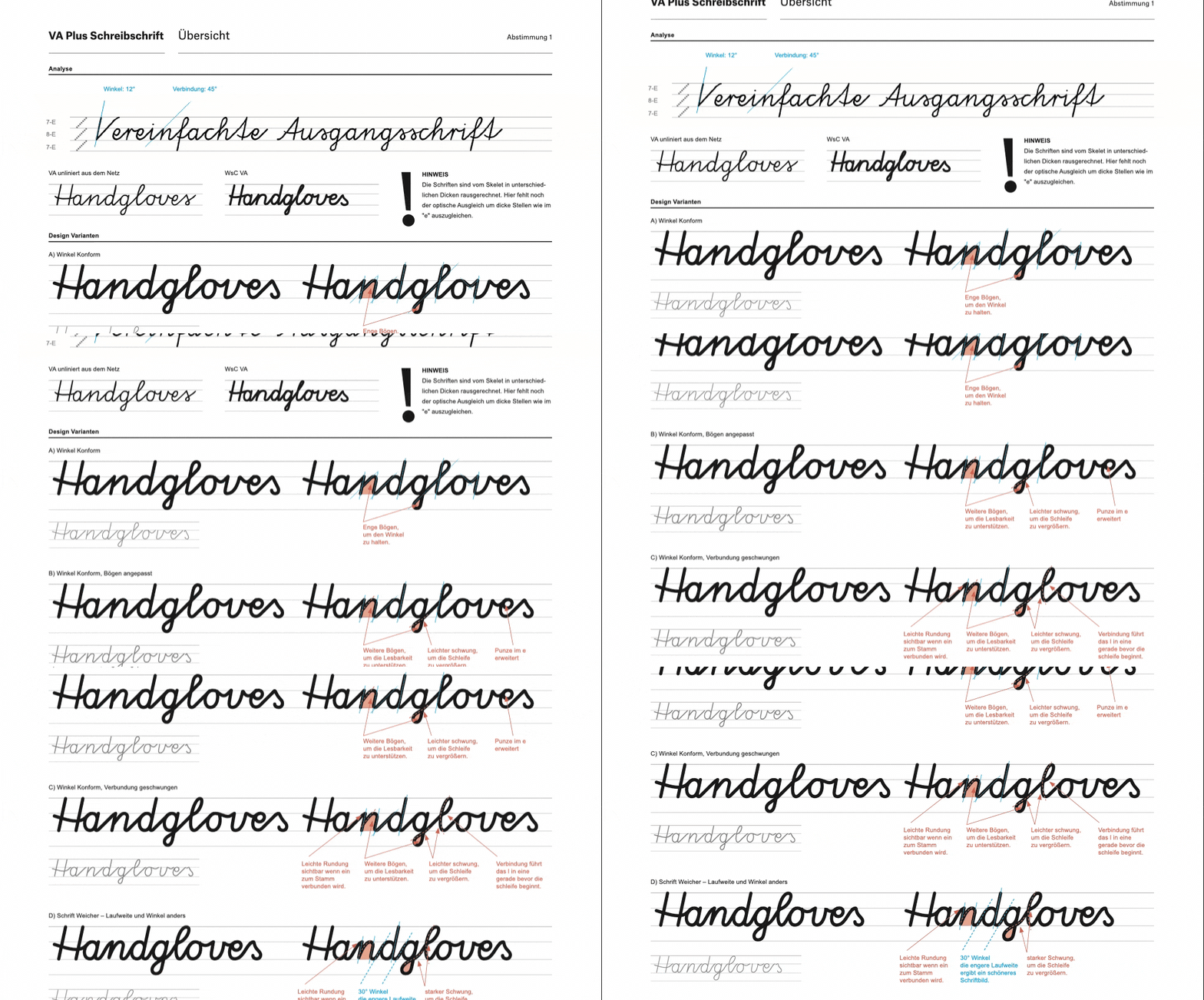
We intentionally escaped the research material again and again to define the boundaries of the design. In close consultation with teachers certain features emerged as pedagogically important for students.
To implement the design of the VA Plus consistently, an OpenType code was written that takes into account two different shapes of the e, which is used contextually, depending on the preceding letter.

Code Command: Replace all e that come after v, w, x with the matching alternate design from the e.
How each letter connected to e and t had to be designed differently from the rest to ensure a consistent fit. To do this, we developed alternate characters for each letter and added programmed intelligence to ensure they were inserted in the right place.
Font Variants
When it came to realising the “outline” variant, OpenType code was invaluable. To achieve a closed outline around whole words, extra initial and final letters were added ❶ and we designed all medial letters to be open on both sides so they can connect to preceding and following letters ❷.
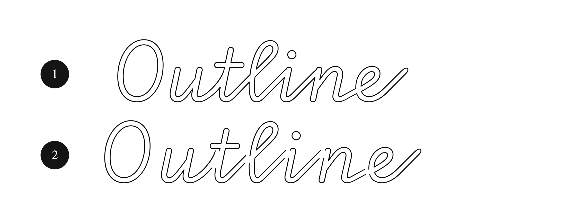
To create a coherent outline in this version of the font, letters cannot overlap as they do in the filled version. Suitable alternate letters, with different open connections, had to be developed for each overlap. For the letter n, for example, there are the following variants:
❶ an n, which meets another letter, which starts at the x-height, e.g. n
❷ an n which meets a round, e.g. o
❸ an n which meets an l
❹ an n which meets an f
❺ an n which meets an e
❻ an n which meets a t
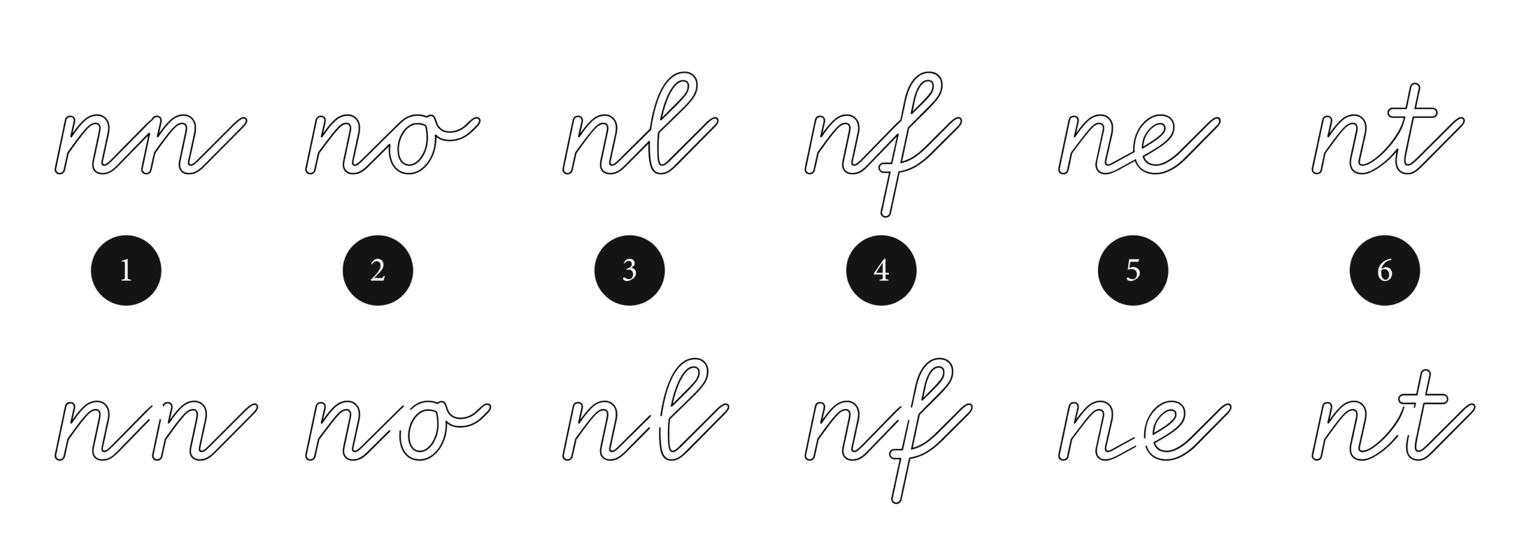
Each new letter’s a puzzle piece with different sides on the left and right to connect the outline typeface.
Let’s stay a bit longer with the OpenType Code, but have a look at a different font for WsC.
The Swinging Script “Schwungschrift”
Instead of letters, the “Schwungschrift” uses “swinging” abstract shapes to develop pupils’ motor skills and understanding of the flow of handwriting. With a design so detached from letters, our first thought was, “Exciting! We'll get there quickly, it's just basic shapes, and they’re not hard!” That's exactly where we were right and wrong. In the end, it looks easy, but implementing it was complicated.
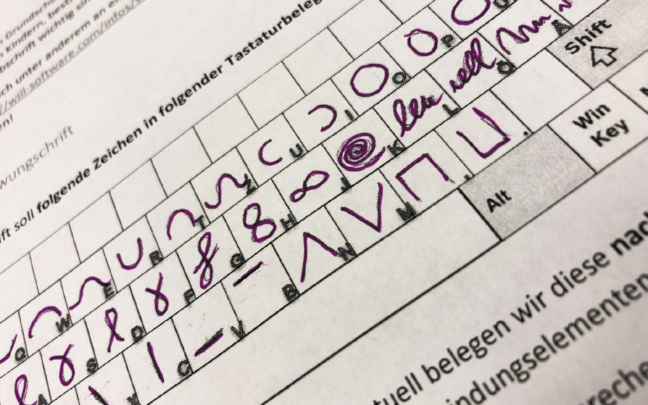
Keyboard mapping for the different shapes and sweeps that the Schwungschrift is designed to represent.
Looking at the shapes, the desired basic forms of the Schwungschrift can be divided into different groups. However, the “swing line” connecting the groups changes depending on the groups it connects.
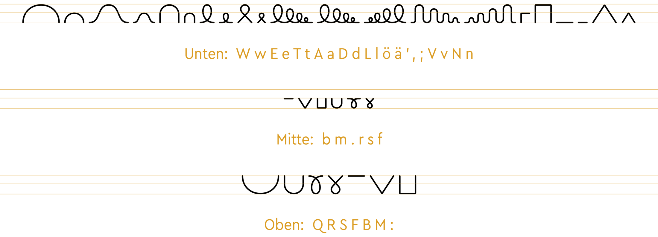
Formally, the shapes can be divided into three groups: Bottom, Middle and Top.
To connect one form to the next with a simple direct line is contrary to the basic concept of the script. In our approach, the individual forms are continued from left to right in a way that supports the Schwungschrift’s writing flow:

The shape of the first letter is continued so that it leads to the starting point of the following letter.
For example, if a shape that lies on the baseline (i.e. a “bottom”) is followed by a “top”, it will be converted into an alternate form that will flow up towards the versal height. However, if it is followed by a letter that starts at the centre, the x-height, the swing of the alternate letter will lead to the “centre”:
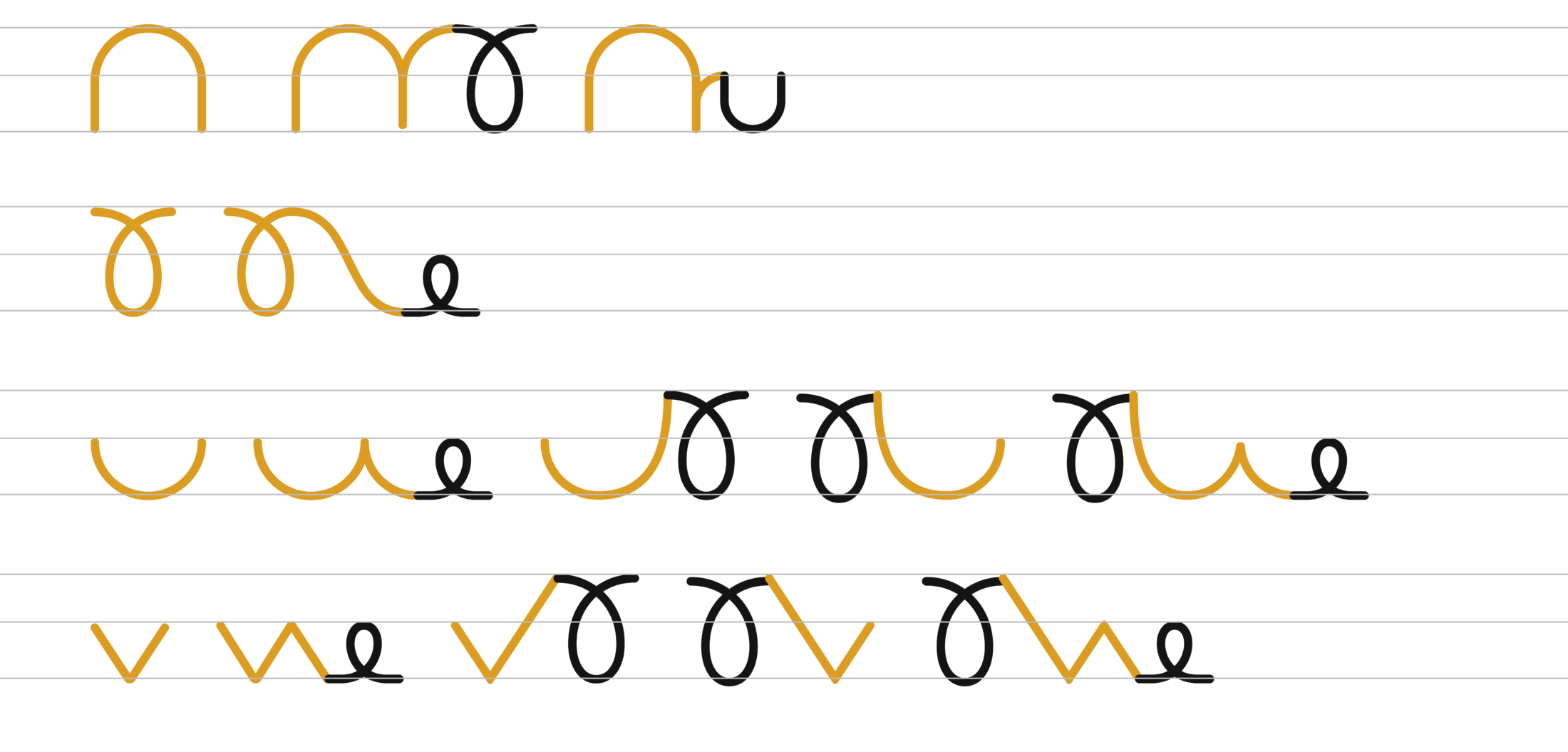
Code: Replacing all characters from group “Top” into alternative forms from the group “Top-Bottom” if they are followed by a form from group “Bottom”.
If you feel tangled up by these descriptions of the logic behind the connections, that’s understandable. The concept is not easy to grasp, and when we were working on the font it led to a lot of questions and clarifications about the desired outcome. We’ve therefore left all the exceptions and special solutions out of this text.
The main thing is that the code always provides the right letter so that the different forms connect and the writer’s momentum is maintained.
Creating the Outline Variant
To connect all the swings without too many additional letters, or too much coding, we started by putting connecting “gaps” in similar places. However, we realised this wouldn’t be helpful to students: the centre stroke, which their pen is meant to follow, would not overlap as it’s meant to.

With this solution, the students would interrupt the swing to move on to the next form, and would not be able to recreate the fluid flow of writing that is the basic element of the Schwungschrift.
As with the contour variant of VA Plus, we needed additional puzzle pieces. Along with the connected forms, we designed alternate glyphs to match preceding and following forms. We achieved a fluid swing line by cutting base forms in different places and used contextual alternates to ensure they sat in the right place.
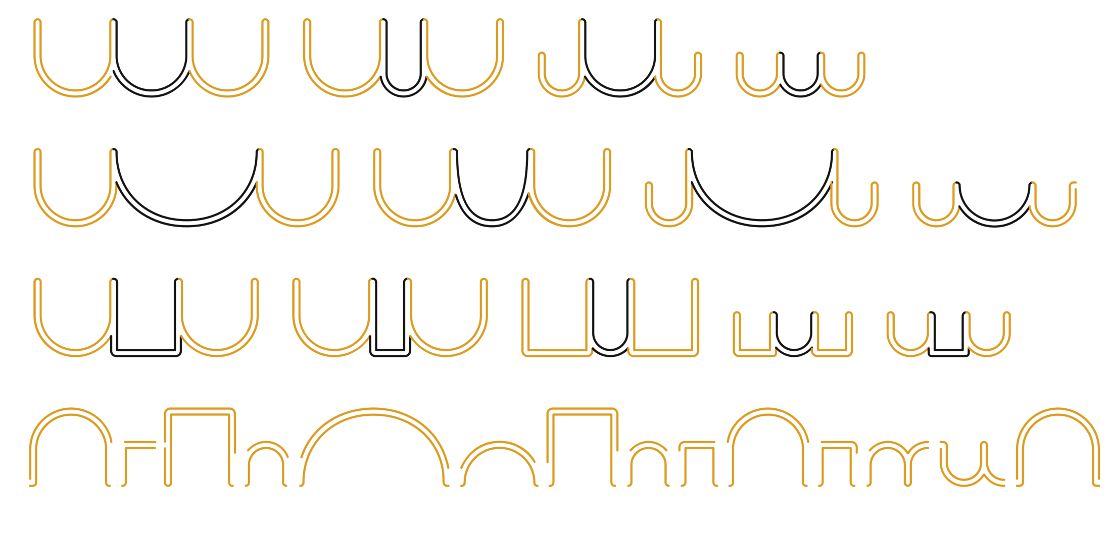
After all the connections had been considered and properly coded, all letters were given initial and final forms so that the contours would close again.
The result is a Schwungschrift that allows learners to trace different shapes within the contour lines. The font is very popular among teachers, a real endorsement of how it does its job. From the outside, it can be hard to see the effort that went into this typeface, but perhaps a few numbers will make it clearer:
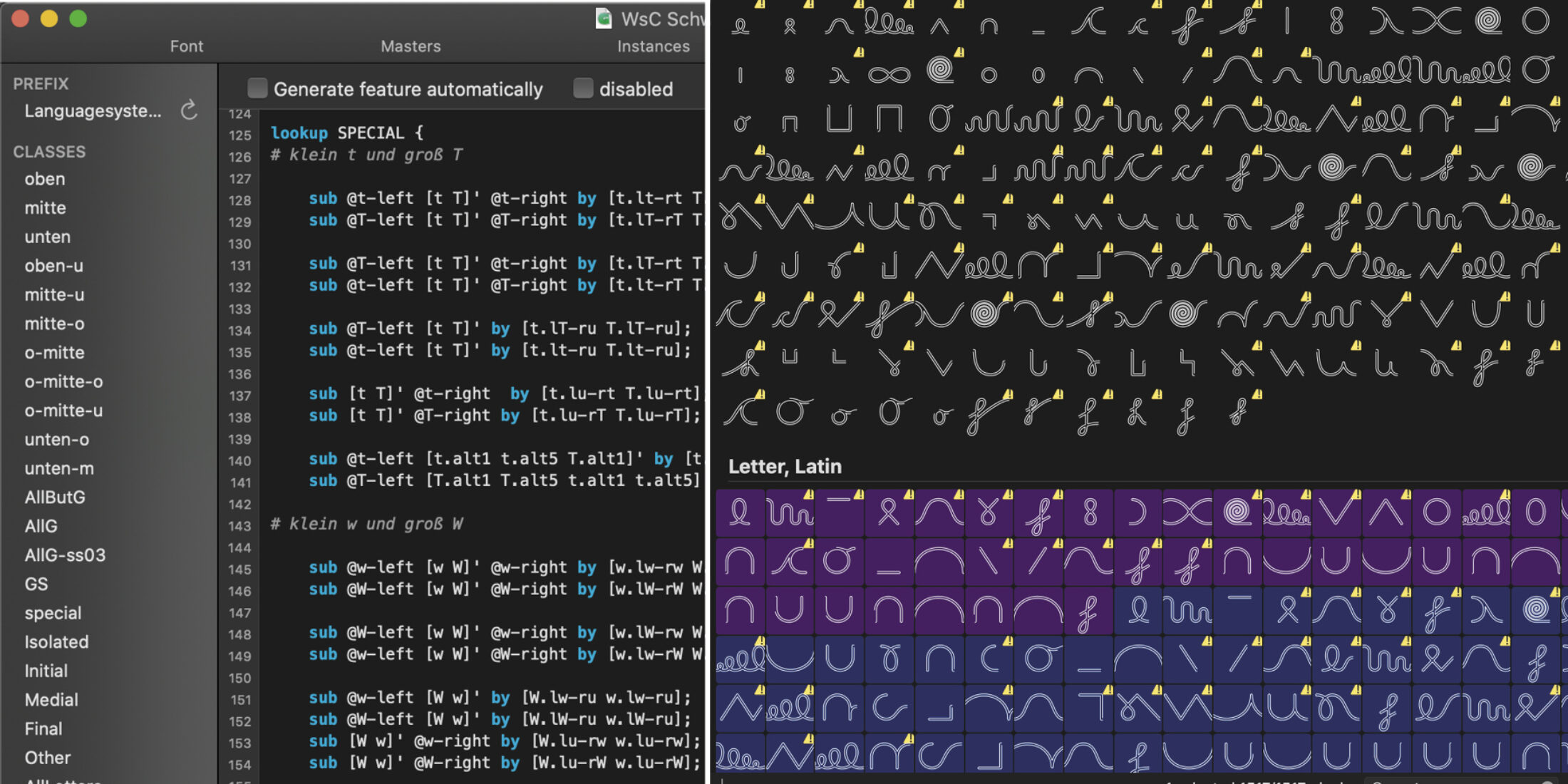
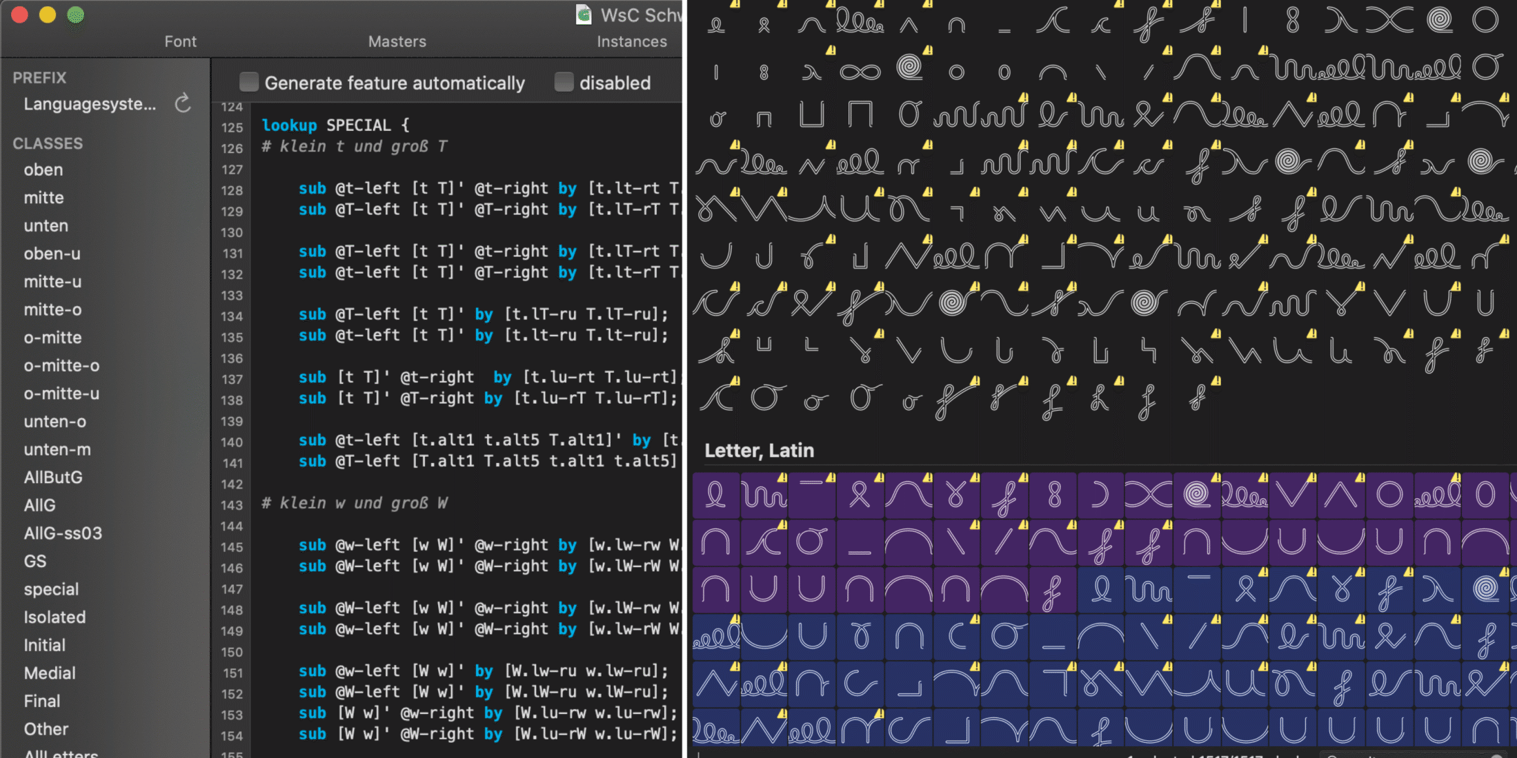
1,500 glyphs, organised into 332 OpenType classes and 734 lines of code are needed to assemble the 66 basic forms of the Swinging Script into a smooth, connected contour line.
Even now, after the project is done, Lisa keeps thinking about how the code could have been simpler — the mind tangle slowly unknotting itself… Either way, the result works flawlessly, technically and didactically.
