An Economical Newspaper Typeface
After being initially released with OurType in 2011, Nils Thomsen’s Meret has been republished with TypeMates. The release contains an update: Meret’s forms and features have been subtly remastered and improved.
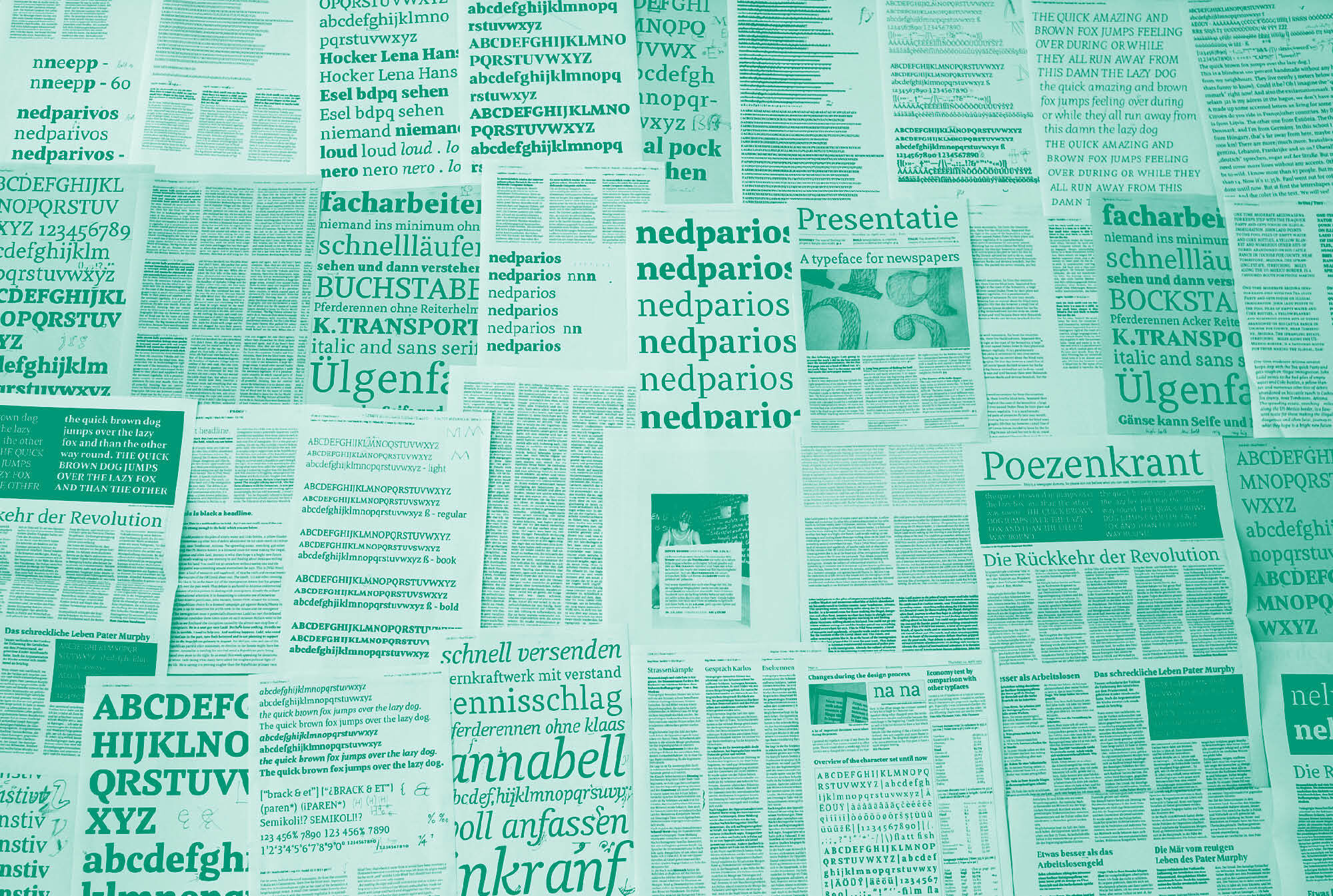
The typeface is an early work of Nils. His approach to design is undogmatic, direct and powered by research, perseverance and using the latest font technologies. Meret, like Pensum Pro, is the fruit of this approach and was first developed as Nils’ dissertation project at the TypeMedia course at the KABK in the Hague.
If you want to read Nils’ thoughts on his design, see early sketches and the research methods he used to make Meret, get yourself a coffee: this is the article for you!
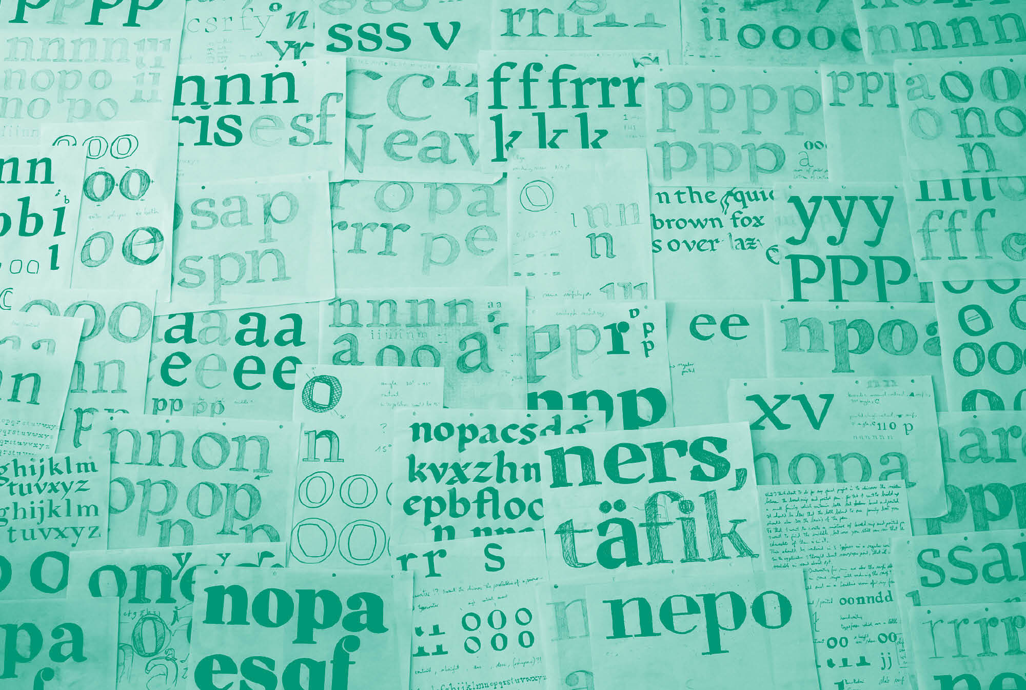
Establishing the basic concept
Let's start with the very beginning: In general I consider that the journey is the destination … But of course there is always an image of the goal on your mind.
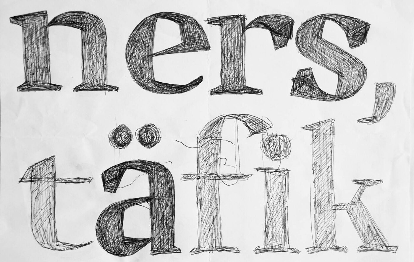
The first idea of Meret in the beginning of my masters at KABK in The Hague.
At the start of the hardcore masters at KABK, one is already under pressure to deliver something very special as the final project. For Meret, there was an initial sketch, which captures the idea of a mixture of two writing models: broad nib and pointed pen. As you can see, Meret does not look like the first idea. Nine months and lots of changes between the first sketch and the final result show that almost all the details were adjusted.
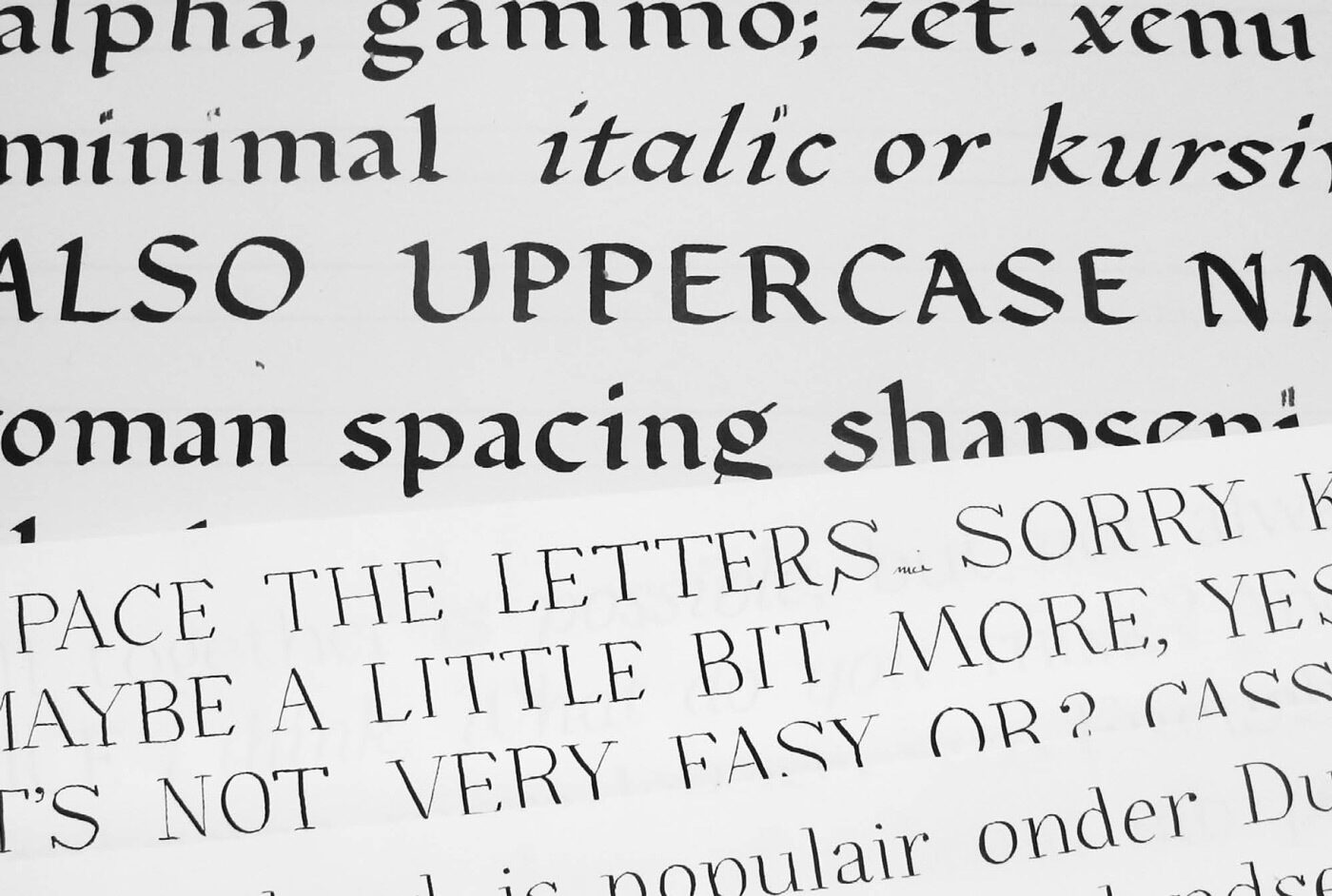
My unfortunate handwriting aka calligraphy. Fortunately, I choose to work digitally!
During these exercises I lost my first image and started a little experiment to find the origin of Meret’s shape. Therefore I set up a little project, which started with three similar but different calligraphic exercises using a classic pointed pen, a broad nib pen and a version in between. The last “transition” version was inspired by combining the two nibs and eventually formed the basis for Meret.
While working, I mostly concentrated on using the round shapes and the 30° broad nib as a contrast to the stable vertical stem of the pointed pen. Have a look at the following sketches to understand my obscure thoughts.

At first I concentrated on o, p and n, always using the three models at the same time: broad nib (1) transition (2) and pointed pen (3). It was difficult to apply the concept of a broken part to the n. It didn’t really work out, so I started to look at the extremes …

Going extreme helped me to comprehend the stroke of the broad nib. This helped to define the right translation and to throw away the angular detail on two of my letter shapes.

My broad nib calligraphy (left) and pointed pen (right) handwriting compared to a digitised version of both models.

Here we are again: (1) the broad nib, (2) the transition version and (3) the pointed pen for comparison. So what did I take from the two extreme masters? The round o got an easy turn, so the heaviest part lay horizontally. The arms of the p got lighter by crossing the stems (pointed pen), while the bowl is inspired by the broad nib including a rounded 30° angle.
Researching newspaper conditions for Meret
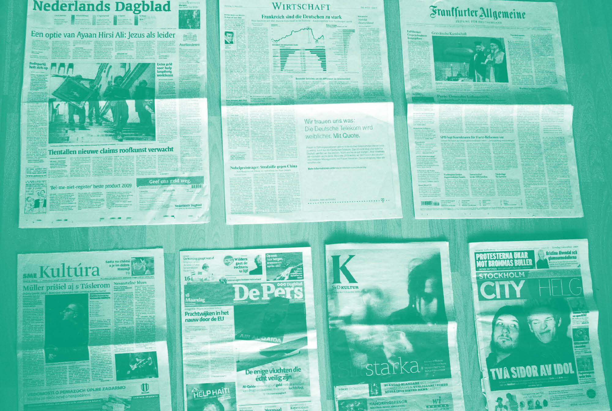
Before continuing to work on the typeface, I did some research on typical newspaper type and the use of such. My research was based on practical tests: learning by doing. Beginning with a collection of newspapers from different countries (The Guardian, Frankfurter Allgemeine, Die Welt, Die Zeit, Süddeutsche Zeitung, sme Kultura, De Pers Nederlands Dagblad, De Volkskrant, svd Kultur and Stockholm City Helg), I started to analyse them by comparing general paper sizes, columns, character of the typefaces, line spacing and how weights are used.
Since I wanted to make a typeface that would work really well in German, I had a special look at German newspapers. They have a rather large format of 400 to 570 mm. On this format I made some tests with different typefaces. I analysed the use of the columns, point size and line spacing and compared English to German, as well as a lot of typefaces on the same grid to see how many characters fit on one page. I did this with the same point size and another test where I adjusted all x-heights to the same level.
Another analysis compared the x-heights of several typefaces. For newspapers, the most used had a rather large x-height which was between 470 units to 540 units.
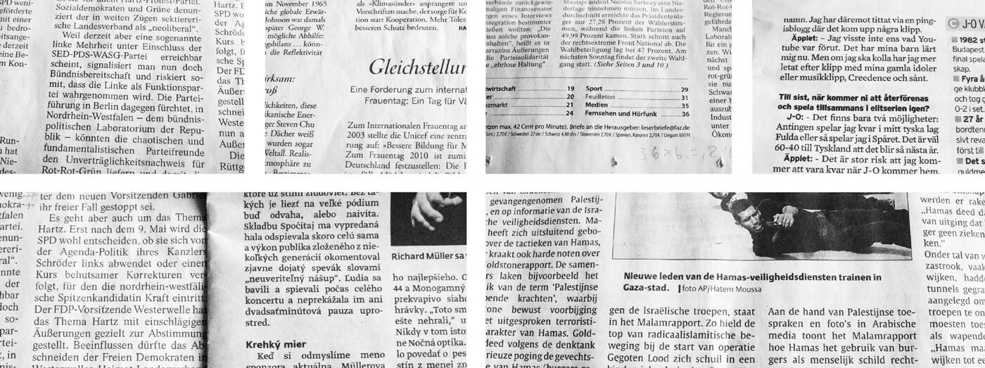
Newspaper analysis of different papers from various countries.

Comparison of various newspapers and their use of text and type.
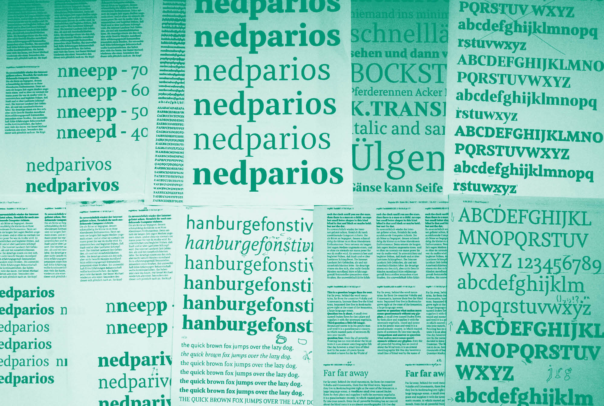
The second part of my research was testing the prototype typeface I had created during the shape studies in real newspaper conditions, and then making it even more economical. Superpolator (a tool to automatically interpolate versions between the two extremes) was the best tool to create different versions of this early version of Meret to get the perfect x-height and width. Going extreme, printing, testing, printing again and testing different tracking, helped to find the perfect proportions to start with. The x-height got slightly higher, the spacing tighter and the shapes more open.
At the beginning of my practical research, I did tests to find out how many characters different fonts could fit on one page: 255mm x 525mm sheets in six columns:
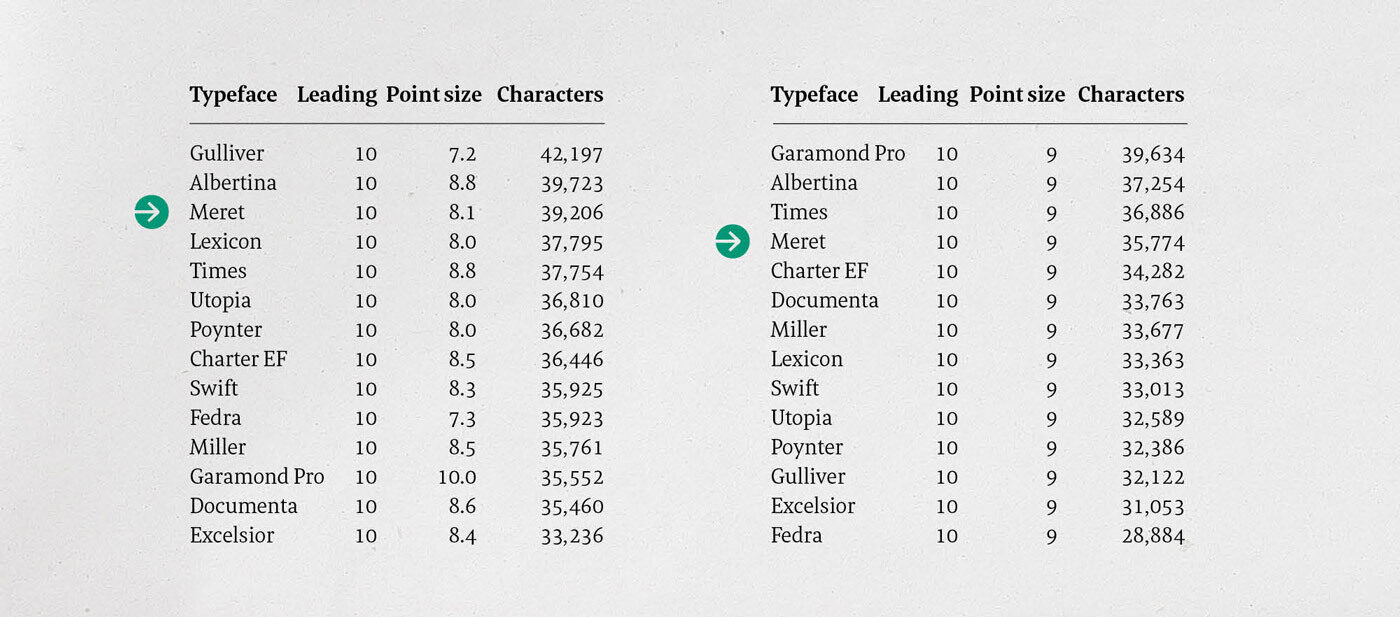
Left: This test shows all faces with their x-heights optically matched to Miller at 8.5pt. Right: Here you see all typefaces with the same point size and how many glyphs will fit on a page.

To choose the right x-height for the newspaper typeface, I did some interpolation tests with the x-height, interpolating between a smaller (440 units) and larger (650 units) x-height. A rough and ready prototype, the version with the larger x-height was created by scaling, without any corrections, to have a quick sufficient research. The results were used to set dummy texts (see below).
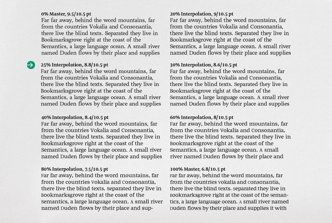
To check if the interpolations really worked in context, I printed comparisons of the different x-heights. Here you see various point sizes set to have an optically matched x-height and 10.5 point leading. The marked version felt best to me.
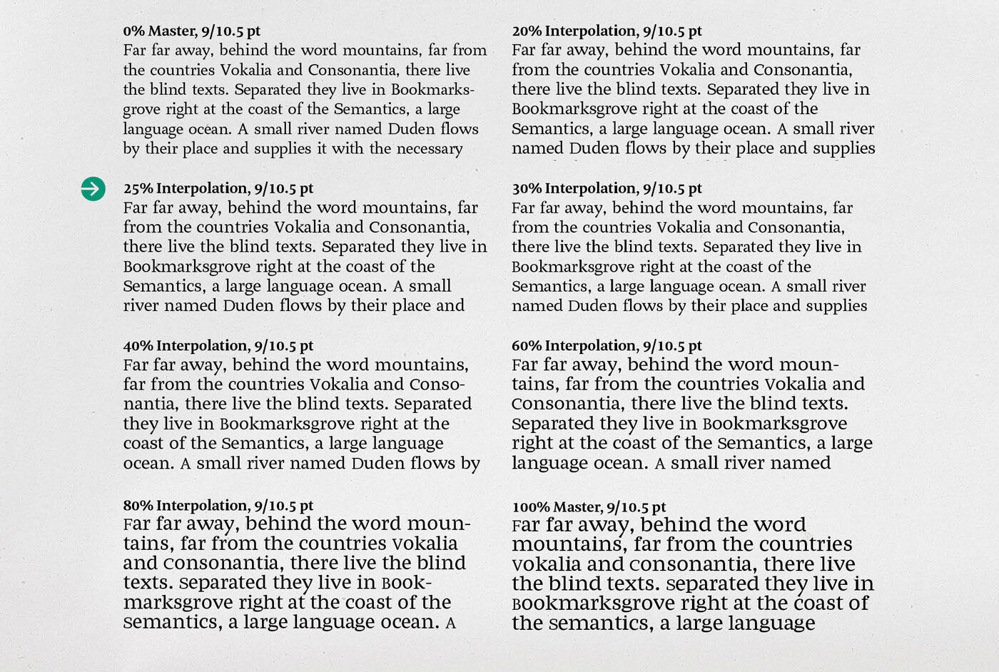
This shows the same fonts, but this time with the same point size and leading: going from a tiny x-height to a large x-height, you can see an enlarged x-height lets a typeface appear bigger, obviously. After a lot of interpolations and printed tests, I felt the marked x-height of 489 units was the right choice for comfortable reading.

Because the early version of Meret (2) still seemed too wide for economical text setting, a tighter version was created by scaling (1) and then I did second set of interpolations to achieve the right width.
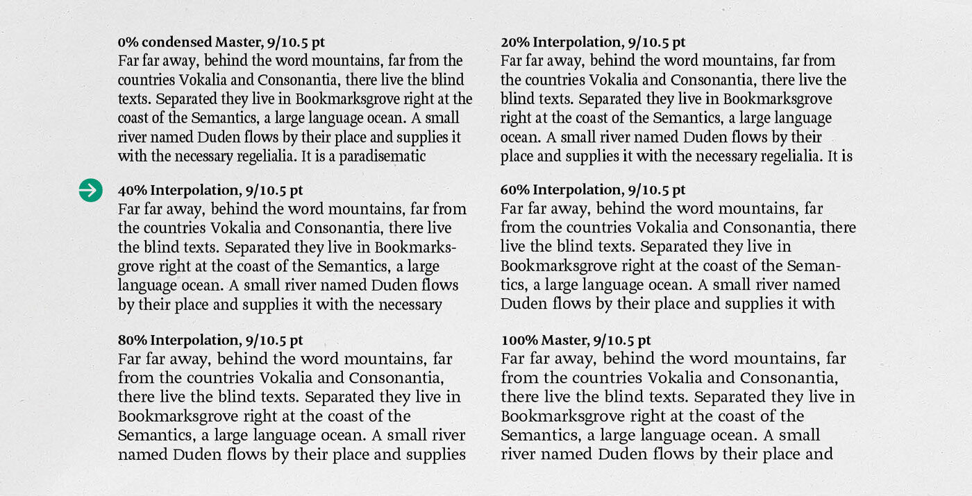
Here you see the already researched x-height paired with interpolations between the narrow and the wide widths from the previous image. To get a more compact and economical typeface, the 40% interpolation turned out to be the right direction to follow. But I had to add 25 units in tracking to open up the narrow spacing after interpolation.
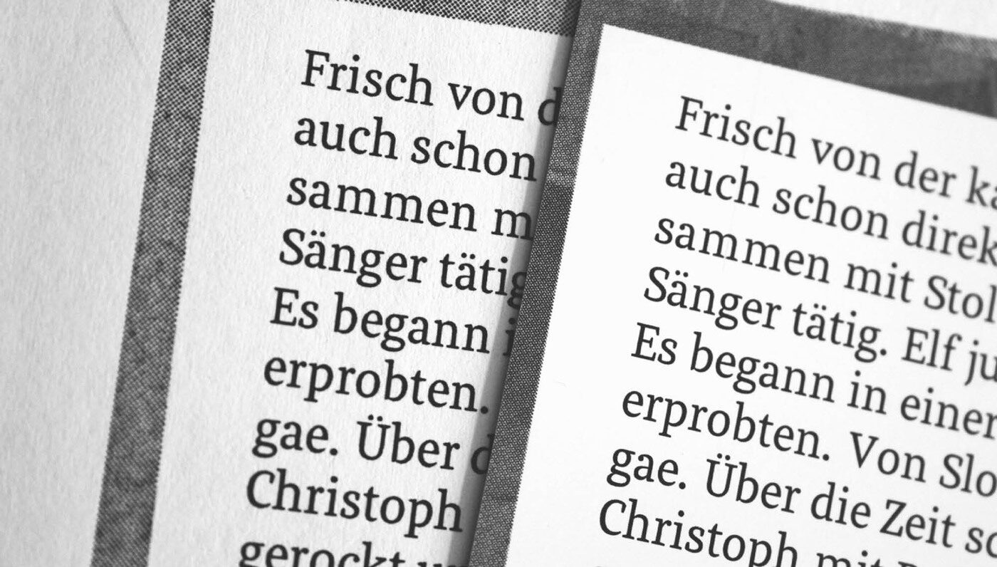
Offset print at flyeralarm.com (right) in 8.75 points and 10 point leading compared to the same file digitally printed at the KABK printer (left). In this photo, it is not really obvious, but the offset print was much lighter than the laser print. This brought me to the idea of having a book weight, giving the user a way to choose the right grey value for text.
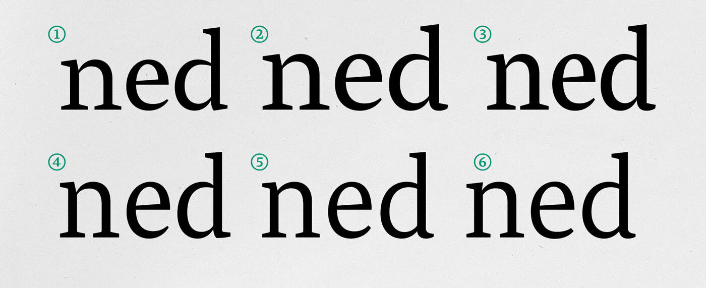
Changes to Meret while the design process was focussed on optimal proportions: First the very early transition version (1), then a version after the x-height interpolation (2), plus the more narrow status quo after the with explorations (3). Then I added more tracking and corrected stems and serifs (4) and after my experiences of offset printing, I lowered the contrast by adding weight to the thin parts (5). And finally, the final version of Meret in 2011 (6).
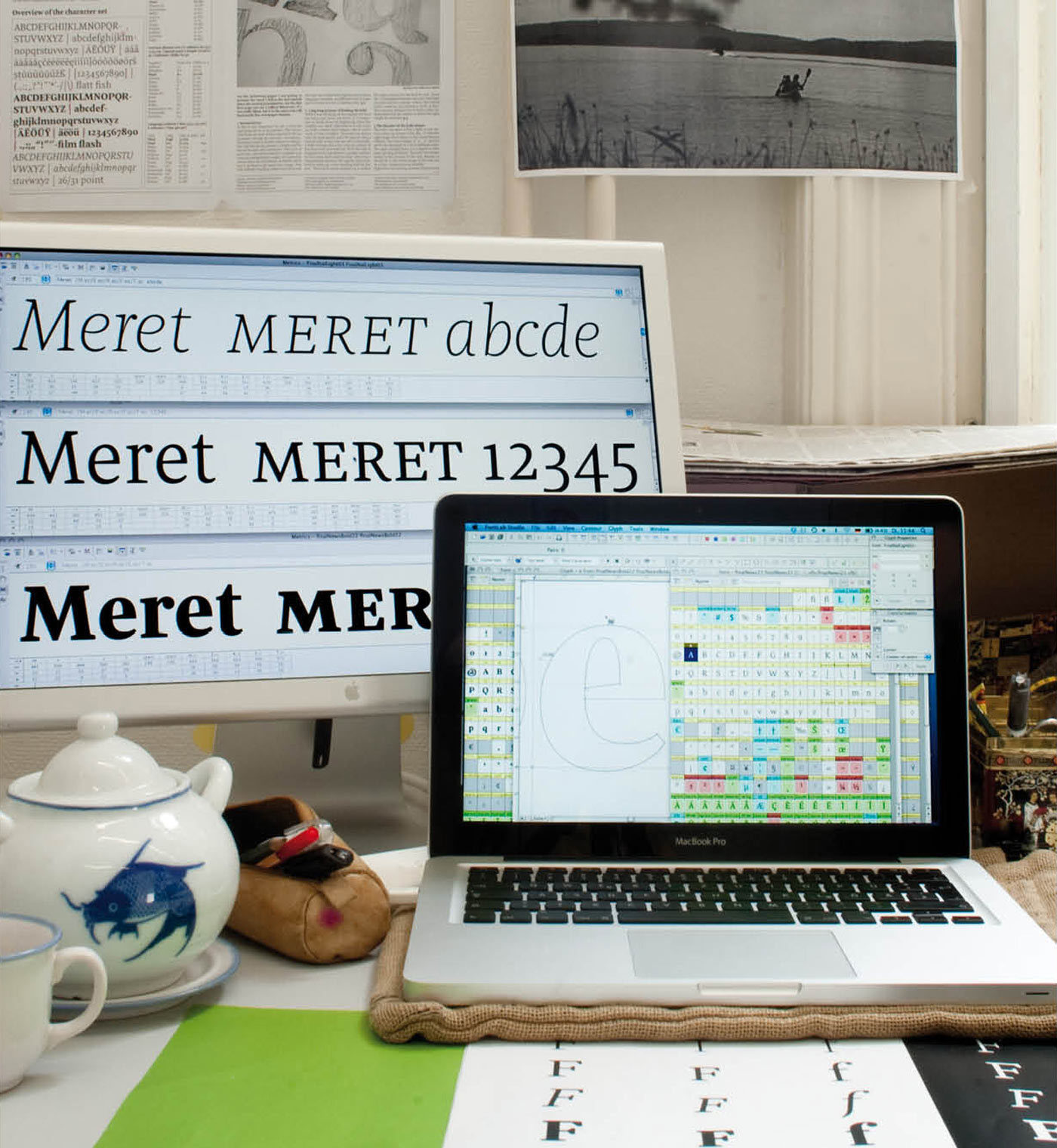
Phew, this was tiring, all those interpolation variants. Time for a tea at my working space at Type and Media at KABK the Hague …
Finalising the KABK Meret
Inspired by the broad nib and pointed pen, I had a clear idea of what Meret was going to be. A narrow lowercase with consistent proportions and high x-height to work well in tight columns like newspaper or magazines. Small and narrow caps to give enough space for possible accents and to be as economical as possible; and wide small caps to set elegant headline.

Tight and compact uppercase, elegant and wide small caps, narrow shapes overall for tight columns and strong diacritics for small sizes.
Overall, the look was clear and rationalised. Strong, straight and simple serifs got combined with round ball terminals to bring silent power. I just had to expand this into a working typeface. And speaking of ball terminals and simple serifs…
Consistency and Details
Consistency played an important role in my design process. In a way I wanted to build up a very consistent typeface family but I also wanted to break this consistency in some points.
To break the rules I started to make four different terminal endings without destroying its charm in working well together. Terminal letter shapes are for instance the a, c, f, g, j, r, s and y.

Comparing the a and, j or y and j: different endings for terminals.
Consistency is also visible in details like the ink traps and the endstroke of a, d and u; compared to the italic letter shapes end strokes.

Kaudi, smart little details to connect the Upright and Italic. But have a look at the bottom part of a, u and d, aren't they super consistent? I will return to the italics …
Would Four Text Weights Be too Many?
Newspapers are often a short-lived product and that means they are usually printed on poor quality paper with a super fast printing technique. Normally, Meret’s regular is strong enough and works well, but on some papers it might need more power. Therefore, along with all the other weights Meret would need for complex typography, a book weight was needed. As text sizes and lining space also play an important role in perceiving page colour, there is also a light and a medium weight.

The first sketches of the bold were made by hand to think about the problems which will come up. But the rest of the bold was mainly drawn digitally.
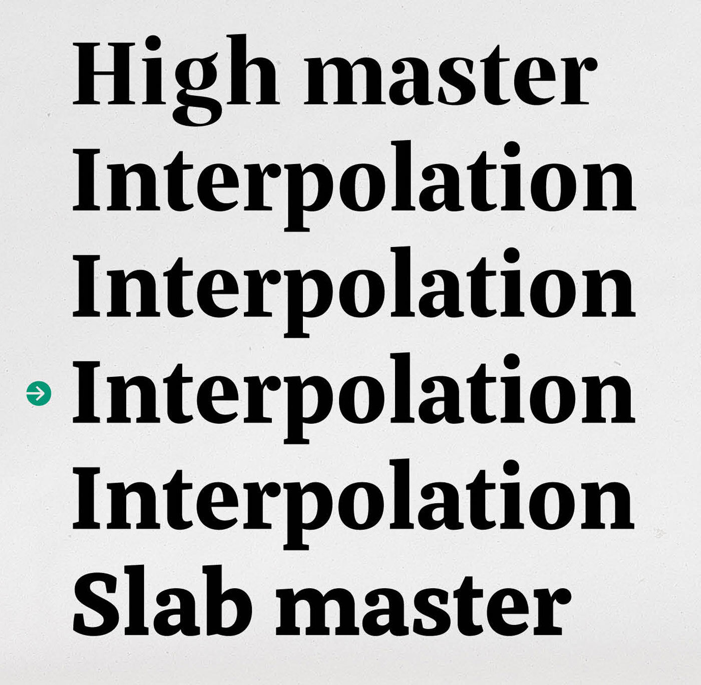
To achieve a proper bold I made a high contrast version and a slab lower contrast version for interpolation. Comparing the high contrast bold master (on top) and the bold slab master (at bottom), the 60% interpolation seemed to be the right one.
With eight consistent weights from ExtraLight to Black incl. four text weights and three bold weights, this straight forward Roman needed a simple and modest Italic for gentle emphasis.
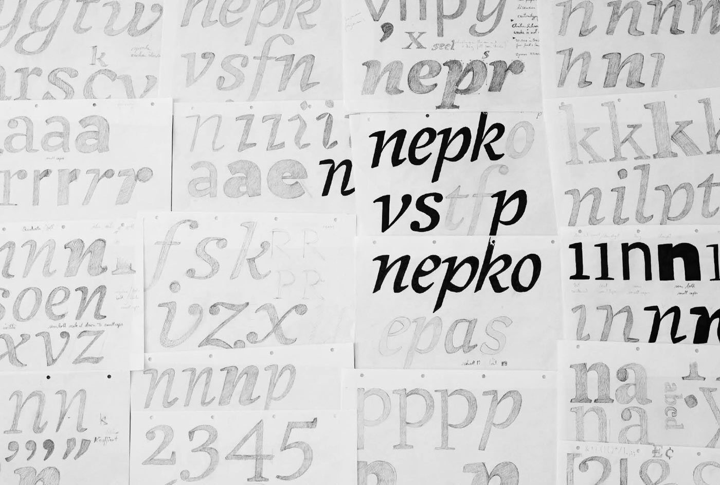
Various sketches to collect an idea for the Italic.
Italic: the Long Process
The Italic was more difficult than I first thought. In its 26 lowercase shapes there was another complex typeface at least. It was all about finding the right shape to work with the Upright: fluent and minimal. As it developed, the angle of the Italic changed from 15° to 9° which was very helpful for spacing some problematic letters like the lowercase r. Sharing similar serifs helped to connect the Roman and Italic.
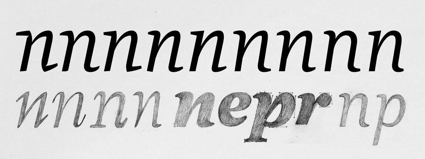
The top row shows the process of the Italic, from the first and fancy digital sketches (left), to the latest version in the most significant steps. Meanwhile the second row shows just some romantic pencil drawing to get your heart beating a little faster.
Are the Figures too Big? Where Are the Serifs?
In newspaper settings, figures need some extra power and I wanted to design them strong for text and clear for tables. Therefore I drew the standard figures a bit bigger, a height between the uppercase and normal oldstyle figures. To stay simple in tables, I decided to cut off most of the serifs and terminals of the figures.
Meret’s almost serif-less figures come in five styles, each with matching tabulars. For tiny text sizes, I drew the default figures slightly taller than the x-height; making them strong enough for tricky conditions and unobtrusive enough. And, of course, there are also lining figures and (for romantics) classic oldstyle figures.
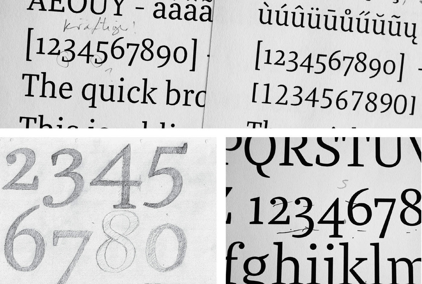
Some sketches, prints and corrections during the process of finding the perfect figures with as few serifs and terminals as possible.
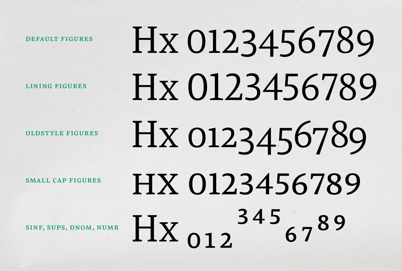
Default figures, lining figures, oldstyle figures, small cap figures, superiors (tabulars of all figures are available, too).
Naming the Typeface
I wanted the name for my typeface to be short and silent but with some power in it. I decided to use only the vowel e because this is the most used vowel in most languages. This made the name silent. The power came from the letters r and especially t in the end. The name starts softly with its M but ends strongly. All these features in the name can be transferred to the typeface. It is a silent or minimal typeface with a lot of power in its consistency.
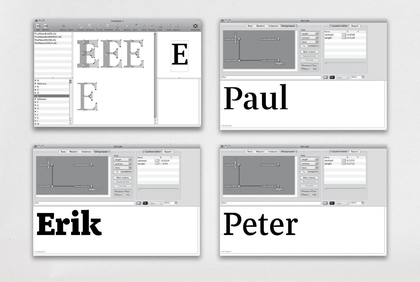
Screenshots of Prepolator and Superpolator. Having fun by shifting the font between three masters and sending kudos to my KABK teachers along the way.
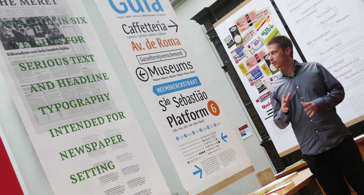
Final presentation at KABK. A heavy 30 minute talk without any digital presentation about all that nerdy shit you just read about!

From 2011 to 2018
Since starting TypeMates in 2015 and diving into marketing typefaces, I have been dreaming of having Meret in my own foundry. Finally at the end of 2017, after eight years of flexing its muscles at the fabulous OurType.com, I took the chance to republish Meret at TypeMates.com. With that chance came the opportunity to remaster Meret.

The revisited e and decorative ligatures are new to the 2018 version of Meret .
But how much can you improve the shapes, spacing and features of a design that is so used and tested? I made a comparison between the early KABK master Meret, the 2011 OurType Meret, which had a lot of valuable improvements already, and the idea of Meret I now carried in my head.
For the e, I came back to a shape from my very early design. The weight spectrum was extended with the addition of the initially planned book weight. Some more letters like s or c got tiny improvements, in particular the diacritical marks and punctuation were redrawn. Further the capital ß — as endorsed by the Council for German Orthography in June 2017 — was introduced to Meret, as well as nice discretionary ligatures.
For the figures I decided to change their default encoding: the enlarged oldstyle figures are standard now. All other variants are easy accessible via OpenType features. Additionally, the tabular figures were tweaked to improve their fitting in all weights.
And last but not least, as I do in general with my latest releases, I added some arrow variants, ornamental quotes, geometric shapes to provide a palette of helpful icons.
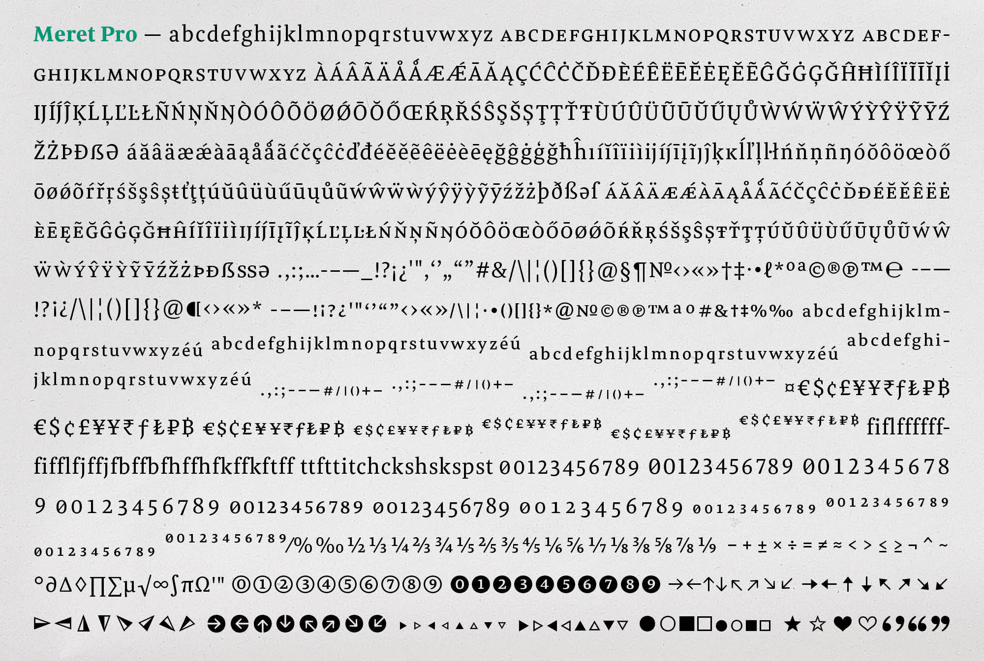
Complete character set of Meret including above 1100 glyphs, genius OpenType features and too many figures.
So Meret got an overhaul, but not a massive one. It matches the qualities of its initial release: keeping the used and tested design, but improving what had to be improved.