Making of Cera Brush
Handmade fonts are pretty hot right now, but for the brushy version of his geometric Cera Pro, Jakob Runge didn't want to use digitally printed or distorted effects – only handcraft.
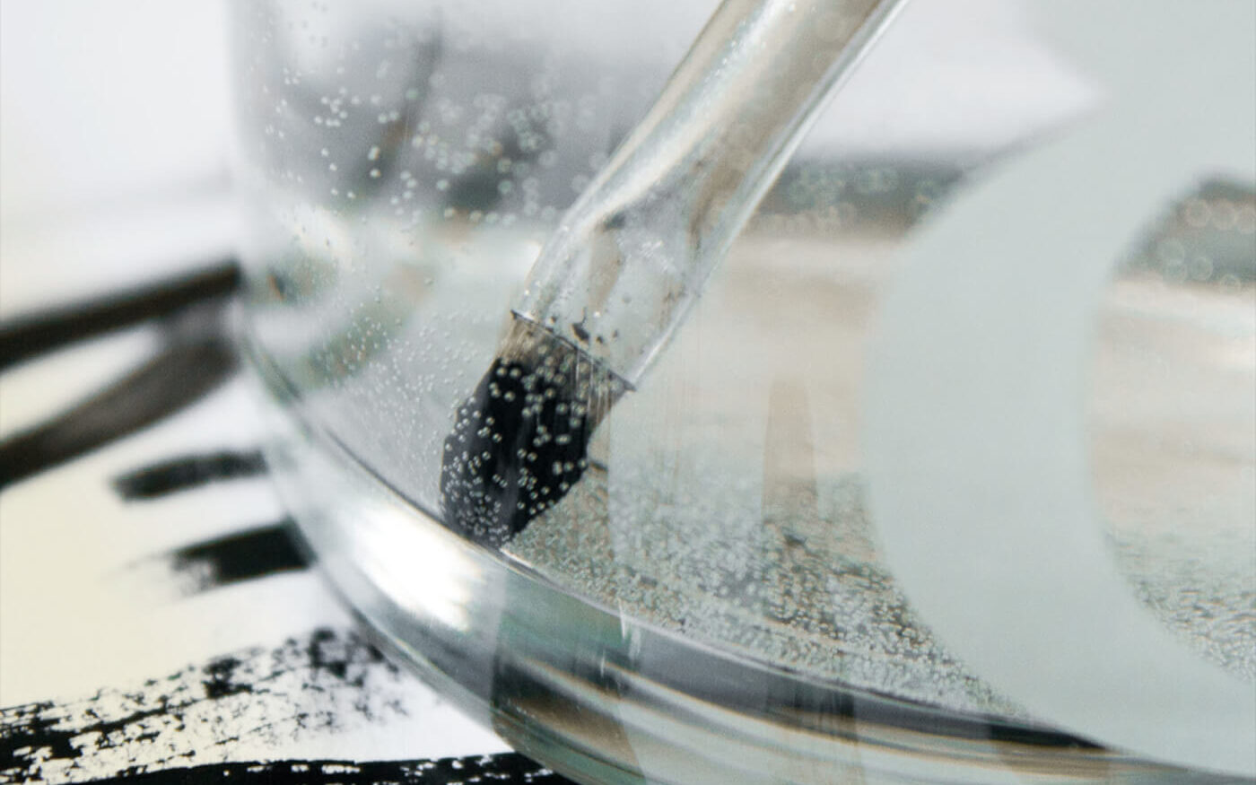
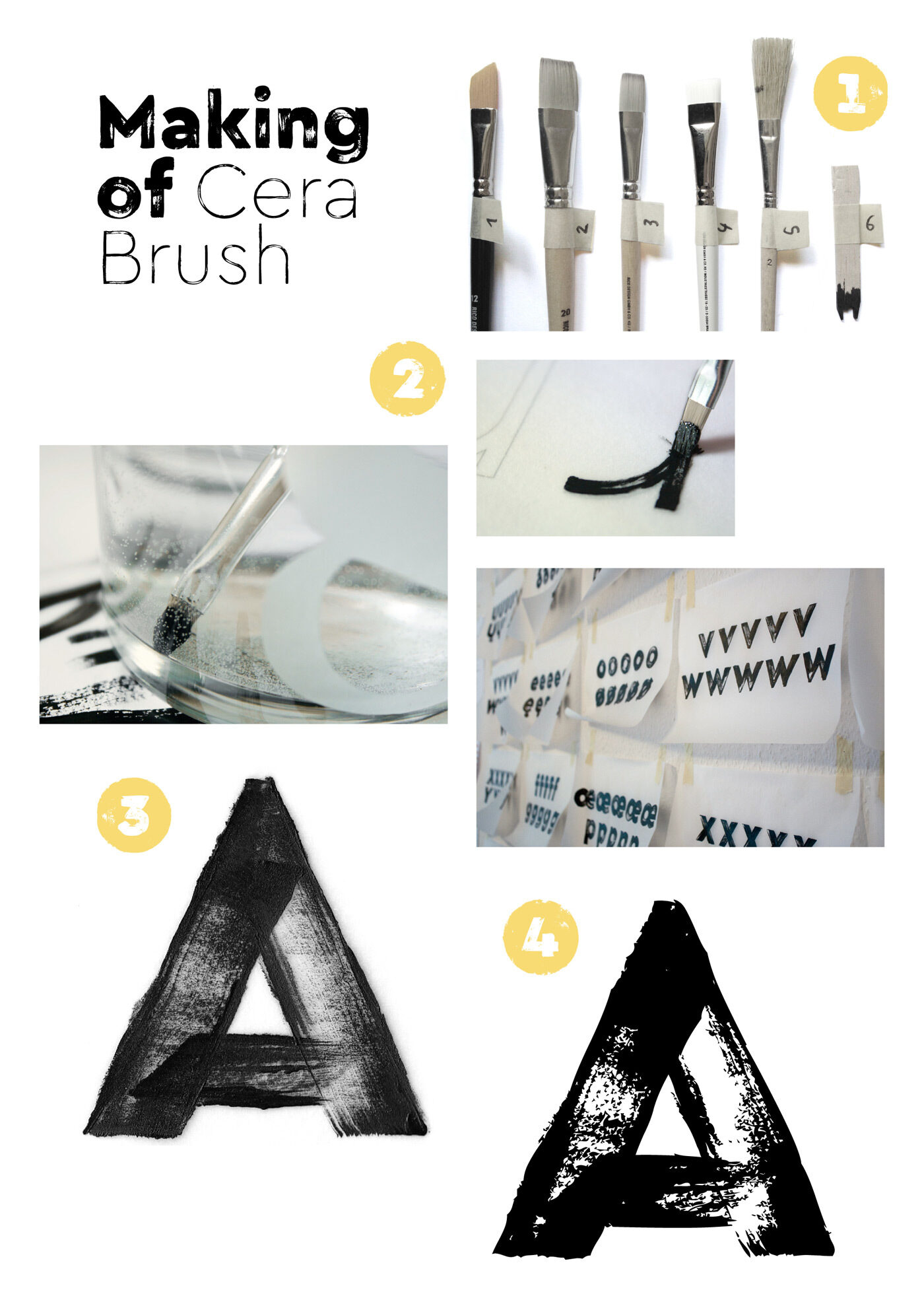
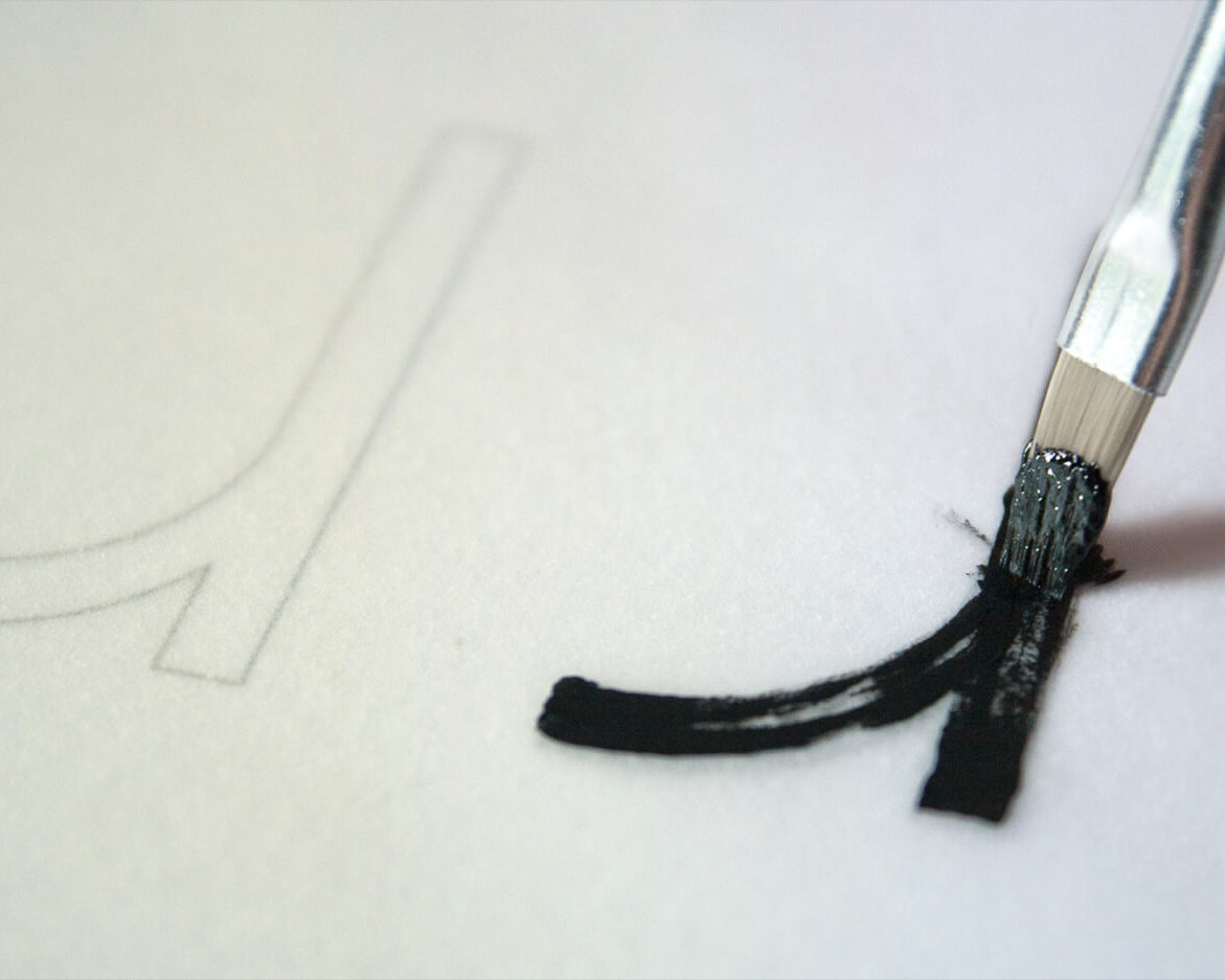
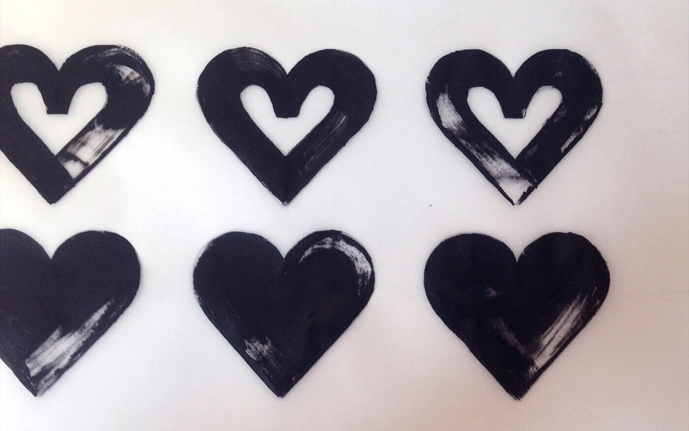
This handwork is by Max Kostopoulos from Hamburg. He has always had a strong focus on analogue design techniques as taught in type design workshops together with Jakob. Several versions of letters were drawn with different brushes, and some studies on the optimal conversion of the analogue greyscale images into monochrome vectors were necessary to realise Cera Brush. Last but not least, OpenType code was applied to the typeface to digitally imitate the natural variation of handwritten letters.
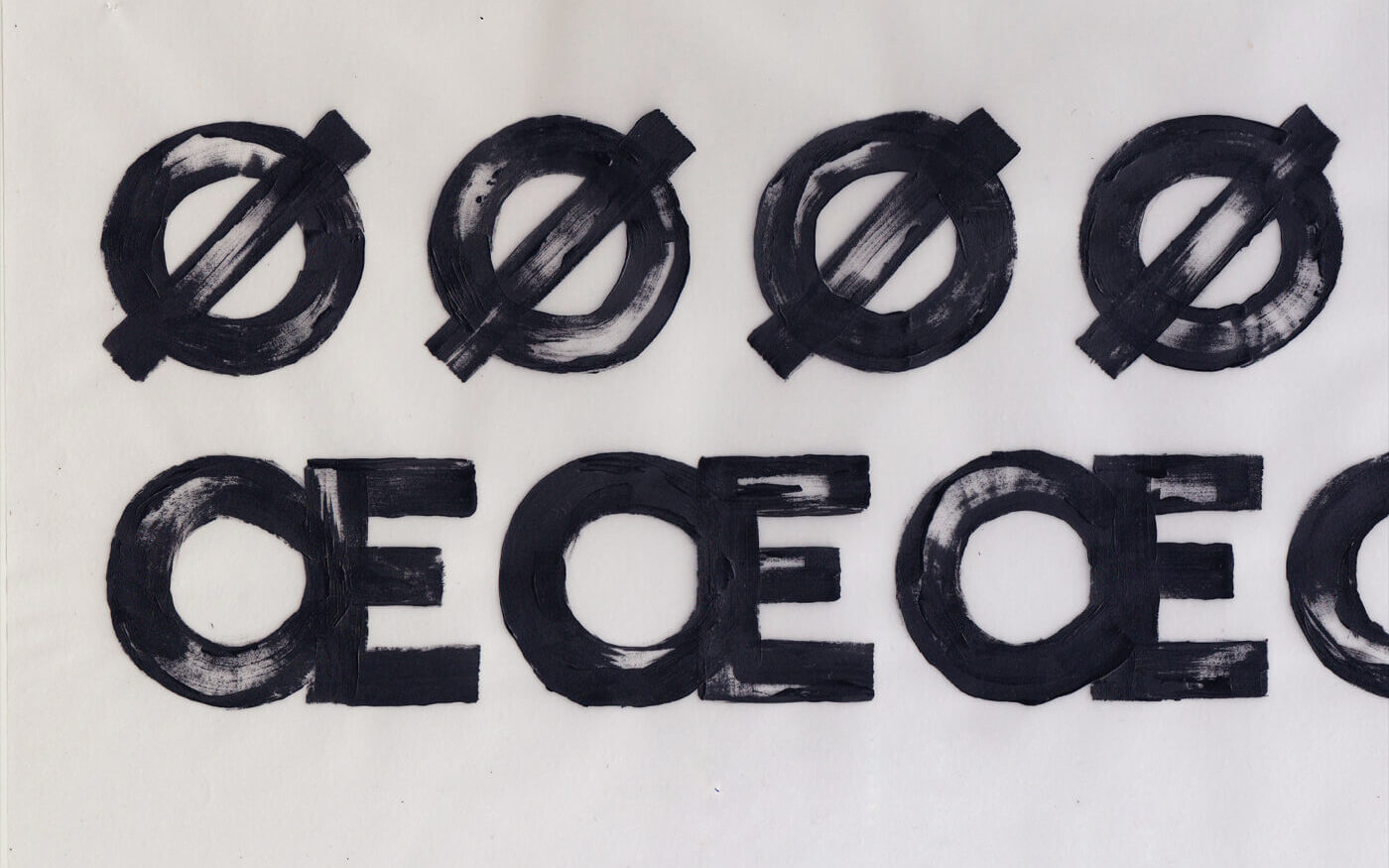
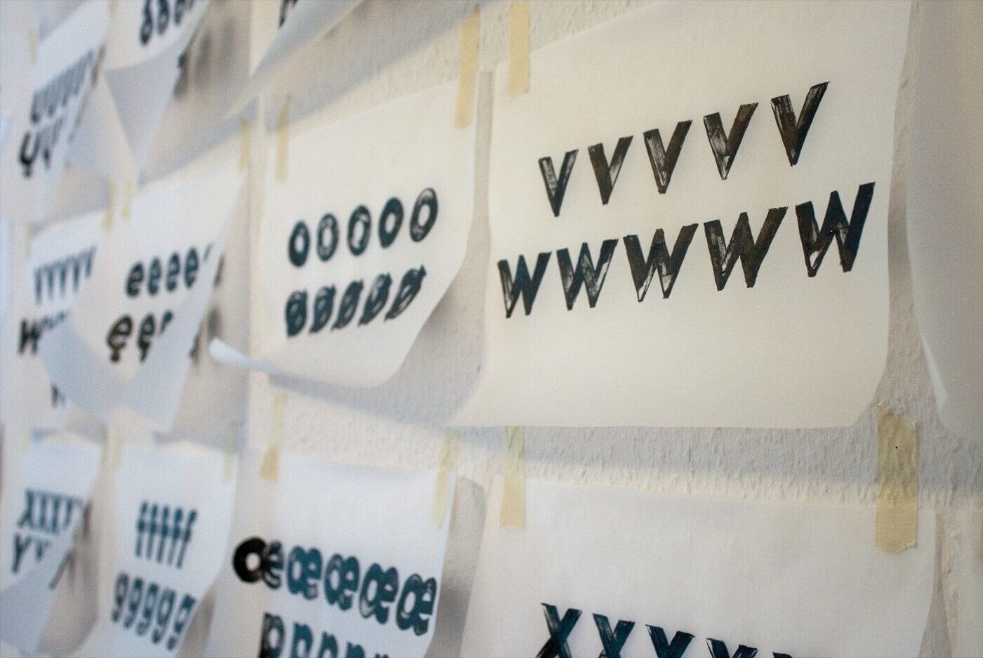
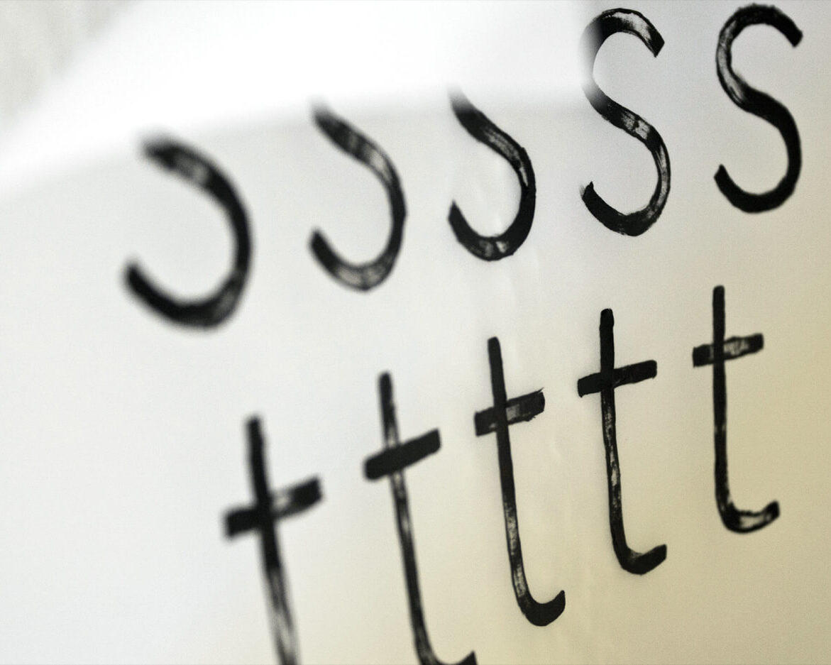
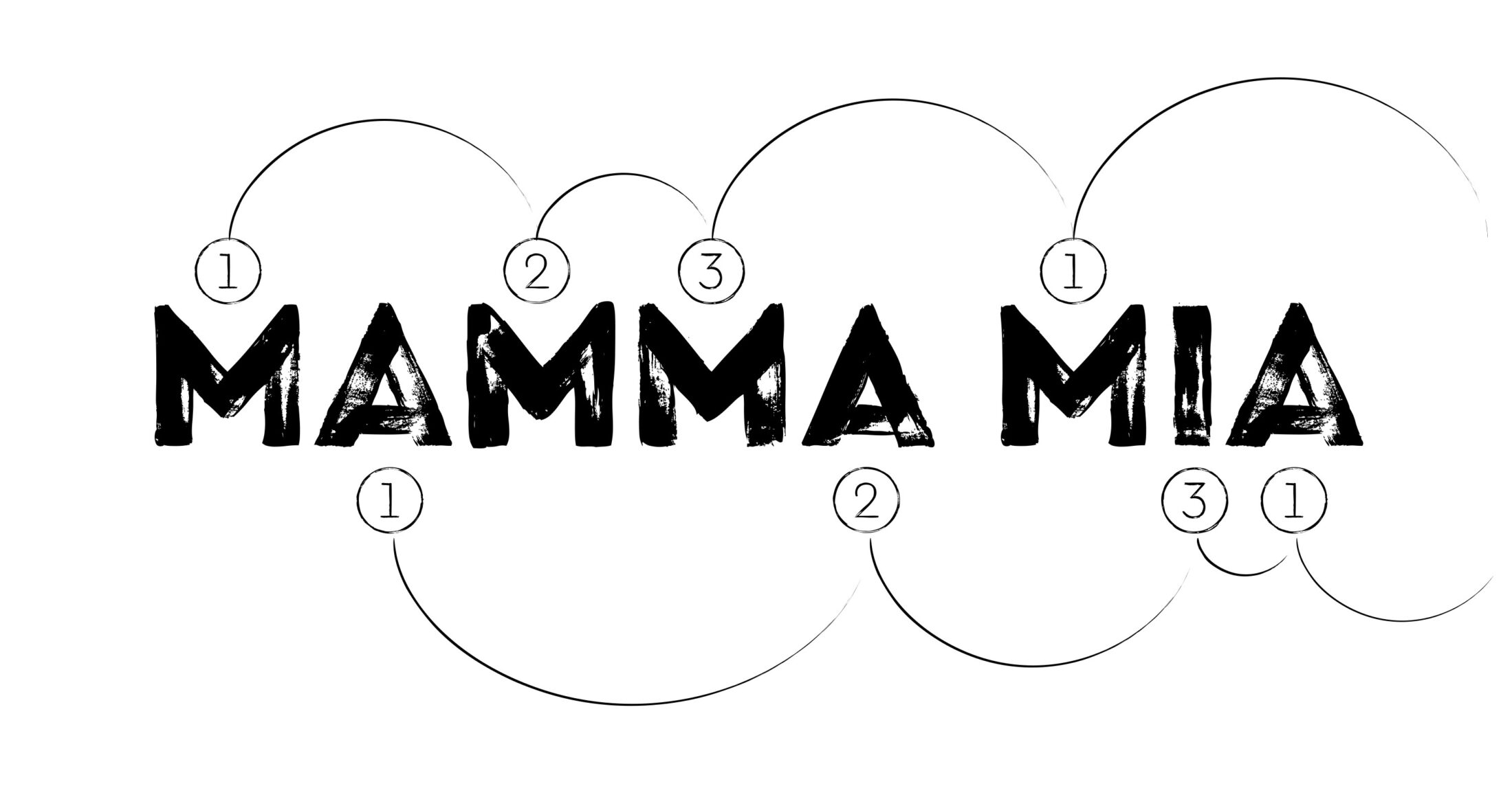
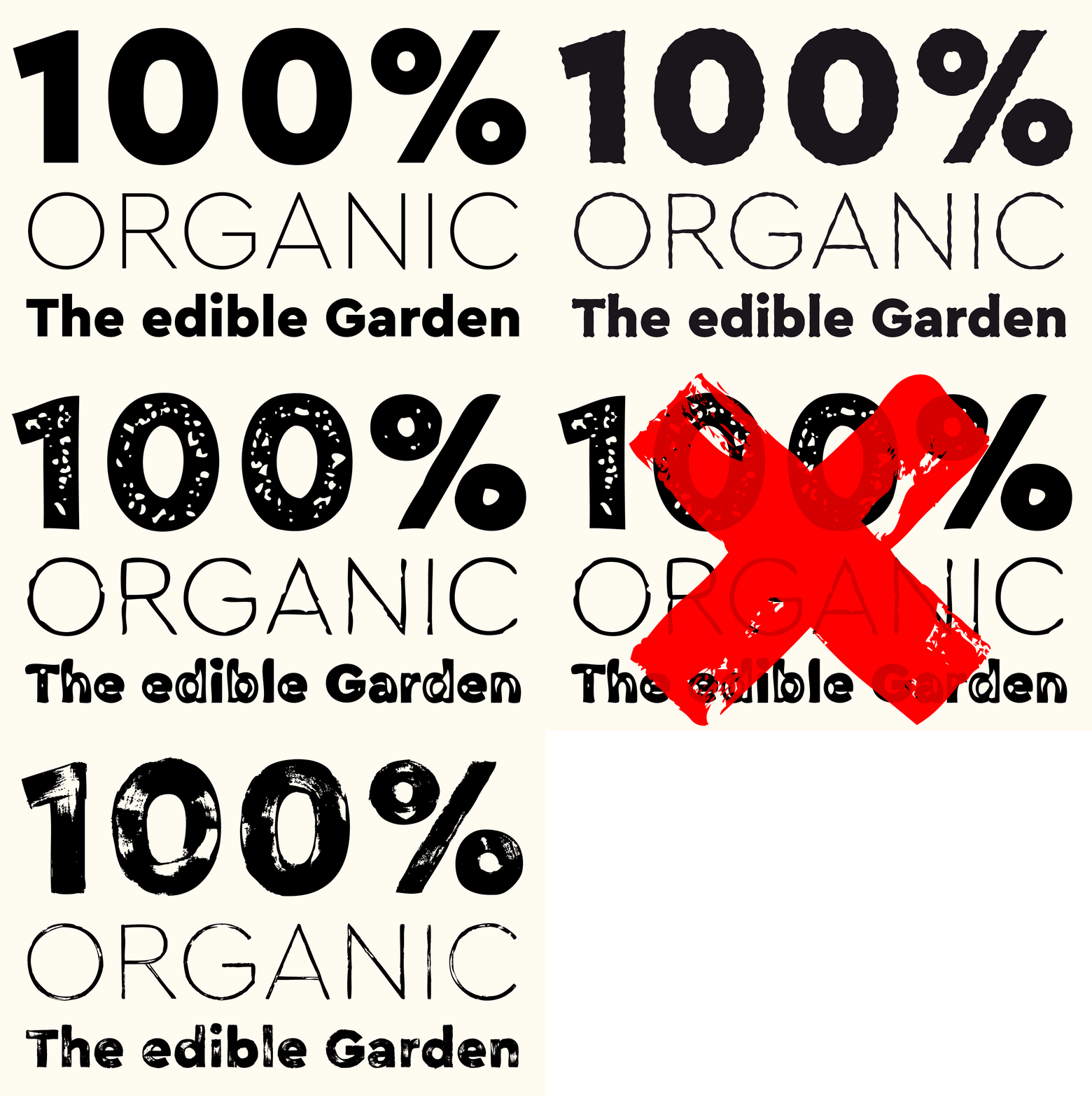
Cera Brush works with two sets of three alternatives each, which rotate for more authenticity. The best part is, their OpenType feature “liga” is standard in most applications.
