Make it Different to Match
Literally, a Bridge connects inaccessible paths and brings things together that wouldn’t normally be connected. Here you can find out how Mona Franz’s Bridge Text and Head are connected by a similar ideas but go different paths in their design approaches.
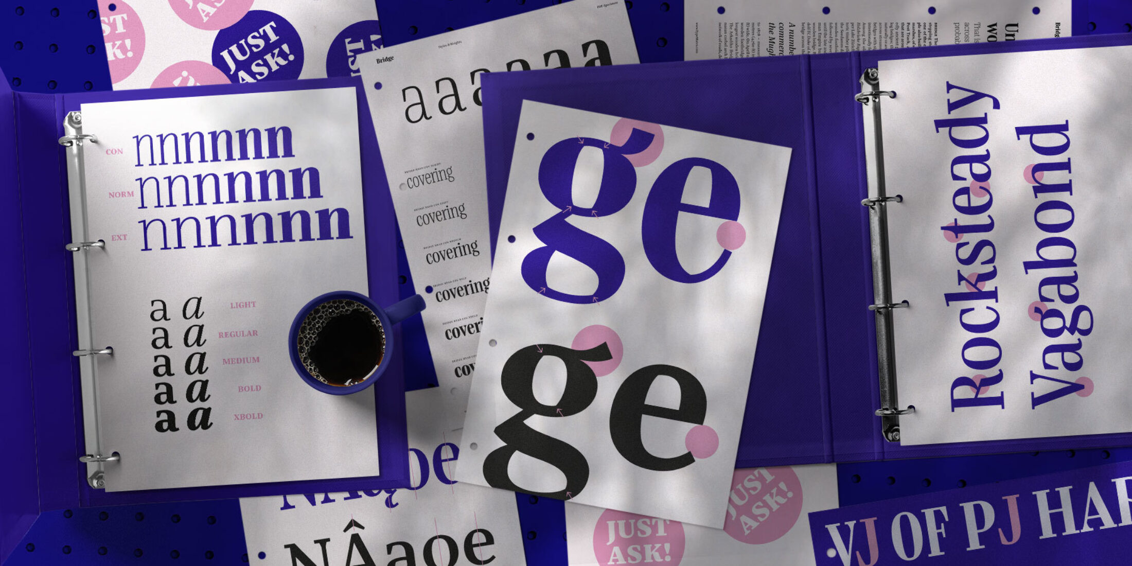
Unlike other superfamilies, Bridge Head and Text are distinguished by more than just optical corrections. With this editorial type family, Mona Franz wanted to create a tool that meets the user needs in a different way. With Bridge Head as the rock star and Bridge Text as the expert drummer, the typeface ensemble creates a confident and edgy typographic sound. Like a band, each member plays a role. They share common ground, but expressing themselves independently to fit their purpose.
Differentiating in Dimensions and Proportions
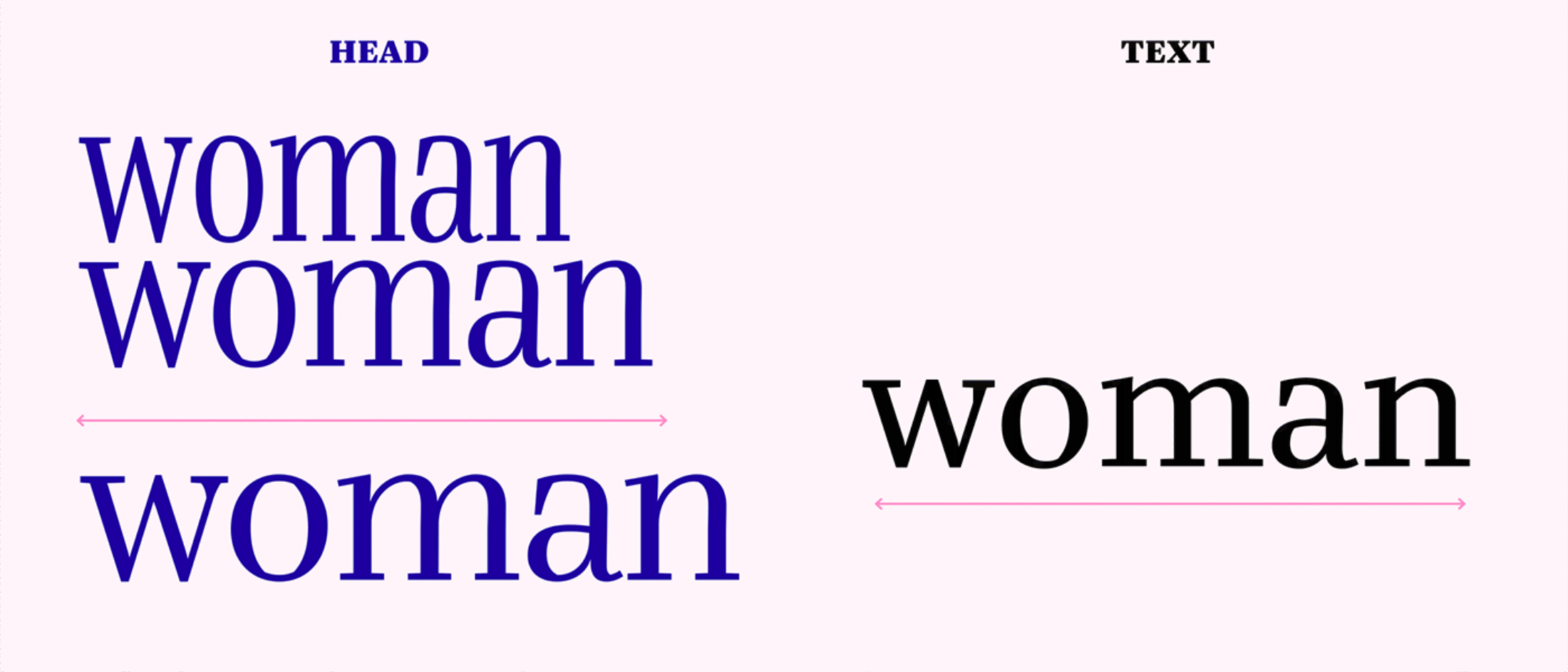
Whilst a textbook would say that typefaces for headlines have smaller x-heights than text styles, Mona found it doesn’t hurt if you give the display styles an even higher x-height! Bridge Head creates a striking look when filling white space. Reading on screens made us more accustomed to larger x-heights, and that is why Bridge Head’s exaggerated approach feels modern.
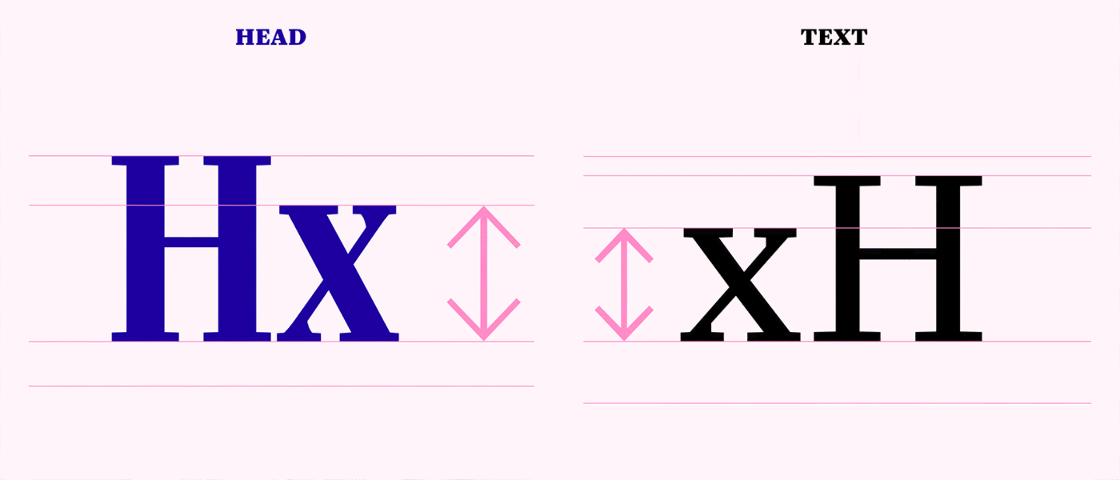
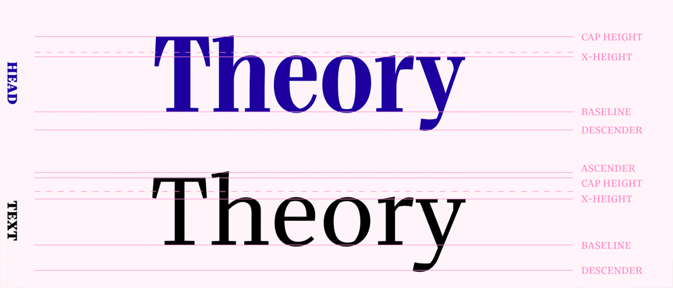
With reduced ascenders and short descenders, Bridge Head allows for tight line spacing and super compact headlines. Bridge Text takes a rather conventional approach: open apertures are combined with a generous x-height and larger ascenders and descenders for improved legibility.
For smaller sizes, Bridge Text’s narrow proportions strike a balance between achieving efficient use of space and legibility in smaller sizes. With three different widths, Bridge Head is multifaceted: you can choose between narrow, narrower and even more narrow ツ
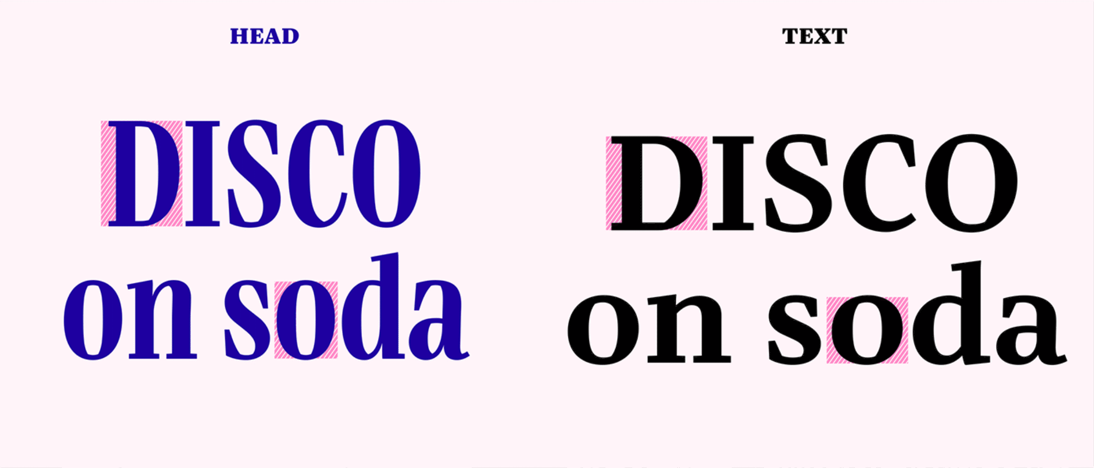
To emphasise Bridge Head’s tighter spacing, the round characters are squarer and more consistent. This is one of the biggest contrasts between the display and text versions as letters intended for longer reading need greater differentiation.
Differentiating Contrast and Construction
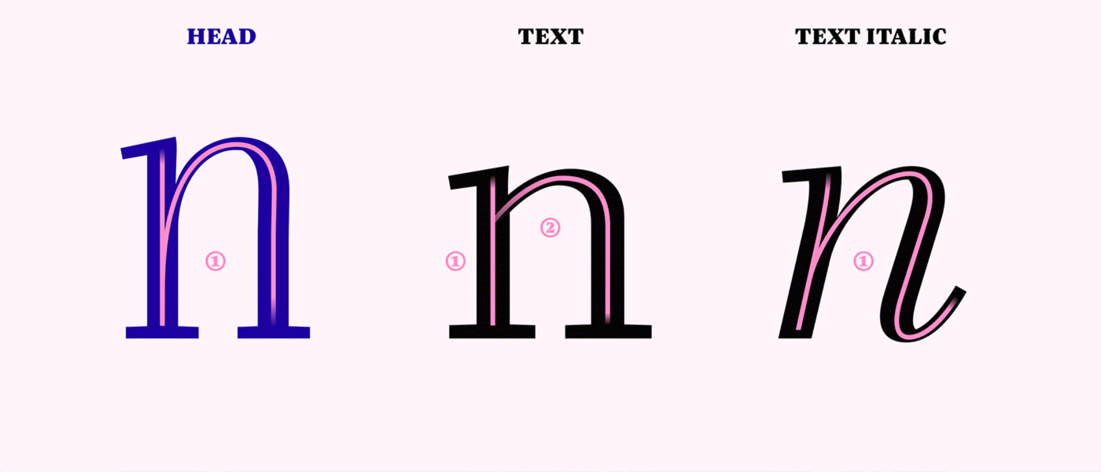
Bridge Text has a visible but moderate contrast between thick and thin lines. Bridge Head, on the other hand, is a rebel. Against conventions established in early metal type production, her “hairlines” stay strong for an edgy and confident appearance. While those classic conventions are meaningful, for Bridge there was no need to follow them and create a super-thin hairline version for large sizes.
Unlike many other superfamilies, Bridge Head and Text are distinguished by more than just optical size adjustments. Bridge Head’s builds on forms that would be created by an uninterrupted pen movement. By contrast, the interrupted construction of the text version offers clearer counters for smaller sizes.
Differentiating in Letterforms and Details
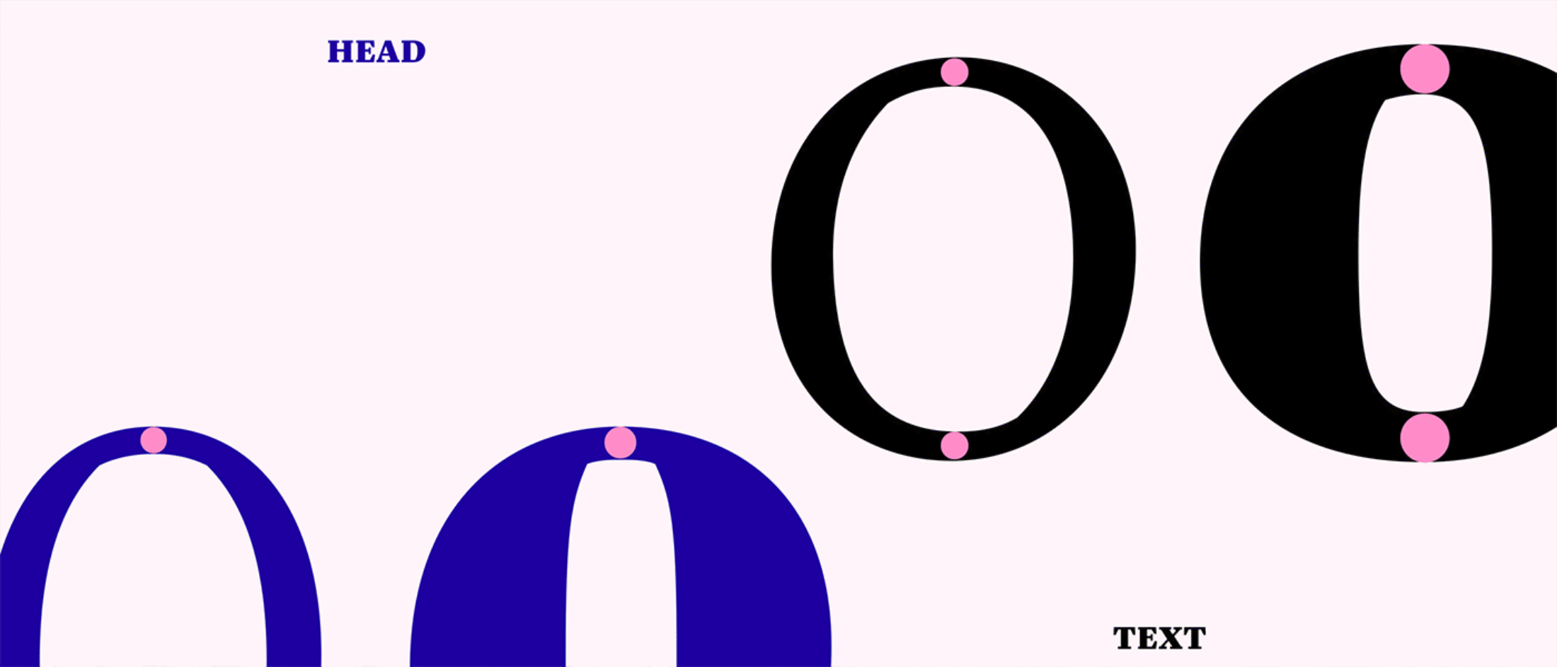
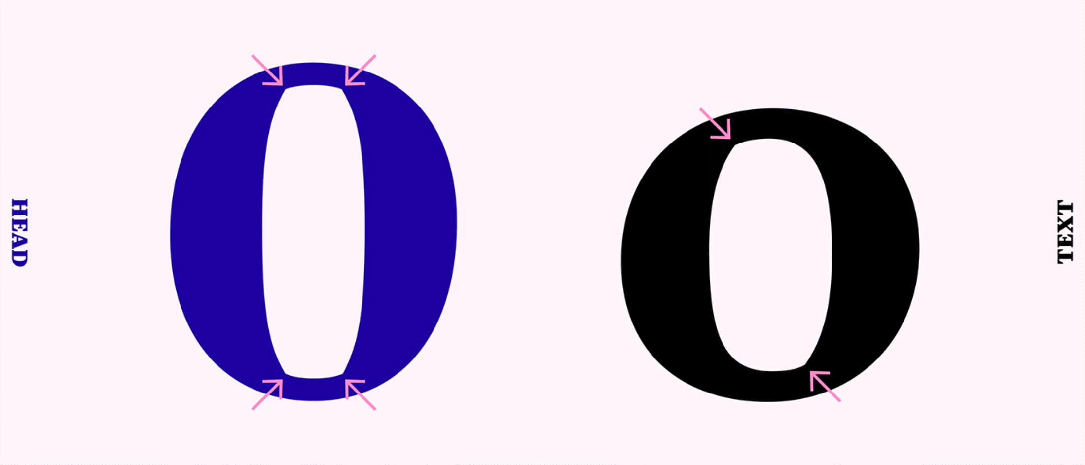
Typefaces exist to serve purposes. In this spirit, Bridge’s letters and details are designed in different ways. Bridge Head should attract attention, whereas Bridge Text needs letterforms that are simple, open and natural in order to work well in body text. Generally speaking, the four corners of Bridge Head’s counter spaces (like in o) give a sparkling, symmetrical appearance. The two-cornered counter shapes in Bridge Text are calmer and their asymmetry emphasise the reading direction.
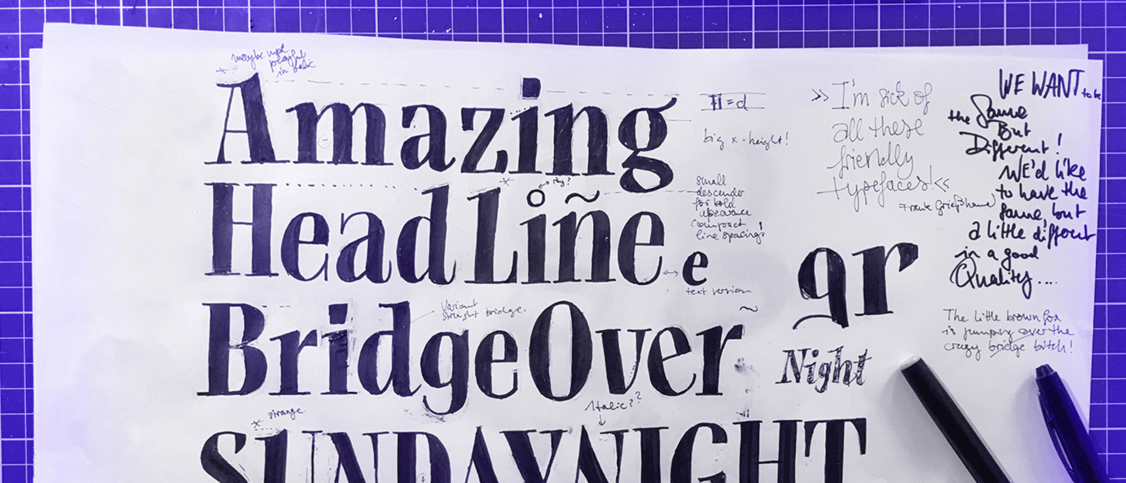
During her time at TypeMedia2018, Mona did a lot of tests to find out which counter shapes and joins work best. If you want to dive deeper into her process, you should read her process notes on the TypeMedia website.
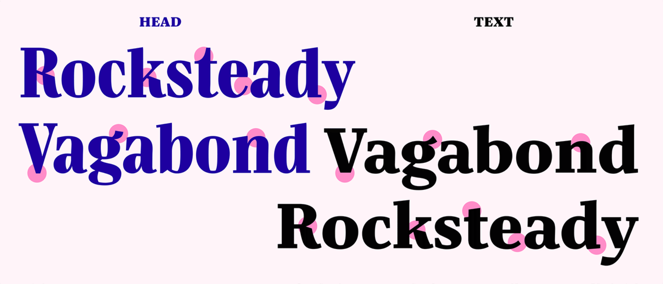
Some letterforms in Bridge Head, like the kickass K and rebellious R, are very expressive and highly recognisable.
Other letters have contextual alternates to live up to Bridge Head’s energy. Switch on your OpenType Features when using all caps and you’ll get a more compressed and dramatic appearance “WHEN A VJ CREATES VISUALS FOR PJ HARVEY”:
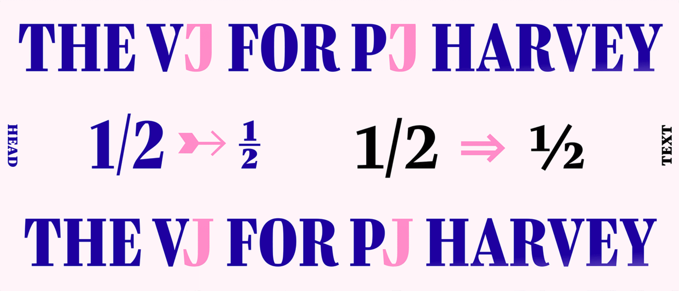
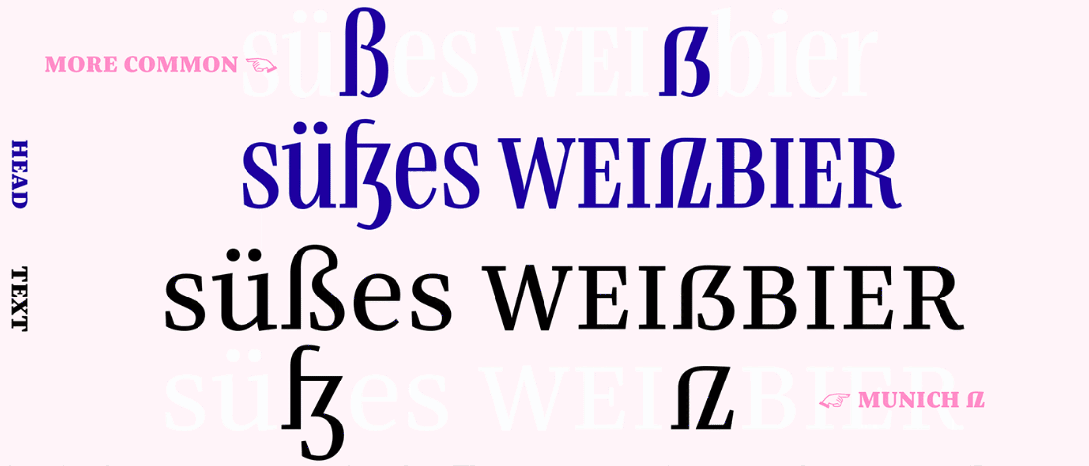
As a German, Mona has a special interest in the sharp Eszett form and Bridge uses OpenType stylistic sets to give you two options. In Bridge Head you will find the expressive and new “Munich Eszett” shape as default. As Bridge Text needs a calmer texture for pleasant reading, the new eszett is nested in the stylistic sets as an alternate. If you want to read more about the process and thinking behind Bridge’s Munich eszett, head over to Alphabettes.
Differentiation in Serifs
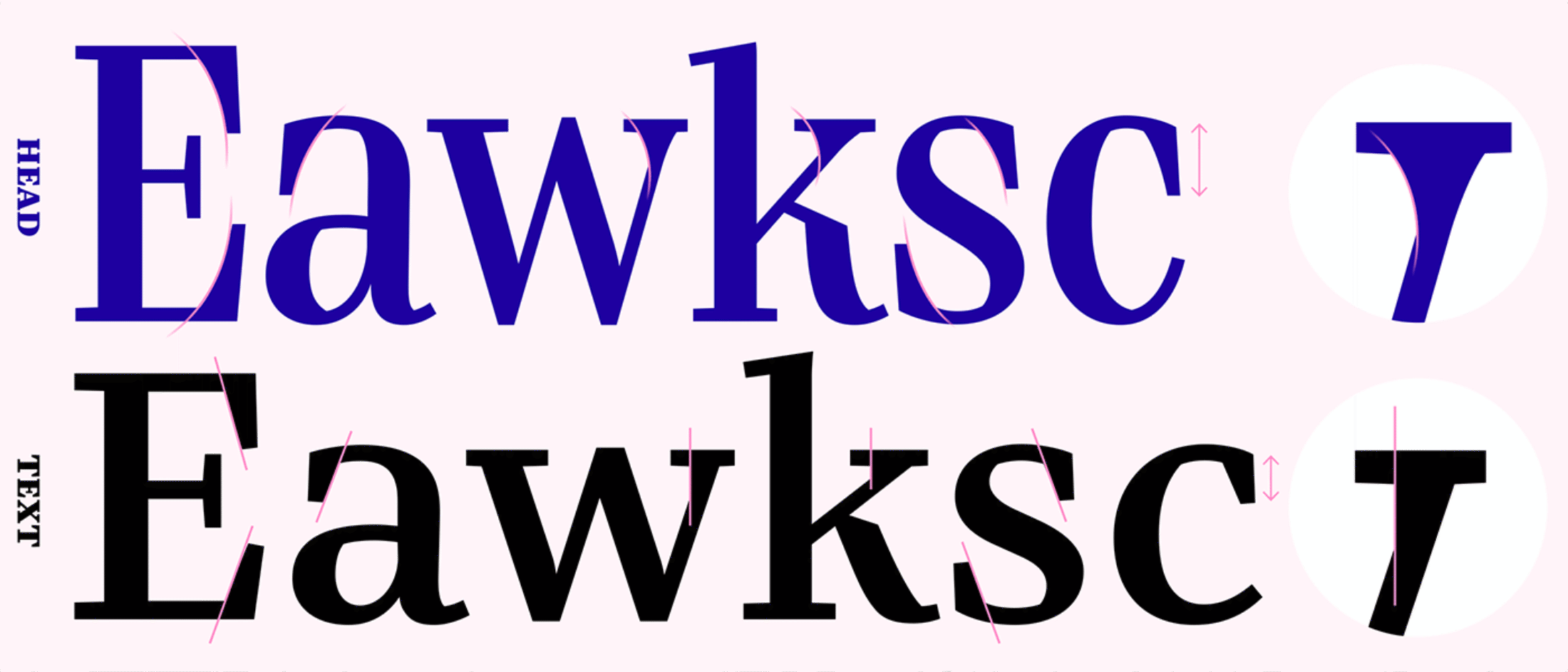
Even Bridge’s serifs needed to be adjusted to give the right tone. Bridge Head has emphasised long, wedged serifs with slightly bent curves. With simpler, straighter serifs the Text creates a crisp texture. Aimed at smaller sizes, Bridge Text’s details are often reduced, designed edgier or with wider proportions.
Differentiation in Styles and Weights
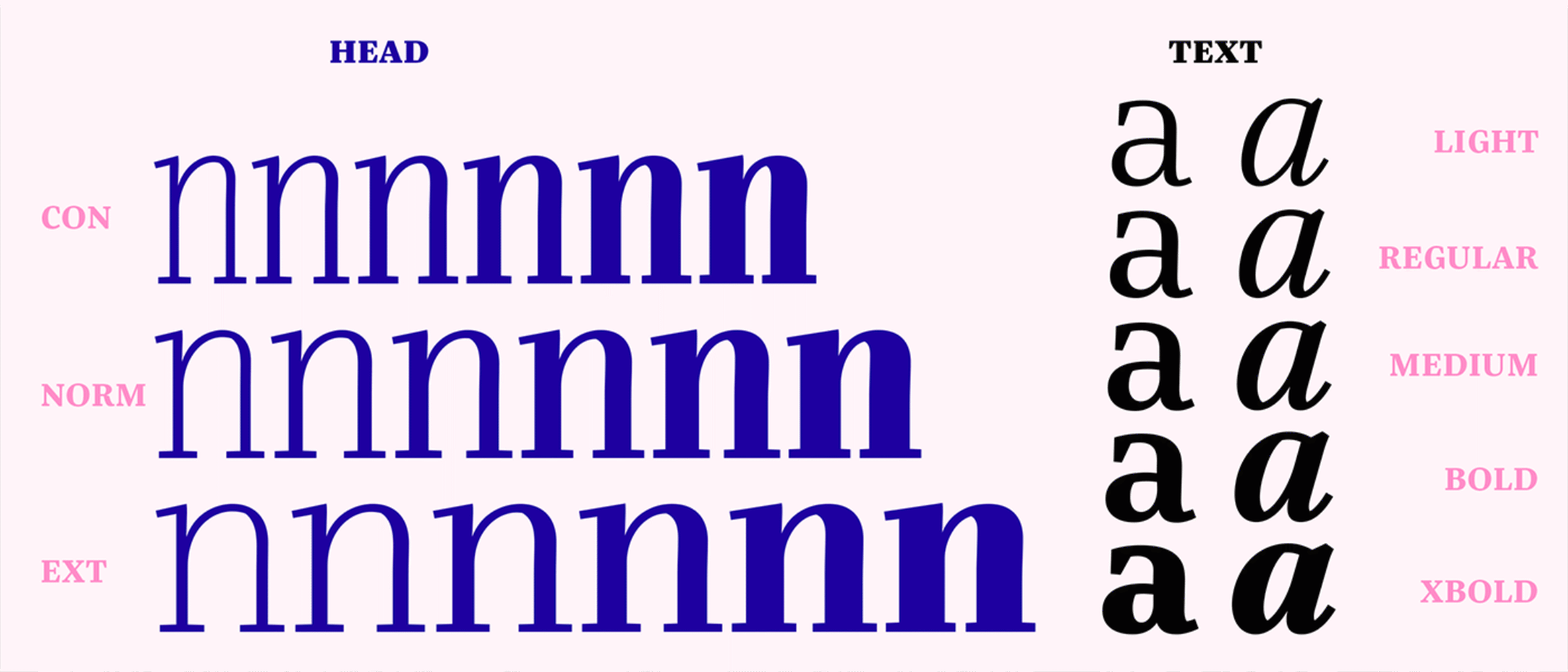
With three different widths from Con(densed) to Ext(ended) each in six weights from xLight to Black, Bridge Head offers a variety of ways to create impressive headlines. Since they’re rarely needed, you won’t find italics for Bridge Head. Instead, you can choose between 18 styles that are super-focussed on what display typography needs: from very compact headlines to extended styles for subheadings or quotes. Bridge Text, on the other hand, offers 10 body copy styles, from Light to xBold, each with matching Italics.
Matching Up in Total
So what do they share? Everything they need. As daughters of classical Didone types, the duo has vertical stress and modern features. Building on the idea of pointed pen lettering, Bridge’s contrast is visible in all styles.
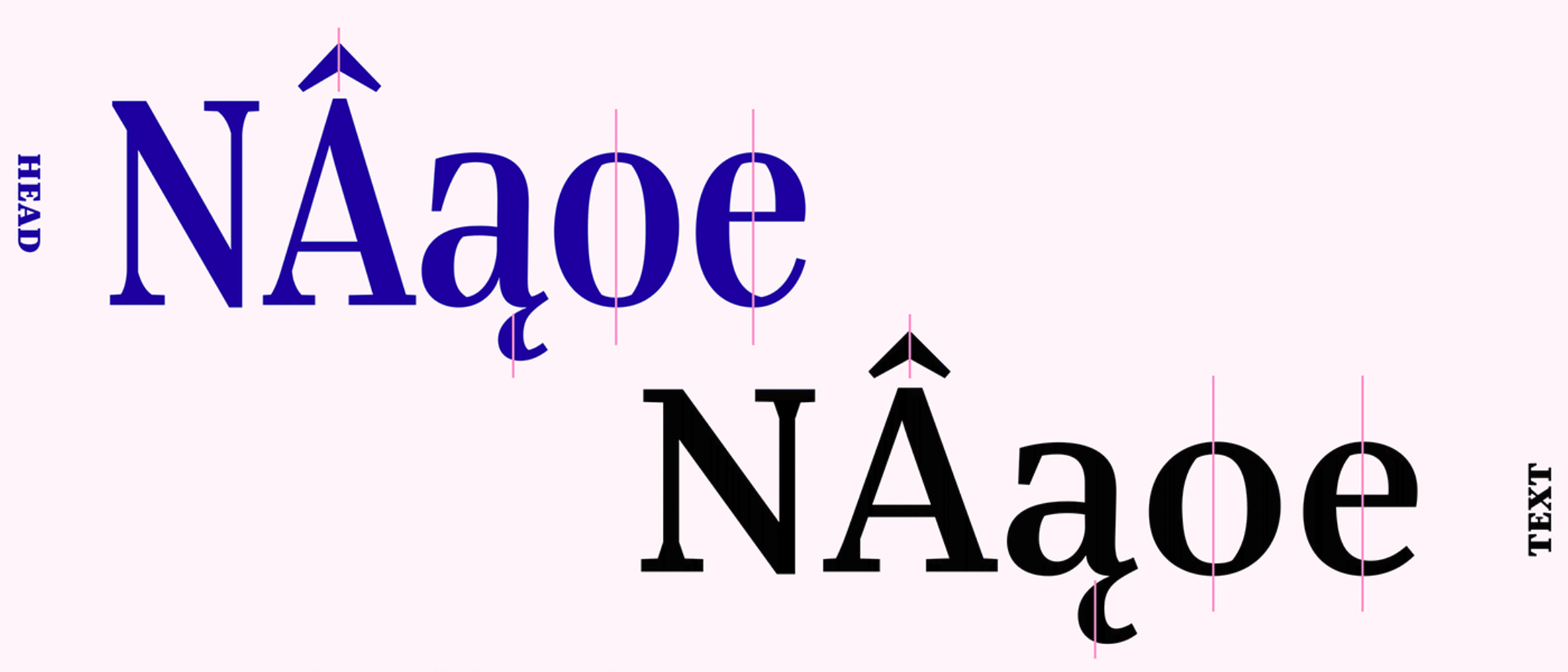
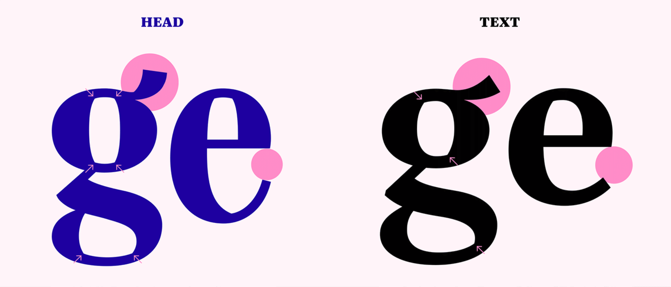
The two typefaces share a common understanding of form, as you can see in the extravagant skeleton of the g. It is the exception, not the rule, that unites the two. As in any good relationship, it’s not obligatory to be exactly the same but to share some of the same interests.
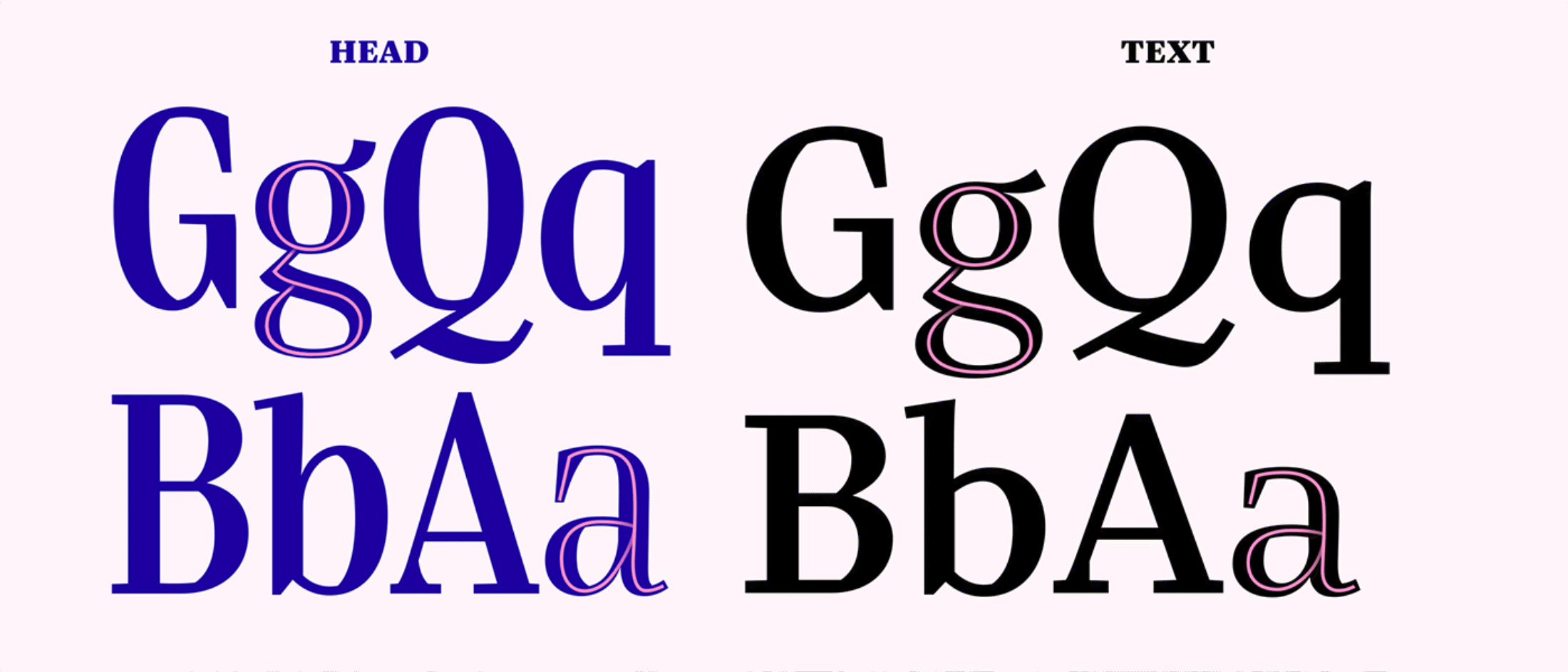
Bridge’s secret is that Head and Text share what’s necessary to belong together. Small details, for example, like the straight base serifs and the angled top serifs.
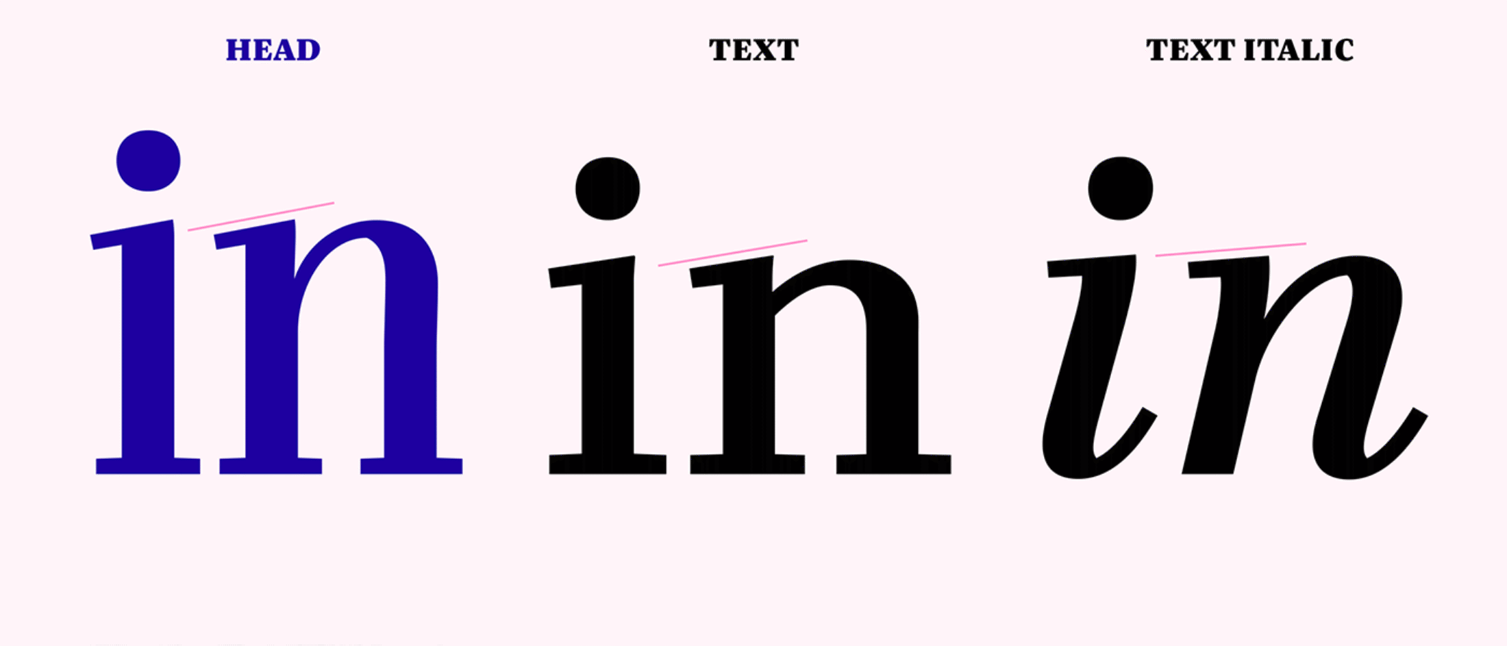
Bridge Head and Bridge Text have very different roles but they complement each other and express a common feeling. The biggest connection between the two is the freedom to be different when needed. This allows Bridge Head to take the stage and attract attention, and it allows Bridge Text to focus on setting a calm, smooth texture in print and digital media. They also pursue a common aim: giving your layout a confident and edgy character.
Just Ask!
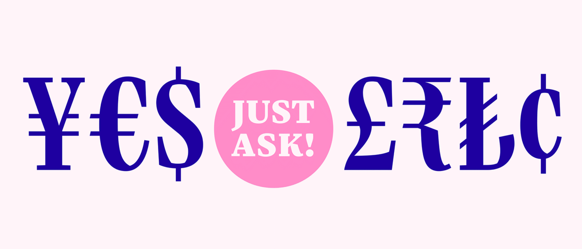
You know the little square that sometimes appears when you type, for example, a € sign in a font that was created before 2000? It’s a placeholder glyph that appears when a type designer hasn’t drawn the character you want to see. If you find the “Just ask!” button and need a certain glyph, send us an email.
If updating makes sense, we will do it. Feedback about language support is always welcome. Perhaps an alternate a is needed for a visual identity, or you need an icon that fits with a specific project? Or what about a “bridge at night” emoji? And if you need different widths or weights added to a typeface, just ask!
Bridges are about connection. With Bridge Head and Text, Mona created two new tools for creative typography. Now it’s your turn to start connecting different paths.
