TOC Letterpress Book
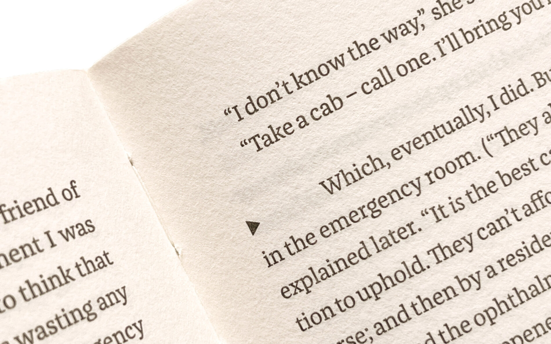
Franziska is a robust and legible typeface, ideal for long body text and TOC’s special requirements. The Berlin-based letterpress publishing house combines traditional craftsmanship with modern typography to create something unique.
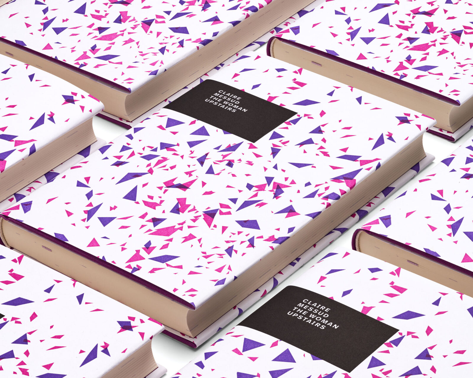
The better-lit photos are by Norman Posselt, courtesy of TOC Publishing.
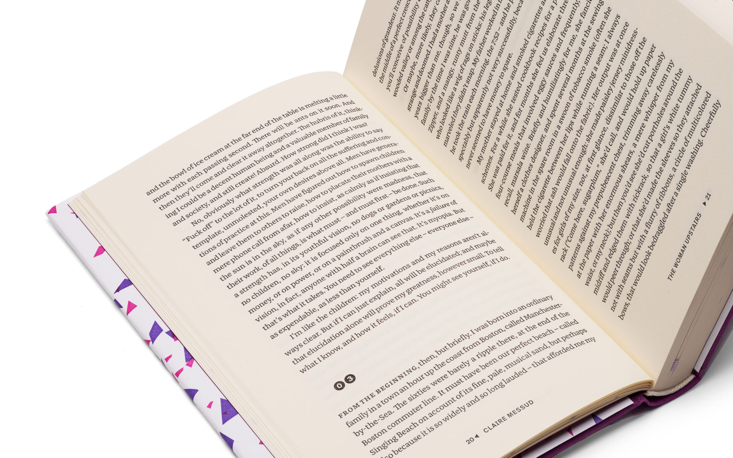
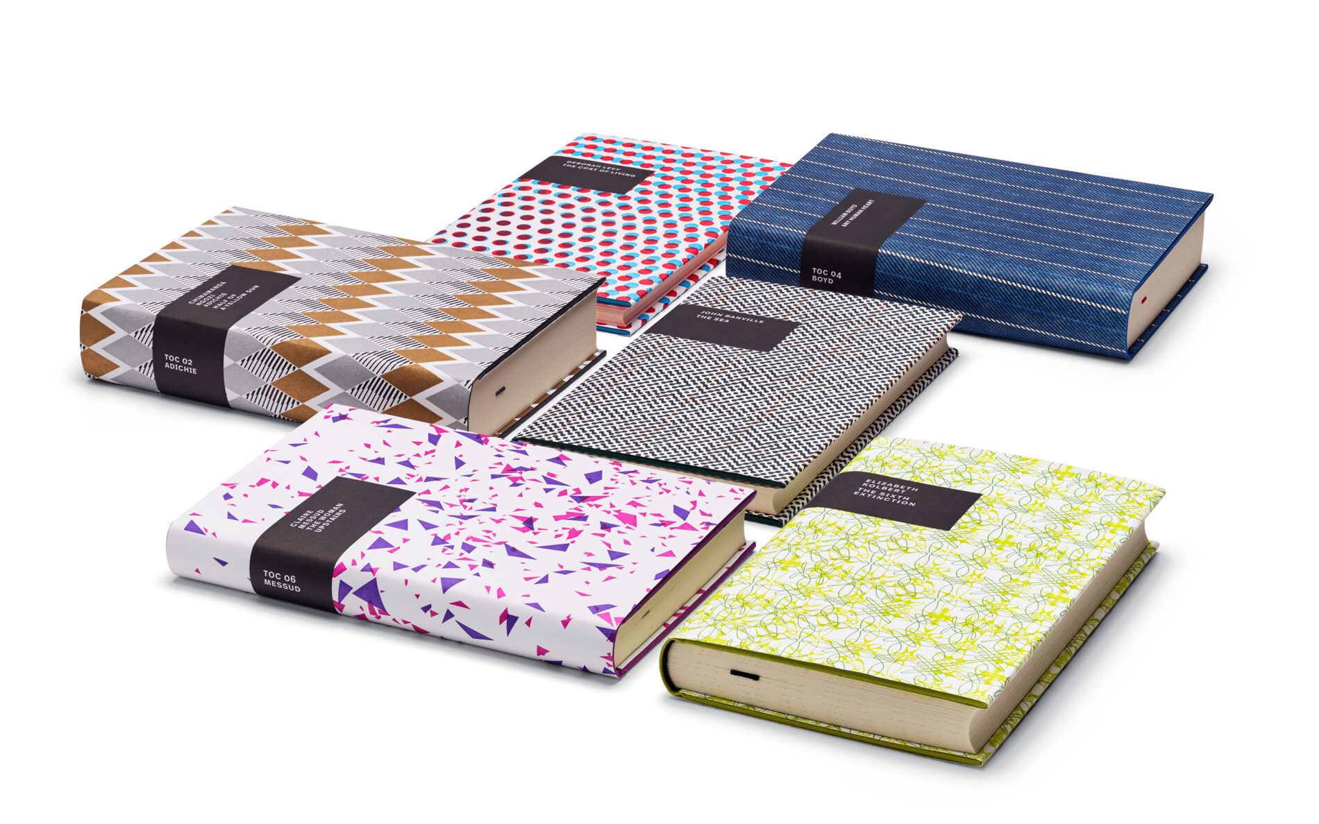
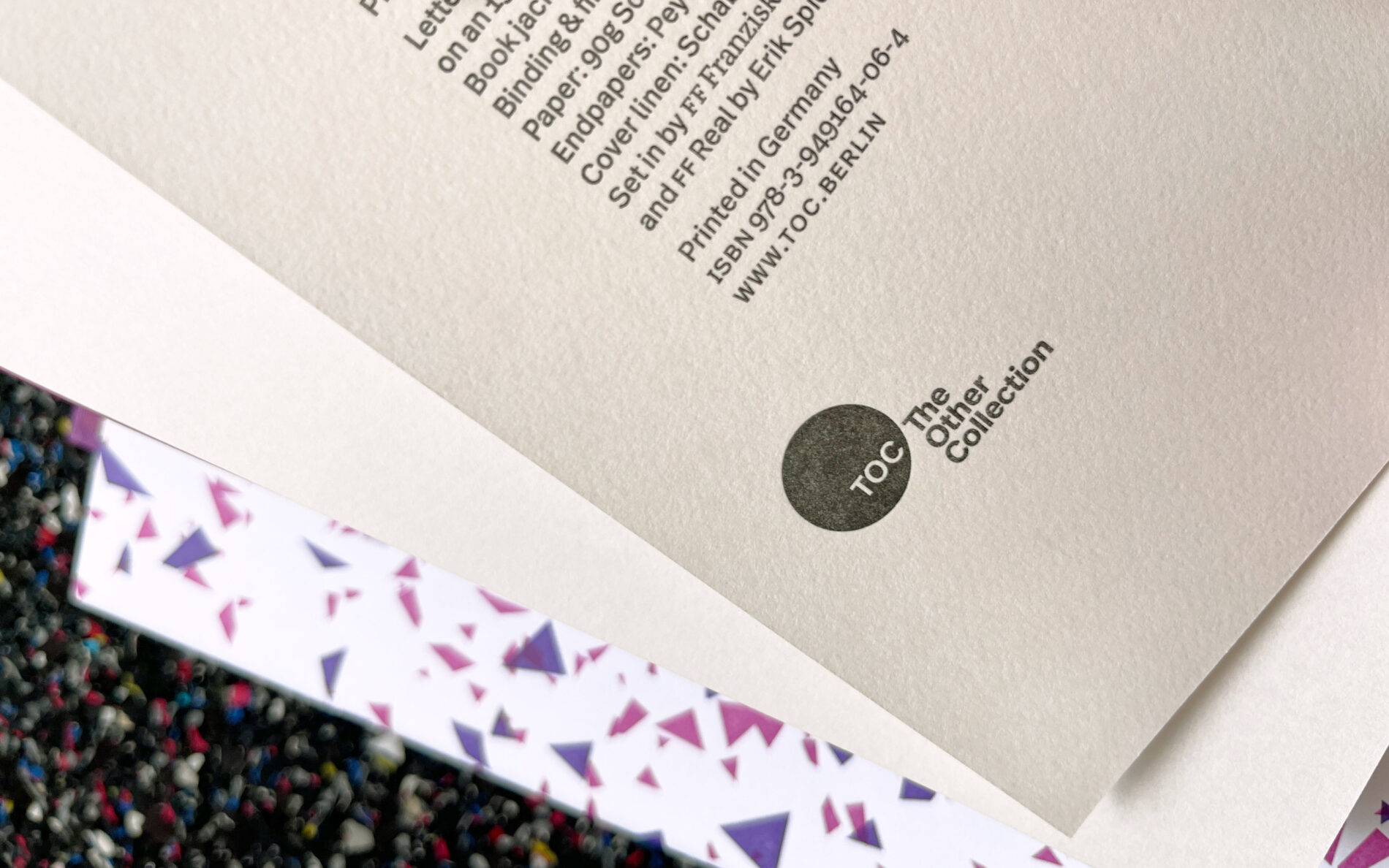
At TOC, everything revolves around books. Not just any books, but very special books. Their books are printed in limited editions, signed, numbered and individually adapted to the content. Believing that excellent literature deserves great appreciation, TOC uses only the finest materials and the most sophisticated printing techniques to produce its letterpress books. TOC blends modern typography with the centuries-old craft of book printing.
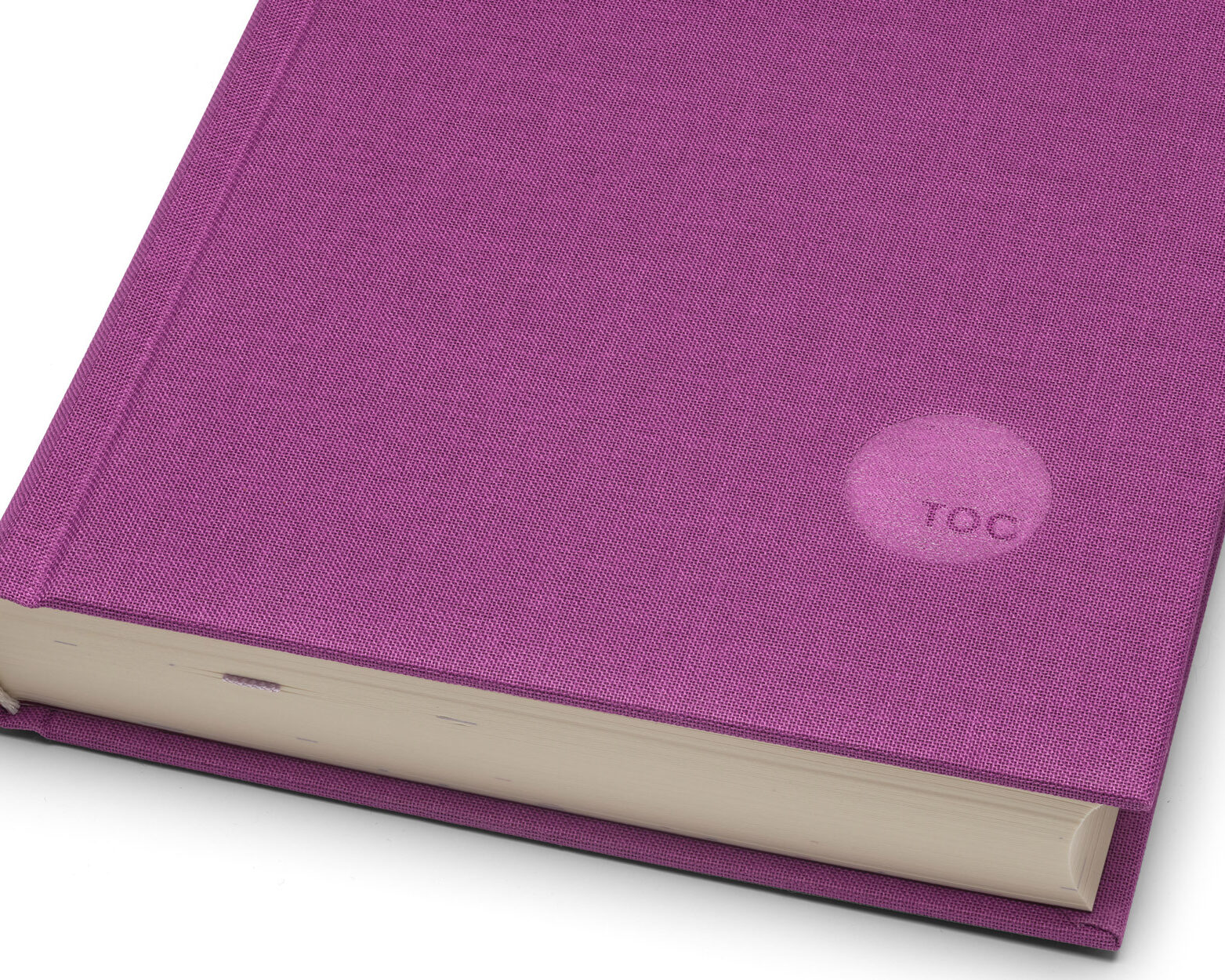
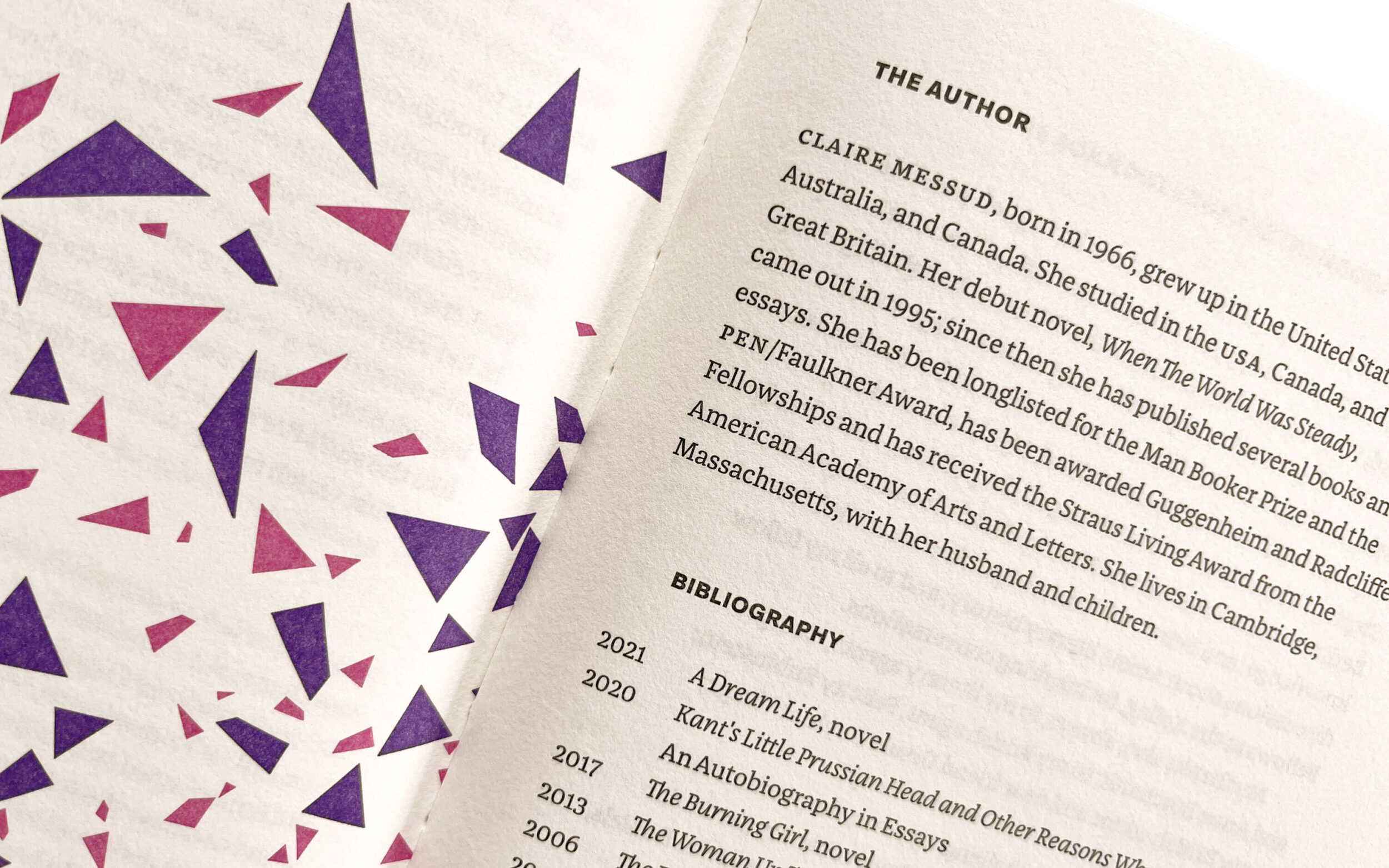
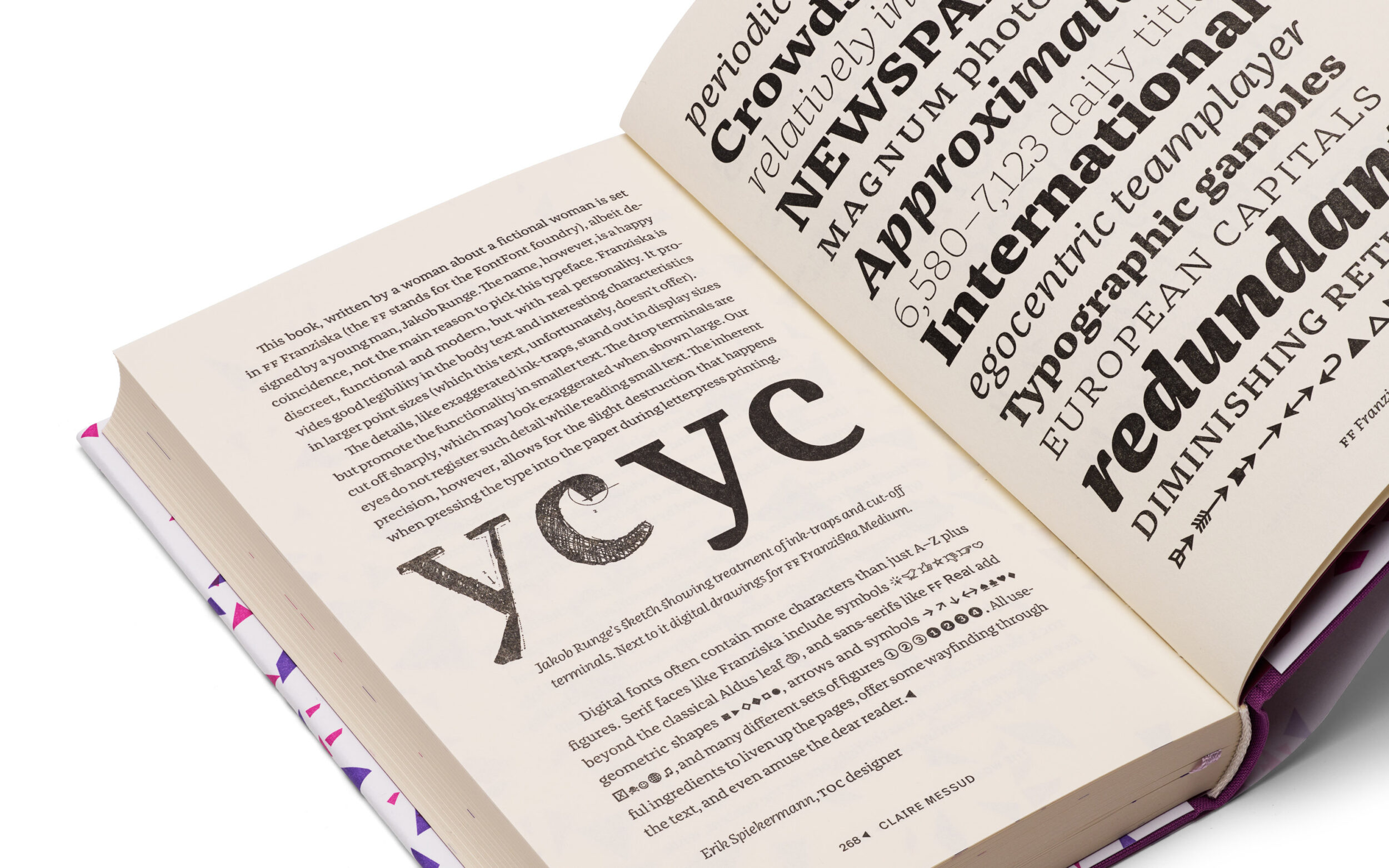
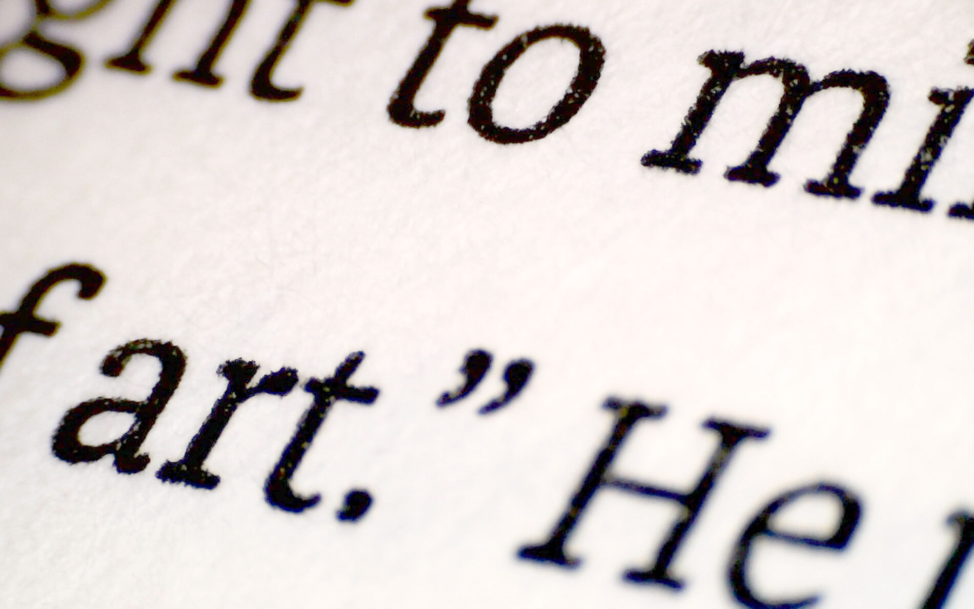
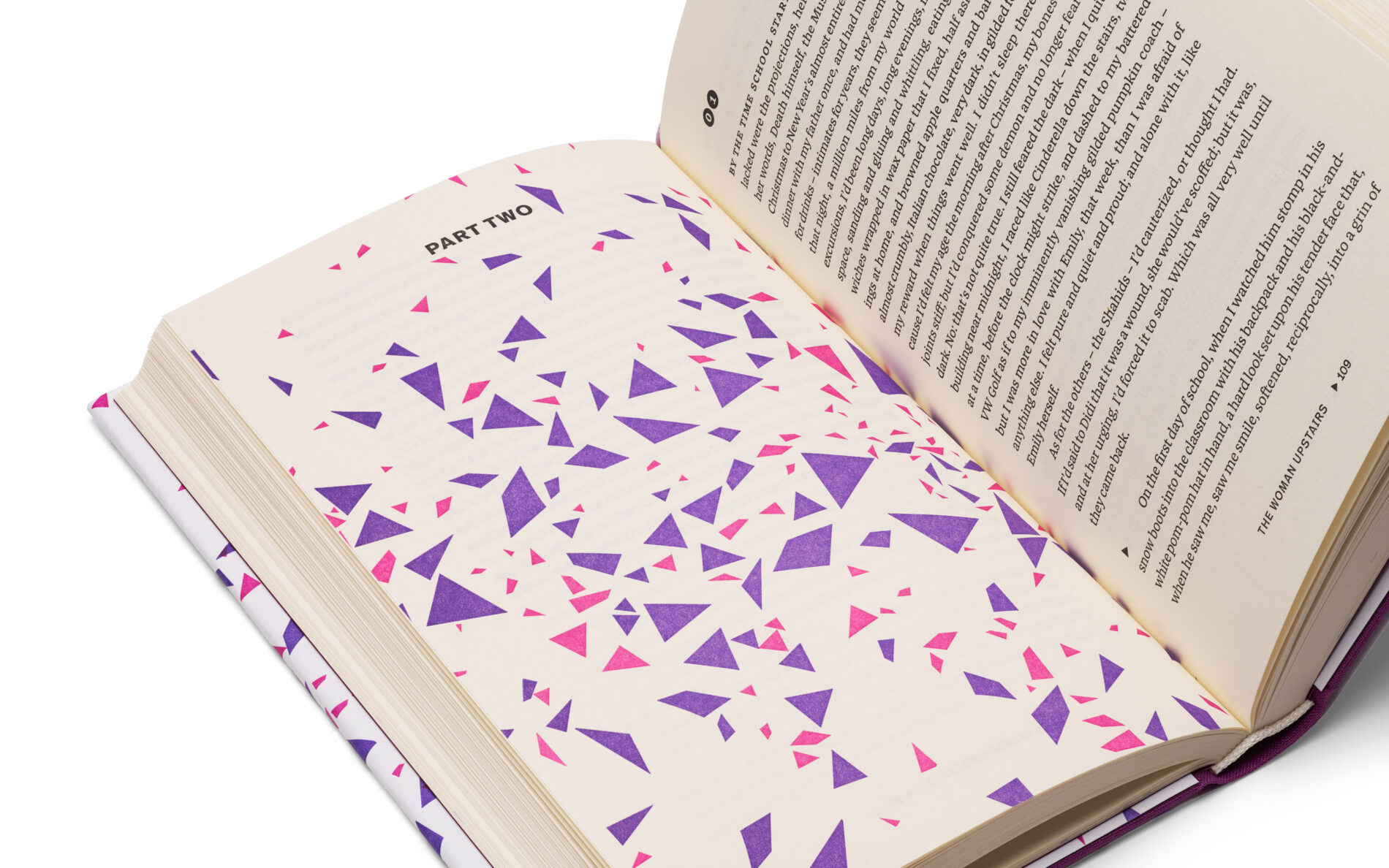
Although traditional letterpress printing provides a pleasant analogue reading experience, its high costs make it impractical for modern book production. To avoid those costs, TOC uses an in-house laser to transfer entire computer layouts onto polymer plates. These plates are then printed by hand, one page at a time, on a Heidelberg cylinder press, which was historically used for letterpress printing. This unique combination of digital technology and traditional craftsmanship results in a one-of-a-kind reading experience. The philosophy is also reflected in the TOC books, which are complemented by our typeface Franziska.
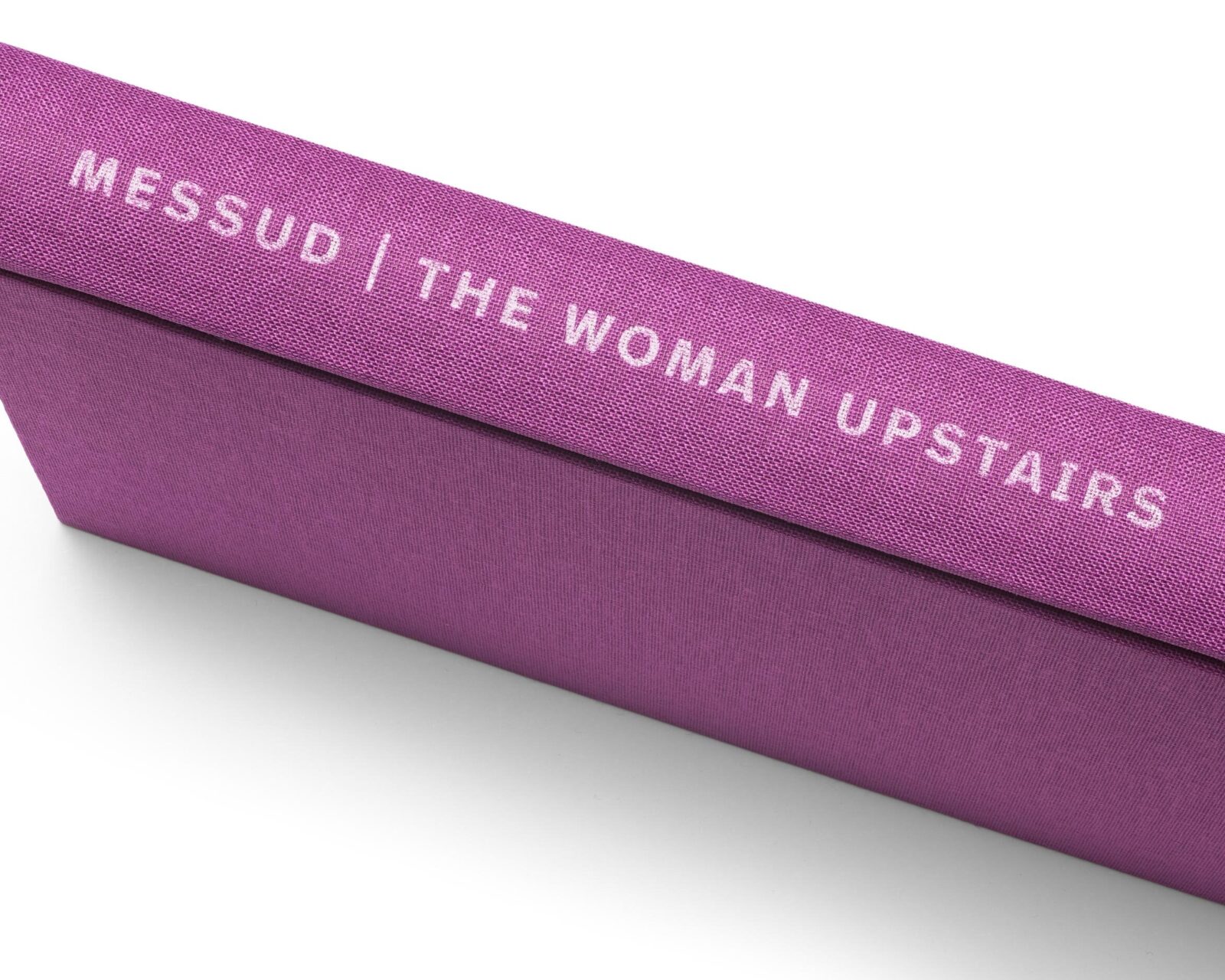
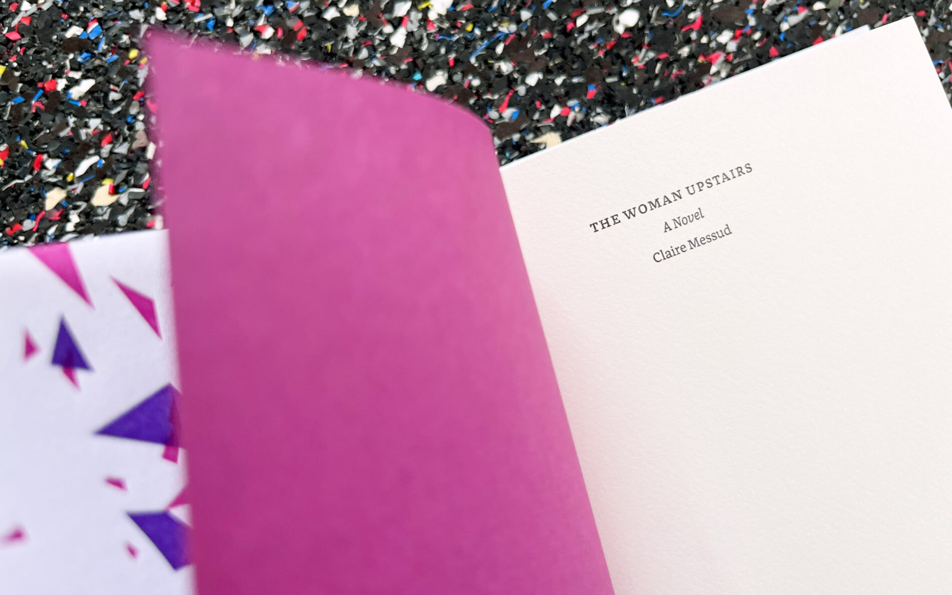
No wonder that Erik Spiekermann was excited about Franziska back in 2013. He immediately brought it to FontFont as one of his favourite typefaces for text. A few years later, he gives Franziska a new task: letterpress. The typeface accomplishes the task brilliantly with the sixth volume in the series, »The Woman Upstairs« by Claire Messud. The book showcases Franziska’s ability to perform under high pressure with clear legibility, quality craftsmanship, and timeless modernity.
