Lebensraum Holz Identity
Construction company Lebensraum Holz stands for energy-efficient and ecological houses. Slab Serif Muriza and its fine italics help to transfer this passion into corporate communication.
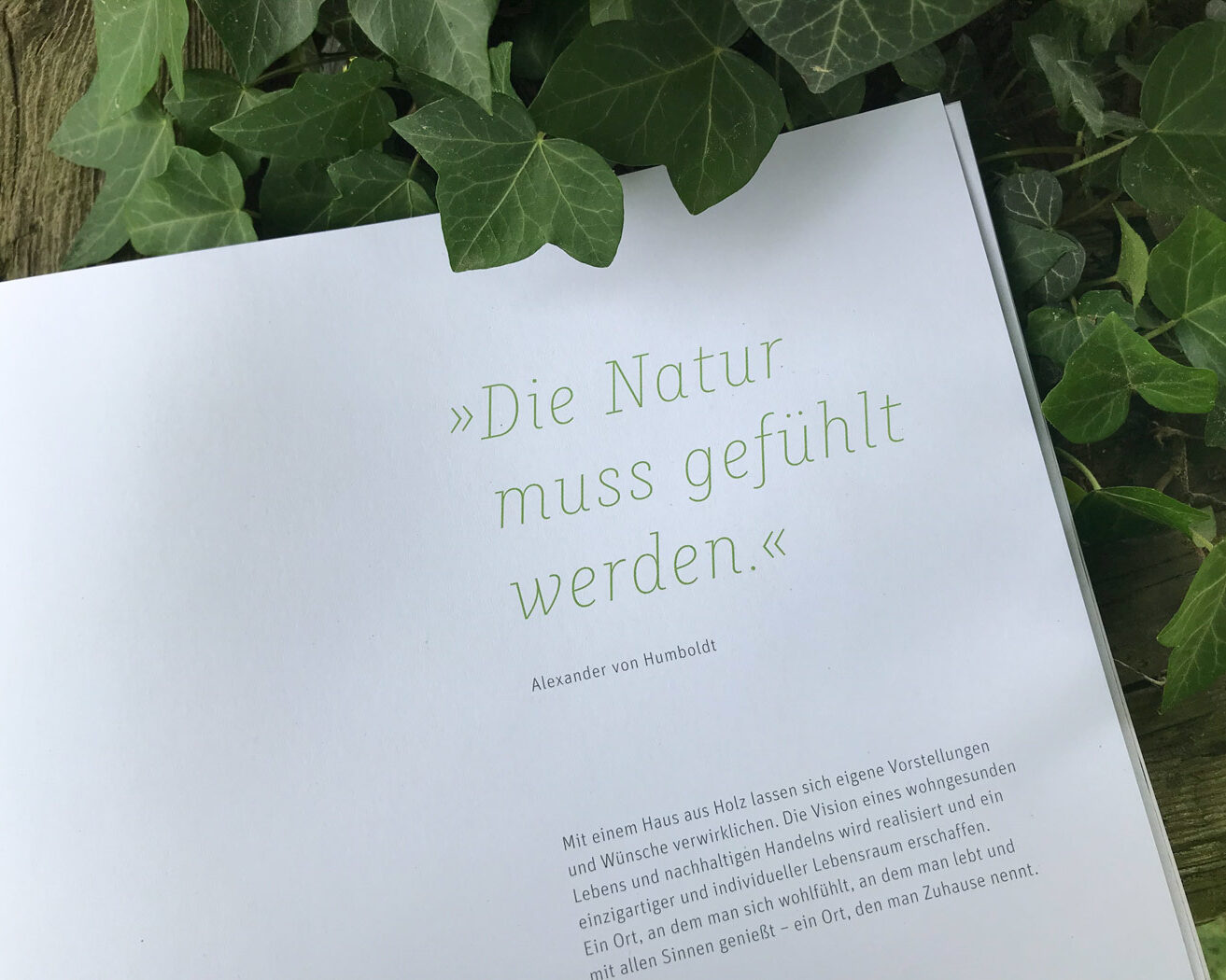
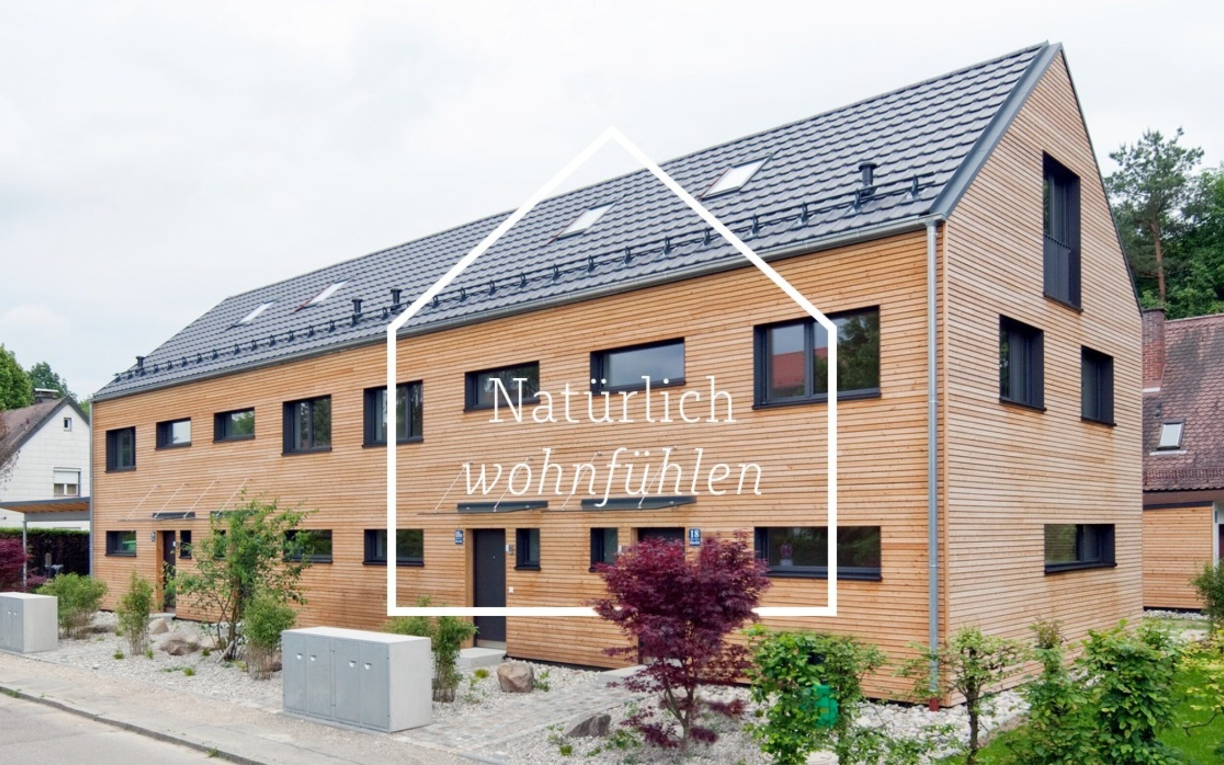
Sine 2011, Munich based agency Im Neuland has been in charge of the digital/print communication for the individual, ecological and efficient wooden house brand. With the new adjustment of the corporate identity in 2017, the brand got equipped with a more emotional and natural tonality.
Art Director Sebastian Muth took the unusual route by not supplementing the corporate typeface FF Unit with the comfortable serif partner, but with our clear and economical Slab Serif Muriza.
With the sans in continuous text and Muriza as brand building typeface, both the website and the printed brochure are characterised by a reduced, yet humanistic typography. Further, in the large-scale use of the light italics, the typography acquires a certain spirit.
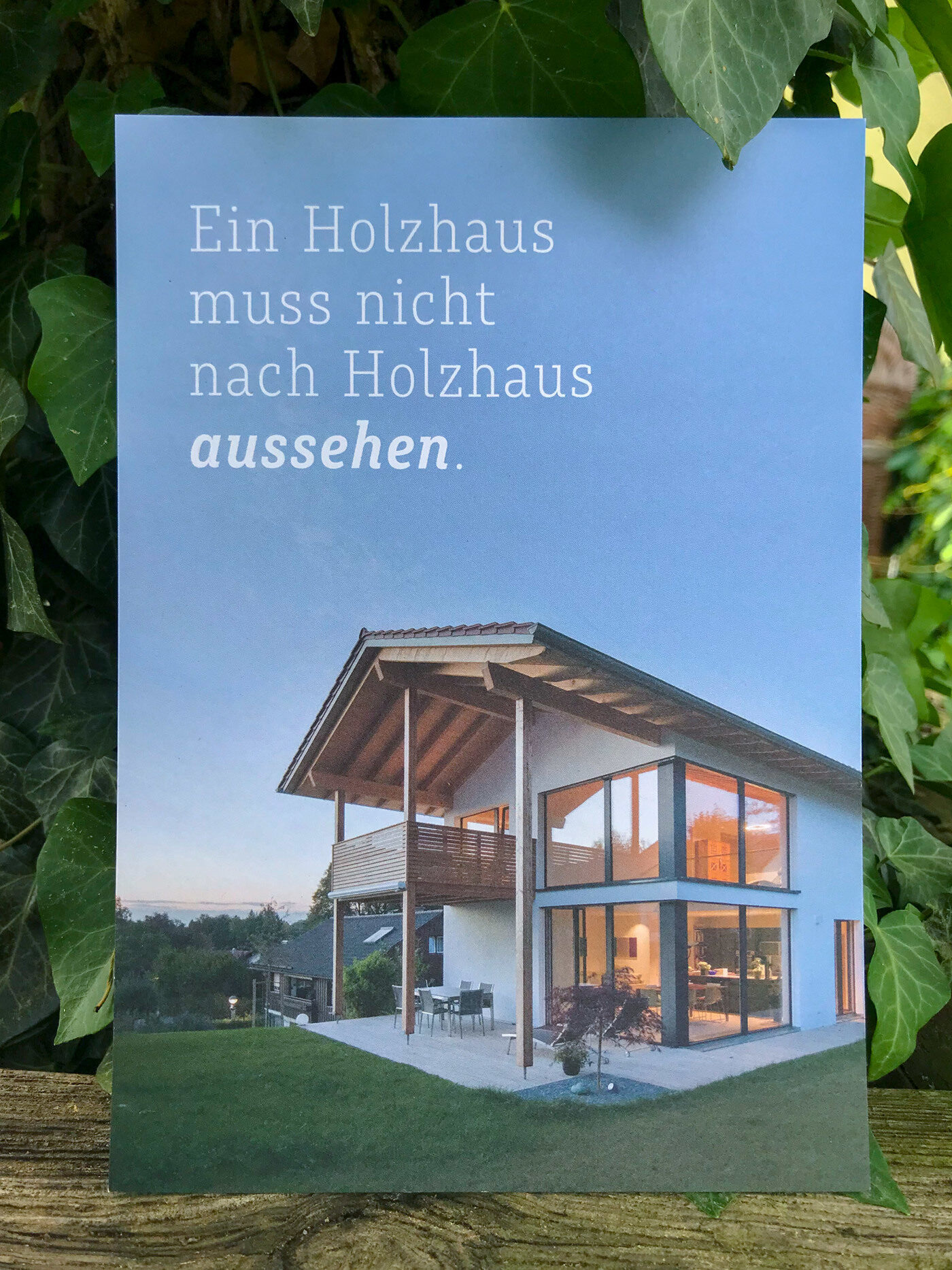
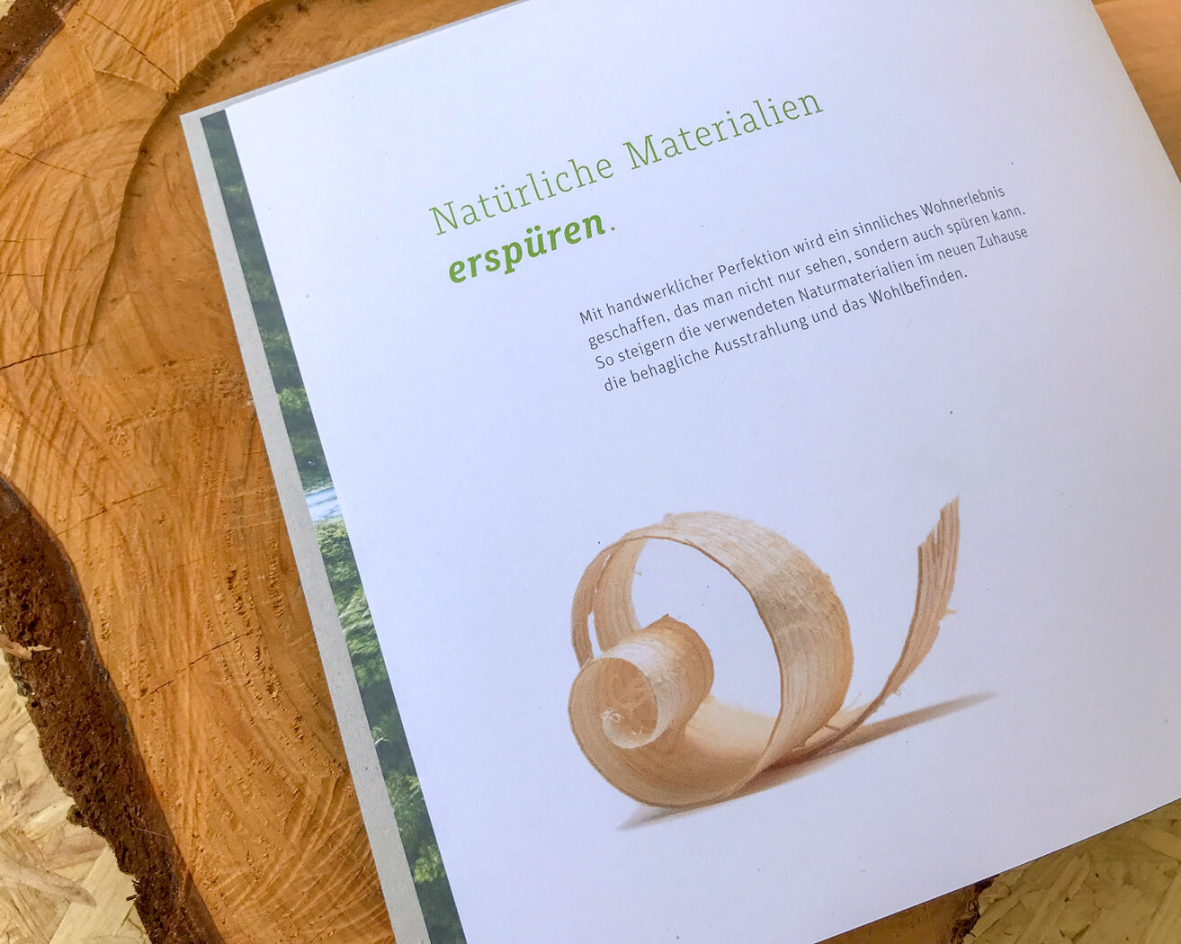
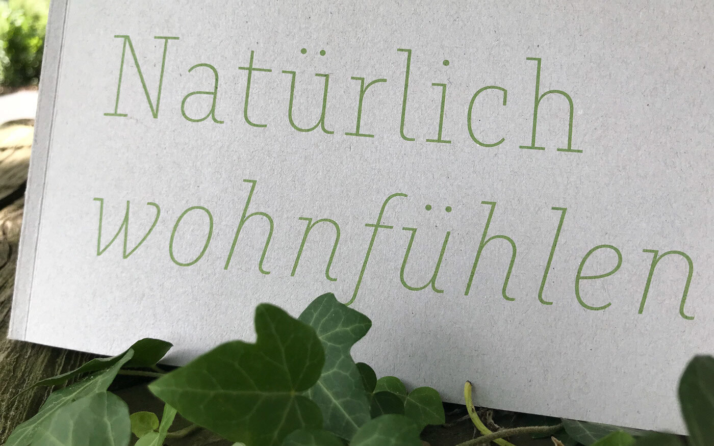
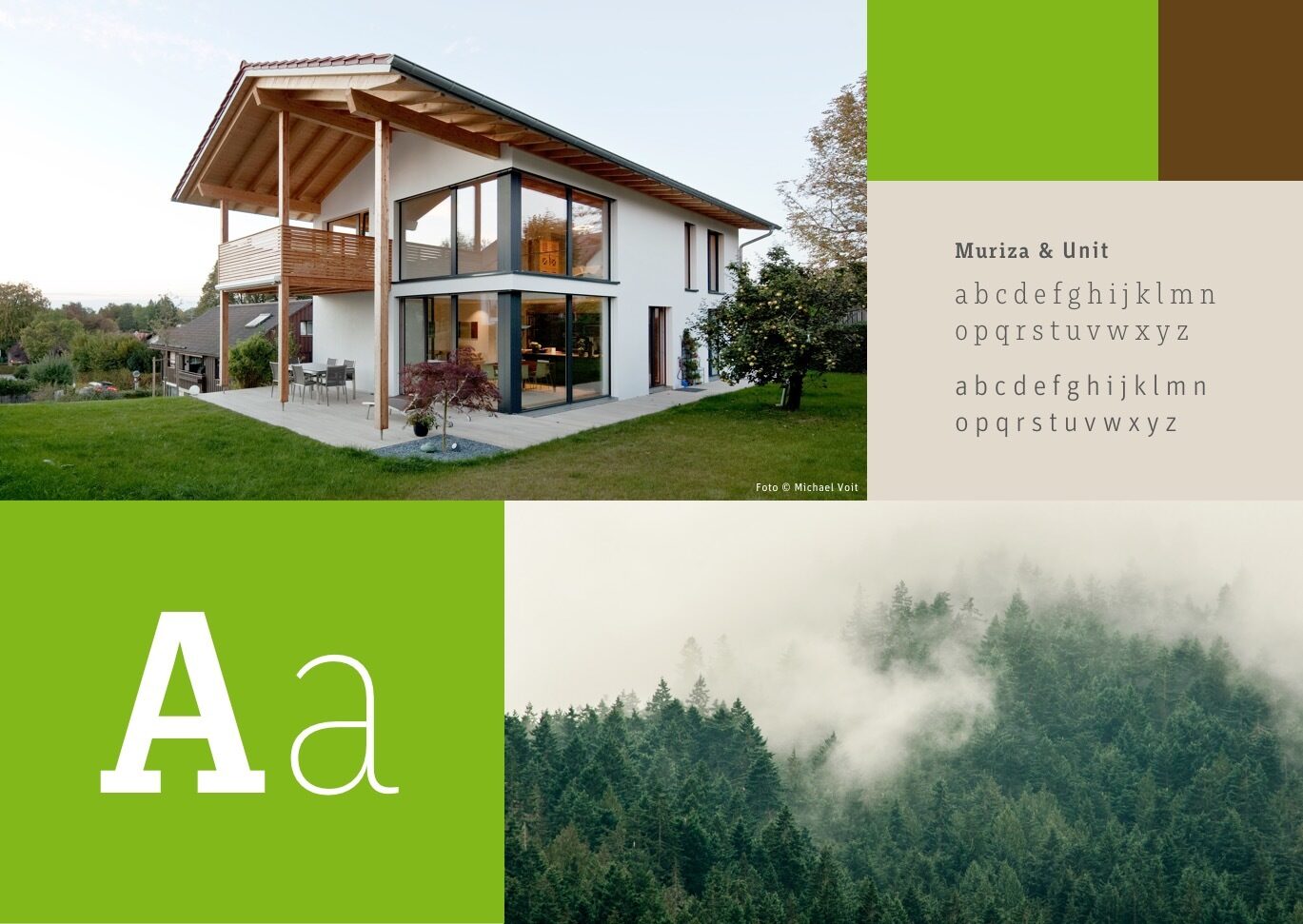
Image by courtesy of Im Neuland
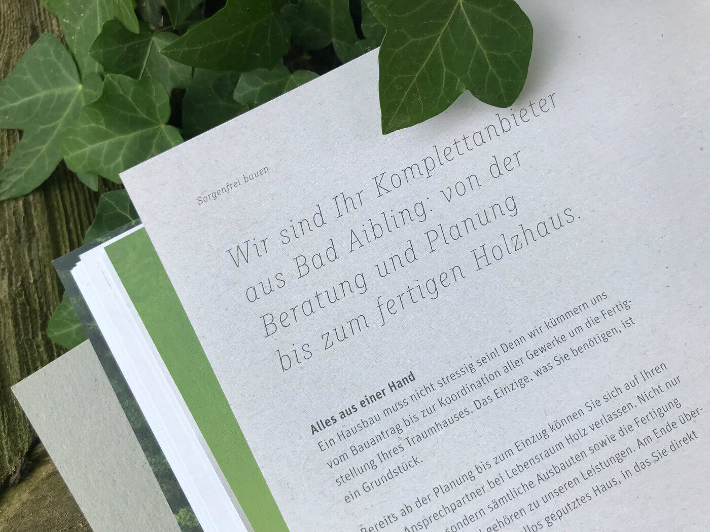
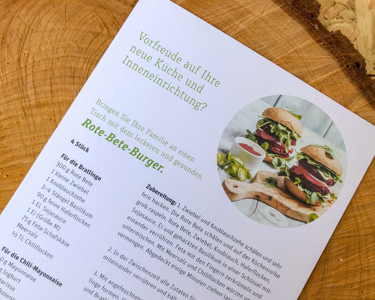
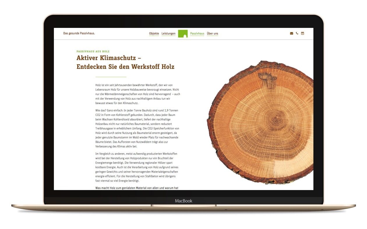
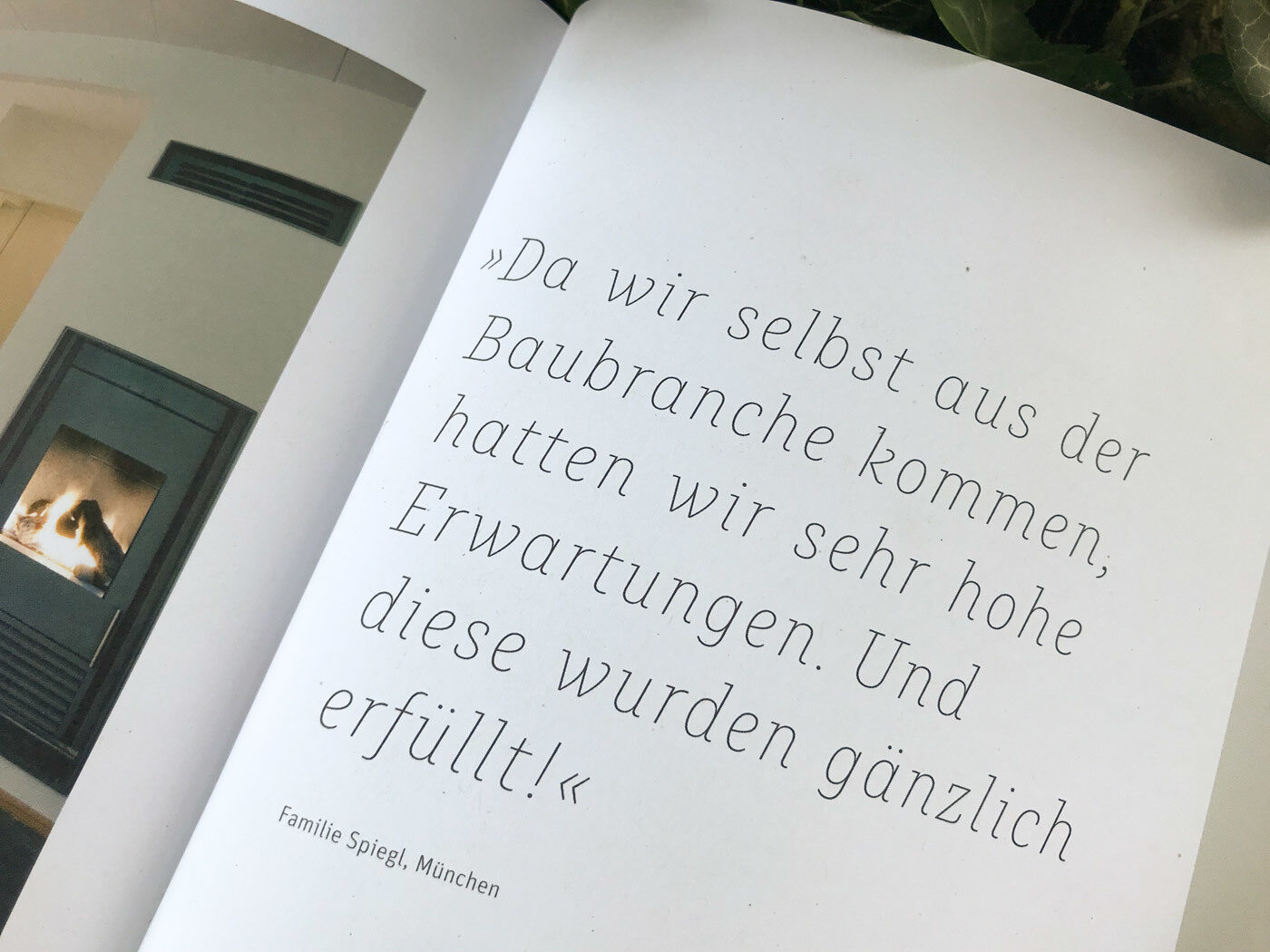
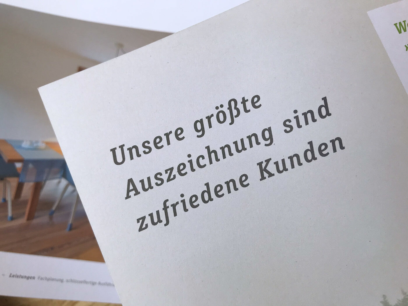
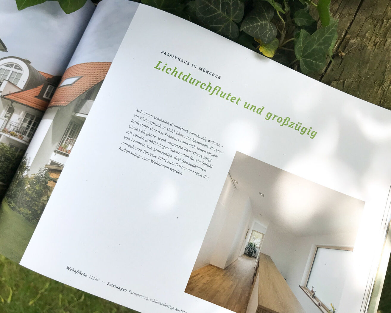
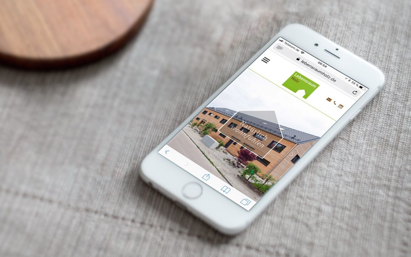
Image by courtesy of Im Neuland
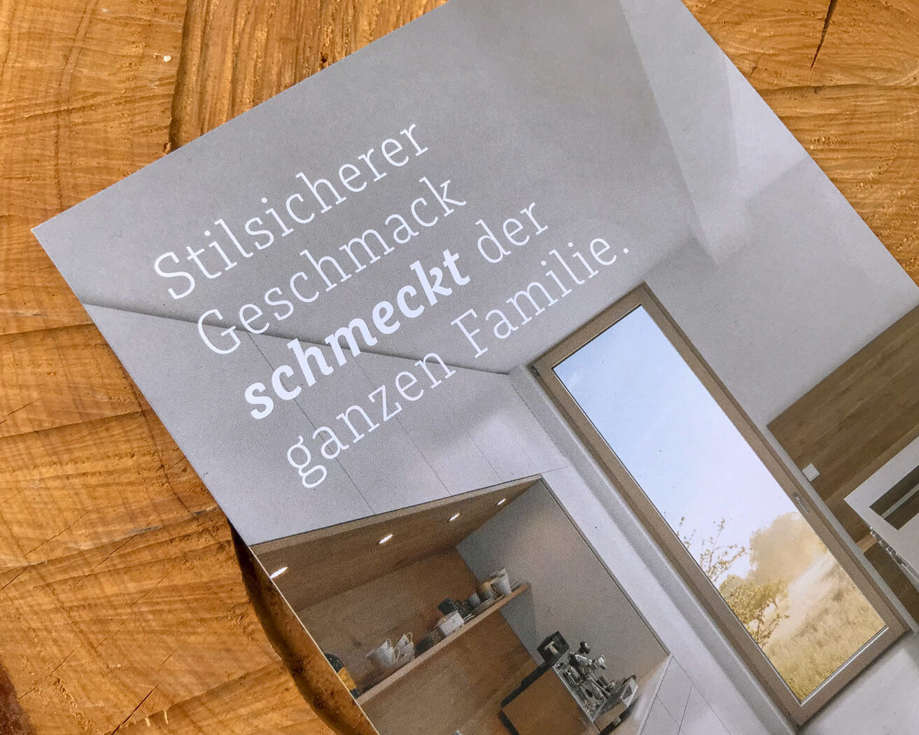
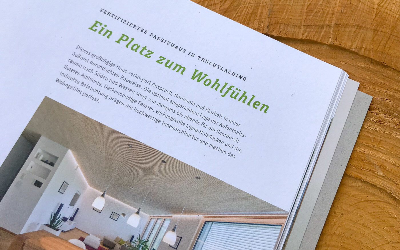
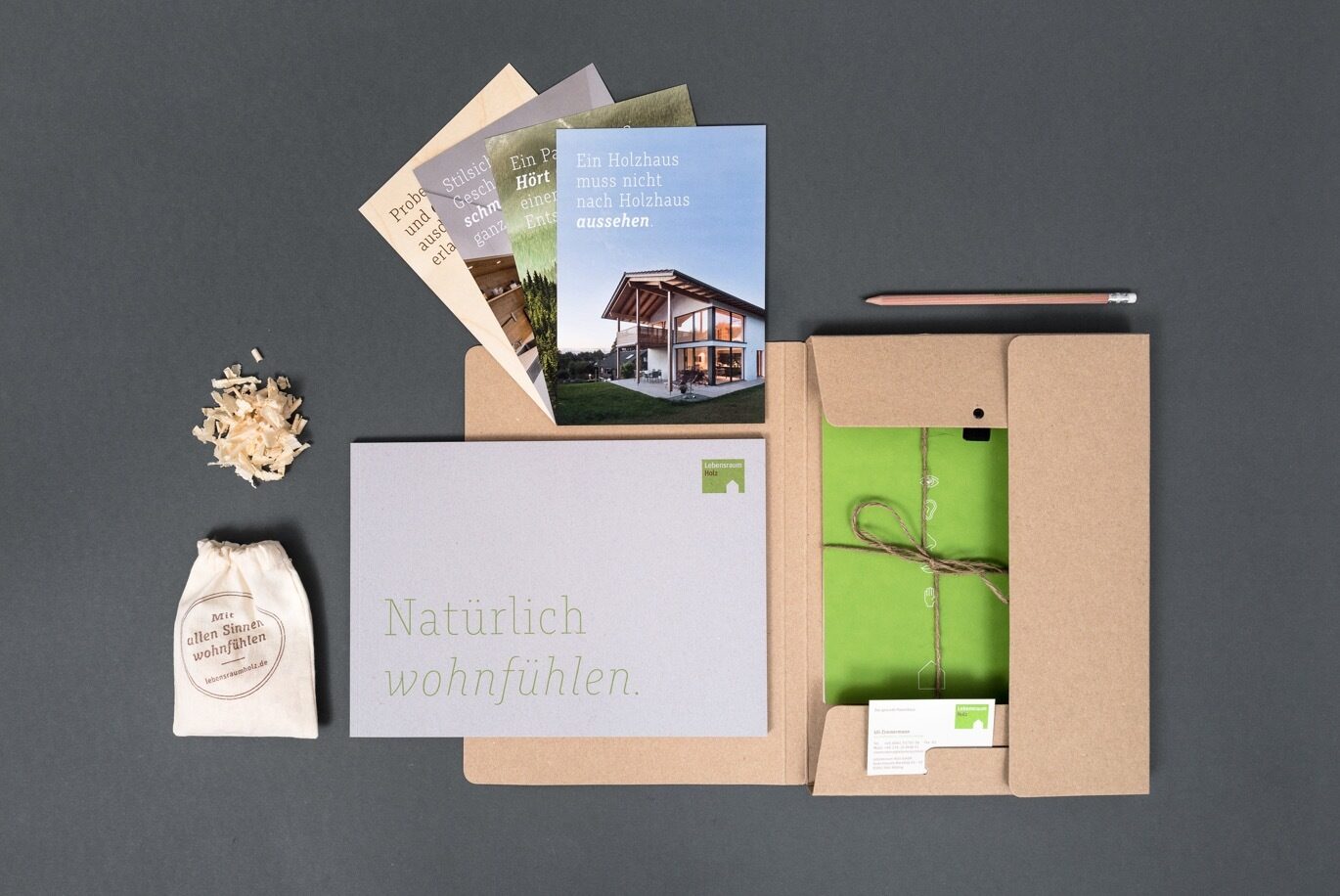
Image by courtesy of Im Neuland