Impulse Magazine
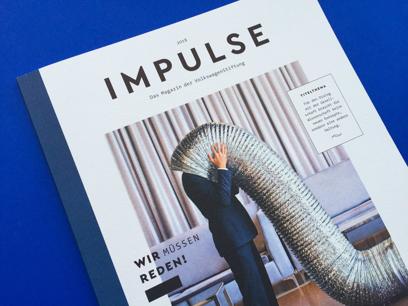
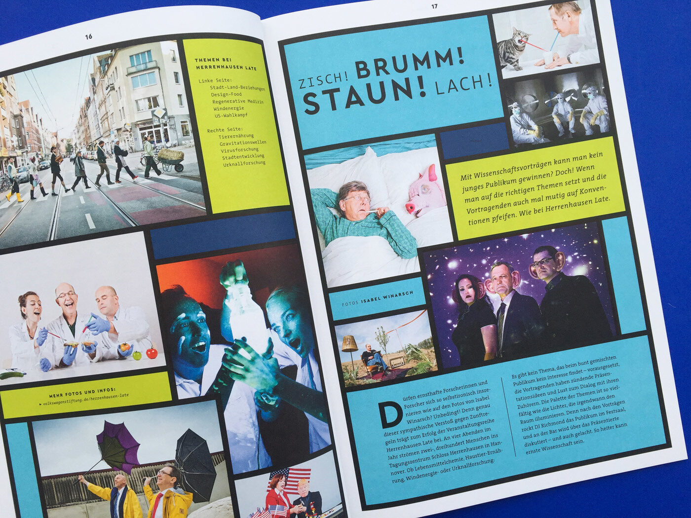
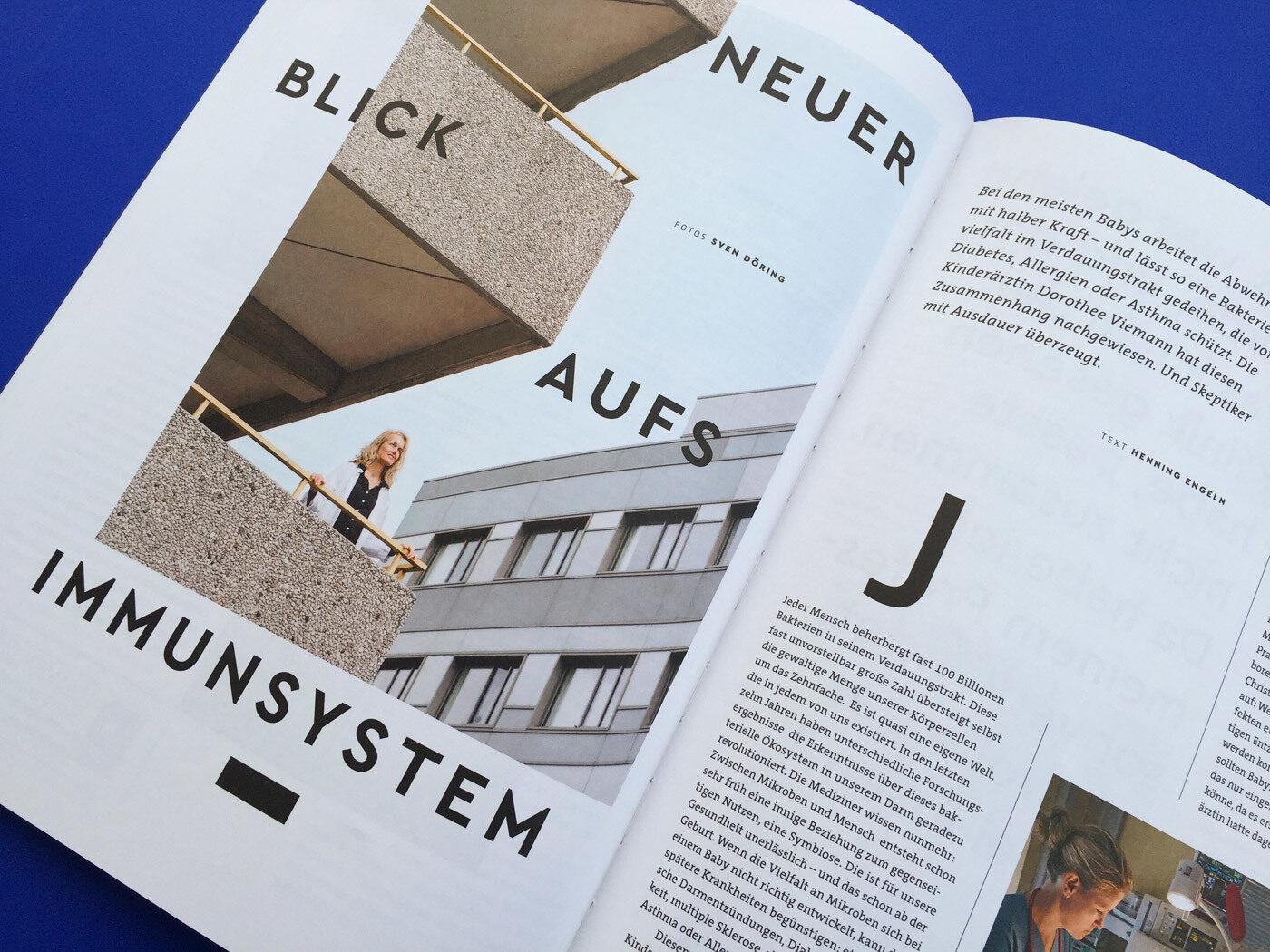
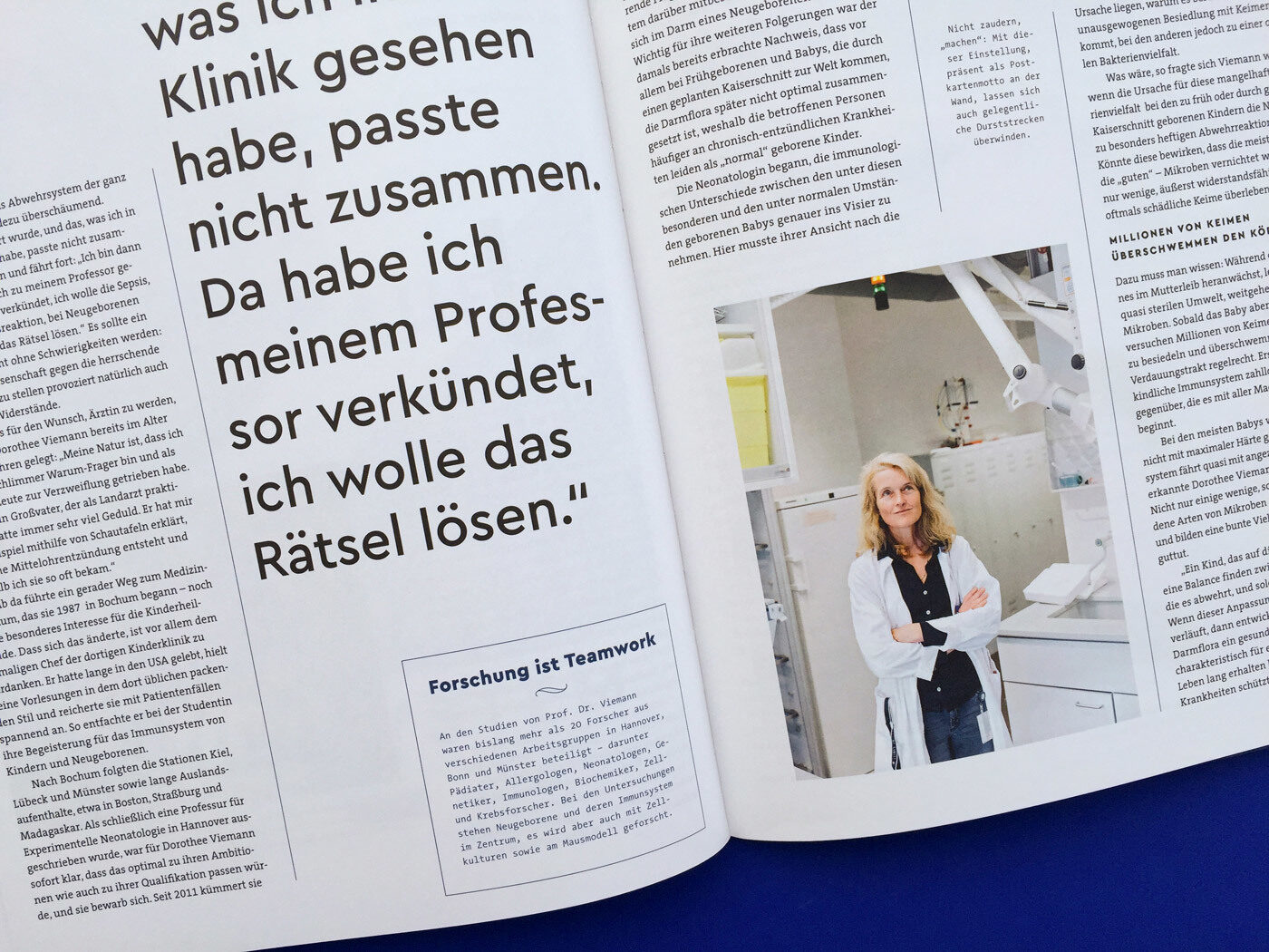
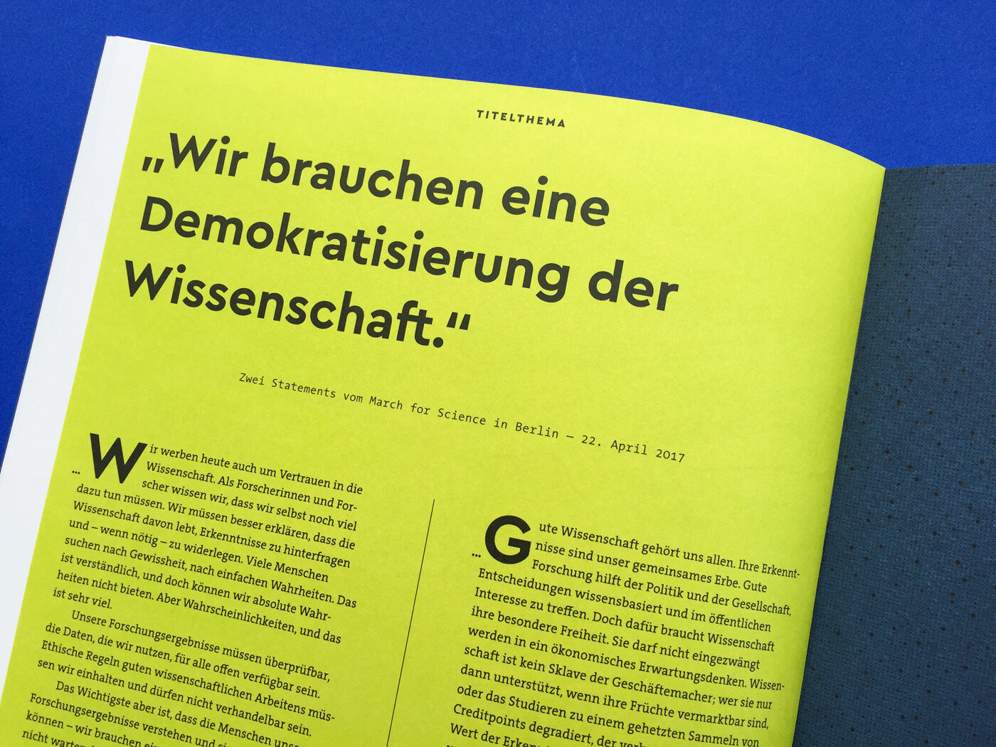
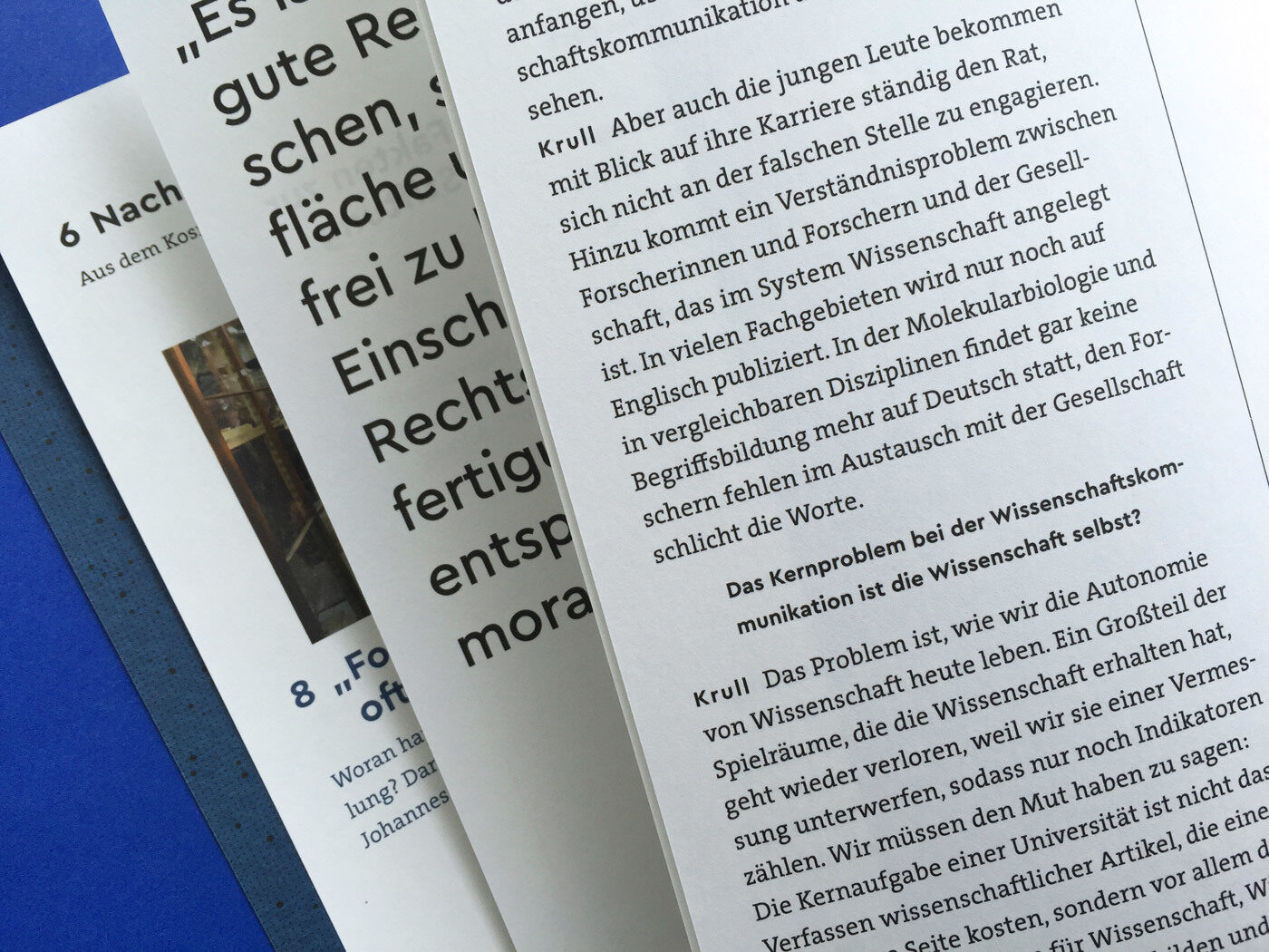
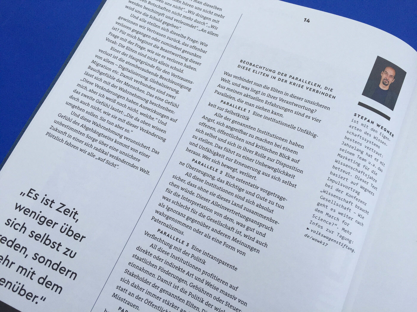
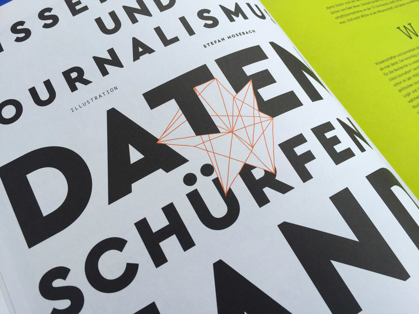
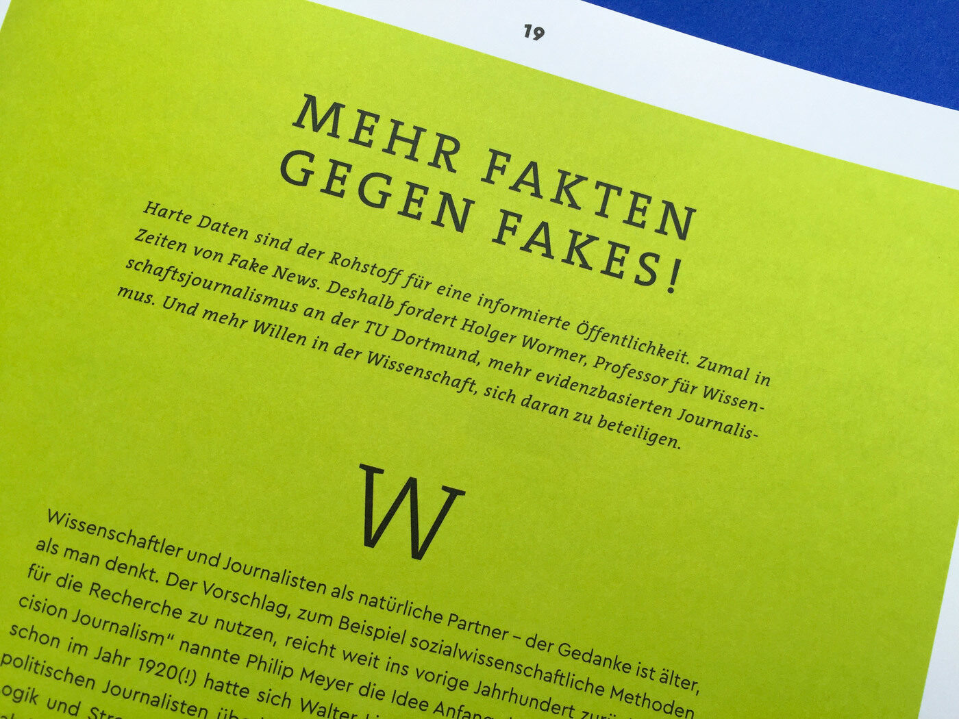
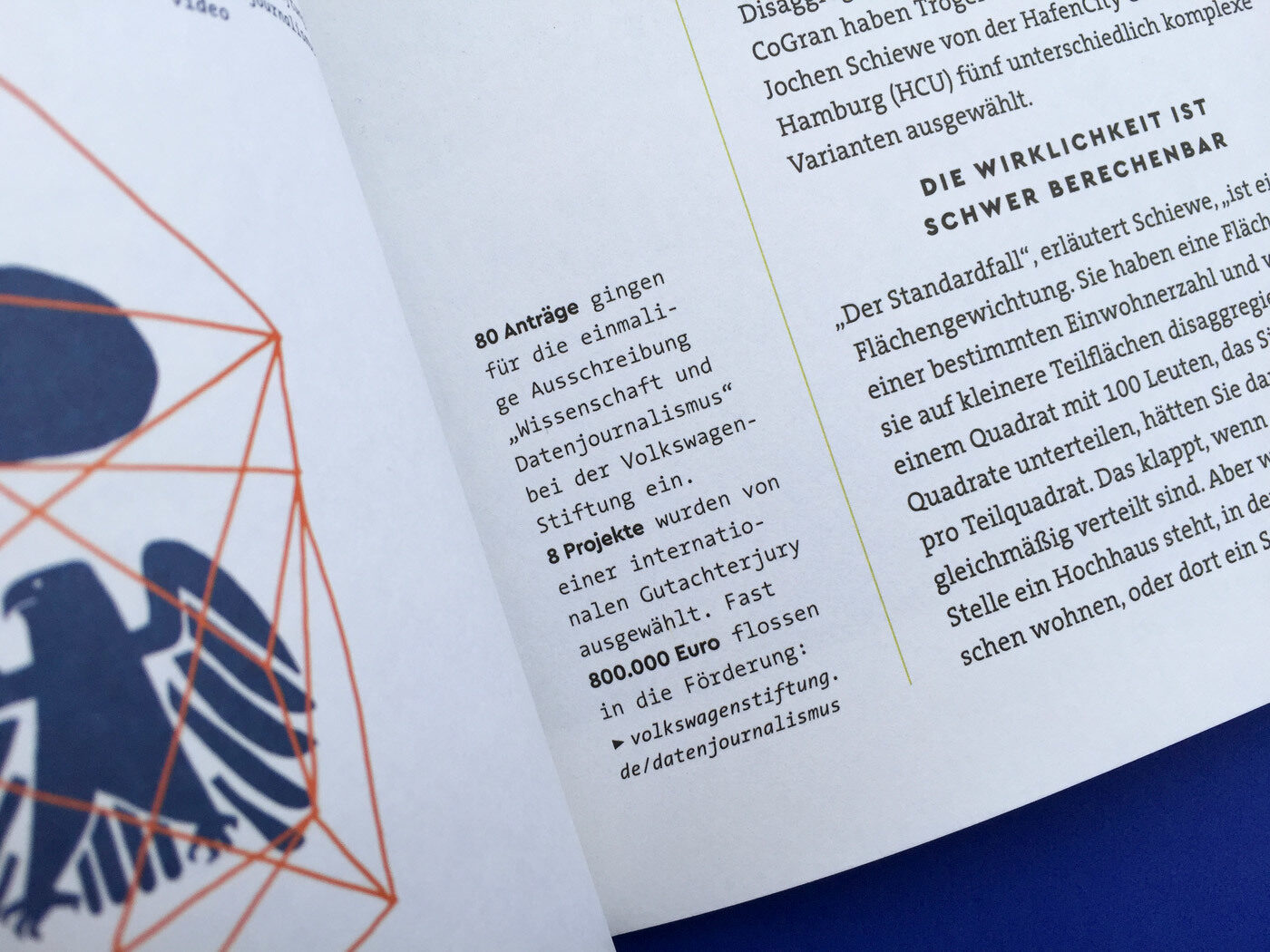
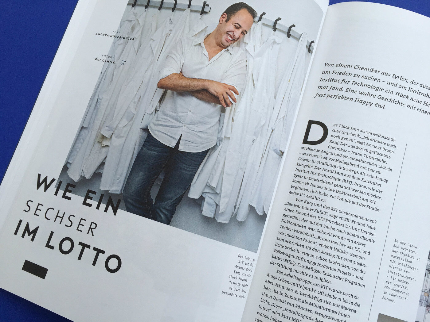
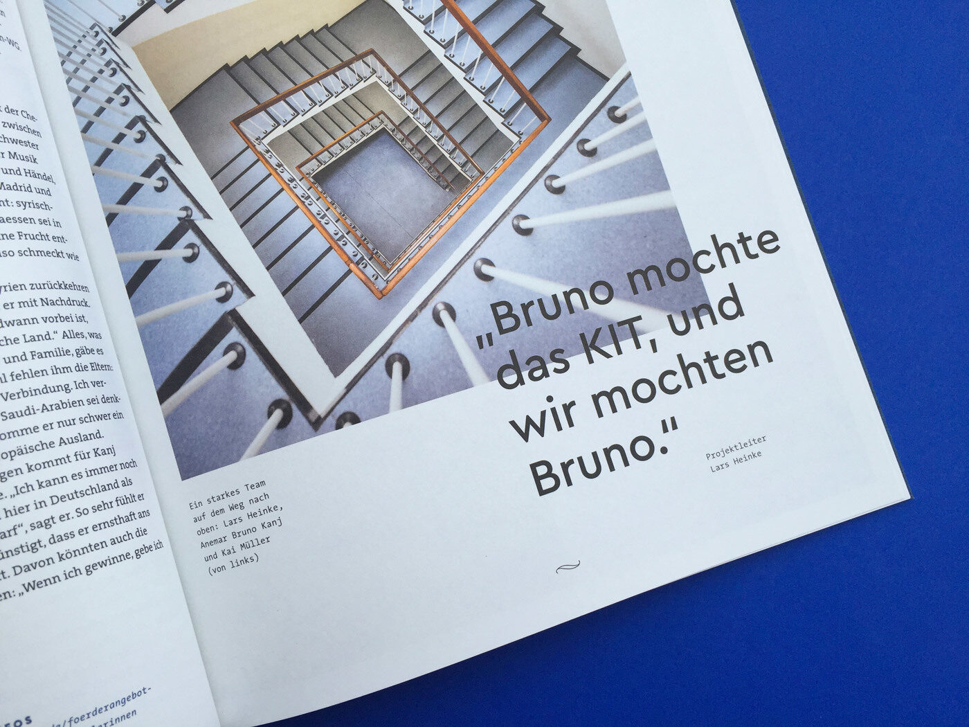
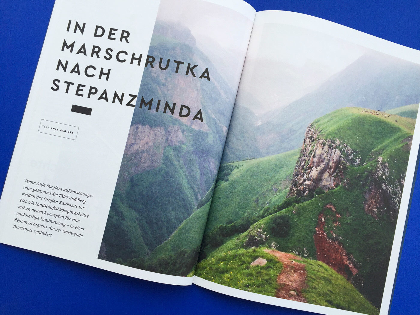
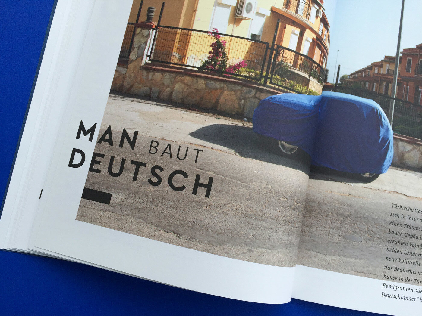
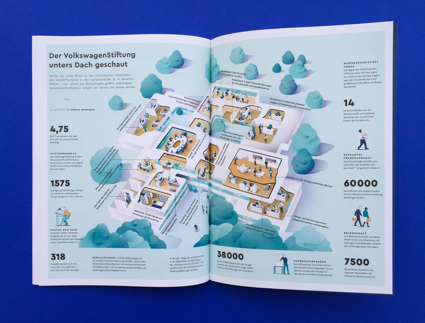
Corporate Publisher TERRITORY developed a magazine for German VolkswagenStiftung. Combing Cera Pro with the corporate typeface Thesis creates an undogmatic, fresh and unique design.

The VolkswagenStiftung is Germany’s largest private, non-profit organisation dedicated to funding research in science and the development of interdisciplinary knowledge. So, it’s no surprise that the first issue of its newly-designed “Impulse magazine” focuses on a science’s dialogue with society.
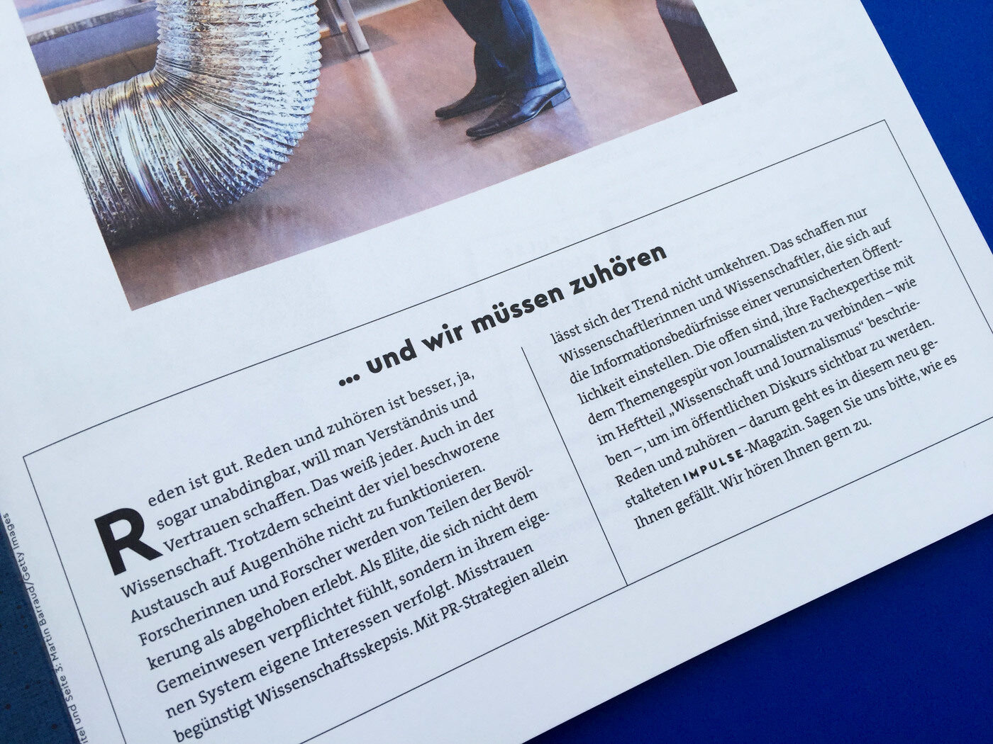
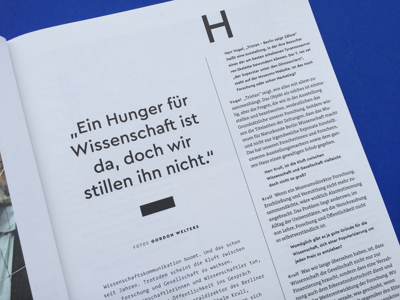
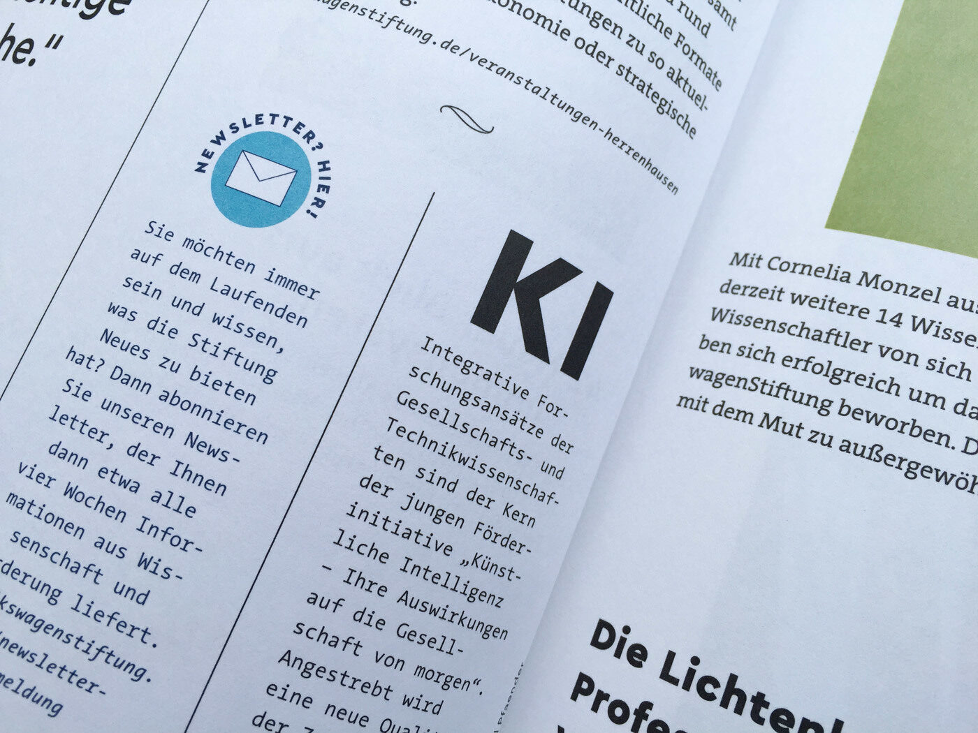
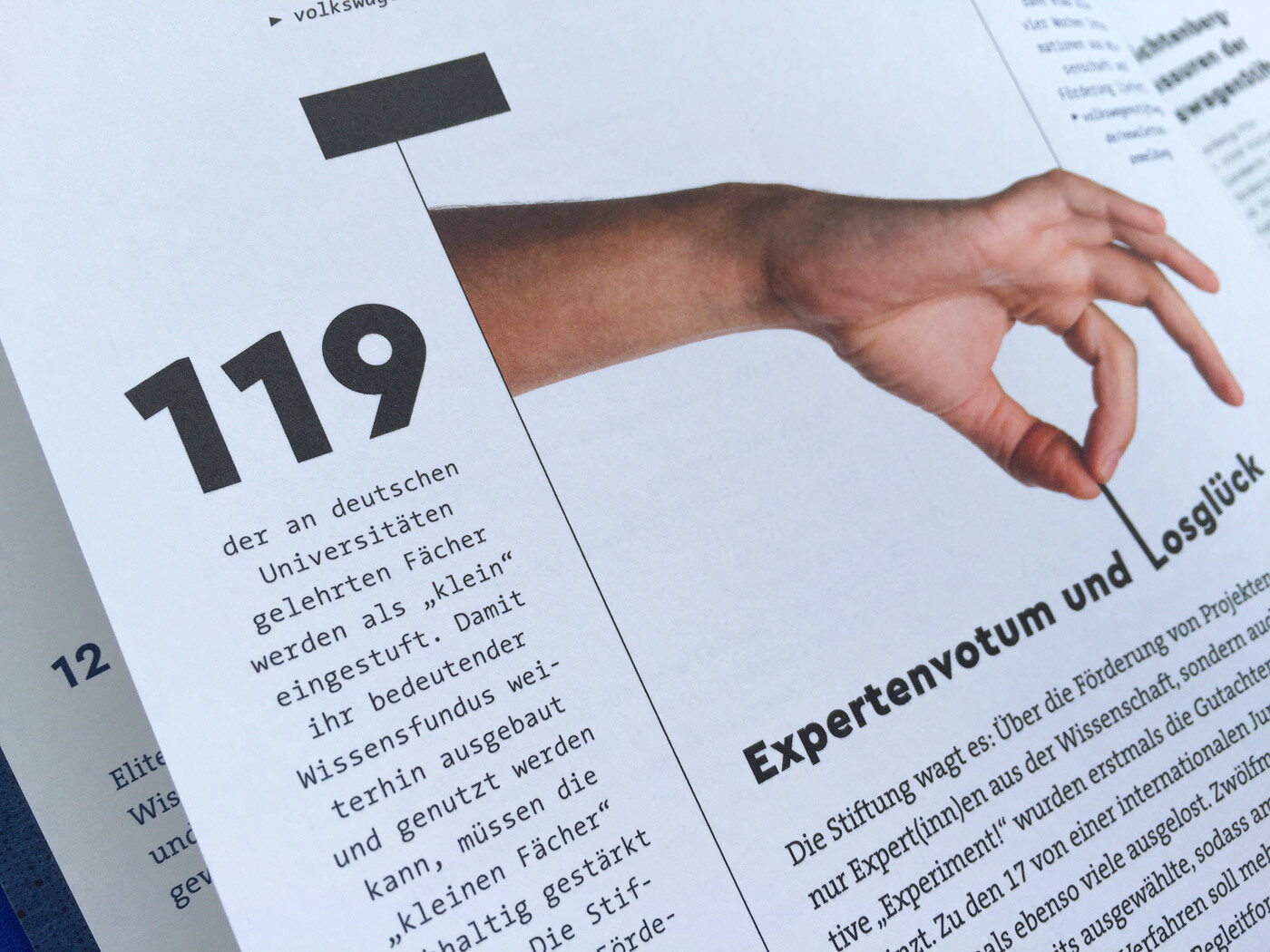
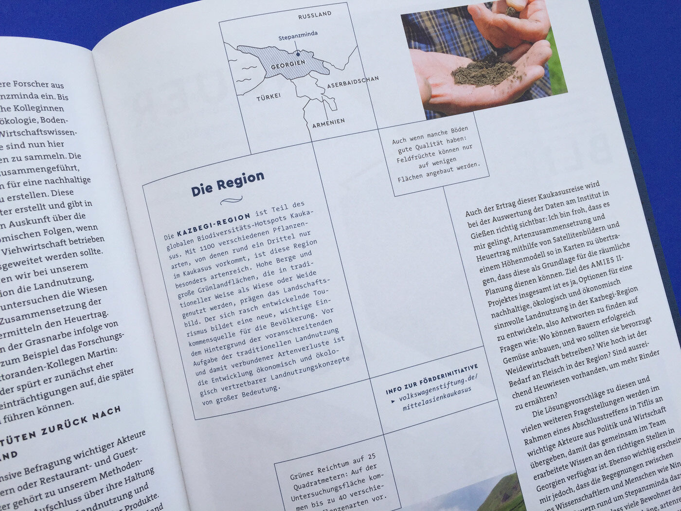
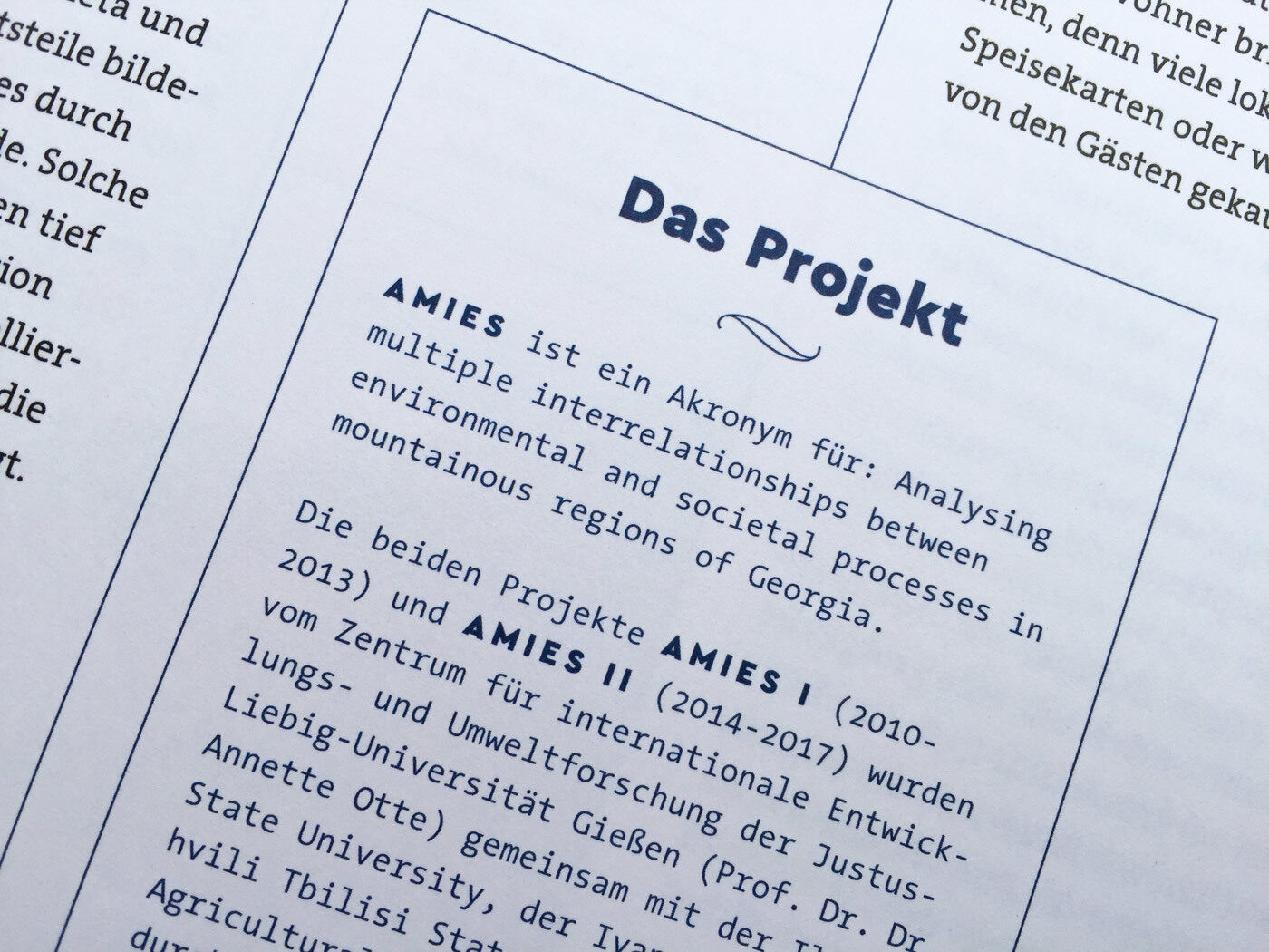
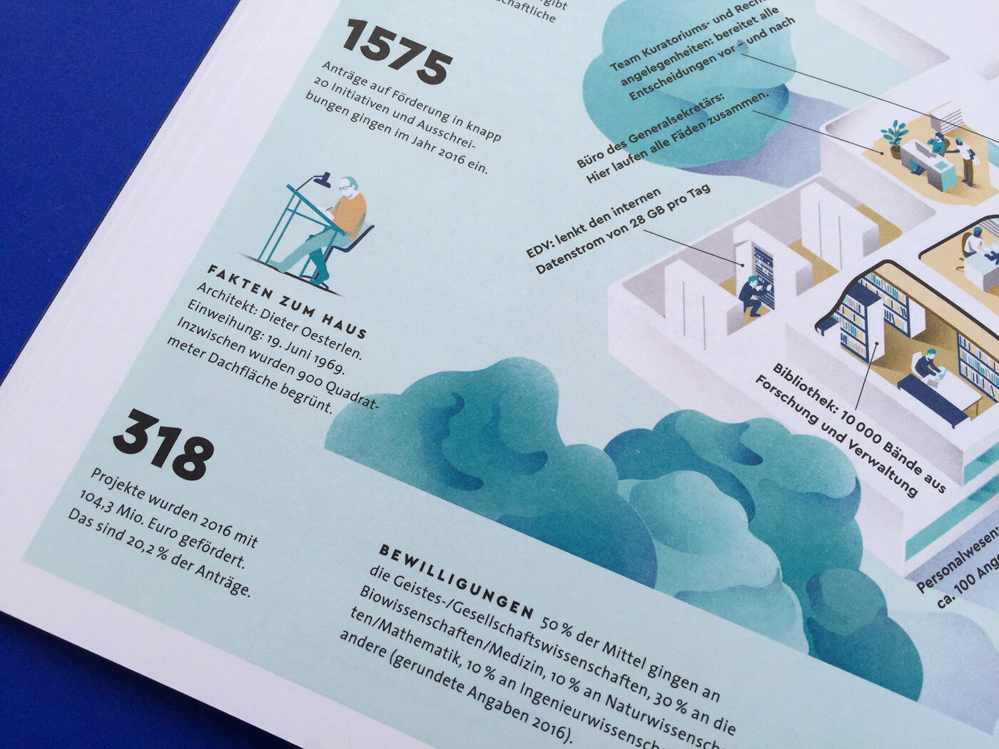
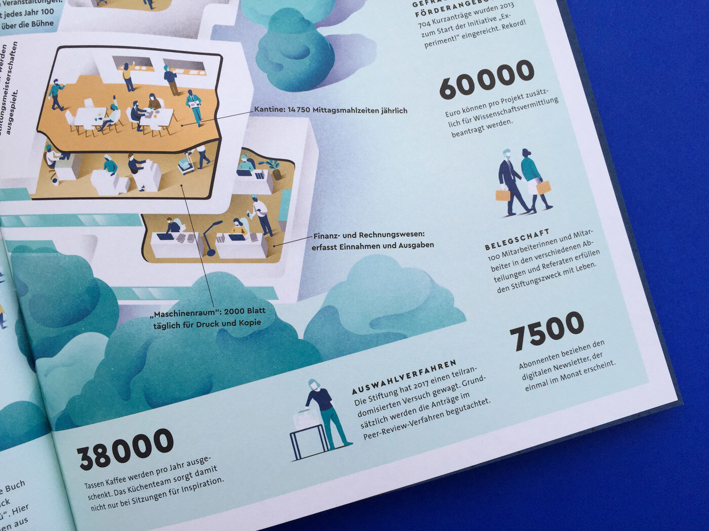
The combination of type is, from a dogmatic point of view, bold but appropriate. Max Nelles, graphic designer at TERRITORY, matched Lucas de Groot’s humanistic Thesis superfamily (with its serif, sans, slab and monospace styles) with the geometric Cera Pro. Although Cera Pro primarily shapes headlines and large quotes while TheSerif handles body text, the two typefaces interweave in margins and captions. Sometimes Cera Pro is used in longer texts; an unusual but identity-building interplay of typefaces.
