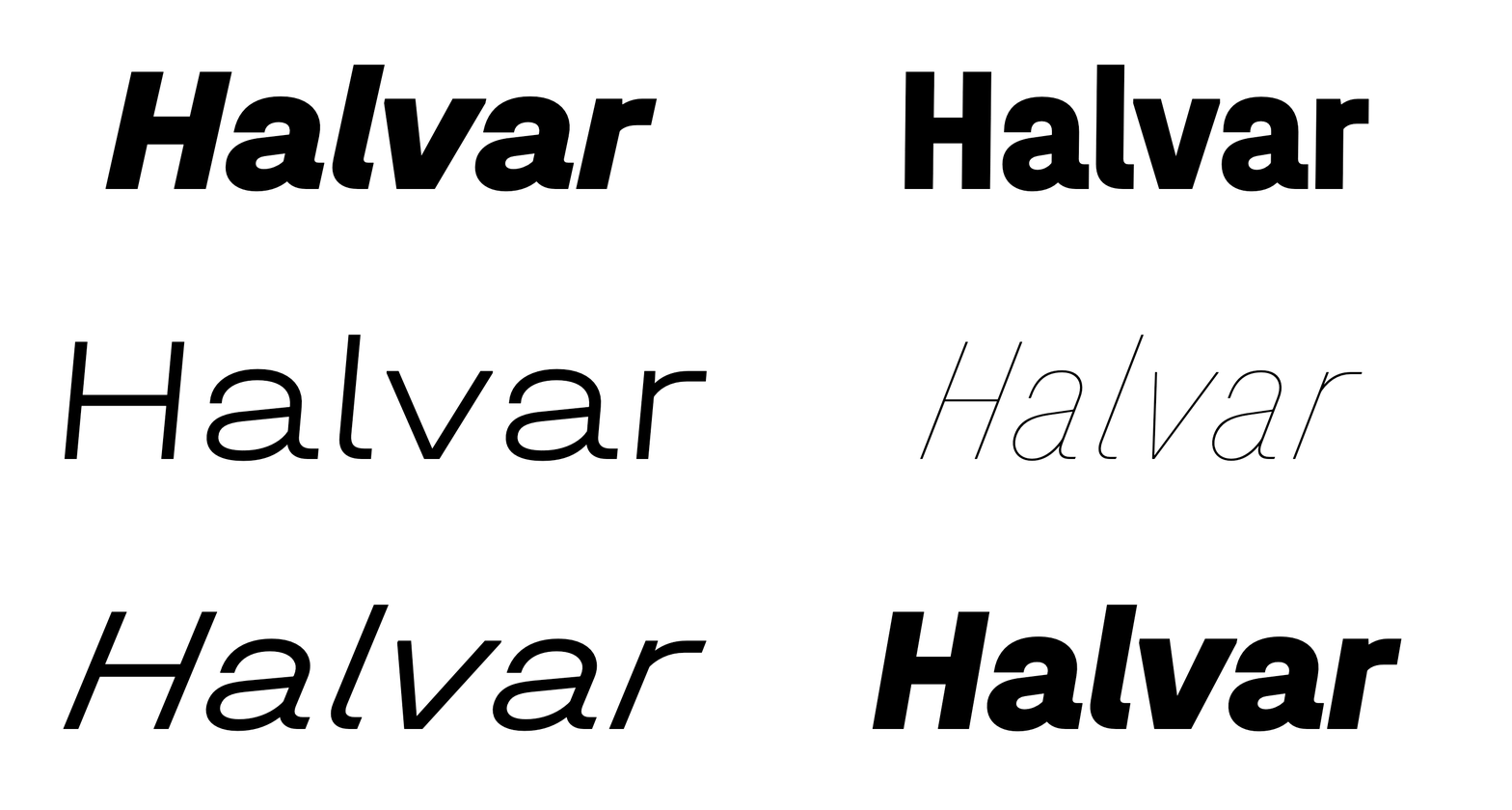
Engineering Halvar — Type Design as a Trialogue
“Four masters, plus italics and we are done!” At least that’s what we said. Designing a plain but complex font system with three designers, an intern and consultants wasn’t as easy as we thought.
How It Started
When it comes to making a TypeMates font, one of us usually takes charge and gets some help from the rest of the team. Co-created by all of us and with TypeMates as the author, Halvar is different. Along with being our first whole-foundry collaboration, Halvar taught us a lot about each other and how we work together.
Sometime in 2017 Lisa started drawing a playful sans. When Jakob suggested that its playfulness could be emphasised by making the letters a little more geometric, clean and closing some of the apertures, Lisa was very clear: “No way!”
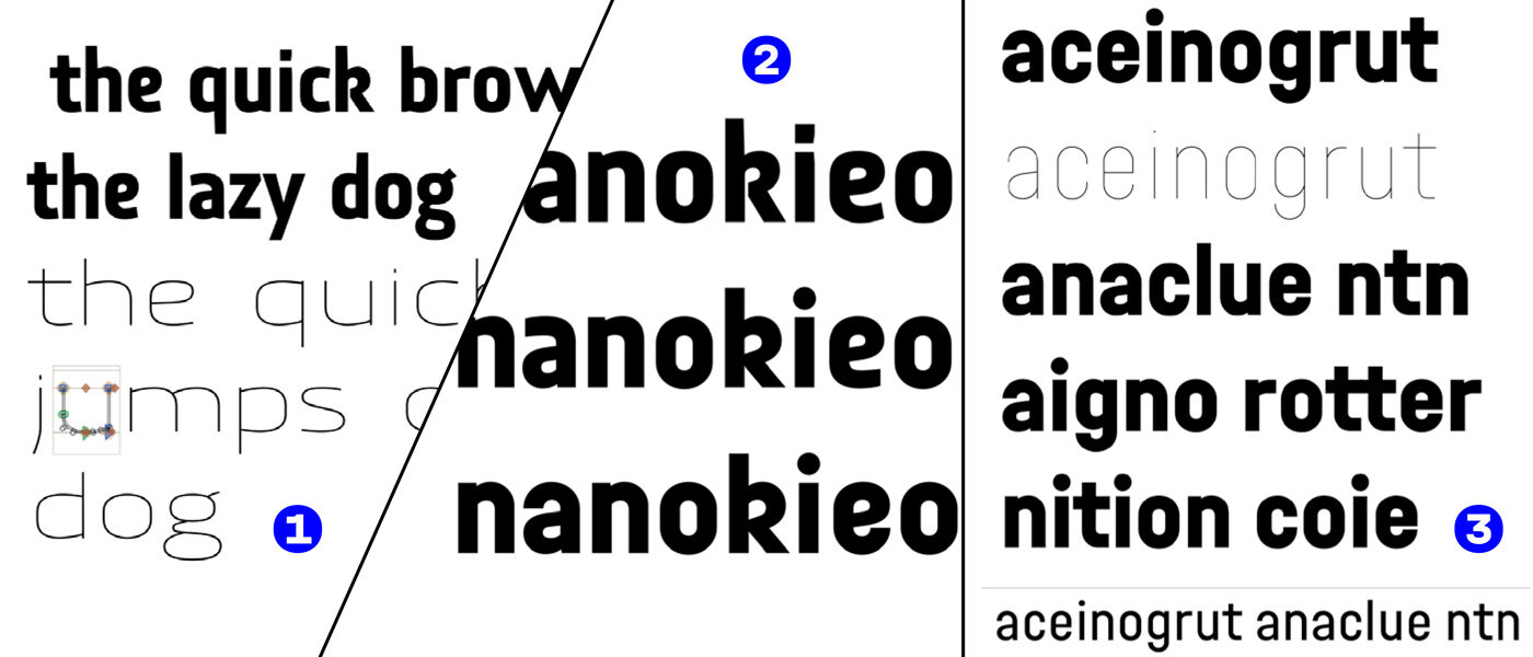
Lisa’s first ideas for her typeface, Jakob’s remodeling, and Halvar 0.1
But with a “Yes, we want this style in our library” the idea stuck and the opportunity to design a typeface together presented itself. We began talking about Halvar and as Jakob and Lisa are crazy for variable fonts, we wanted to be ambitious when defining a design space and finding out where a multi-axis mindset could take us.
Early on we already faced the first problem. Figuring out a practical licensing model for a large, three-axis superfamily in a single variable font is not as easy as we originally thought. But we wanted to design a super-flexible type system and Halvar’s huge range of weights and styles — static for now — are available in our shop.
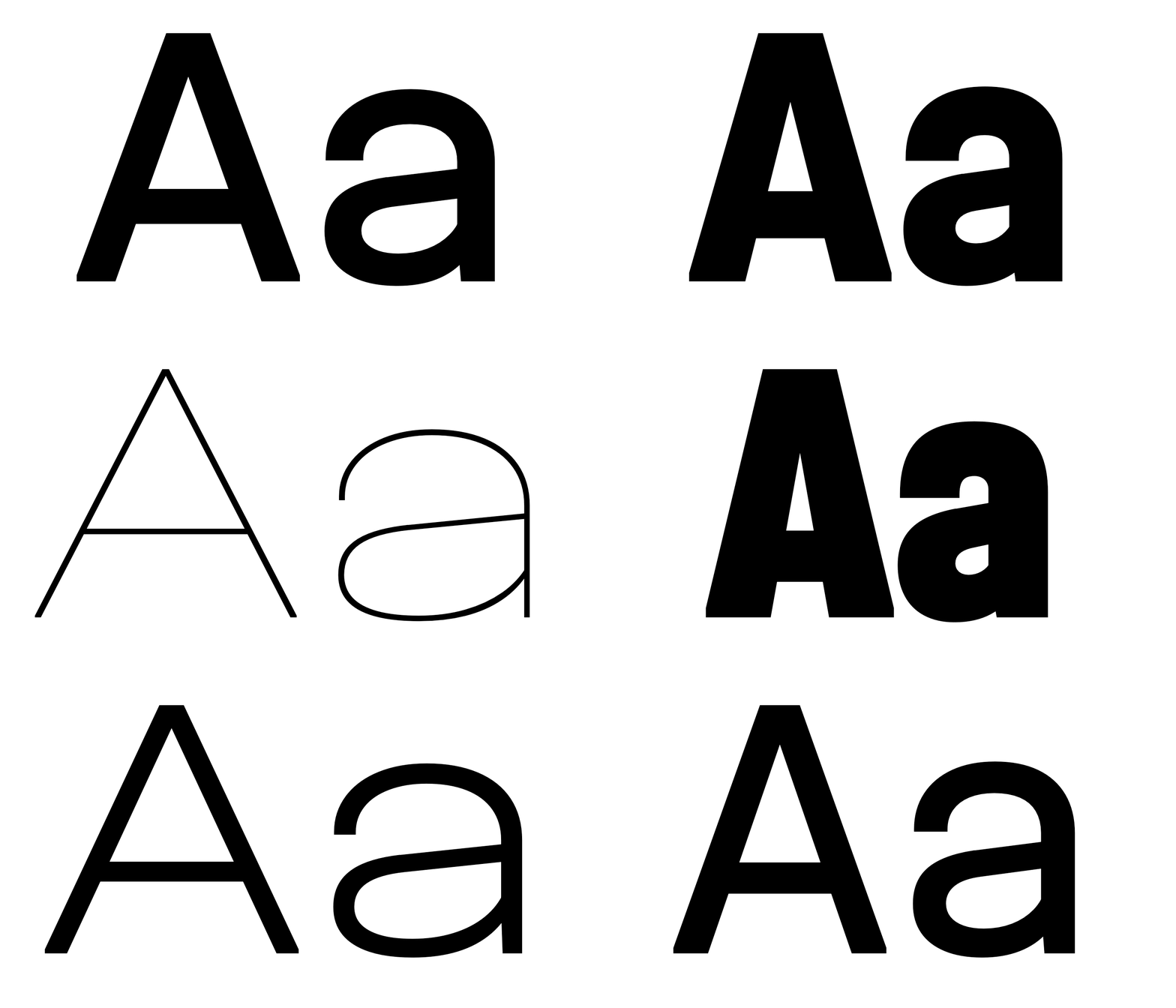
Variable flexing is so alluring.
Speaking of variable minds: we liked how David Berlow created he name for his “Decovar”, a decorative design transferred to a variable font with multiple axes. In Norwegian, “Halvor” describes a solid rock and a protecting guardian. Picking up Berlow’s method, Nils’s suggestion “Halvar” fitted our sturdy design idea and referenced the variable font function we were keen to explore.
We agreed to make Halvar truly flexible. We wanted to have a multi-axis, so that designers could tune the weight, width and slant for responsive interfaces and editorial designs.
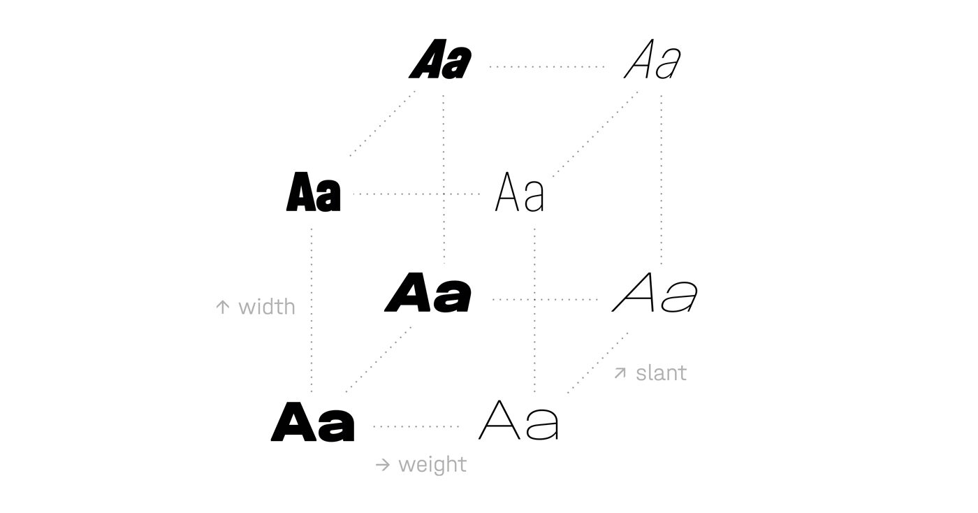
The desired multi-axis system with Weight <wght> + Width <wdth> + Slant <slnt> axis.
On top of making it flexible, we wanted to make it multiplex: mapping the weights of each width to the same matrix. This would make roll over and animation effects easy and allows text to be switched unproblematically between weights.

Uni-width letters across all weights.
At the start we told ourselves that a geometric typeface built on simple shapes would be easy and fast to finish. Well, this turned out differently!
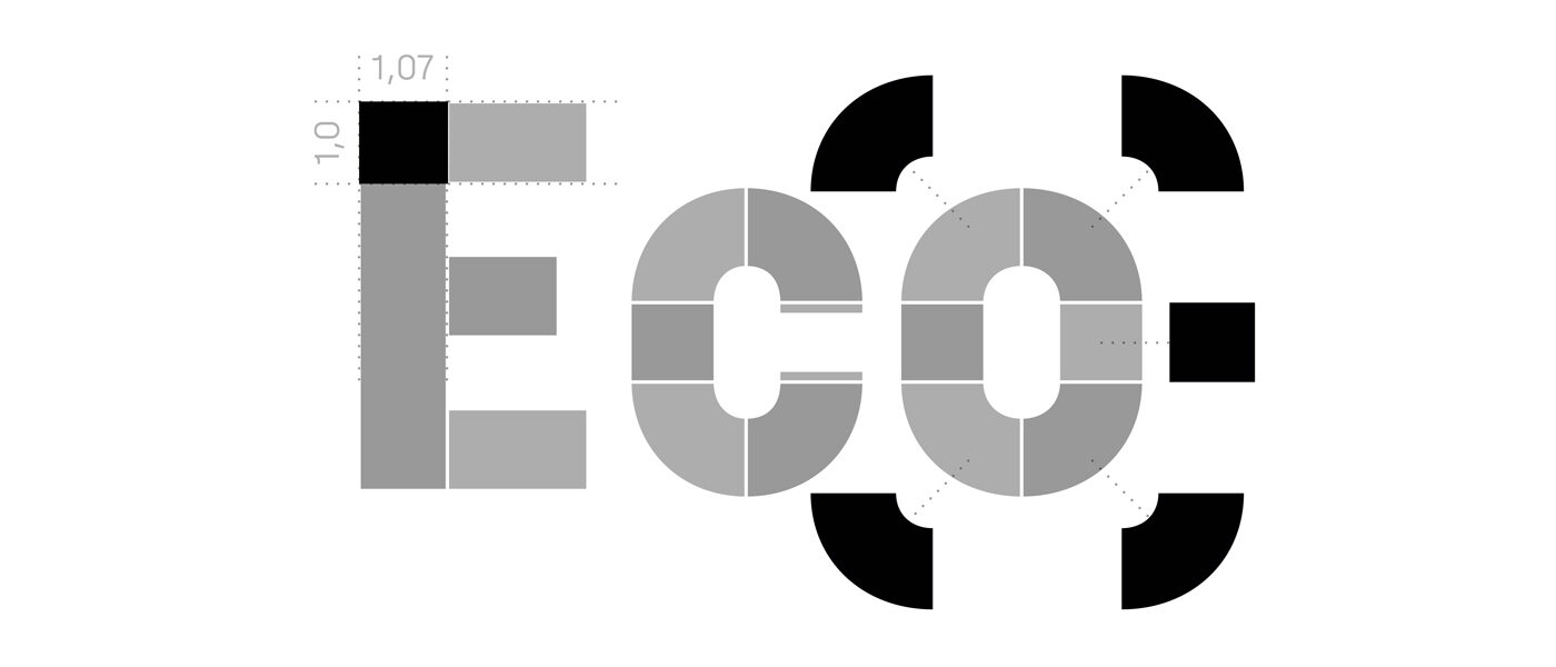
Simple ideas: Stems and quadrants. Then recycling these over and over.
Shaping Character
While Lisa and Jakob were discussing if a circular o in the widest design of Halvar colud work, Nils started to extend the character set. It turned out, that the squarish condensed and intermediate widths look best with an extended that has some horizontal emphasis for contrast.
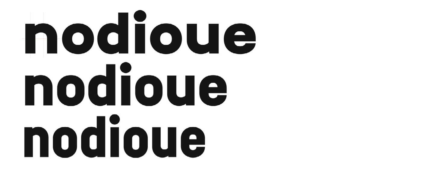
Farewell circular o, we have Cera Pro for that.
While in charge, Nils suggested a more horizontal and static lowercase a. Poor guy, Lisa and Jakob didn’t agree.

Nils, however, wasn’t thwarted in his ideas and added his own secret detail: letter t with a subtle curve.

While Nils was playing with quirky details, Jakob had something more rational in mind. He thought Halvar could be a simplified, unadorned typeface that could follow the lead of Helvetica, Din or Univers. However, time proved that having subtle details was key to Halvar: things like its round dots (no rectangles!) is where it gets its humanity and flair from.

Going for subtle details in the otherwise rather plain constructed typeface: a serifed a and l were added.
At this point we had to clarify what the core of the typeface was about. That question kept us busy for a long time. It also made us test different ideas, some of which we kept. The monospacey I in a stylistic set started as a way to give Halvar an exaggerated mechanical look.
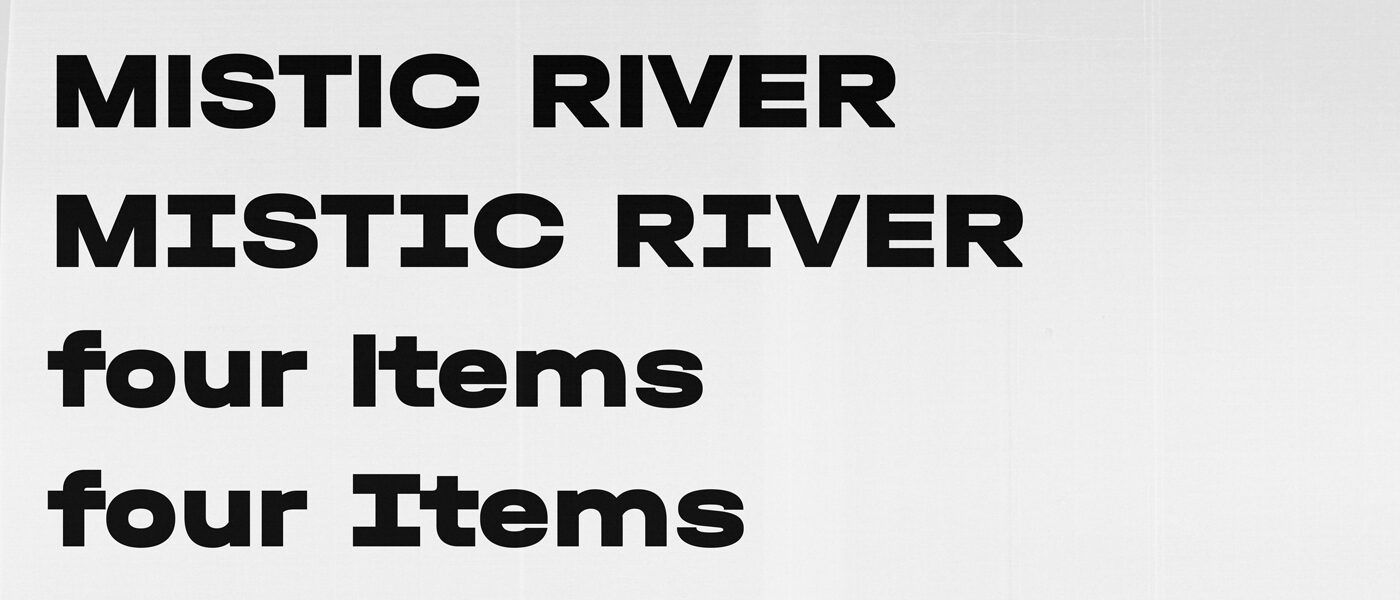
How a single letter makes a big change to a typeface.
Halvar’s attitude is built from details. The slight trimming of diagonals helps to emphasise the technical squareness, but it also stops Halvar from appearing too harsh from a distance. At one point Lisa feared making Halvar too technical and Jakob (who had just finished modifying Cera for the Ministry for Foreign Affairs of Finland and the bespoke typeface for Cherry) was beginning to think that he had become addicted to technical typefaces. Nils convinced them to stick with it though.

With the main character of Halvar being sorted, it was time to not only think about the system theoretically, but also practically. When it came to creating all the masters and styles; we discovered that the condensed masters were too squarish for interpolating the middle widths directly. The dream of “four masters + Italics and then it’s beer time!” was gone and it was time to get to work.
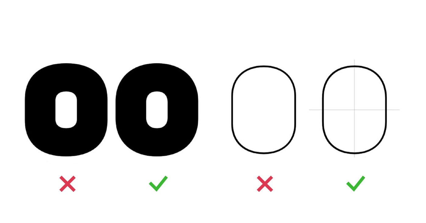
Adjusting the middle widths of Halvar to keep the squarish condensed masters, while preventing the normal widths from feeling too rectangular.
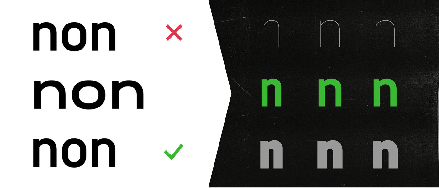
It might be hard to tell the difference between all these ns but as soon as we started playing the monolinear game, we had to use the manually optimised version on the bottom. This basically buried the dream of an easy interpolation with a minimum of masters.
But we didn’t extend the design to nine masters only for more precise strokes. Being able to finesse some of Halvar’s other details was important too.
Halvar manages the balance between a clean design, a straightforward, geometric construction and personal expression. The outcome is a somewhat universal and approachable sans, that loosens up in its details. This approach continues in the diacritics: more conventional in basic letters, more quirky when a language uses complex accents. That’s how Lisa’s secret detail of Greek ΐ snaps into place. Where the Latin accents have a strong horizontal orientation – even the steep French acute and grave – the Greek tonos goes for a more vertical design. In the end all of Halvar’s accents are slightly emphasised, but the method is different and respects the script they are used in.

Language Extension
By spring 2018, Halvar fell into place. We had wrestled the superfamily’s 18 masters into shape and it was time to start thinking about going the extra mile with Greek and Cyrillic. That extra mile turned into a marathon …
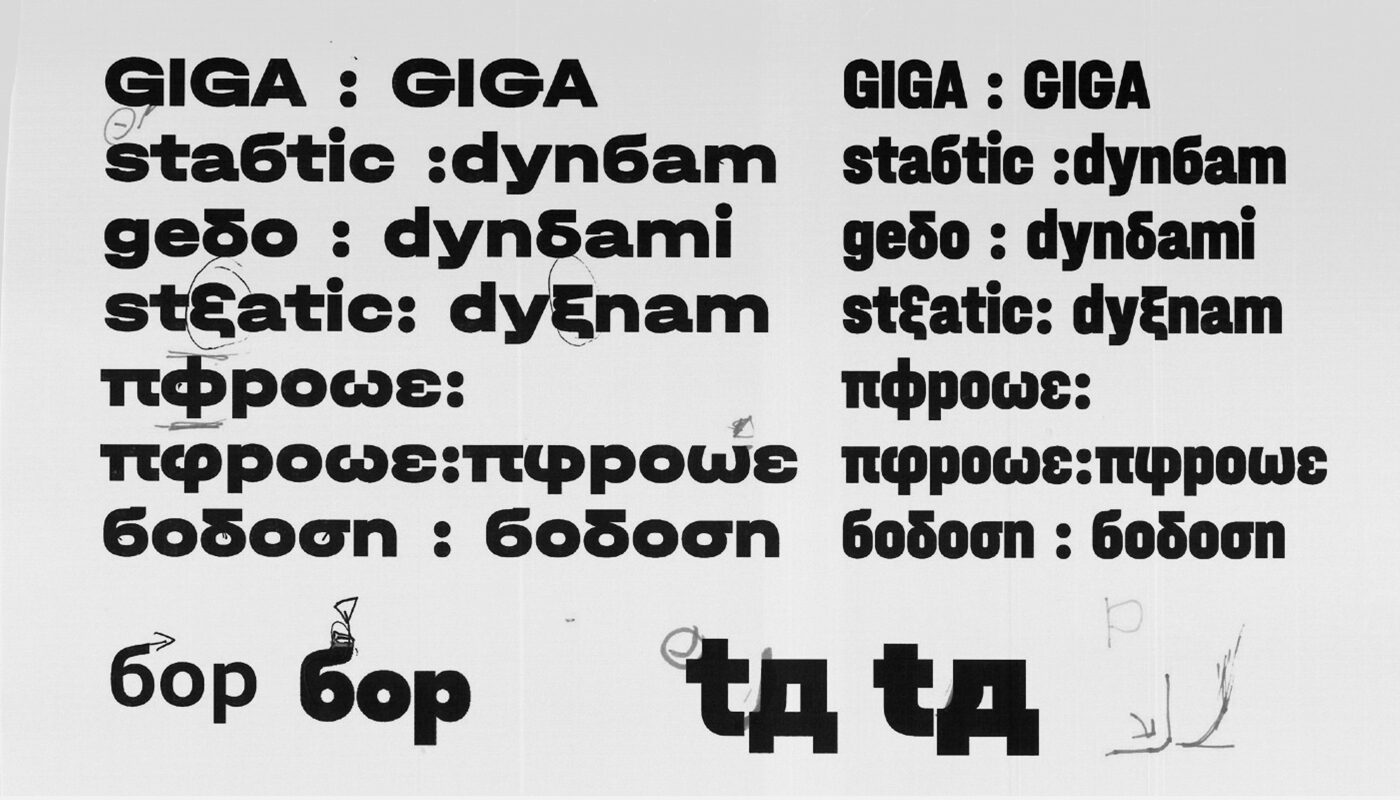
An early attempt to support around 190 languages of three major scripts in Europe.
To make sure we got things right, we sought help from Lisa’s favorite Cyrillic consultant Maria Doreuli and our good friends from type.today, Ilya Ruderman and Yury Ostromentsky.
Working with three consultants who want to bring out the best in your design does a huge amount for your work, but it also means you have to do a huge amount of work. We improved our shapes just to discover they need to be improved again. At the start there were times we felt like “Nooo! It’s so much work to do!” but soon that became “Yesss! If they think something this good can be better, we can keep on going.” It was a rollercoaster of emotions. We all know bonus rounds for fine-tuning design work, but foreign scripts always teach you the hard way: there is more to learn.

Discussions on Bulgarian alternates, how Latin they are and how Russian their construction should be.
We had a similar experience working on Greek. This time, Nils and Jakob had more severe letters in mind, but Lisa had met Kostas Bartsokas at the University of Reading and they both thought differently.
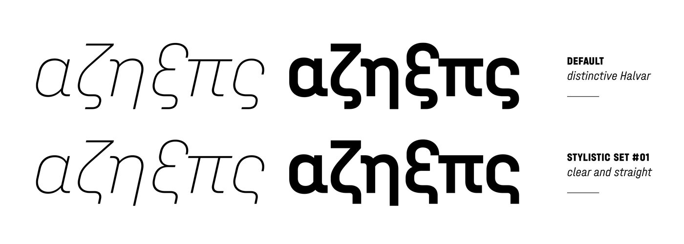
For a long time, Lisa’s favorite versions of Greek letterforms were pushed into stylistic sets, but on the verge of the release, Lisa and Kosta’s concept for these letters became reality. In order to have a properly localised, native treatment of Halvar’s design ideas, the most eccentric Halvar became default. For everything else there are stylistic sets: ss01 to access more clean shapes, plus ss02 for more legible and UI oriented variants:

The Omega sparked a debate about what we should do when Halvar’s square-sided rounds join strokes. Inspired by Albert-Jan Pool’s type safaris in Greece, it was clear to most of us that the more extroverted form—an Omega with an extra elevating stroke—was the way to go, especially as Halvar has a Theta with a stroke that creates a similar look. Initially sceptical, Jakob was won over when he realised how this approach unlocked a much more playful omega in Halvar Stencil.
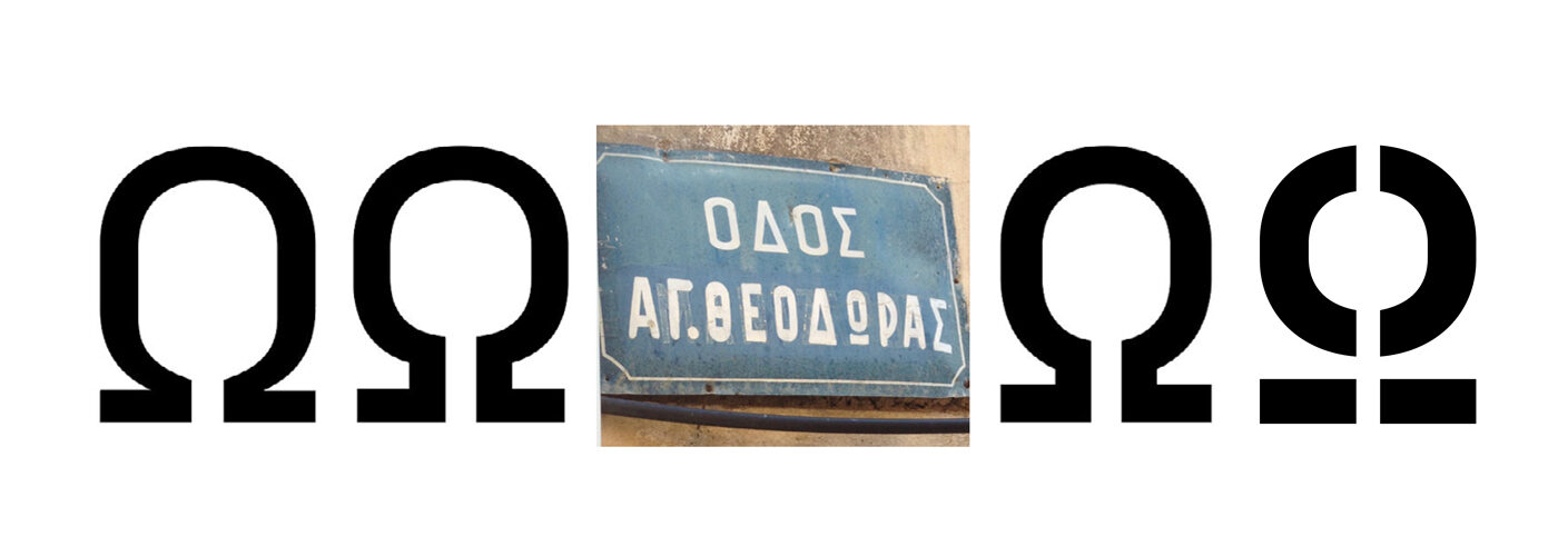
Six shades of Omega: Jakob’s first draft, Lisa’s version including Kosta’s recommendation, what Albert captured on the road, the final design and Halvar Stencil.
Doodling with the most unnecessary details, Jakob’s secret detail in Halvar is the notdef character. Only appearing in the case of missing glyphs, we hope no one will be forced to see this character, but if you like you can use it as ShadeMedium (unicode: u+2592).
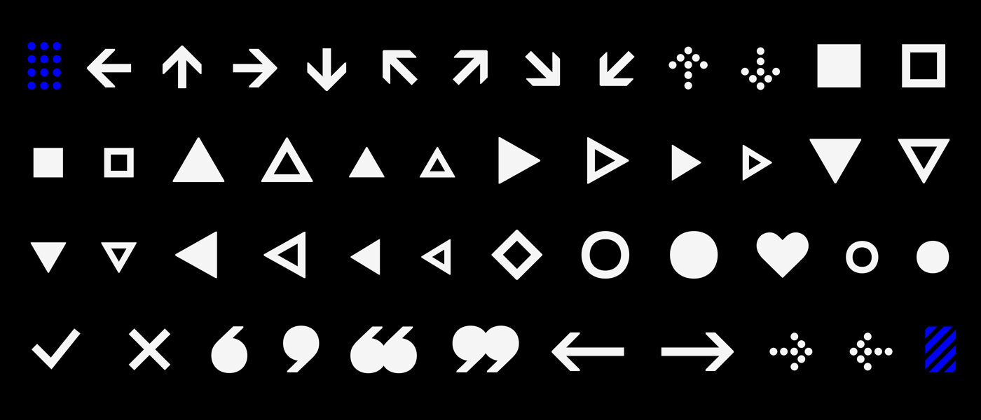
Alongside the “.notdef” some more special characters are included.
Slanting Stuff
Watching Nils doing all the work, Lisa and Jakob came up with the brilliant idea of supplementing Halvar with a highly slanted Oblique. “Let’s max-out the fun of sliding the <slnt> axis back and forth! Get to work, Nils!” Traditional 12º obliques? They can be interpolated later.
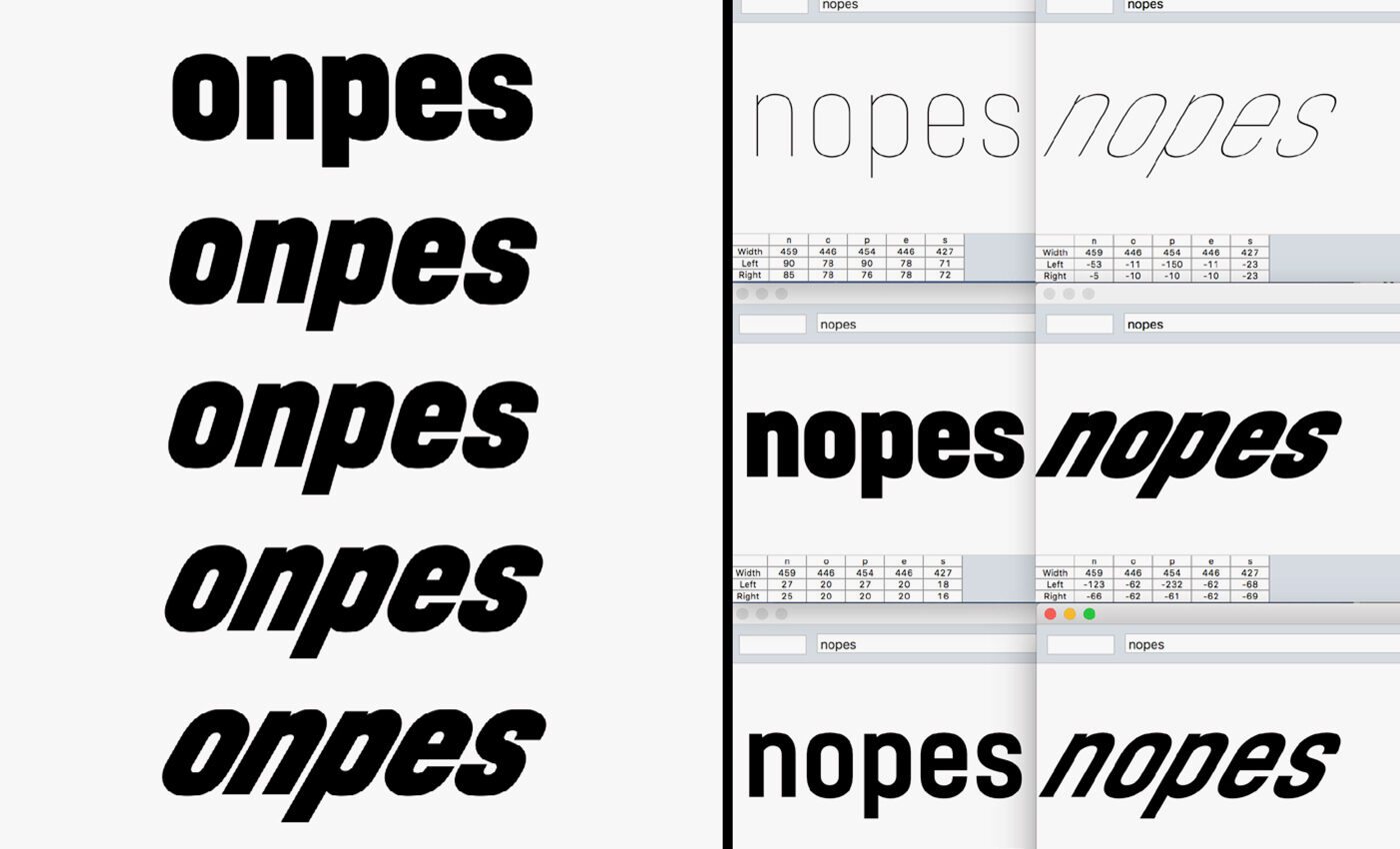
Nils is slanting stuff. Exploring the SuperSlanted angles.
When Nils was slanting and testing 30 degree obliques, we realised that the stems were getting tighter and there wasn’t enough space to give them the right weight. 24 degrees felt like the extreme angle of choice as it didn’t need so many corrections, but: pustekuchen! In practice a 24 degree oblique is still too light without proper correction.
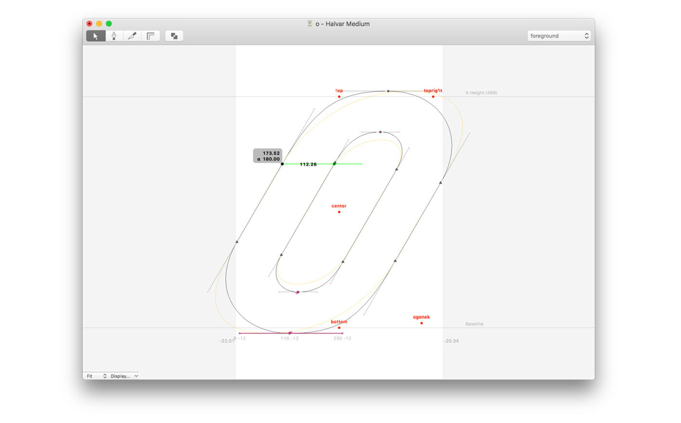
After slanting a shape, the work began. We need to care about skewed curves and far too thin stems.
Slanting a typeface with a technical feeling and no cursive elements turned out to be much more time consuming than we expected. Was it the 24º angle, or Nils taking two months off with his new family in his multivan? Either way, Jakob and Lisa stopped drinking beers and joined Nils in finishing the italics. It was then that their breezy “Hej! Let’s have some SuperSlanted italics!” came back to haunt them.
While Paul battled his way through creating Halvar Stencil, Lisa and Jakob discovered that drawing nine perfect oblique masters was physically demanding. Grabbing shortcuts on the keyboard, tilting heads, lifting a fresh stack of proofs from the printer, standing up to get a different perspective on a detail — the multi-axis minded design space of 2017 led to a 2019 work out.
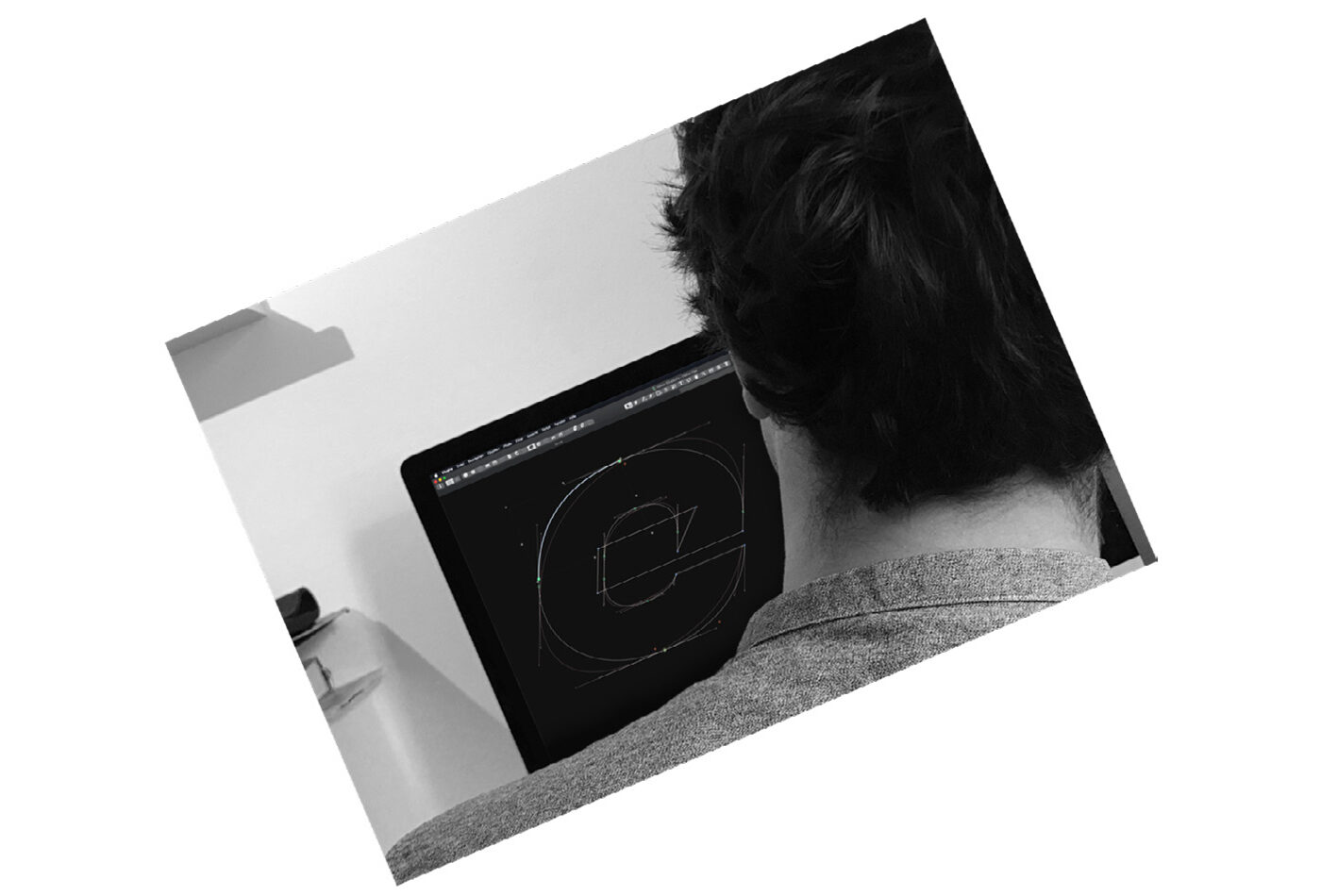
If you stare into the slanted, the slanted stares back at you.

Whoa! Both masters are compatible but interpolating with an angle separates o and e in this letter. Interpolation strains the power of imagination.
Post Production
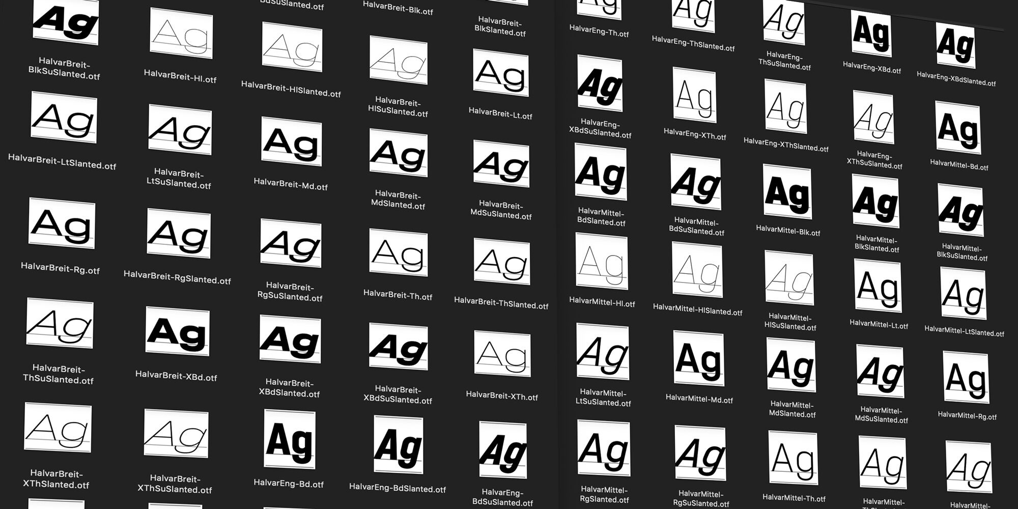
Nils came up with the idea of using the original DIN typeface naming syntax Engschrift, Mittelschrift, and Breitschrift for Halvar’s widths. After he posted a Wikipedia image to our Slack channel, Lisa and Jakob loved the idea — it’s raw and simple, and so is Halvar.
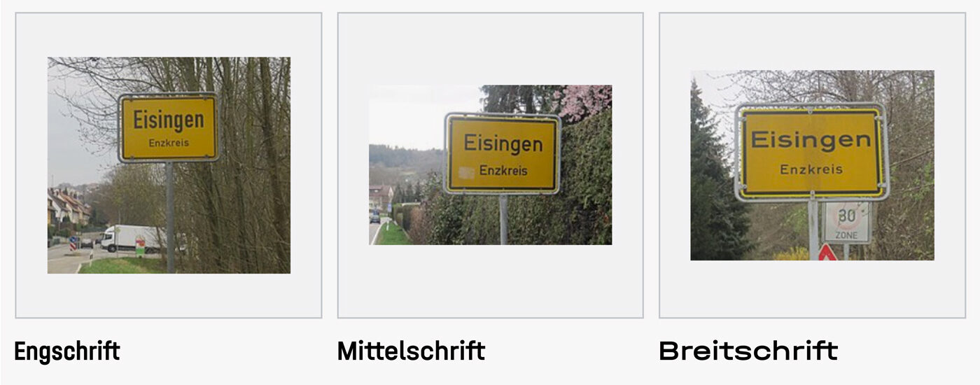
A few months later, Jakob began to think that using both German and English in the style naming might be clearer; e.g. “Halvar Breitschrift Bold SuperSlanted”. He even tried to involve his wife to raise his vote against Lisa and Nils. No chance.
All the hassle with Halvar’s multiplexed design and the SuperSlanted finally paid off when it came to kerning. With Halvar being constructed out of consistent parts, the kerning values for the extended Breitschrift could be transferred and scaled to the condensed masters. And as each weight and style in one of Halvar’s widths will occupy the same space — even the angular italics (mostly) — the multiplexing paved the way for us to kern the complete superfamily by kerning one master and doing some maths! Hail to the rule of three, long live Queen Systemisation!
We wanted a pixelproof screen performance. And yesss, any customer will want that too, but nooo, we can't afford manual TrueType hinting for 81 styles.
Happily, Anke Bonk stepped in and helped us have TrueType hinting that’s better than most auto-hinted fonts out there. The penny pinchers that we are, we got her to focus on the text styles, spending time on improving the deltas of the neediest letters. We can’t say that all 81 styles are manually hinted, but you can’t deny that the rendering of Halvar on screen is pretty good:
Finally
Phew, that was hard. After delaying the release of this megalomaniacal project to get things just right, it was finally done. For us, it’s time to take a look at the ampersand stretching and enjoy the feeling of mission accomplished.
