Cut, Select, Delete, Repeat!
Halvar Stencil is here and ready to max the gap! Here’s how Paul Eslage managed to handle all the variable gap sizes, weights and widths; struggled through the Cyrillic and Greek letters and tried to include all of the three TypeMates’ opinions.
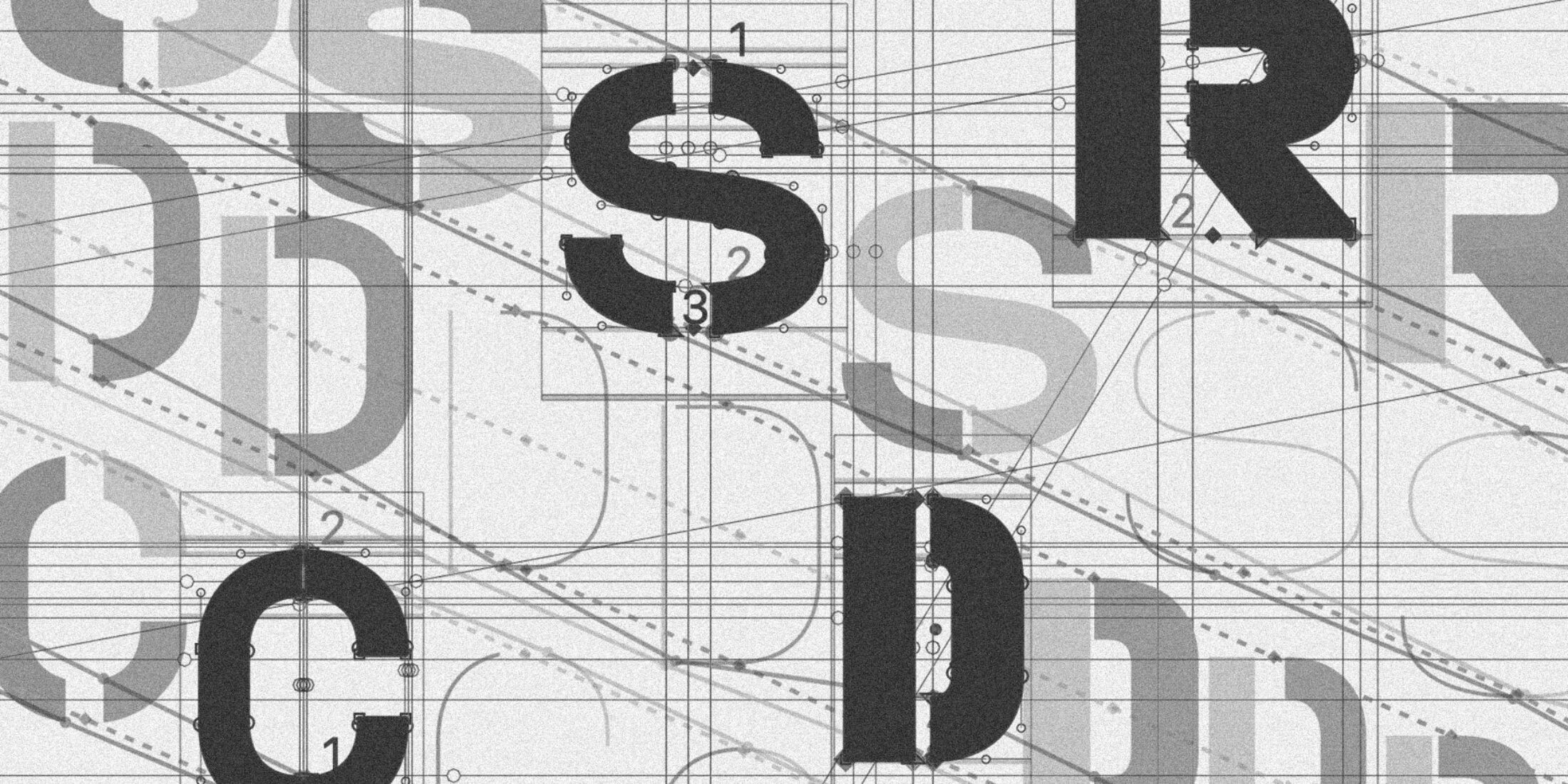
When I started my internship at TypeMates, they asked me to board the Halvar flagship to work on a stenciled version of the typeface. Of course I was into it and I thought I would easily finish it during my time at Nils’ office. I mean, it’s just taking existing letters and cutting some gaps into them, isn’t it?
Well, the process of Halvar Stencil became an odyssey of vectors: choosing a stencil style that suits the Halvar universe, struggling through a variable font with 18 masters (yes, eighteen!) and feeling like a child of divorced parents when it came to grappling with Lisa, Nils and Jakob’s feedback. Along the way I learned many lessons, lessons that defined the process of making Halvar Stencil.
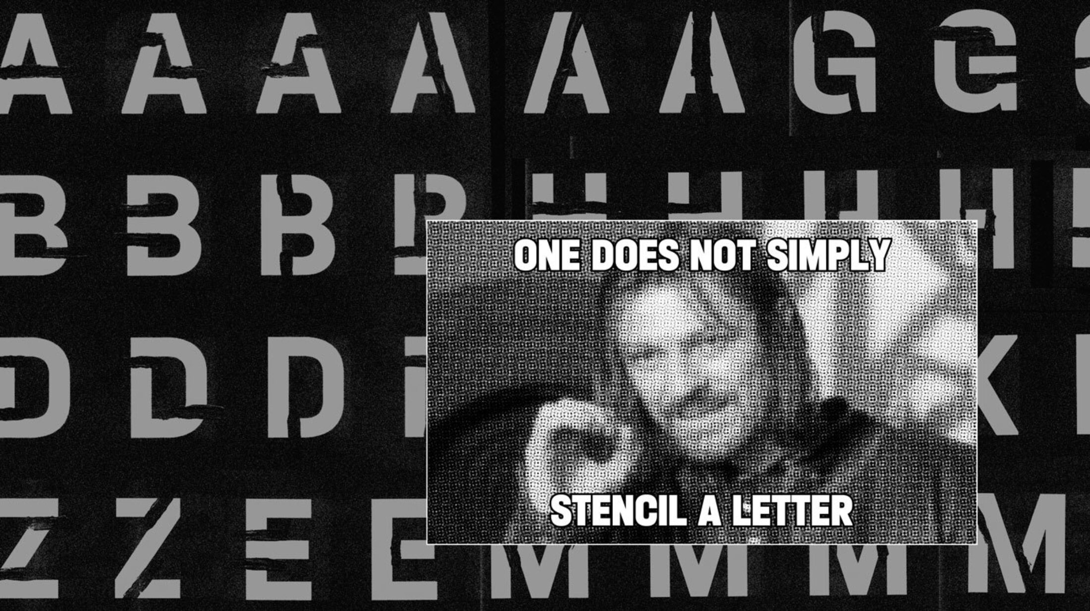
Lesson #1 — One Does Not Simply Stencil a Letter!
Starting out, I had to gather ideas on how to break the letters into parts. I never thought there were so many ways to cut a clean sans serif typeface like Halvar. The key question was whether the gaps should be horizontally or vertically arranged, or rather a mix of both to follow the intuitive flow of each letter. Also, how far could I depart from the original design? So I went back and forth trying to find the simplest way to cut the forms and still retain the character that makes people want to use Halvar Stencil. While Nils wanted the keep the stencils all straight and clean, Jakob and Lisa were interested in more organic and angular ideas.
Angular exceptions in certain letters.
Take for instance the lowercase n and related forms. The original Halvar has a slightly angular part where the curve hits the stem. At the beginning I tried to keep this detail as a key characteristic of the typeface and I even overdid the angularity of it. But in the end it appeared too organic and was working against Halvar Stencil’s rather raw style. That’s why the final form got rid of the angular detail completely appearing unbreakable and industrial.
A similar difficulty occurred in every letter where a curve meets another curve, like in the lowercase a and m, but also in Greek letters α and η and the local Serbian form for б. After thinking about a curved stencil gap that follows the letterforms, I decided to keep it angular to maintain a little bit of rawness.
Lesson #2 — As Vertical as Possible, as Horizontal as Necessary!
The first rule of stenciling Halvar was “As vertical as possible!” But as Halvar is a variable monster that has to work from Hairline to Black, from Condensed to Extended and from minimal gap to max gap, I had to introduce a second rule: “As horizontal as necessary!” Many of the characters have a centred vertical gap, but I had to make exceptions. In the Condensed Black, the crossbars of T, t and f were too narrow to put a max gap through them, the diagonal letters needed diagonal gaps, and then some mixed versions were necessary too. The Latin Z has a diagonal and horizontal gap and figures like 2, 3, and 5 follow a mixed approach. I applied the same principles to the Greek and Cyrillic character set, although they need more horizontal gaps due to the number of crossbars and additional strokes.
To complement the original Halvar — a design all about solid and pragmatic construction — Halvar Stencil’s letters also had to emphasise these qualities and appear indestructible. This also ensures it doesn’t compete with TypeMates’ Cera Stencil, which takes a more organic approach.
Visual balance of the gap size through the different weights.
Lesson #3 — Trust Your Eyes First and Math Later!
When I started defining the size of the min and max gap for the Black Condensed, it was obvious that these values could not just be applied to all the other weights and widths of the family. To make the gaps look similar through the different instances, they needed to grow as the font grew thinner or wider. I ended up with a Black Condensed having the tiniest and a Hairline Extended having the biggest gap sizes.
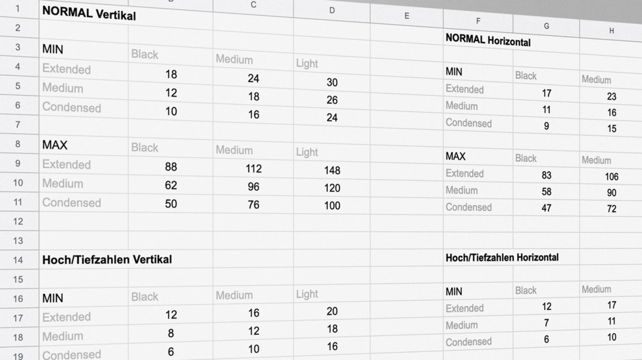
List of all the different gap sizes. I think I know them by heart now.
At this point I tried to solve the problem mathematically. I looked at Halvar’s axes to see in which steps the masters get thicker and wider and tried to adapt this growth to the gap sizes. So far so good, Jakob likes formulas too, so he supported this approach, but Nils protested: “Hands off all that mathematical stuff! It needs to be visually correct. Trust your eyes!”
And he was right. Some things don’t work in a pure mathematical way. The gaps either looked too wide or too narrow in comparison to the others. So in the end I took the best of both worlds. The most important part was to make it feel right visually, but if you can, then put it into a mathematical formula that is comprehensible and reassures the eye, that’s even better!
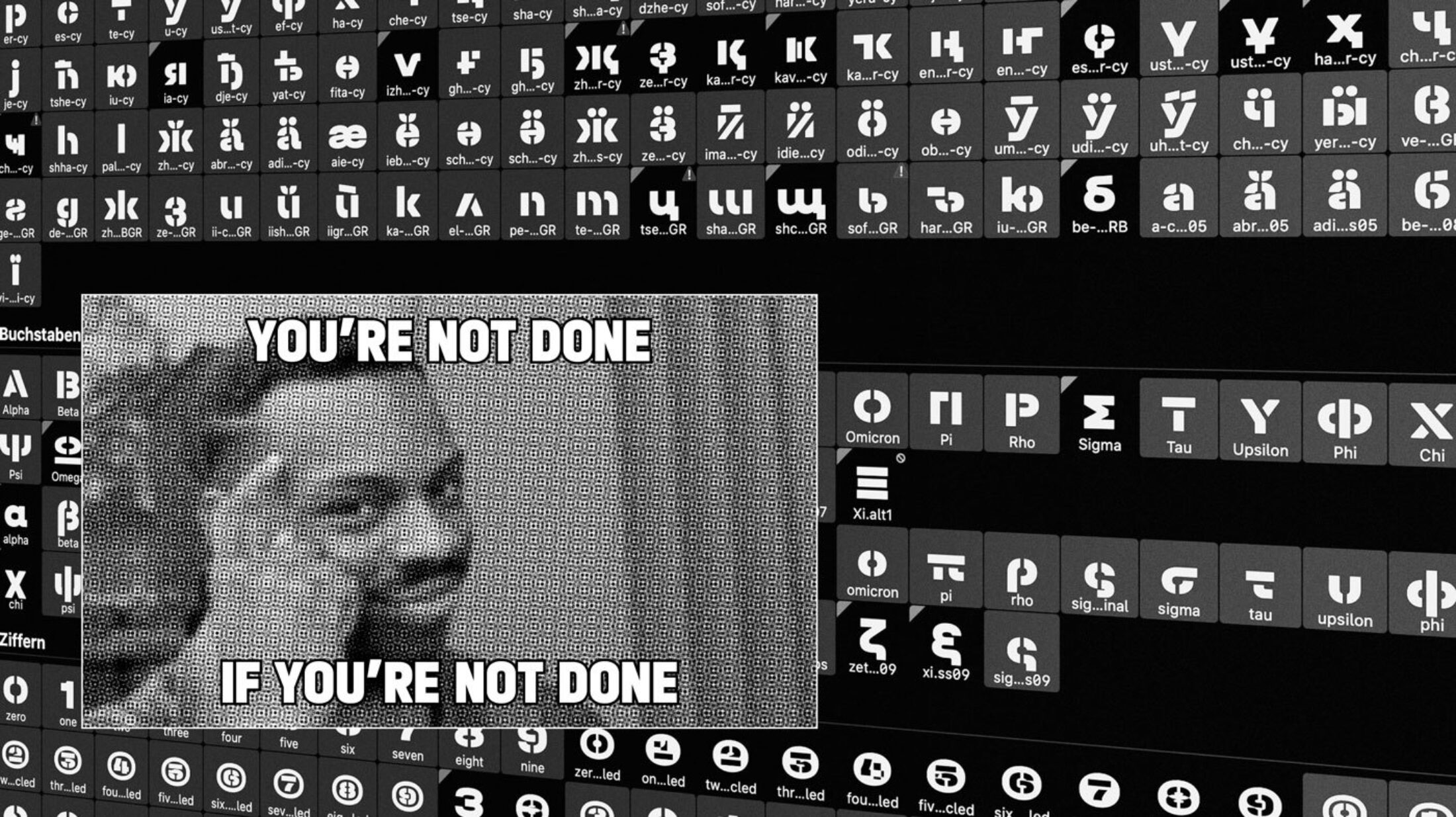
Lesson #4 — You’re Not Done, if You’re Not Done!
So there I was: I finally figured out how to stencil all the letters in the most difficult “Condensed Black MaxGap” master and I had finished all the latin letters in each of the 18 masters. That means I’m almost all the way through, right? Just copy & paste these principles onto the rest of the glyphs, done!
No. The real struggle had only just begun. As I was completely new to Cyrillic and Greek, their letterforms had some hidden challenges for me to conquer. After I had tried cutting these letterforms on my own, I was happy to draw on the expertise of Maria and Kostas. They showed me which principles from the Latin characters could be transferred onto Greek and Cyrillic letterforms and which couldn’t. Taking some time to look at Greek and Cyrillic letters in high contrast fonts helped too; in some cases it felt natural to put gaps where the thinnest parts of a high contrast letter would be.
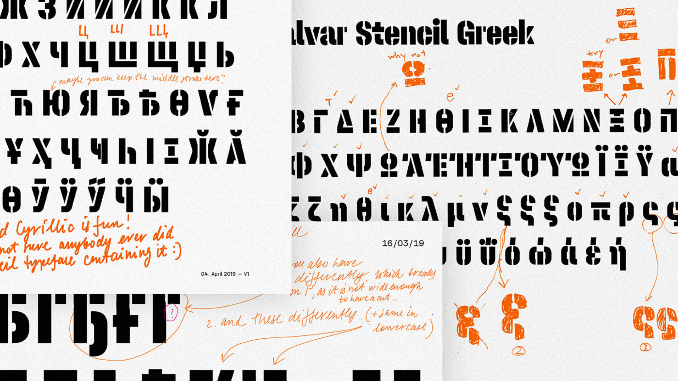
Revision sheets by Maria and Kostas.
Finishing Halvar Stencil almost felt like finishing Berlin Airport — or executing Brexit — it would seem close one moment and never ending the next. Looking at all the glyphs that weren’t interpolation compatible, I often thought, “Yeah, just these few missing characters and I’m done!” But as the human brain is programmed, I finished all the easy ones first and left all the difficult and time-consuming letters to the end. All of this but also the fact that Halvar Stencil was the first typeface for me to truly finish and push to a release, lead to me working through some nights and having to defer some deadlines.
Compatibility preview of all the 18 masters of the ampersand.
Lesson #5 — Keep It Compatible!
When talking about time-consuming letters I mean those characters with masters that were difficult to make compatible. Often anchor points that were necessary in the min gap master had to visually disappear in the max gap. Some design ideas even had to be discarded because the compatibility wasn’t possible or certain interpolation steps would look weird. This case occurred in the Cyrillic И, for instance.
To make this more distinct from the Latin N, in the beginning I wanted the И to have some vertical gaps. But I soon realised this won’t work in the max gap masters of the condensed Engschrift family — there wasn’t even the space to place one vertical gap in the middle. So, I had to stick with the flipped N version. There were also other plans to design the Cyrillic Ж in a more dynamic way but the transition from the diagonal strokes into the horizontal crossbar in the middle didn’t look good during interpolation.
There were also other cases where I had to kind of redesign and tune letter shapes so the interpolation would work fine. This occured in the Latin R and Cyrillic Ж, К and Я. If I wasn’t careful, they would create weird interpolation steps where the two diagonals or the curve and diagonal meet. To get rid of these, I had to rearrange the diagonal strokes to make it work.
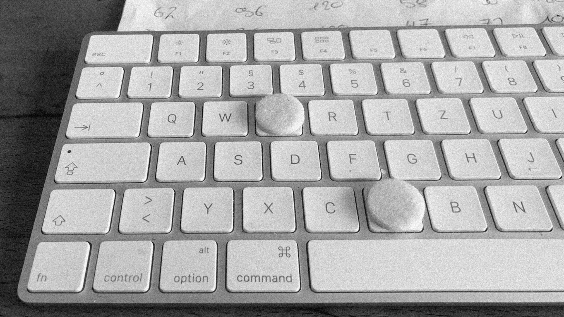
Keeping the stencil workflow efficient. I didn’t even had to look down to reach the most used Glyphs tools anymore.
Lesson #6 — Become the Typeface You Design!
Stencil typefaces haven’t really been present in my head and my toolbox when it came to choosing fonts for different design projects so far. Just out of personal taste I didn’t consider stencil typefaces as beautiful and for me they always seemed too obviously industrial and therefore too decorative almost. But working on Halvar Stencil, a stencil typeface with many options, I grew some sympathy for this style of typeface. We kind of became friends and worked in unity. Like gear wheels in a piece of clockwork, like cylinders in a car engine, like robots passing prefabricated parts: cut, select, delete, repeat… an unbreakable team in every aspect. But enough of the corny metaphors!
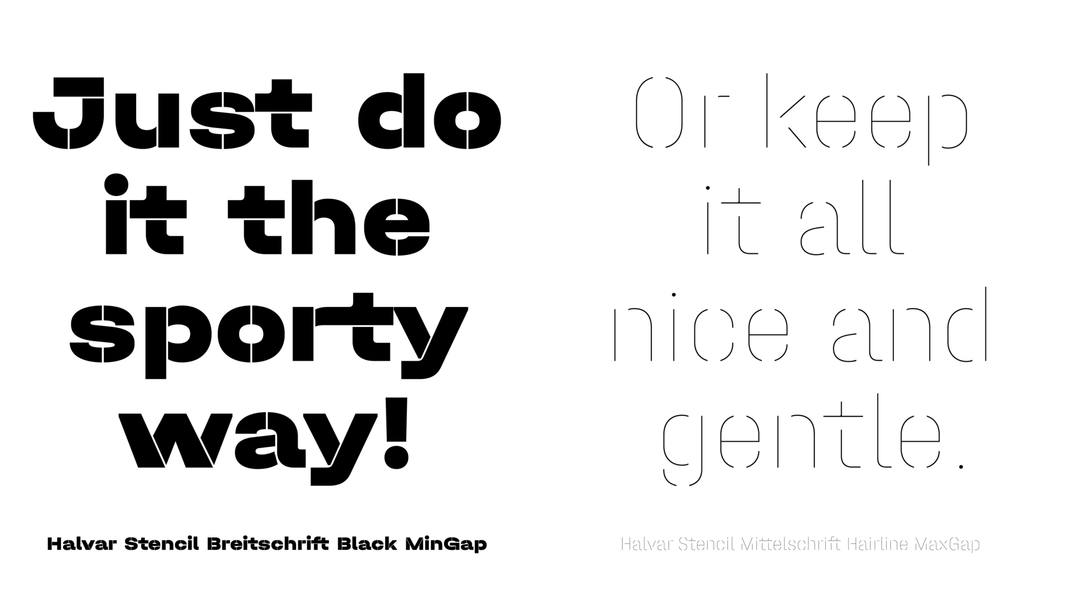
For me, especially having styles like a “Hairline MaxGap” and a “Black MinGap”, it adds a whole other character to the typeface. Almost to a point where I wouldn’t want to even call it a stencil typeface in the first place. It’s not just a loud, raw and heavy typeface. Due to all the different styles to choose from it can also show a modern, sporty and even gentle version of itself. Unbreakable and ready for far more than just huge stencil signage.