conmoto: Catalogues and Communication
Jens Könen is clearly on fire. His magazines and catalogues won the Red Dot and the German Design Award. It’s great to see our Cera Pro as the typographic key ingredient for the conmoto brand.
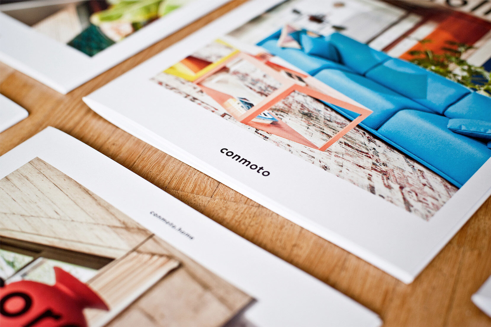
Dedicated to high-quality and sophisticated design, conmoto is a brand for designer furniture and custom design. Alongside the new strategic concept, Jens Könen developed a holistic redesign for the brand’s communications.
conmoto Catalogue
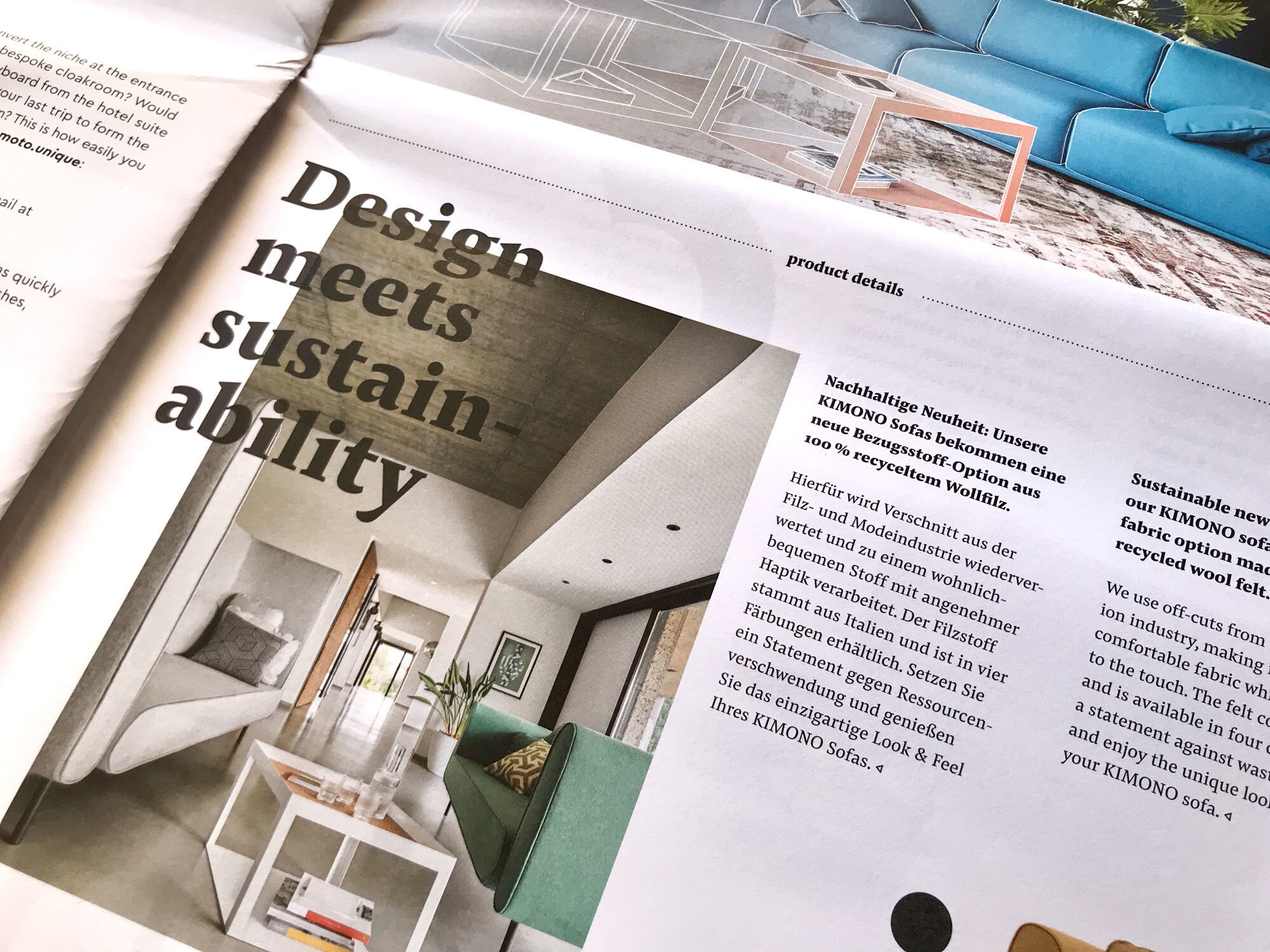
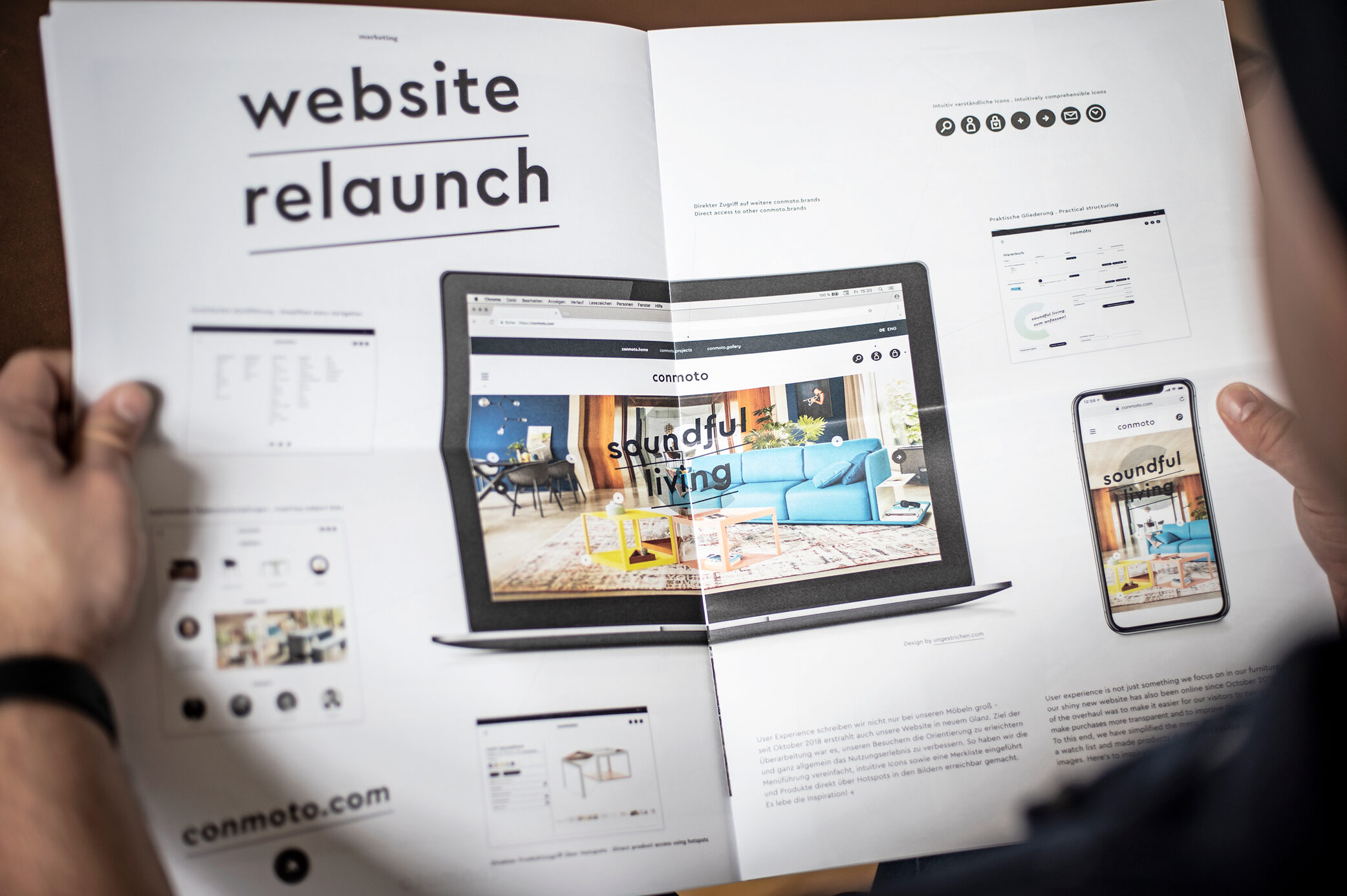
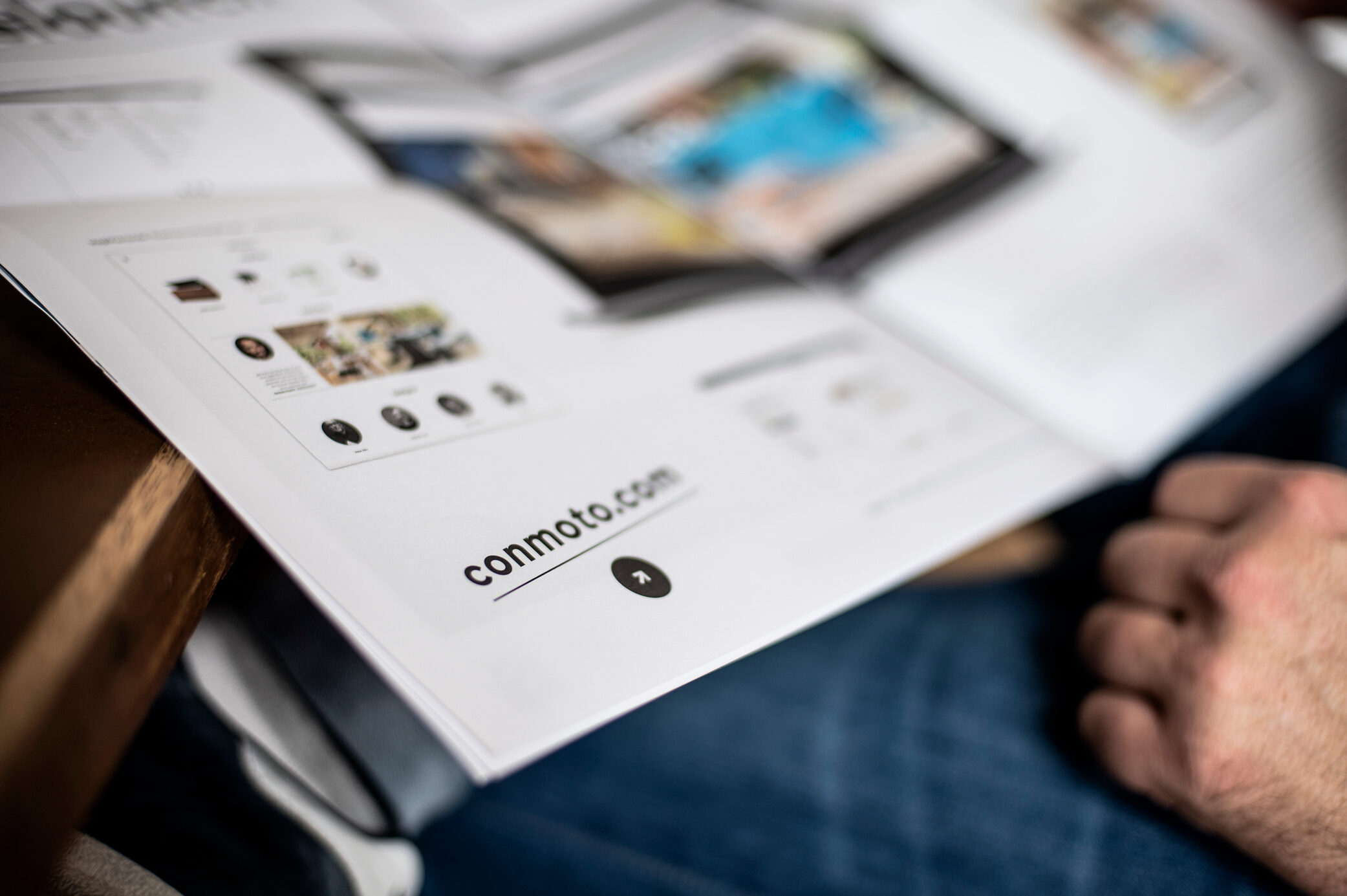
As part of the new corporate design, conmoto’s sales media were restructured and redesigned. Instead of one main catalogue, Jens designed a series of conmoto.home brochures. Each catalogue focuses on a series of products that connect through a shared visual identity by rotating Cera’s italics.
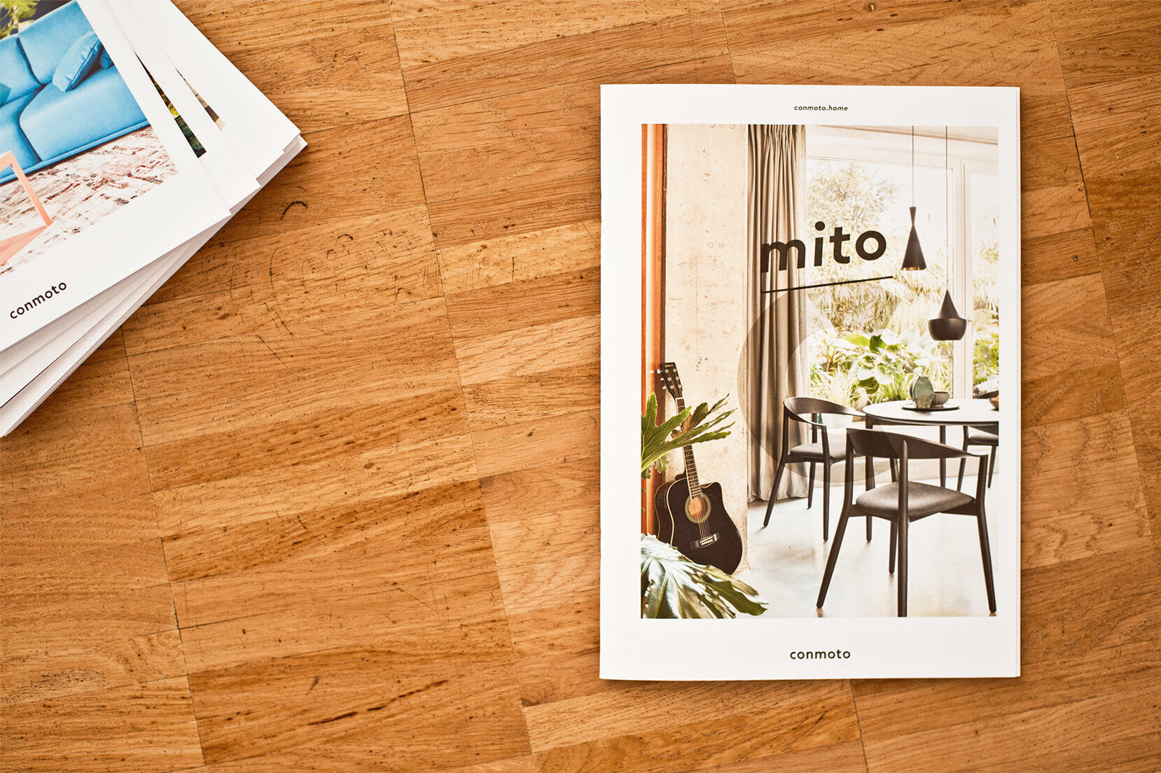
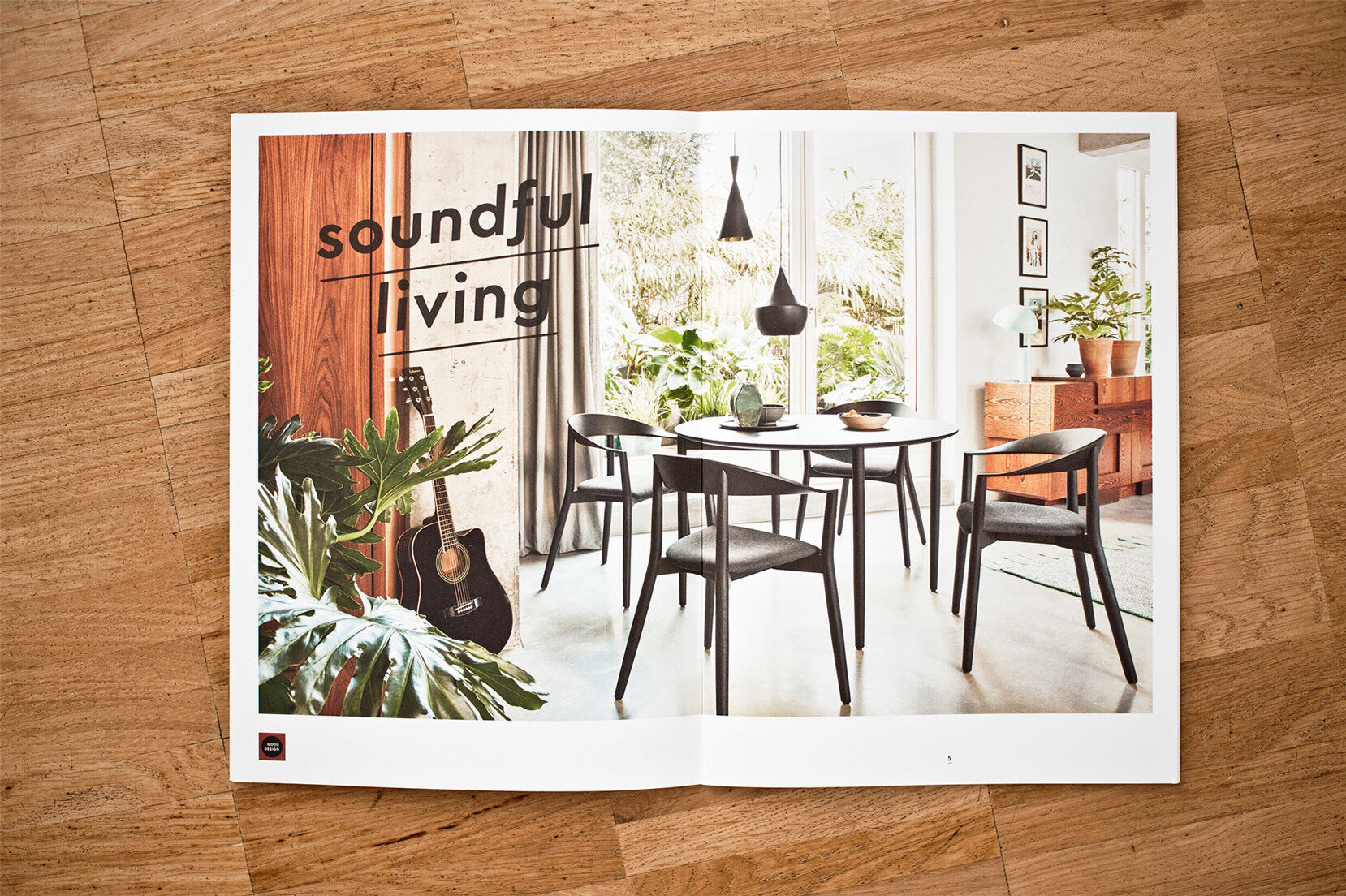
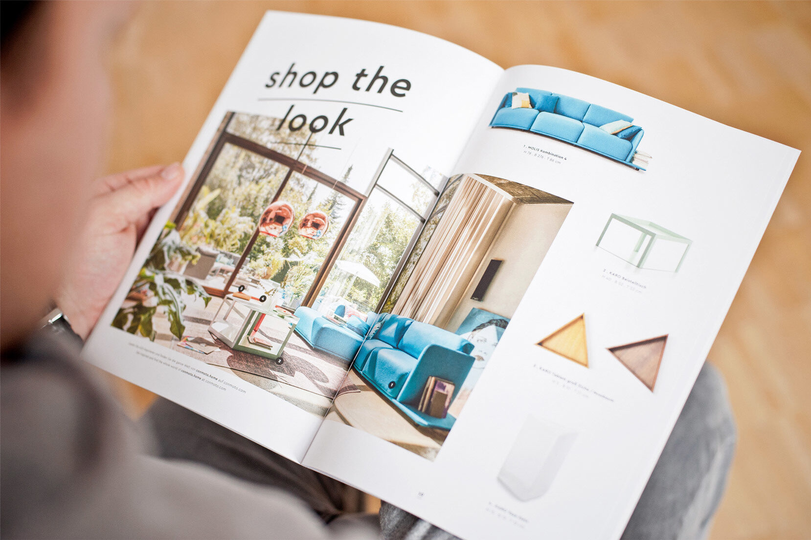
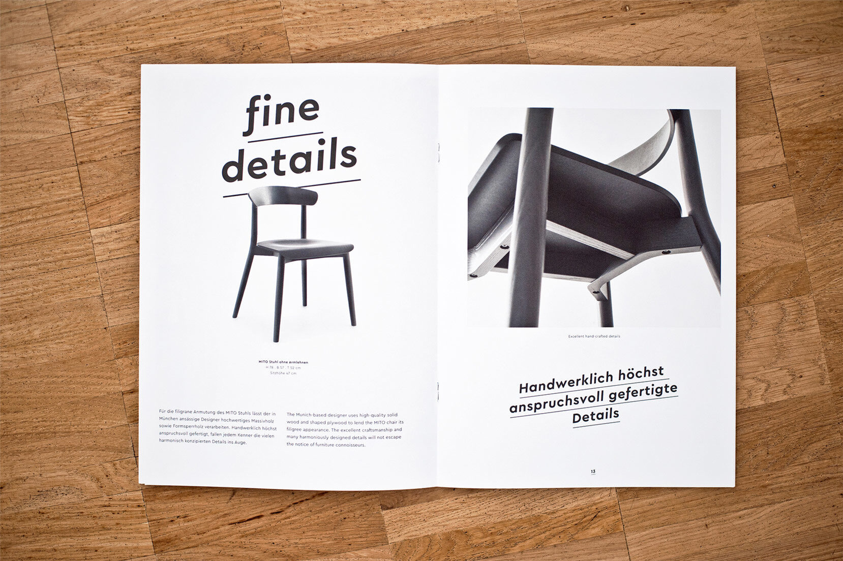
Jens built a shared visual identity by rotating Cera’s Italics.
—
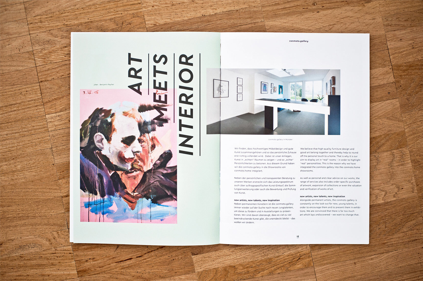
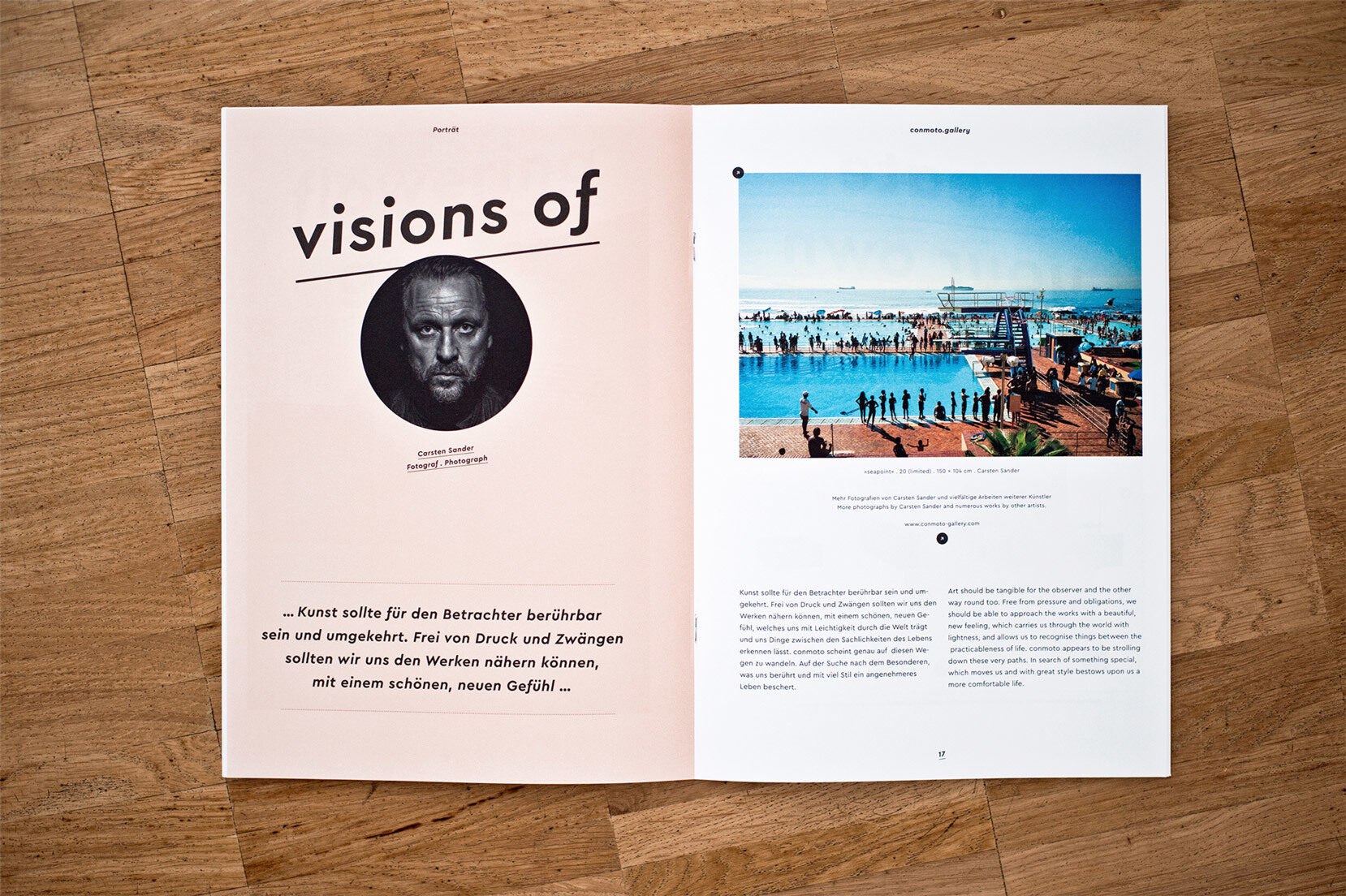

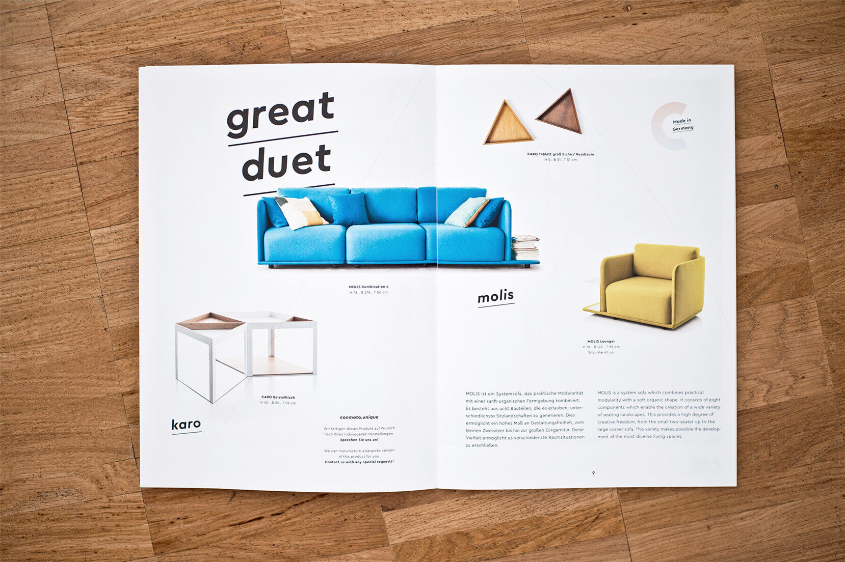
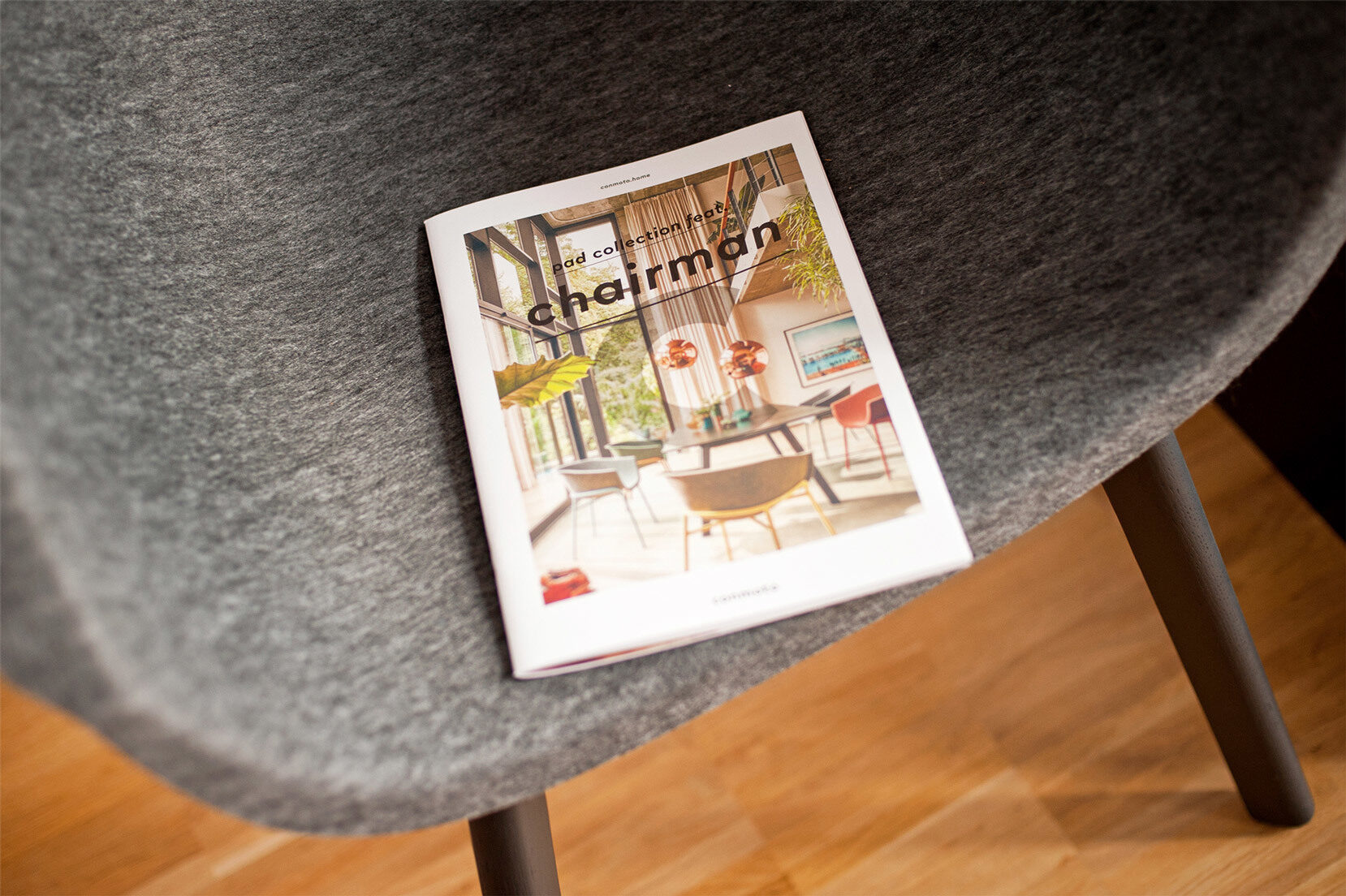
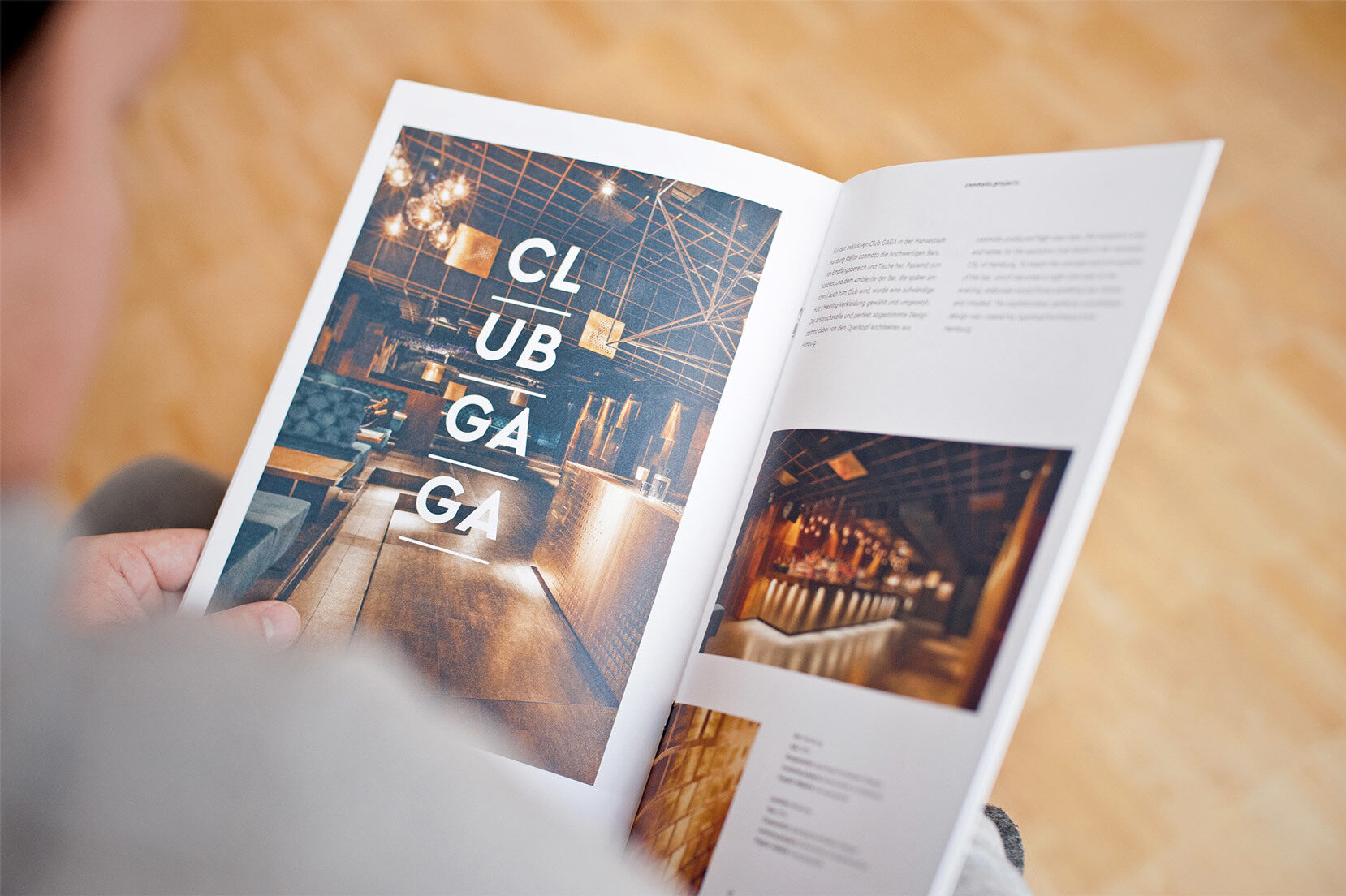
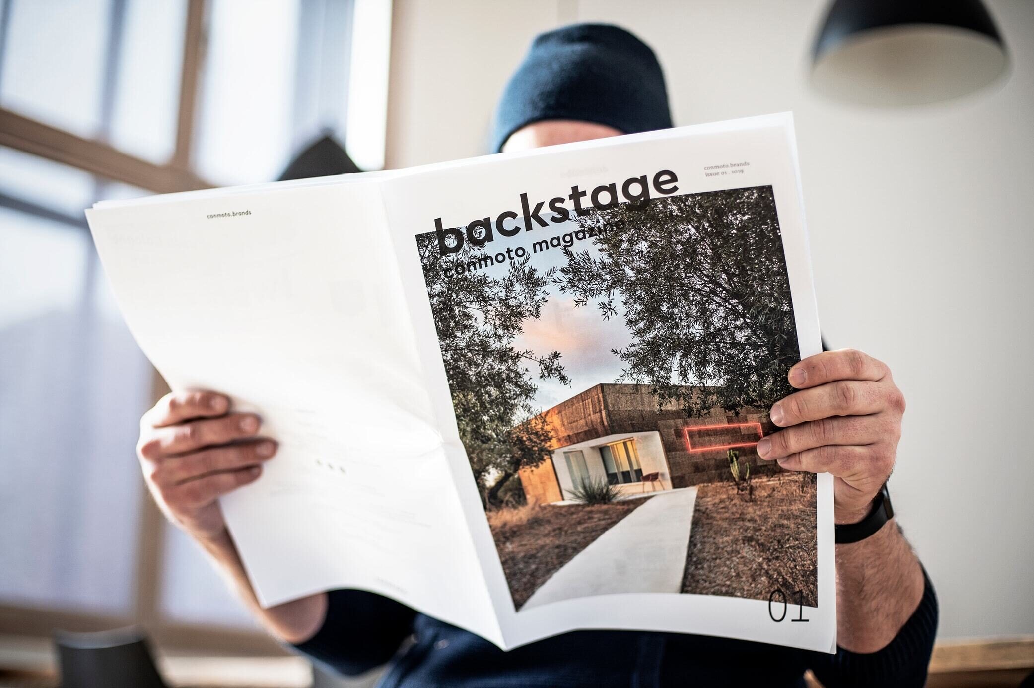
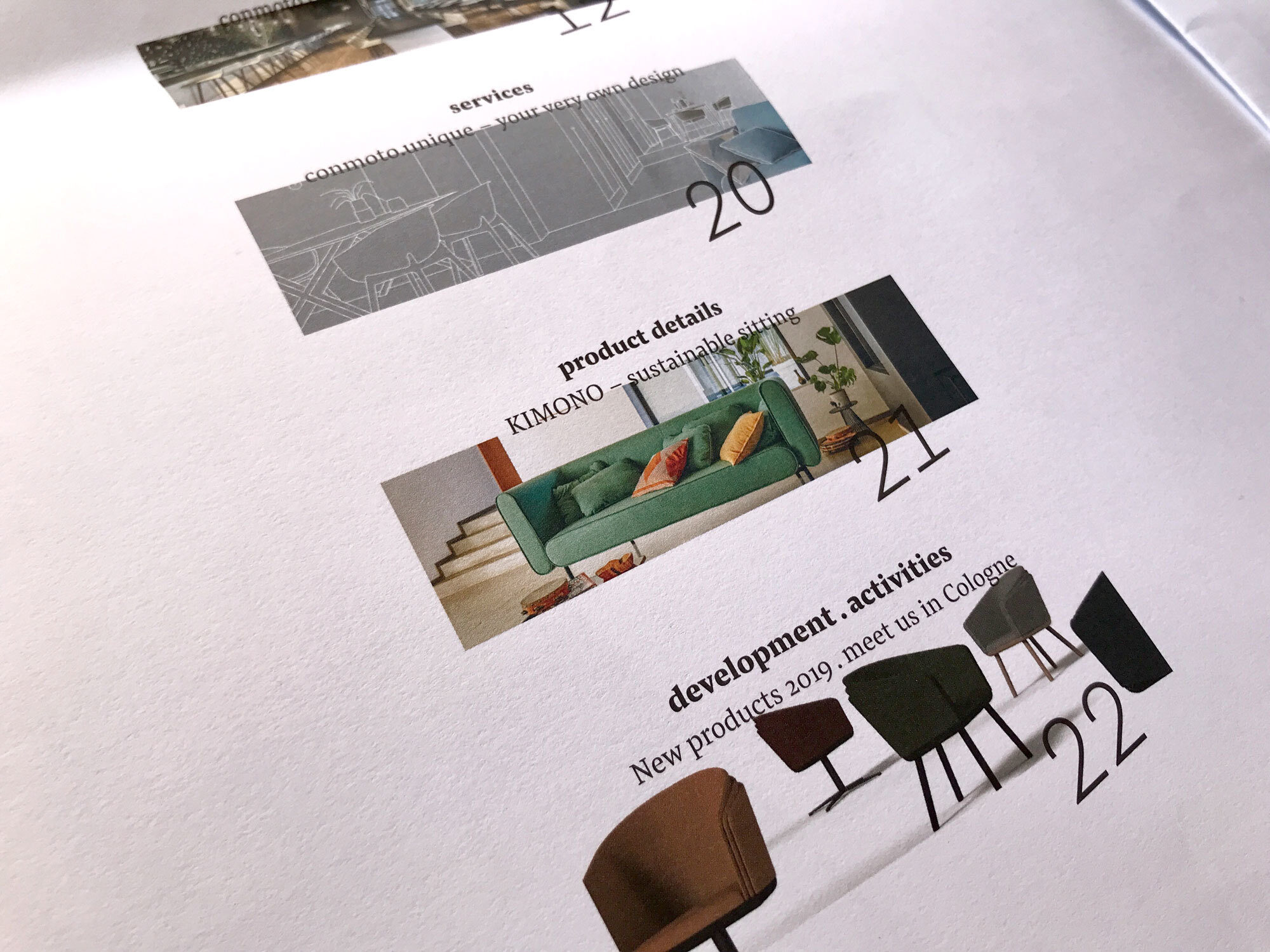
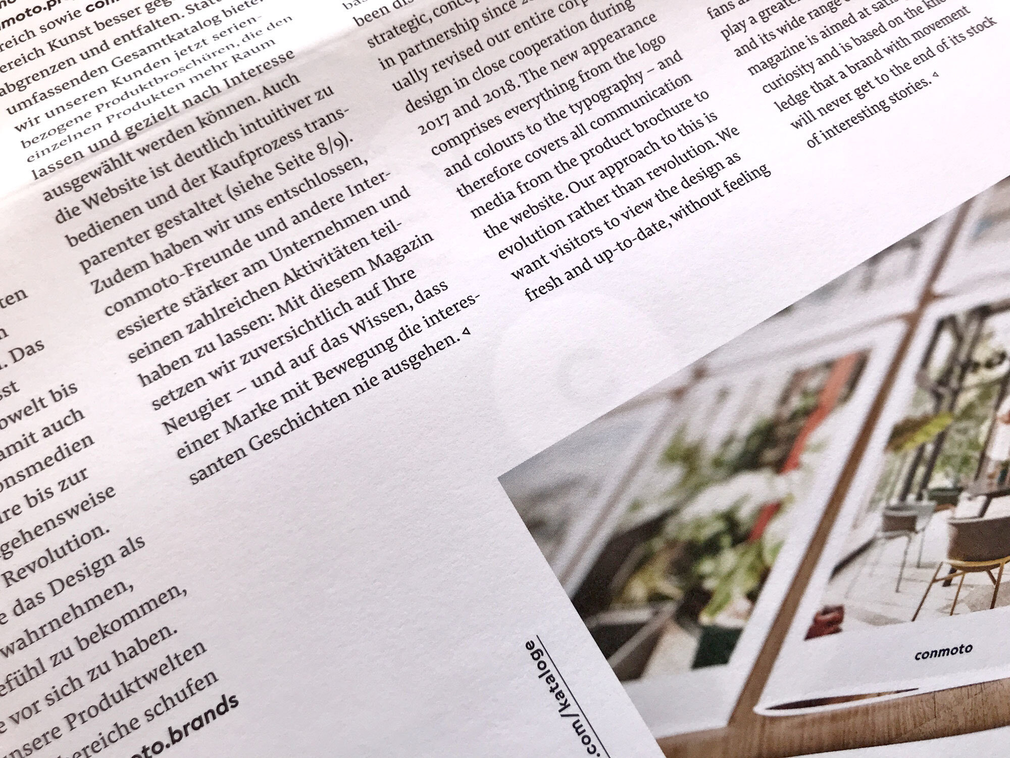
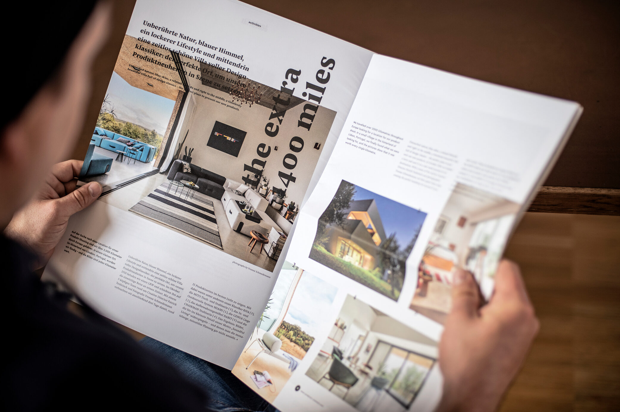
Cera is complemented by Pensum, which is used for body text.
—
conmoto Corporate Communication
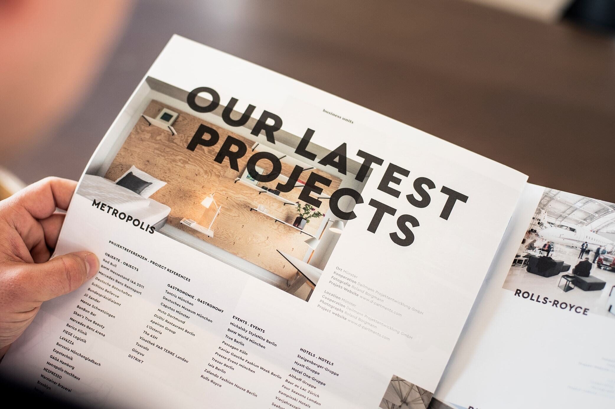
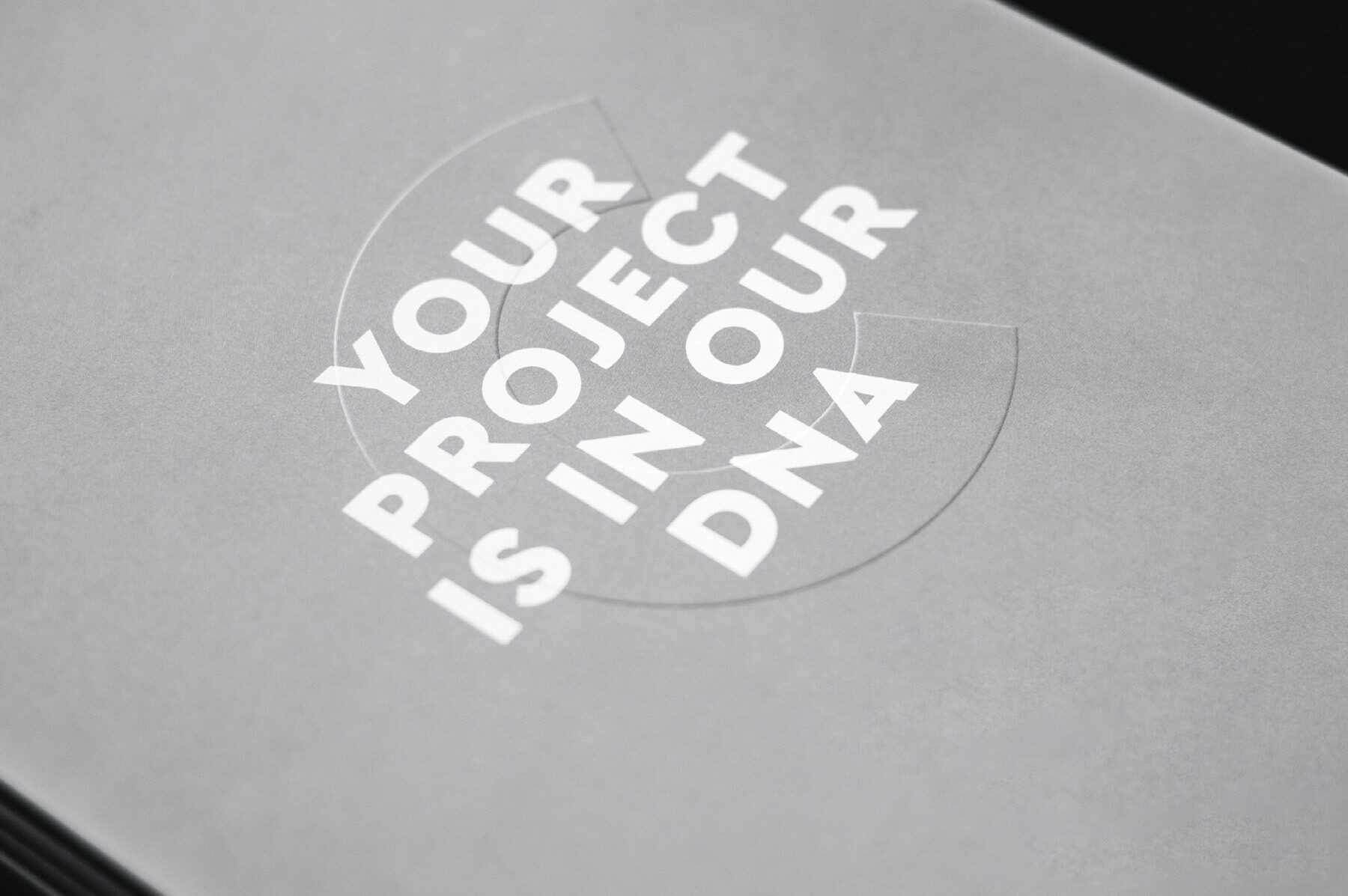
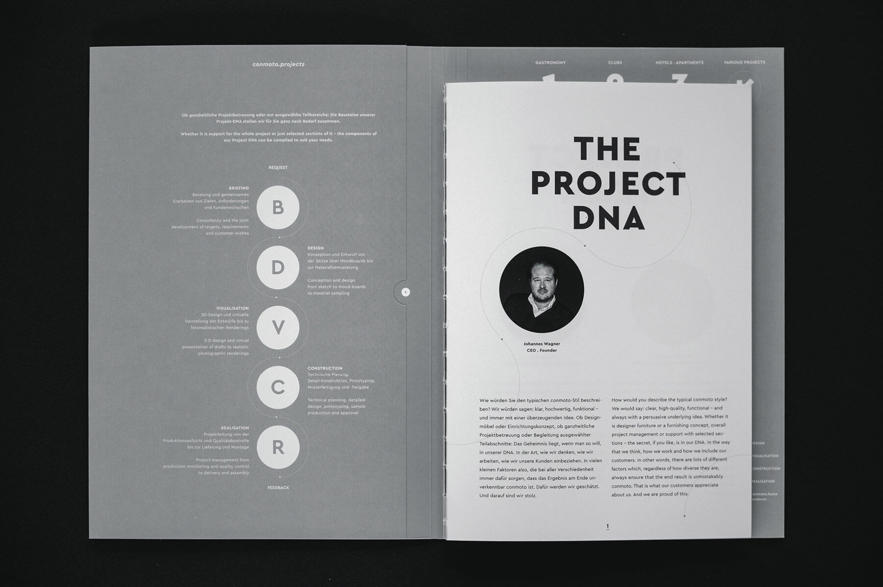
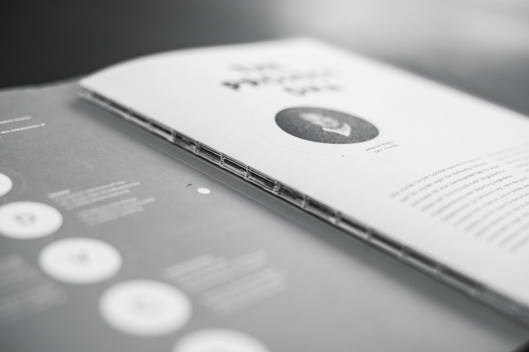
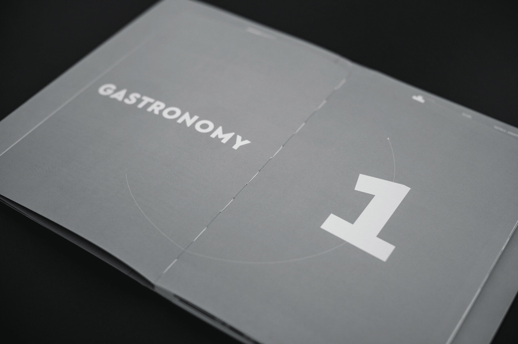
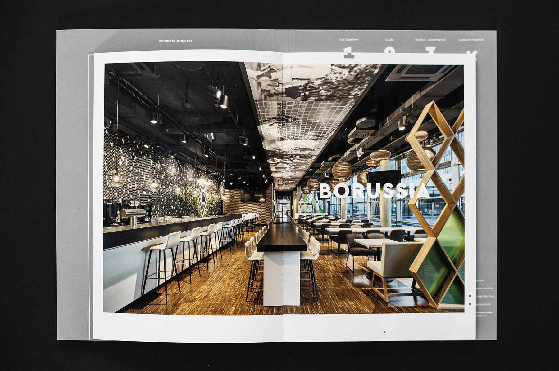
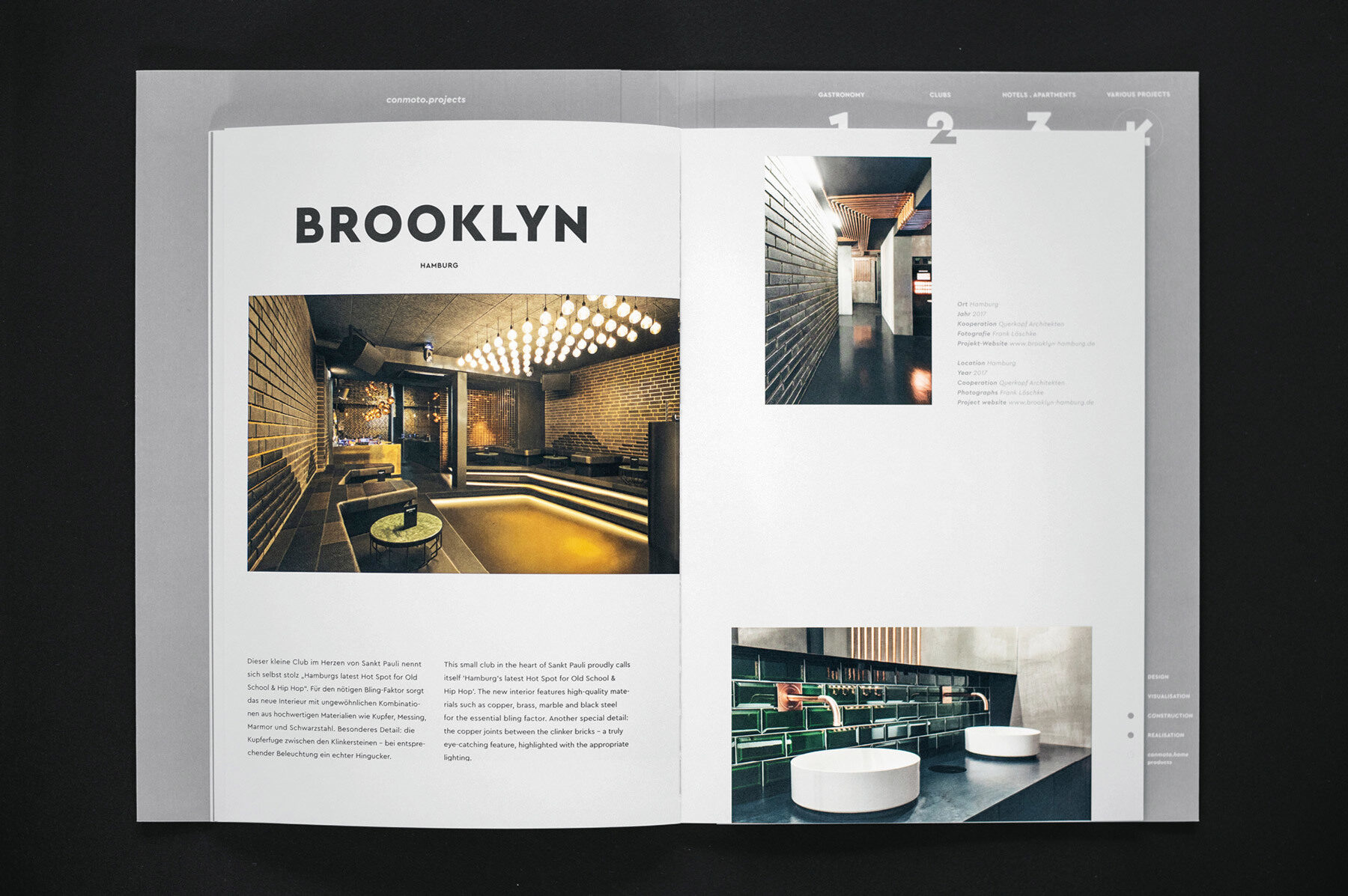
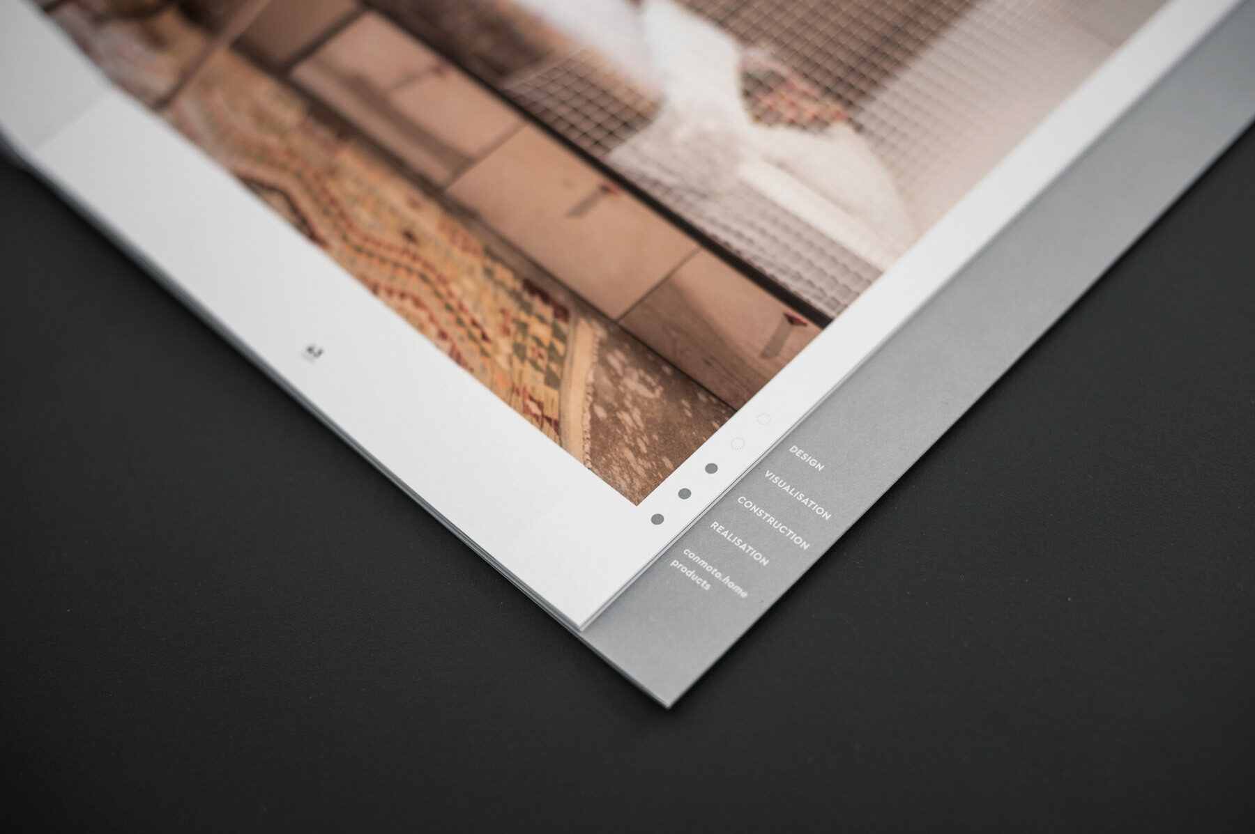
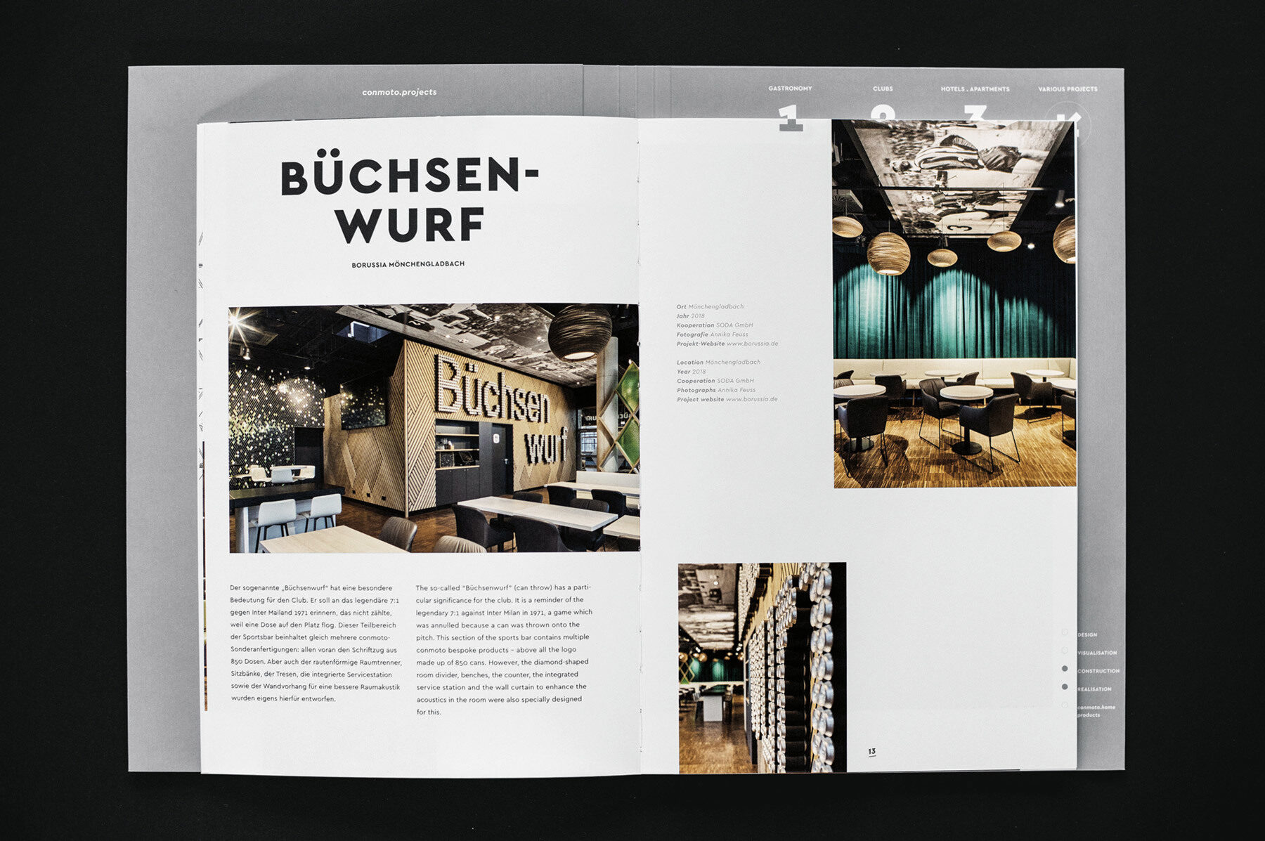
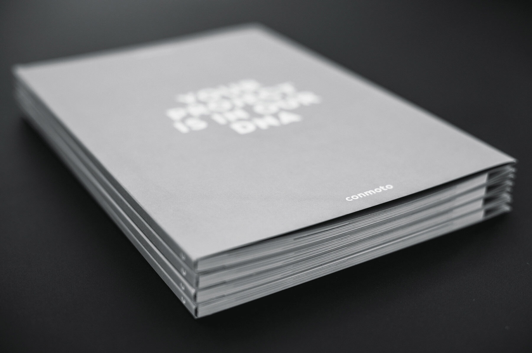
Another focus of conmoto is their individually tailored designs for international clients. Their brochure Your project is in our DNA presents some of their projects. Using a visual system inspired by highly-abstracted DNA structures, they break their projects down into smaller parts and weave them back together in a way that makes their work and process easy to understand. As a business-to-business marketing tool with a premium appearance, the layout has a simple colour palette that provides a neutral backdrop for the various references and details.
In 2019 Jens Könen and Your project is in our DNA won a Red Dot design award plus German Design Award 2020 in the Editorial Design category.
Images by courtesy of Jens Könen, phoptographs by Simon Erath.