ROSSMANN Magazine Centaur
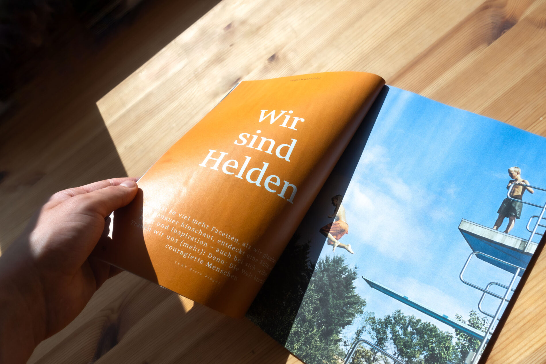
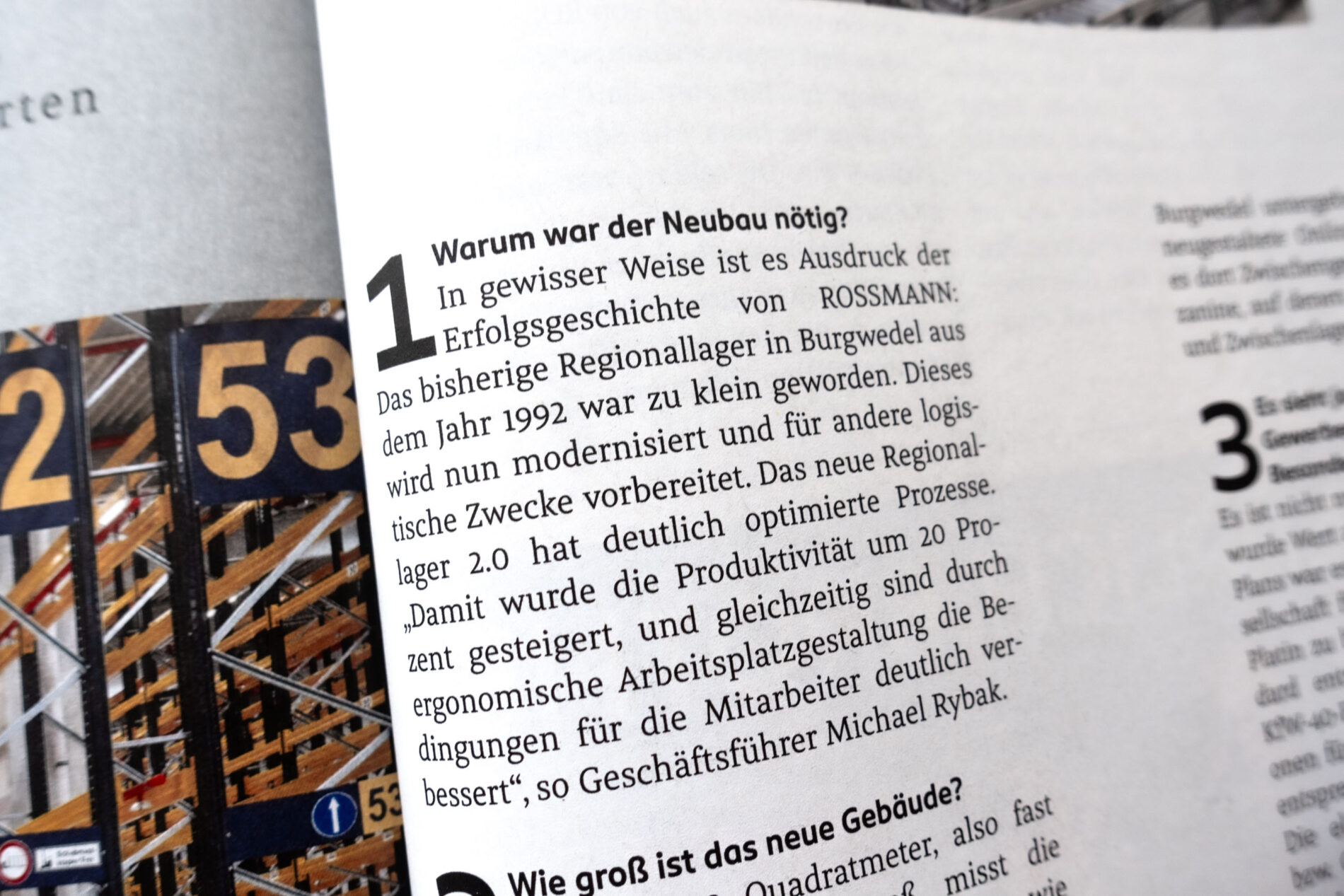
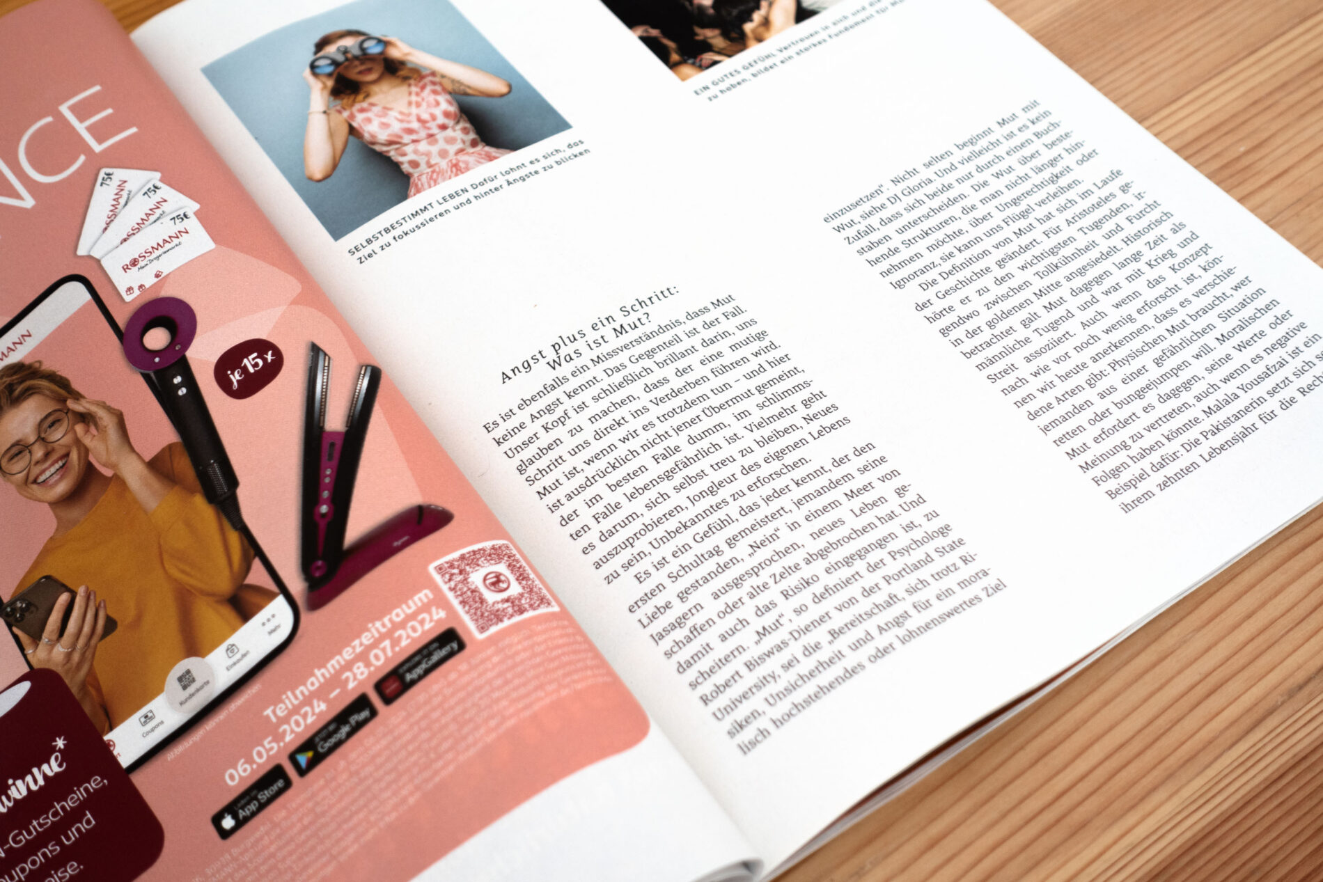
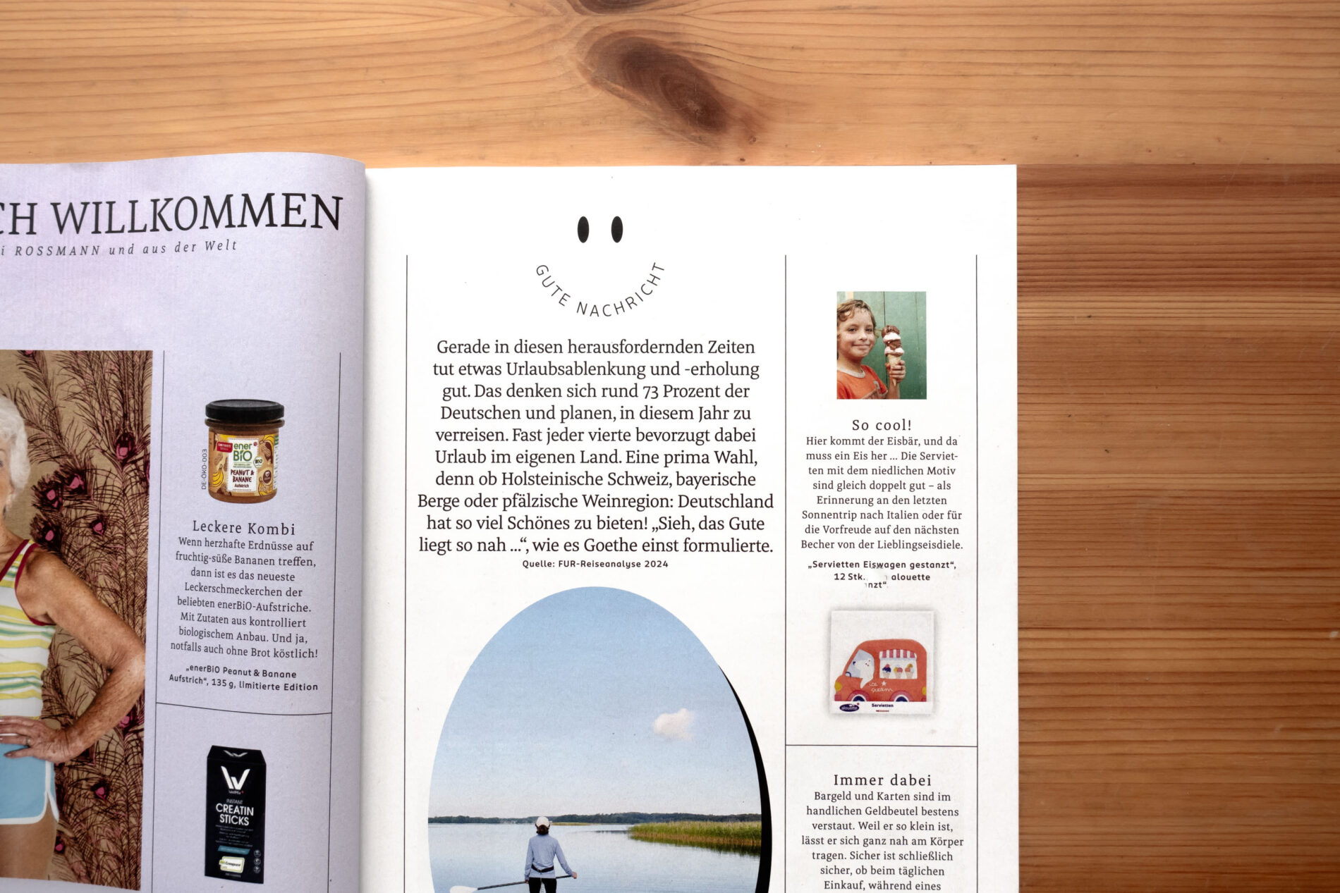
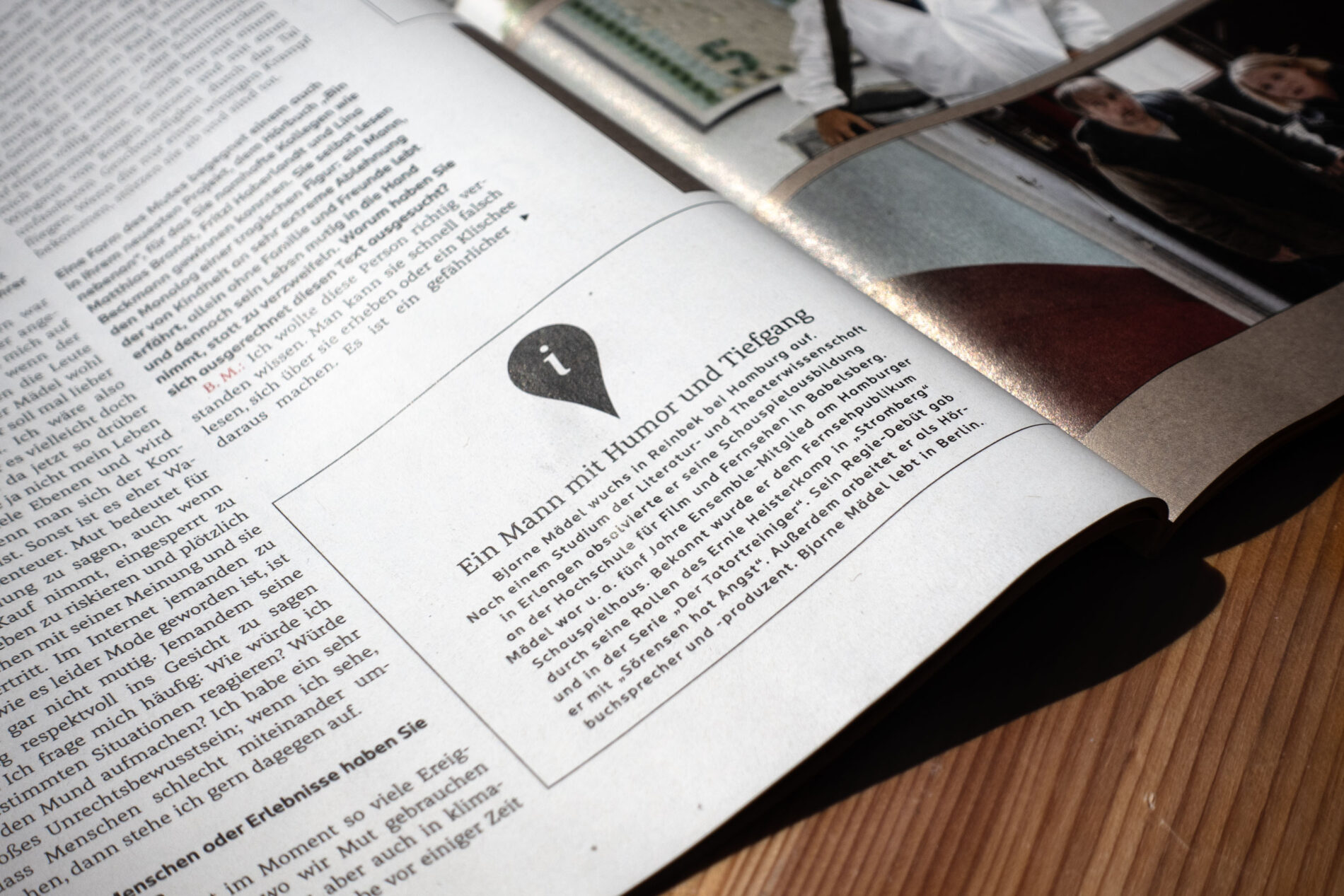
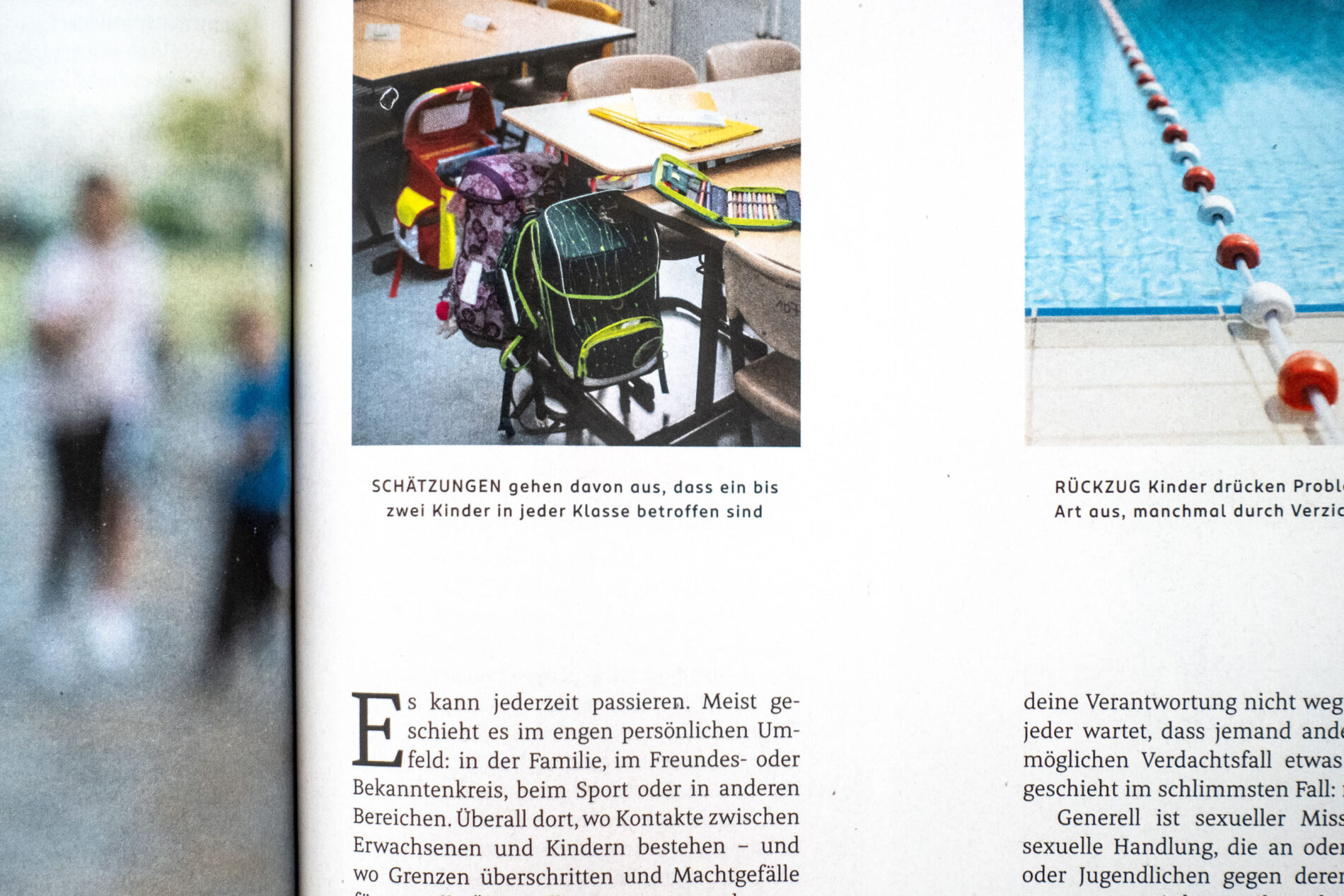
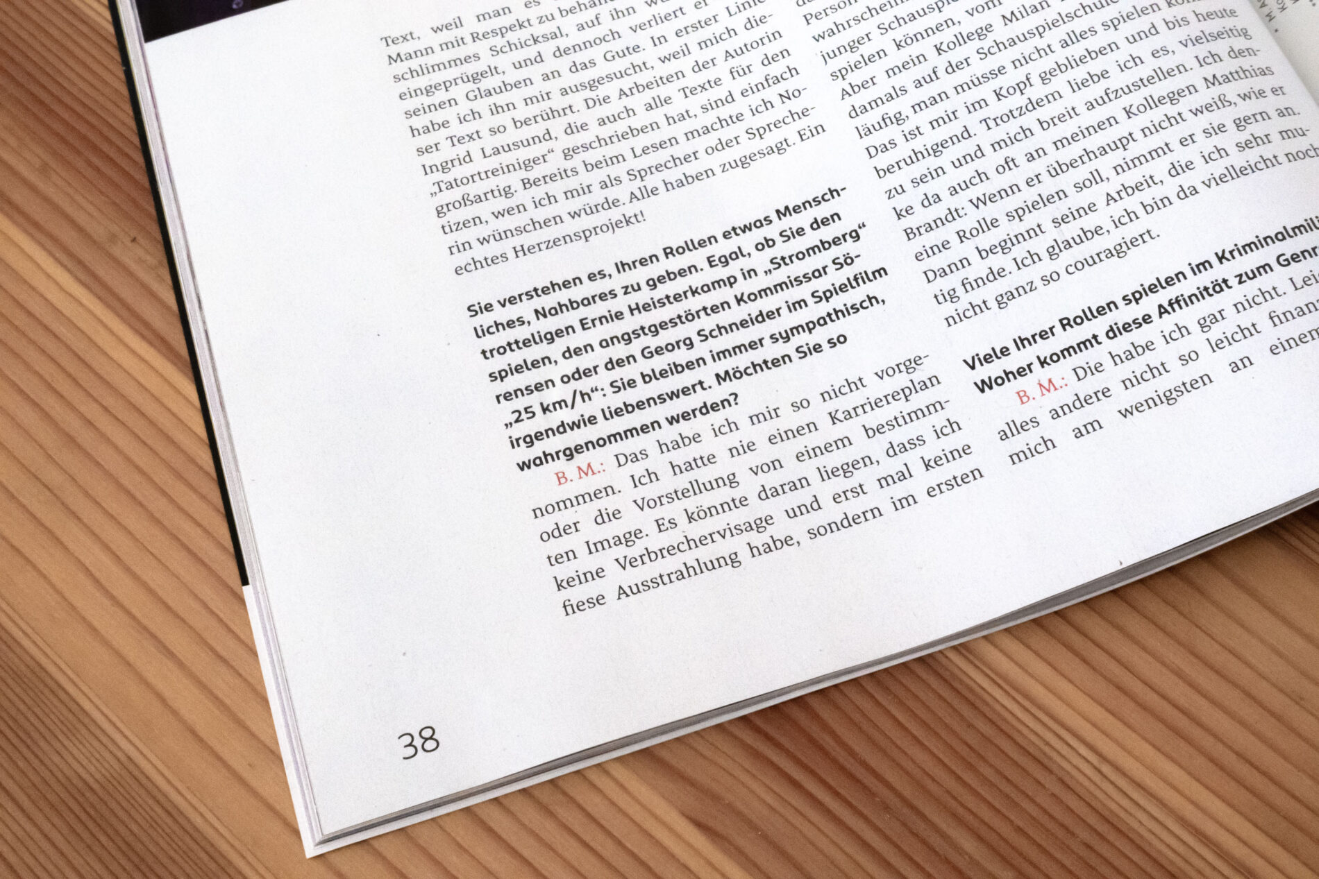
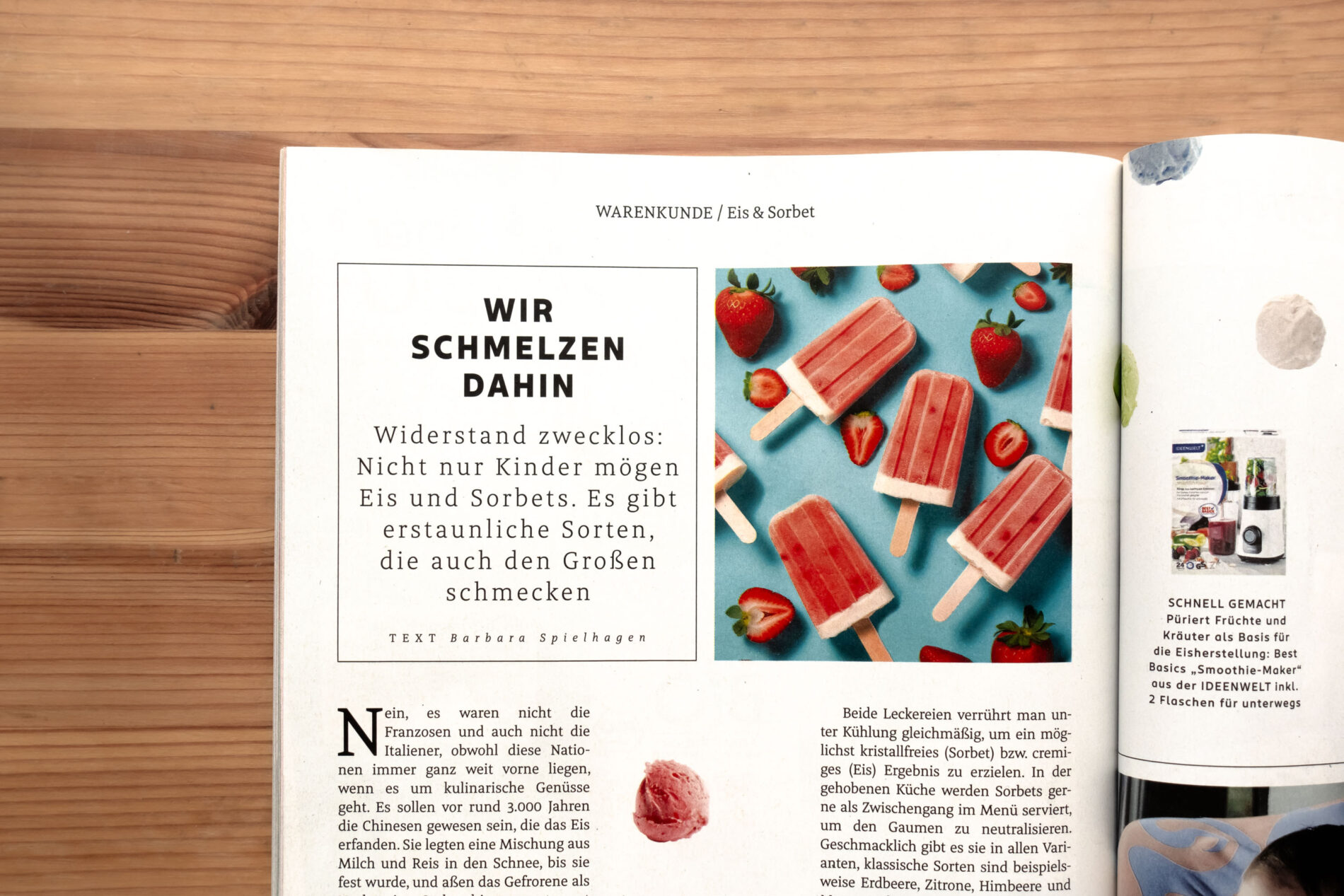
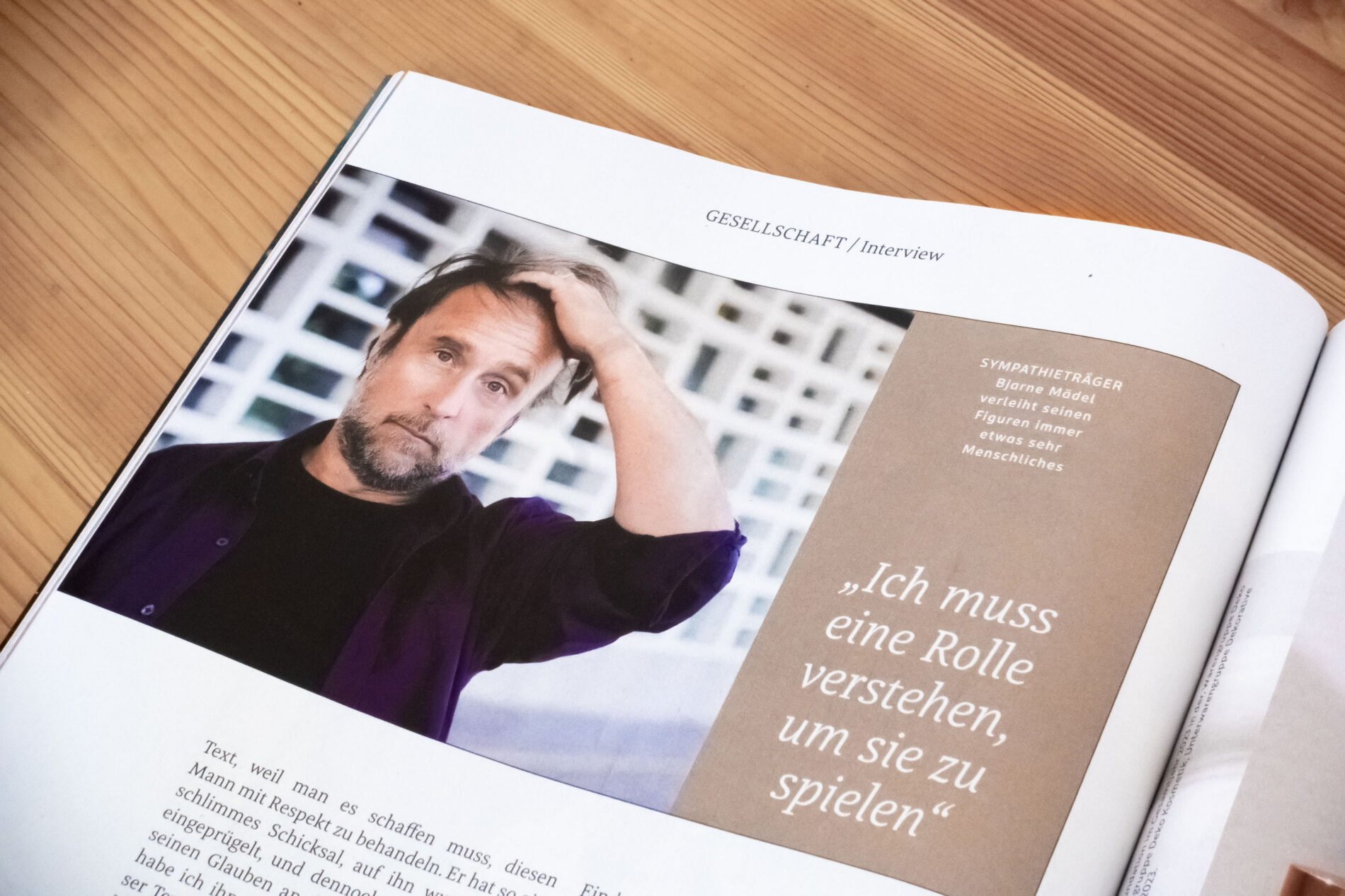
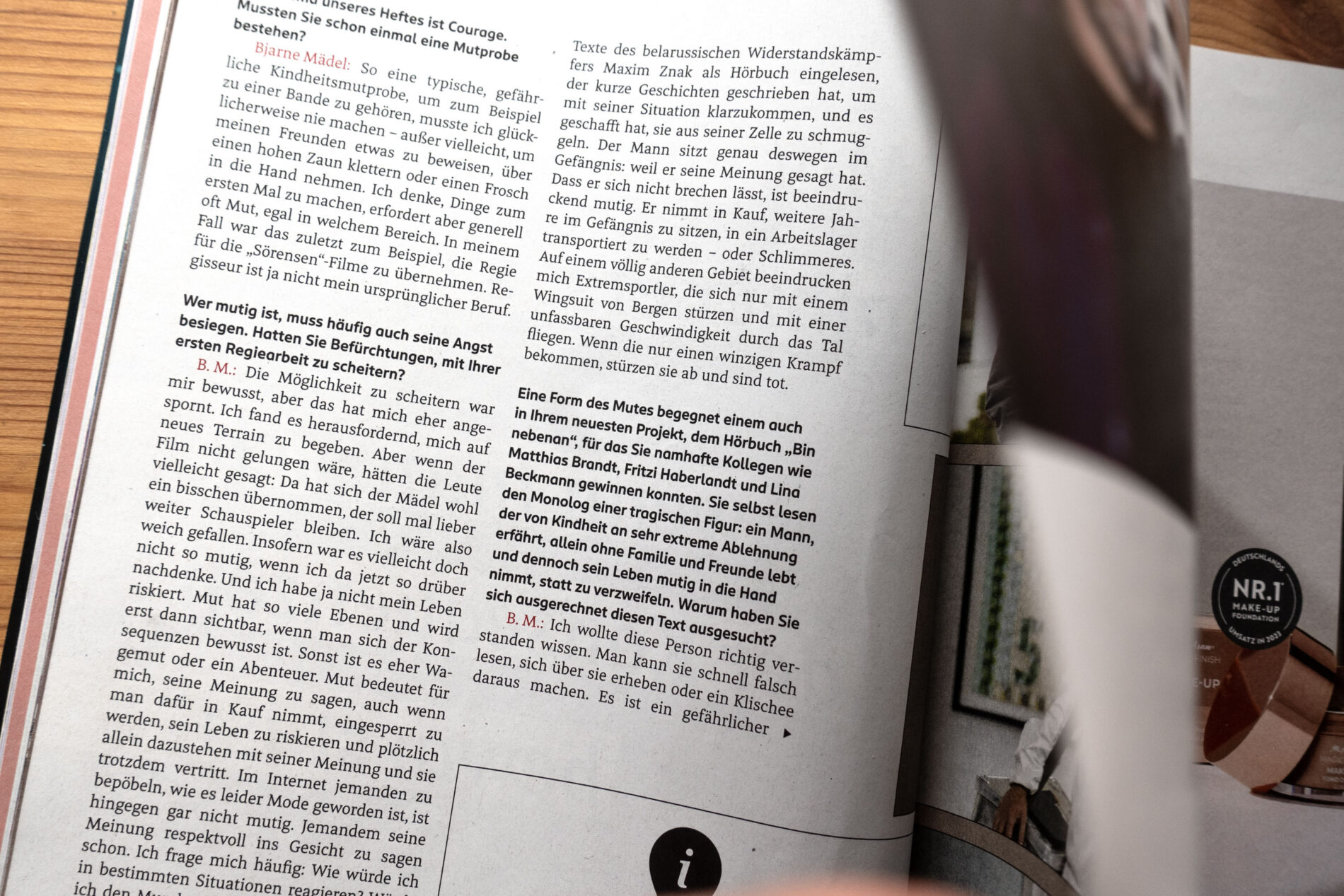
Meret is a text typeface for complex typography in editorial design. Robust and precise, it shows its strengths in the ROSSMANN customer magazine Centaur, where it harmonises well with the new corporate typeface we designed for them.
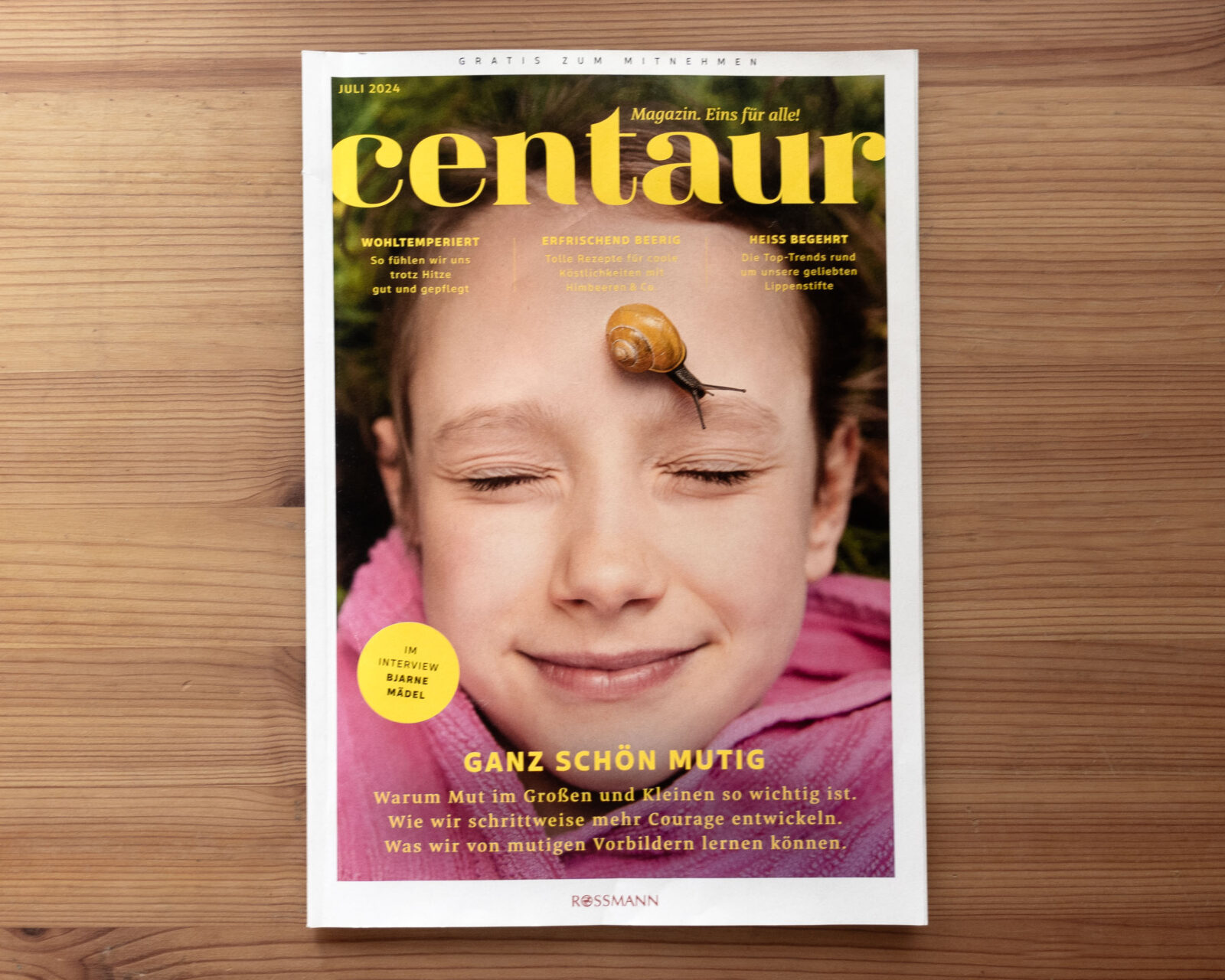
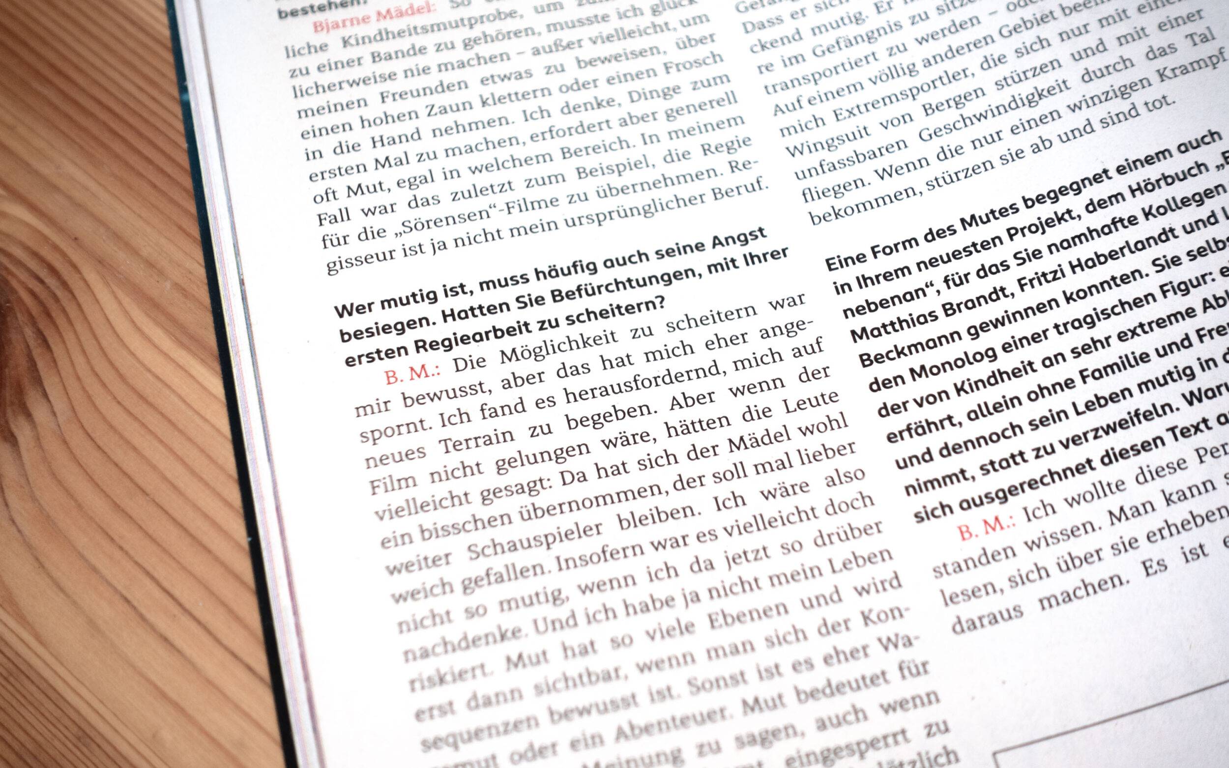
ROSSMANN’s customer magazine Centaur, designed by TERRITORY, originally used Meta Serif. During the development of the new ROSSMANN Sans, it became clear that the magazine needed a fresh serif typeface to harmonise with the newly designed corporate typeface. At the same time, the Serif needed to be friendlier and rounder than the previous, more economical one. As the serif typeface is used exclusively in the customer magazine, we helped ROSSMANN find a typeface that would meet the requirements of the editorial design and at the same time visually match the Sans.
After extensive testing of various typefaces, Nils Thomsen’s Meret was chosen. With its human flair and warm ball terminals, it is the perfect counterpart to the friendly Sans. To achieve a balance with the corporate typeface, Meret’s vertical dimensions have been adjusted and it has been made wider overall– exclusively for the magazine. This brings the proportions of the two typefaces closer together, resulting in a successful pairing. Thanks to this adaptation, Meret, although not directly related to the Sans, creates a harmonious picture and can develop its usual finesse in the magazine’s complex editorial environment.
