Background of Jabana and Its OpenType Madness
We could claim that the idea for Jabana came to Nils over a “Schorle” in a hip Hamburg coffee bar. But if we are honest, it was rather beers that inspired Nils. Here you can find out how the first sketches came about and what the OpenType madness of the so far almost undiscovered 20 Stylistic Sets can do.
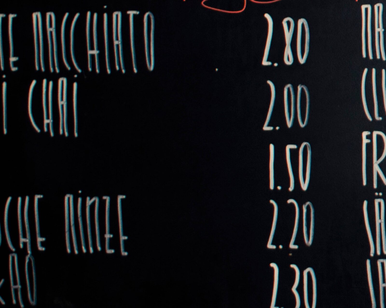
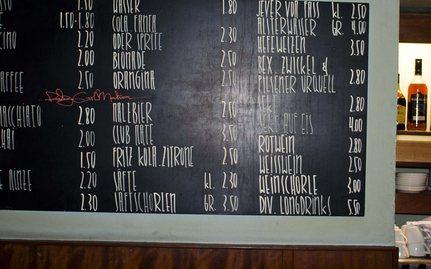
The first shapes were spotted around Hamburg hipster area “Sternschanze” and “Karoviertel”. To announce their special drinks or cookies, a lot of small cafés and bars use blackboards. We are not sure, but it seems that there is one person who wrote on all blackboards, or the specific style was copied by every bar.

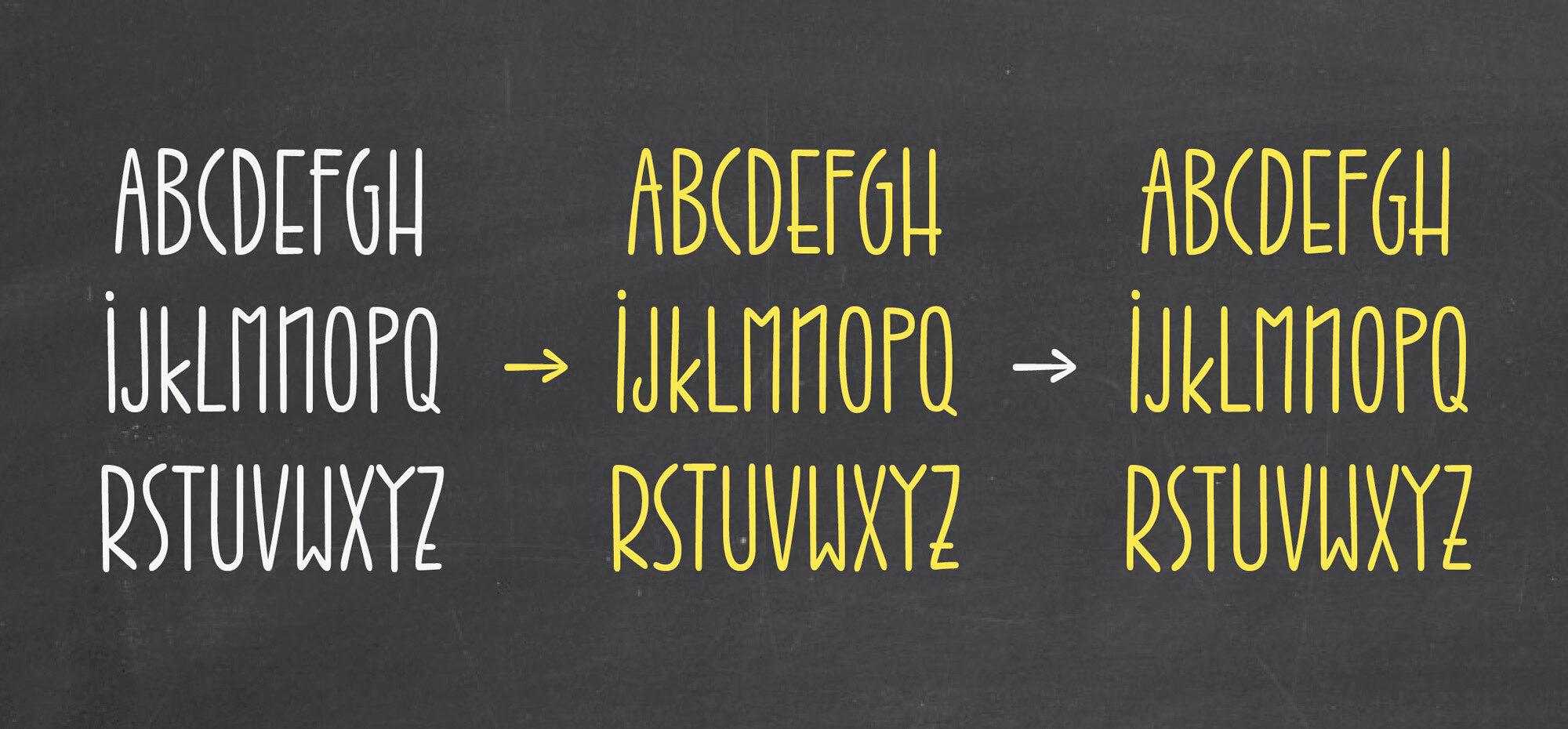
Before and after: At first, the shapes needed to be analysed. So Nils took pictures of some significant shapes and inverted them. Surprisingly they look totally different in black on white.
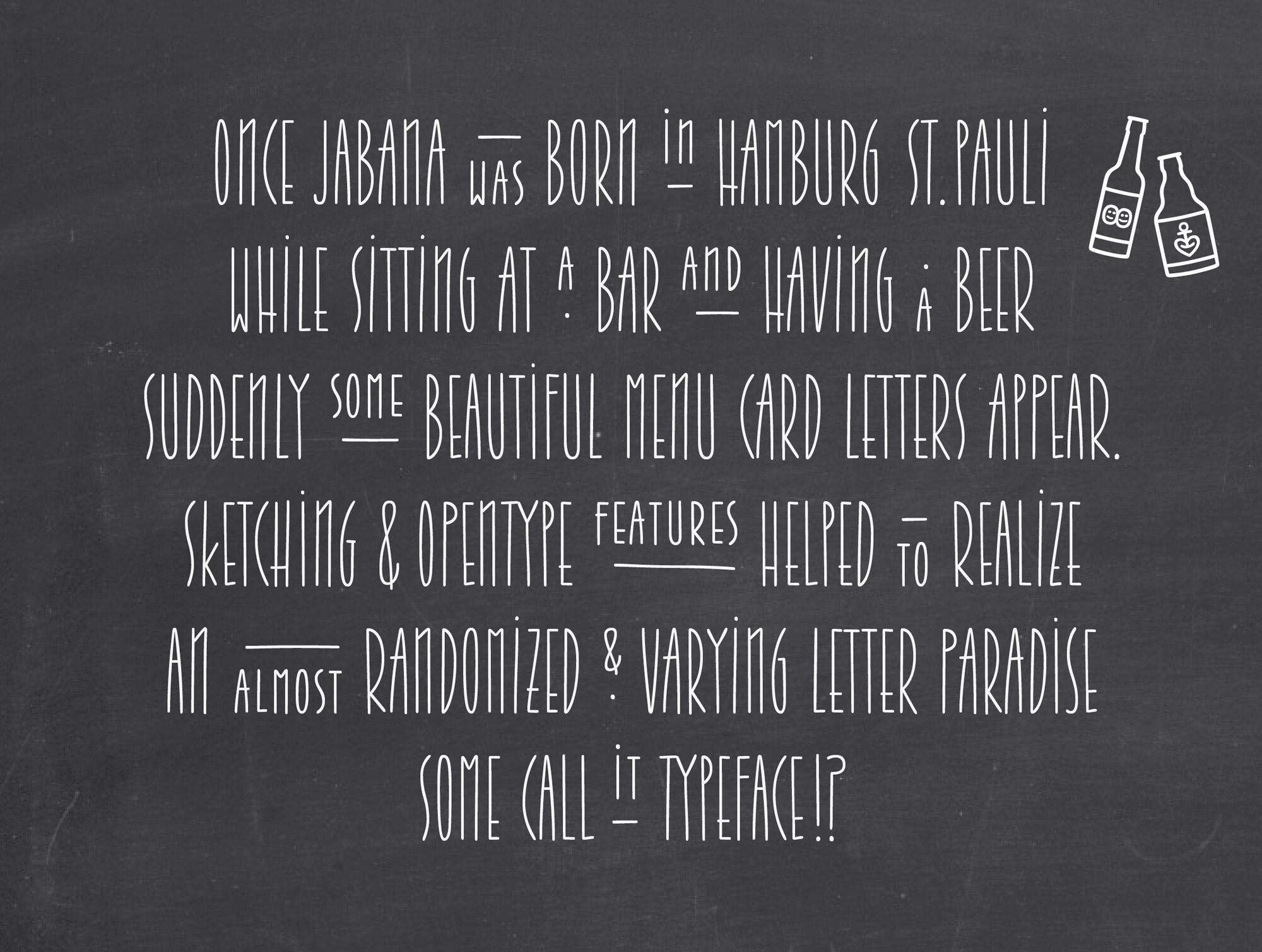
The feature we are most proud of is the combination of two features: At first the whole text needs to be formatted with the stylistic set 03. Then nothing will happen. But, now you are able to decorate your poem with the denominator or numerator feature: This scales the capital letters to half the size, aligns them upwards when the dnom are activated and underlines them. With the numr, on the other hand, everything moves to the baseline and is given a line above it.
Jabana comes with a character set of more than 1500 glyphs as it has three variants of each letter shape. If you do not want to use the contextual feature you can directly choose stylistic set 01 or stylistic set 02 to get a less diversified text. But we suggest to switch on the feature for contextual alternates, as we describe within the next graphic.
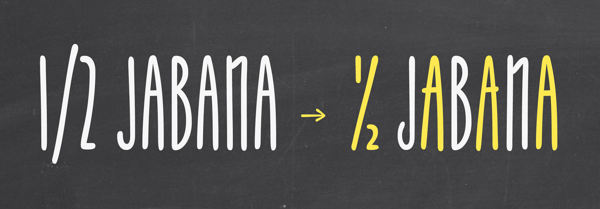
The contextual alternates feature exchanges the three different glyph variants, to make sure letter shapes won’t repeat too early. The glyphs are just slightly different, but will give your text a handmade impression. Further, the 1/2 Jabana will remind you to use the fraction feature for more awesome details.

The Jabana family is based on uppercase shapes. The small caps are half sized caps, which are slightly wider and accessible via the OpenType feature (short cut: cmd+shift+h). Moreover the quite short lowercase letters are shaped from the tall and condensed uppercase. So a lower w originates from a cropped upper W.
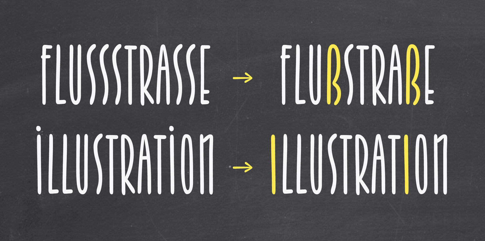
Stylistic set 04 will change the correct double SS in your uppercase setting to the German ß (germandbls). Meanwhile the Stylistic set 05 will remove the dot on the uppercase I.
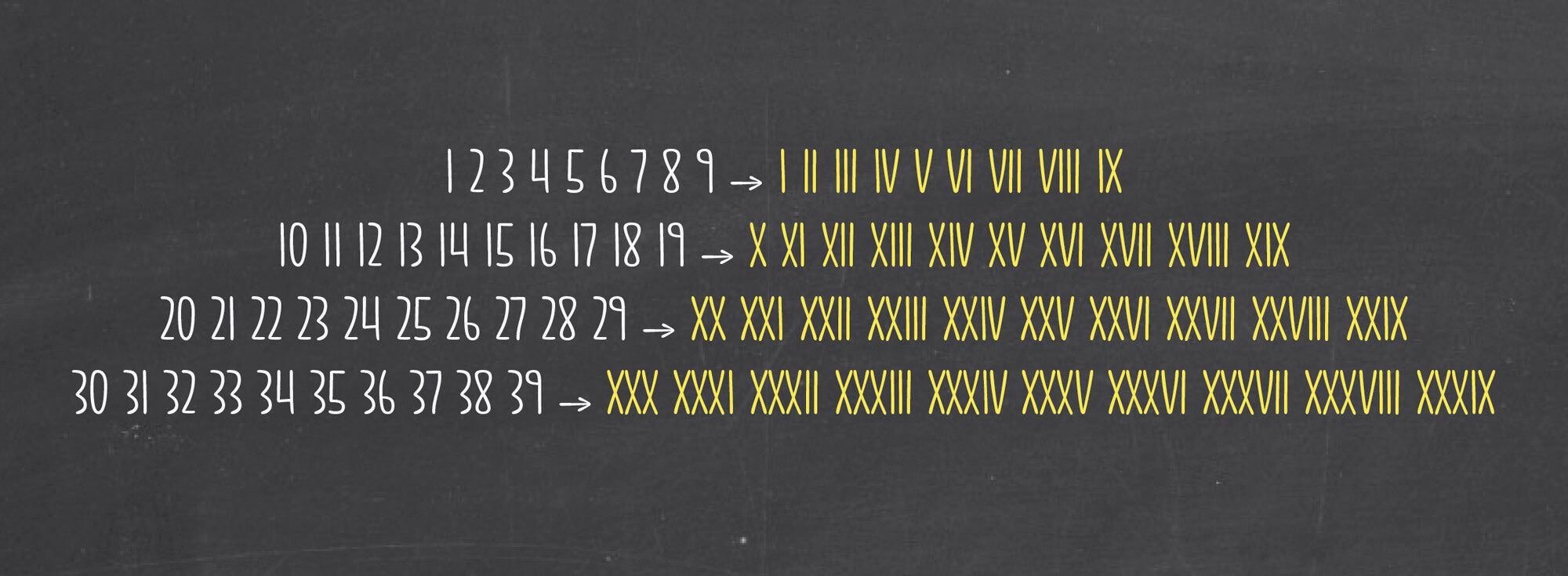
Stylistic set 06 changes your Arabic numerals from 1–39 to Roman numerals. Here is a challenge for you: If someone shows us a in use case including the Roman numerals, Nils will add 40–99 as well!

Stylistic set 07 is all about circled black figures. Possibly nice to emphasise and structure your project a little more.
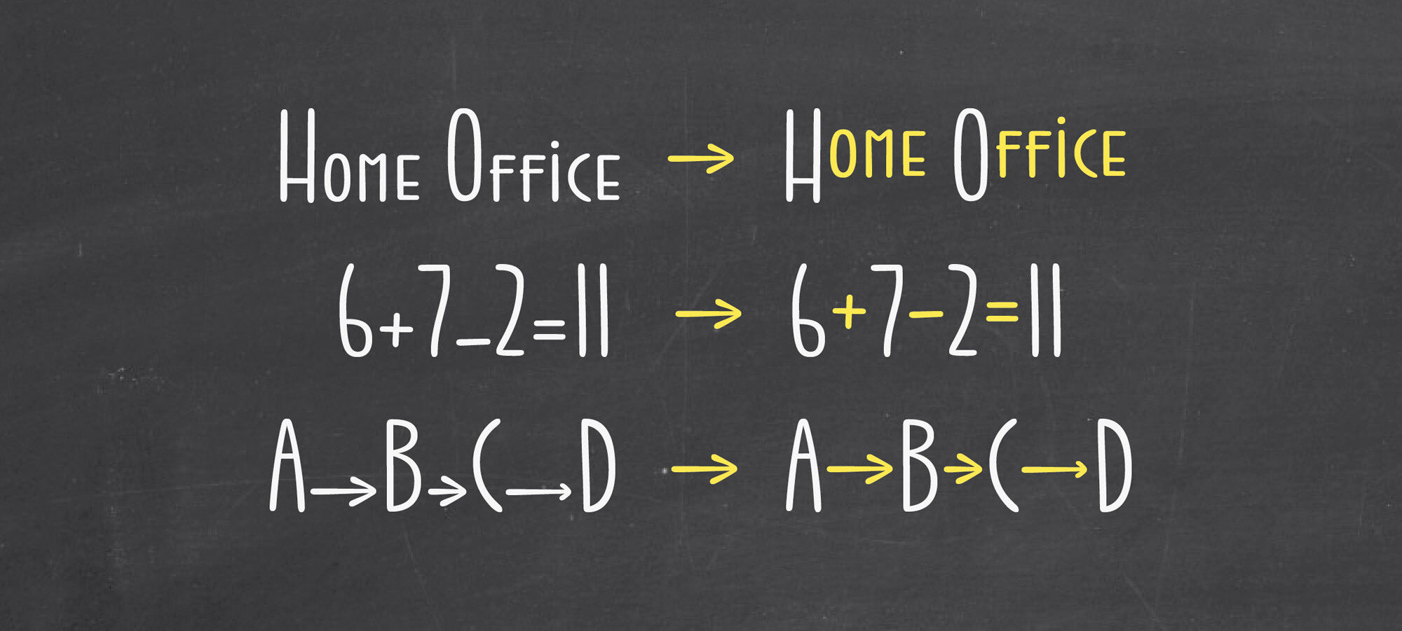
Stylistic set 08 shifts some letter shapes to the centre of the cap height, because the lowercase are so tiny. This results in a clean all caps text, but also adds a nice extra to the small caps.
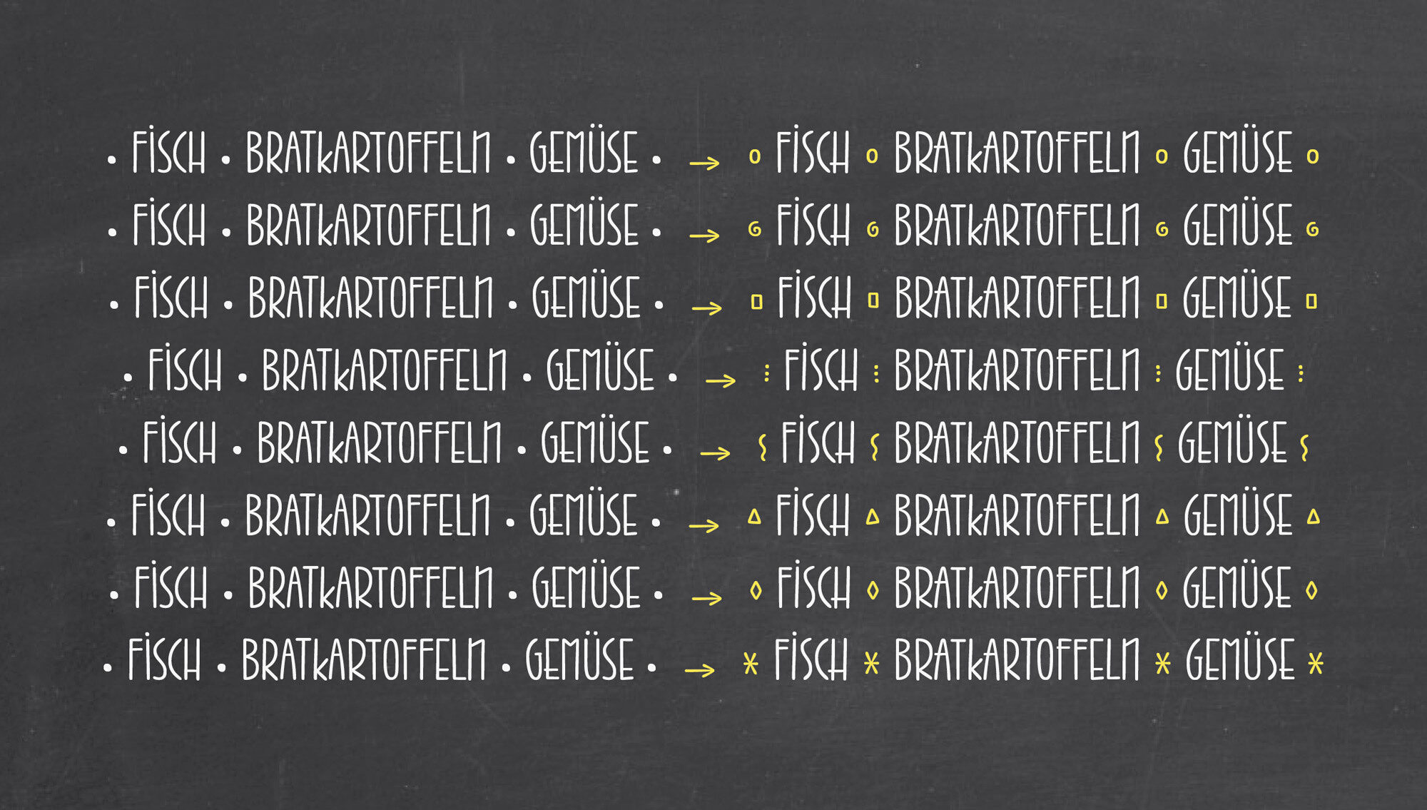
Stylistic set 09 to 16 replaces the bullet with seven varying bullets. For example: circle, spiral, rectangle, dots, snake, triangle, diamond and star.

Stylistic set 17 replaces the fancy N and the lowercase styled K with a more usual N and K, better legibility guaranteed. And if you prefer, you should check the Jabana Alt family with more balanced shapes for better legibility.

Stylistic set 18 and 19 replace the standard arrows by stretched and stylish alternates.

Last but not least, Stylistic set 20 will just shift all lowercase shapes to the vertical centre of the caps height. It can be nice ;-)