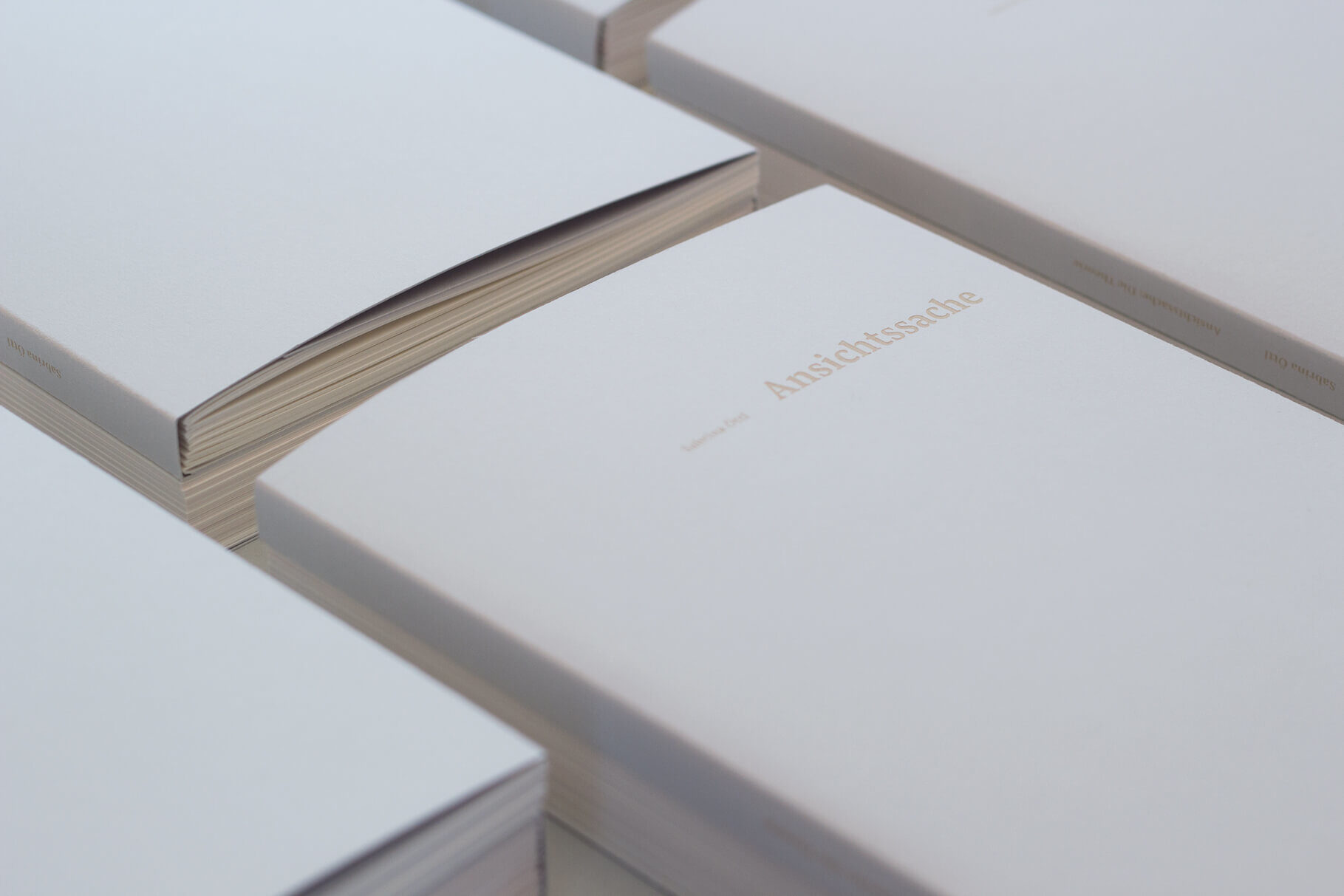
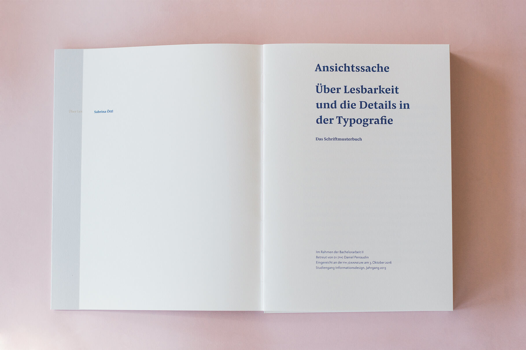
Ansichtssache: Bachelor Thesis on Legibility and Details in Typography
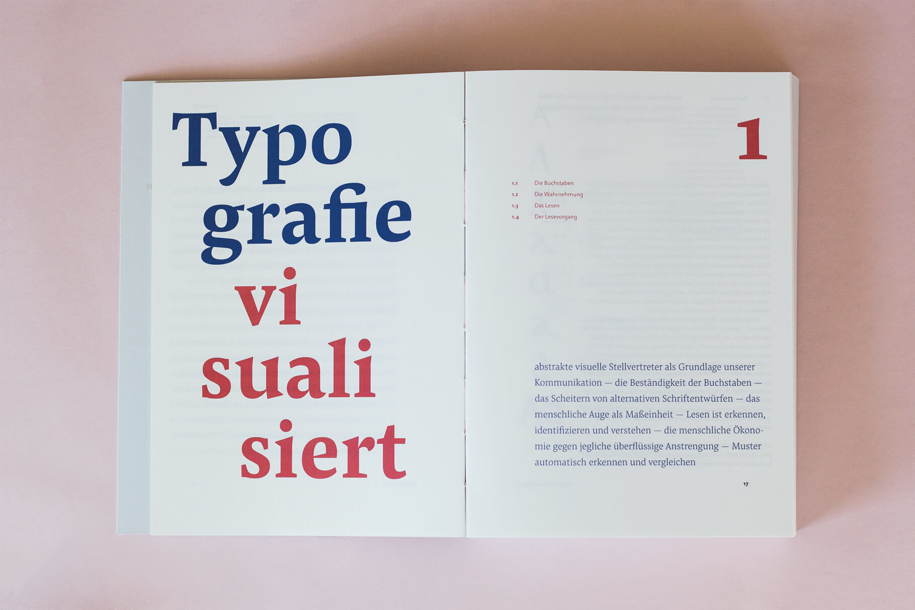
Type is visualised language. Every day we encounter information built from letters, that have been combined into words and are read across different media. In a pool of information, things that are clearly differentiated also stand out, and typography becomes a balancing act between design and communication.

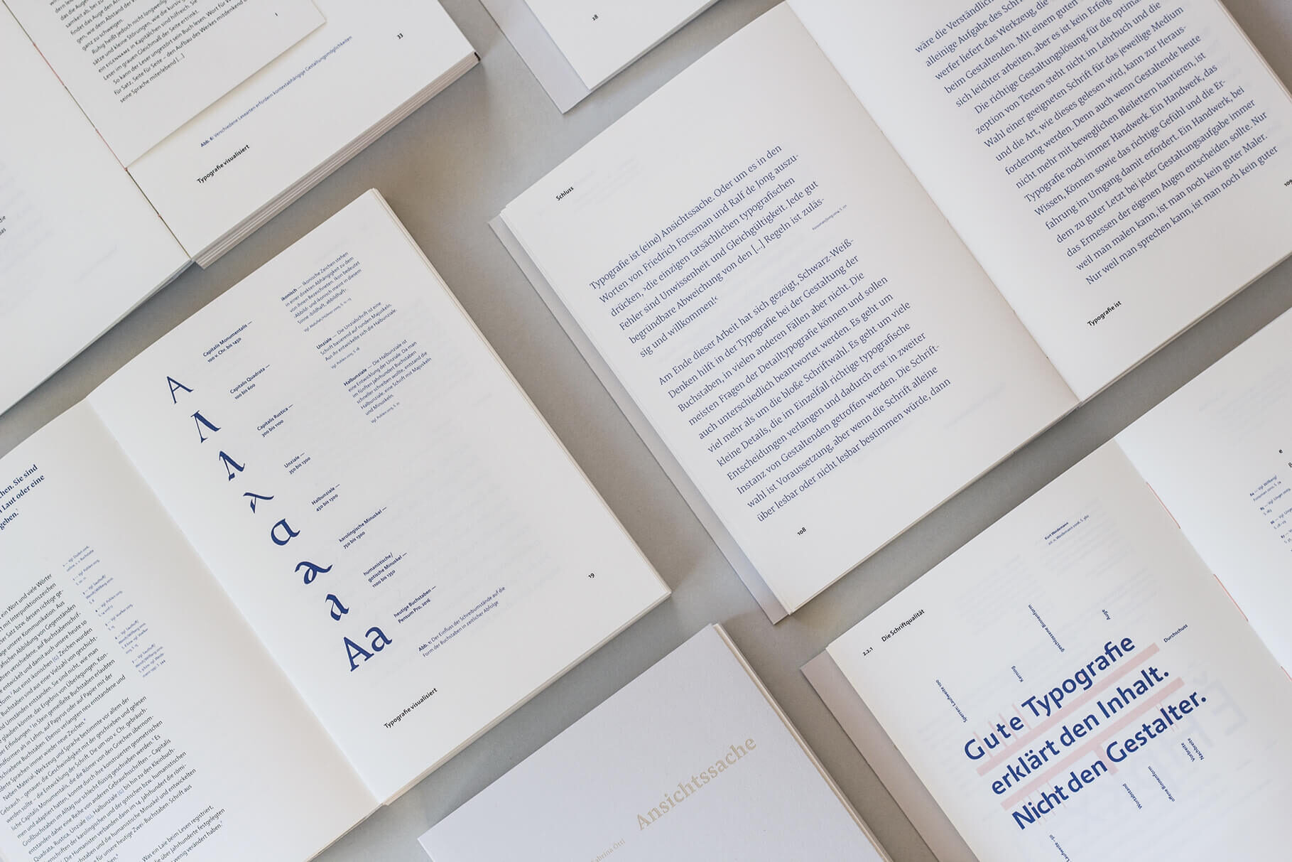
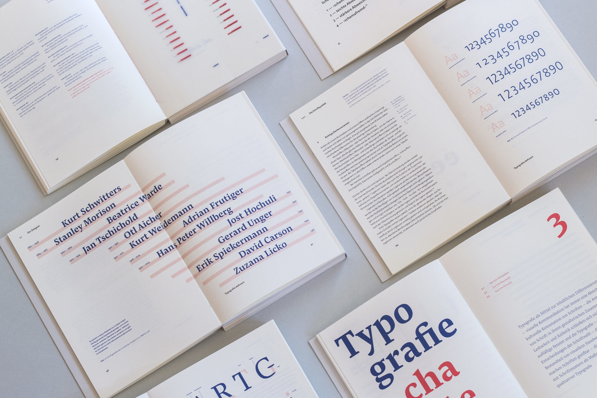
“Ansichtssache” deals with legibility and details in typography and analyses the aspects of micro typography, which influence the legibility of printed text, as well as the design possibilities that arise from this. For this purpose, various hypotheses by different designers are put into relation and a rating system for the ideal type, beyond subjective or contextual circumstances, is developed. The work shows that it is not only the choice of the font that matters. Typography is a craft, and requires knowledge, skill, intuition and experience from the users
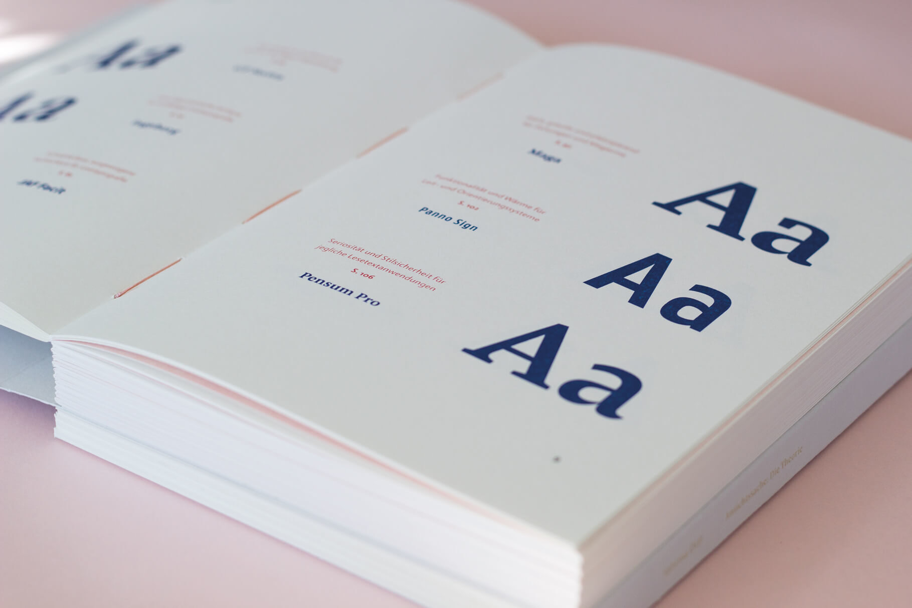
The practical part consists of a sample book using the criteria developed in the theoretical part. The thesis not only transmits typographic knowledge, but also has practical relevance and helps the reader to orientate themself in the multitude of available typefaces.
The typeface family Pensum Pro was one of the two main typefaces in which the work was set. It was also used as a sample font in the practical part.
Bachelor’s thesis by Sabrina Öttl, October 2016. Submitted at University of Applied Sciences FH JOANNEUM, Graz. Mentored by DI (FH) Daniel Perraudin.
