An Ambitious Plan: the Making of Resonay
Is it possible to create a serious font that would work as an illustration rather than text? Sometime in 2014, Andrej Dieneš had the idea for a fresh typeface that would emphasise its construction through two overlapping layers and be easy to use.
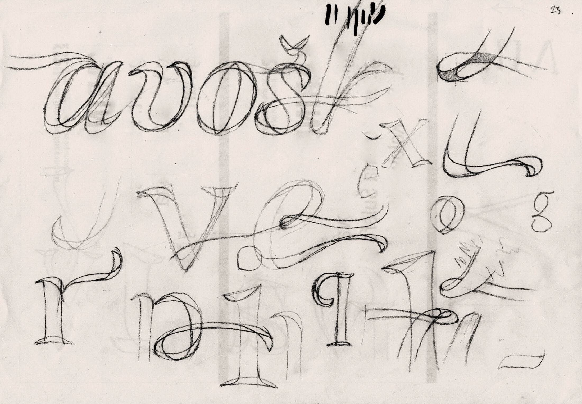
I started sketching a script font, something like Abelina from Sudtipos. My plan was to create two fonts that would make sense when exactly aligned (tricky, I know!). The two script fonts would support some of the irregularities of handwriting—random mixing of alternate characters, discretionary ligatures, a bouncing baseline and other lively details. The only thing making my work easier was that the characters wouldn’t have to be joined by connecting strokes.
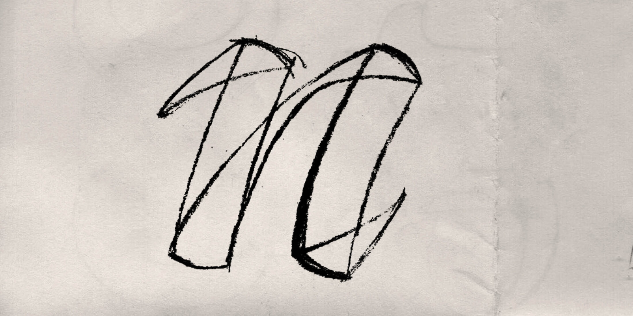
One of the first sketches shows the solution of the narrowing of the middle stroke.

The first digital version of the font - it's very fresh, but I wanted to get more out of this principle.
Script AKA Serif Typeface
Honestly? Such a font was simply beyond my skills in FontLab5, but I couldn’t resist my idea – I was obsessed with it. The first test in InDesign looked promising, but there were also doubts. Would it look natural? Would I finish it before retirement?
These sober thoughts lead me to simplify my ideas. I mechanised the font, so I could use shapes modularly. I exchanged the bouncing baseline and handwritten irregularities for repeating patterns and more classical proportions. Then I asked: if I already have an Italic, why not draw an Upright? My idea was a natural fit for an italic, so it would be a challenge. On the other hand, the typeface would be more useful. So, the Script became a Serif with a traditional typographic structure. The brush turned into metal matrices…
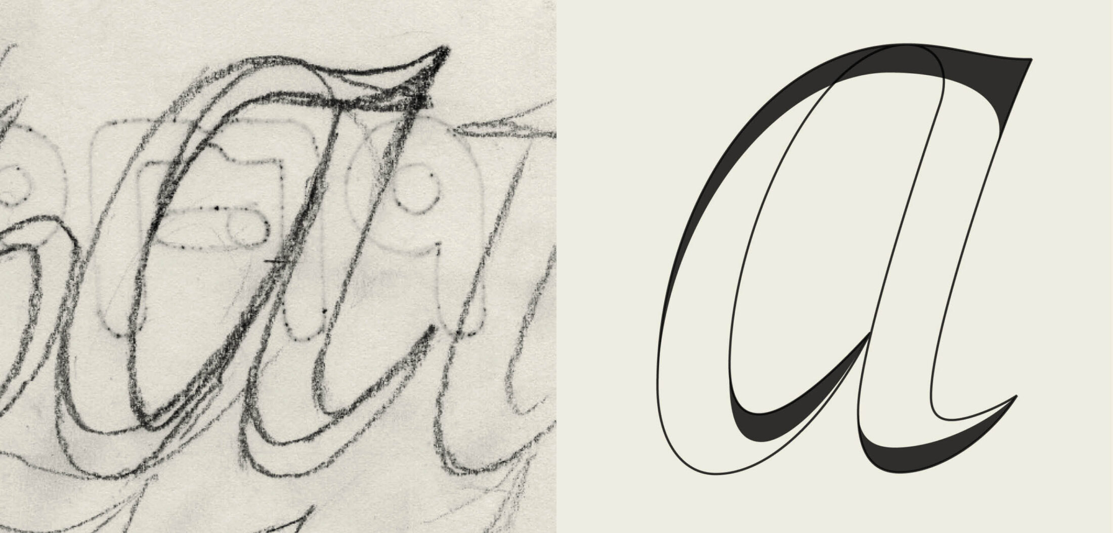
From a rough sketch to a digitalen drawing.
Rationalisation, But Also a Mix of Styles
Adapting my idea to Italic went smoothly, only the Upright was uncertain. There was no natural flow and it was not always clear what the best anchor positioning was. A certain ambiguity remained in the font until it’s fourth version in 2017.
Then a great rationalisation and cleaning of the shapes began. The first focus was on ensuring the continuity of the base and cover layers, so they appeared to emerge and disappear perfectly. The Upright changed from an embarrassed boy to a smooth, confident gentleman.
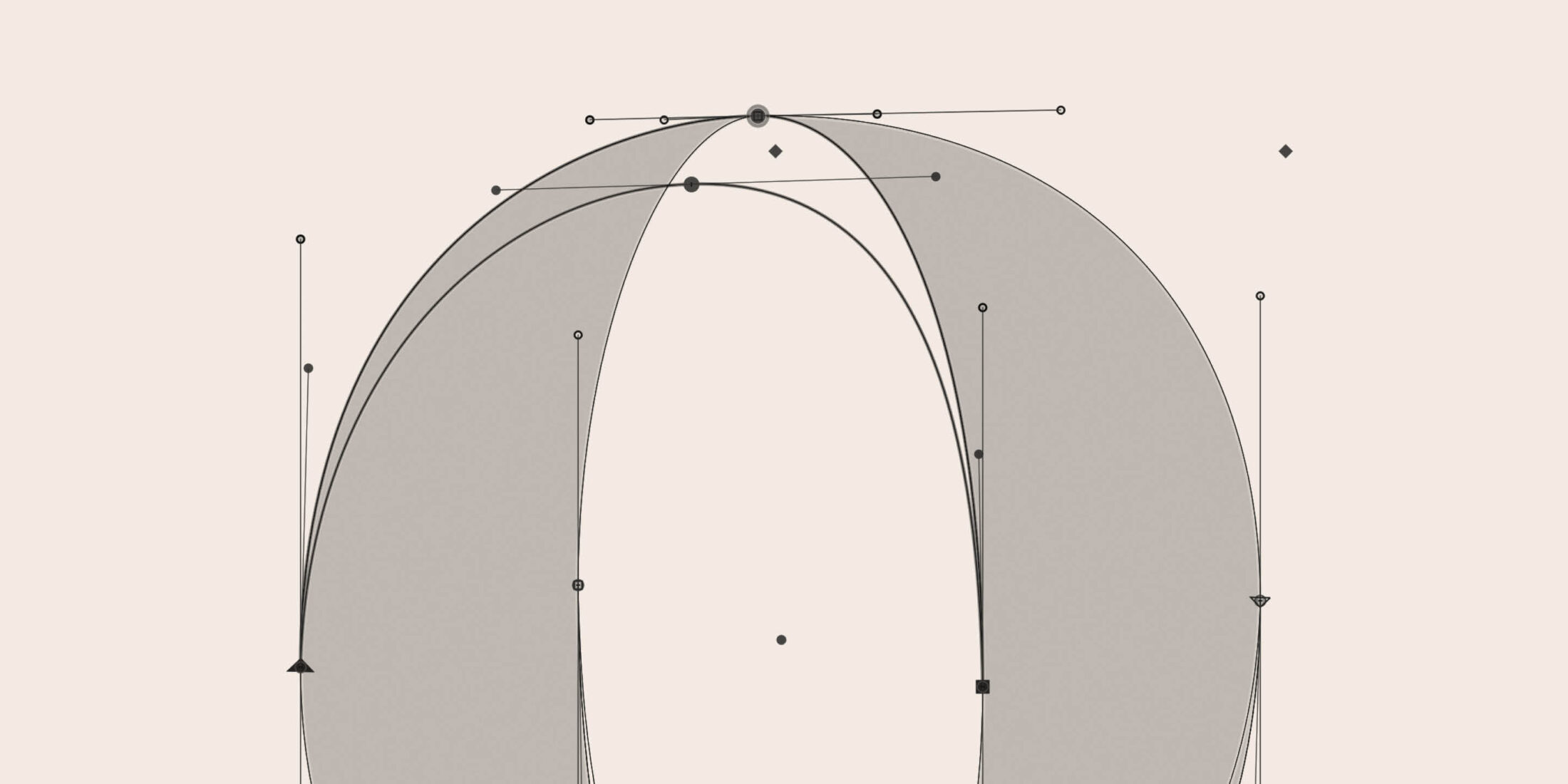
I made the decision to divide the Base and Cover elements not on random alternation, but according to their orientation: all vertical (thick) strokes are part of the Base layer and all horizontal (thin) strokes are part of the Cover layer. This logic also meant an increase in the number of strokes. E.g. o got 4 strokes, instead of the original 2. At this stage, the typeface was reminiscent of Baroque aesthetics with twisted terminals and I realised I wanted to make something more surprising. As I was not bound by any historical model, I decided on an unconventional combination of ball and sharp terminals (sometimes both in one letter), arranged only emotionally. The idea of rotating the pen, from the gothic fraktur, also penetrated italic (note the ending of f and j). Instead of putting the font in a historical period, I took from each period what was best suited to the design.
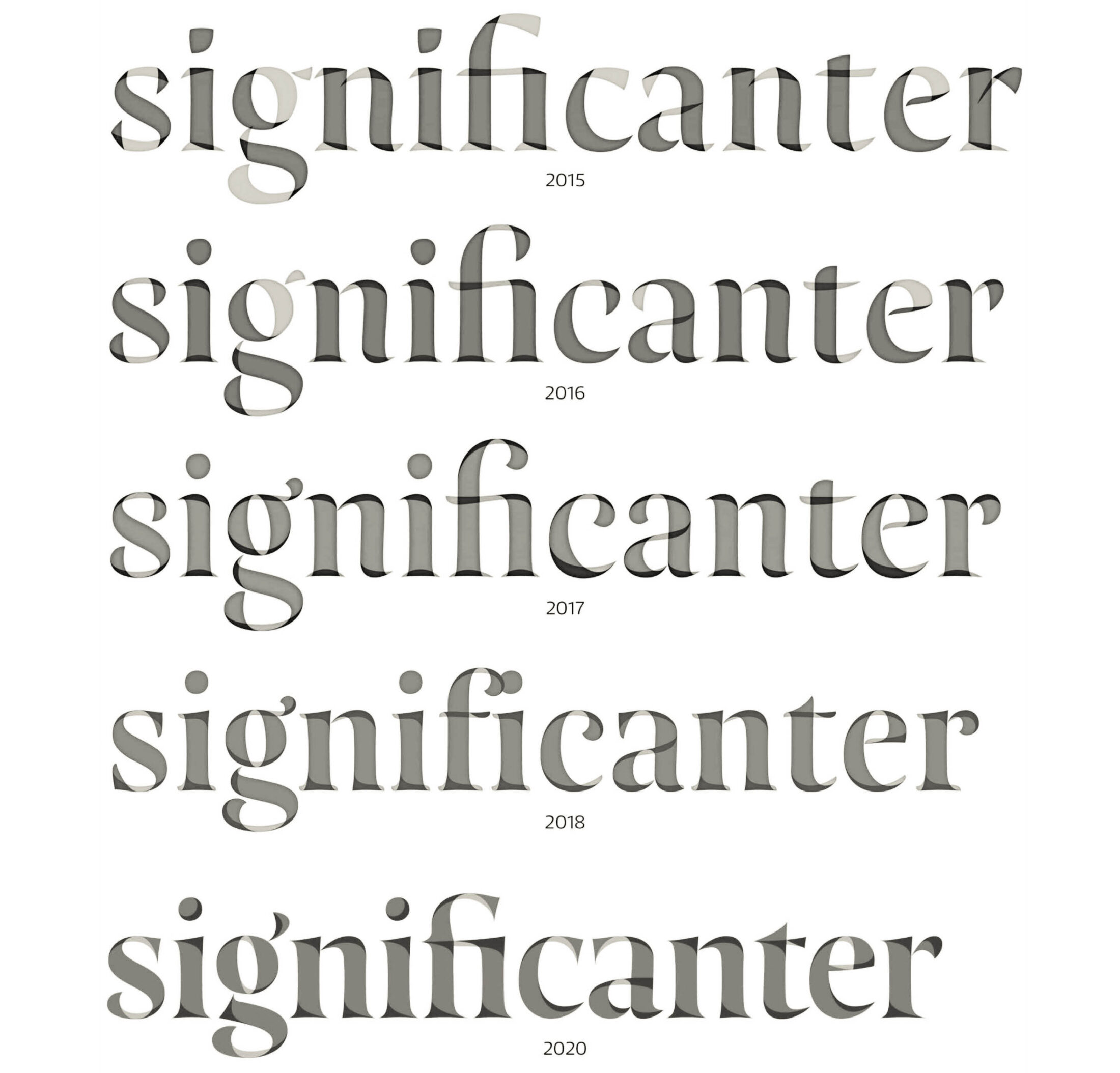
Evolution of Resonay from 2015 to 2020. We can see a shift from random and unbalanced design to clear and sleek curves with thoughtful construction. From trendy angular shapes, through baroque curls to renaissance sophistication.
Crazy Idea
What if the whole Base layer could be used on its own? It was a huge complication for me, but it expanded options for the user. The high contrast base layer looked great and it would be a pity if it always had to be covered. But how to solve the crossbar in f and t? With 2 strokes crossing in different directions flattening the base and cover layers into one felt like denying the whole logic of what I was trying to do. And what about the ligatures, uppercase, and everything else I’d already designed? I haven’t added it up but I estimate that this crazy idea added at least half a year to Resonay’s development.
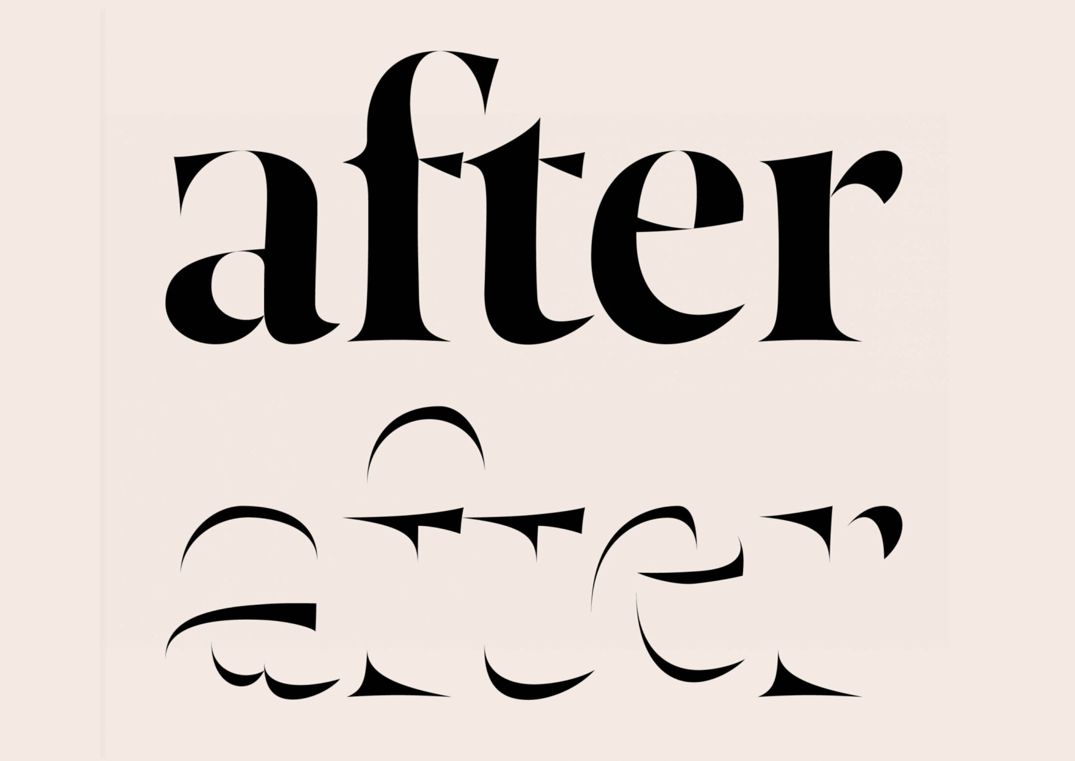
How to solve the crossbar on f and t so that the base layer could work independently? The whole crossbars could not move to the Cover version without weakening the Base layer, but omitting the crossbars from the Cover version looked inappropriate. This proved to be the best solution.
Serifs and Return Dynamics
From the moment I left the script version of the font, I was puzzled about how to design the Cover layer’s serifs. With so many options, how to choose the right one? Over time I realised there must be a smooth transition from the stem and some asymmetry. As my 2018 version was too fragmented, I decided to simplify.
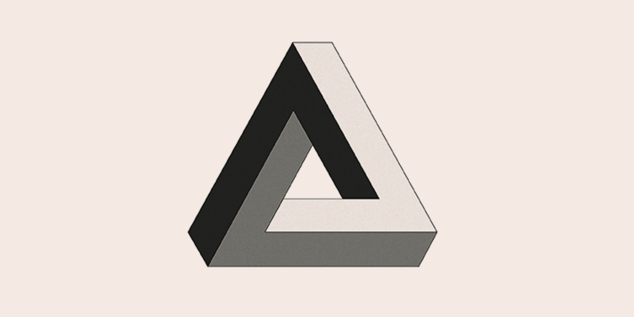
I was puzzled from the moment I left the script form: how to choose the right serif form from so many options? Over time, I realised there must be a smooth transition from the stem and some asymmetry. Since they seemed too fragmented in the 2018 version, I decided to simplify. I copied the flared shape of the Base font and added a dynamic line connecting the farthest points of the serif. This also resulted in dynamic, circular shapes connecting the inner and outer contours. Elegance à la Penrose triangle:
Another Voluntary Complication
I noticed this Penrose feature created an attractive swirling movement in the letters. But let’s go even further: what if the direction of this vortex could be influenced? Of course, I wanted to make two versions – one swirling from the inside out and the other from the outside in... More important than the direction of the swirl is its incorporation into the letter shape. In addition to needing new masters, changing the “direction of rotation” created other problems. In o for example, the wrong swirl direction broke the slanted axis typical of fonts of this type. I decided to make each letter dynamic in a way that accorded with its natural appearance.
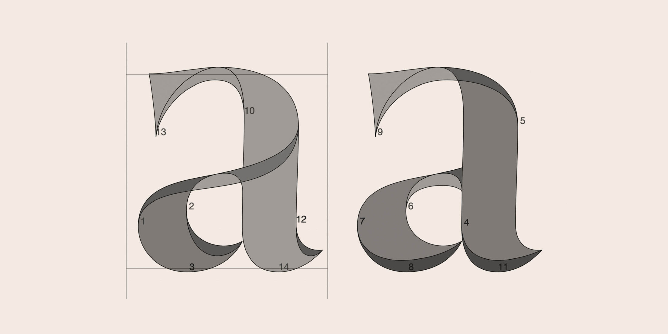
Idea with swirl direction control. In the end, the right variant was not implemented due to the excessive complexity of some features.
From FontLab to Glyphs
About the first third of Resonay’s development took place in FontLab5. But, after a while, I could no longer look at low-resolution letters on a retina screen and changed to working Glyphs. This transition was not as painful. Some characters needed to be redrawn completely, because FontLab is more benevolent to interpolation errors.
At first I drew the base and cover layers simultaneously, in one file, and then manually sorted and divided them into two files. Later, thanks to Jakob, I found out how the layer work and so it was possible to keep them in one file and have better control. Although learning a new design programme took time, Glyphs saved me a lot of time and allowed me to stuff the font with features I didn’t know about before.
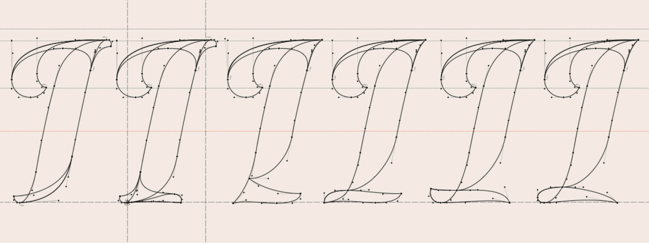
Italic variants of I in FontLab.
Per Aspera ad Astra
A typeface with no historical model puts obstacles in your way and asks you to overcome them alone. Although I had a Venetian Antiqua in mind, the complexity of this layer design meant I had to find my own path. Dividing strokes into layers is a subjective matter that can be done in an infinite number of ways. You are constantly comparing them and most importantly – you are constantly discovering new ones! I defined my design space as follows:
- it must be as visually attractive as possible
- no straight vectors
- it will stylise its calligraphic construction, which is normally hidden from us
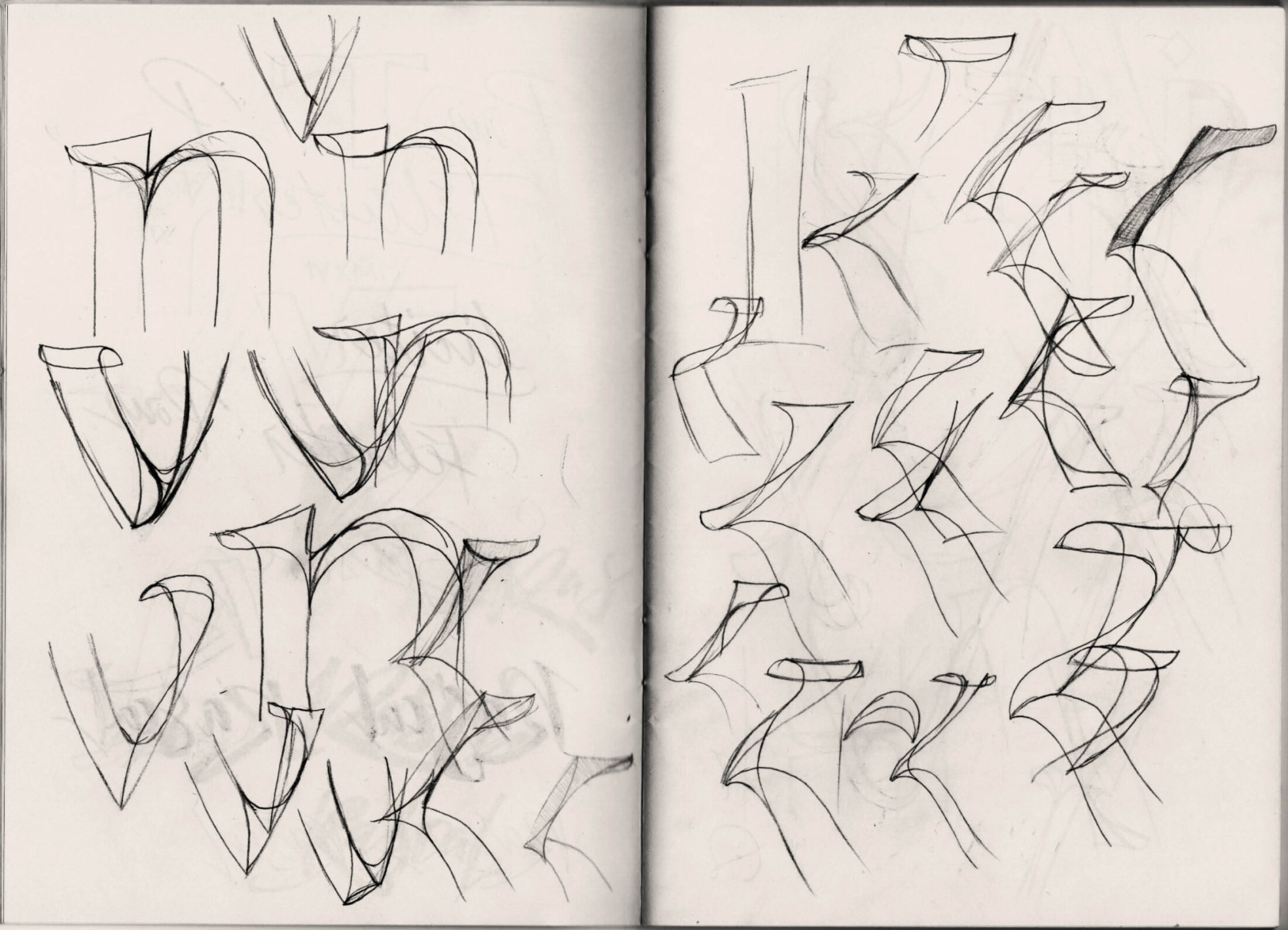
When there are so many options, it’s hard to pick one version of k. And the more you look at it, the more options appear...
With so many options, it’s easy to slide into complexity and deprive the font of its power. I realised this had happened in the 2018 version: the design needed to be moderated, too many curves had made the font’s spirit fade. The solution was to make some outlines common to both font layers, unifying the fragmented design into a harmonious whole. Less is always more.
What’s the Name?
I like names that indicate what the font is about. What can we expect from it. It does not have to show the most beautiful characters or where it originated, but it is necessary to work towards a logical name, which captures its atmosphere. I began to think of -ant as a suffix for Antiqua, capturing Resonay’s historical background. I followed this concept for a very long time. I wrote down more than 150 ideas for names with this suffix. Some completely crazy, some quite usable.

In the end, I opted for “Revelant”. It seemed to fulfil everything – it sounds like the name of a mythical hero. Revel in English = entertainment, fun, celebration, and revelation = exposure, discovering, finding. Ant = Antiqua. But everyone thought it was called “Relevant”, which felt inappropriate.
After consulting with Nils, I decided to rename the font. The “ant” suffix seemed exhausted, but an artistic impression of the font led me to the nice and simple “Portray”, but there was a font with a similar name “Portrait”. In the end, we agreed on “Resonay”, which sounds more original, contains a call to action, and suggests the atmosphere of the font
Lessons I Learned from This
Type design is made for people. If users don’t understand your design, it doesn’t mean they’re stupid, or it’s a stupid design. You might not have kept a critical distance from your design and made something overcomplicated. Today’s type design technology makes that easy — the possibilities are constantly expanding and fonts are becoming more complex. There reaches a point where it goes beyond the ability of the user. They may consider your artistic features a mistake, making your overworking of your idea not only unnecessary, but harmful. This probably happens whenever you work on something for too long. However, working on something for a very long time and keeping its freshness is the ultimate challenge for any designer.