Cherry Gaming Font
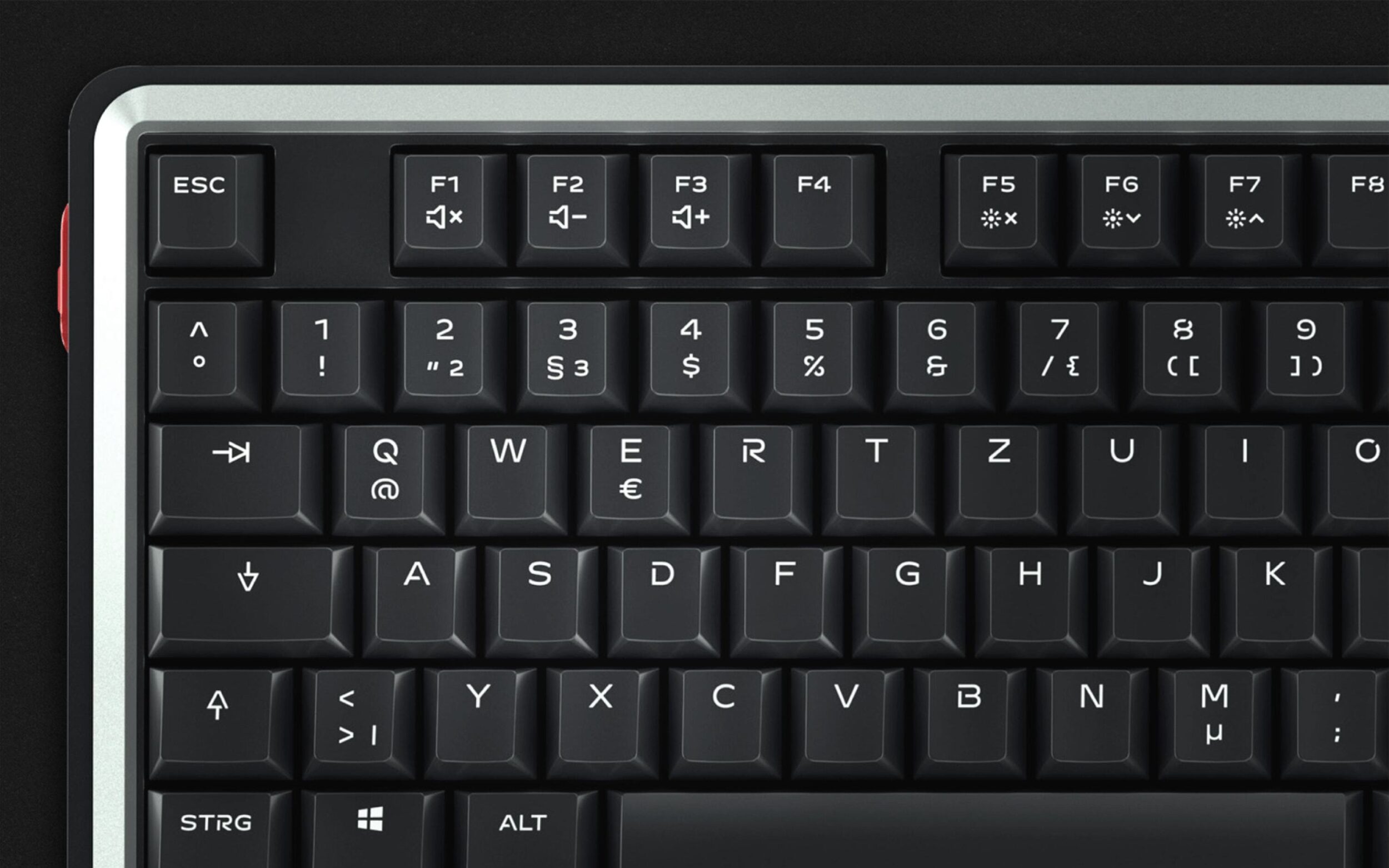
We developed an exclusive CHERRY gaming font to ensure a perfect illumination of the 2K keys. We also equipped the brand new MX Board 5.0 with a fresh and futuristic look.
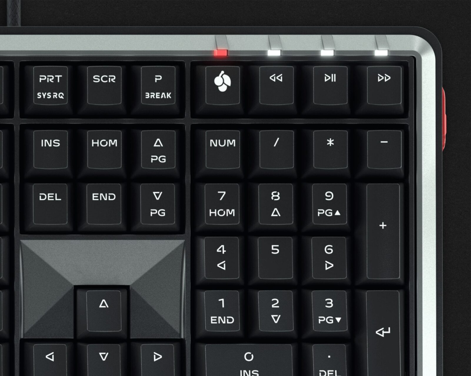
Photography by Cherry AG
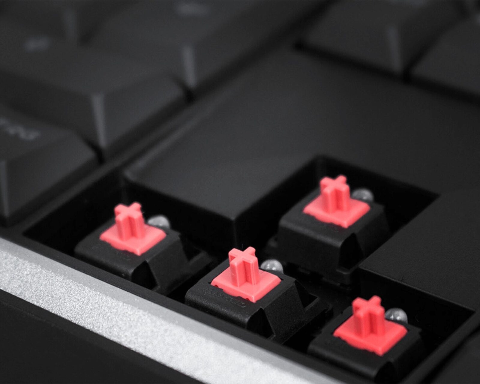
The new design is — and had to be — fundamentally different: The CHERRY MX 5.0 keyboard is based on Cherry’s iconic mechanical keyboard technology MX. It’s a patented design with an XL palmrest and keycaps made of two-components manufactured together in the “doubleshot” moulding process. The results are ergonomic and highly durable — perfect for even the most demanding PC gaming enthusiasts.
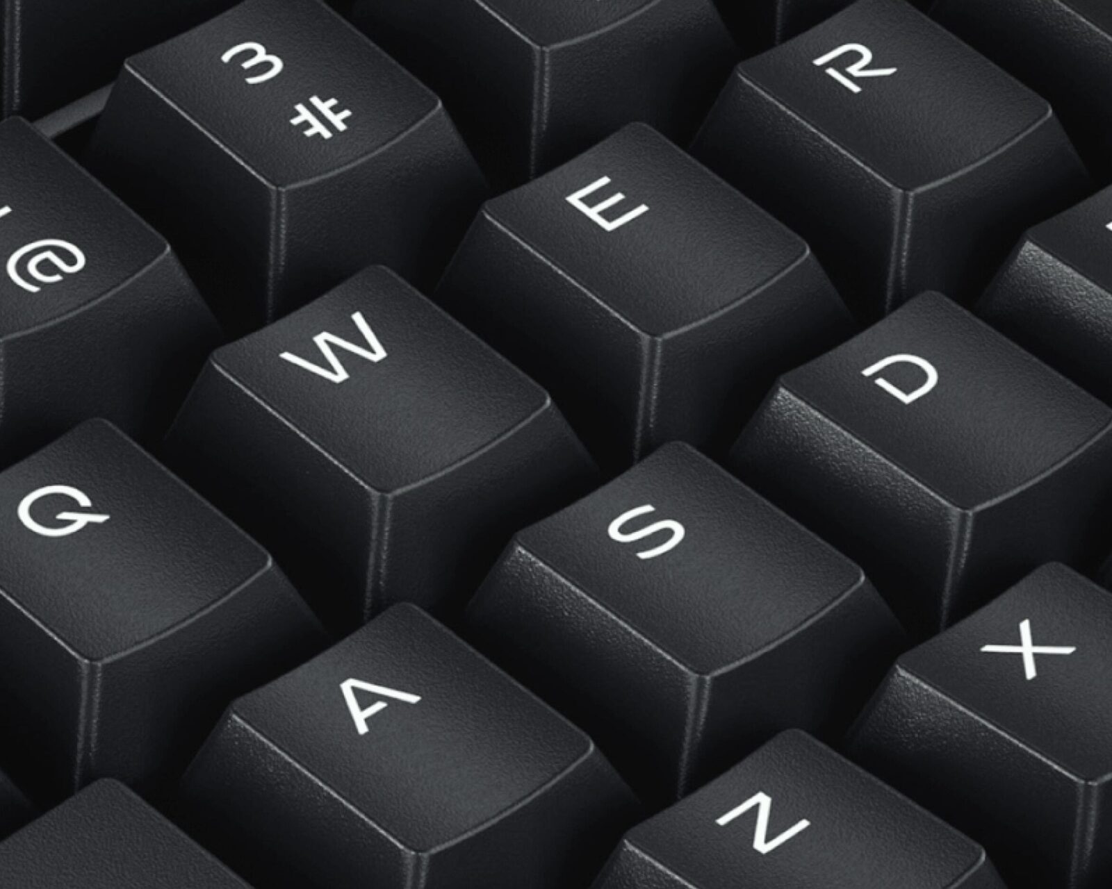
Photography by Cherry AG
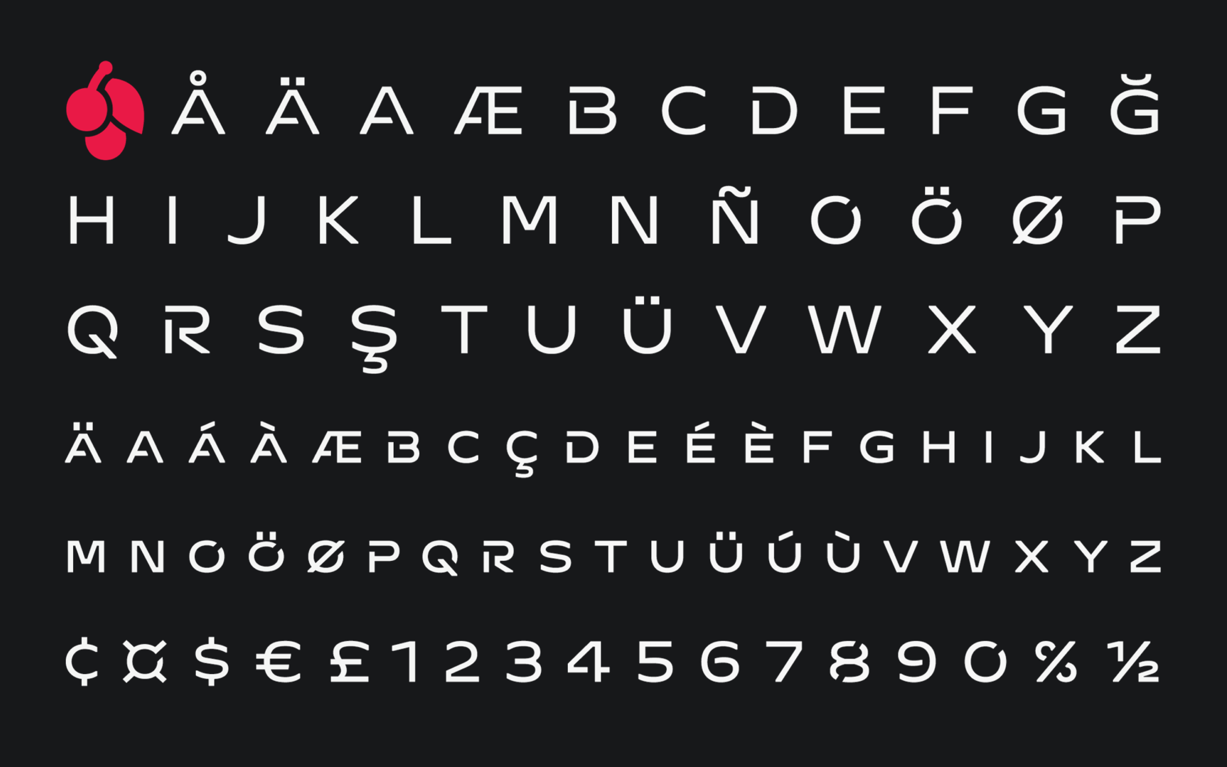
We were tasked with designing a typeface that would not just label the keys, but be built into them in a manufacturing process involving two wet-in-wet injections: the first moulding the key shell, leaving out letter shapes to be filled by a second injection. This process would place exacting technical requirements on anything we designed. We had to discover those technical demands little by little. In an agile process, we analysed, measured and sensed rules: defining the space we were designing within, and then redefining our understanding of that space each time we discovered a new requirement. But before we dove into the production requirements, we started with a design. We wanted to establish how the new keyboard should look and feel.
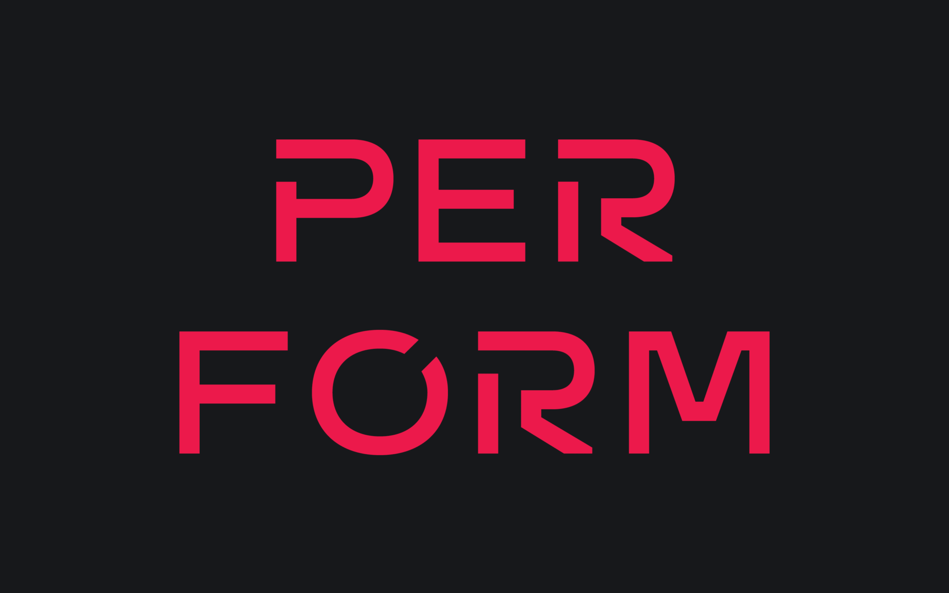
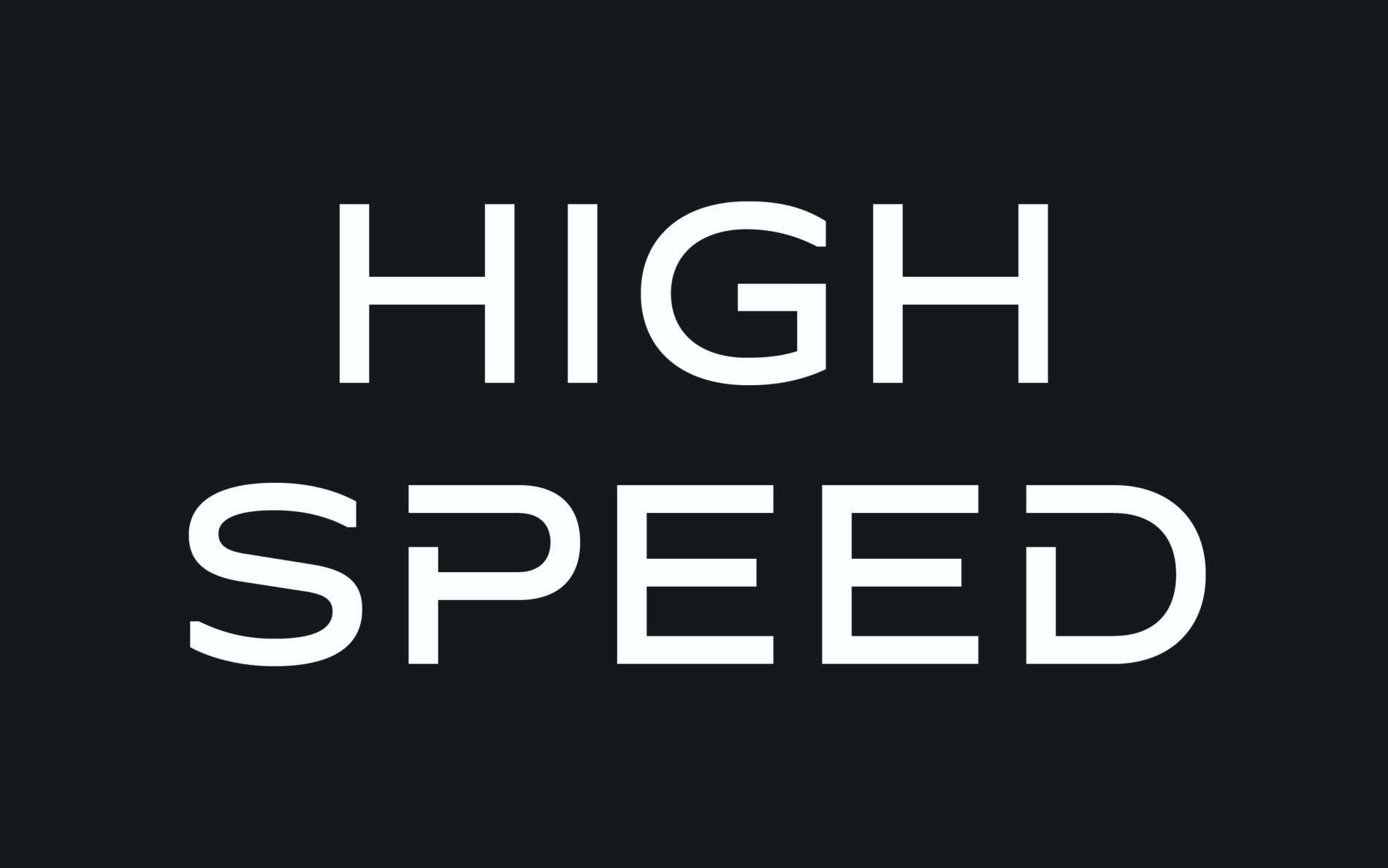
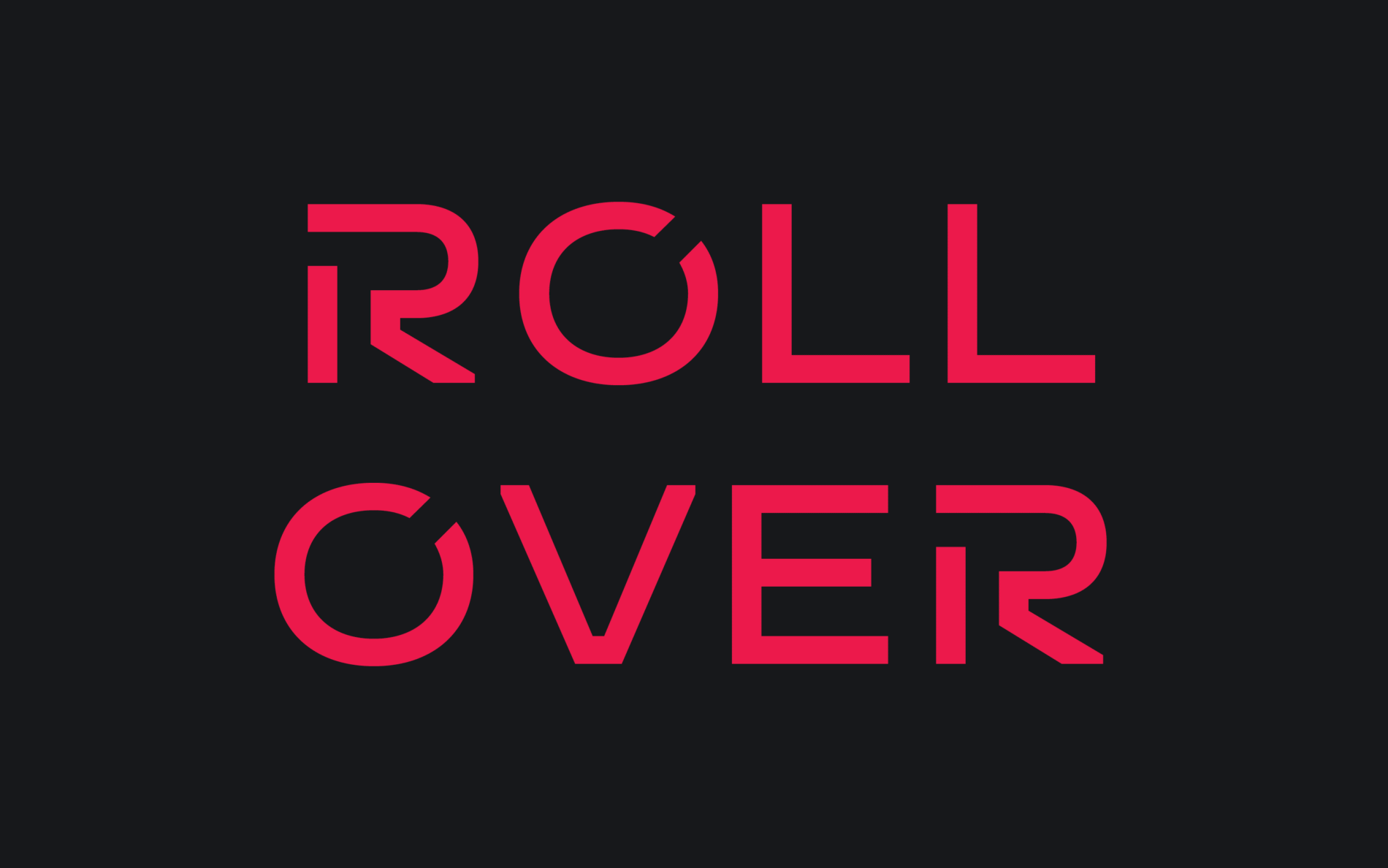
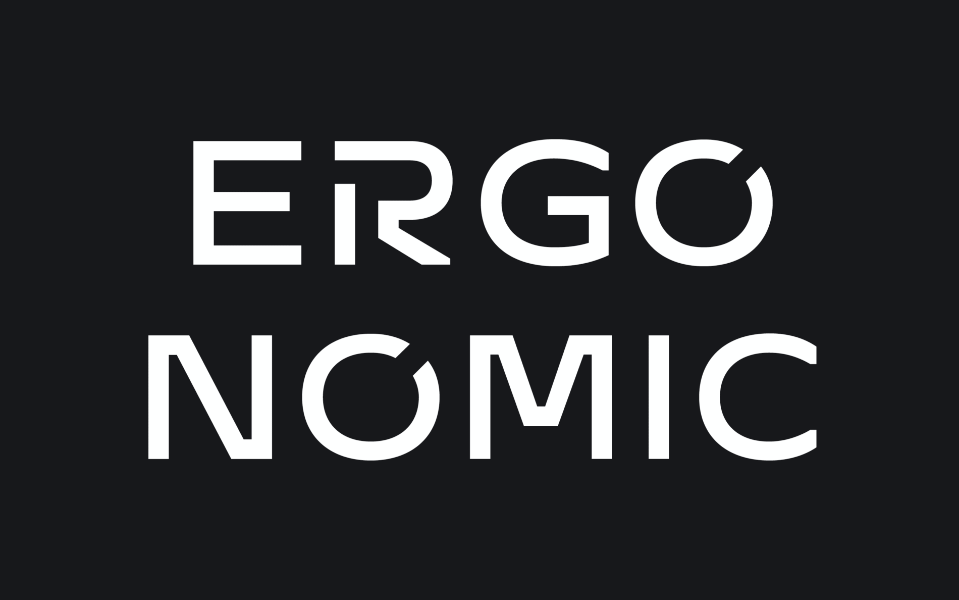
Circular, squarish, stencil overload or rounded — each different approach found a way to communicate a technoid and futuristic appeal, each using stencils for production-side optimisation. Once we and CHERRY had found a design that worked, we began to tune it in detail, adapting it to the exacting technical demands of the manufacturing process. We solved problems too. The stencil design is not just a cosmetic feature, it guarantees the key labels are illuminated consistently and without compromise. Introduced to the preserve small counter shapes, like the center of the A, from the combination of stresses that arise from moulding and interior illumination, it found a place throughout many of the font’s other glyphs: necessity giving rise to an important design feature.
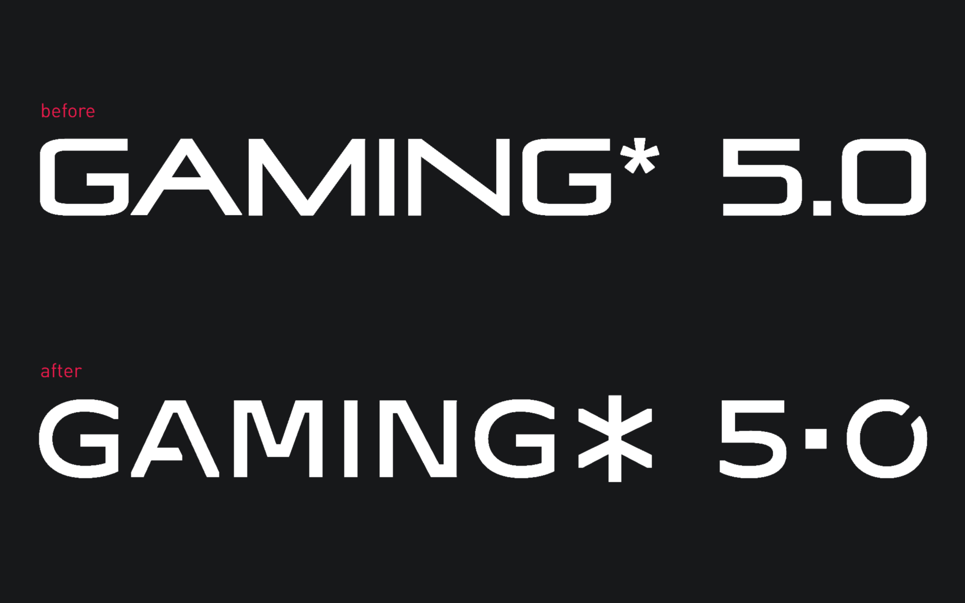
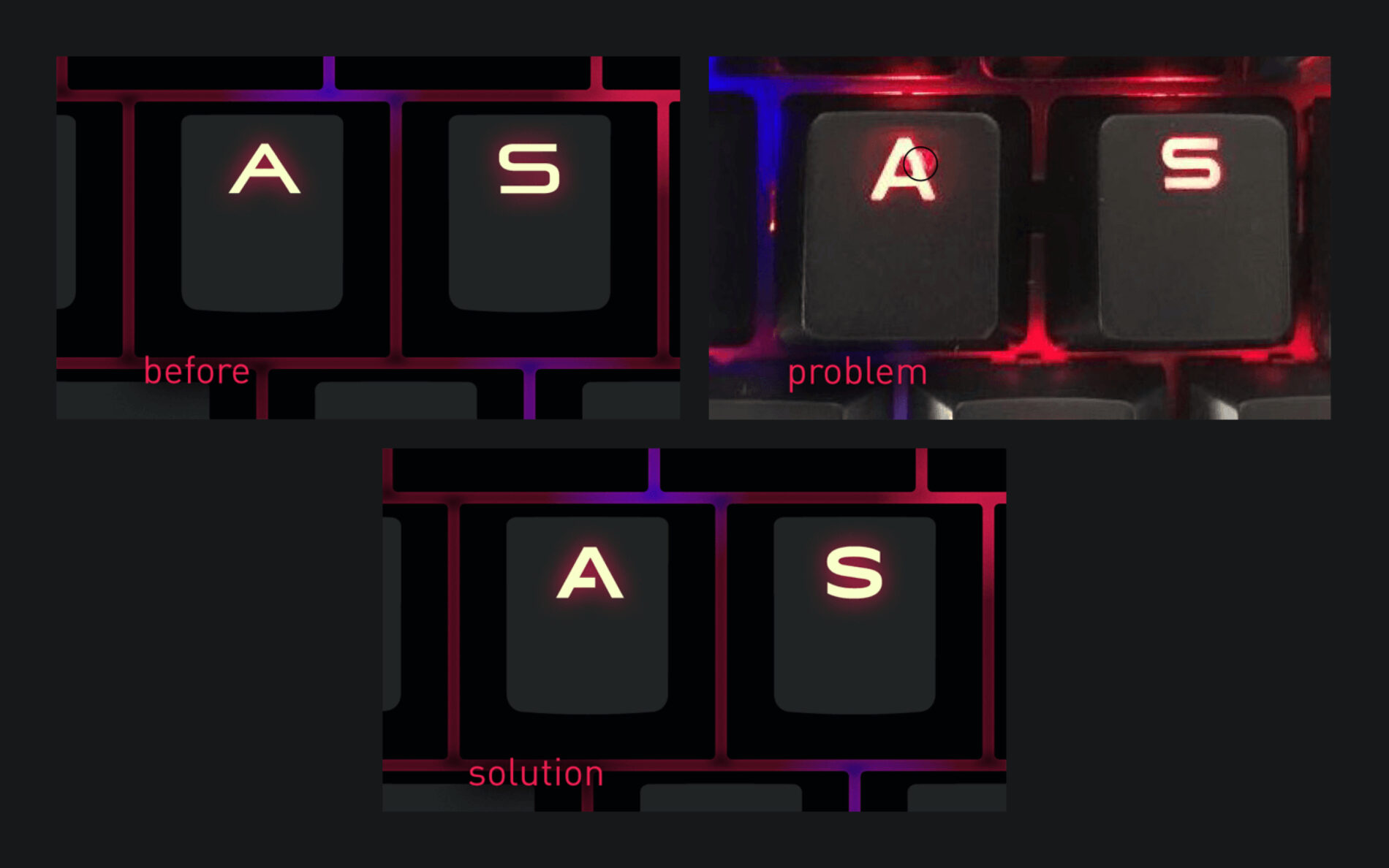
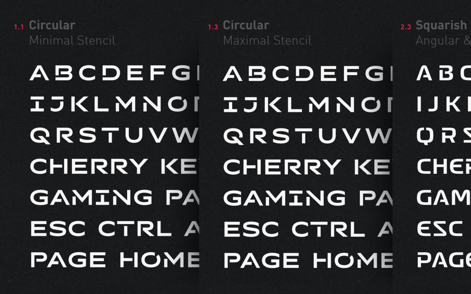
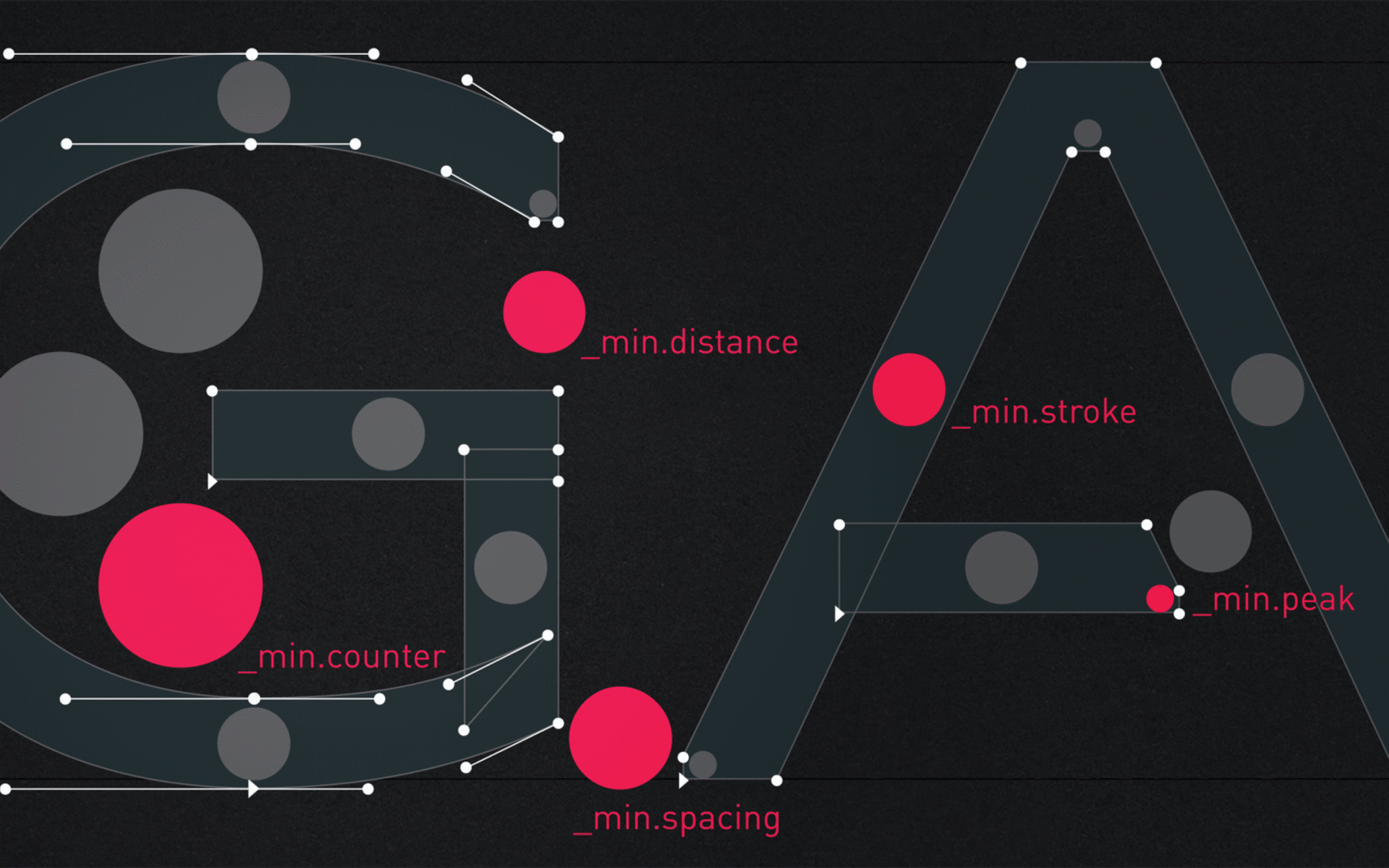
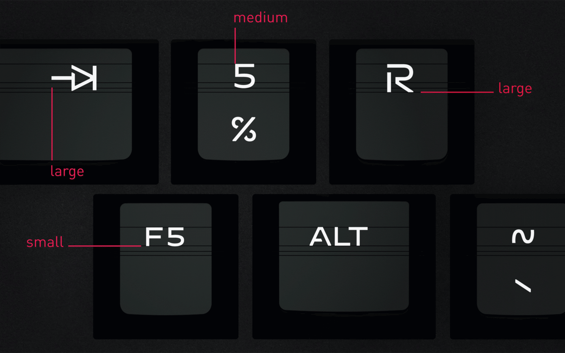
Another crucial aspect are parameters like minimum stroke thickness, minimal distance and maximum width. Without considering these, we could have designed a nice typeface but a totally worthless product. And to prevent fine details from breaking off during the moulding process, we started implementing ink traps and slightly rounding off sharp points.
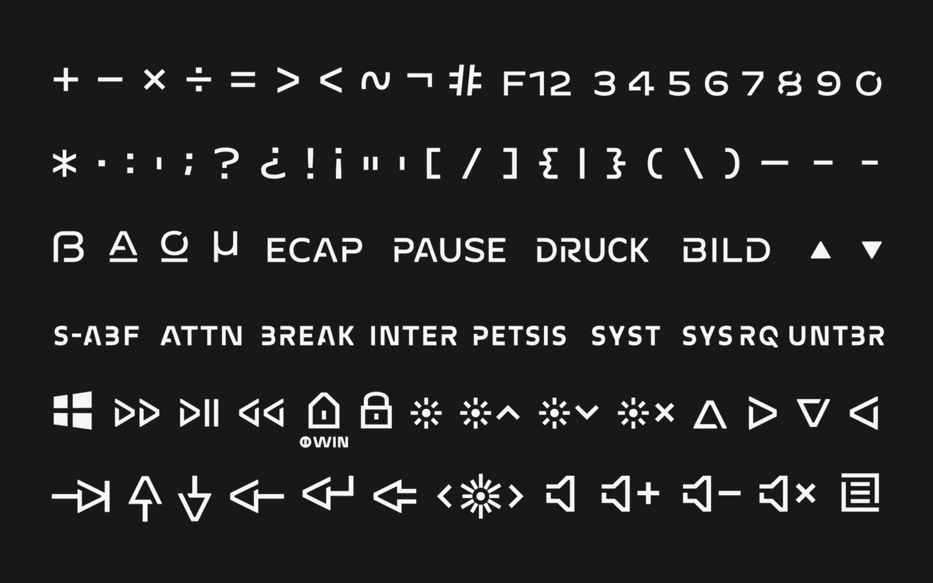
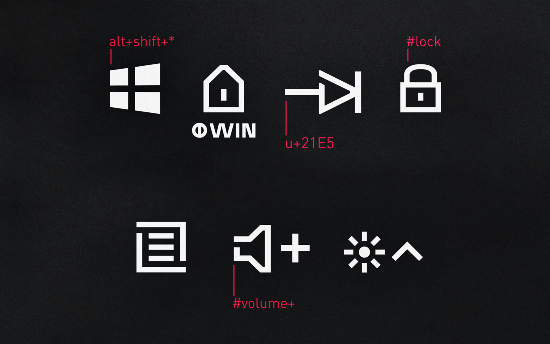
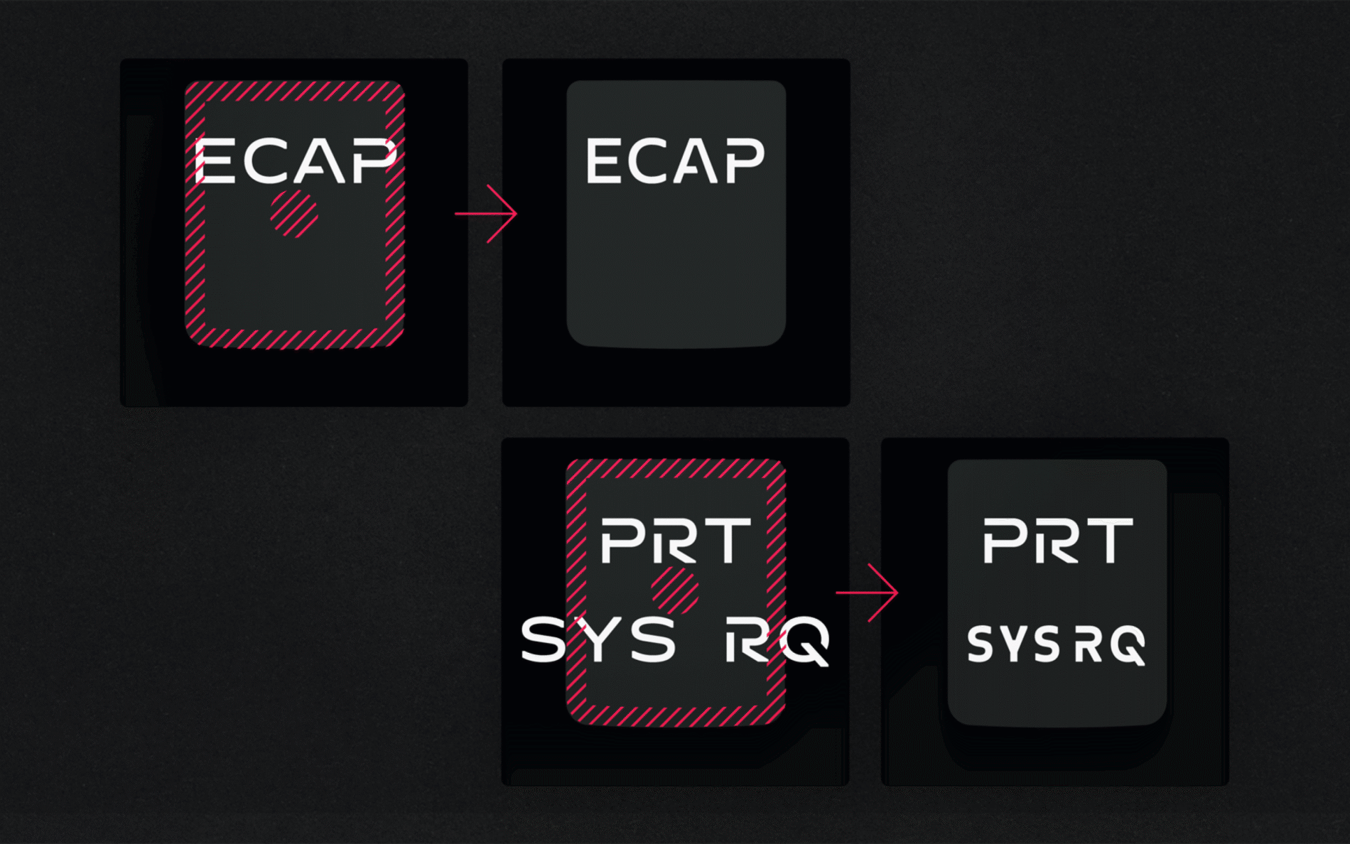
To fit within the boundaries of the keycaps, we created glyphs made of complete words before compressing and carefully tweaking them to ensure they didn’t lose the extended typeface aesthetic. Naturally, we incorporated symbols, arrows, icons plus every other abstract glyph and we made them easily accessible through Unicode encoding and OpenType programming. Balancing all the technical parameters, we designed the font to contain glyphs in three apparent sizes, each for a particular use and guaranteeing perfection down to the smallest detail.
These technical challenges were part of what we found most satisfying about this project. Often our work is lead by a strong aesthetic approach and is intended to be used in design environments with very few technical restrictions. In the case of the CHERRY doubleshot gaming font, it was very different: we had to work within a complex production process and we developed a piece of work indelibly formed by function.
Today, we are proud to say our high-quality workmanship, carefully engineered in Germany, enhances the new CHERRY MX 5.0 keyboard. We’re looking forward to that new keyboard — to get hands on with letters designed by TypeMates.com
“These guys are competent, they have a strong commitment to their work yet being prepared to compromise! Further: they are really fast. And definitely worth to recommended for any challenging projects…”
Tolga Akcadag, product developer at Cherry GmbH
Keyboard photography by courtesy of Cherry GmbH.