A New Awakening with Altona and Alison
The reawakened Altona and its companion Alison are two contemporary interpretations of a Didone. United by the clarity of their distinctive forms, they form a bold and idiosyncratic team.
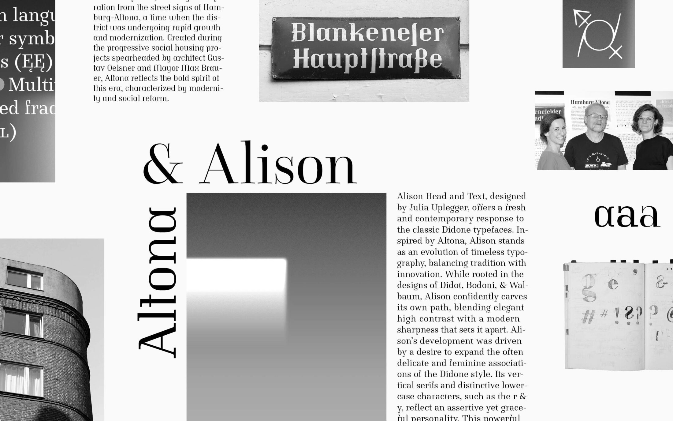
The new superfamily from Albert-Jan Pool and Julia Uplegger includes three strong serif typefaces. Altona preserves the beautiful, idiosyncratic letters of the historic street signs of the Altona district of Hamburg. Inspired by the same signs, Alison Head develops a powerful and expressive approach to a Didone, while Alison Text provides a reliable foundation for body text.
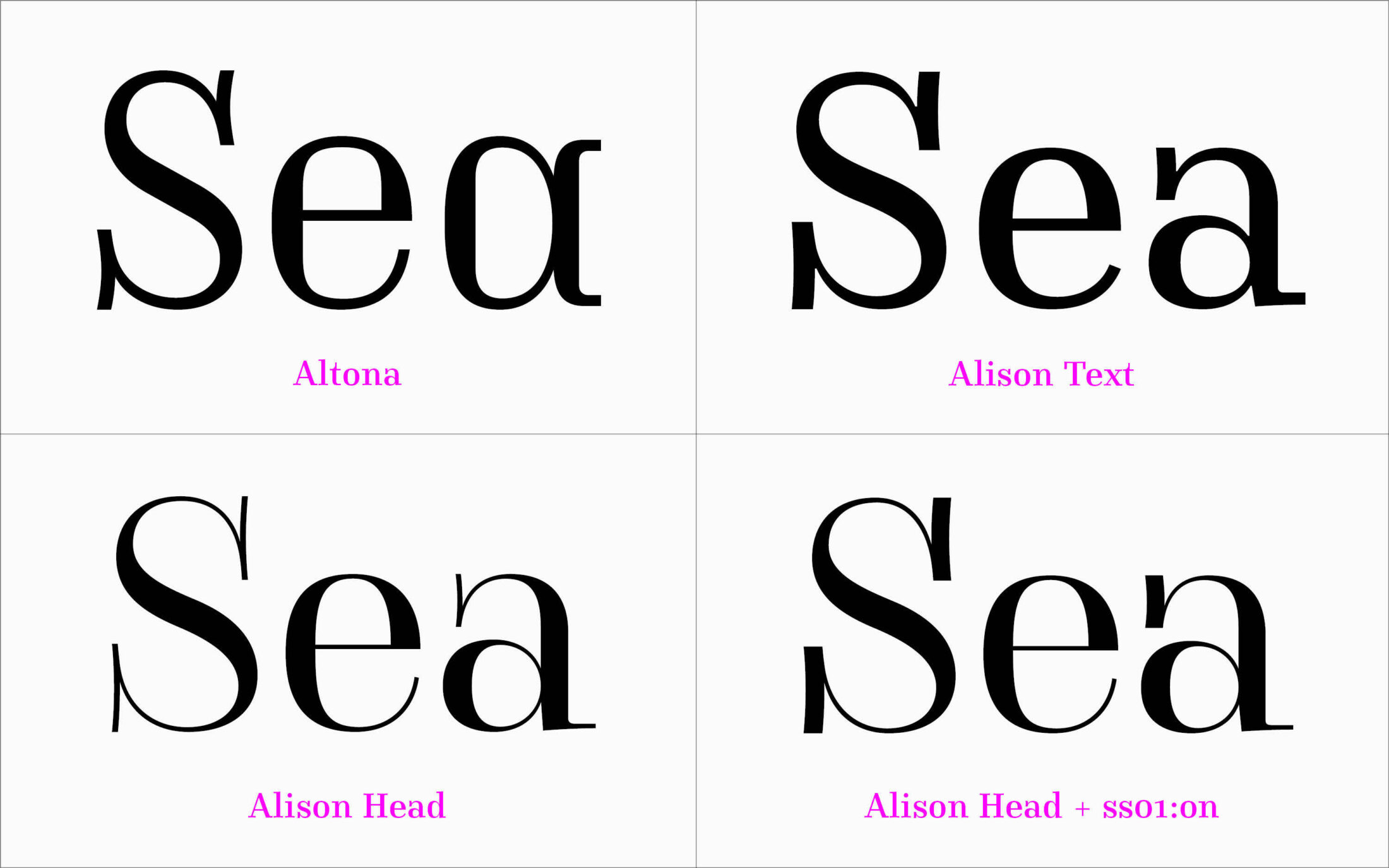
The distinctive look of Altona, Alison Text and Alison Head is created by vertically accentuated serifs.
Together the typefaces stand for new beginnings: Altona represents the rapid growth of the 1920s in an independent and social democratic city, while Alison represents an emancipated break with traditional models and approaches.
Altona revisits the old
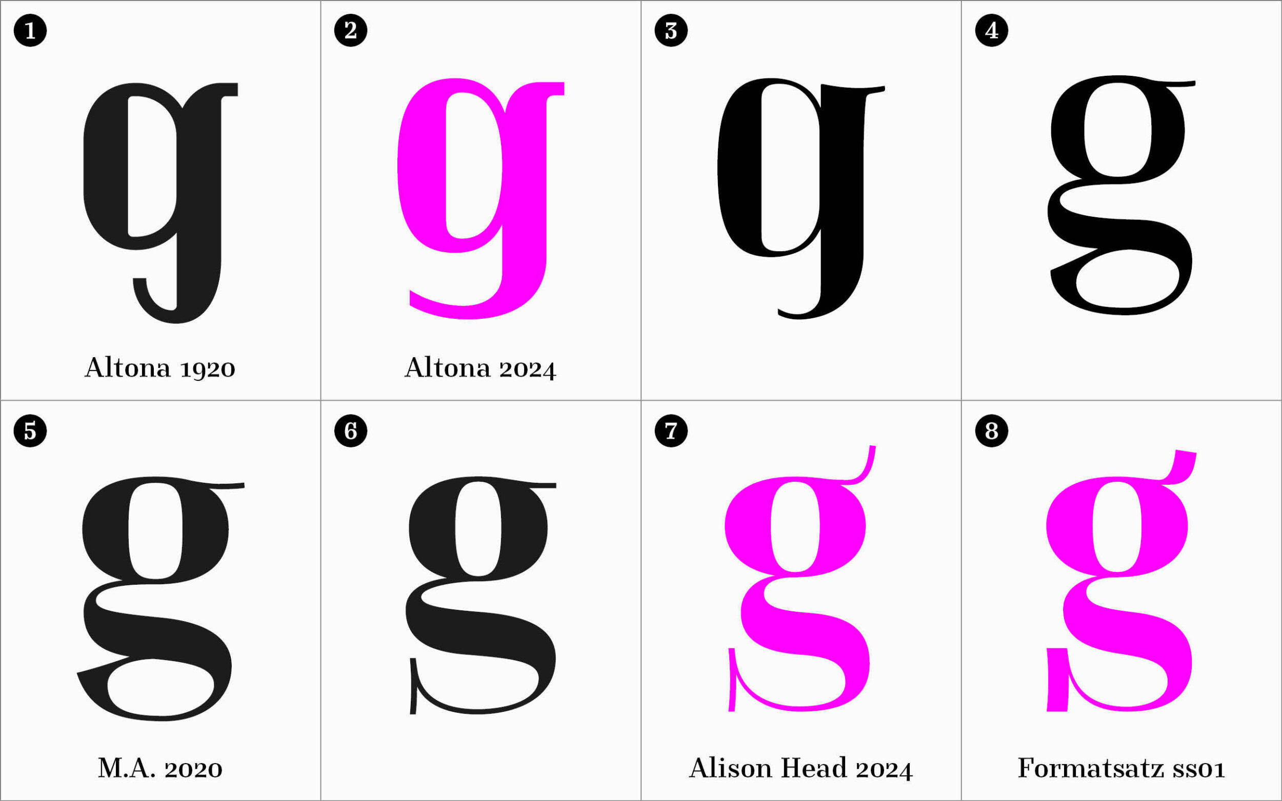
Altona is modeled on original street signs from the inter-war period, when what is now Hamburg-Altona was an independent district. Thanks to the Groß-Altona law, initiated by the Social Democrats, Altona rapidly grew: incorporating neighbouring communities and much-needed land, investing in its harbour and modernizing its infrastructure.
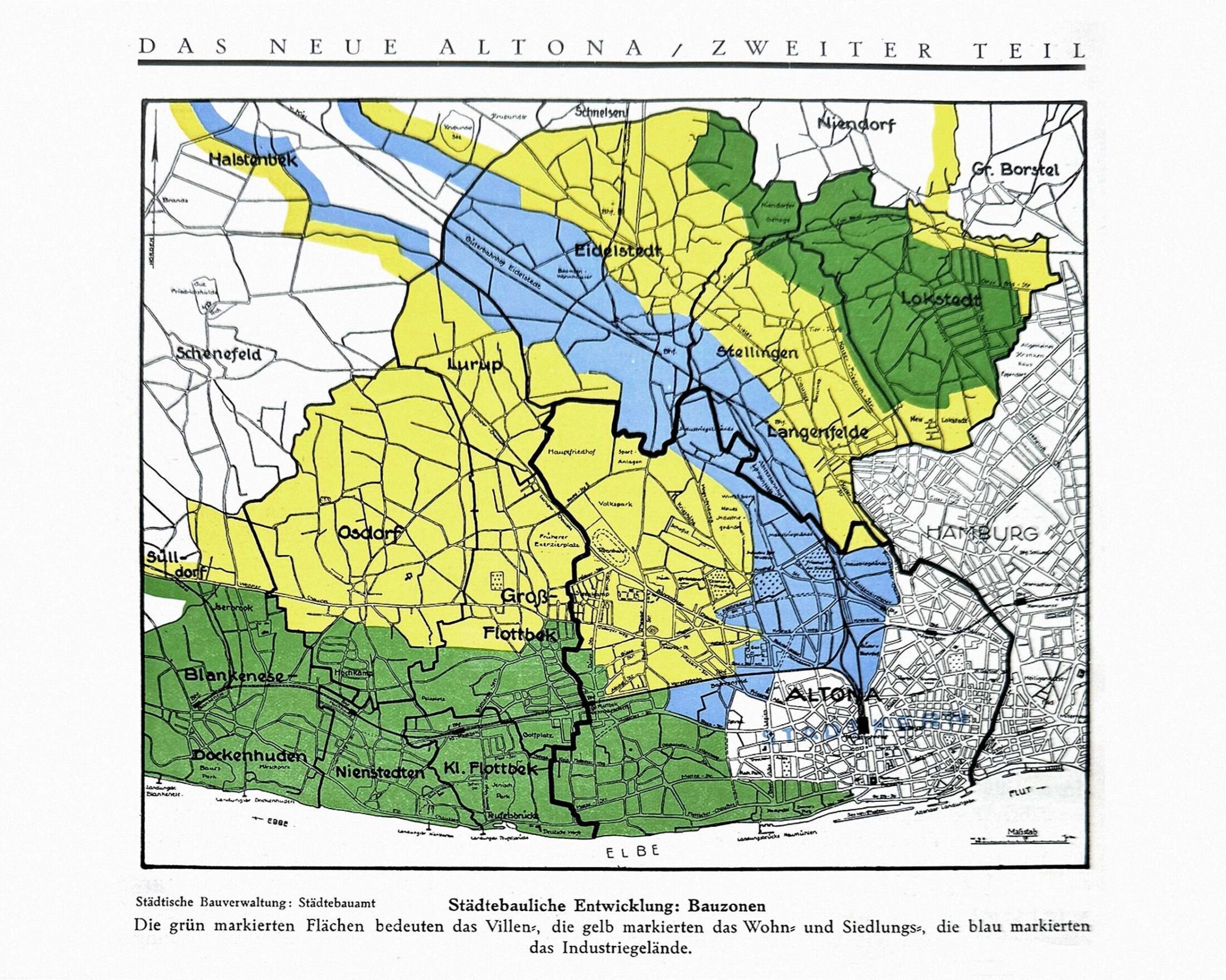
Planned expansion of Altona as part of the preparations for the Groß-Altona Law of 1927.
The Altona street sign typeface was used in the progressive social housing projects planned by architect and urban designer Senator Gustav Oelsner and the district’s Mayor Max Brauer. With forms based on the Didone style, Altona is a child of its time and well suited to the brick architecture of the new homes. With its unconventional geometric shapes, Altona reflects a contemporary spirit of progress, the emerging modernity of the neighbourhood and the dazzling ambience and diversity of the people who live here today.
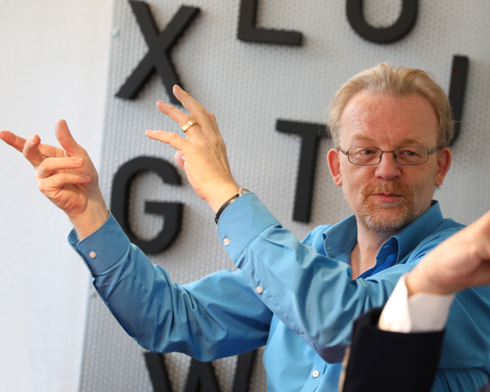
Alber-Jan Pool
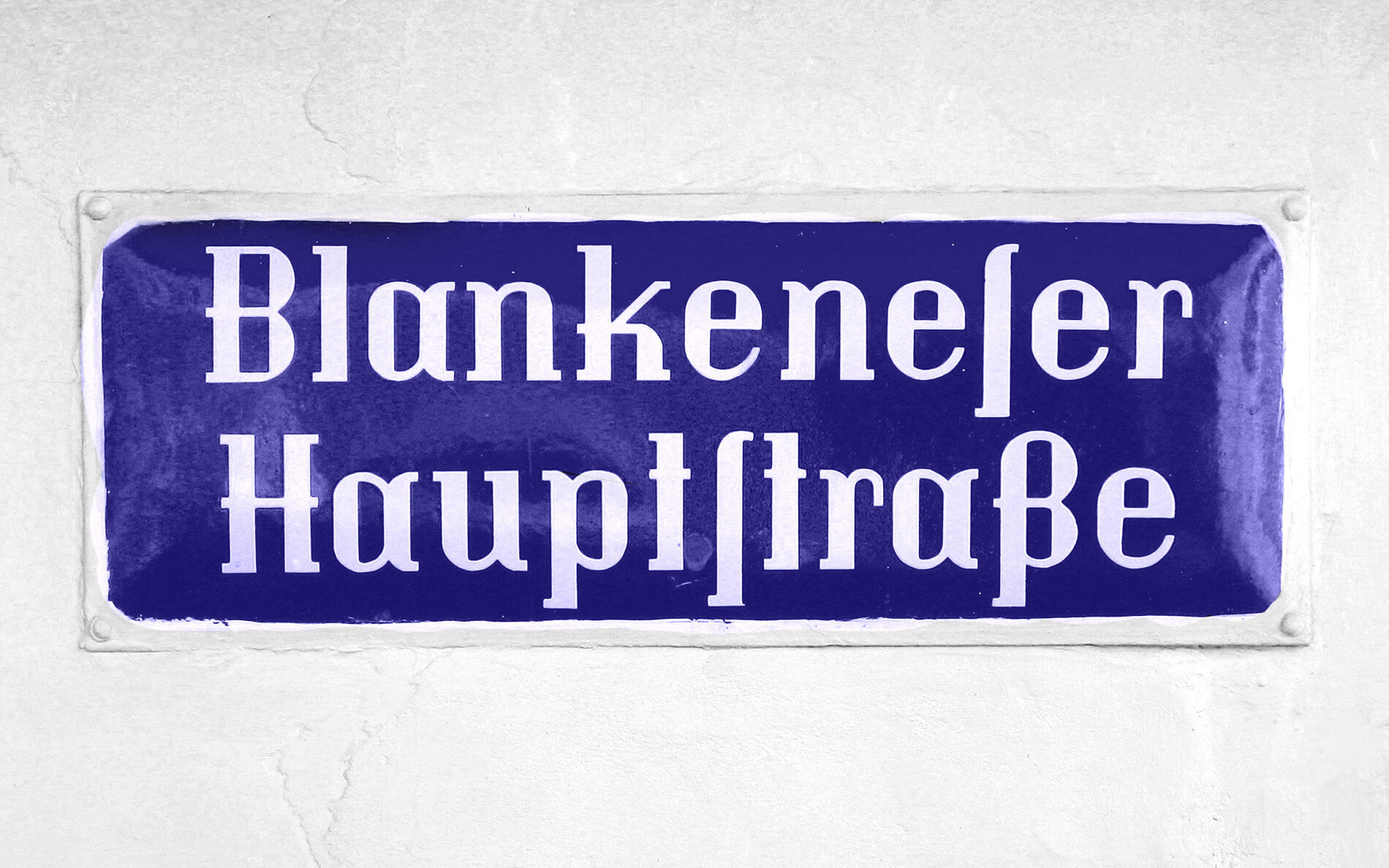
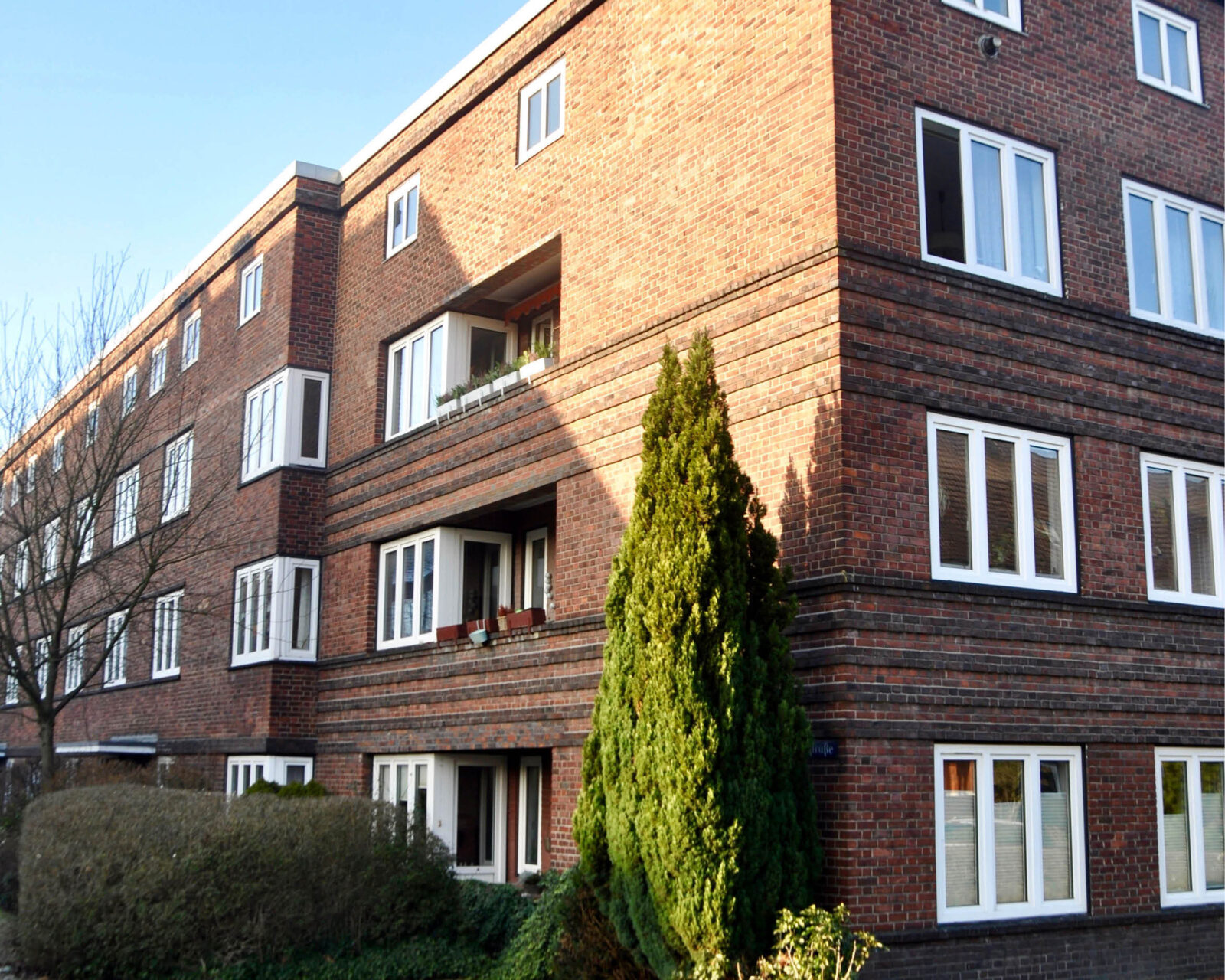
Brick architecture in the Reichardtblock.
Constructivism was in vogue at the end of the 1920s. The design of new serif, sans serif and blackletter typefaces was already common practice for sign painters and lithographers. What was innovative, however, was their use in the context of graphic design, a new profession at the time. One logical consequence was that designers not only reconstructed familiar forms, as in the case of the Romain du Roi, but used geometry to create new, contemporary forms.
While elsewhere the opportunity to combine legibility and originality in signage was not taken, in Altona the street signs are unusual and identity-forming. Albert was fascinated.
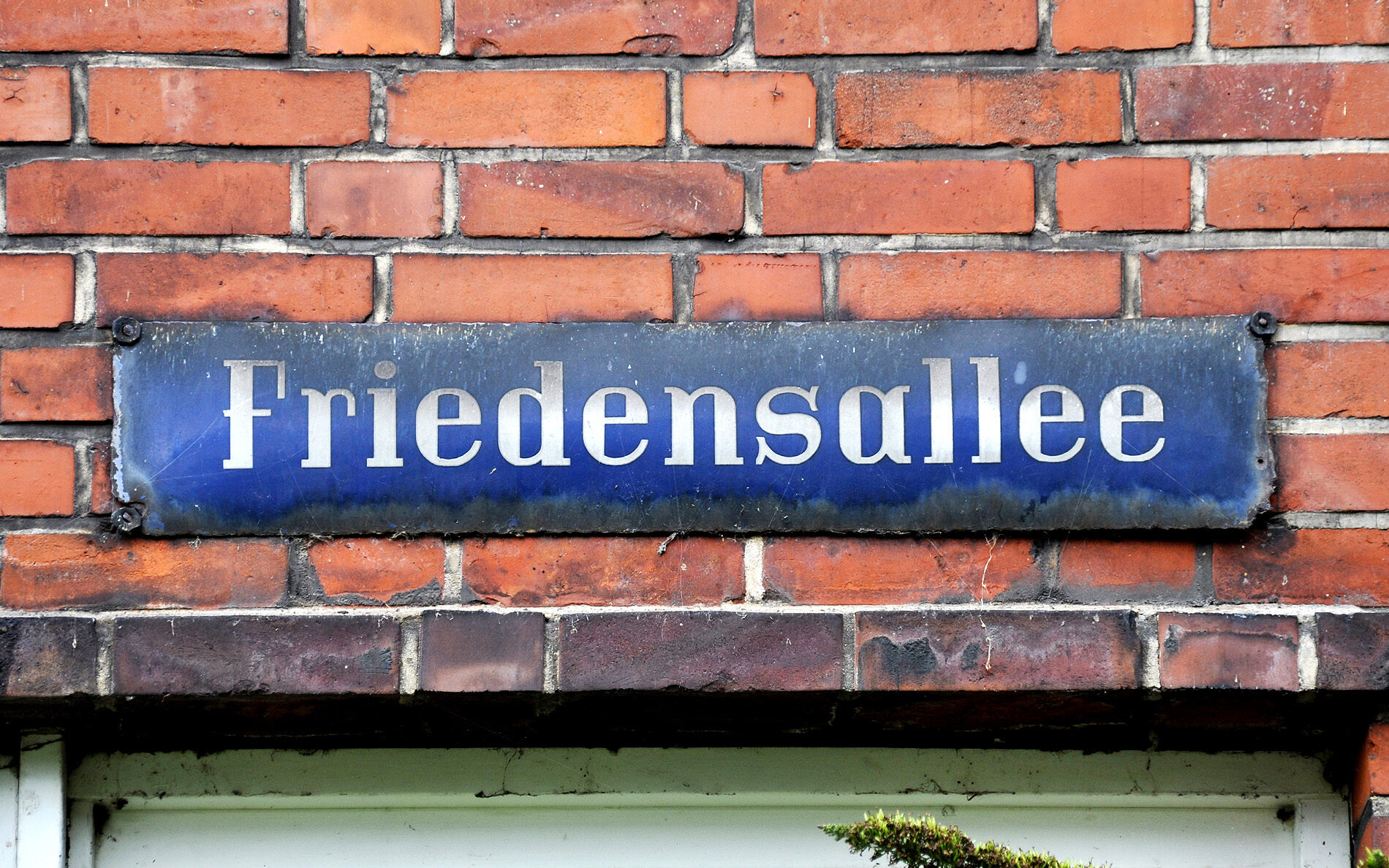
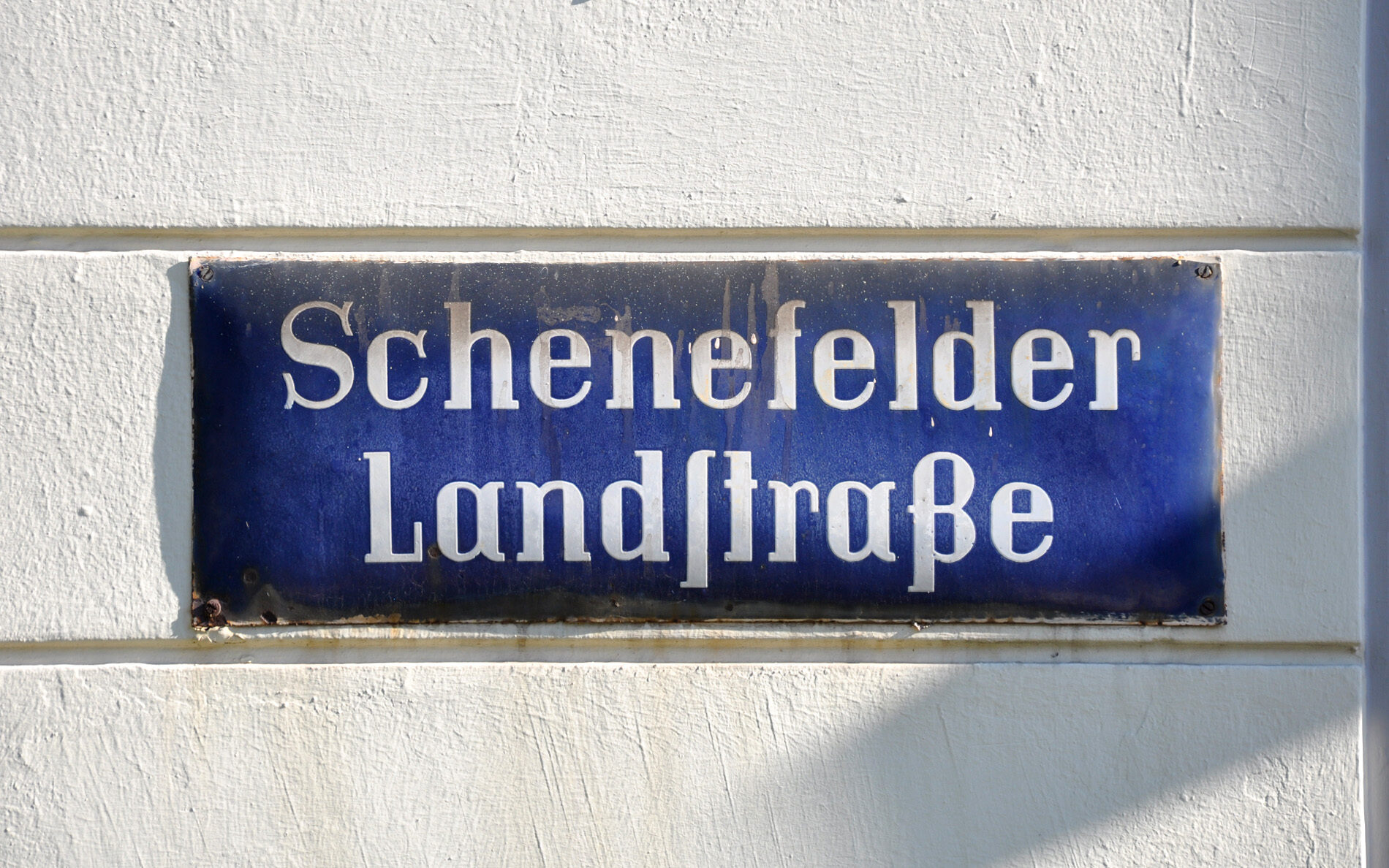
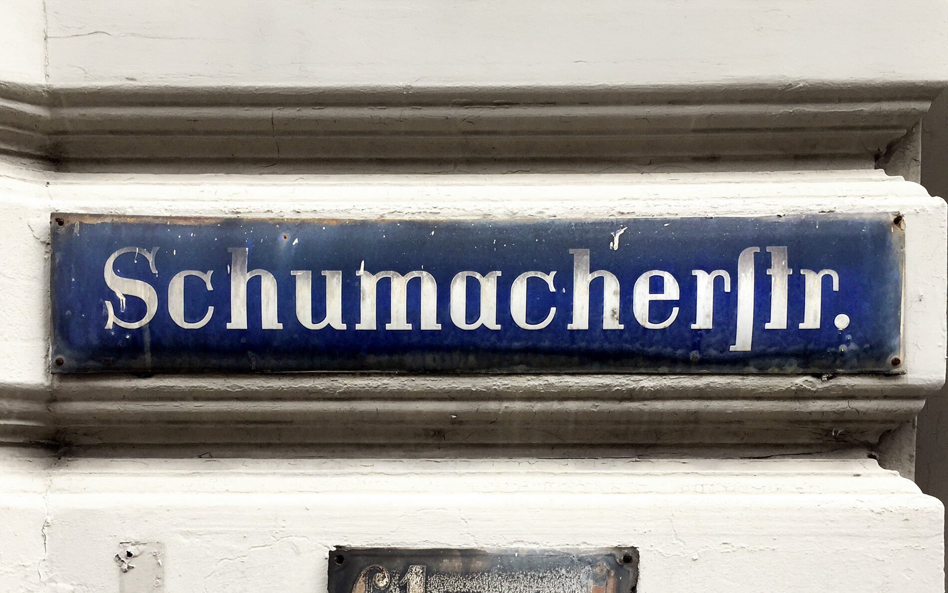
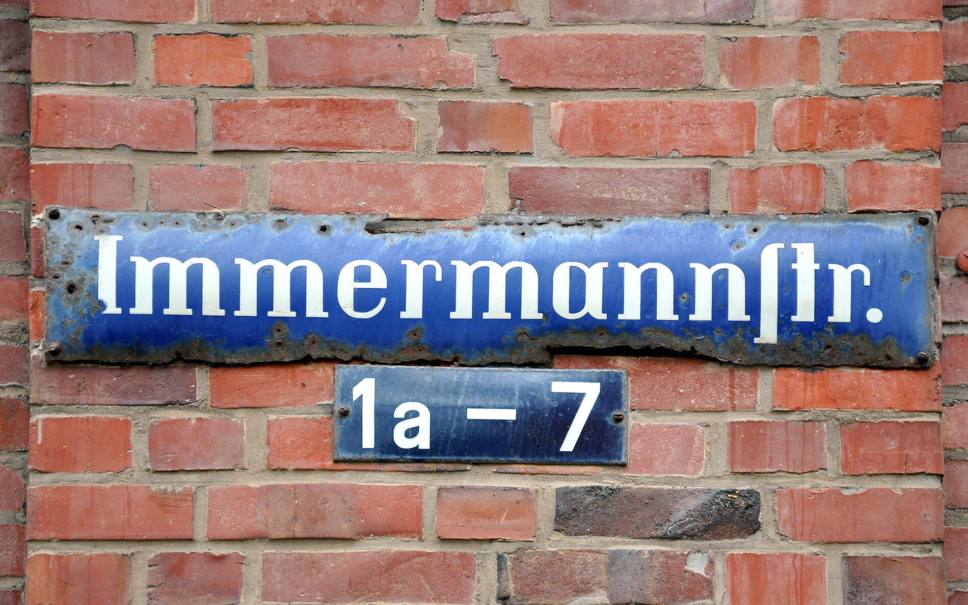
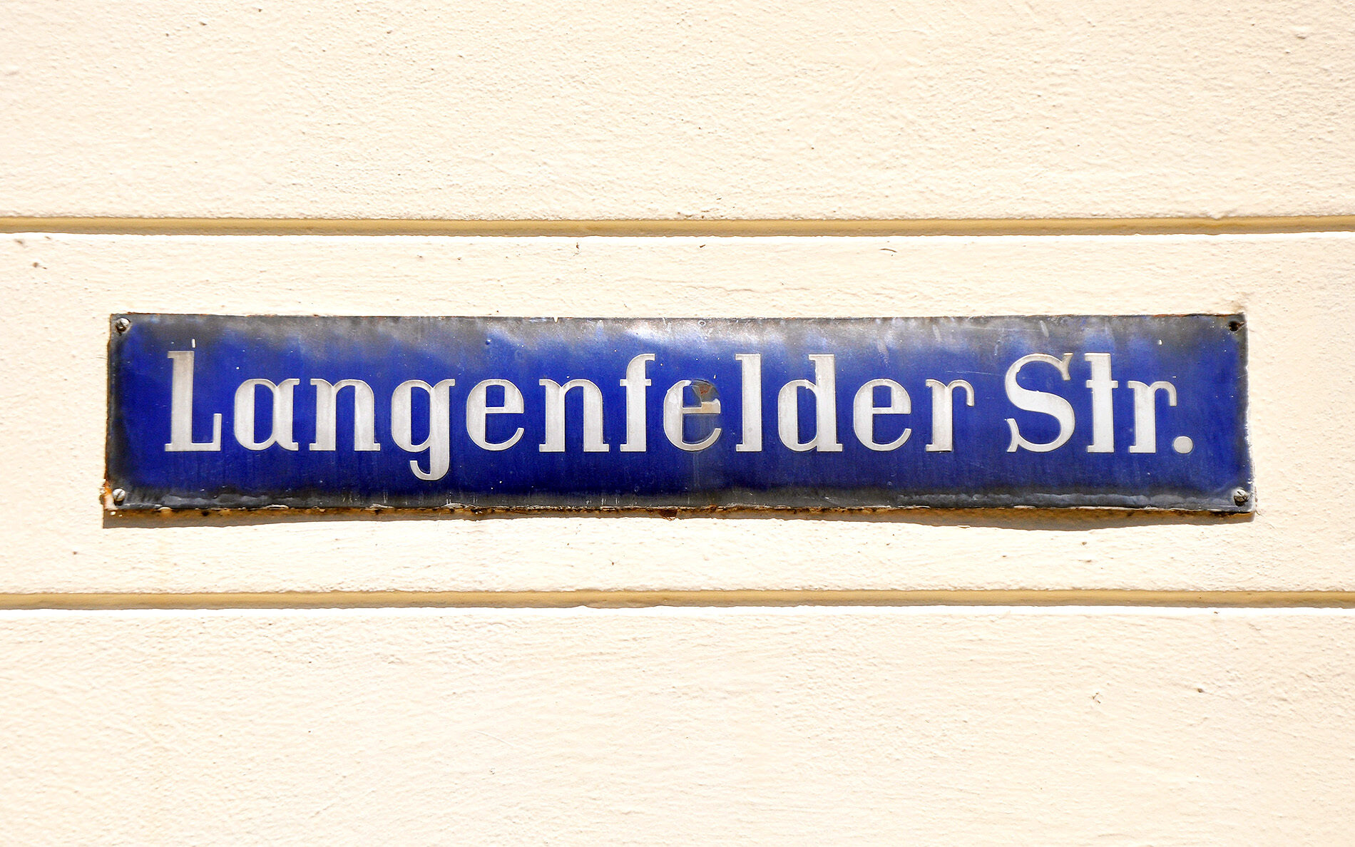
The project to digitise Altona began in 2018 during a field trip to ATypI in Antwerp. Julia did not yet have a final idea for her master’s thesis at the Muthesius College of Art and Design in Kiel. She had already finished the type design course with Albert, but had not yet finished a type design project. The final push came from the ‘Revival’ exhibition by students at the Plantin Institute of Typography. Not only were historical typefaces digitised and improved, but completely new designs were created based on the originals. Whether such a project would still be possible today — had everything already been done? — was discussed by the two on their return. While Julia drank an espresso, Albert ate a fish bun and showed off his first photos of Altona’s historic street signs.
Starting the first digitisation, it quickly became apparent to Julia that the street sign alphabet was incomplete. It’s rare for a German street name to begin with a Q or an X; other important letters were also missing. Despite type safaris to every corner of Altona, Albert was unable to find them. Also surprising from a modern design point of view: there was no basis for corresponding numerals. In order to do justice to the unusual letterforms, equally unconventional numerals were added — and there are different designs for lining and oldstyle figures.
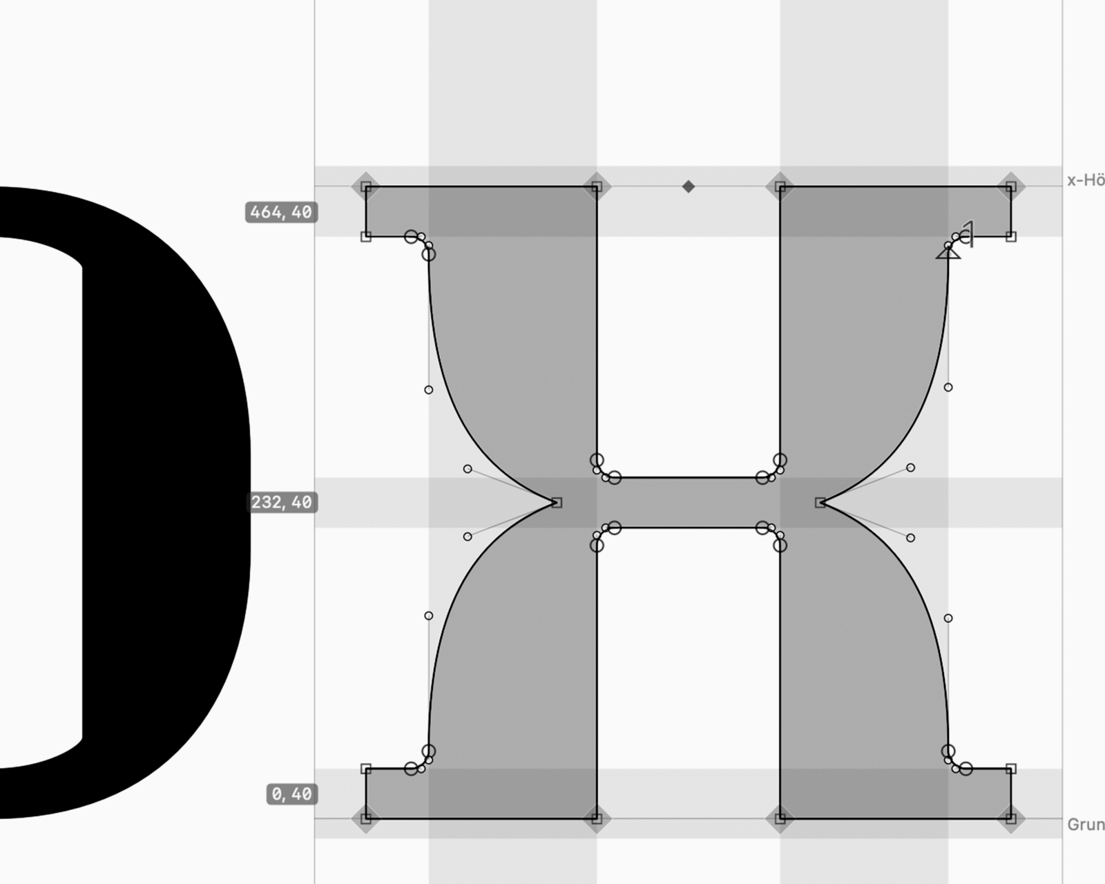
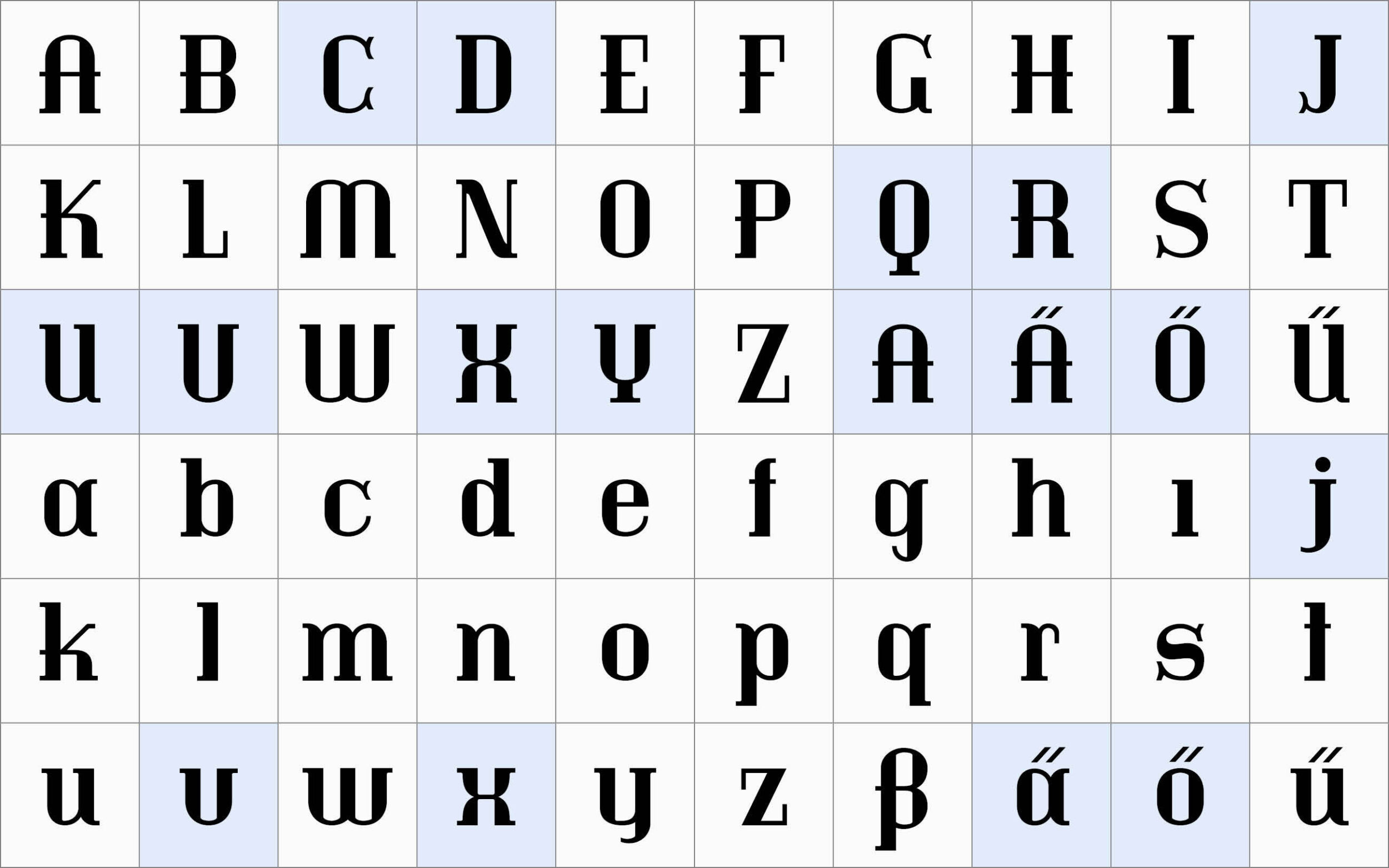
Altona street sign typeface (designed ~1926, possibly a few years earlier) in the first digital version by Julia Uplegger 2020.
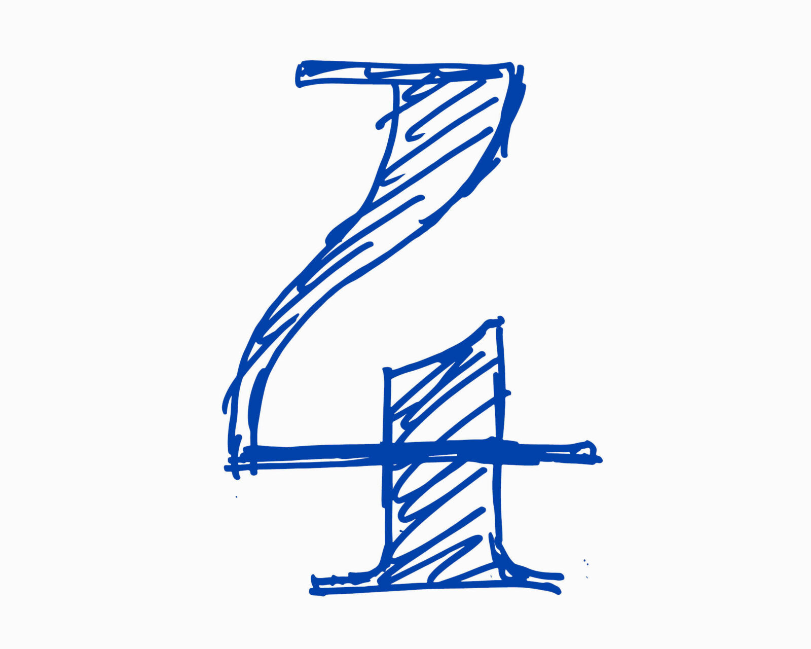
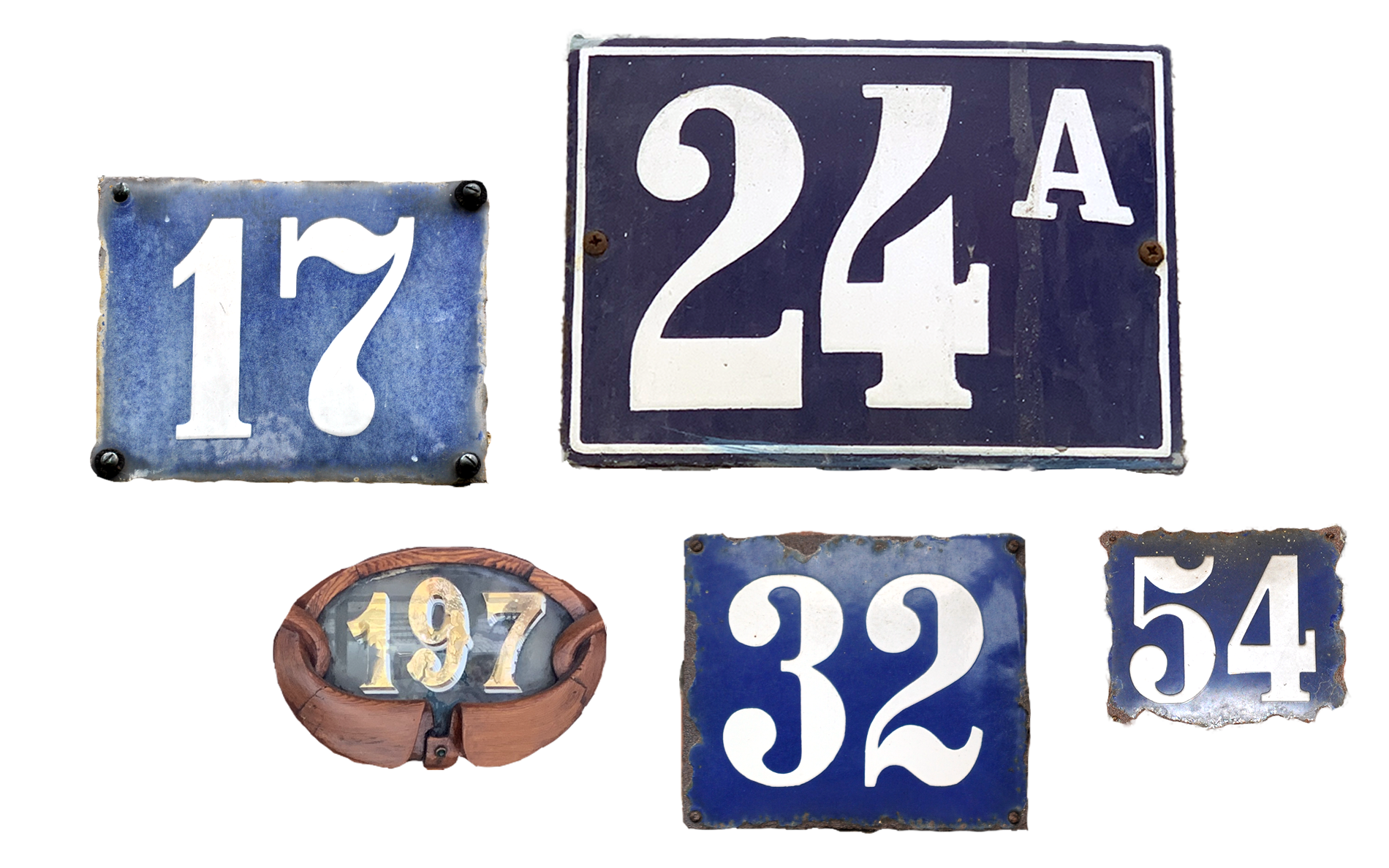
Additional inspiration for the design of the numbers – including lettering and house numbers from Portugal. (197 & 24A)
Once Julia had digitised the original alphabet, there was some discussion about how many weights there should be and what weight in particular might be suitable for body text. The shapes were unusually rigid, and the serifs were arranged more randomly than logically. So, Albert decided to try making everything more suitable for everyday use — without losing the typeface’s special character.
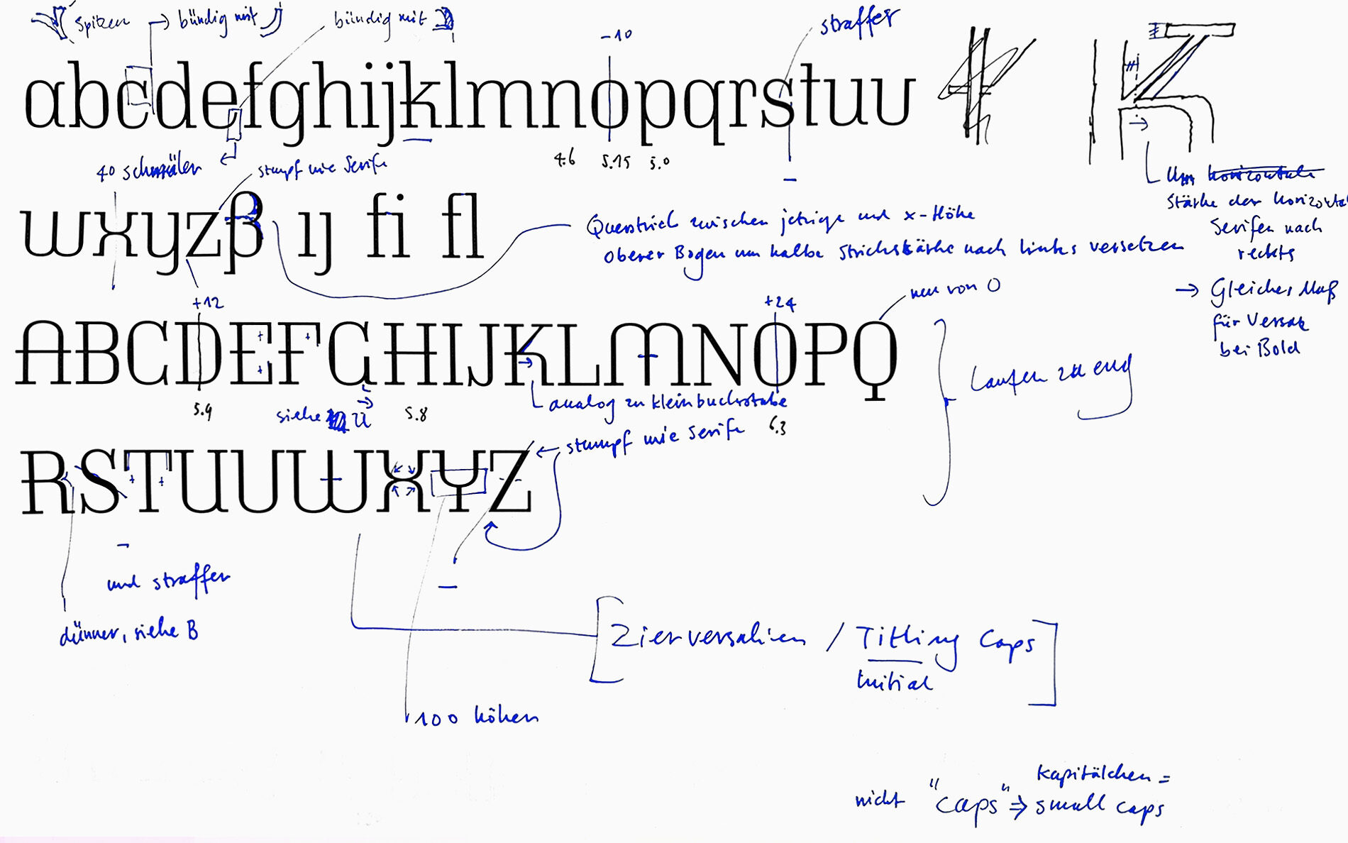
Alison Head as a contemporary response to old classics
After the initial digitisation of Altona, Julia concentrated on her own typeface, Alison, drawing inspiration for her own forms and ideas from historical photographs, right in the spirit of an extended “revival” project. The common denominator with Altona was experimentation and an intense study of the Didone. This involved balancing how changes to the design parameters affected the character of the typeface.
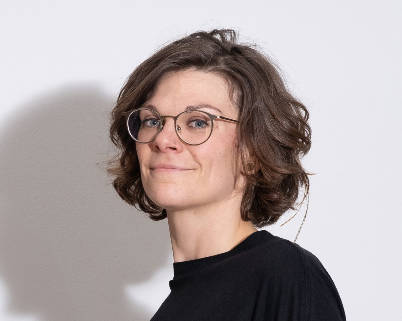
Julia Uplegger
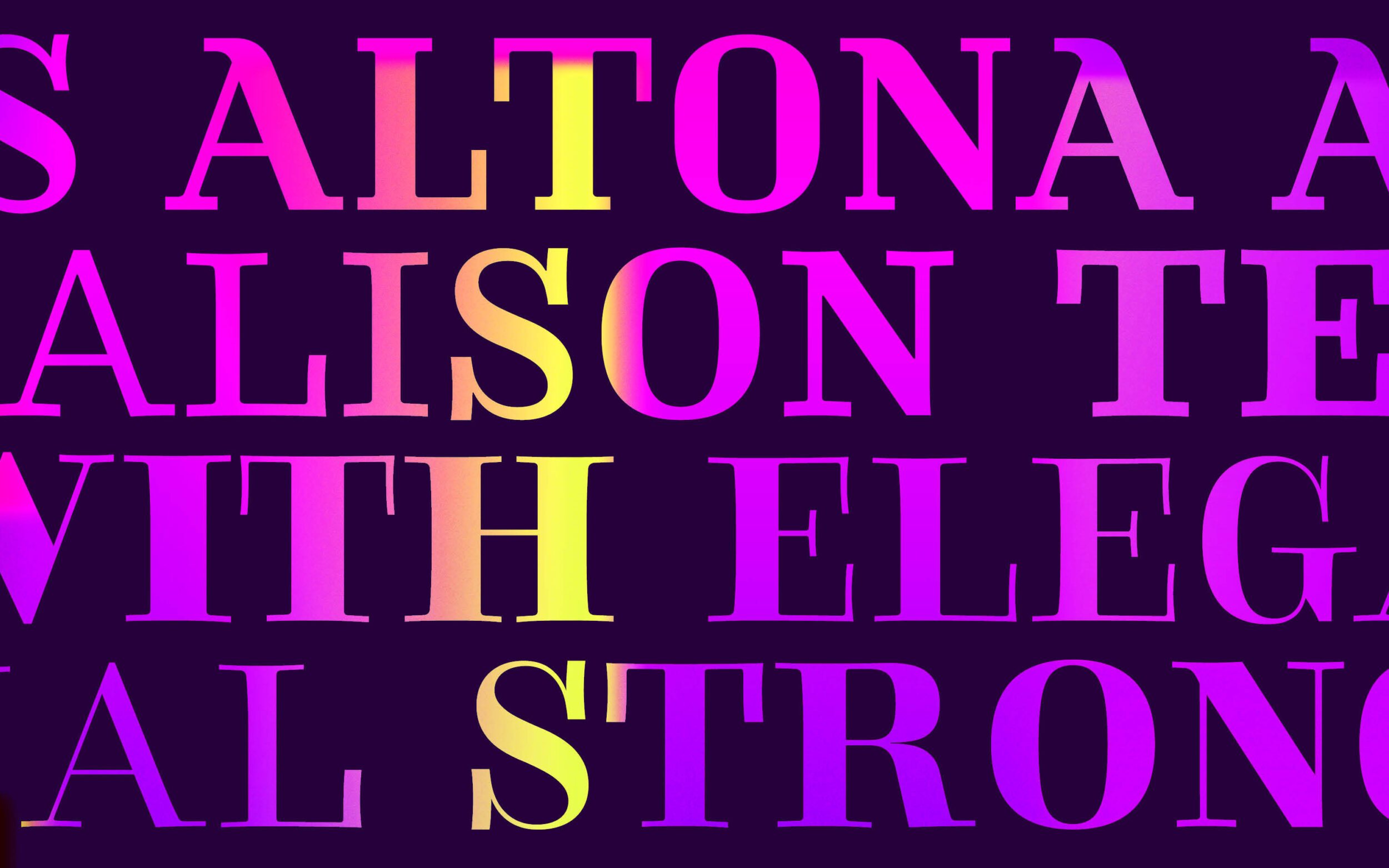
Alison Head in process: Inspired by Altona’s shapes, Alison takes an independent design approach.
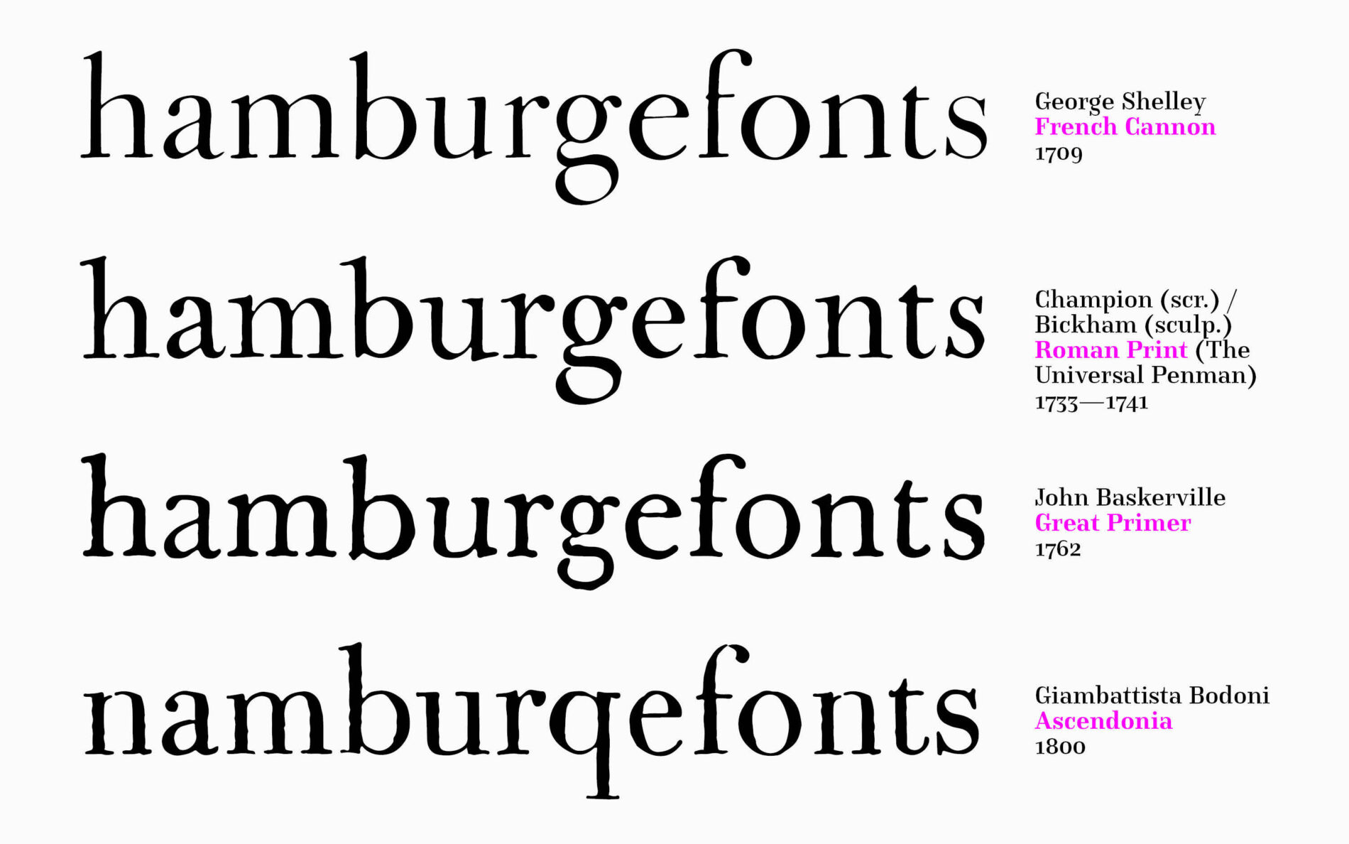
Alison is an emancipated development of the Didone. Building on the designs of Didot, Bodoni and Walbaum, she confidently goes her own way: stronger hairlines than a Didot, warmer atmosphere than a Bodoni and more idiosyncratic than a Walbaum, all while retaining good legibility. Equipped with classic features, a high contrast, elaborate rounds and an elegant appearance, Alison is powerful and expressive. Her generous and progressive approach to role models is also reflected in her set of icons.
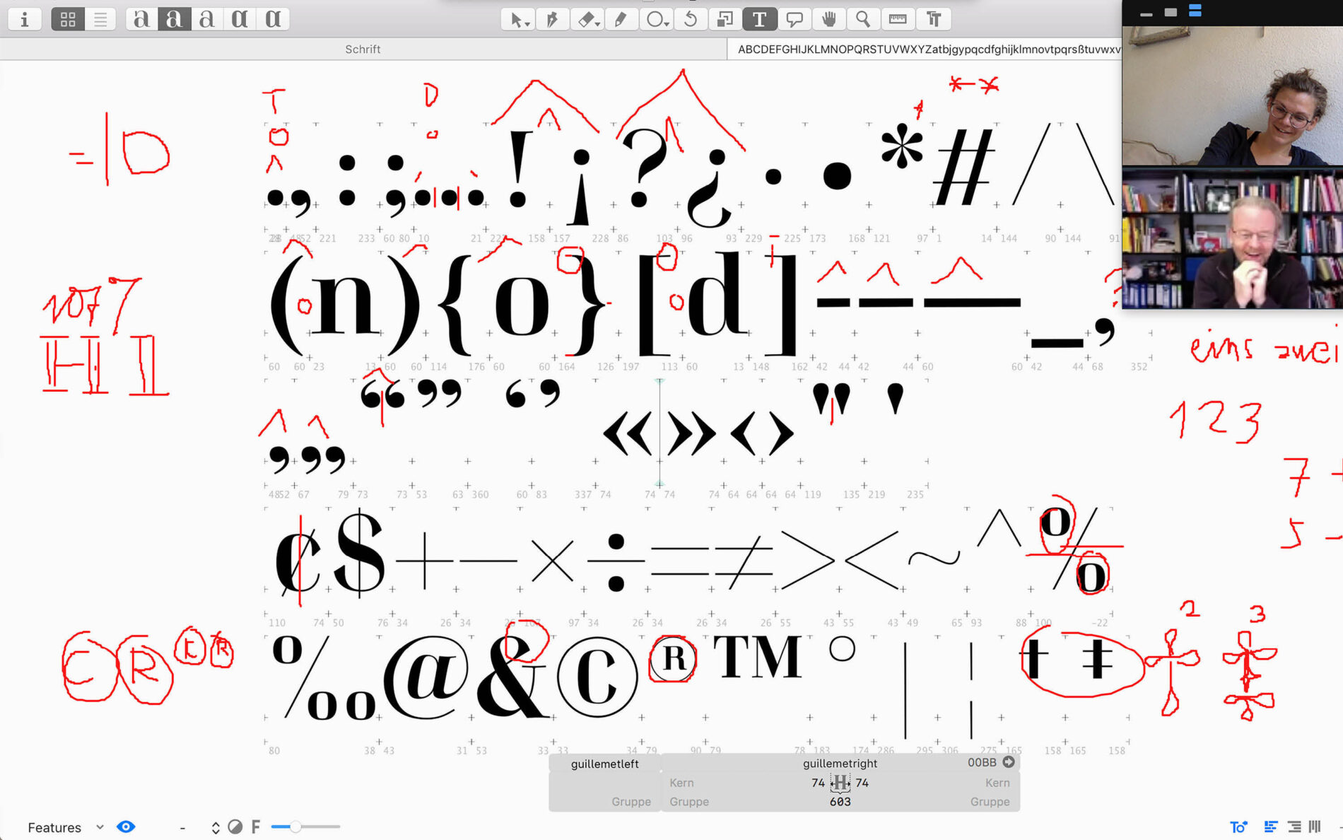
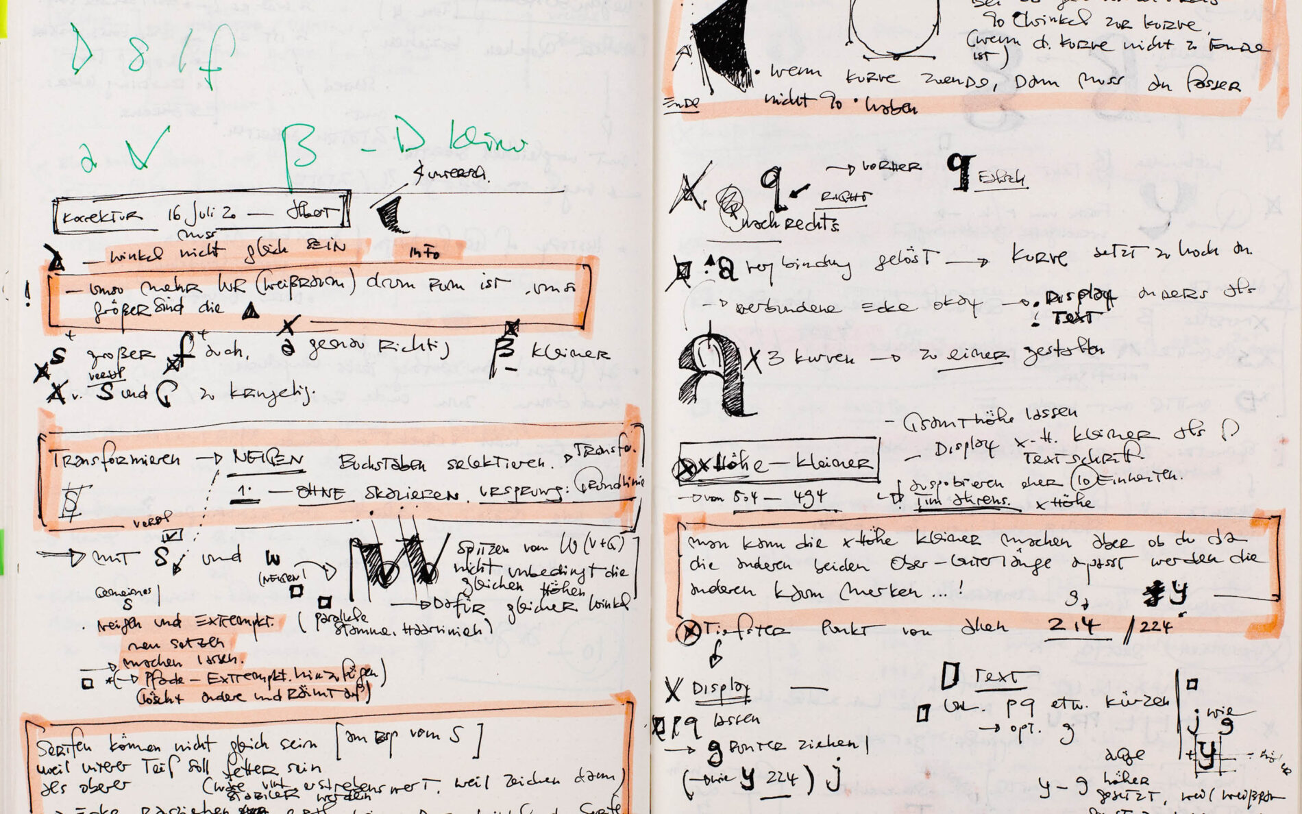
Alison takes shape – driven by the desire to complete a typeface and create a cohesive super-family with Albert.
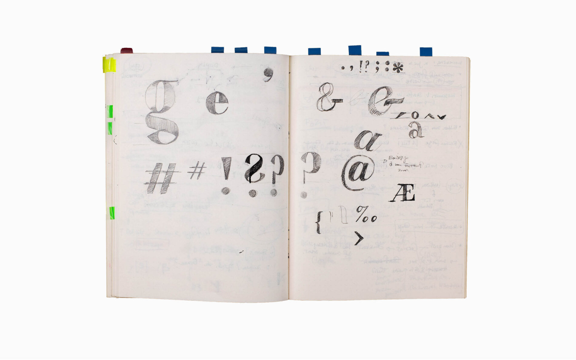
With Alison Head, Julia aimed to give the often ‘feminine’ and ‘delicate’ Didone a broader interpretation. She emphasised vertical serifs, creating a characteristic typeface that contrasts the familiar teardrops and softer curves of Didones with a certain sharpness. This is particularly noticeable in the lowercase r and y.
Albert says of Alison Head: ‘Alison is not narrow-minded. She has the ability to make serifs, accents, and other details either elegantly thin or robustly bold. She does not conform to the cliché of strict straight lines. Alison’s serifs have a subtle “swing” to them.’
With a stylistic set of alternate, blocky serifs, the super-family comes full circle and Alison shows its historic connection to Altona.
Alison Head with an active style set for maximum serif emphasis.
Alison Text – solid and elegant
Following Alison Head, the text variant was developed under the umbrella of certain key questions. To what extent is the formal principle of a high-contrast Didone still relevant? Is it possible to translate the idea and eccentricities of a display typeface into a legible text face?
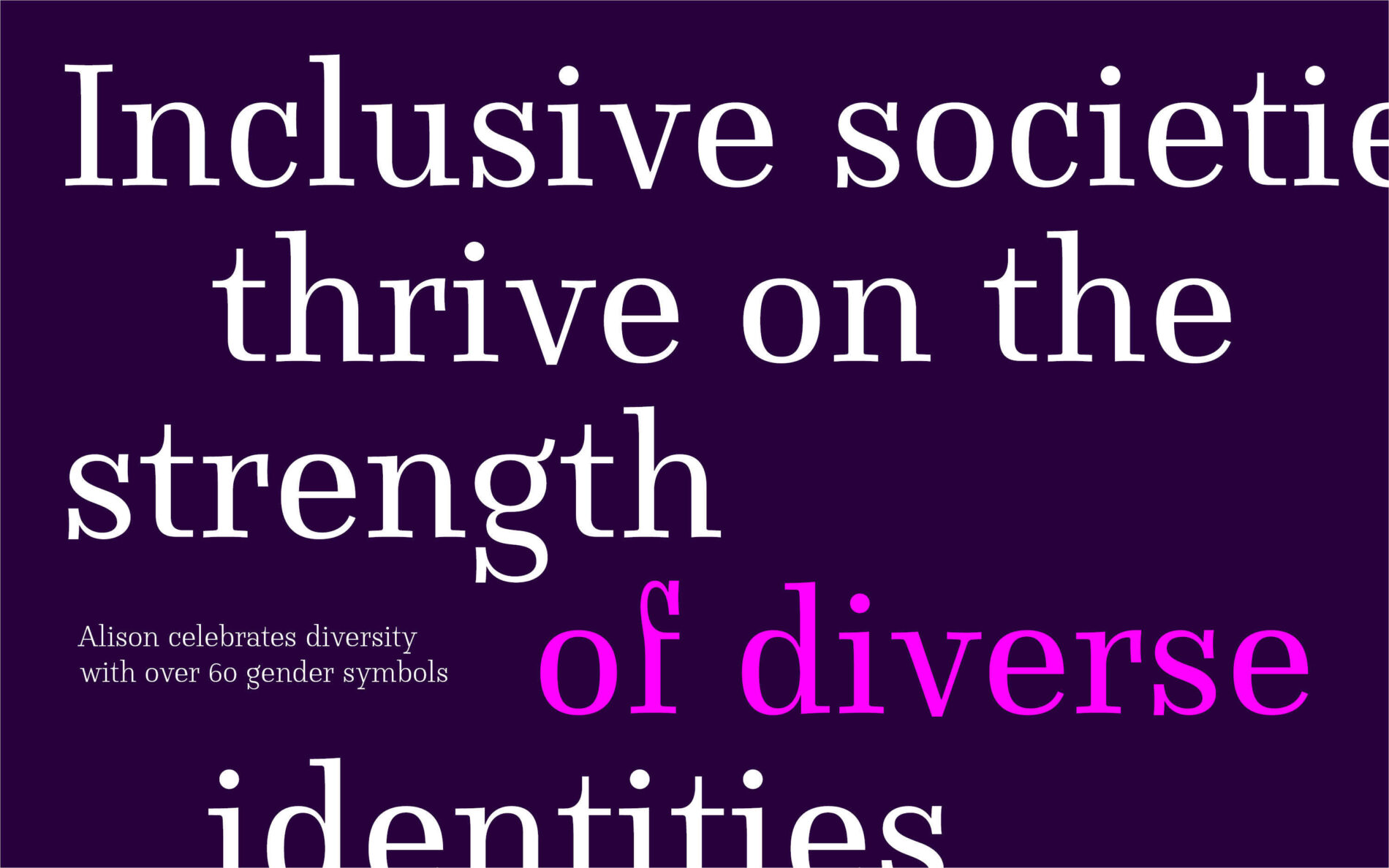
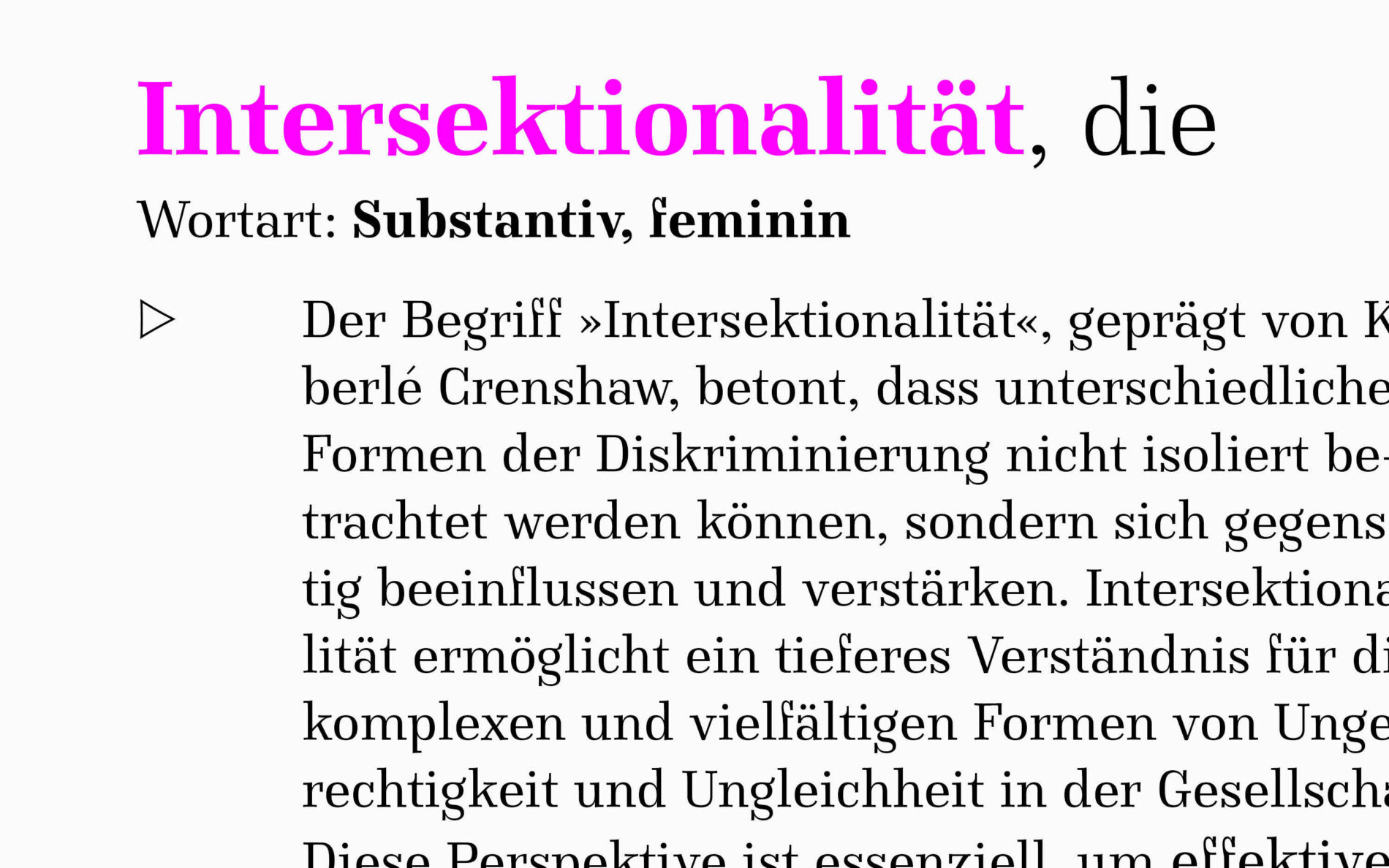
Alison Text strives for elegance in body text.
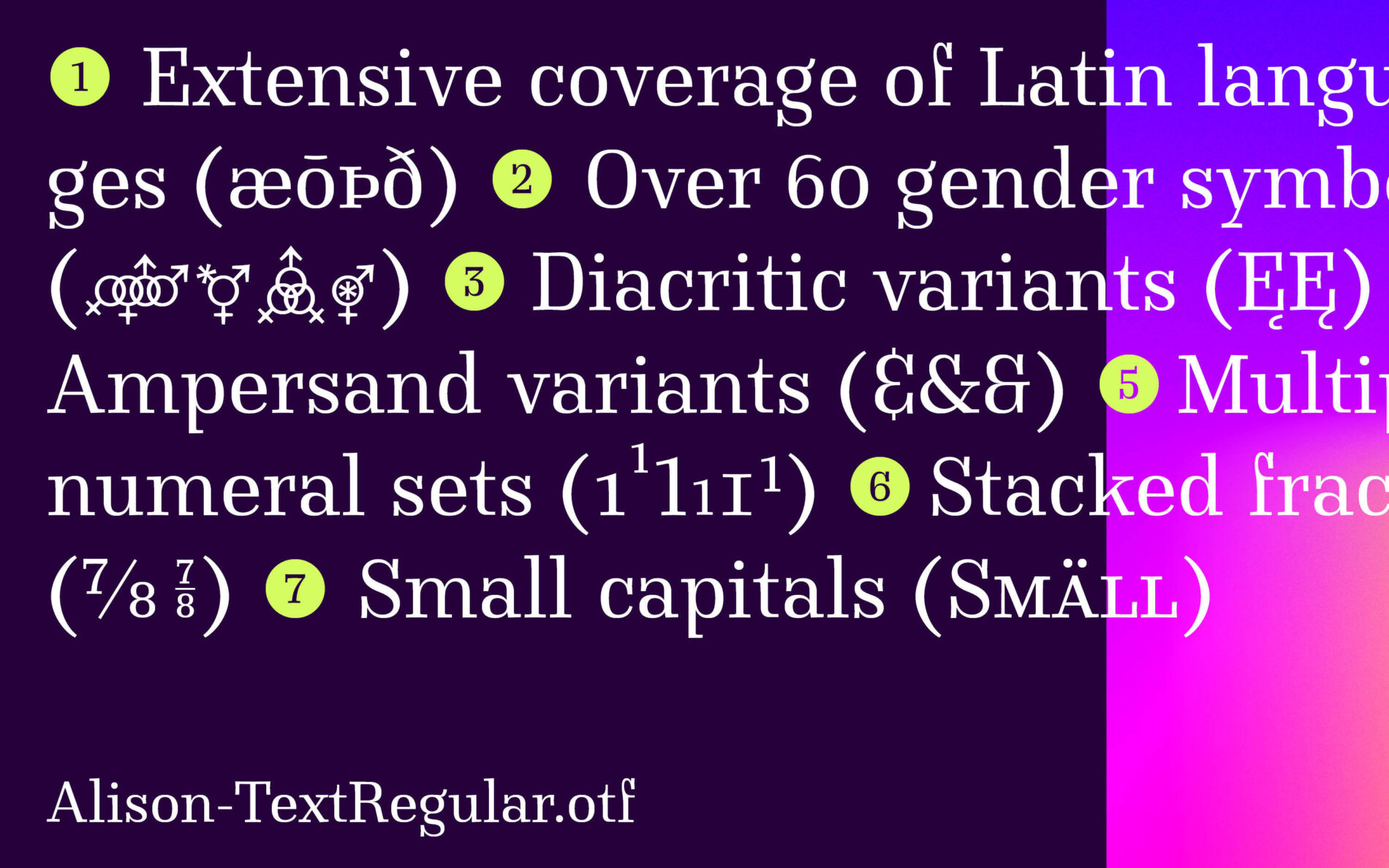
Alison Text attempts to answer these questions. Specially designed and tested for body text, Alison Text combines good legibility with a delicate charm of a Didone. The hairlines, the x-height’s relationship to ascenders and descenders, and the grey scale of the regular weight were specially adapted for small point sizes. Together with its companion, Alison Head, the two families form a strong team, both visually and technically, with many OpenType features and gimmicks.
Similarities and differences
Alison & Altona are a duo of three typefaces: historical revival and creative interpretation mark the similarities and differences that characterize the individual designs.
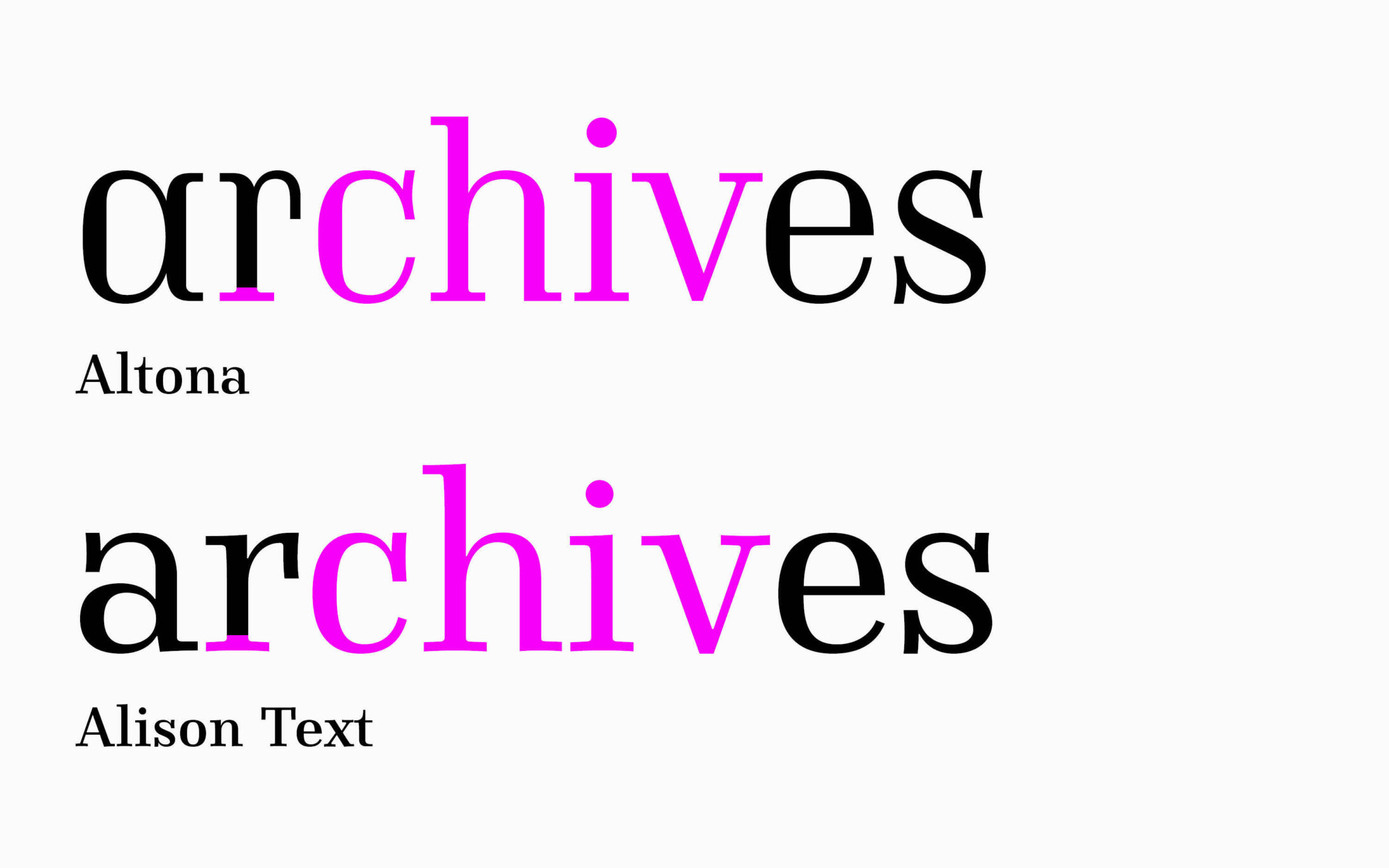
Some of the design elements overlap. In other ways, the fonts are very different.
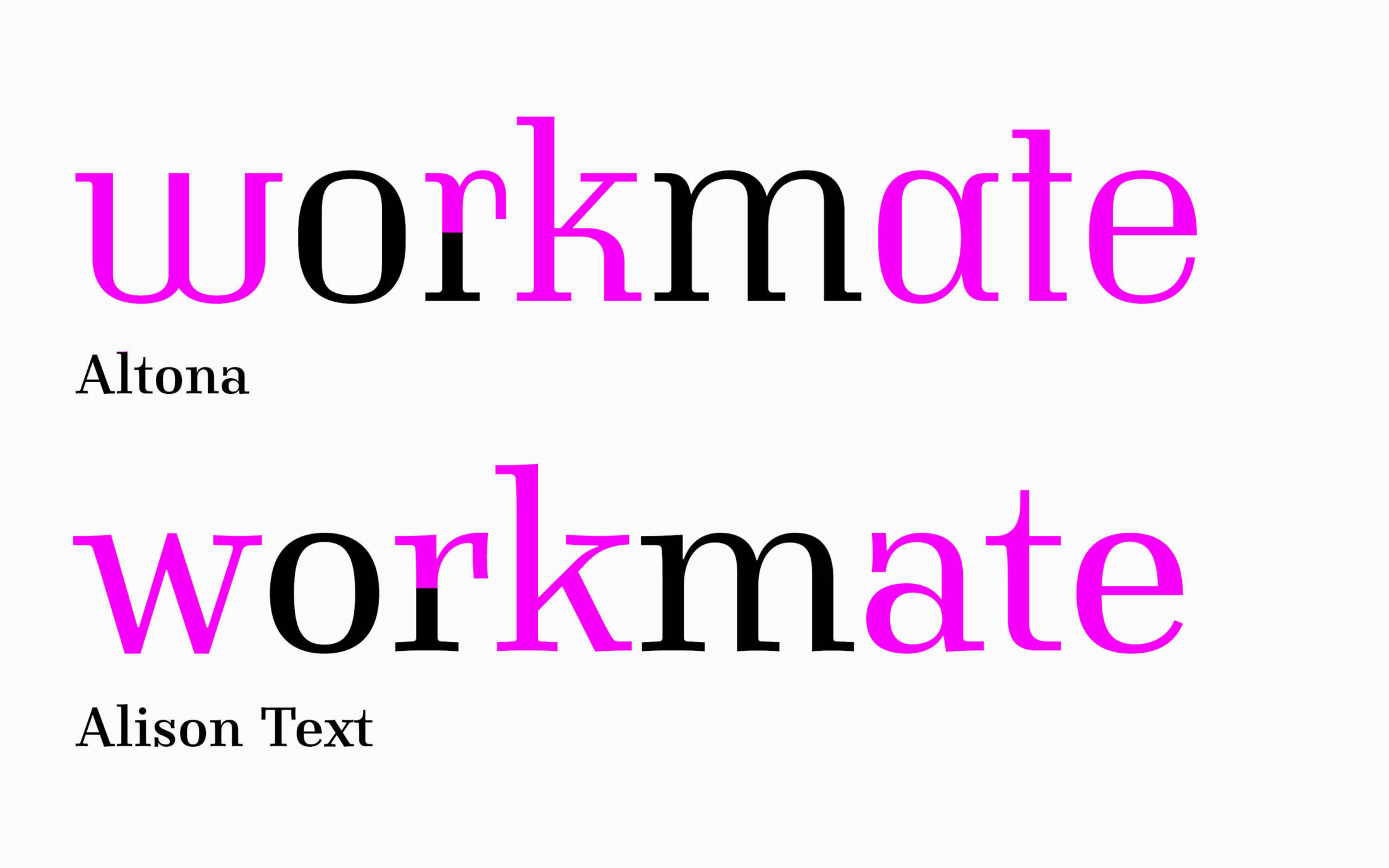
Albert and Julia initially took different approaches to the question of which form of the German Eszett should be used. Albert’s choice for his Altona was immediately clear:
‘In my opinion, the so-called “Dresden” form of Eszett is more suited to the dynamic principle of form or to a Renaissance Roman. The “Sülzbach” form, because of its vertical emphasis, is much better suited to the static form principle or a Didone itself. It was also developed in the 19th century.’
In a 21st century spirit of interpretation and differentiation, Julia had originally drawn the more contemporary ‘Dresden’ form. In the end, however, they both agreed to integrate the ‘Sülzbach’ form consistently across the families.
From forms to features
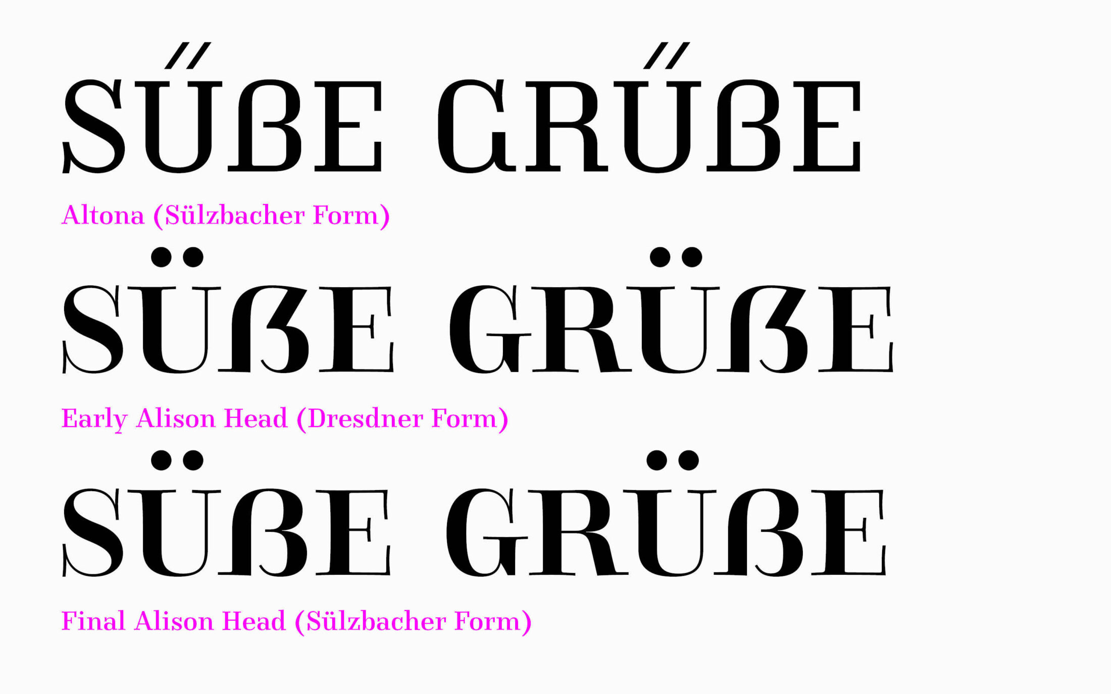
While Julia focused on her own projects, Antonia Cornelius joined Albert’s work on Altona, helping with production, code, features and finishing touches. One eye-catching feature is Stylistic Set 10: this feature positions fractions on top of each other. Getting the feature code right was an exciting challenge for Antonia: ‘It was fun to discover, with each new font export, whether I had (partially) fixed an old error—or created a new one.’
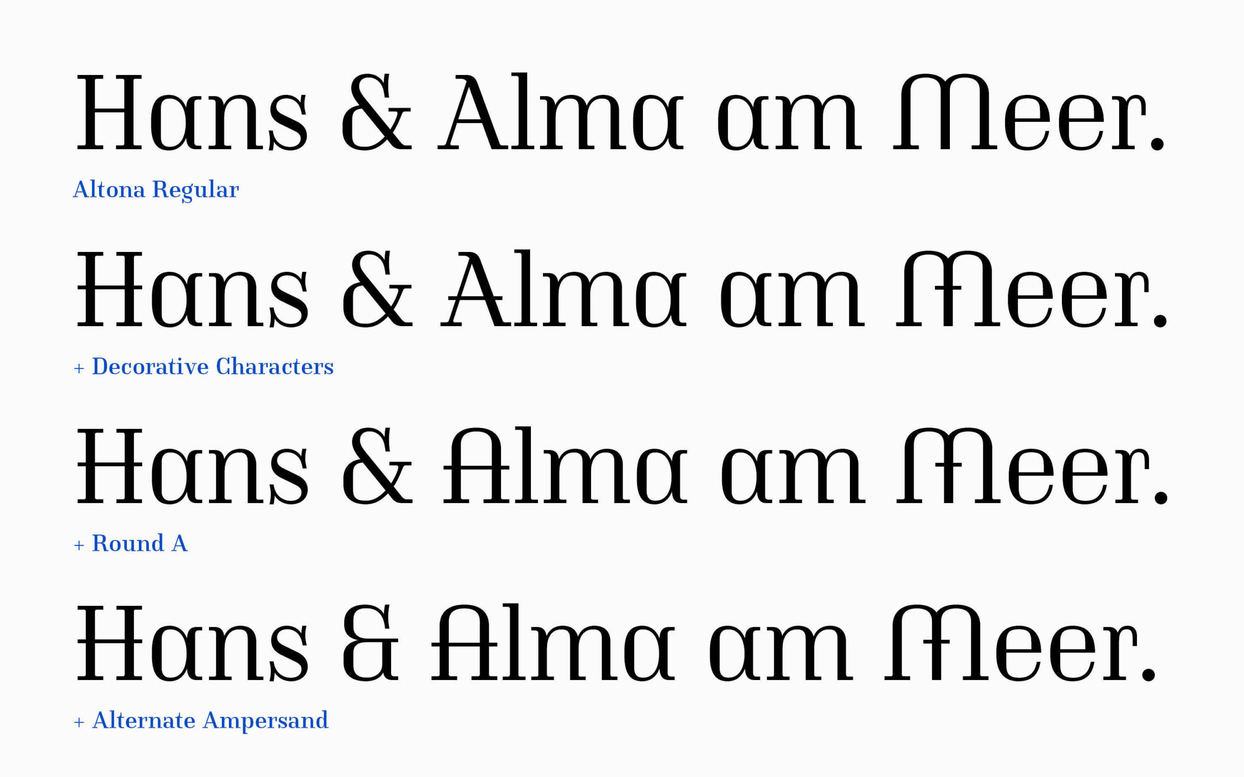
In Altona, ss02 ‘Decorative Characters’ expands the design possibilities for expressive headlines: adding horizontal decorative strokes to various uppercase letters and the lowercase k. Combined with other stylistic variants, Altona is extremely versatile. You can choose between a rounded A, a square i-dot, and between separate and combined accents.
Altona enriches the icon palette
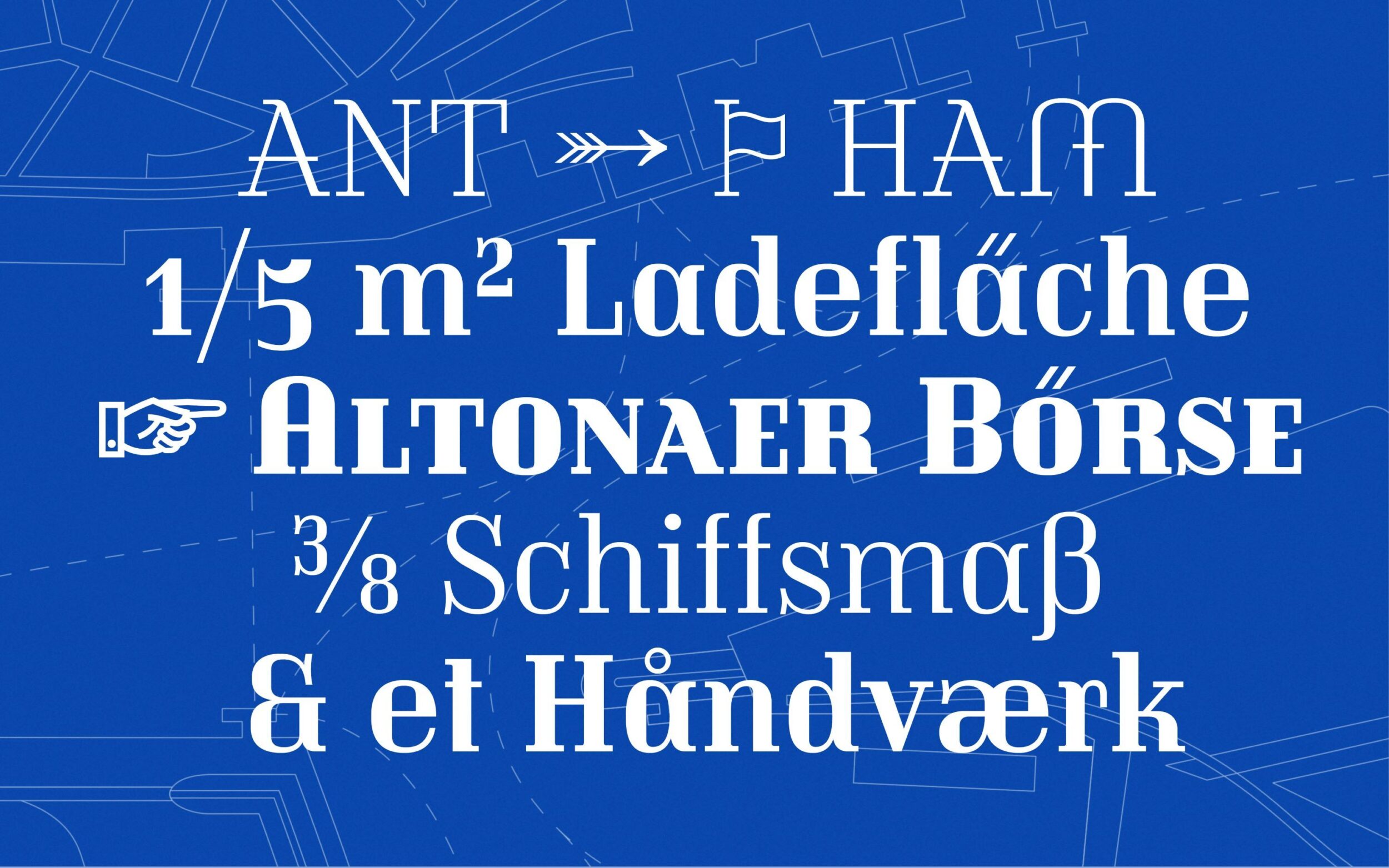
The more than 160 icons are inspired by Hamburg’s district: around 60 pictograms relate directly to the history of Altona. They illustrate famous landmarks of the city, different types of ships, means of transport and offer a range of maritime and Hanseatic symbols, such as a Franzbrötchen.
Designed by Antonia, the icons are emblematic of the emerging and modernising Altona of the time, and are still state of the art today: the weight axis of the variable font can be used to flexibly configure the weights of the pictograms and symbols.
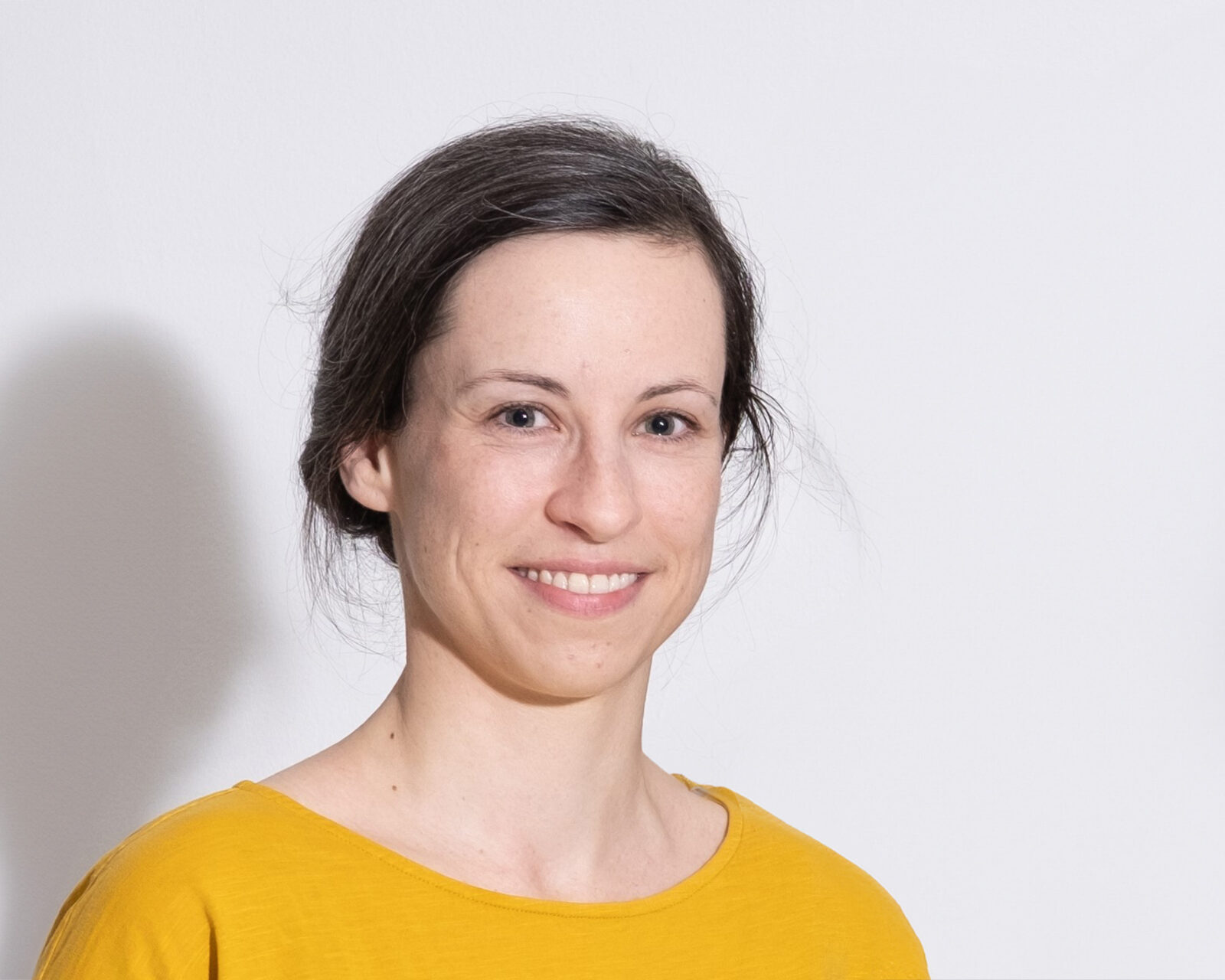
Antonia Cornelius
The Stuhlmann Fountain on Platz der Republik near Altona Station.
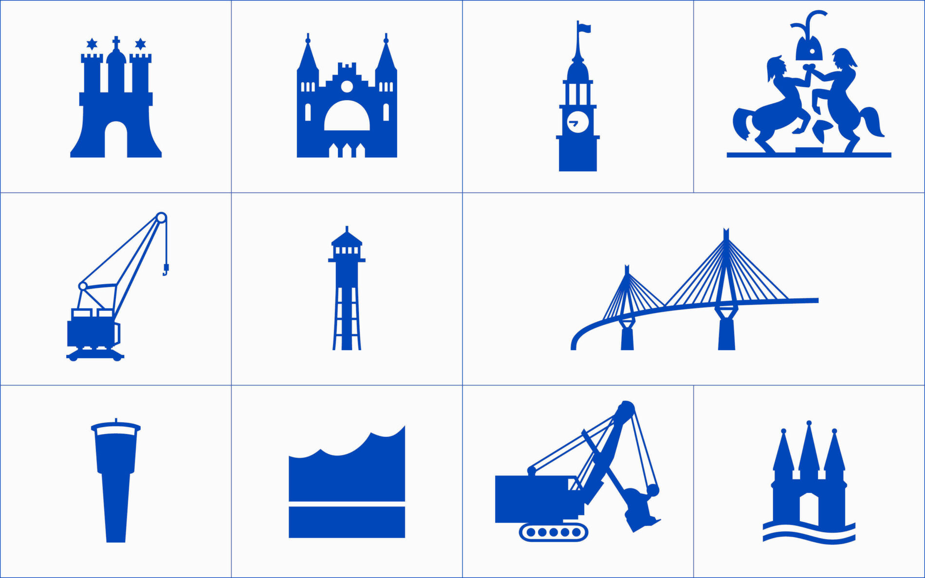
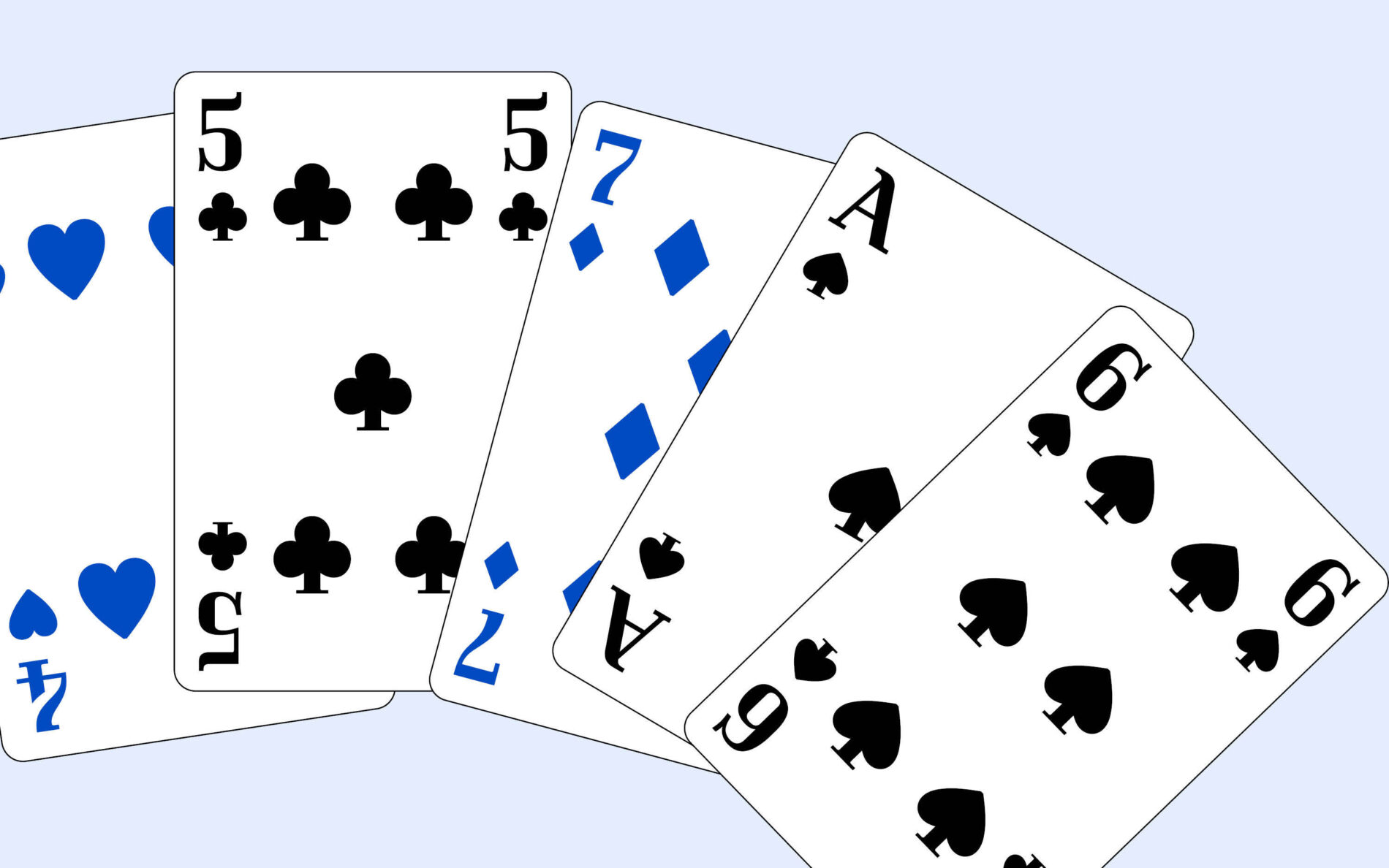

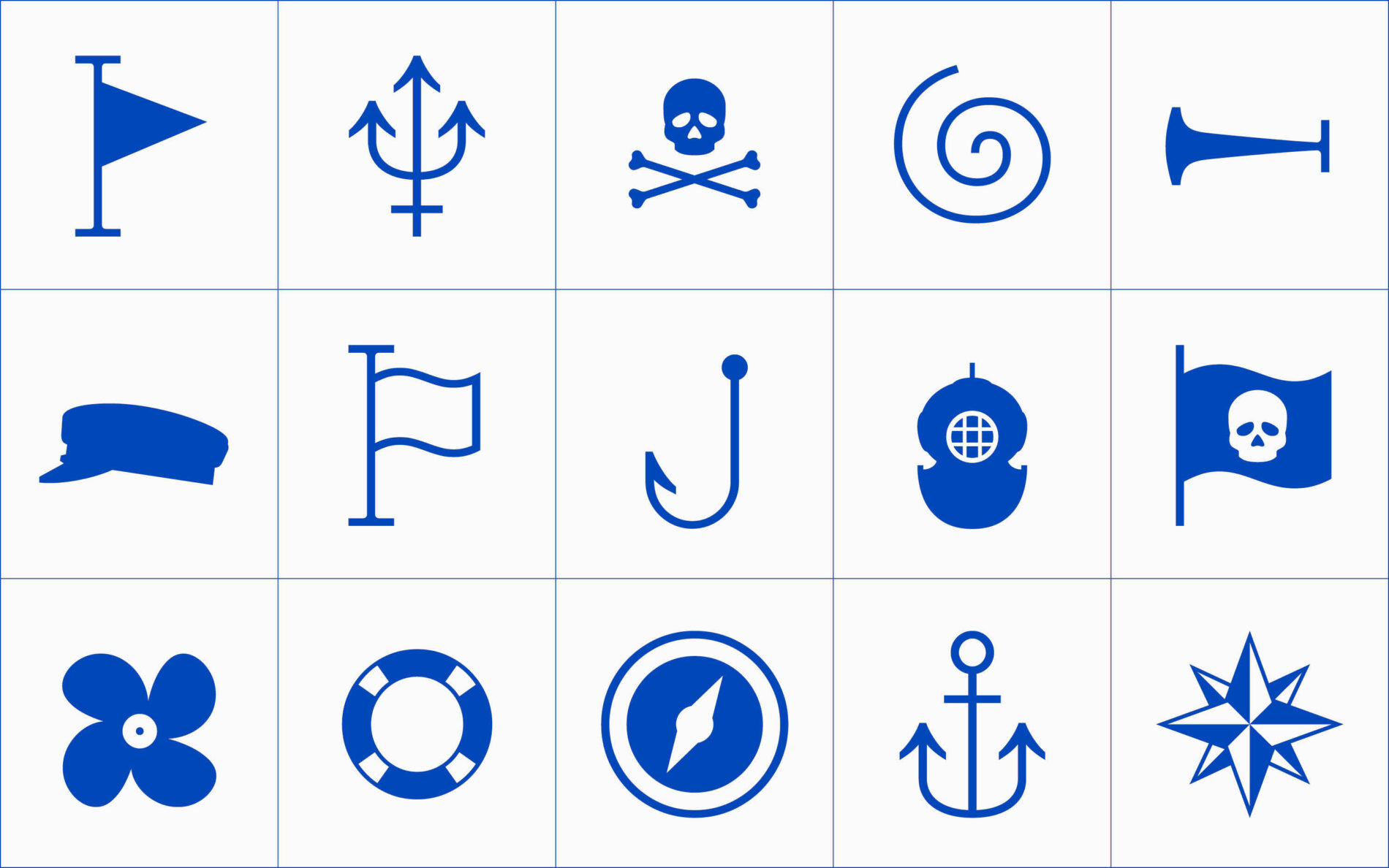
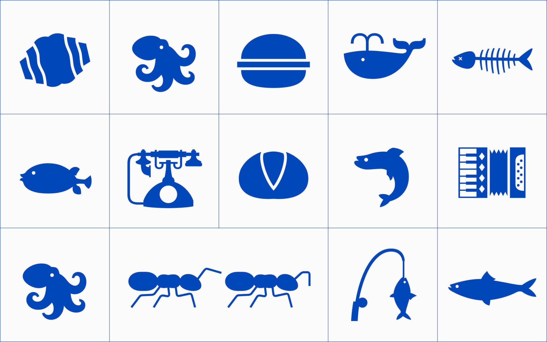
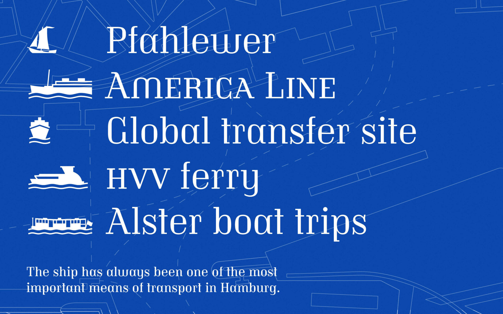
Most symbols can be easily accessed via contextual ligatures. For example, typing “_elphi_” automatically transforms the text string into the silhouette of the Elbphilharmonie concert hall, without having to scroll through the glyph palette.
Alison develops symbols for diversity
With over 60 different symbols recognising different genders, Alison expands her spectrum of icons and gives modern diversity typographic expression.
Alison believes all genders have equal values, which is why all the different gender forms in her suite of icons have the same weight. Harmonizing the sometimes very complex symbols across different font sizes presented her with a challenge, as there are no models from other font families.
Like progress, any discussion, development and selection of gender symbols will be incomplete. Thus not all are represented by a Unicode. New ones are constantly being articulated, adapted and optimised, but Alison is waiting in the wings with her wide selection to help express worlds.
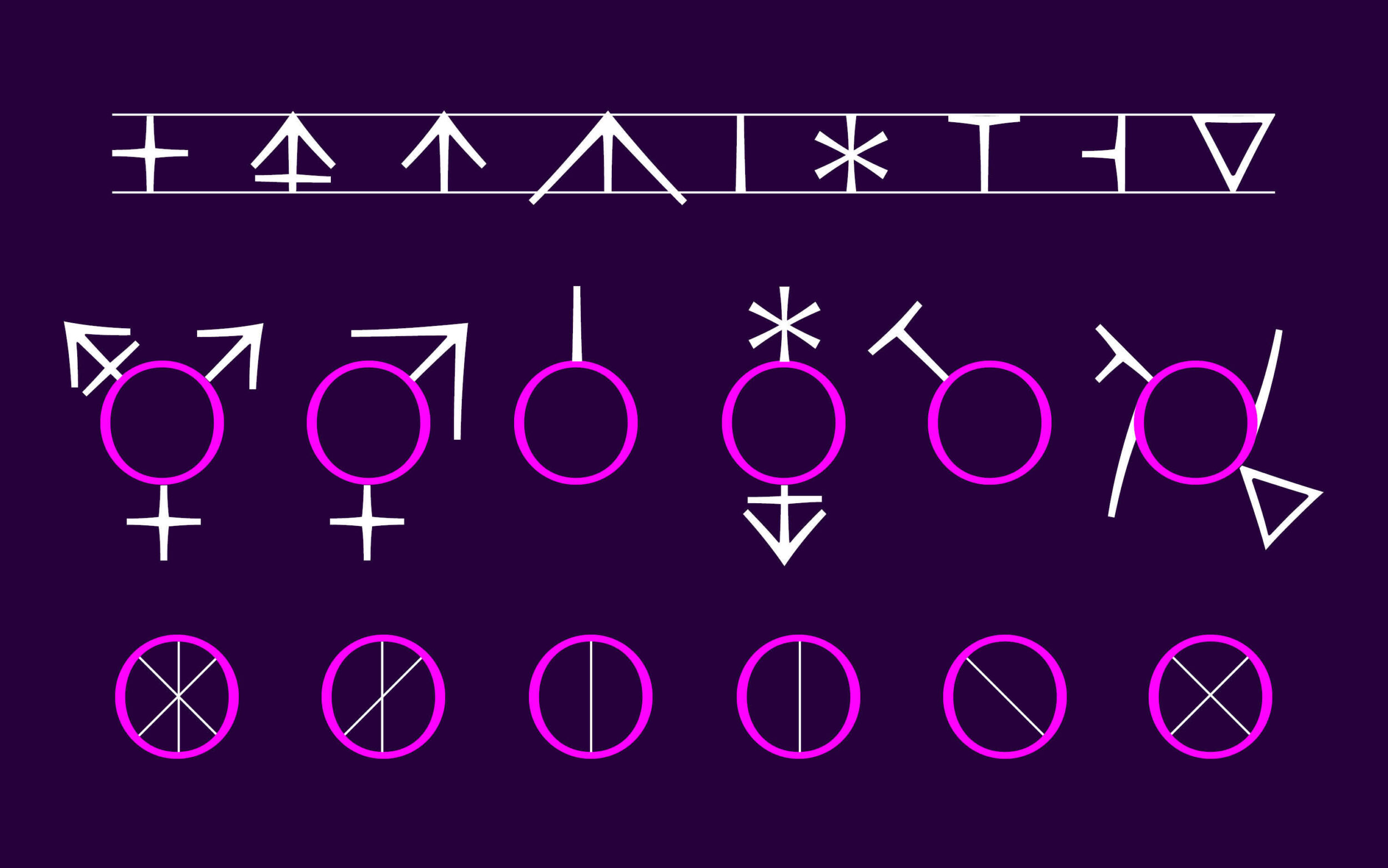

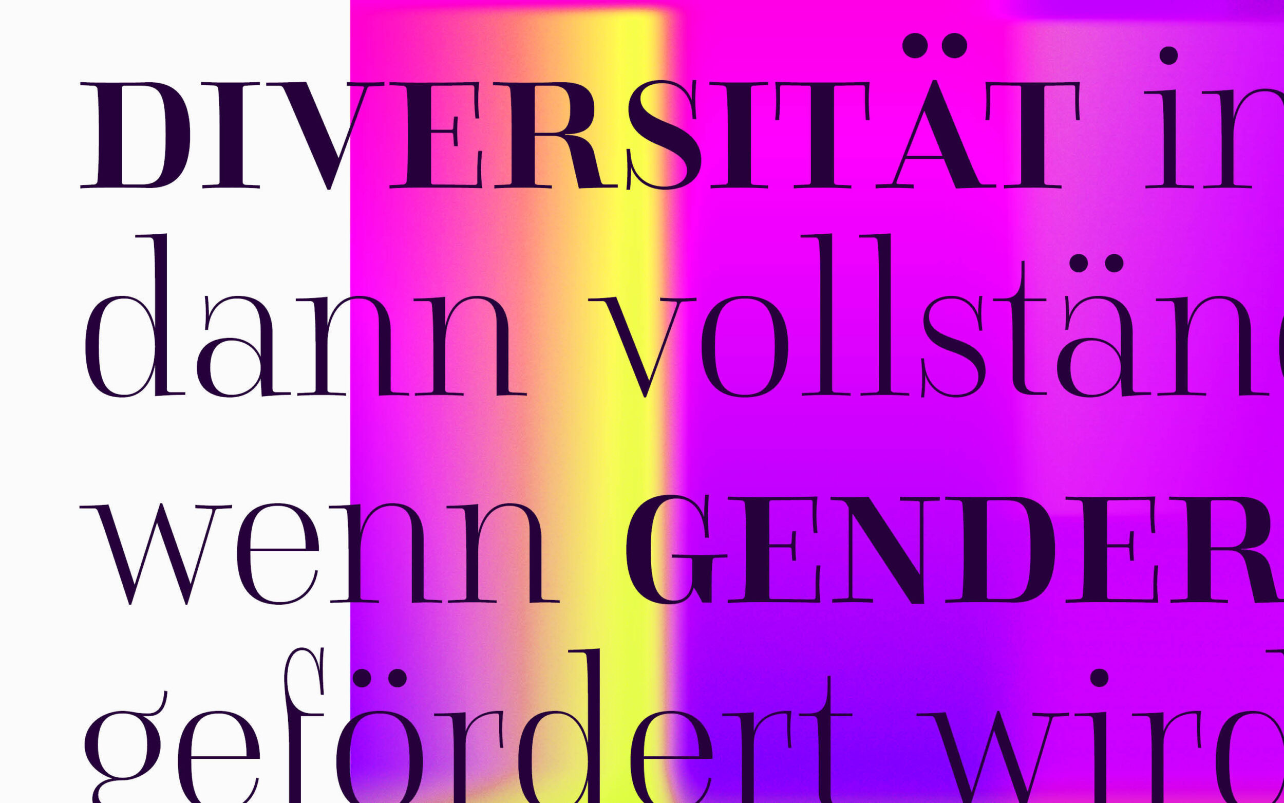
The common feature of the gender asterisk emphasises open-mindedness and attention to detail. When the asterisk is deliberately used as a gender symbol, OpenType's contextual alternates feature (calt), which is usually enabled by default, corrects the position of the asterisk to create a harmonious reading flow — even in small caps or uppercase. This feature is also available in other TypeMates fonts such as Netto or the Grato Collection.

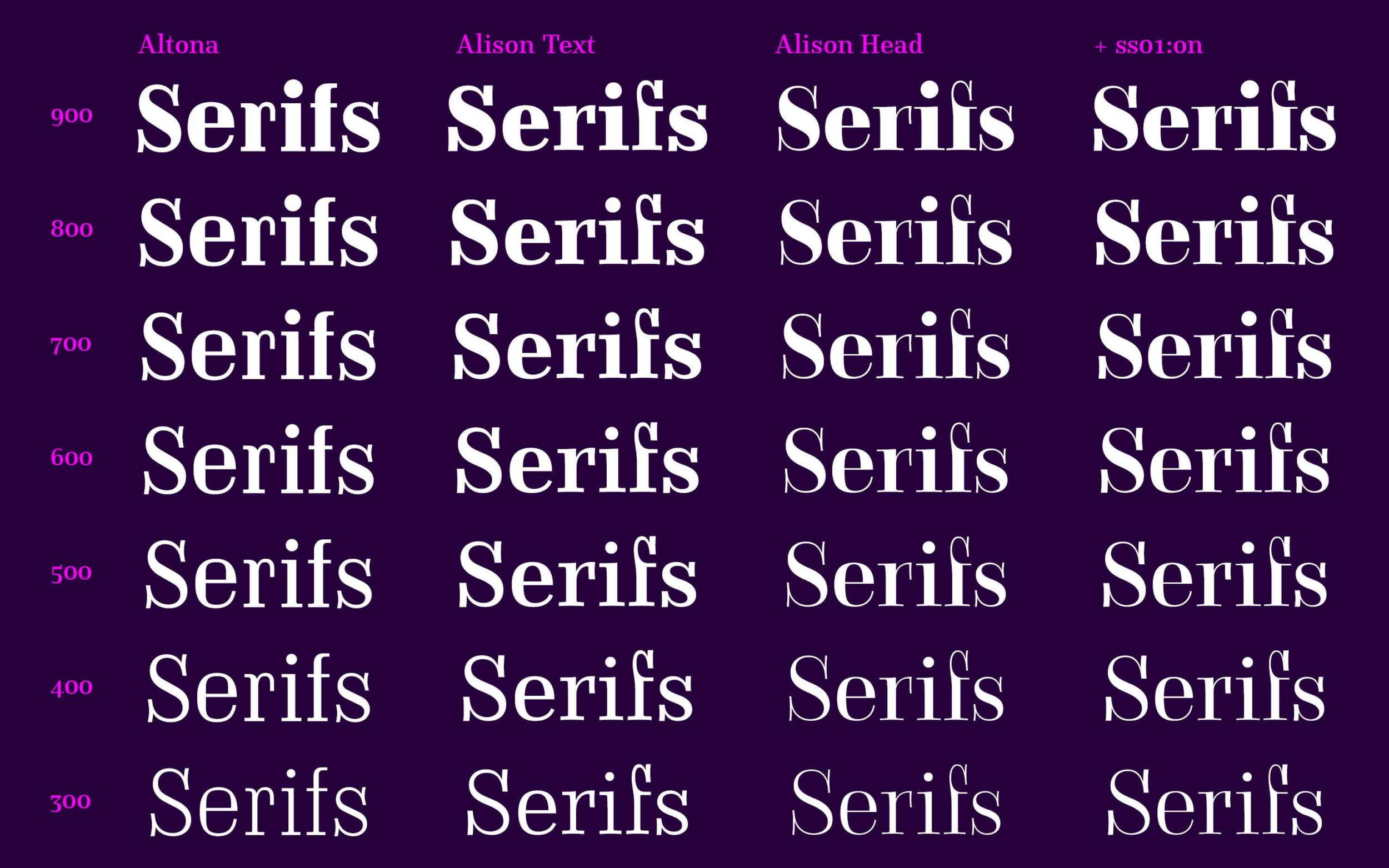
Completed at last: the type system for Altona, Alison Text and Alison Head.
Finally released, Alison and Altona remain two passion projects of type designers who have positioned themselves socio-politically in the design process. Altona, digitised for the first time, and Alison, with its powerful and expressive interpretation of a Didone, make the project special.
After several years of working on the fonts, Albert and Julia still smile at the fact that the project started with a stereotypical fish bun ...
Altona and Alison's project is a special release for Lisa, Nils and Jakob. Not just because of the passion and style of the designs: they all know Albert through his legendary FF DIN and as their teacher at the Muthesius Academy of Fine Arts and Design in Kiel. He was a huge influence on all three.
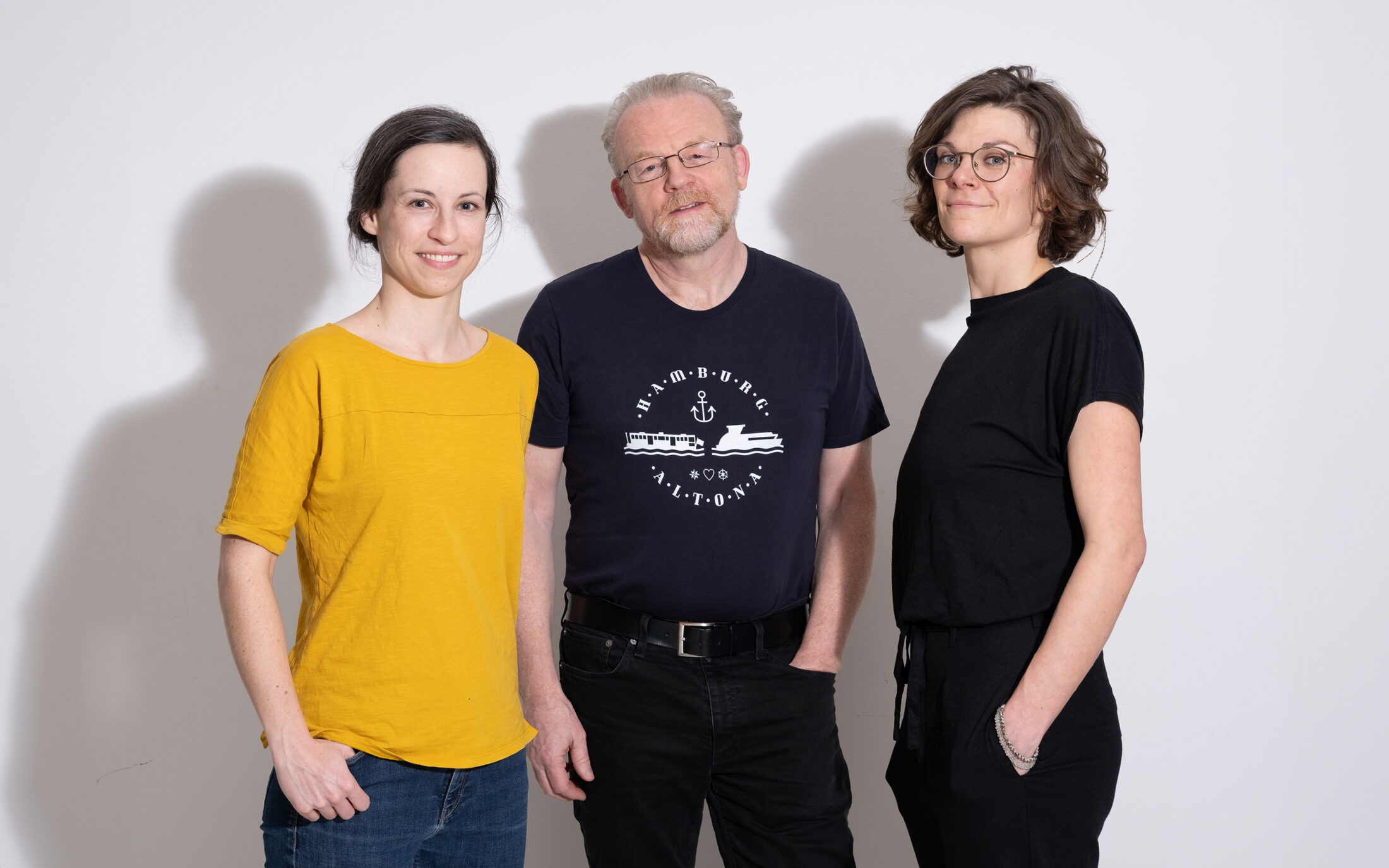
Design team of Altona and Alison at the Typostammtisch in Hamburg: Antonia Cornelius, Albert-Jan Pool and Julia Uplegger. Photo © Hari Klein.