A Decade in Print
For over a decade, Franziska has brought personality and legibility to a wide range of printed products, from coffee-table books and illustrated volumes to poetry, student research projects and magazines.
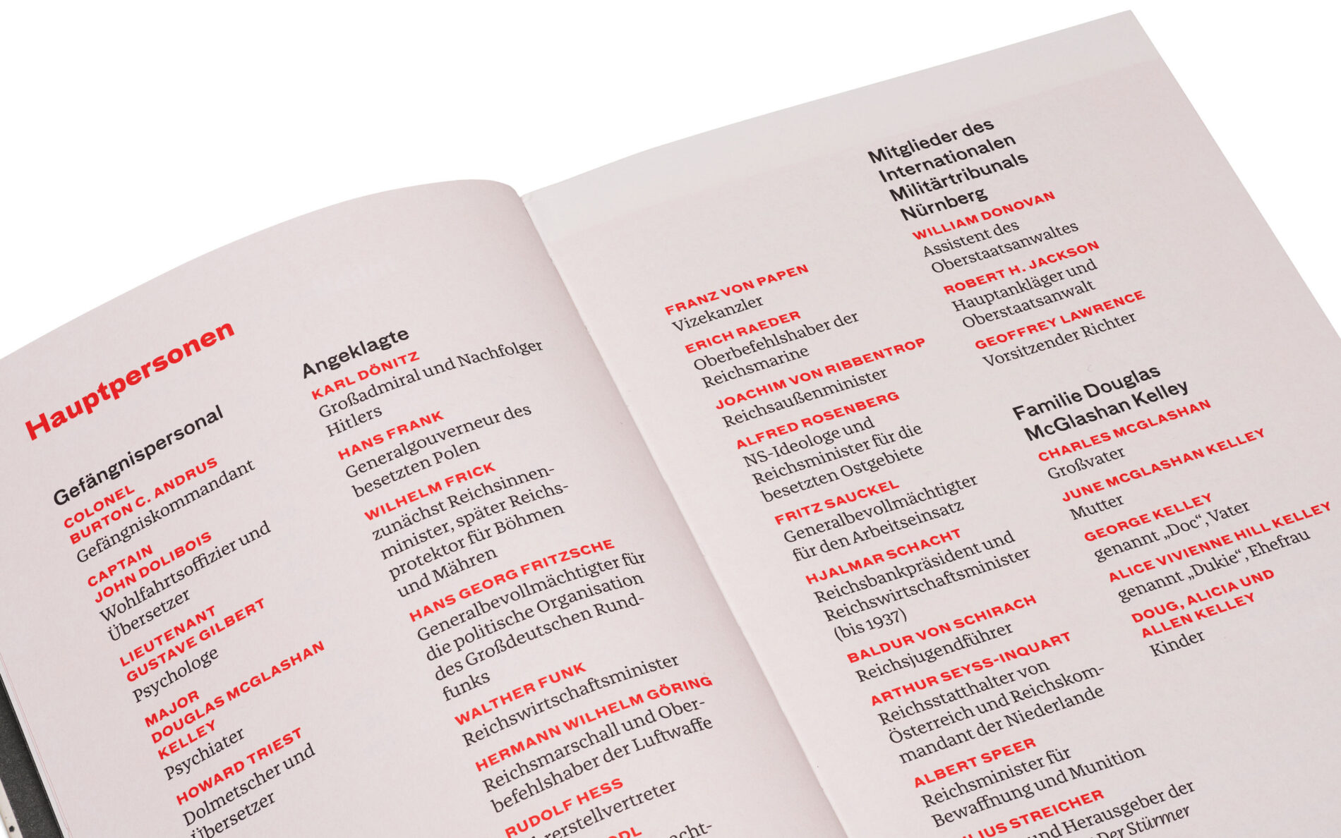
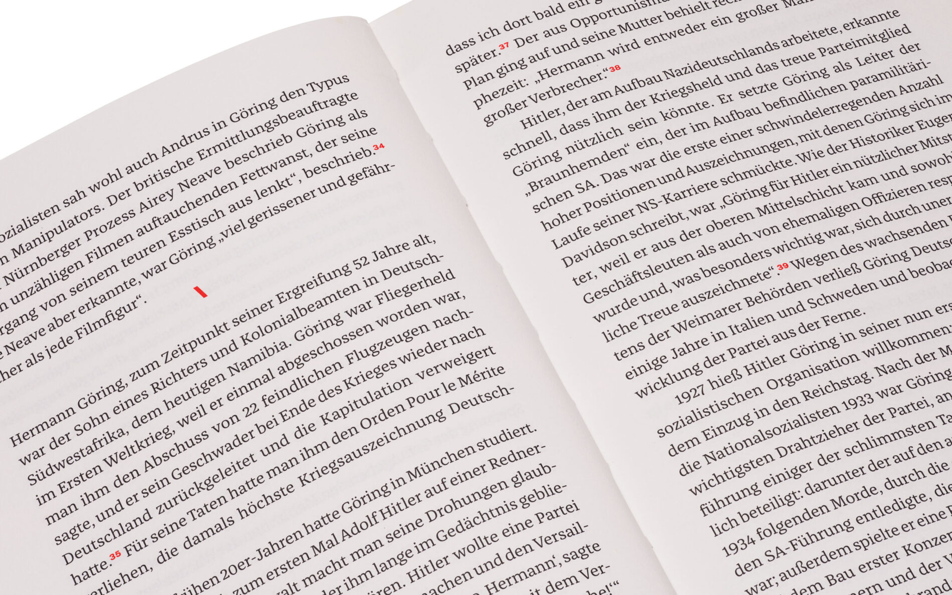
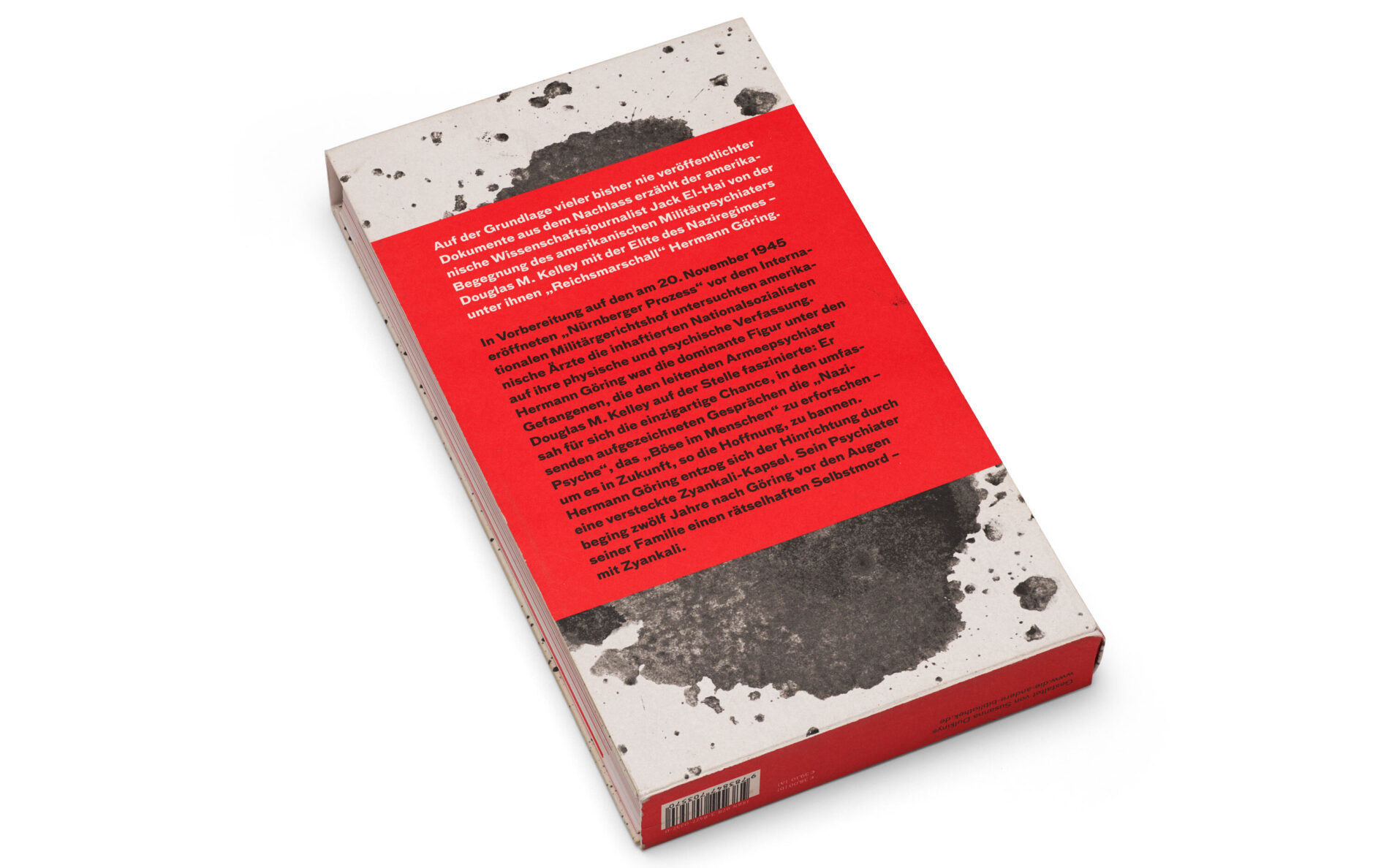
The Nazi and the Psychiatrist by Jack El-Hai
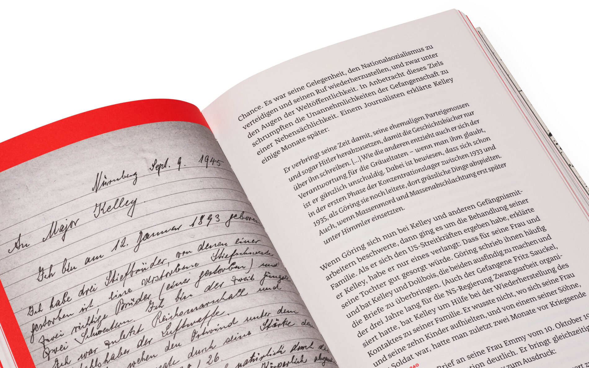
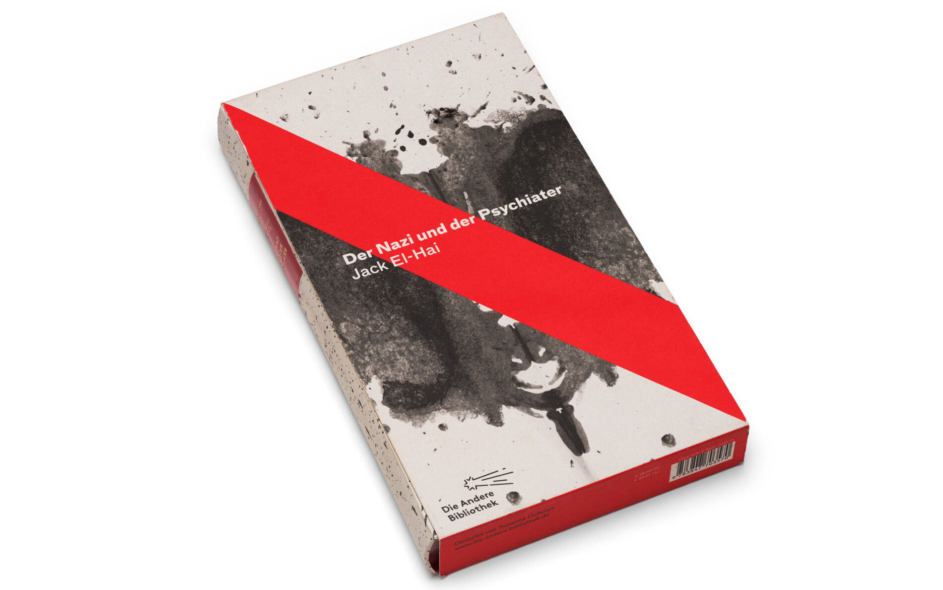
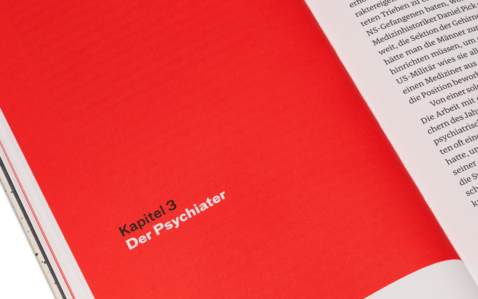
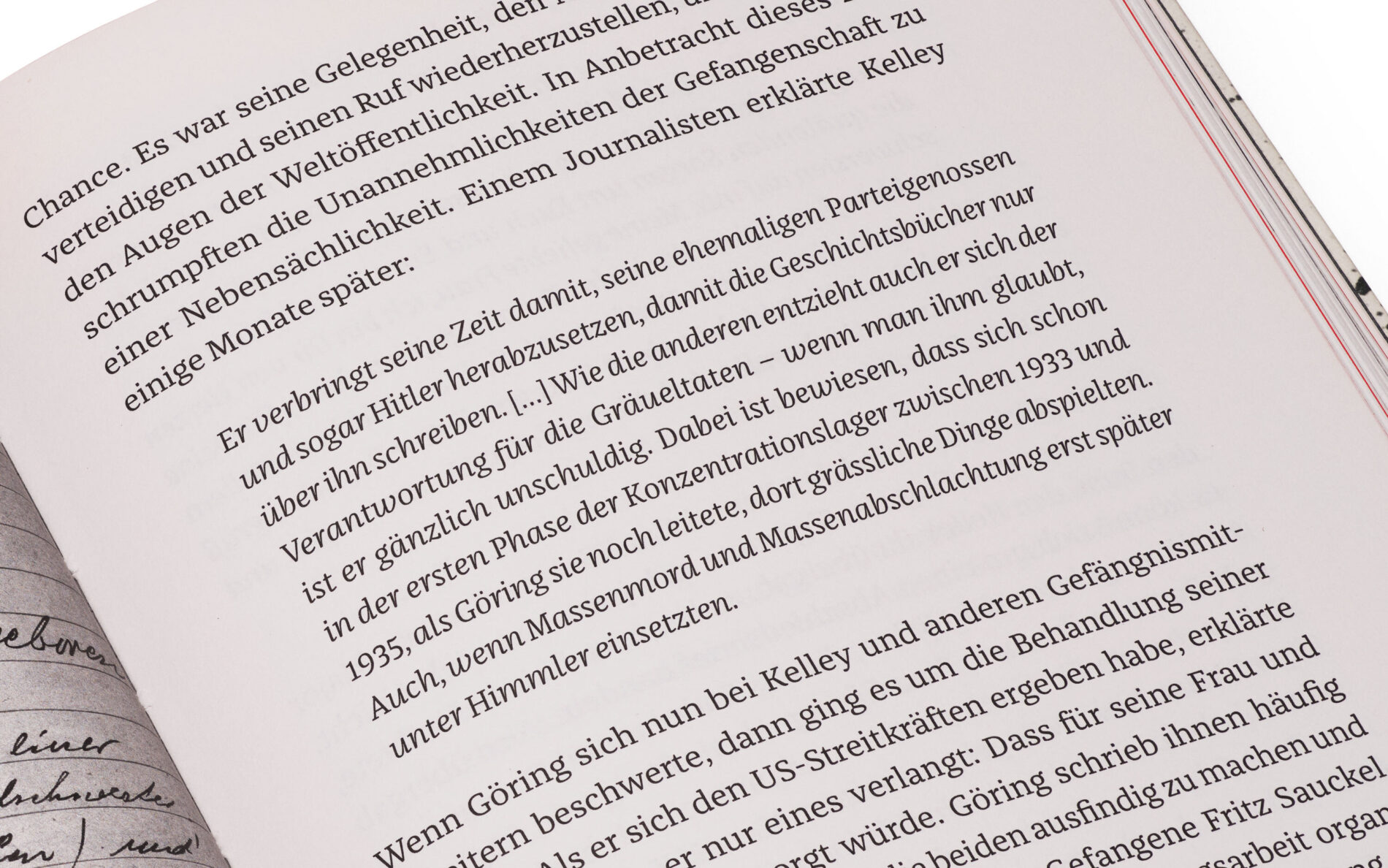
Based on historical documents, science journalist Jack El-Hai tells the story of a fateful encounter between military psychiatrist Douglas M. Kelly and Hermann Göring, arguably Adolf Hitler’s most important aide. During the preparations for the Nuremberg Trials, which opened in 1945, American doctors under Kelly’s direction were tasked with examining the mental state of the Nazi elite who had already been imprisoned. Fascinated by Göring, the psychiatrist tries to look behind the abysses of humanity in long conversations in order to understand the psyche of the Nazis. With his detailed and exciting character study, not only Jack El-Hai writes history, but also Franziska with him. Used as a text font in Susanna Dulkinys’ edition, published by Die andere Bibliothek, Franziska emphasises inserted original sounds with her striking Italics and, like the content, impresses with exciting details and direct accessibility.
Sebastian Lörscher is a writer and illustrator based in Berlin. His award-winning work has been published by various publishers in Germany and Austria and includes graphic novels, illustrated books and illustrated reports. All of his works have a common thread — they tell stories about places and people that may seem peculiar at first, but are always intriguing and unique. Franziska is used as a text and headline font not only in his work, but also on the website of Sebastian’s graphic stories.
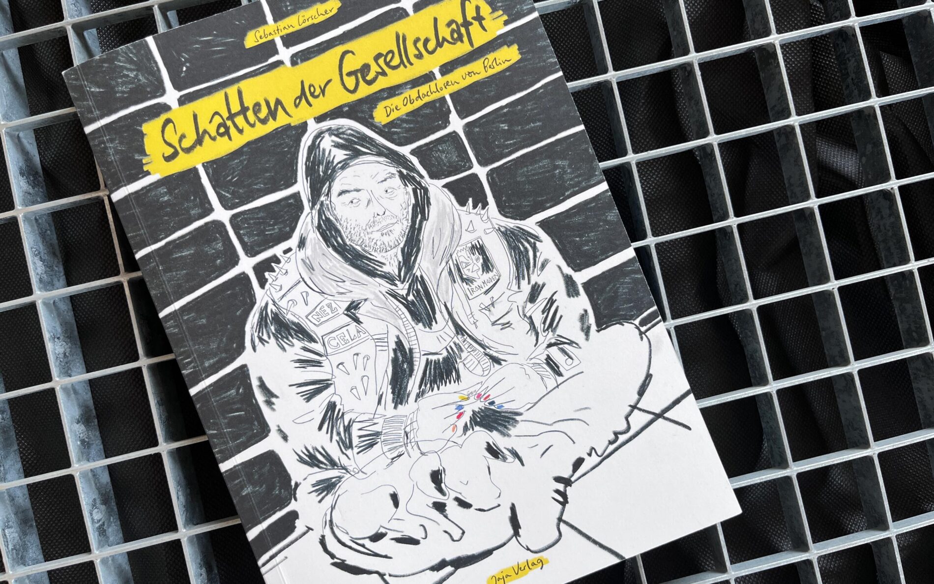
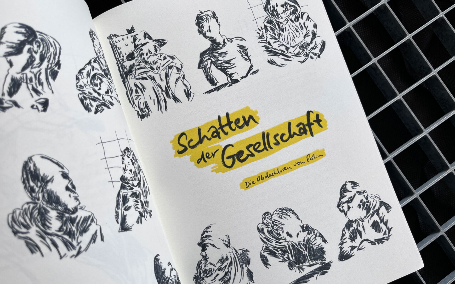
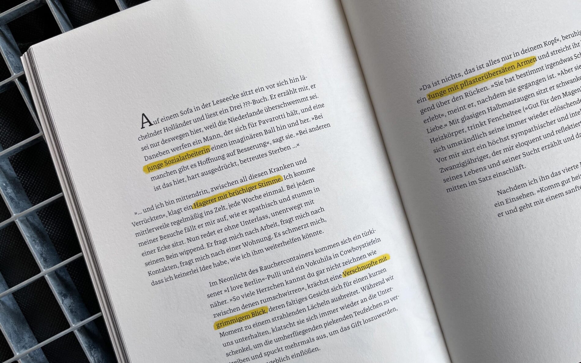
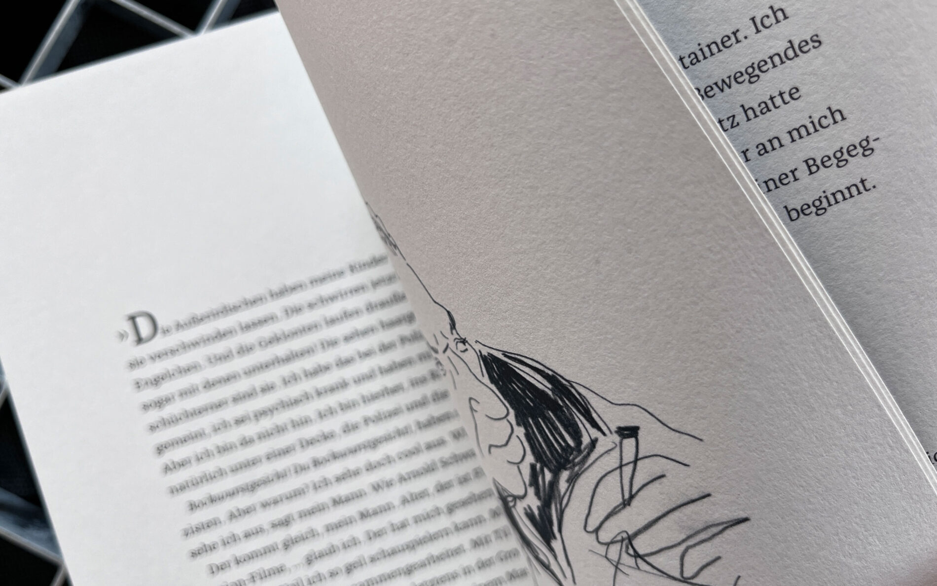
Schatten der Gesellschaft
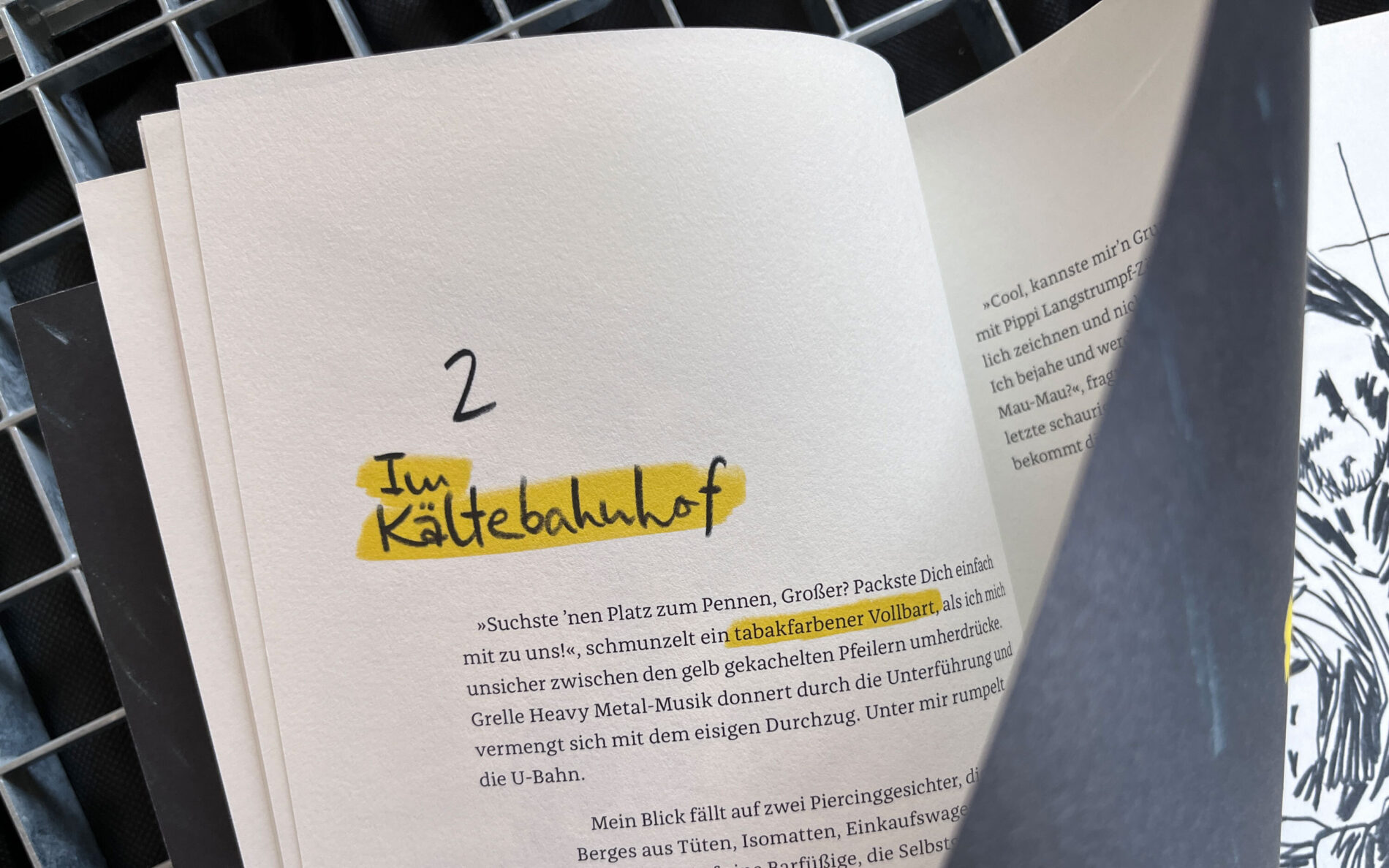
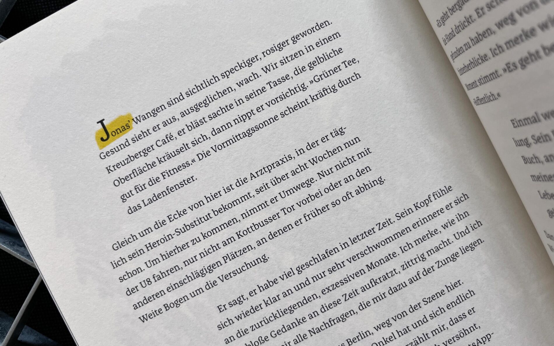
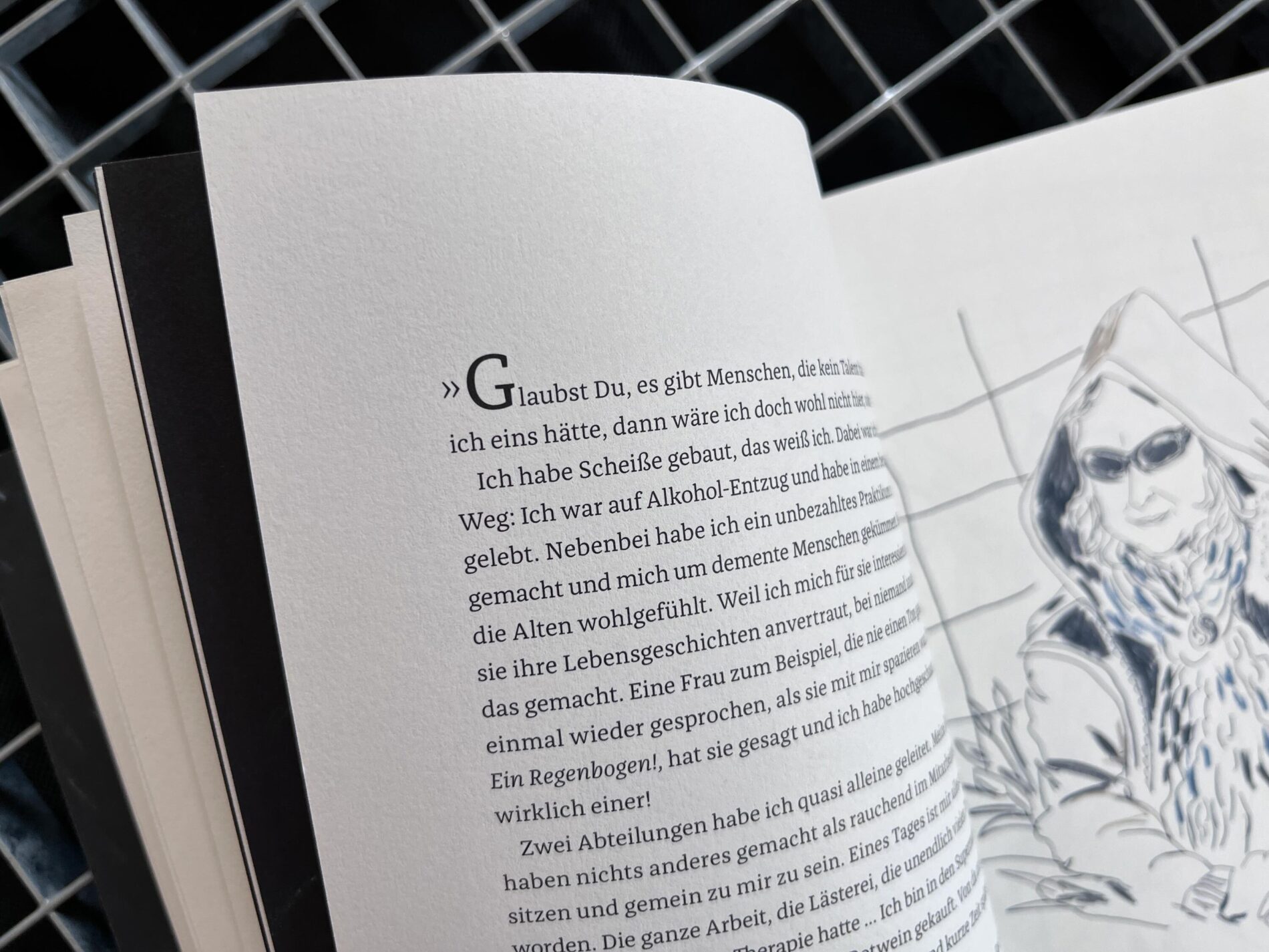
“Schatten der Gesellschaft” (Shadows of Society) is a book about life on the streets that is both beautifully designed and shockingly honest. The author and illustrator’s pictures and texts give a face and a voice to people who are rarely recognised or even ignored by politics and society. He explains his mission this way: “In the middle of winter, I took my sketchbook to places where homeless people sought shelter from the cold. I wanted to find out who they were, these people I often meet on the streets of Berlin. I sat with them, drew them and listened to them.” Franziska, used as a text typeface, keeps a low profile. It creates bold body text, but allows the expressive handwritten headlines and illustrations to take centre stage. The black and white spaces, yellow highlights and accents in the text and images create both contrast and connection. They direct the reader’s eye and create interest and empathy. An incredibly valuable book that is well worth reading!
Anthology Federlesen, Issue 7
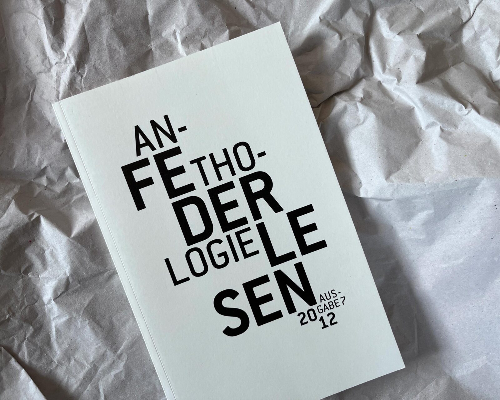
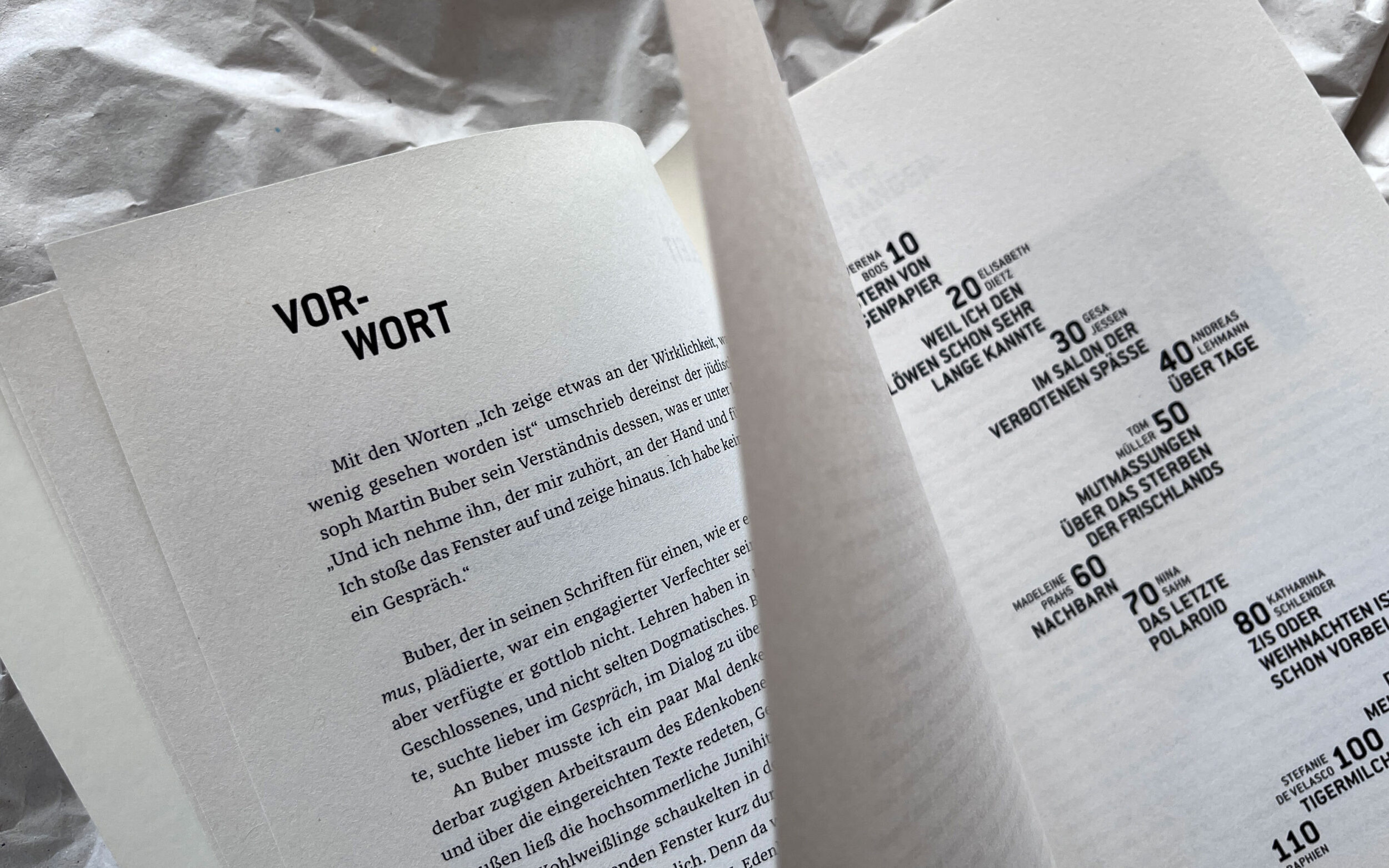
The Jürgen Ponto Foundation for the Promotion of Young Artists and Herrenhaus Edenkoben regularly organise exclusive workshops under the direction of writers Judith Kuckart and Joachim Helfer. Young talents are given the opportunity to work on their written prose and develop their skills with the help of professional advice and support. The results of the seminars are documented and published in the anthology series “federlesen”. Issue 7, designed by Sebastian Lörscher, is printed on a particularly haptic and voluminous paper that gently turns the pages to match the poetry. Franziska is the warm, friendly and legible partner, skilfully handling the print on the voluminous paper.
Lesbar – Typografie in der Wissensvermittlung
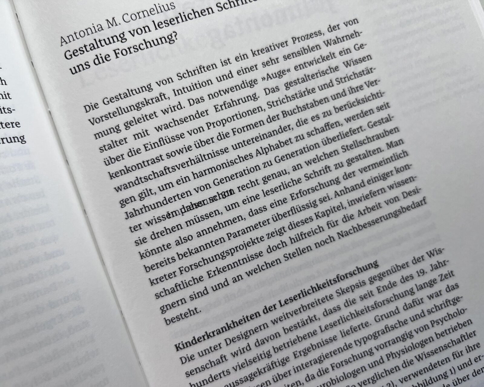
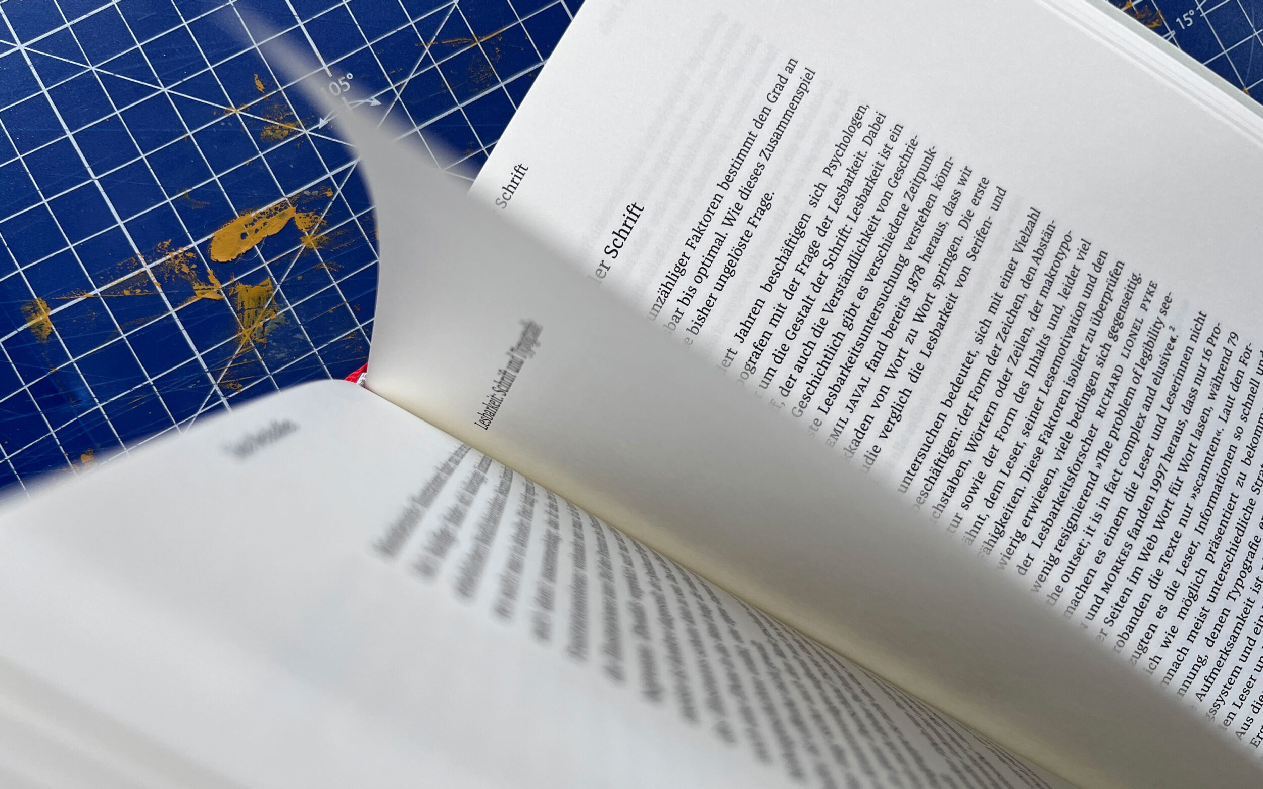
Didactics is about making knowledge understandable. Successful learning and information transfer requires visually appealing, clearly structured and well-defined layouts for printed and digital teaching and learning media. Typography, in particular, plays a crucial role here, as knowledge transfer is not possible without text or type. Ultimately, it is typography that makes content visible and effective.
This is illustrated in the book “Lesbar - Typografie in der Wissensvermittlung”, which is a comprehensive project involving 24 experts from different fields, including Antonia Cornelius and Albert Jan Pool. The book sheds light on the key aspects of didactic typography, type, and readability. It explores the mechanisms of typography in various contexts and explains the characteristics required for effective typography. The typeface used for the entire work is Franziska, which was chosen by Rudolf Paulus Gorbach for its smooth legibility and didactic precision in knowledge transfer.
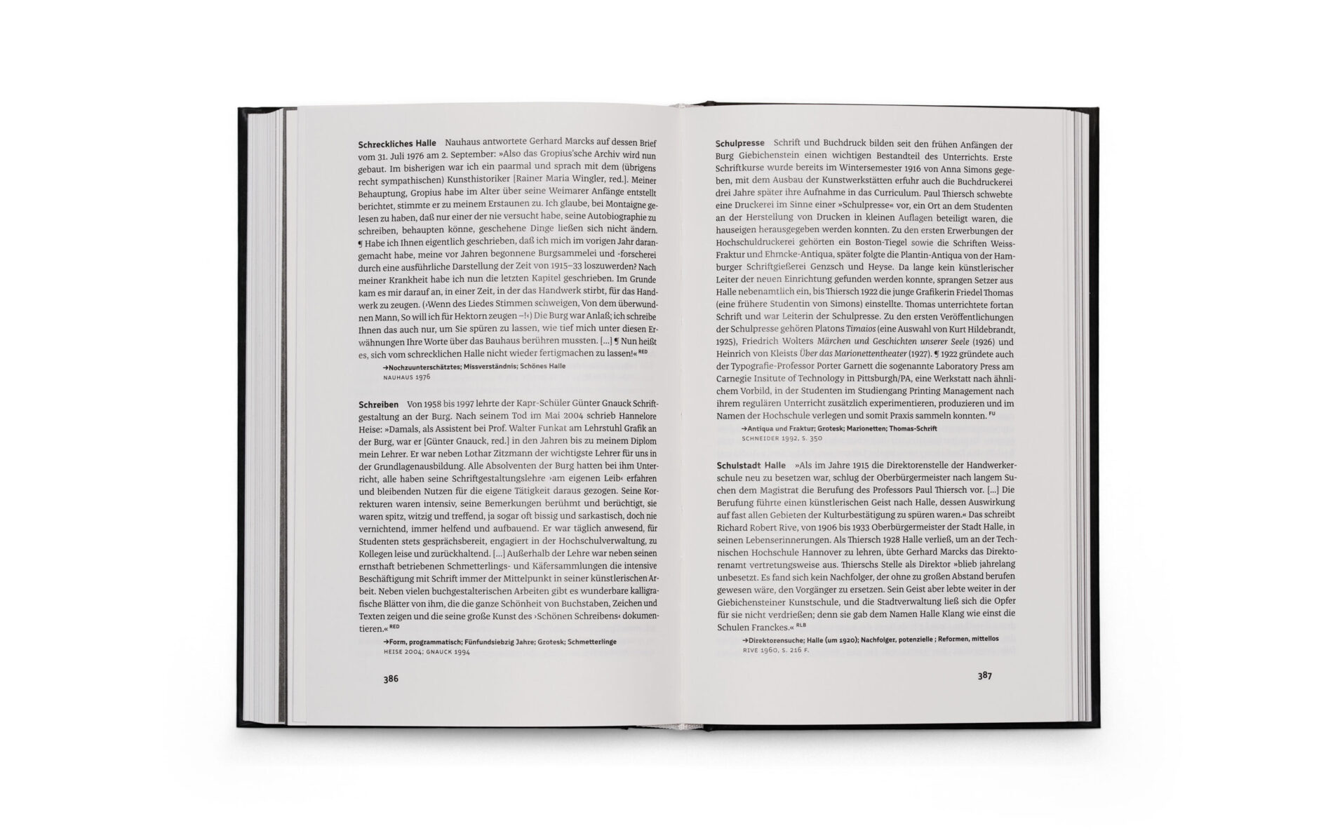
Encyclopaedia 100 Years BURG
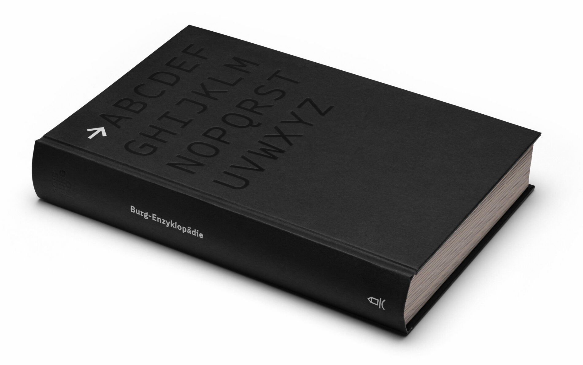
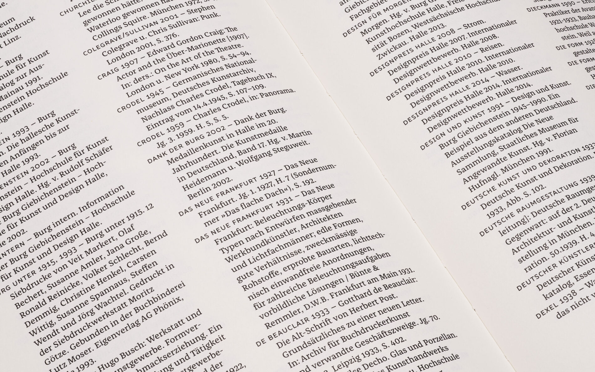
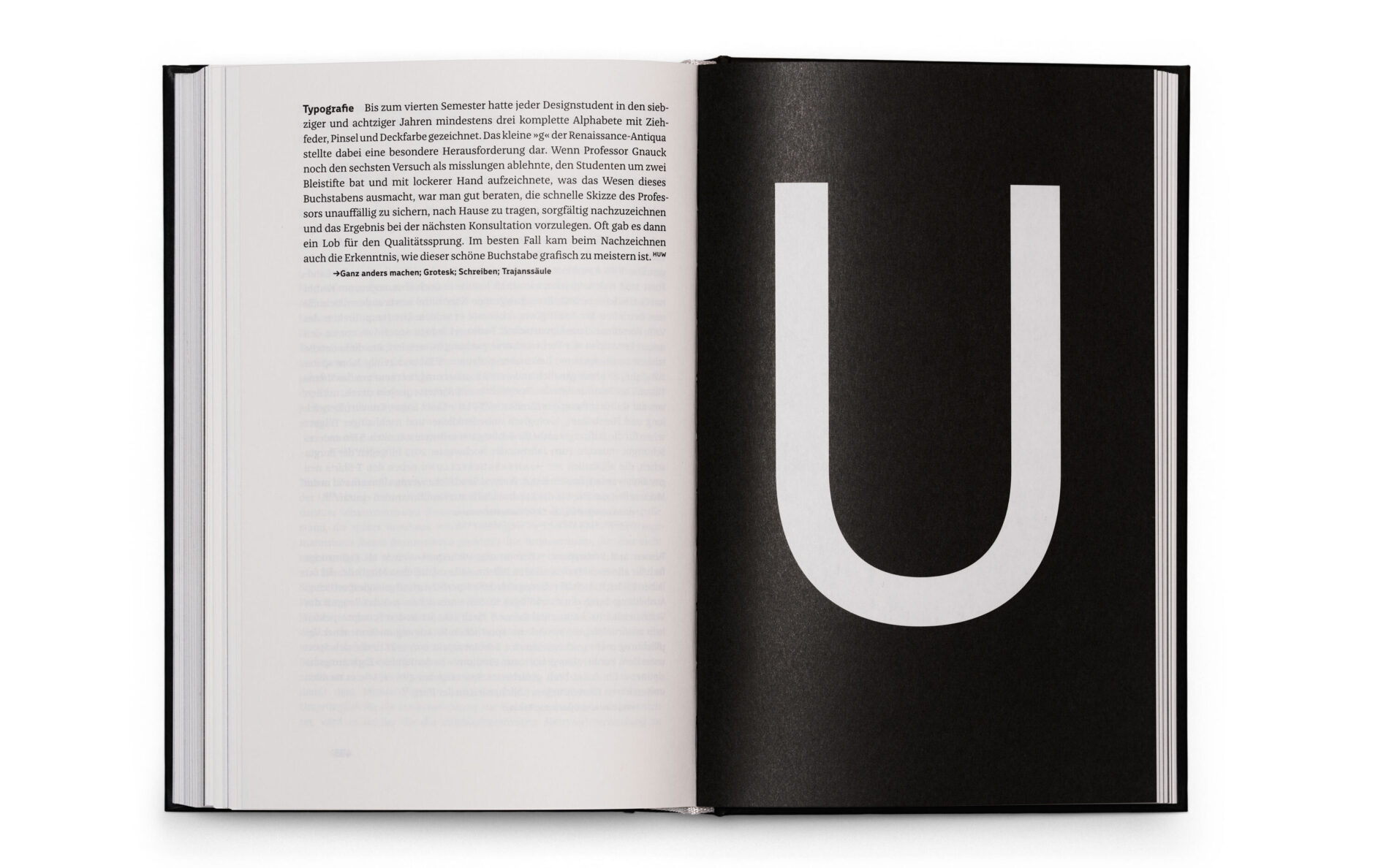
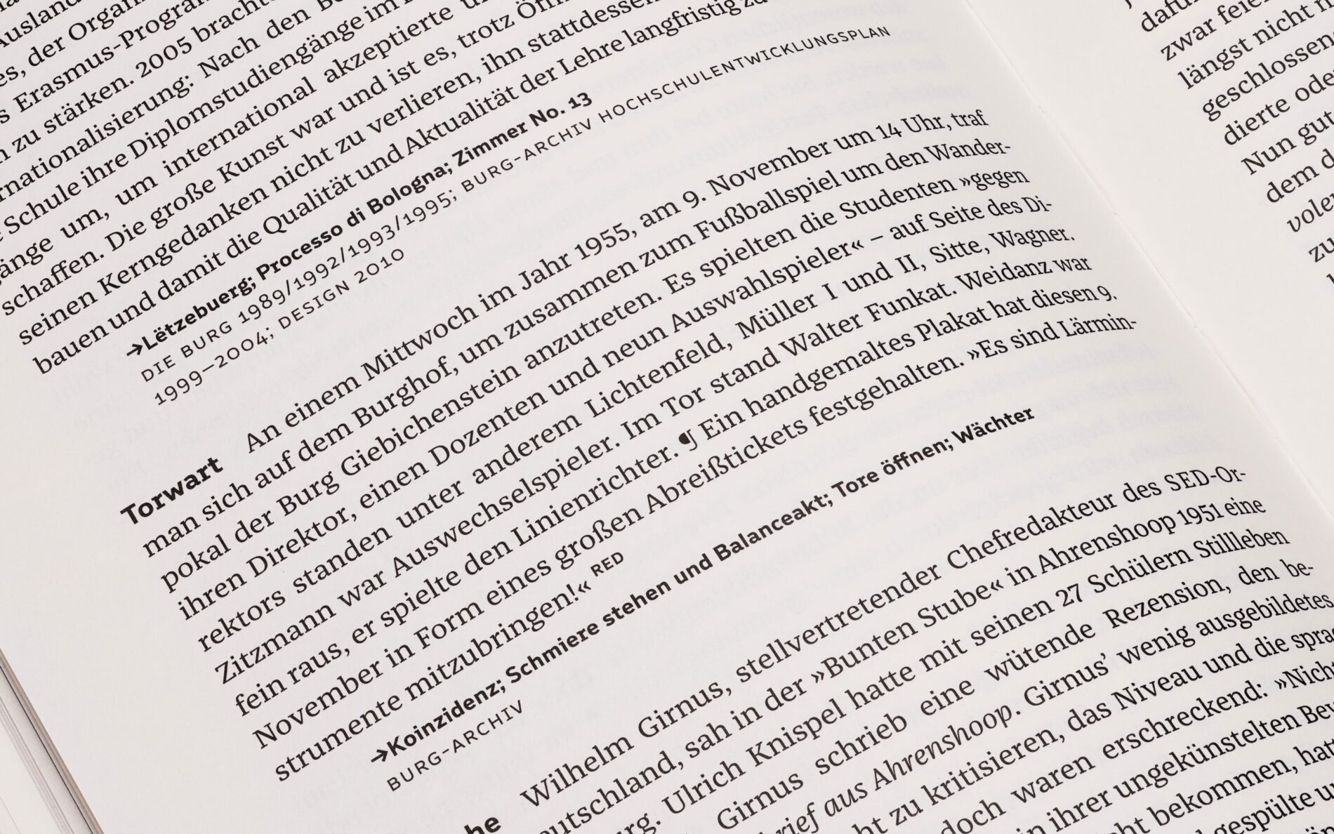
The Burg Giebichenstein University of Art and Design in Halle is celebrating its centenary with a special insight into its history. Under the title “Die Burg Giebichenstein in Halle, in alphabetischer Reihenfolge. Eine Hochschulenzyklopädie”, designed by Ferdinand Ulrich and published by form+zweck, the book contains a total of 825 entries by 82 authors and attractive illustrations. Franziska serves to convey knowledge and creates a solid body text. In combination with the house font Burg Grotesk, Franziska tells the story of people, events, successes and failures at the university in the reflection of time. She not only clarifies and provides facts and answers, but also invites the reader to ask questions and make connections.
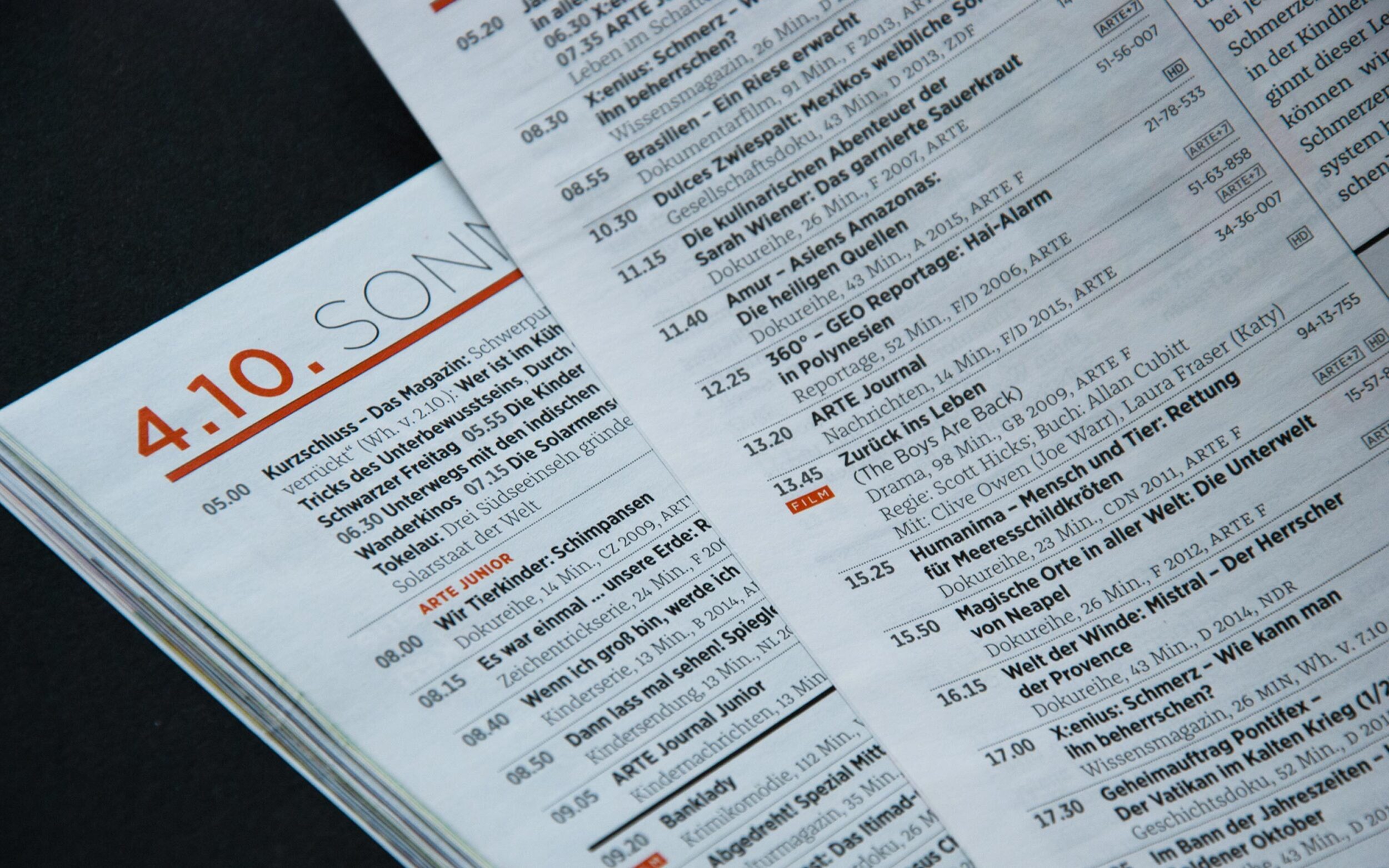
ARTE Magazine
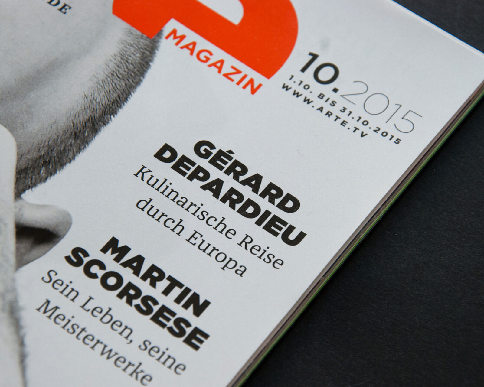
ARTE Magazine is the TV channel’s monthly magazine dedicated to art and culture. In 2015, the Hamburg agency twotype, where Juliane Kess is a partner, took on the redesign of ARTE Magazin. The new issues, published by Axel-Springer Corporate Solutions, use the ARTE typeface Gotham together with Franziska for text. The geometrically constructed Sans and the clear Serif Franziska emphasise a certain lightness within the depth, keeping the spirit of the Franco-German culture channel ARTE.
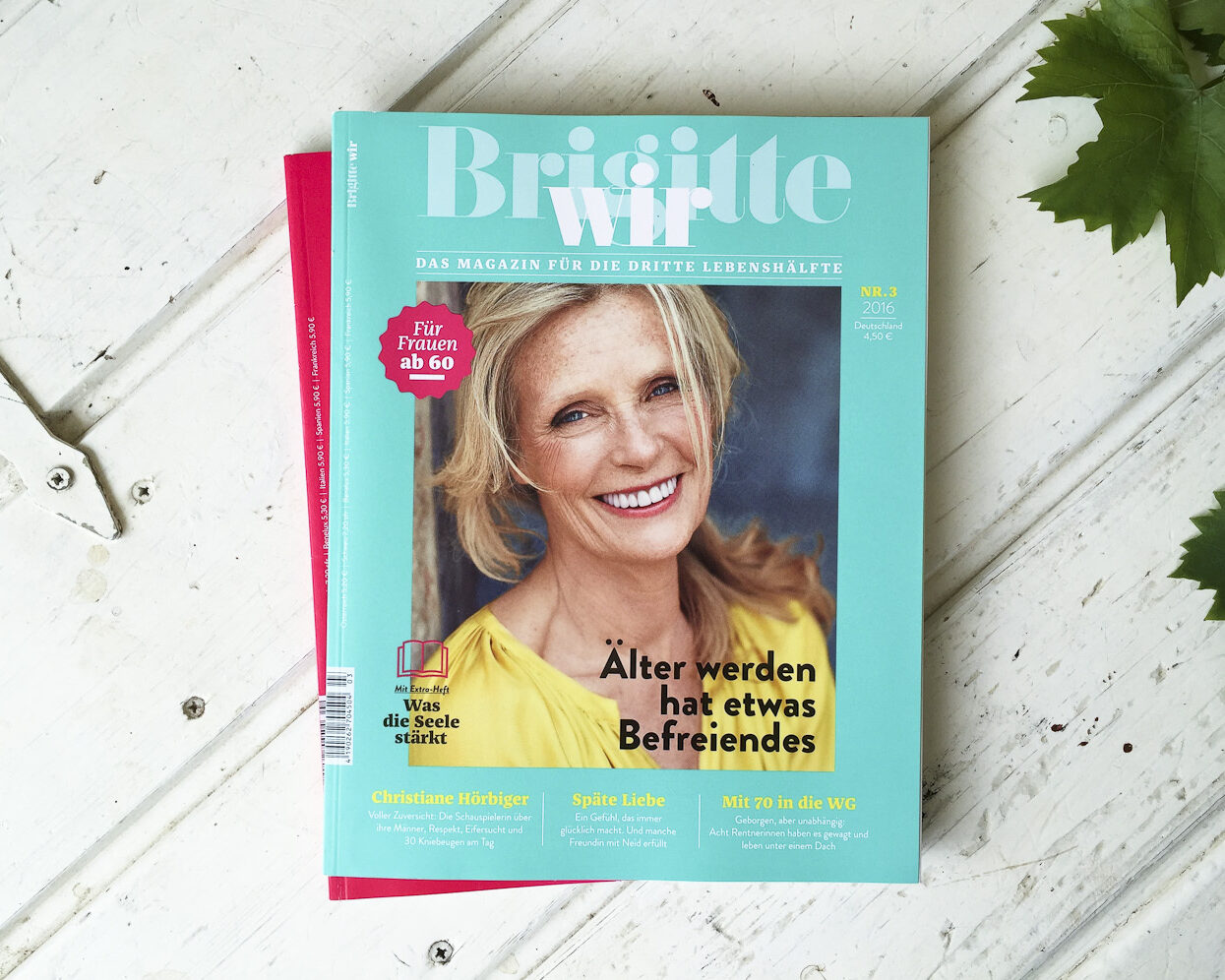
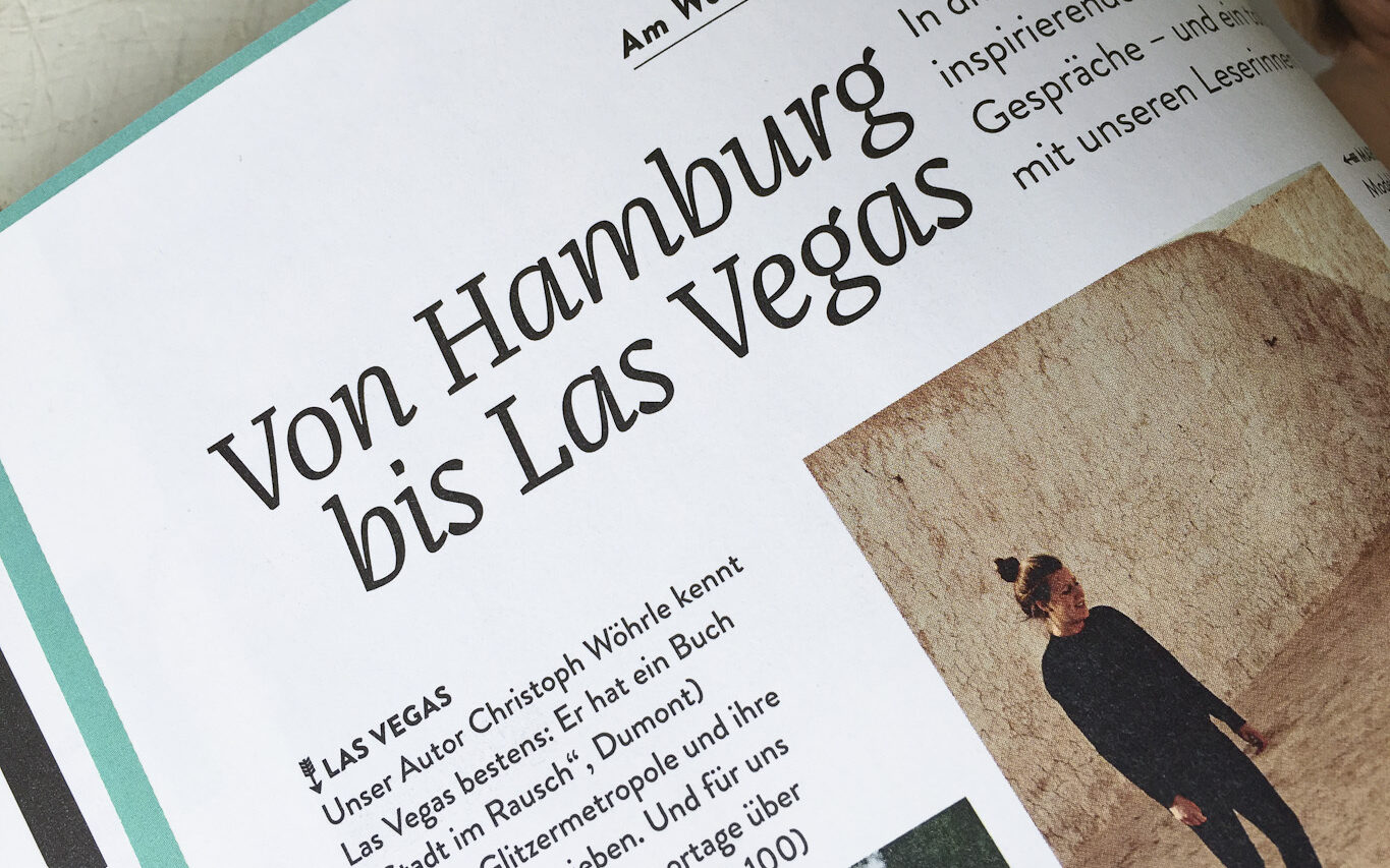
Brigitte WIR Magazine
The magazine “Brigitte wir” focuses on women over 60 and wants to pay more attention to this growing but socially marginalised age group. In spring 2015, former art director Juliane Kess redefined the magazine with a new design: Brandon Grotesque was introduced as the new Sans. For text, some large Italic headlines and quotes, the previous Garamond-like typeface was replaced by our Franziska. Still in use, but much less conspicuous, is the more experimental ITC Binary.


Münster Urban Magazine
Heithoff & Companie, an agency based in Münster, launched the city magazine Münster Urban in 2016. Unlike most city magazines, Münster Urban focuses on in-depth stories about life and people in the city of Münster. The printed magazine and the website use Franziska for text, Cera for headlines and captions and Playfair Display for typographic highlights.
The Muthesius Academy of Fine Arts and Design in Kiel is the place where Franziska originally started as Jakob’s Master’s thesis. Franziska is always happy to return there:
The Muthesius Academy of Fine Arts and Design {https://muthesius-kunsthochschule.de/kommunikationsdesign/schriftgestaltung/} in Kiel is the place where Franziska originally started as Jakob’s Master’s thesis. Franziska is always happy to return there:
Exhibition catalogue Skulpturen im Schleusenpark Kiel
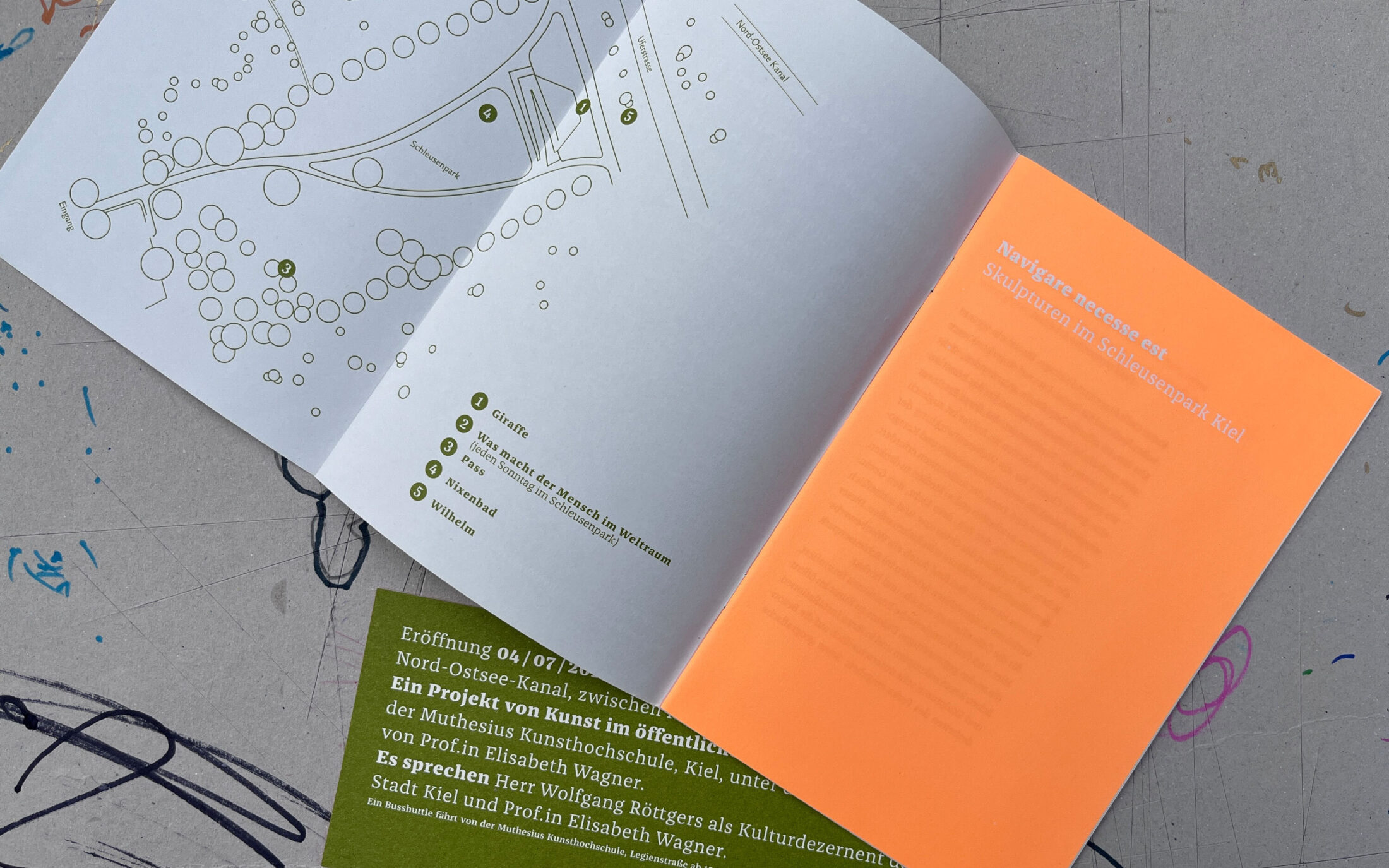
Franziska makes an appearance in the exhibition “Skulpturen im Schleusenpark Kiel” and therefore also finds a place in the accompanying brochure. Designed by Vivian Manning and Markus Kleinloh, Franziska shows off her skills and gives the reader a comprehensive overview of the research project. Even with experimental colour contrasts, such as light green or white printed on neon orange, robust Franziska remains legible.
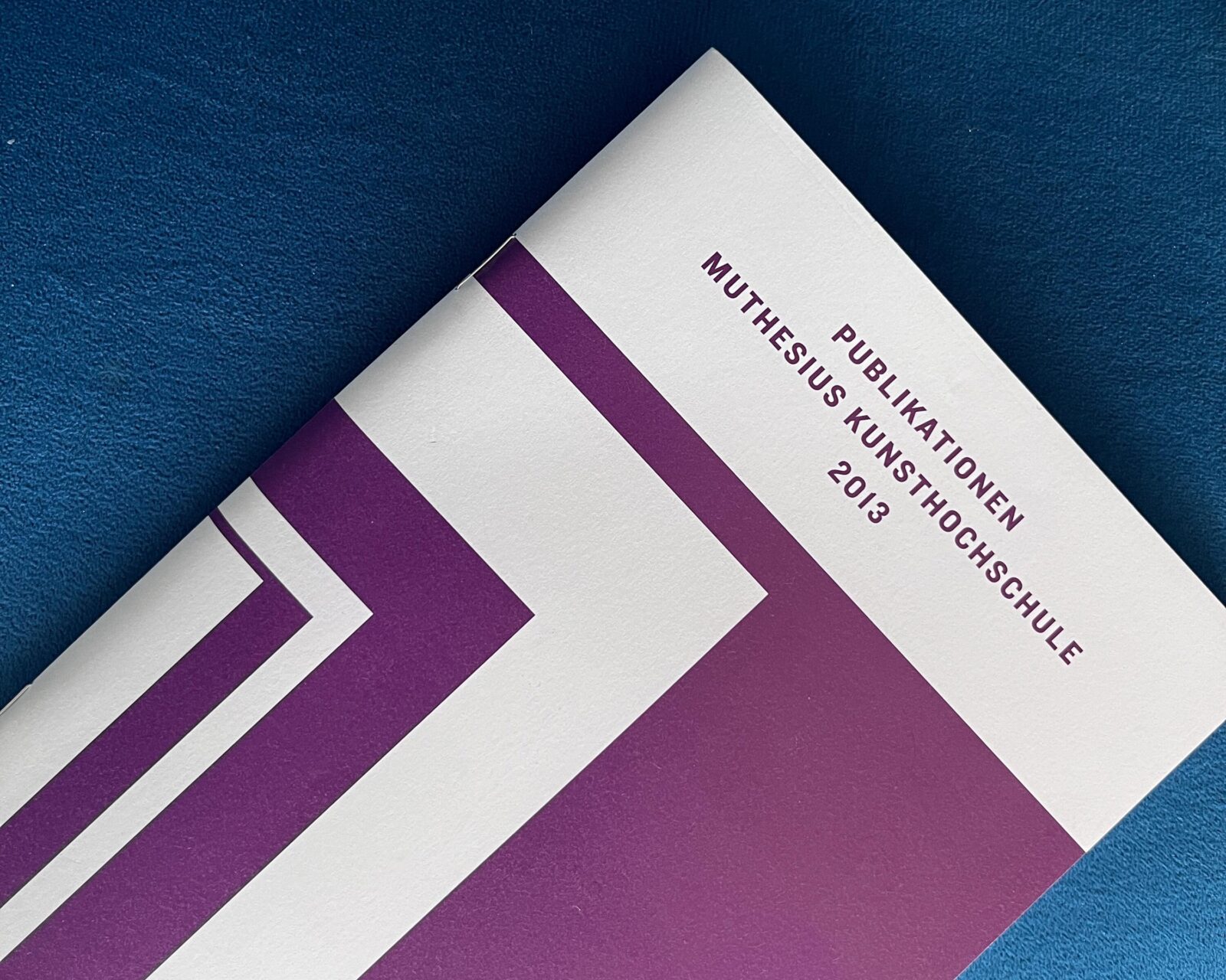
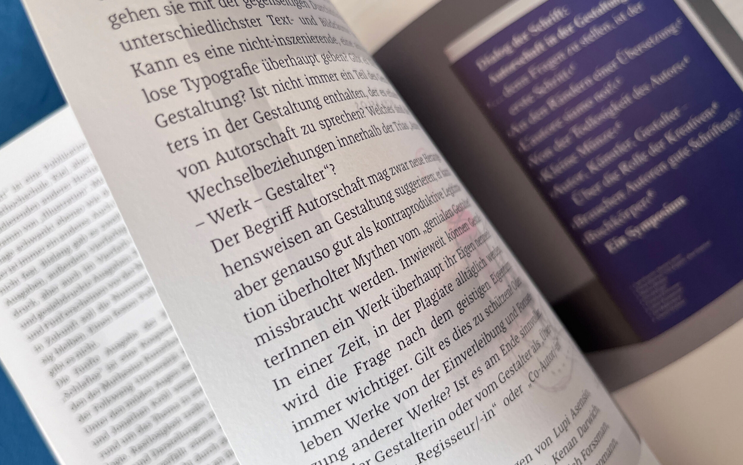
List of publications Muthesius Academy of Art and Design 2000-2013
The Muthesius Academy of Fine Arts and Design not only accompanied Jakob on his way to completing his typeface, but also uses Franziska for their own publications. Teresa Döge and Sandra Mulitze chose the typeface to design a publication booklet to break up the otherwise dry, text-heavy nature of such a collection. The designers gave the booklet a lively and easy-to-read layout, supported by Franziska as a clear text font.
Fotos © Lisa Kolbe
Bachelor Thesis MashUP
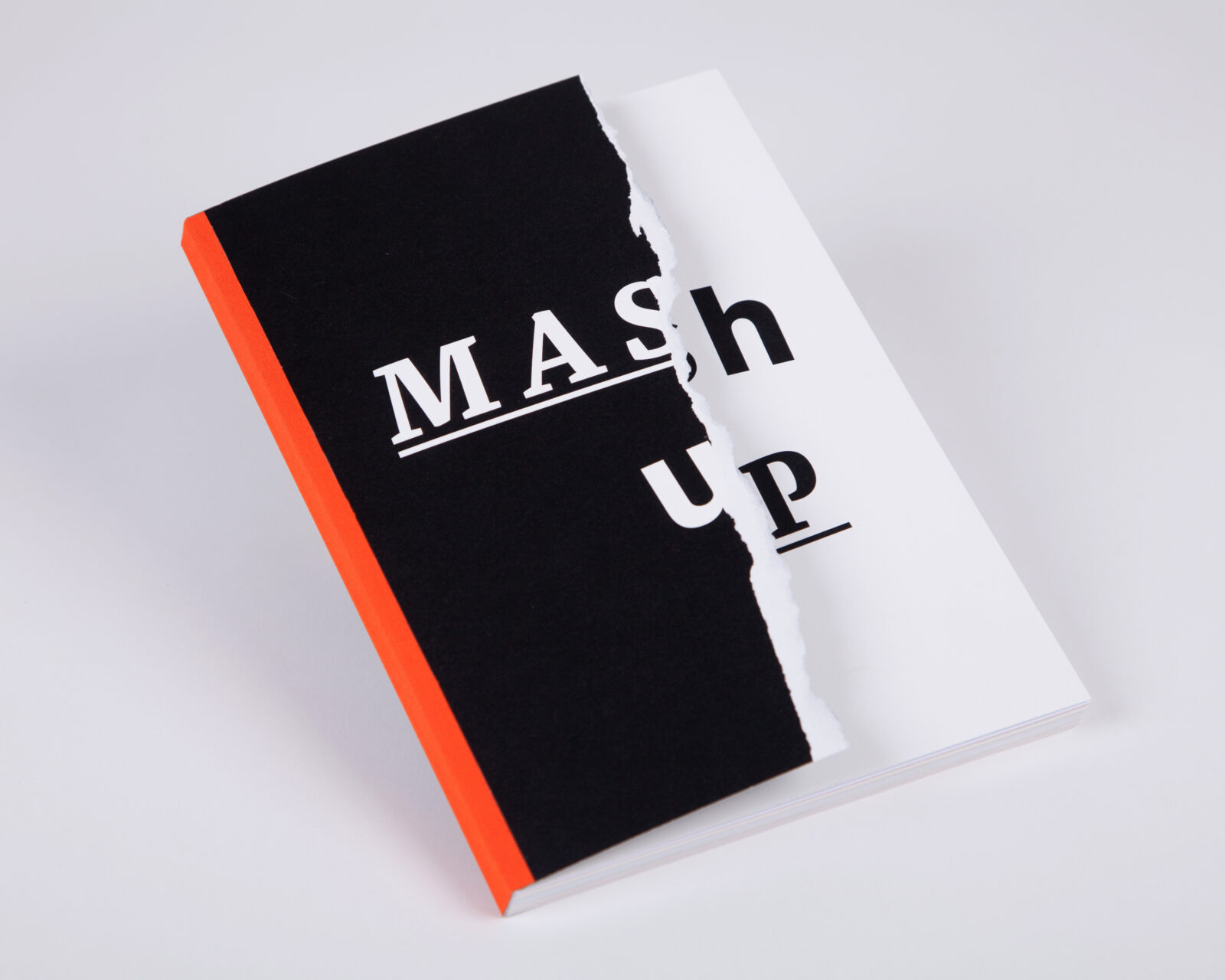
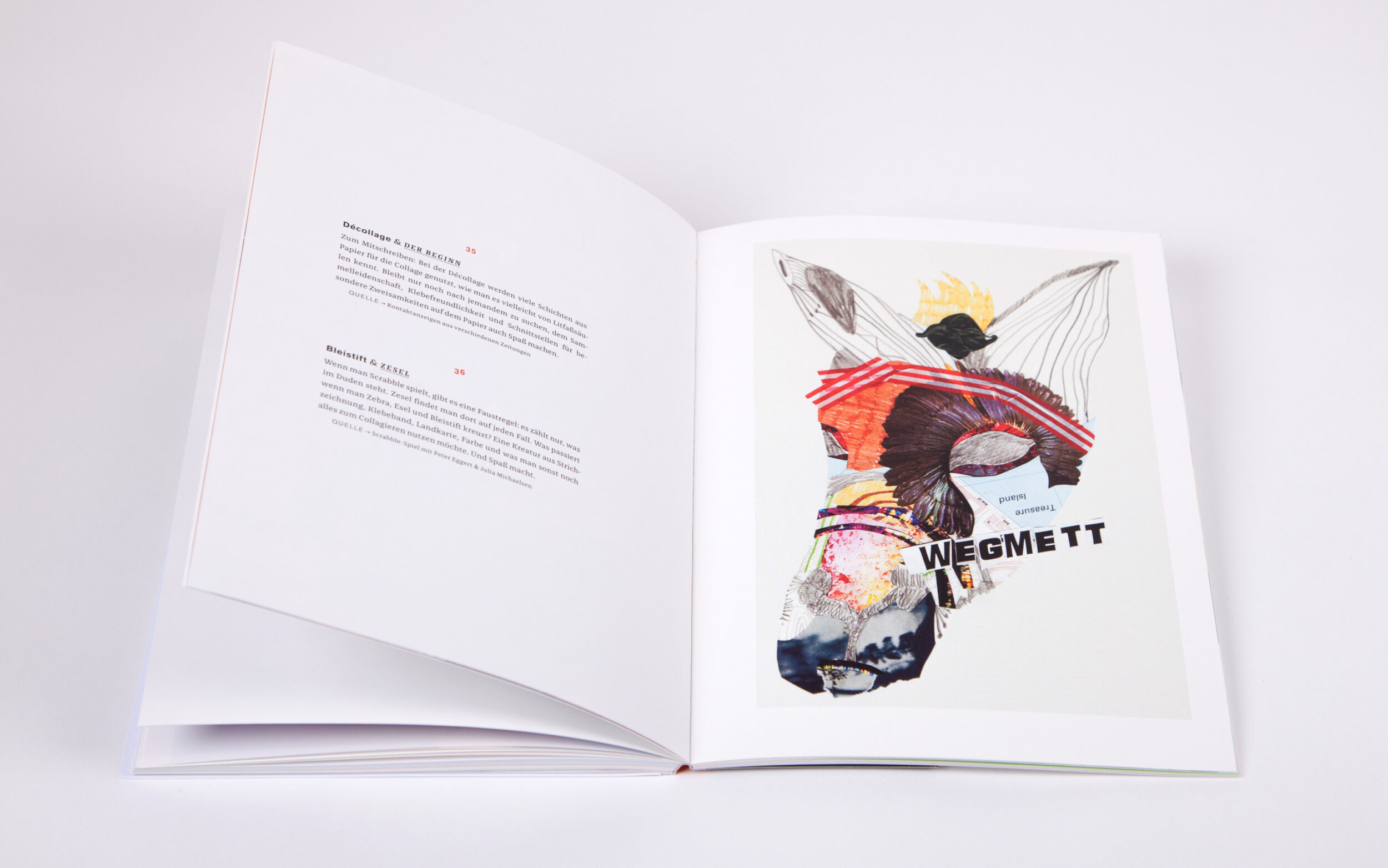
Mashup means the recombination of media content and, in this particular case, design in free fall. Lisa Kolbe worked on collages for her bachelor thesis at the Muthesius Academy of Fine Arts and Design. She was motivated by a free approach and the particular appeal of combining existing fragments to create her images. The basis of the experiment is a table consisting of an arbitrary list of techniques and media content. Divided into style and content, it assigns each collage both an aesthetic component and a source of content. These two areas were repeatedly recombined and brought together in collages. The result is a book of 44 collages, whose basic principle is reflected not only in the cover but also in the contrasting typography. The modern, organic-looking Franziska is a real contrast to the classic Akzidenz Grotesk and shows how versatile it is: sometimes soft, sometimes angular, sometimes loud, sometimes quiet - Franziska knows no boundaries, just like Lisa’s collages.
C20: Company Biography about Mutabor
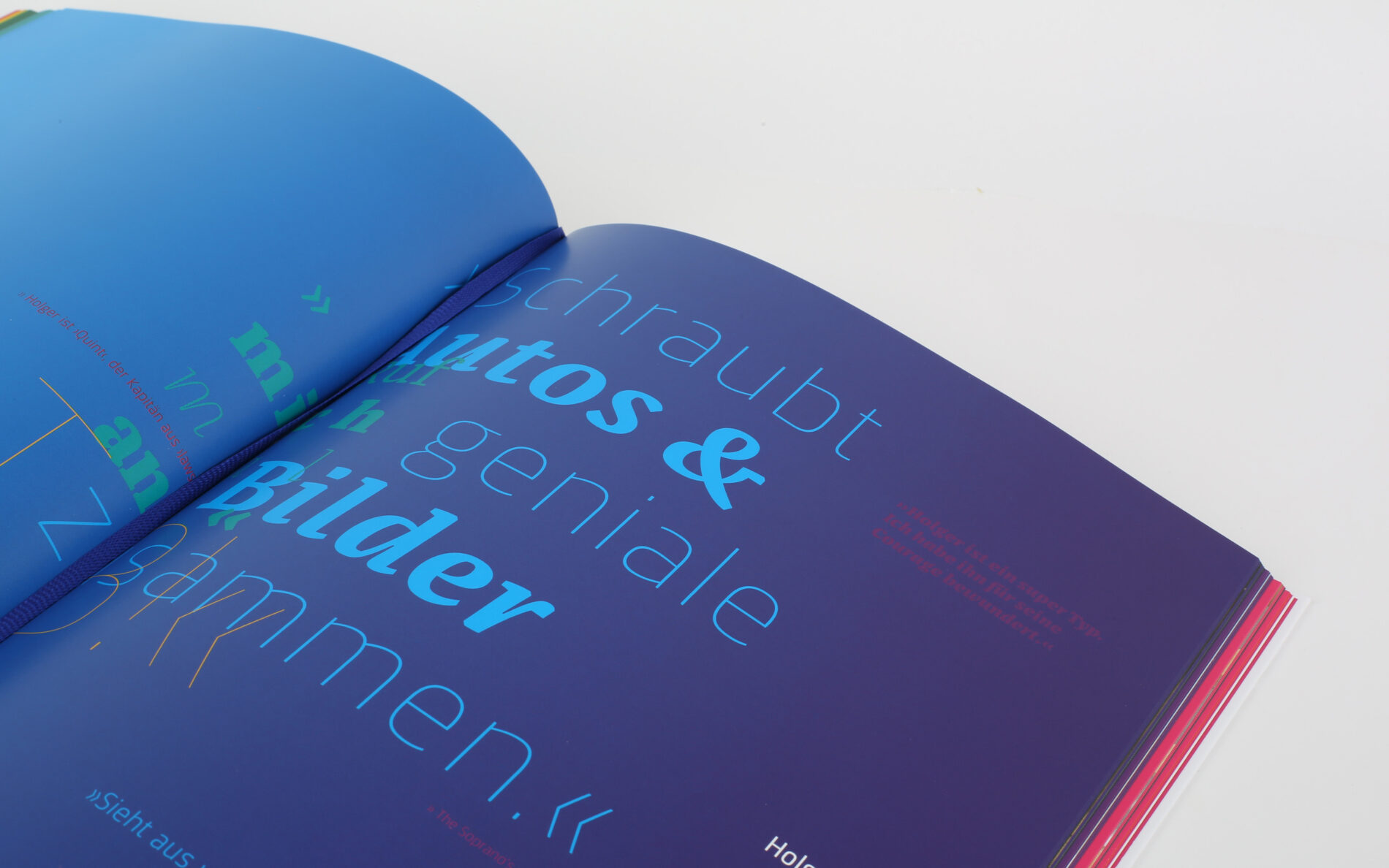
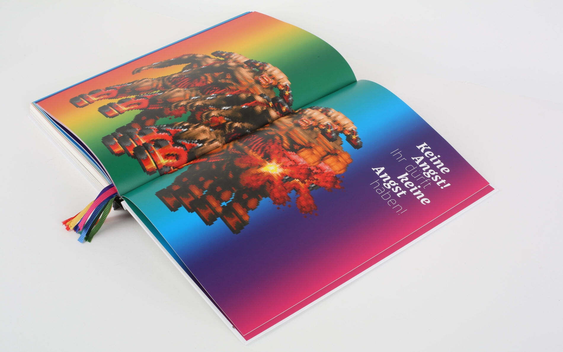
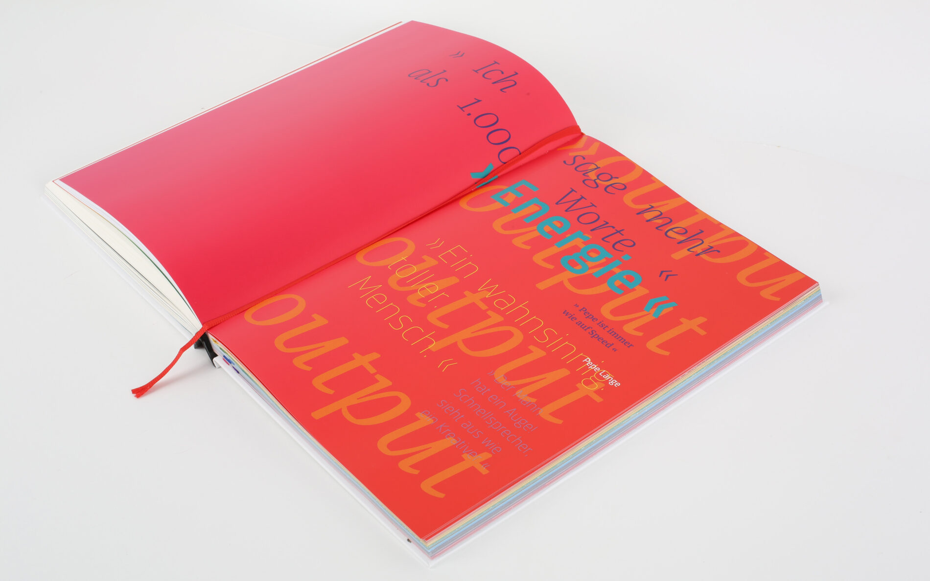
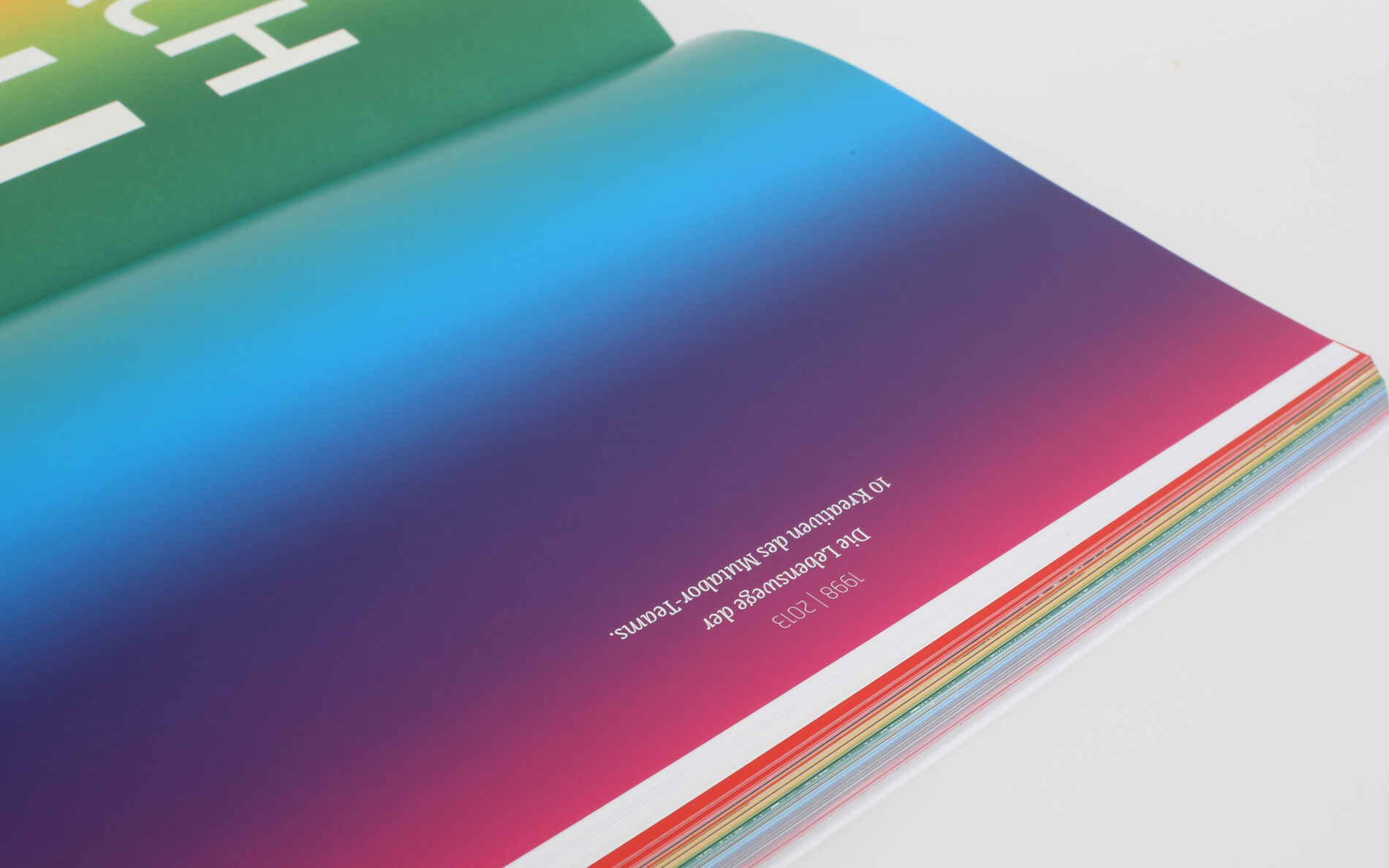
Born in the C20 workspace at the Muthesius Academy of Art and Design, Mutabor Design GmbH has grown to become the largest independent 360° design agency and marketing consultancy in Germany. The book “C20: 1 Raum/1 Magazin/ 10 kreative Lebenswege - 1993-2013”, published by the university and designed by students Christin Pukallus and Sophia Ewig, marks the 20th anniversary of the Hamburg agency. It traces the development of the company, which began as a university project and is now world-famous. Using Franziska as a text font, our Sinews Sans and interesting infographics, the two communication designers show the different stages of the founders and visualise their life stories. The small and striking details of Franziska are highlighted by large quotations on several pages.
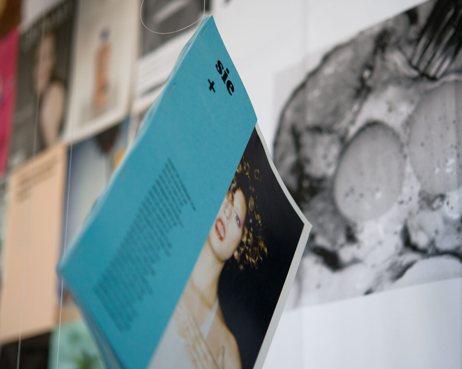
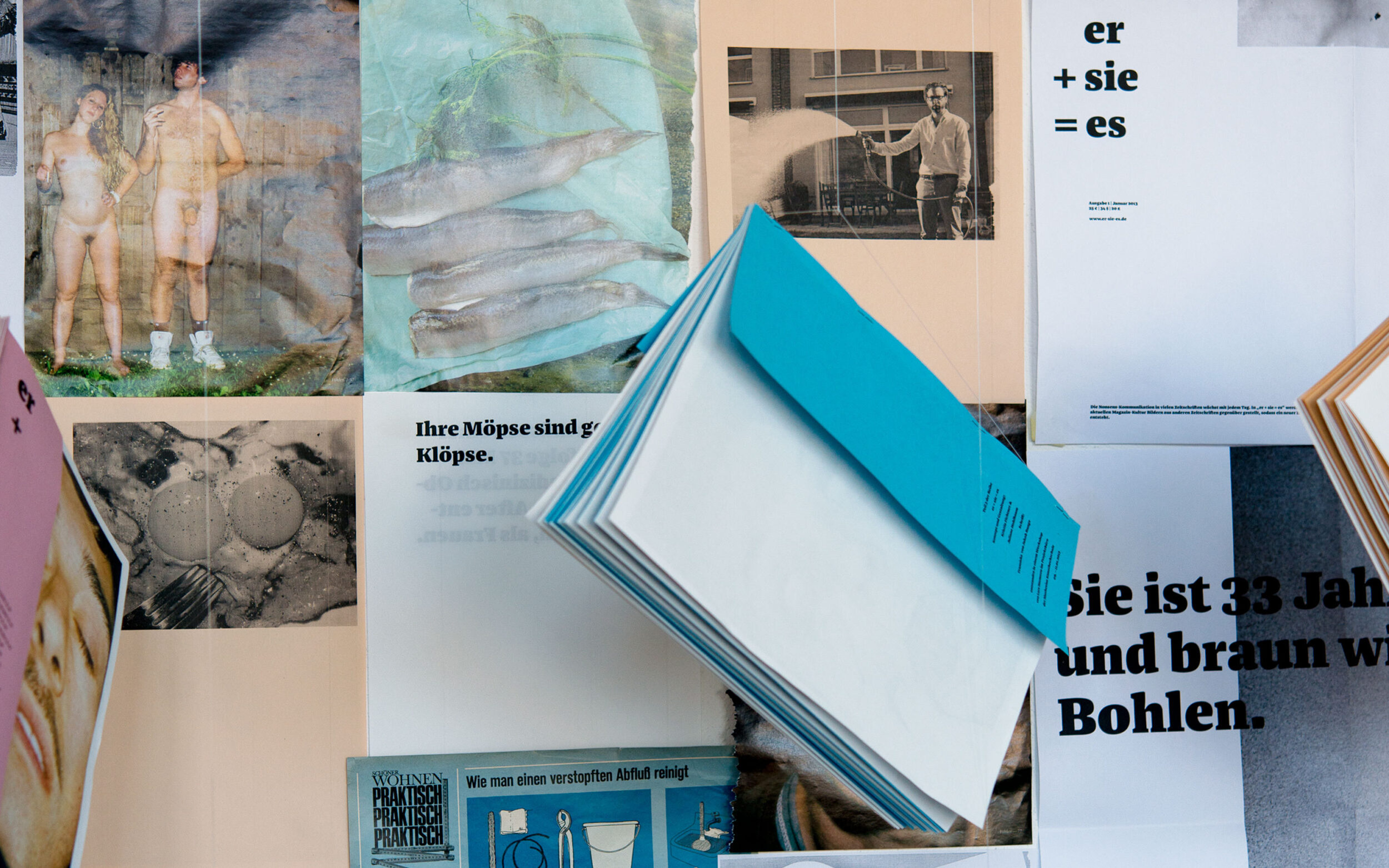
Magazines : er + sie = es
Conserving resources is a topic that is not only important in the context of the climate crisis, but was also the focus of the workshop “UPCYCLING - redesigning a magazine by using existing print products”. In this workshop, communication design students from the Muthesius Academy of Fine Arts and Design, under the guidance of Lars Harmsen, created new designs using old print products. The accompanying magazine deliberately has no title and does not use text to convey the content, but consists solely of images. But that doesn’t mean that writing isn’t important. This is illustrated by the contribution “he + she = it”, for which students Kristin Fichtner and Juliane Hohlbaum took quotes from current culture magazines, arranged them next to each other and placed them in a new context. The result is three sets of three magazines and one set of seven posters. Distinguished by a different colour scheme, each issue deals with a specific theme, such as man, woman or love/sex. Set in the black weight of Franziska, the typeface is loud, bold and provocative, proving that the font family is as diverse and versatile as the content.
