A Closer Look at Harrison Serif
Designed Jakob Runge and Lisa Fischbach, Harrison Serif is a modern Slab Serif, that ranges between capable and casual.
Harrison Serif is a sturdy, yet contrasted Slab Serif that combines a rational and efficient approach with a warm voice. Beiing a typeface of nuances, the slightly carved and occasionally extended serifs evoke the friendly side of Harrison Serif and contrast with the straight forward nature of the squarish curves, open counters and horizontal emphasis.
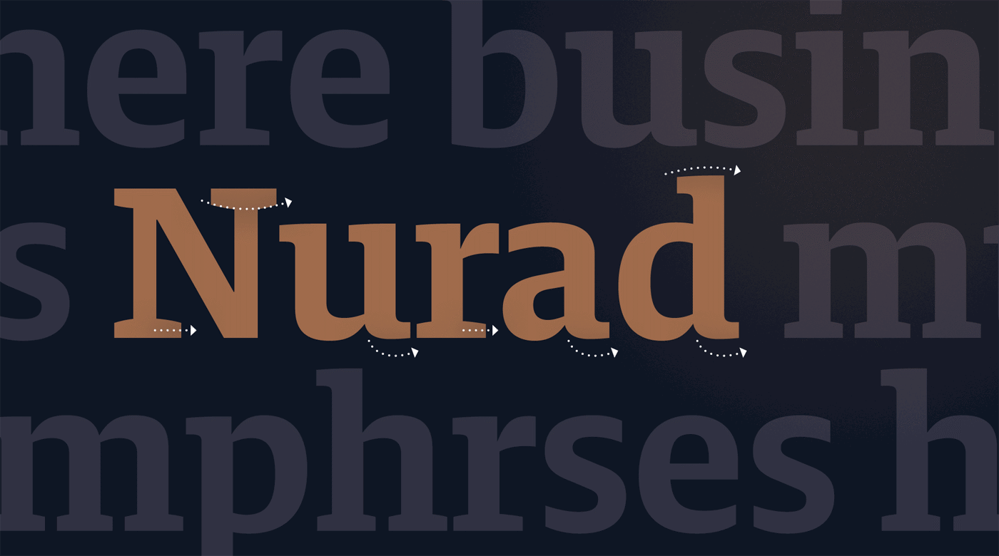
The friendly appeal: Slightly caved bracketed serifs (n), smooth tails (a, u, d) and extended serifs in N and r to improve legibility and personality.
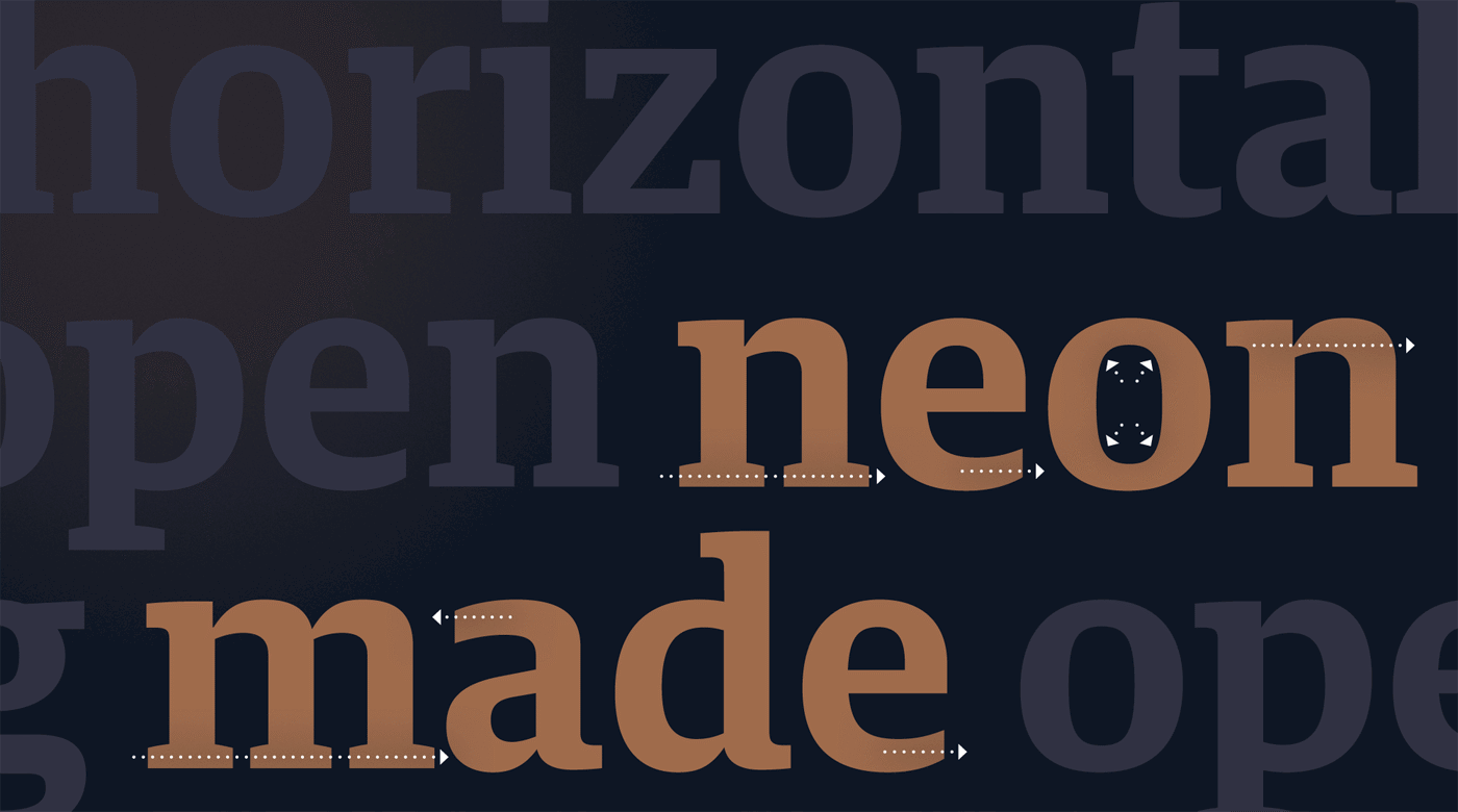
The mechanical aspect: Emphasised horizontal serifs (n), open terminals (a, e) and angular counter shapes (o).
Harrison Serif was drawn for long reading on screens and user interfaces, but the refined details come alive in high-resolution media and print. The almost mechanical vertical terminals, open counters and modest capitals get complemented by the generous x-height to ensure the typeface holds up on screen. With a sturdy physique, any medium is fitting for this serif typeface.
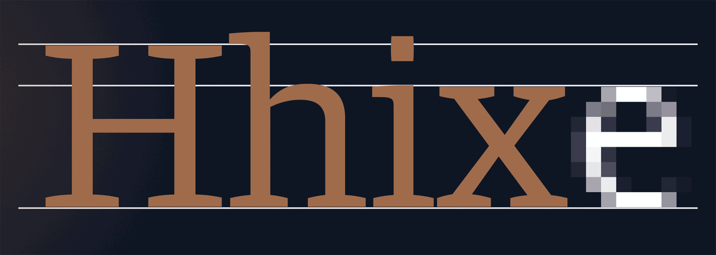
Modern proportions and open terminals designed for screen application (like this ClearType rendered e in 16 px)
One unorthodox feature is how this mainly Slab Serif style typeface plays with being a Sans. Implemented to improve readability and smooth text colour, this adds extra distinction to Harrison Serif. The Sans feature is also visible in the figures and the currency symbols.
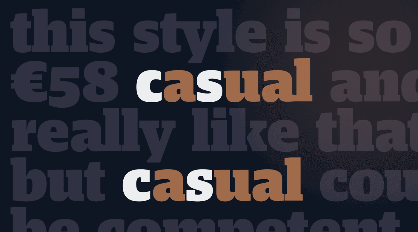
For usage that requires a more classic approach, the stylistic alternates provide a serifed c and s.
Harrison Serif’s broad range of weights means that it’s more than a just a simple text face. From sheer Hairline to deep, dark Ultra, its weight spectrum is divided into nine distinct styles — leaving no need unfulfilled for editorial designers.
All of the weights are based on the concept of weight growth that Adrian Frutiger developed in his groundbreaking “Univers” ( shown in: Adrian Frutiger “Typefaces: The Complete Works” page 93 ) Consequently, the letters and shapes of the complete Harrison family expand and contract in a rational and systematic manner.
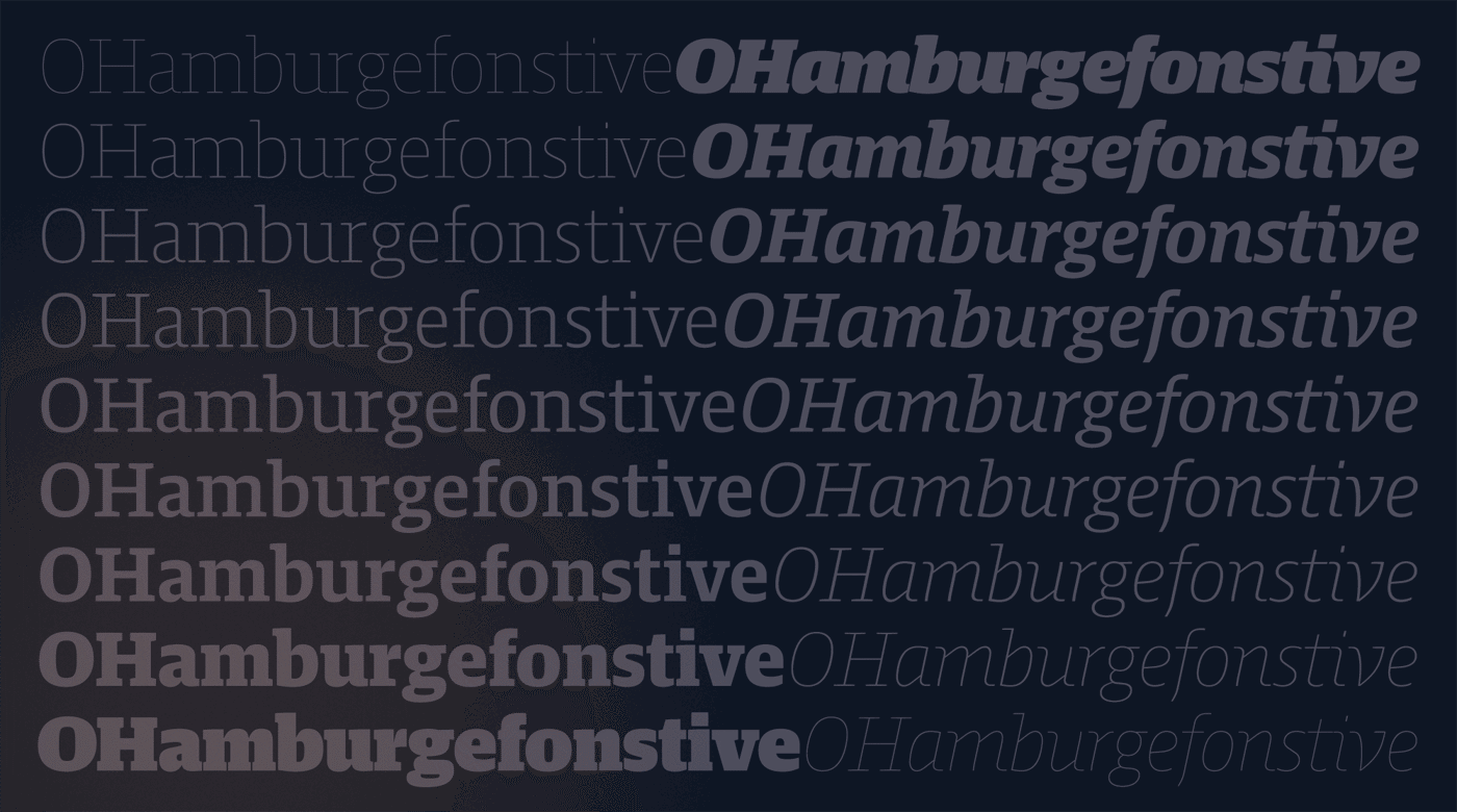
Nine weights, from hairline to ultra black, define Harrison’s extensive design space.
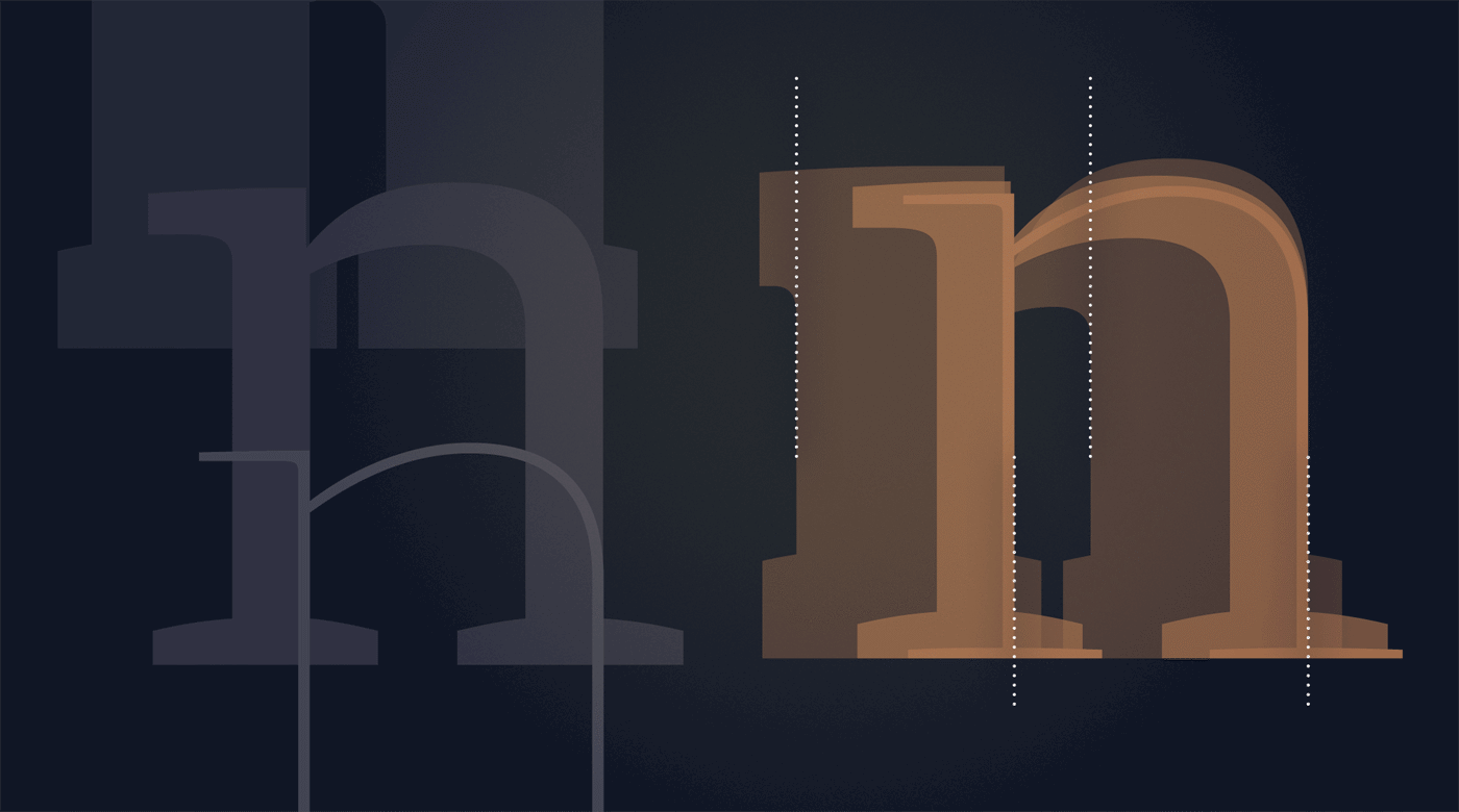
While gaining weight, the distance from inner counter to outer stem remains constant, keeping a harmony between the growth of width and weight.
Harrison explores nuances in its Italics. Somewhat between true Italics and Obliques, they range from cursive to playful, from expressive to sobriety. Where most Italics are shaped by their slant and the profusion of diagonals, Harrison Italics are still focussing on the horizontals. Even playful characters, like the lowercase w, bring boxy and horizontal quality to the lively and handwritten form.
Thus, the Italics strike a balance between business and distinctive without losing focus on what’s important: differentiation from the Roman within the same grey value. Alone or in combination with the Roman, Harrison’s Italic adds character while keeping a low profile.
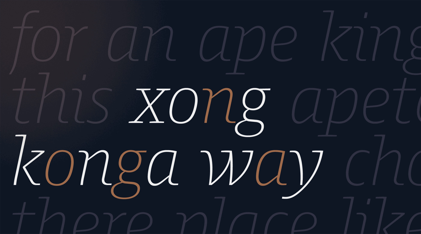
Along with unpretentious slanted oblique characters (g, o, x), the Italics include range from cursive shapes (a, k, n) and playful and expressive letters (w, y).
Of course Harrison provides all the OpenType features needed for ambitious typography: a variety of figure styles, small caps and the capitals-to-small caps feature. No doubt that it also contains broad Latin language support and a set of helpful symbols.
Harrison is not a shiny superstar, but across multiple platforms it will prove itself a skilful and useful tool — for whenever you want a modern serif that ranges between capable and casual.
Like all TypeMates fonts, Harrison Serif is available for print+web, embedding and server licensing. It’s free to test all styles on your desktop: