Complete family from € 260.00
→ FROM ⇄ LOOPS TO ⏎ LINES
▷ ▶ FROM DATA TO RESULT ░


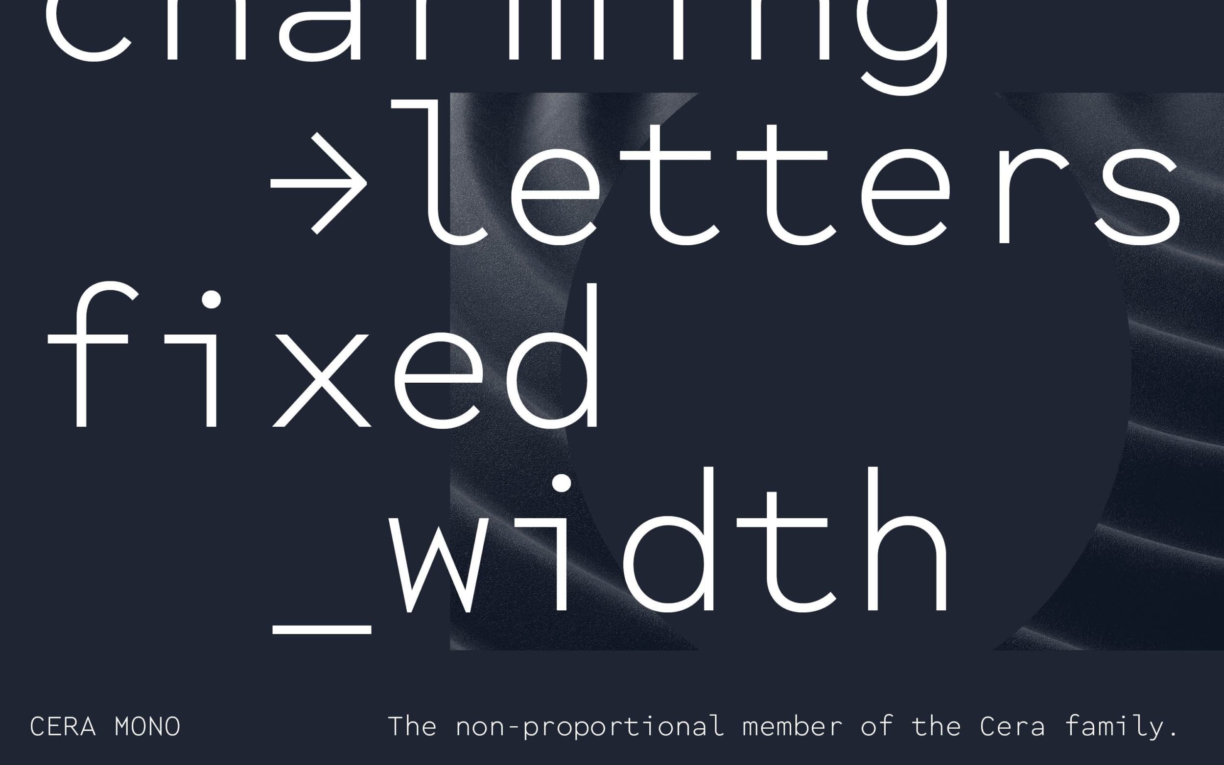
Cera: redefined. With a fixed width for all characters, Cera Mono is the non-proportional companion to our warm, geometric workhorse Cera Pro.
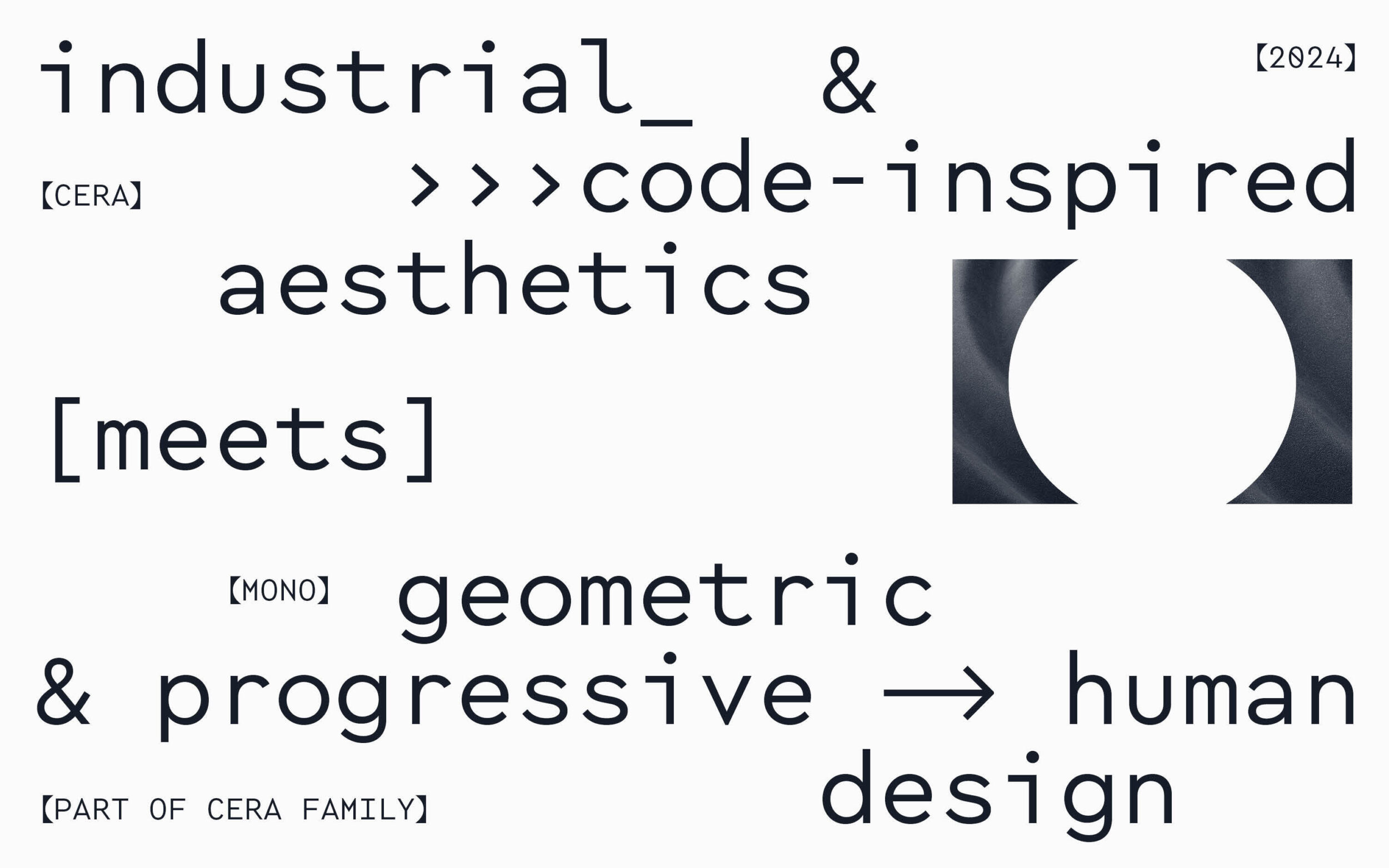
Cera Mono brings a human voice to code-inspired aesthetics. With a technical texture, controlled dissonance and inharmoniously balanced shapes, Cera Mono pairs the ‘undesigned’ qualities of typewriter fonts with geometric focus. In artistic and cultural contexts, the resulting bureaucratic and slightly glitchy texture gives its light weights expressive power while for those that generate value from code and data, its utilitarian design and carefully-selected spectrum of six weights can refine the noisiest data into information.
With a fixed-width defined by an almost-perfectly round lowercase o, Cera Mono brings Cera’s circular emphasis to a utilitarian uni-width typeface. The results give a new tone of voice to Cera’s elementary shapes. True to Cera Pro’s approachable attitude, narrow letters such as a l and i are not mechanically stretched to become monospaced but use the momentum of their outstokes to adapt to their new spacing.
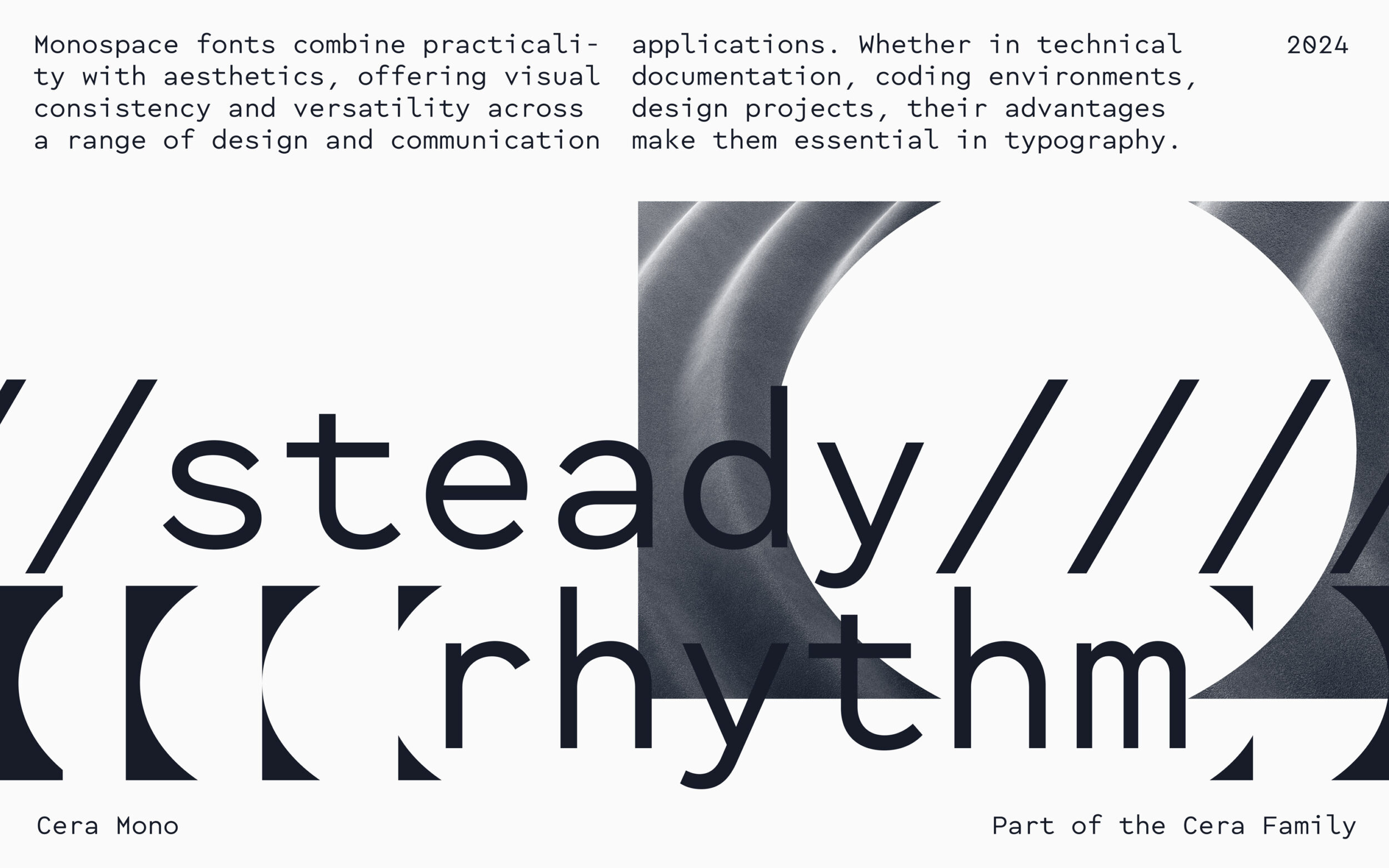
Suggesting raw data and industrial qualities, Cera Mono is well-suited to no-nonsense typography: equipment manuals for hovercraft, captions in industrial material exhibitions, visualising the data from volcanoes, and technical documentation for deep-sea farming.
Cera Mono is a fixed-width typeface, but it’s not fixated. For a less raw typographic texture and more balanced whitespace, activate Stylistic Set 15. Narrow characters like l and i now sit on half the space of their companions: maintaining a monospace flavour and providing a better reading experience.
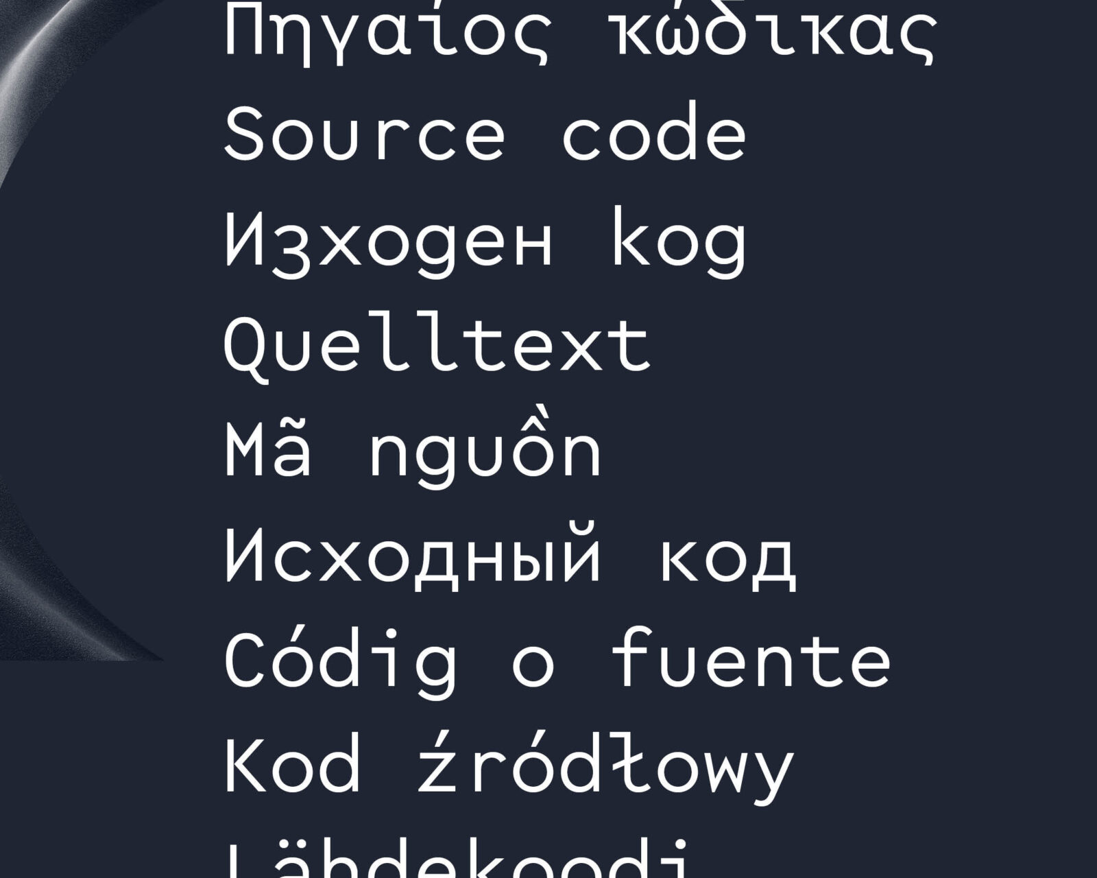
Available in six weights, with useful arrows and an extensive range of geometric symbols, the pan-European Cera Mono supports around 270 languages in the Latin, Cyrillic and Greek scripts. With 1,270 glyphs per style, it cares about localised letterforms and is approved by native consultants.
The Cera Collection is driven by pure geometry including the bestselling Cera Pro and its space-saving counterparts, the fixed-pitched variant Cera Mono, the stencilled enhancement Cera Stencil, a truly hand-crafted display Cera Brush and soft, machine milling inspired Cera Round.
- Designed by
-
Antonia Cornelius, Jakob Runge
in 2024 - Consulting & Help
- Ilya Ruderman & Yury Ostromentsky, Irene Vlachou
- Specs
- Providing 6 styles and weights, more than 1,270 glyphs per font
- Formats
- otf and ttf for desktop and apps, plus woff and woff2 for web
- Tags
- SansMonospaceHeadlinesBody TextInterfaceIdentitySignageLatinCyrillicGreekVietnameseGeometricCleanFriendlyVariable FontDuplexSuper Family
- Related Typefaces
- Cera Pro, Elma, Piet


Styles
- Thin
- Light
- Regular
- Medium
- Bold
- Black
Character Set
Language Support

Cyrillic: Abaza, Adyghe, Agul, Avar, Azerbaijani, Balkar, Belarusian, Bosnian, Bulgarian, Buryat, Chechen, Crimean Tatar, Dargin, Dargwa, Dungan, Erzya, Hill Mari, Ingush, Judeo-Tat, Kabardian, Kalmyk, Karachay, Karakalpak, Kazakh, Khinalugh, Komi, Komi-Permyak, Kumyk, Kyrgyz, Lak, Lezgian, Macedonian, Meadow Mari, Moksha, Moldovan, Mongolian, Montenegrin, Muslim Tat, Nanai, Nogai, Northern Yukaghir, Russian, Rusyn, Rutul, Serbian, Southern Altai, Tabasaran, Tajik, Tat, Tatar, Tsakhur, Turkmen, Tuvan, Udi, Ukrainian, Uyghur, Uzbek
Greek: monotonic Greek