Mosca Icon Set
As part of Mosca GmbH’s redesign, we collaborated with design strategists klee.steinberger to develop a system of 60 icons true to Mosca’s guiding principle: non-stop performance.
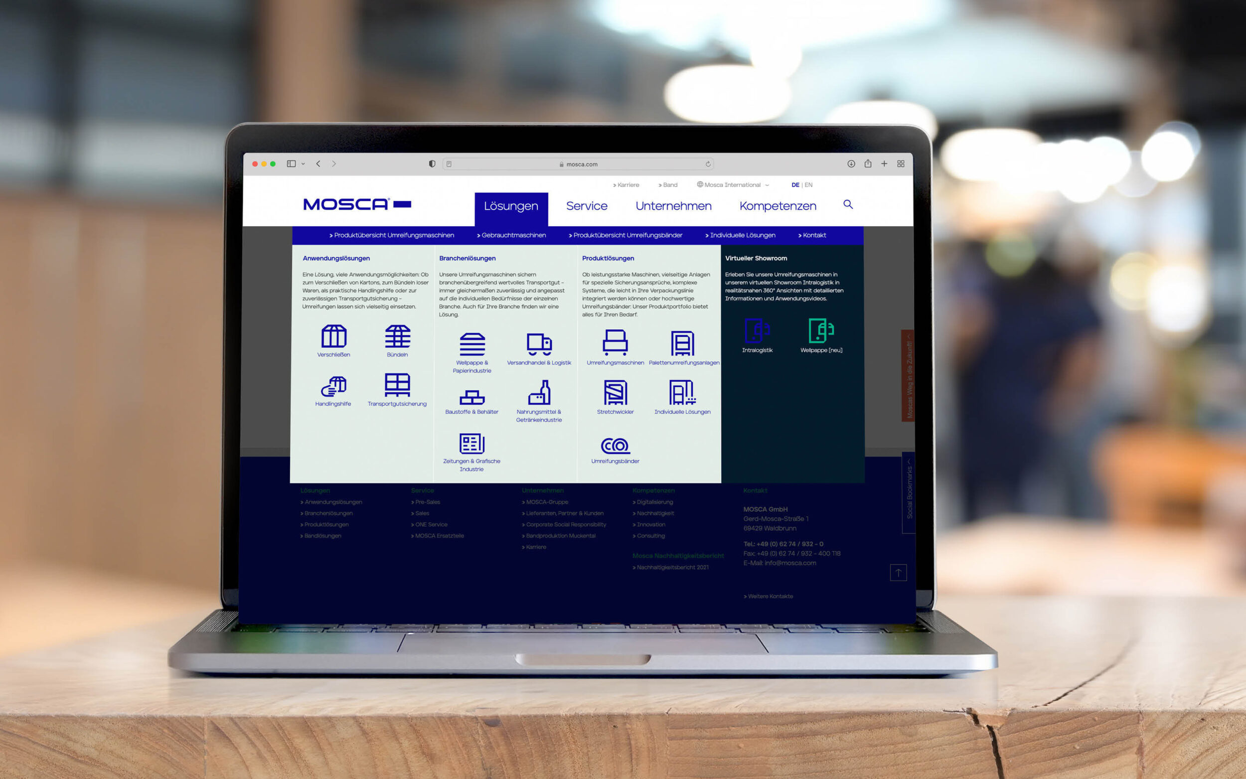
Mosca develops intelligent packaging systems tailored to individual needs and workflows. Their process is reflected in the brand story: instead of working extensively with photos or detailed illustrations, the two lead designers opted for the clear and systematic language of icons.
The brief for the icons was defined by the new Mosca font. Drawing on the peculiarities of the black style and a brand-defining folded corner, we applied its visual language to around 60 icons and created a number of process-specific variations.
Whether used as an organising icon or a striking illustration, the 60 icons fit seamlessly into Mosca's design language of tomorrow and reinforce the brand's emotional storytelling in a systematic environment.
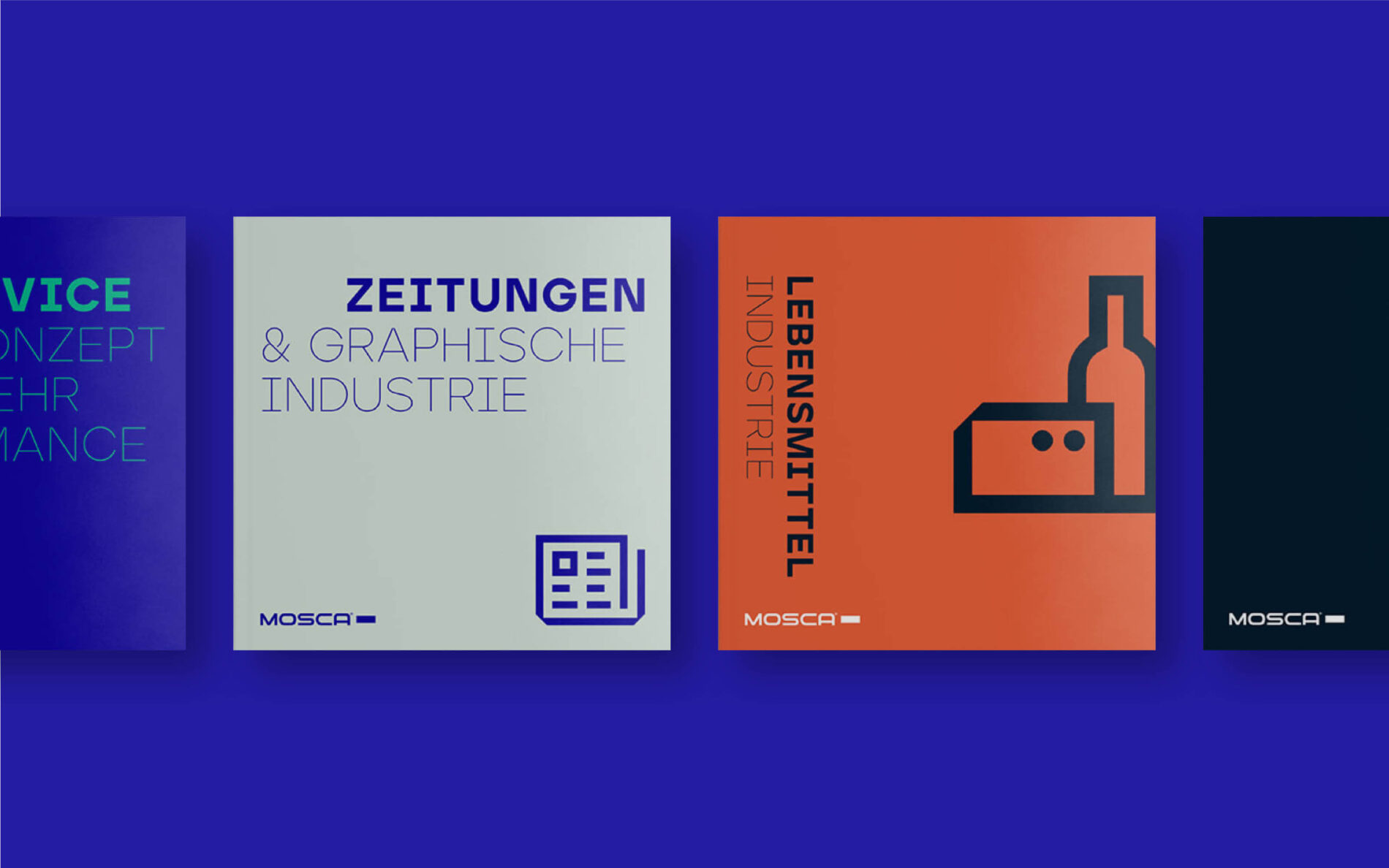
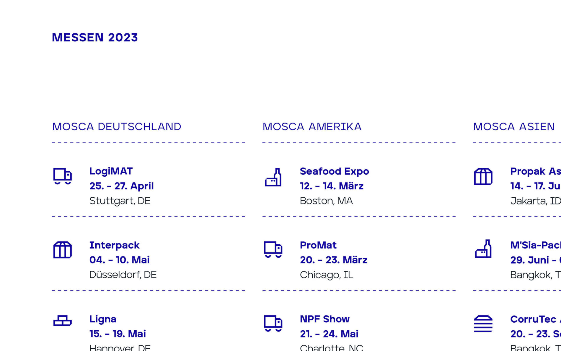
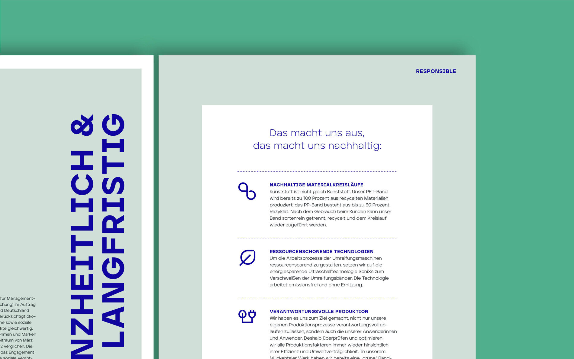
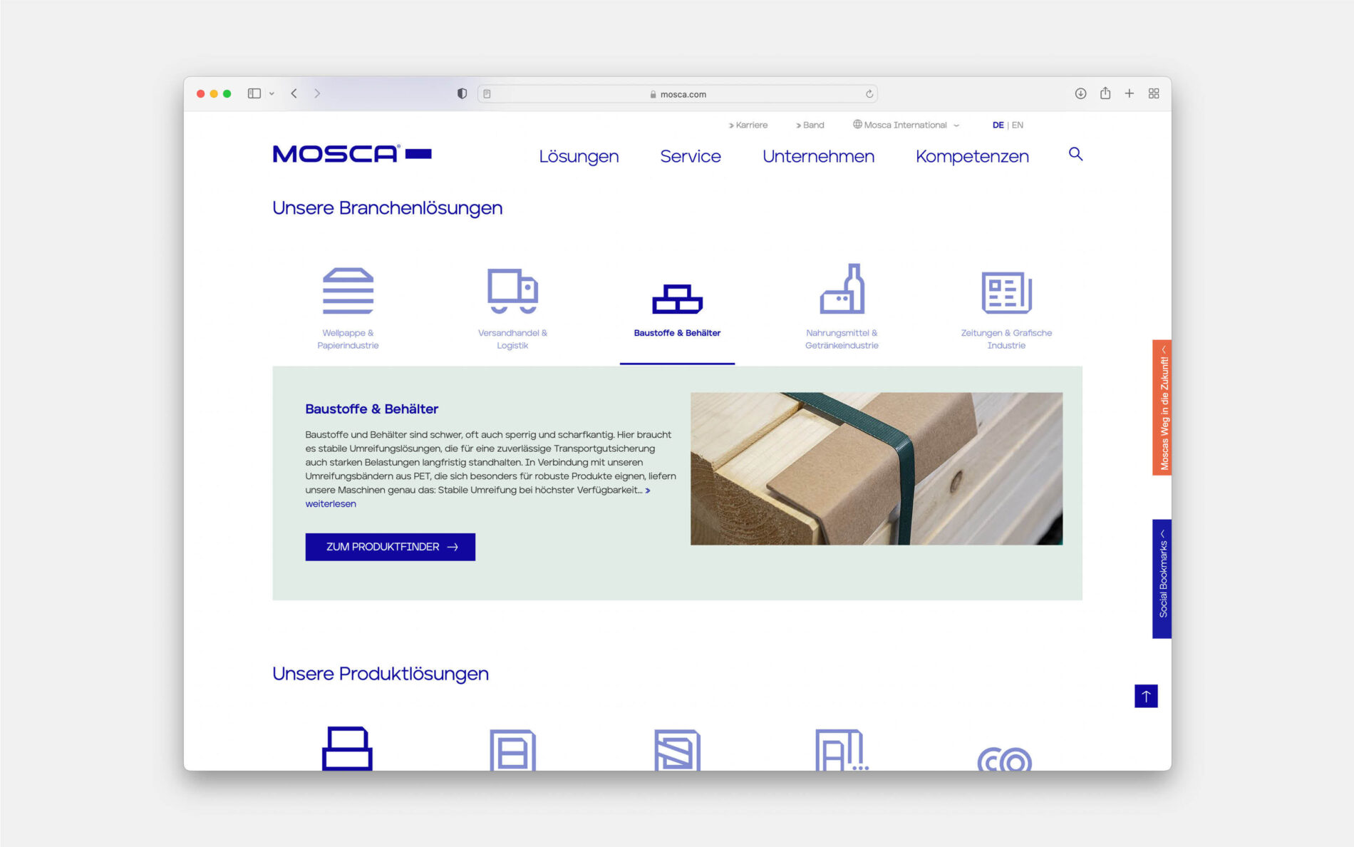
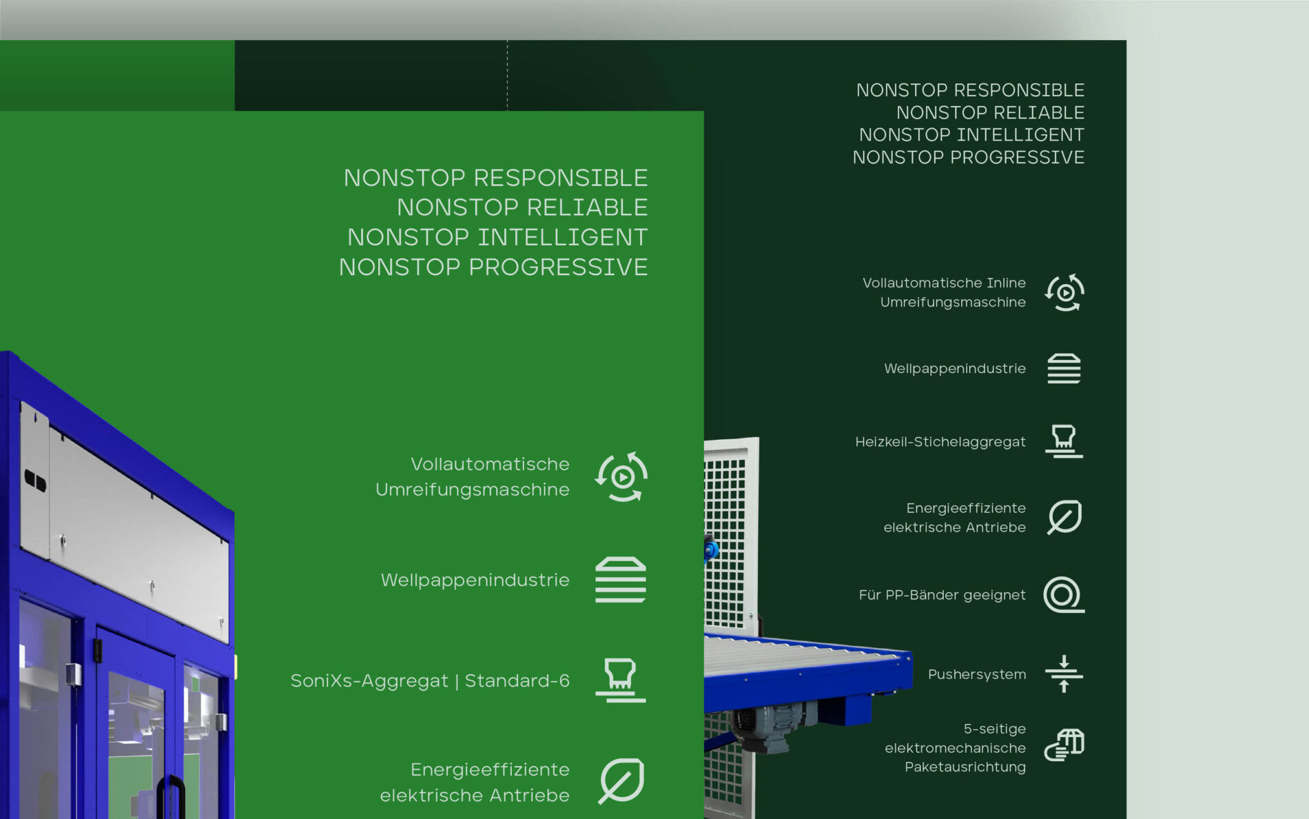
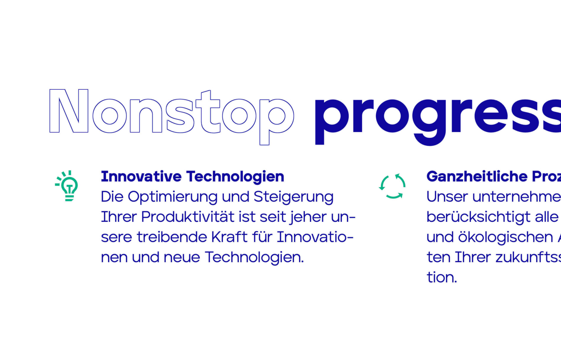
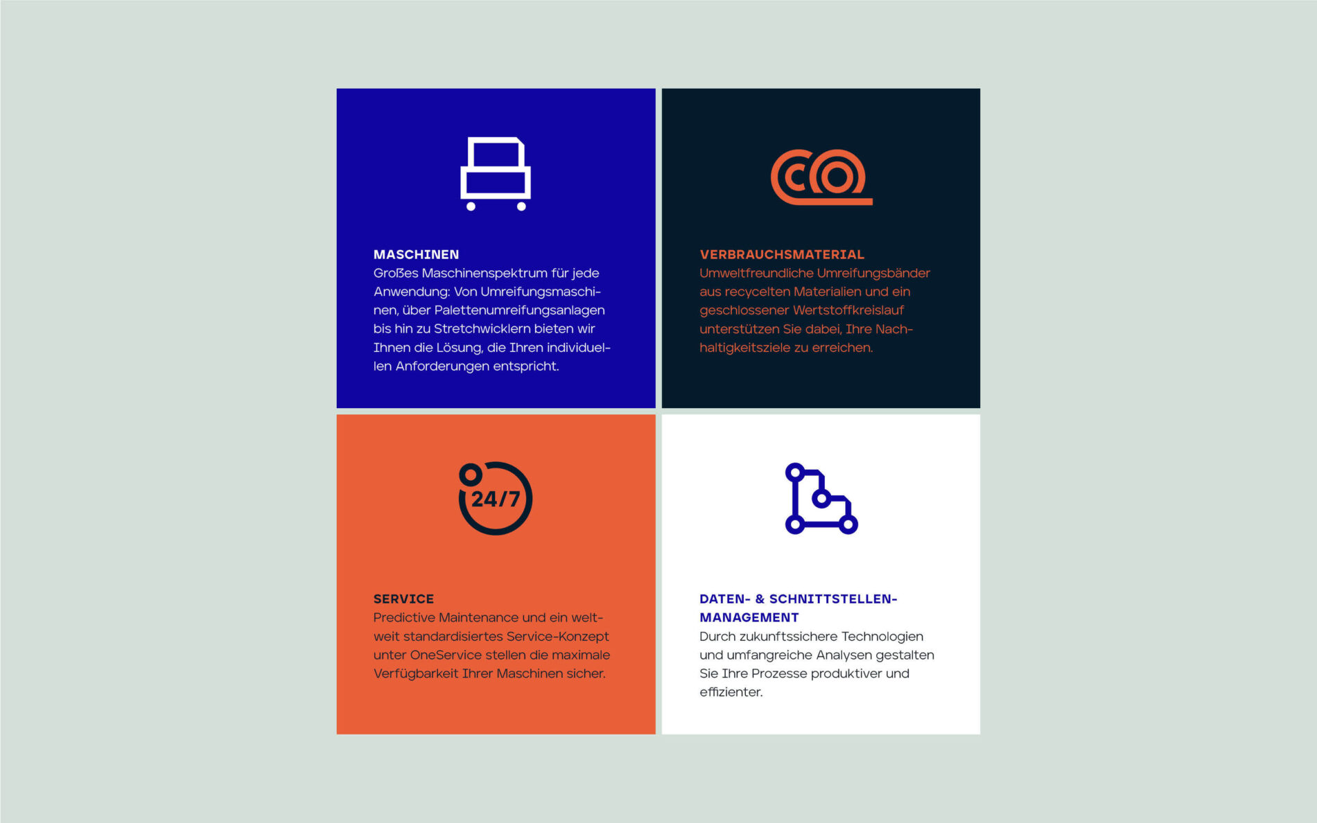
Brochures and images from Im Neuland Agency
Nonstop process
The Mosca house font inspired the design of the icons. While some were solved with a few drafts, others, like the icon for virtual showrooms, were more challenging to translate into a focussed visual language. Simplifying high-tech machines into recognisable and minimal icons was an exciting challenge for people outside Mosca’s specialist industry.
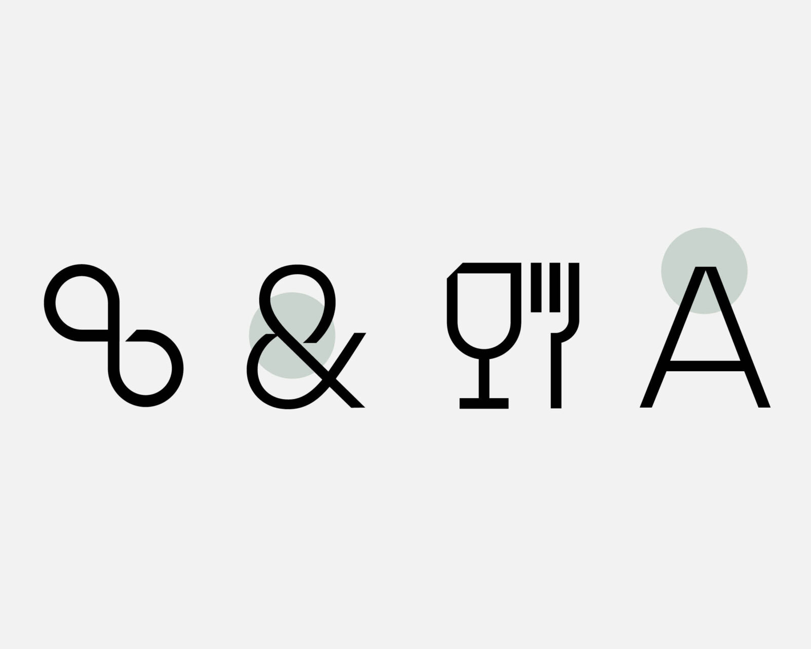
Inspiration Mosca typeface: Cut in &-Glyph, Break in the top of A
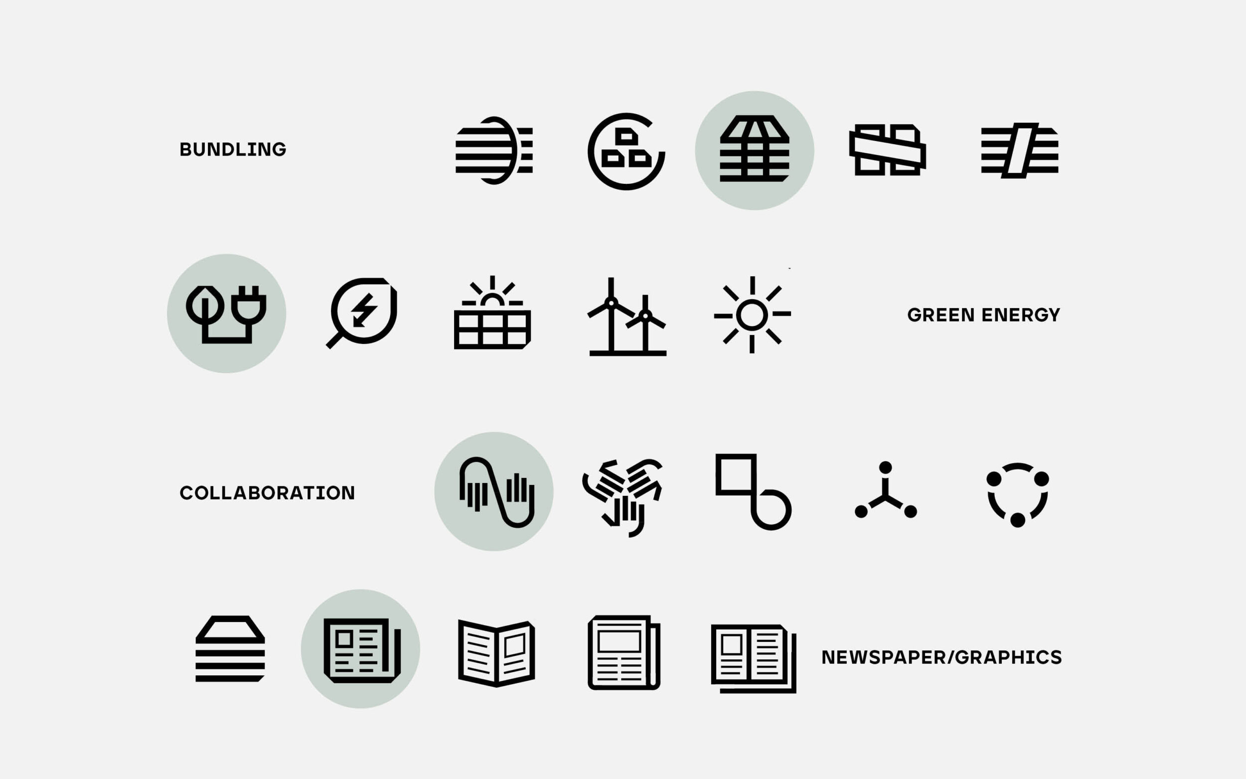
Design process: transfer themes lie Bundling, Green Energy, Collaboration und Newspaper/Graphics
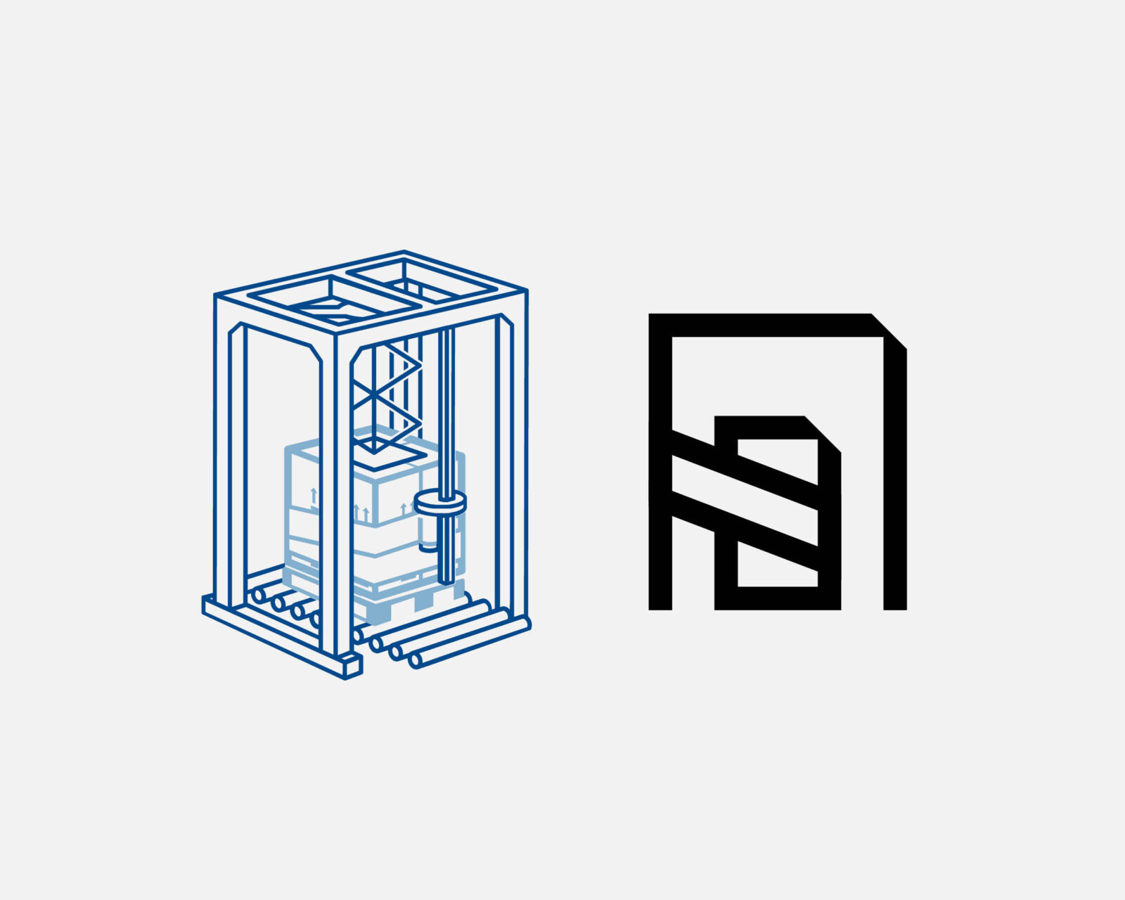
Reducing high-tech machines. The core task was to depict the key details while communicating the shape of the machine as a whole.
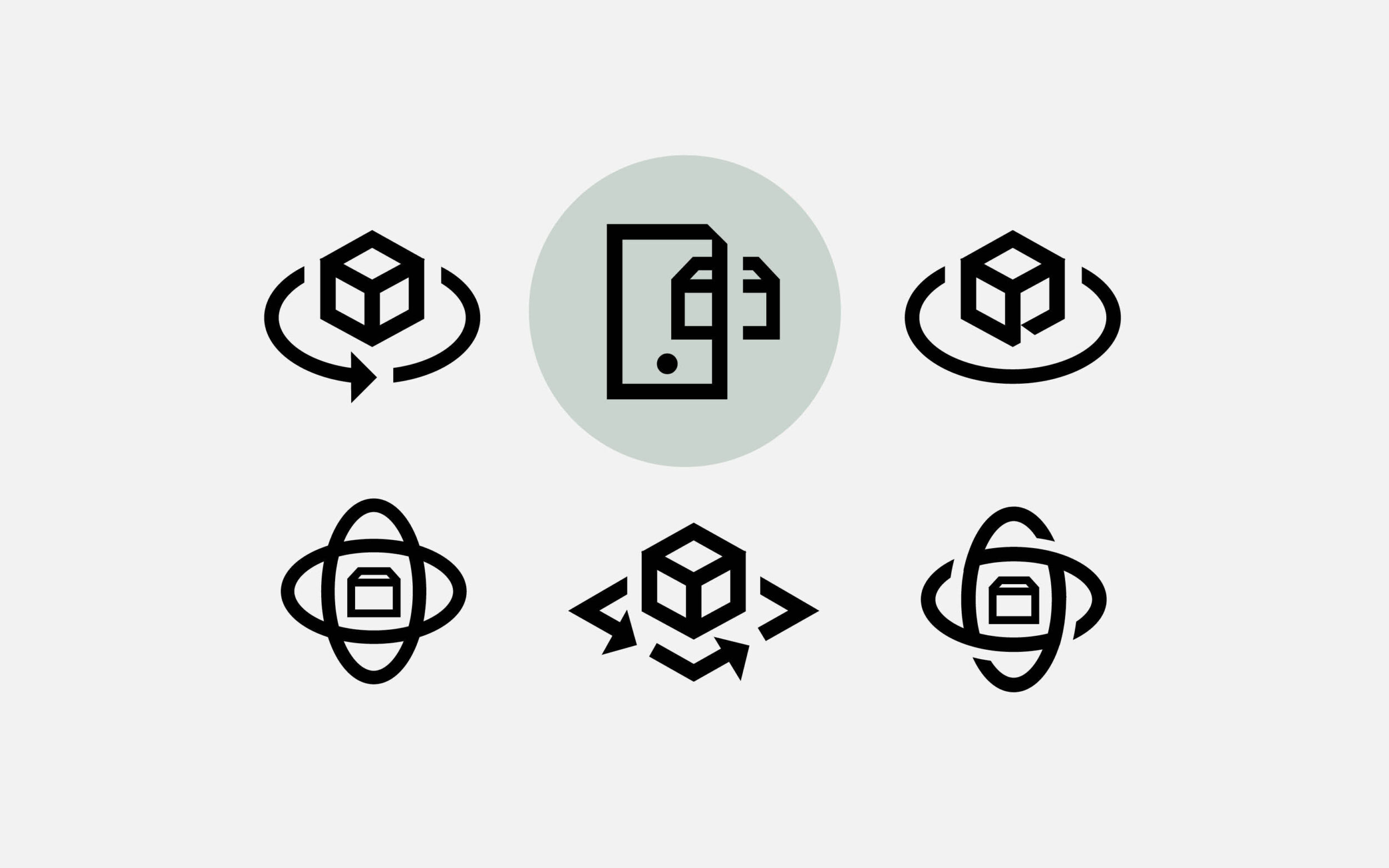
Searching for the perfect form: virtueller Showroom