Ministry for Foreign Affairs of Finland
When Mikael Kivelä, Head of Design at the Helsinki-based creative agency 358, picked a typeface for the identity of his governmental client, he already had a precise idea in mind: Cera Pro would just need some charcater tweaks and it’d be the perfect match for the Ministry of Foreign Affairs of Finland…
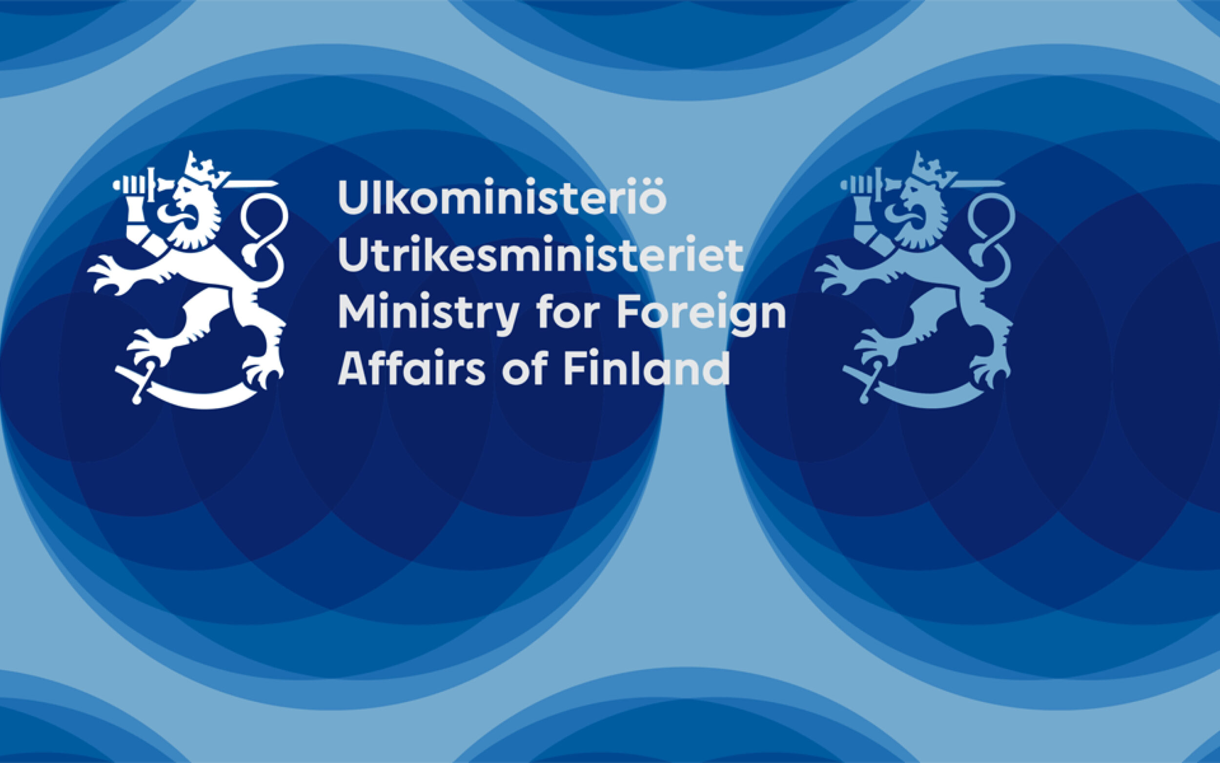
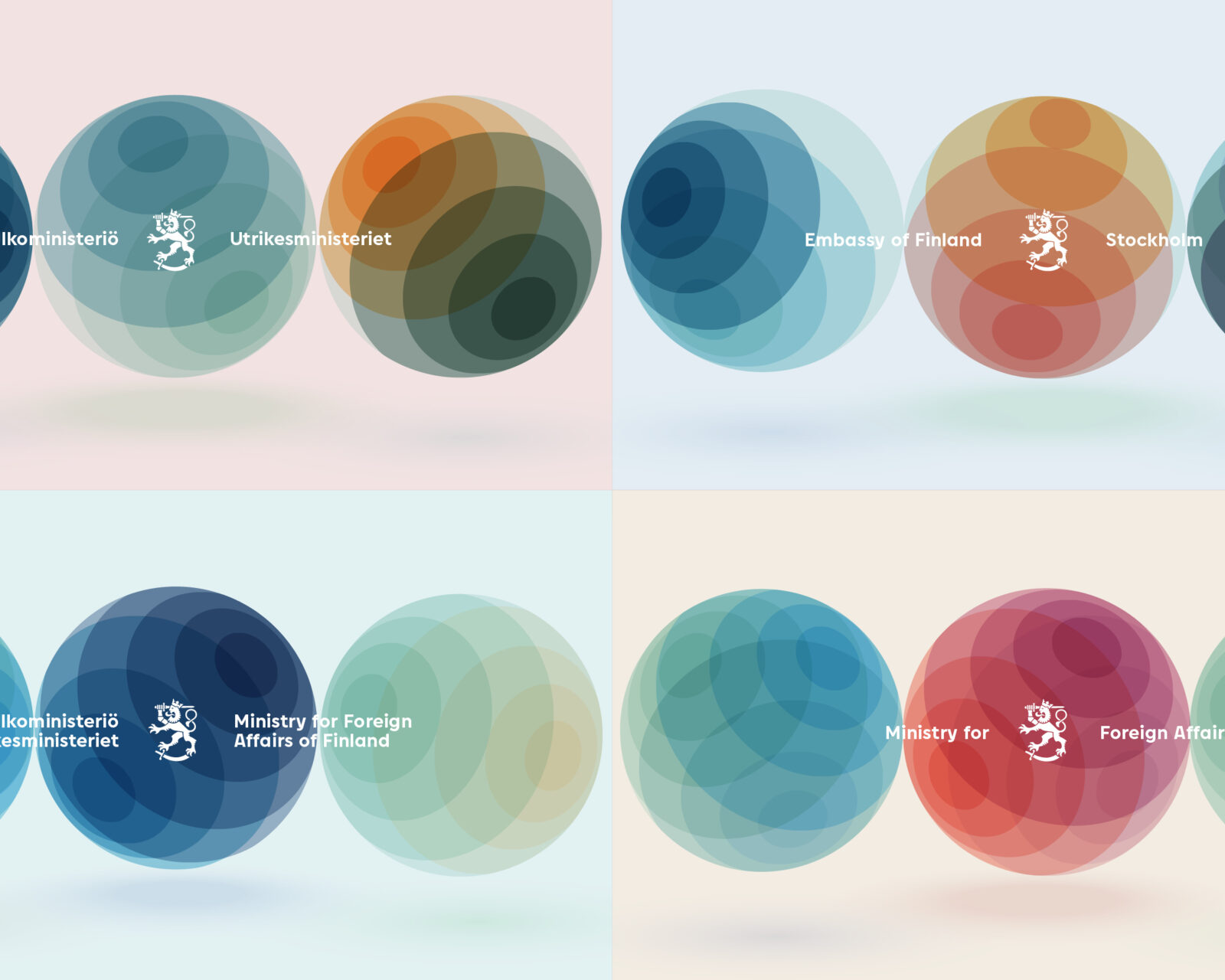
When making logos, designers like Mikael often do small modifications to the glyphs themselves, but the Ministry for Foreign Affairs of Finland didn’t need one logo. Each of their offices in hundreds of locations and countries would require their own version of the logo. Instead of drawing the 200 variations manually, Mikael came to us: with a customised font, the client could have a tool where they could generate the logos they needed.
Focussing on the bold weight only, we made a few modifications to the original typeface.
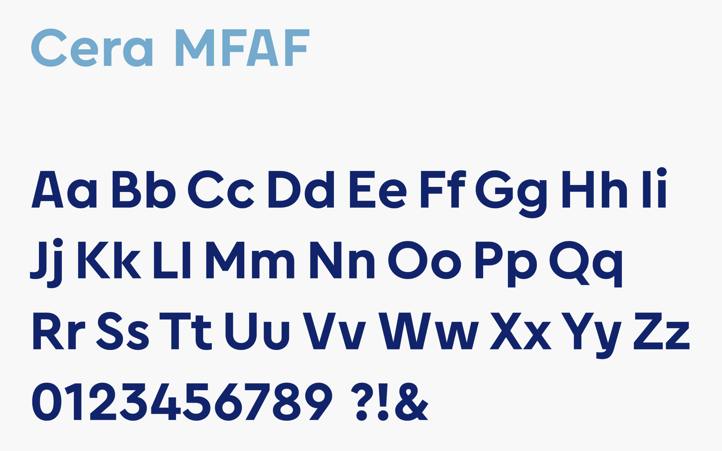
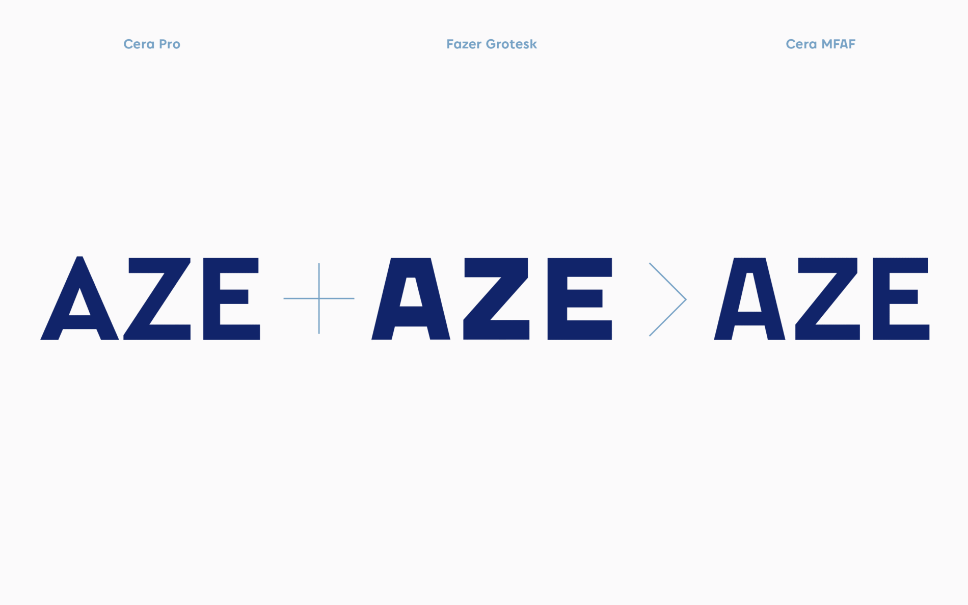
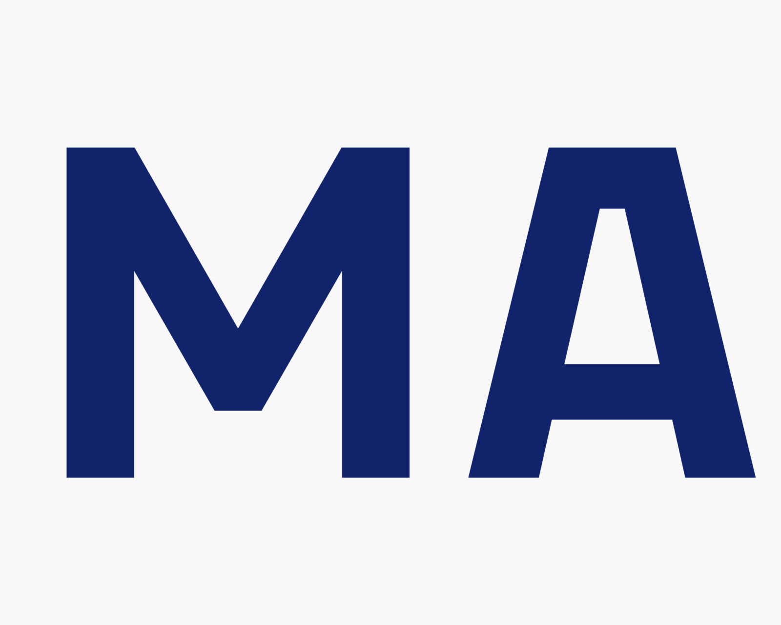
Inspired by the old signage of Helsinki’s Fazer Café the uppercase A was tweaked towards a truncated design.
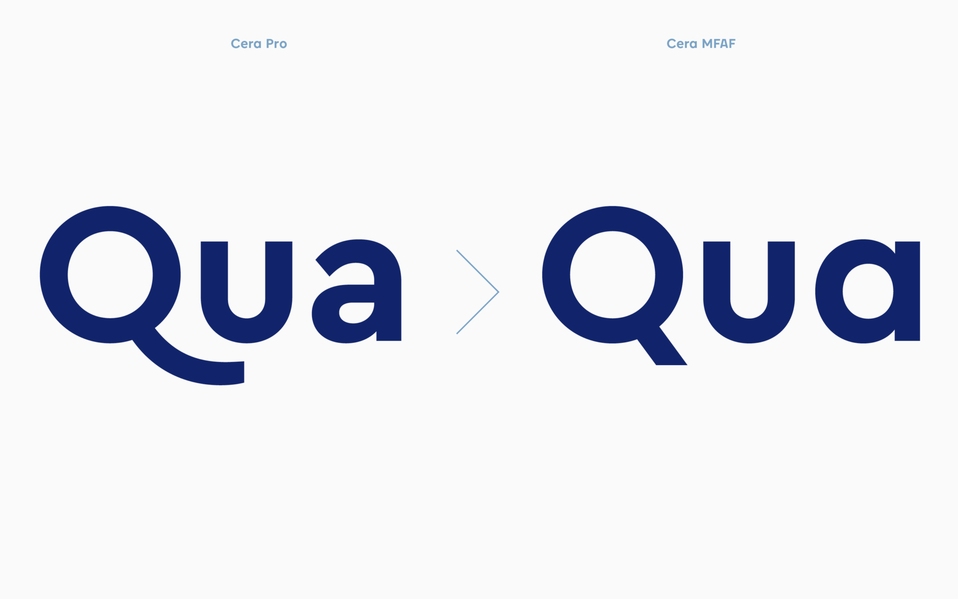
And the Q and lowercase a were modified to give the typeface a more fitting, direct and practical voice.
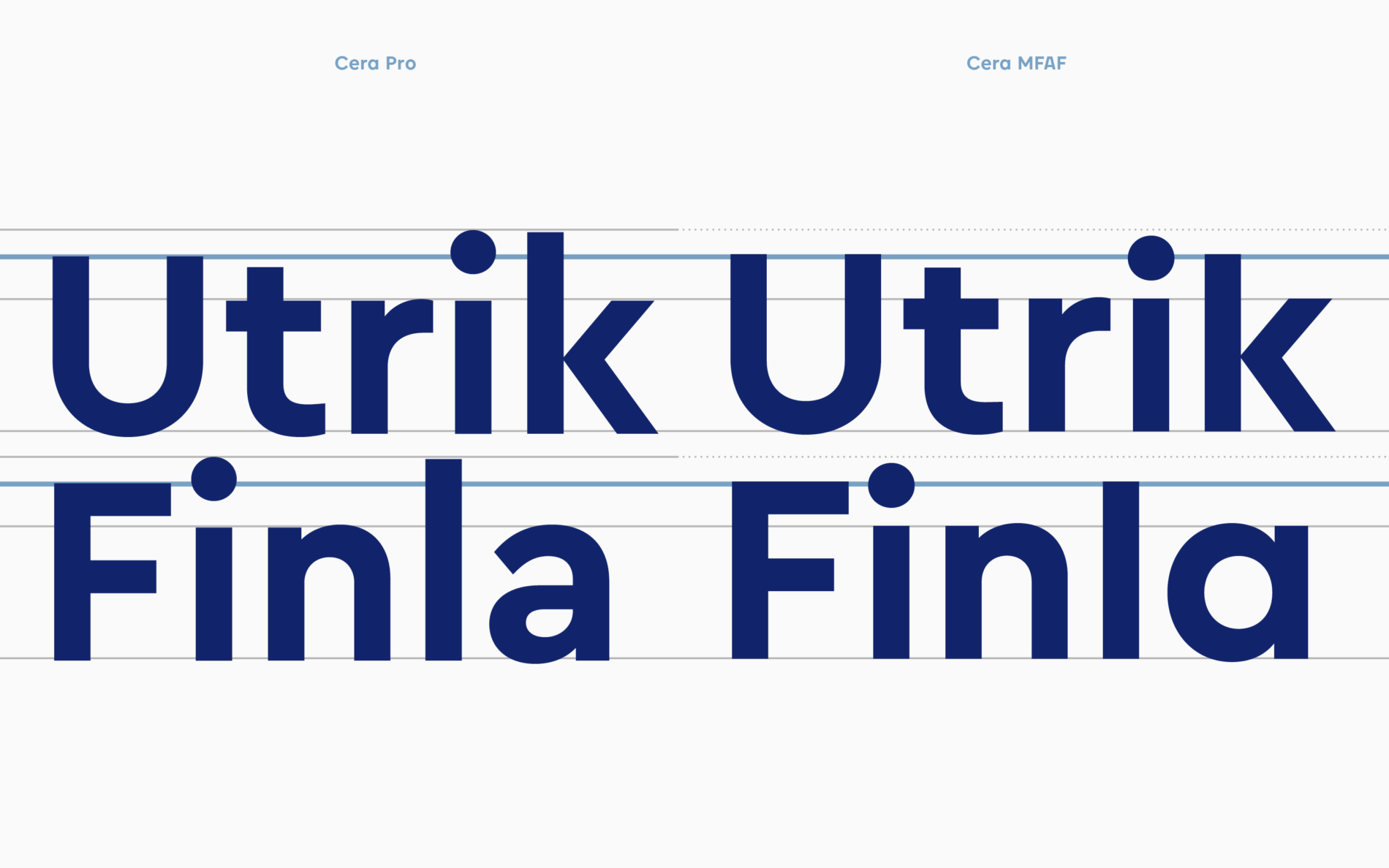
Shortening the ascenders to match the already low cap height, and adjusting the diacritics, helped turn Cera Pro into a tool for making compact logos.
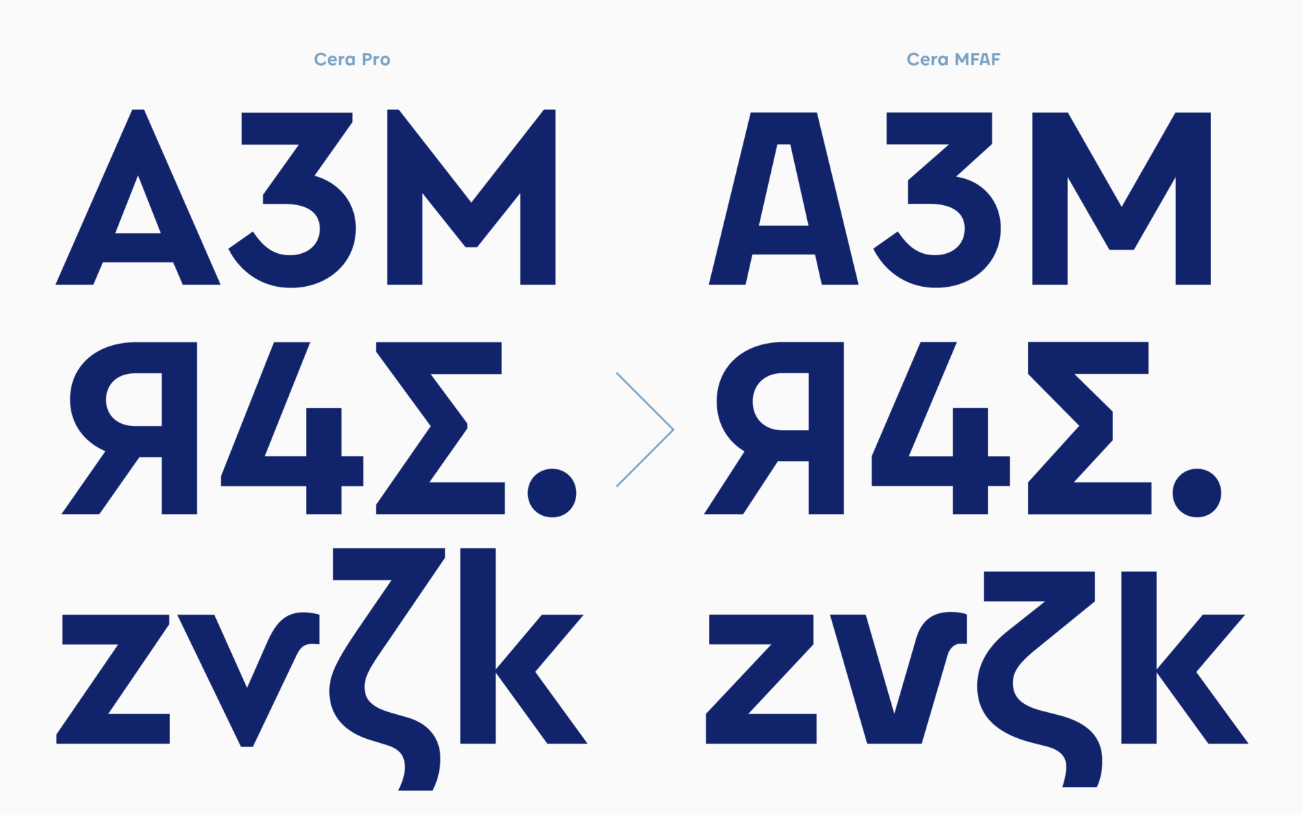
Working on the custom version, it turned out that the truncated A could be a starting point for modifying other letters, like M or k. But the wideness of the A’s top couldn’t affect the design of the other letters too much.
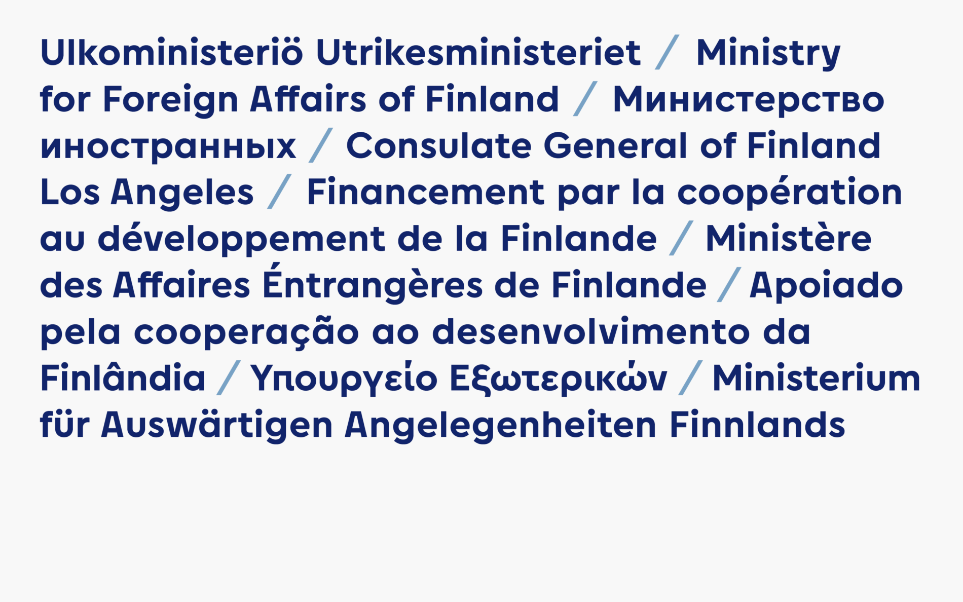
In the final version, we didn’t let the industrial become an indulgence. The peaked corners of Cera Pro have been truncated, and neither bland nor overwhelming Cera MFAF strikes a balance that mixes more conventional letters with the distinctive.
Image by courtesy of 358.
