Melbourne Festival
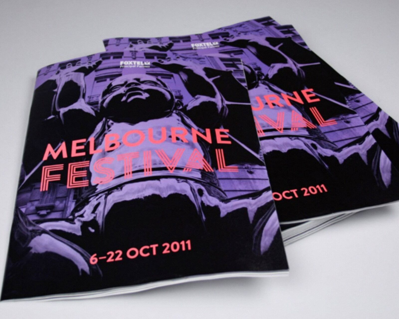
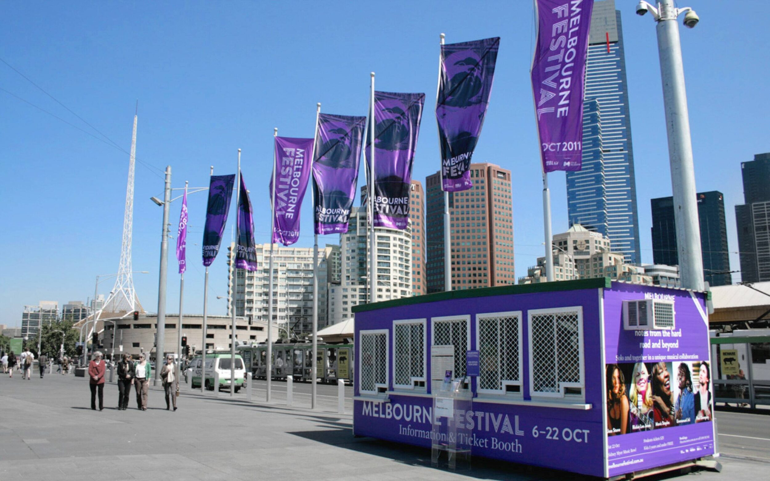
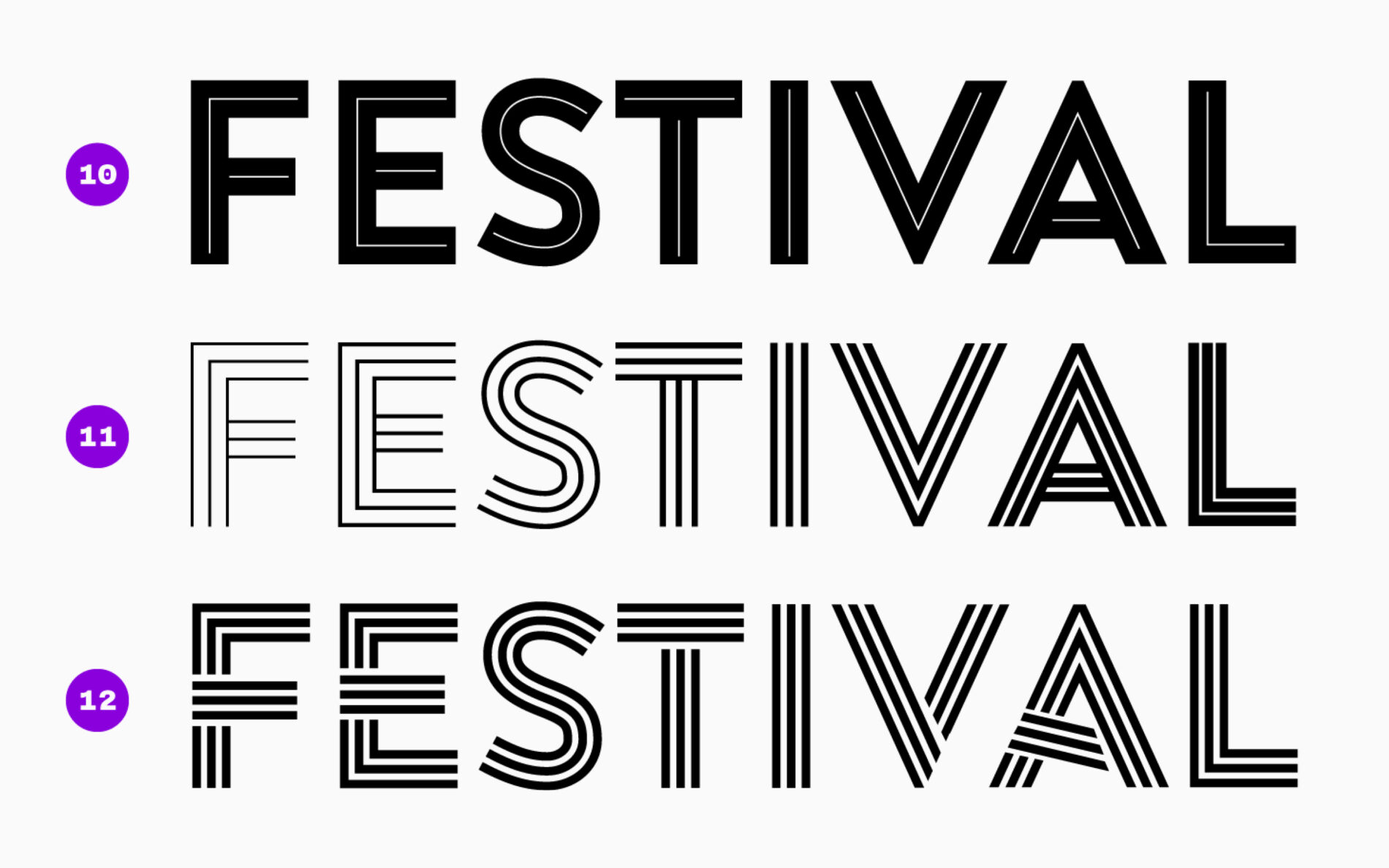
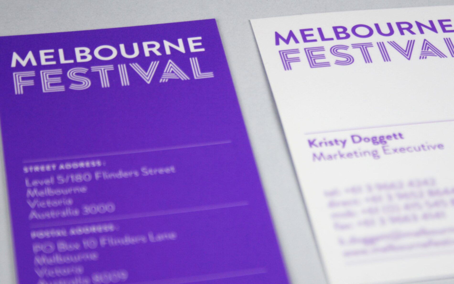
The Melbourne Festival is one of the largest art and culture festivals in the world. For the temporary identity 2011, the word mark was designed in a stripy look that strongly referred to the corporate typeface.
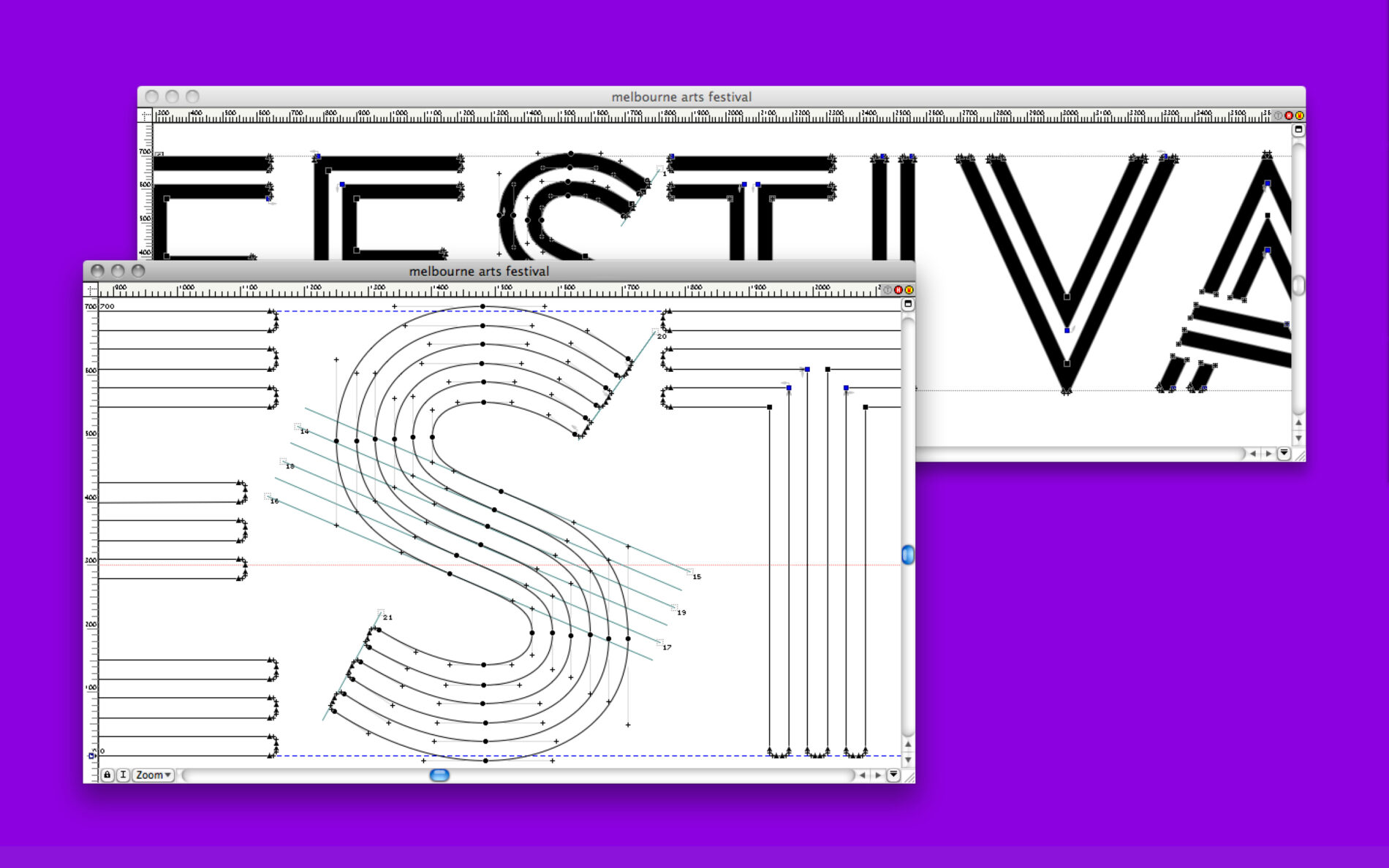
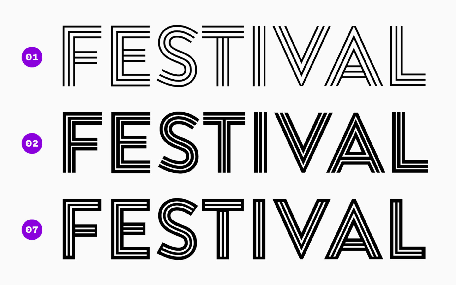
For the logo of the Melbourne Festival Dominic Forde and his team from Famous Visual Services needed a typographically fine tuning. The logo of the arts and cultural festival should —as given in a rough sketch— be implemented and optimised for a three-stripe look and referring to Brandon Grotesque by Hannes von Döhren.
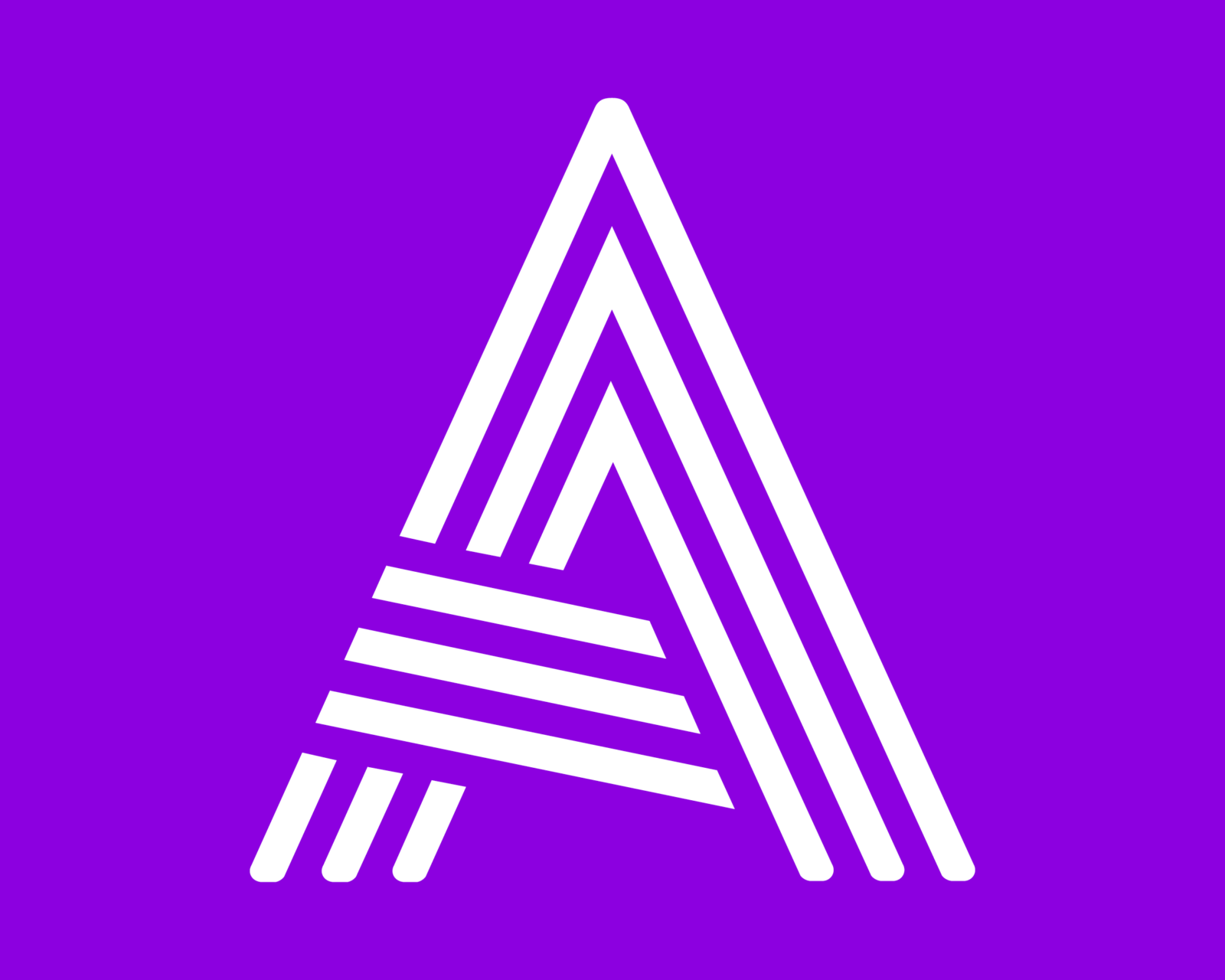
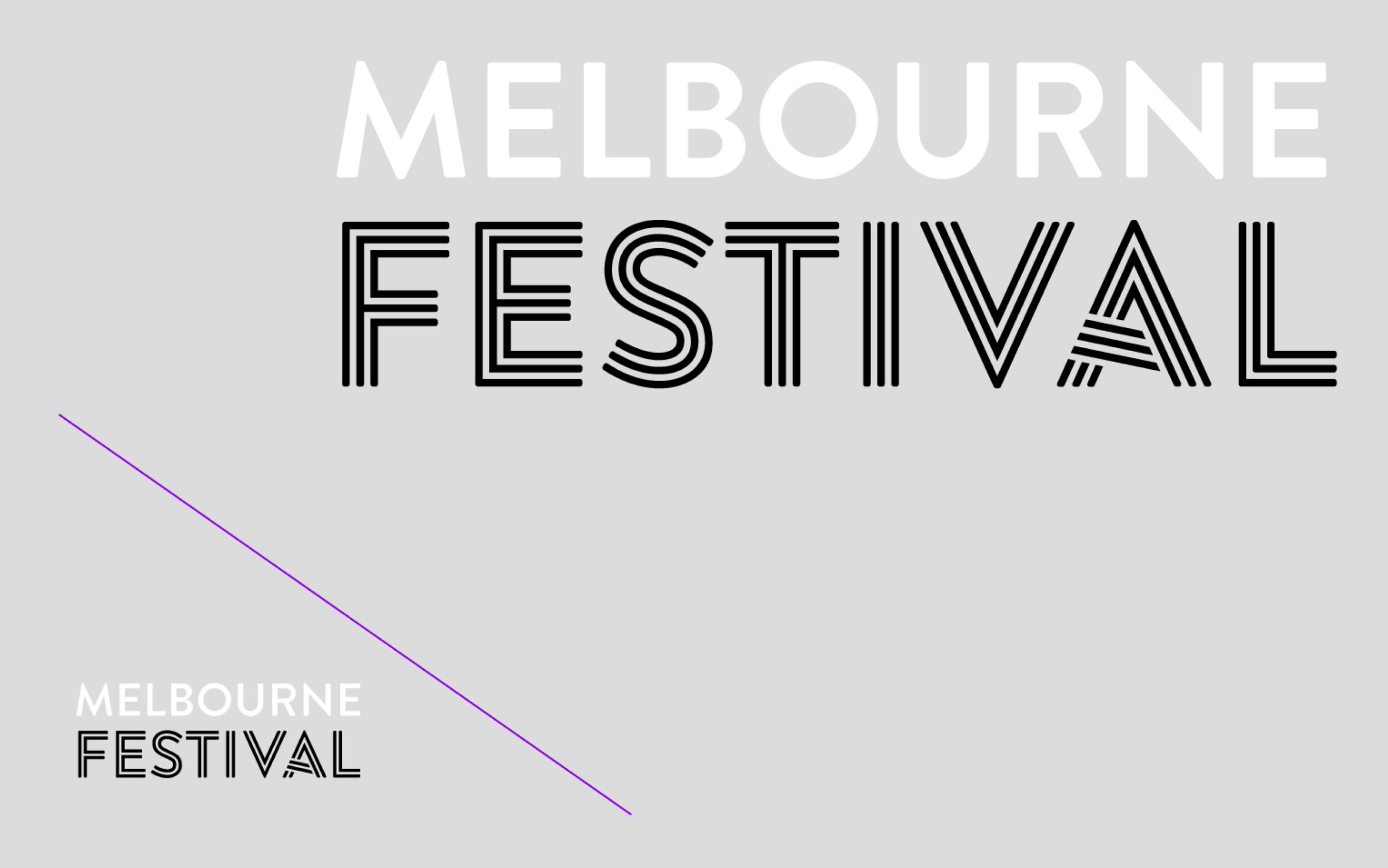
After the customer was inspired by some experimental approaches in the development process, an unusual A is exposed for the Arts in the logo of the festival. Concluding the word mark comes along with an additional micro variant. Although it no longer carries the three pillars of the festival —art, dance and music— visually, it still retains the striped character when used in small sizes with a width less than 2.5 cm.
