immo Sans
immowelt is a popular real estate portal in the German-speaking world. With a bespoke font family for all channels, immowelt uncompromisingly strengthened their corporate identity.
The launch of immowelt’s broad brand and interface redesign in 2020 also included a custom made typeface – immo Sans.
When we started with circular shapes, the lead designer Danilo Leicht and his team already imagined the typographic look for the brand. However, the team was not stuck on a certain design, but was very open to suggestions how the letters could look in detail.
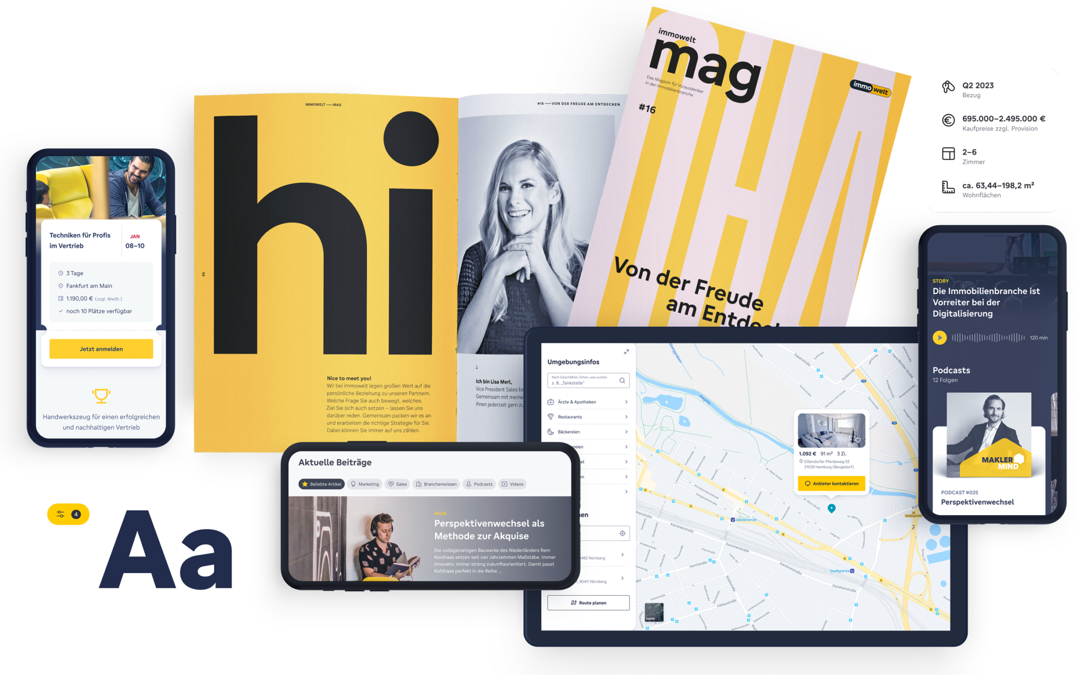
Playing collaborative ping pong by sensing demands and possible solutions led to a fresh realist Sans Serif typeface in tradition of typical American Gothics from the early 20th century. We developed an utilitarian family suited for everyday uses: circular, geometric sans yet space-saving with fundamental friendly atmosphere.
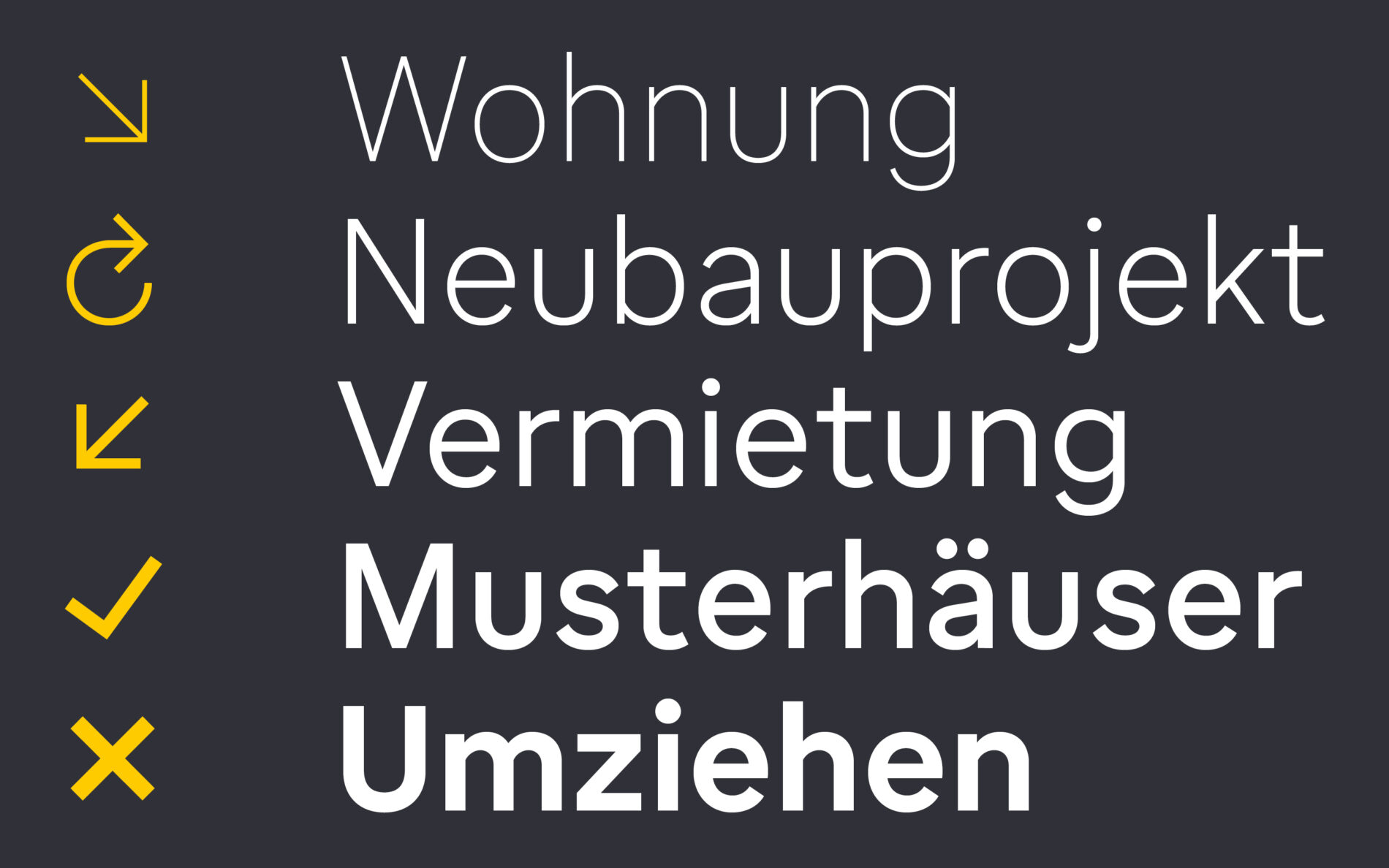
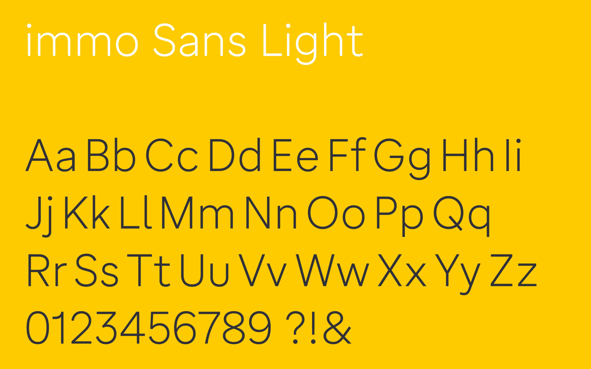
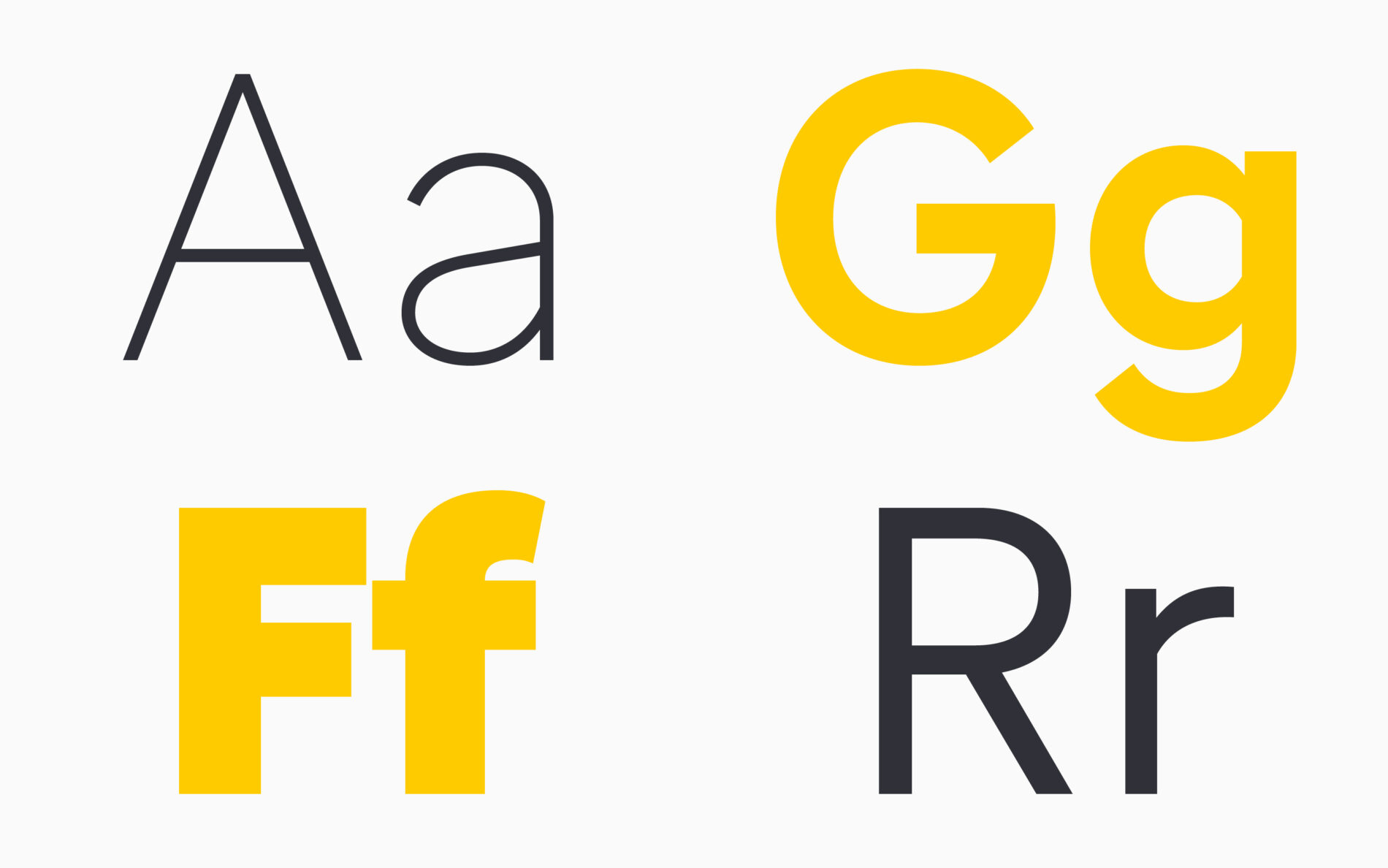
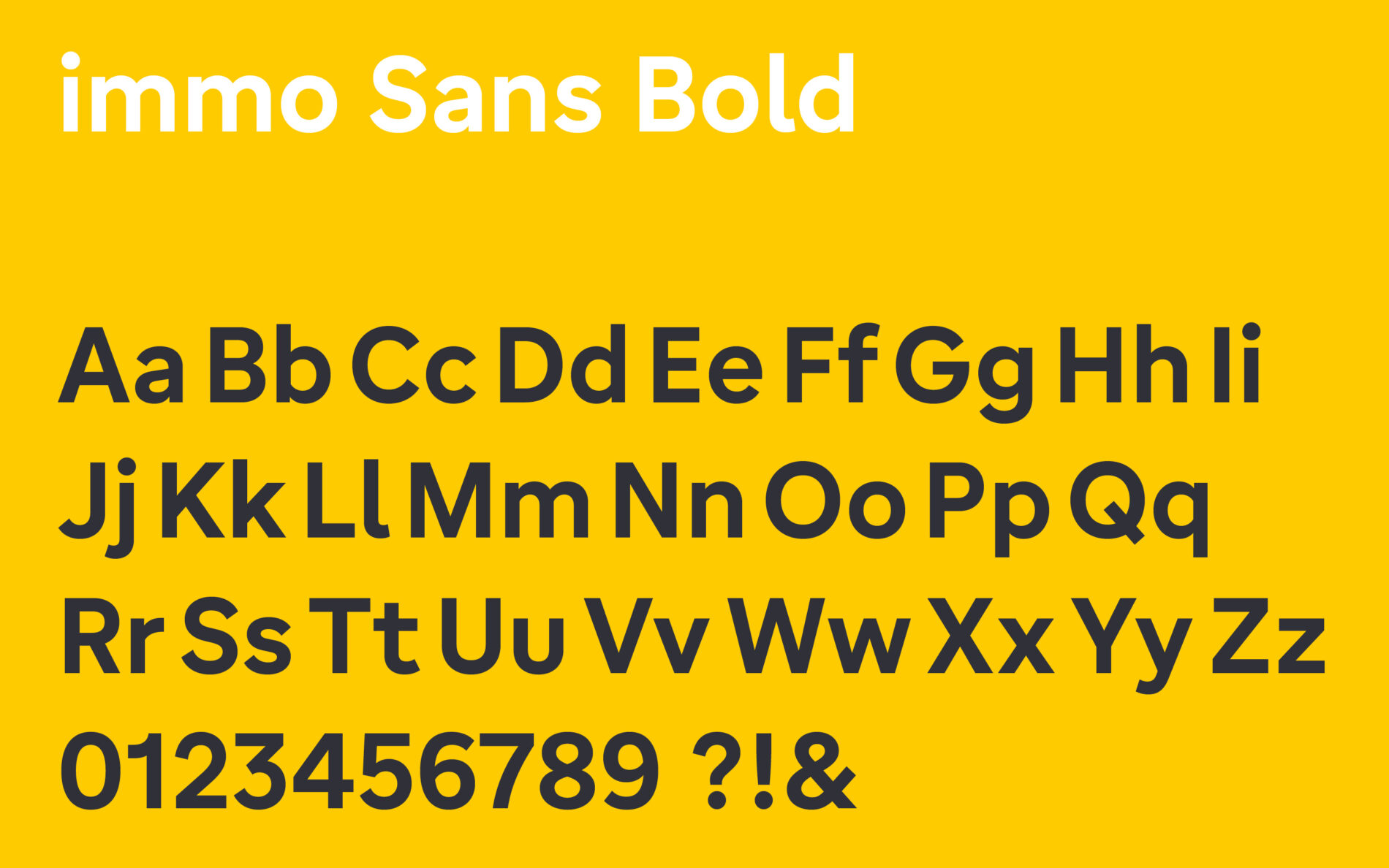
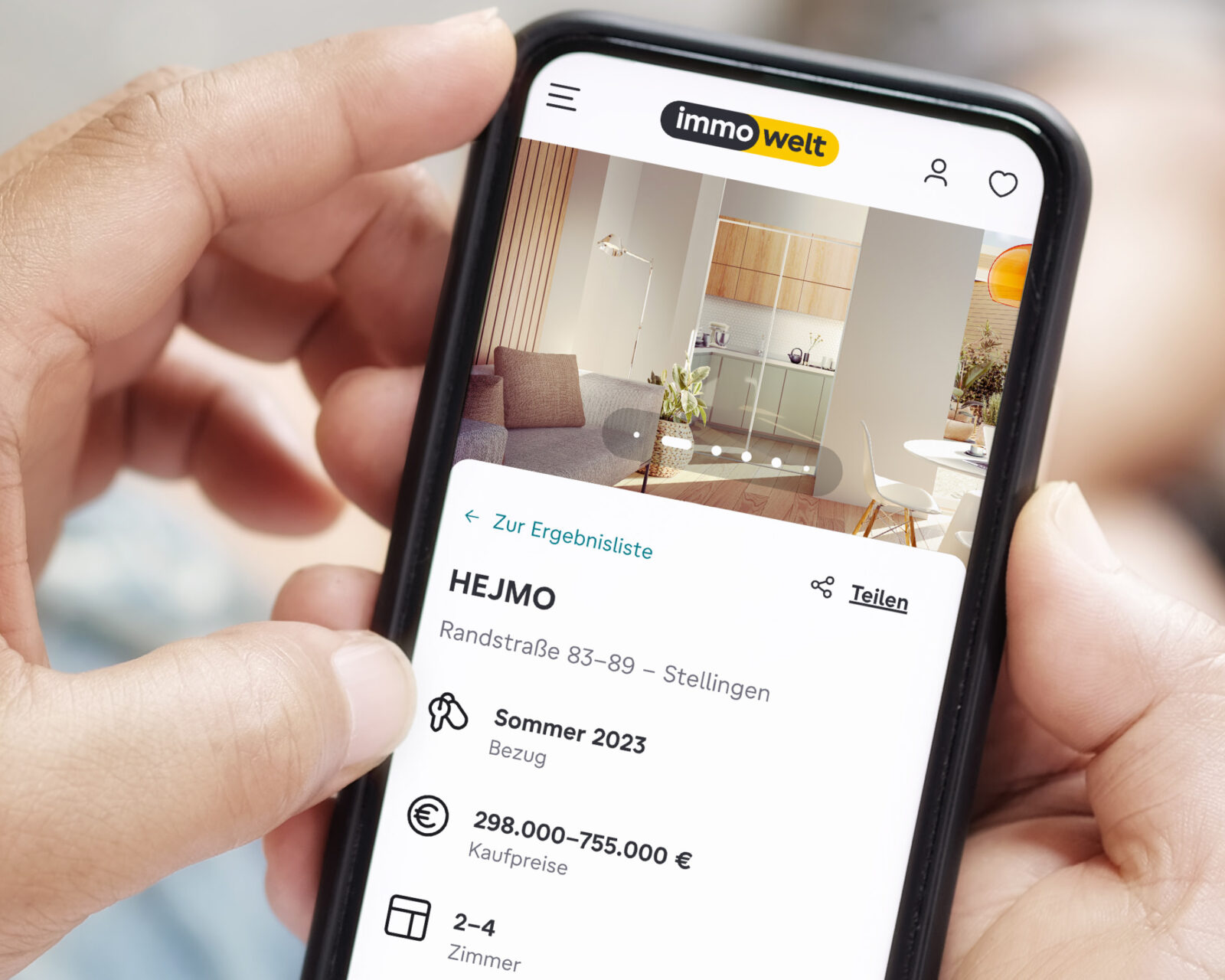
The main focus was put on text specifically for small use on screens. Anyhow, a bold and powerful voice for Heros and Headlines is brand alignment, so immo Sans has become an all-rounder, to work well in different sizes to maintain readability and usability in every usage.

Pure geometric type (left) vs. quite organic humatistic sans (middle) vs a balance of both (right)
Pivotal moment in this challenge was with the serifed l: implemented for better readability, it quickly developed into a brand-defining characteristic that transports a familiar and friendly air — for the team at immowelt this new designed letter used in the logo felt even more familiar than the actual one.
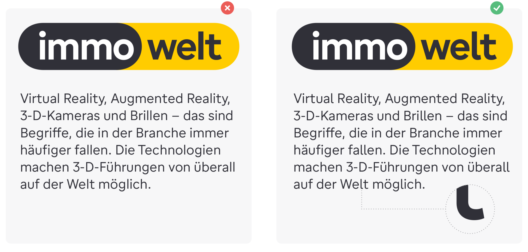
What a particular detail is capable of: logo and text with (right) and without the serifed l.
The Fundamental Framework
Shaping text for optimal user experience: even if the most important factor is the work of the interface typographer, we contributed an essential component —the typeface— and made that already in its core highly legible:

An initial design decision was the tall x-height to have a better legibility, as the white space within each letter is more visible. Larger x-heights tend to translate to easier legibility when set at small sizes. Plus balanced proportions of familiar non radial shapes with circular freshness.

Another crucial design choice was to easily distinguishable letterforms to clarify things fast for the users eye. This even boils down to little but important details like the counter shapes.

The next trick in the type architecture derived from challenging usage of figures within the text for real estate announcements: when combined with uppercase letters the figures perform best at capital height, when standing out as a group, the figures then appear too large in comparison to most lowercase minted text. Therefore ascenders of lowercase are designed to top the height of capitals. But just a bit, to keep a fresh and contemporary impression.

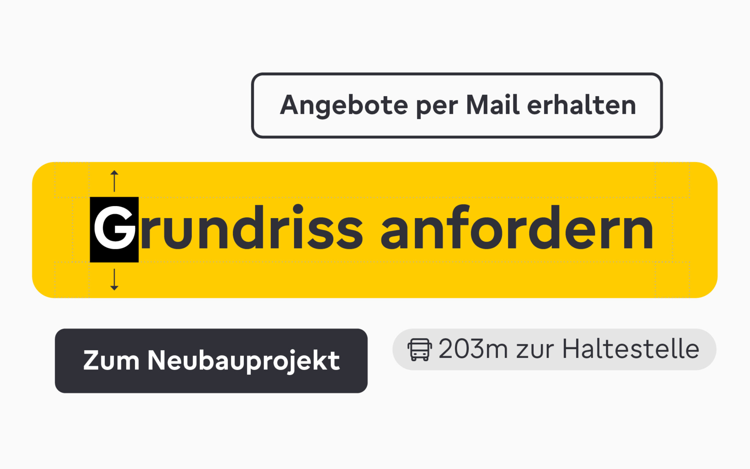
Last but not least, for UI a well centered vertical alignment in buttons is worth a mint. Tweaking the vertical metrics allows time-saving out-of-the-box use without having to adjust top or bottom padding individually.
Full Family Flexibility
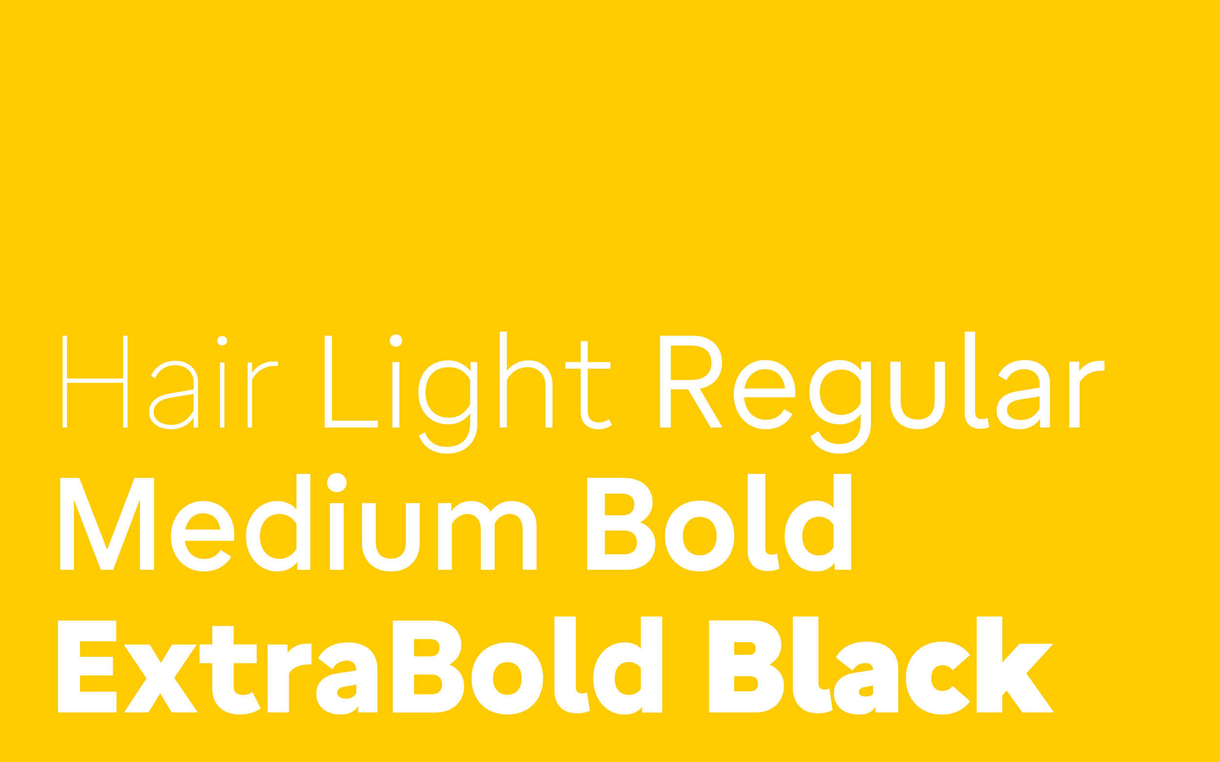
To create hierarchy, immo Sans features a spectrum of seven styles from extreme Hairline to Black. On screen, the more robust Light and less swamping ExtraBold represent the comparable mix. And, of course, Regular and Bold for text. The Medium weight, in many cases poorly treated, somewhat superfluous, makes absolute sense here: for UI a Medium is a great alternative for the Regular when it is used, usually quite small sized, as button copy, or if the Bold looks too fat.

immo Sans has wider tracking to improve its readability. The increased letter-spacing focuses on Regular and Medium weights that are most relevant for text.

Increased letter-spacing (on the right) improves readability significantly.
Unconventional but Appropriate
Together with the client, we implemented some design features in immo Sans that might be wrong for retail but are totally right in a custom tailored design:
The figures are slightly too condensed in comparison to the letters. But for mobile-first layouts that feature a lot of figures in portrait mode, e.g. prices and square footages, they’re balanced to fit the typeface and simultaneously become as space saving as necessary.
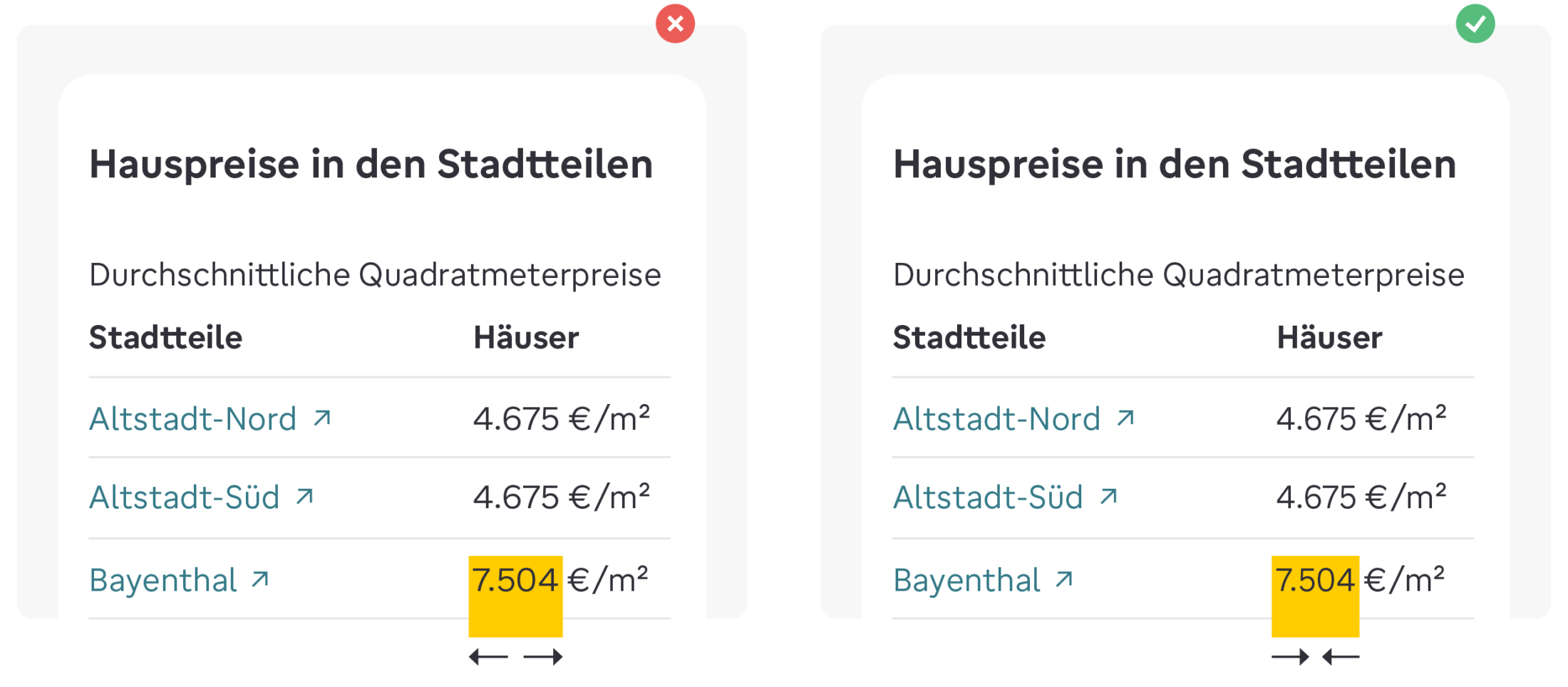
What is properly derived correctly (left) does not always have to be the right solution (right).
The Regular is kept quite light. On purpose. Together with the design team, it took us several reviews to find their ideal grey value. However, no problem at all, as it performs well in the interface plus has all its adjoining styles in balanced accordingly to make the family’s weight system work.
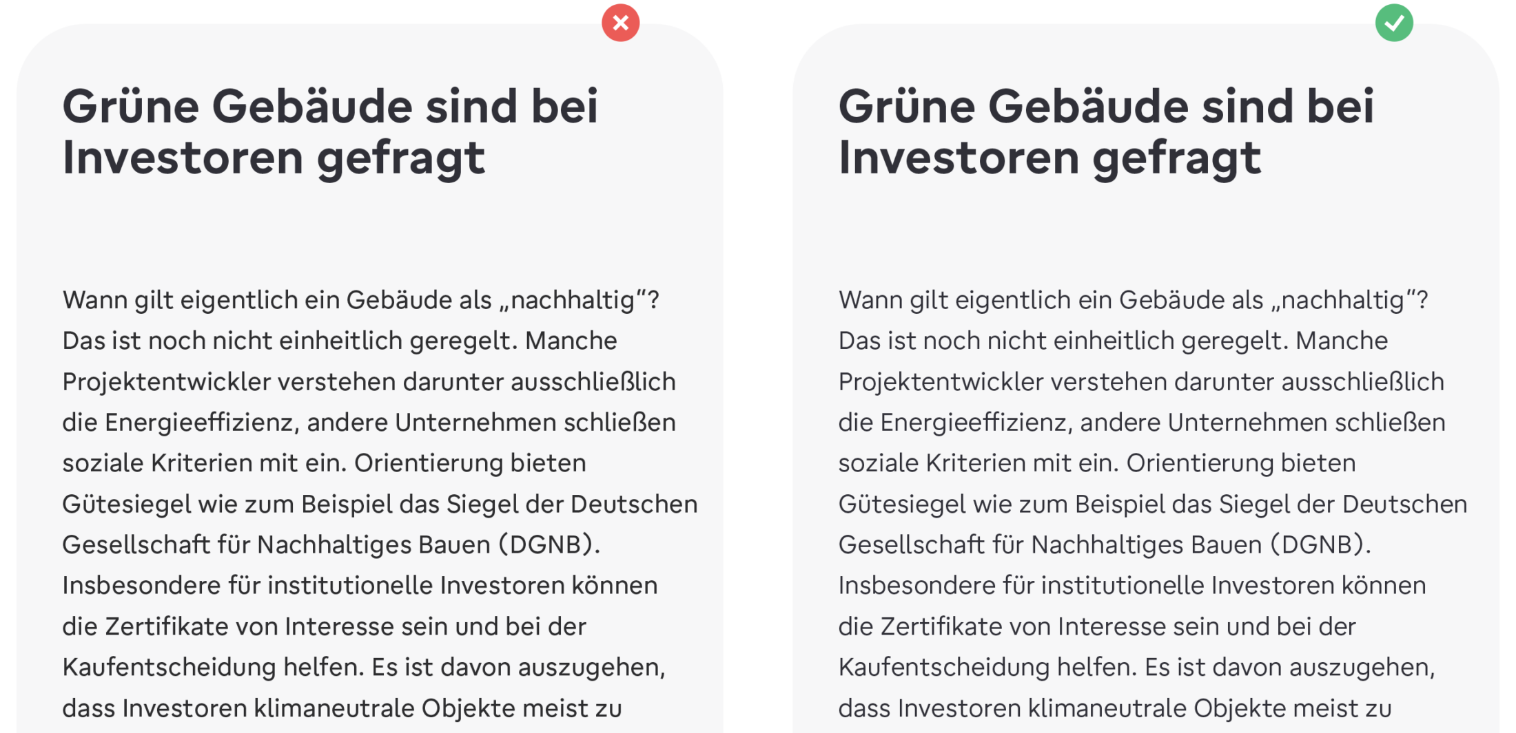
The light body text typography creates a sense of ease.
Pixel Proof Performance
As the brand is the UI first, there is no question of additional hinting to a screen centered typeface design. With the expertise of Christoph Koeberlin we tried and tested an appropriate rendering of the fonts on screen: Smooth rendering PostScripts for display weights and more manually tuned TrueTypes for styles that are meant for text. This screen optimisation even is so elaborated to perfectly preserve generous x-height and semi-circular look and feel.

For low-res screens a reader-friendly design is not always satisfying: additional hinting controls the rendering of the font to pixels perfectly (on the right).
Extra Treatment of Logo
While we were working at the corporate type, we helped with a bespoke logo as well. Adding a more circular touch to the logo than in custom font to to better refer to the rounded outer shape. With shortening the ascenders we created a more compact logo appearance. At last we put an optical emphasis on the word “welt” within the brand name.
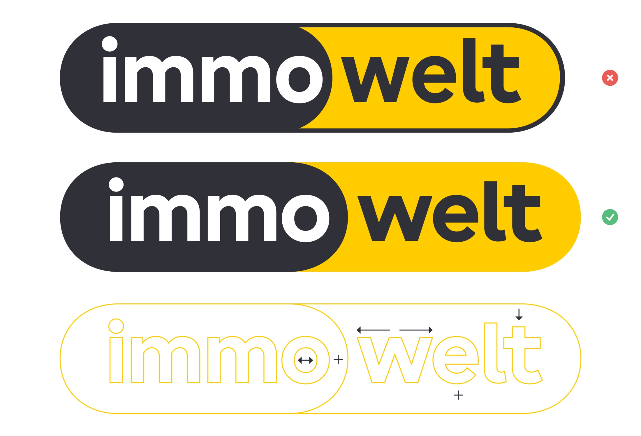
Logo with new typeface applied (top) and how we helped to improve the logo (middle).
One Family, One Look
The previous design situation was a clear and geometric typeface for print and brand, substituted by a humanist Sans for screen. Now these inconsistencies are resolved and joined together in one family, one look: an all-rounder typeface with legible architecture, stylish geometric traits plus a familiar and friendly air. A custom font family that is key component of all branded communications, transfering the brand values to the smallest entity, the letters.
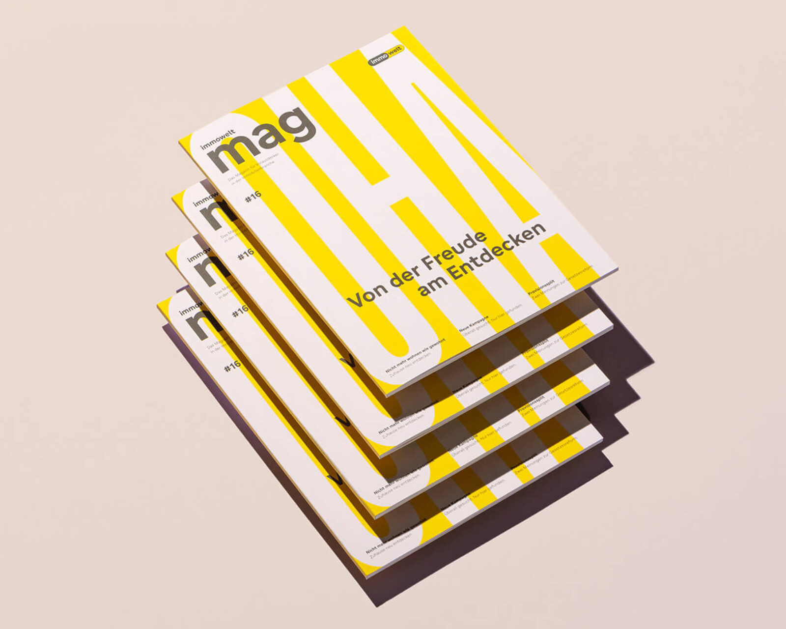
immowelt Magazine by EIGA
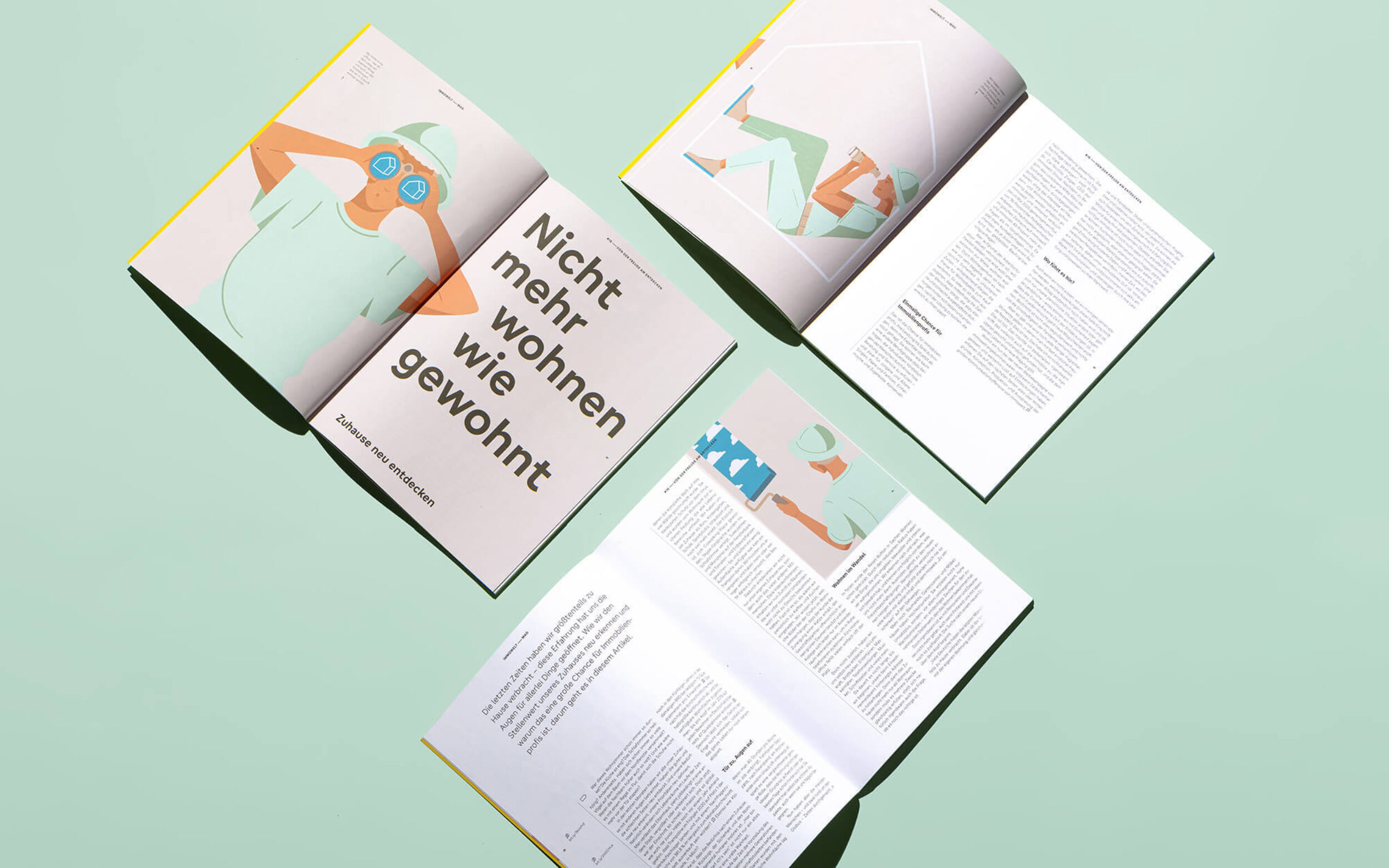
TypeMates have 200% met the mission of bringing brand and UI together.
This family is licensed under an unlimited Enterprice licence which is allowing immowelt to use it in the most flexible way. We truly love those projects: design and usage flexibility combined in one.