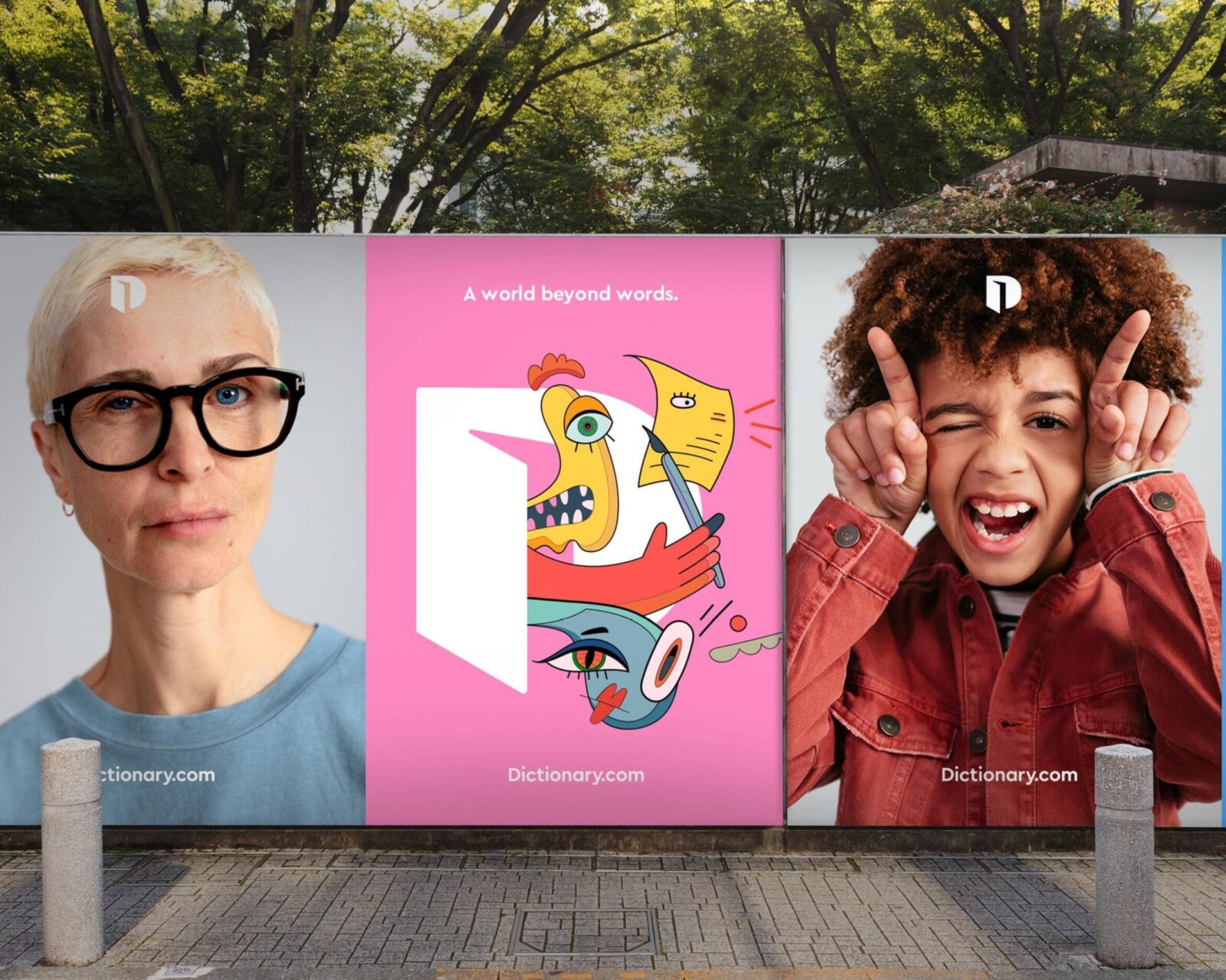
Dictionary.com
Dictionary.com is the world’s leading digital dictionary. They strive to enable and inspire connection, creativity and expression in a world powered by words. We supplied a carefully customised font family for their very specific needs.
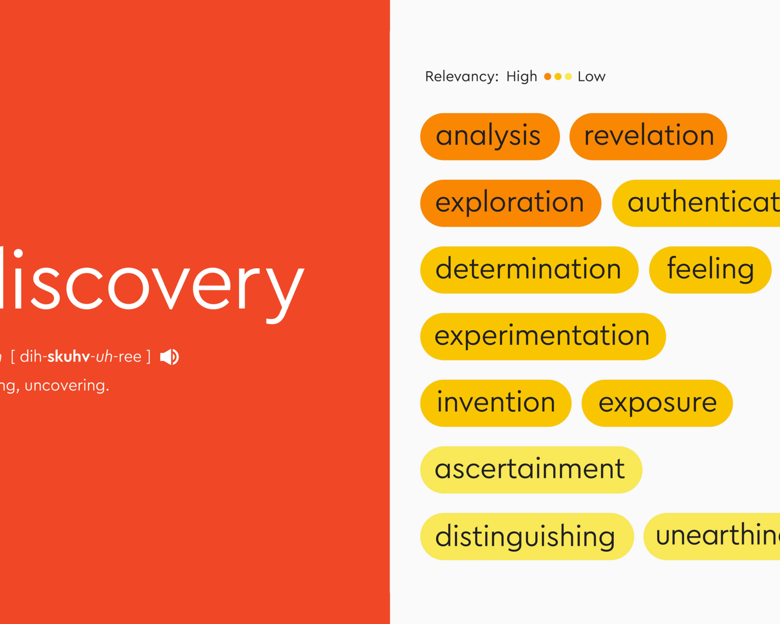
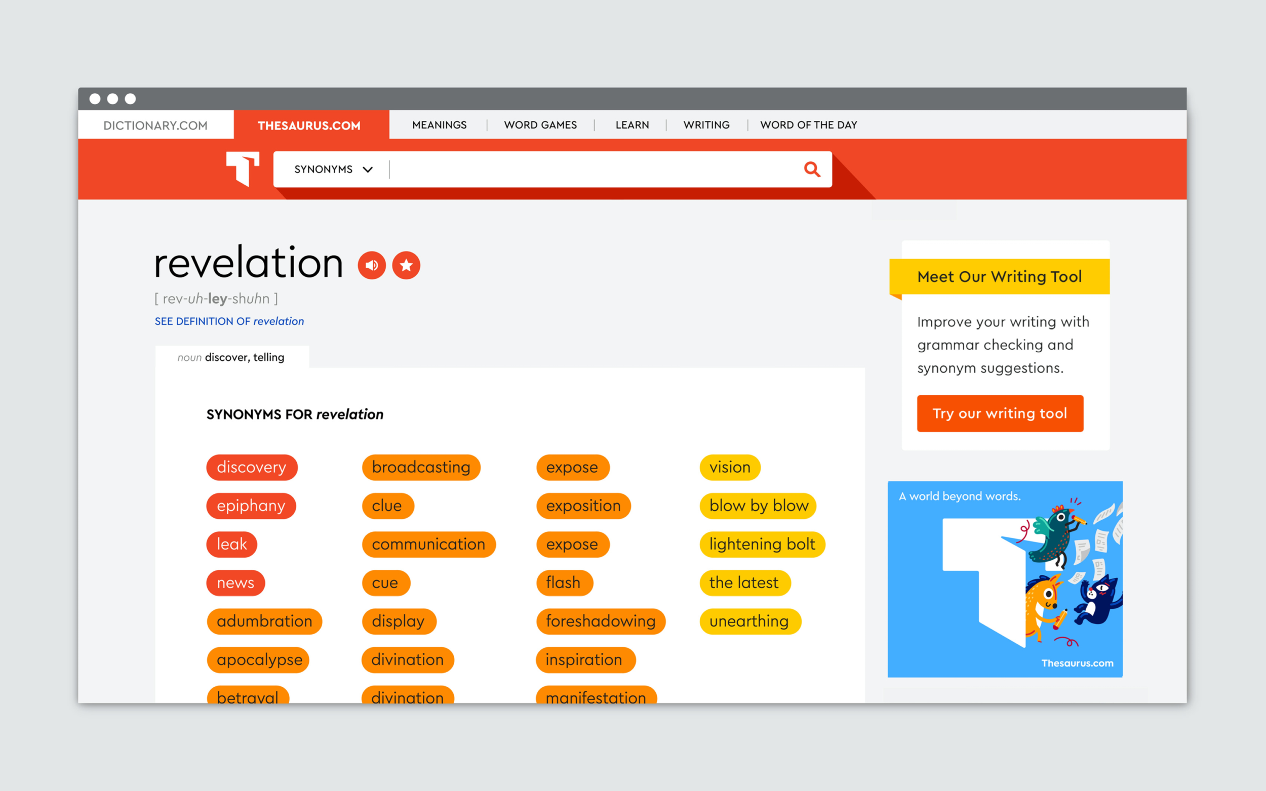
As the world’s leading digital dictionary, Dictionary.com is providing millions of English definitions, sentences and word origins. To broaden language variety, its sibling Thesaurus.com helps users with over 550,000 synonyms.
For the new branding of their websites, which was guided by San Francisco-based creative agency Tolleson, Dictionary was striving for a smart, light and inviting layout. All characteristics that Cera Pro pays tribute to already.
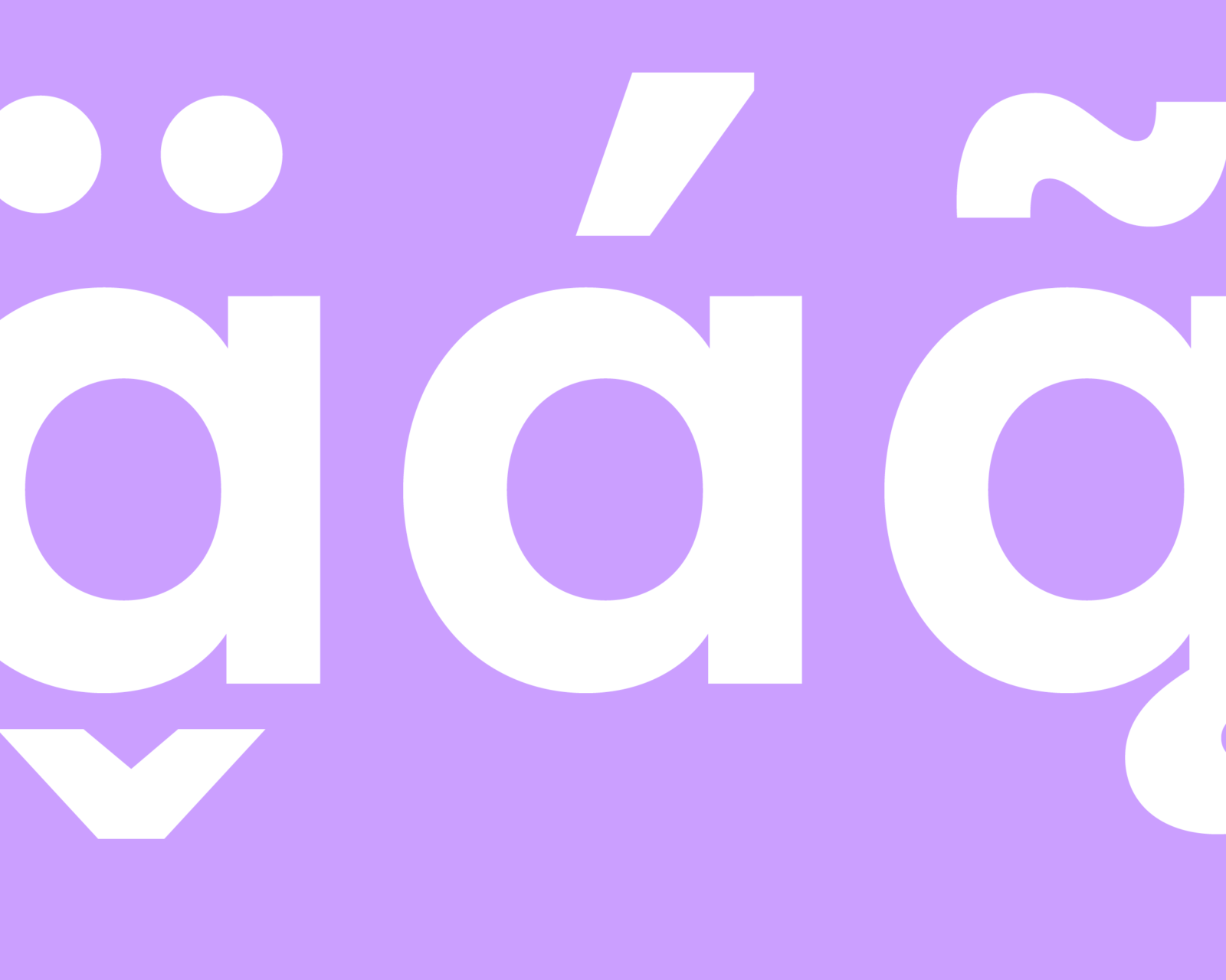
Talking to Sandy Micone and Ana De Magalhaes Ortegano at Dictionary.com, we came to realise that their ideas went much further though. On one hand Dictionary needed very particular characters that Cera didn’t have, on the other hand some of Cera’s existing letters needed to be dropped to reach a compact file size.
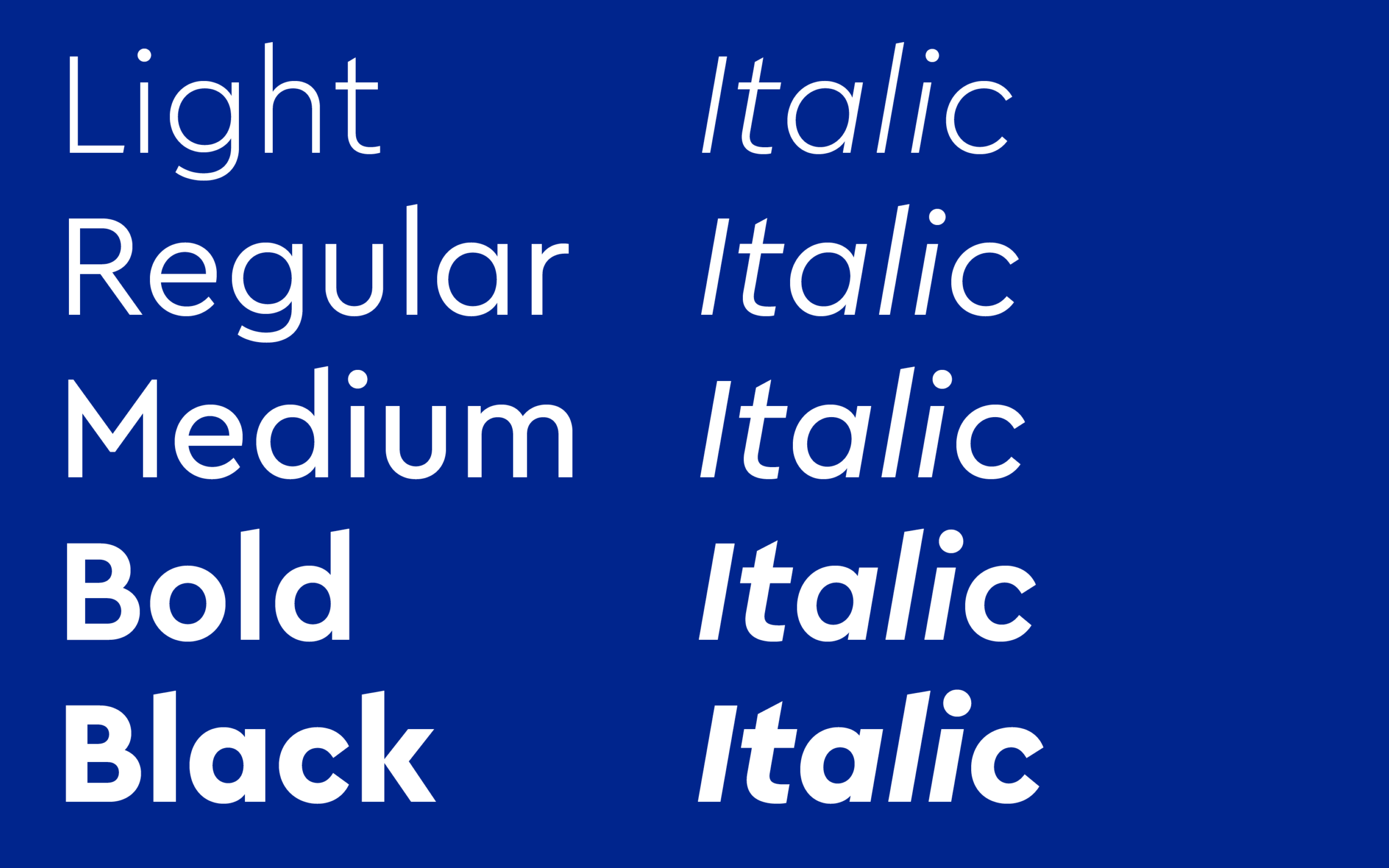
We advised Dictionary.com to go for a Variable Font to compress vector data and speed up performance with just one single font request. As they planned to use around three weights plus Italics, the sum of 6 styles in a static font format outputs more than 200 KB of data. A Variable Font, which contains all these at once, is less than 75 KB. Based on that, we simply had to take advantage of this technology.
The sans’ compact weight spectrum and the compatible italics were combined in a small, efficient format to enhance type hierarchy, legibility and expressiveness without sacrificing web performance.
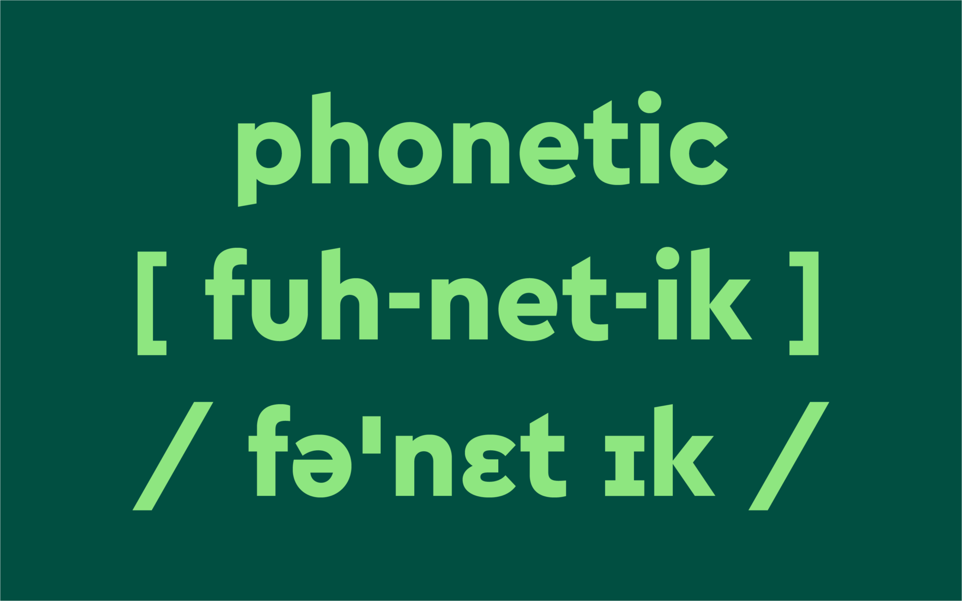
After an intensive month of tweaking, enhancing and testing, the new type for Dictionary.com was equipped with several custom-made features, like additional characters, phonetic letters and combining diacritics. By uniting the typeface with the graphic elements of UI and corporate design, we managed to support Dictionary.com to get their very own custom voice.
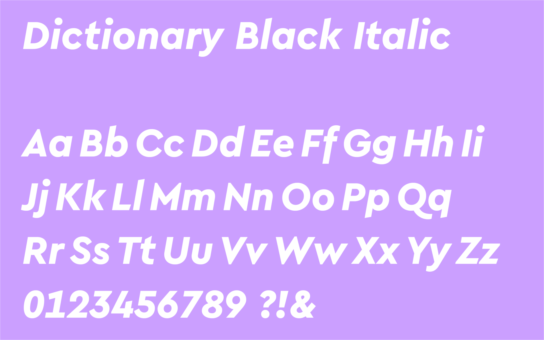
With the help of the single-story a and the newly designed Greek α, we made the font more proprietary for Dictionary.com. Ascenders and descenders got cut to mirror the open books from both logos of Dictionary.com and Thesaurus.com.
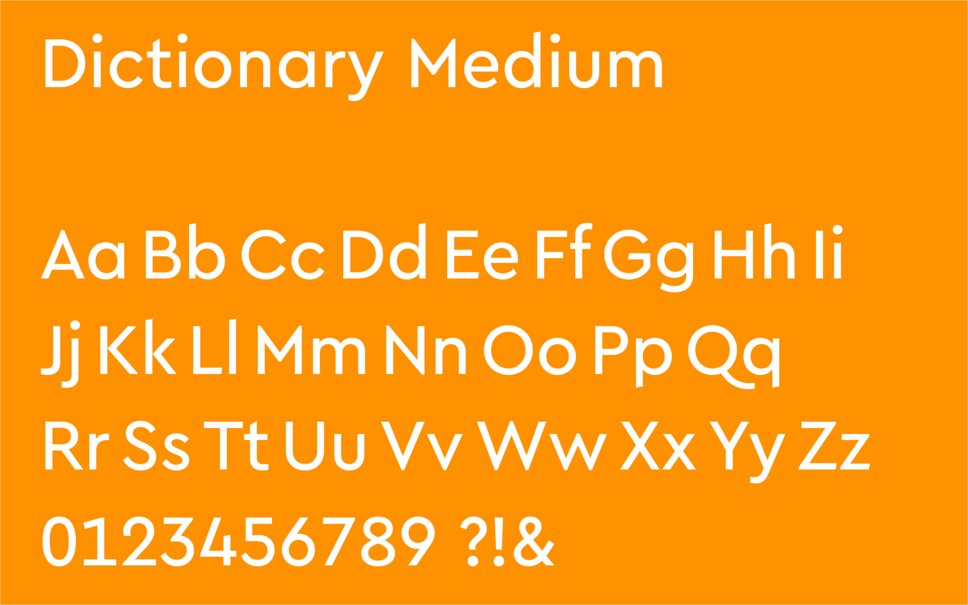
As a seasoning in general, ascenders, descenders got cut to reference to the diagonals of visual metaphor of opened doored D and T in the logos of Dictionary.com and Thesaurus.com
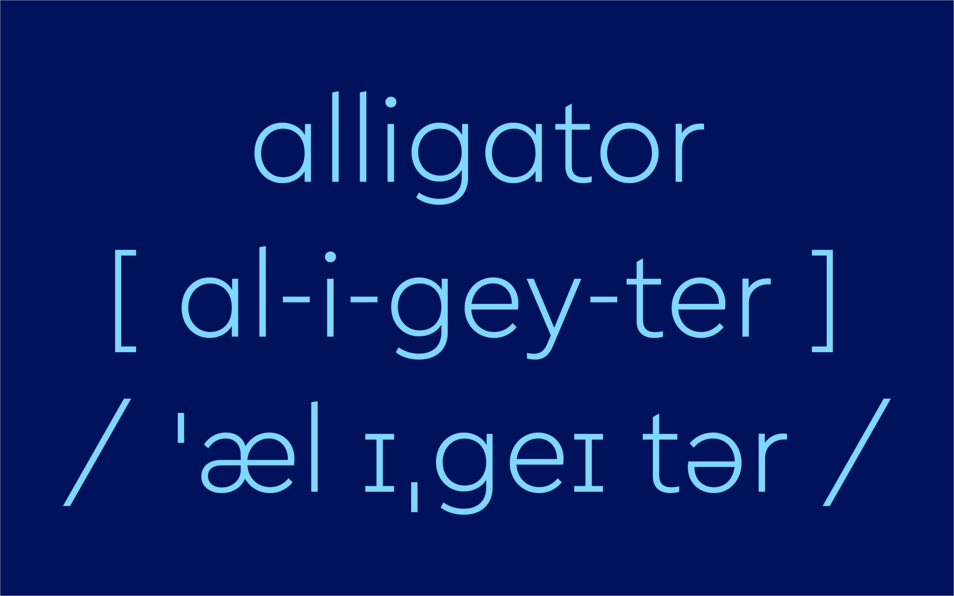
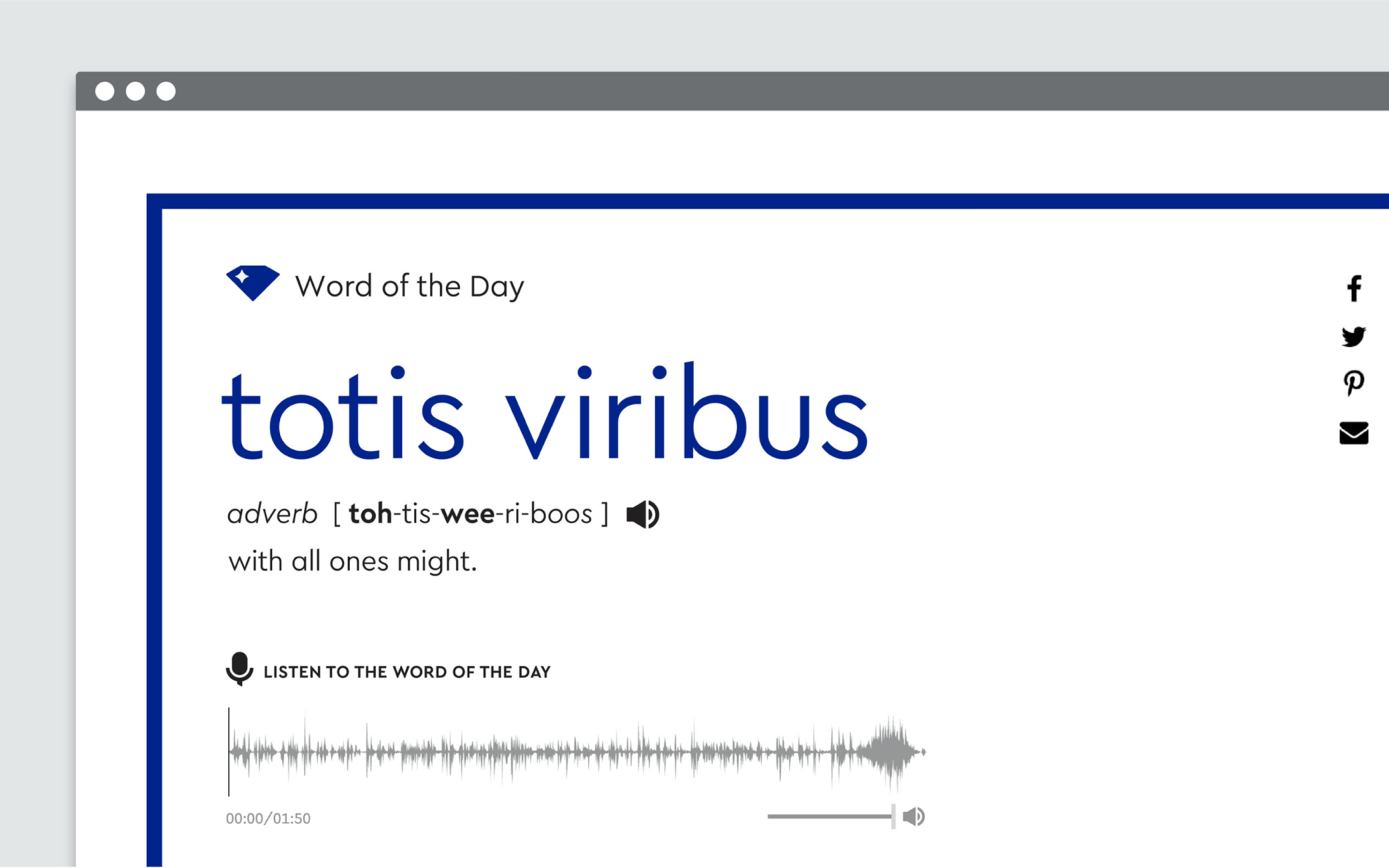
The new „Dictionary“ typeface is slightly condensed to make it fit perfectly with interface and text on rather narrow mobile layouts.
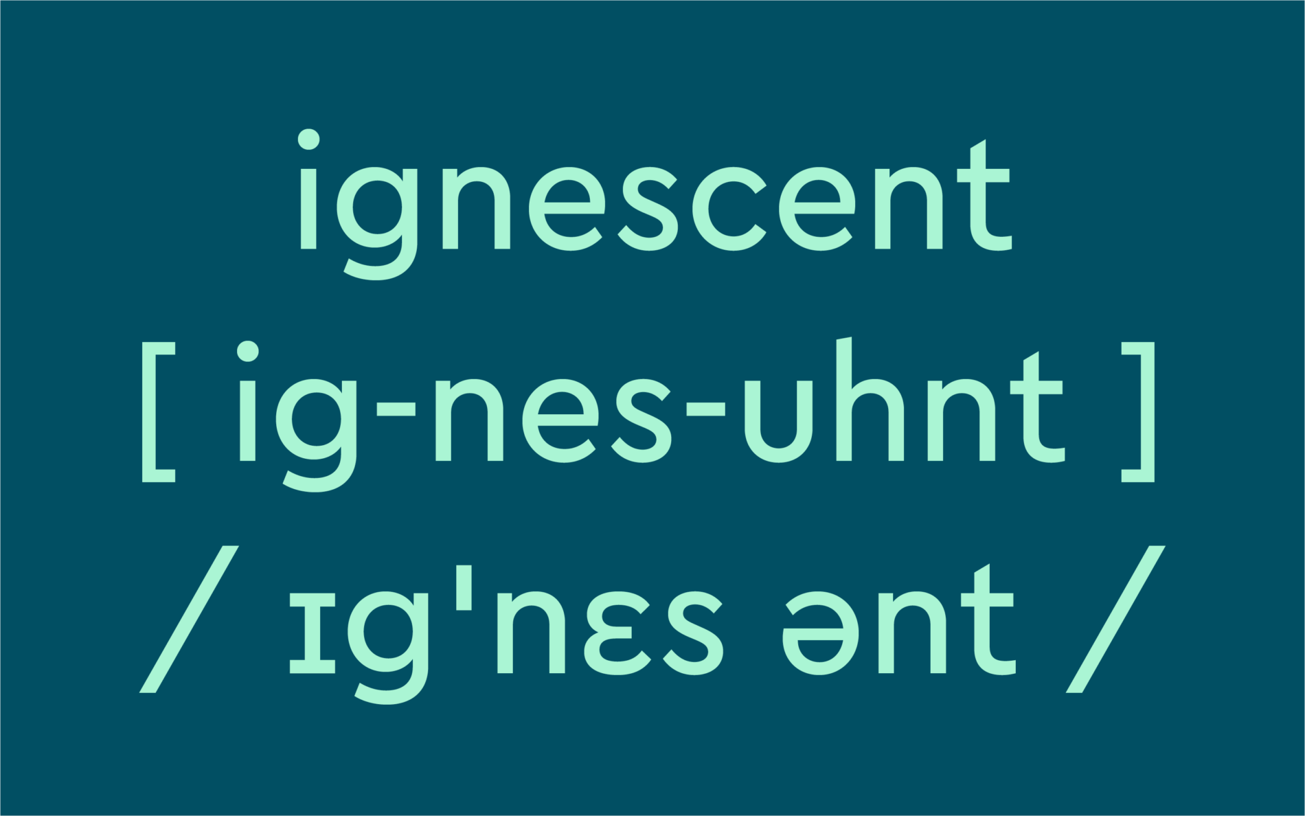
In coordination with Helen Langone, lexicographer at Dictionary.com, a lot of extra characters, phonetics letters and combining diacritics were added. This way we guaranteed that languages, transliterations and expressions were adequately covered.

The result is an aesthetically and technically smart custom font. Through tailored design, maximum license flexibility and a future orientated font format, we were able to contribute to a world beyond words.
